10,000 search results
(0.035 seconds)
- Fielding by AVP,
$25.00 Characterized by generous unstressed curves, subtley waisted stems and asymmetric serifs, Fielding is a great choice for sure-footed stylish text and elegant headlines. Its warm classical forms resolve into highly readable text at any size both on paper and on screen. Six weights and corresponding italics provide a choice of styles while small capitals, superscript, subscript, fractions, a range of ligatures and cameo capitals will add refinement to the most demanding of layouts. Default numerals are of uniform height, a little smaller than capitals and are proportional: not 'old style' in the traditional sense, they nevertheless sit comfortably in general text. Tabular numerals and lining numerals are also available. Italic styles are lighter in weight and freer in form, skipping alongside their upright counterparts to provide pleasing emphasis or variation. The comprehensive latin character set includes eastern European, Baltic and Turkish languages. First designed for a quarterly magazine, Fielding can be used wherever a modern interpretation of tradition is required including branding and packaging, websites, news media, books, general publicity and smart documentation.
 - LAMPOH by Afkari Studio,
$13.00 LAMPOH - The Handmade Scratch Display Font LAMPOH is an artistic and captivating handmade display font, meticulously crafted by a talented type designer to bring uniqueness and authenticity to your creative projects. With its scratch-inspired design, LAMPOH stands out as a one-of-a-kind font that exudes a raw and artisanal charm, making it perfect for various artistic endeavors. Every character in LAMPOH has been meticulously hand-drawn with love and passion, ensuring that each glyph carries a distinct and organic feel. The imperfections and irregularities of the scratch strokes add an element of human touch, providing a genuine and authentic character to the font. LAMPOH comes in both regular and bold styles, giving you the flexibility to choose the perfect weight for your design needs. The regular style boasts elegance and subtlety, while the bold style makes a powerful statement, ideal for headlines and emphasis. LAMPOH's versatile design makes it an ideal choice for a wide range of projects. Whether you're creating eye-catching headlines, attention-grabbing posters, logo designs, merchandise branding, or anything that requires a touch of artistic flair, LAMPOH will effortlessly enhance the visual appeal of your work. The uppercase characters of LAMPOH are bold and expressive, demanding attention with their captivating presence. On the other hand, the lowercase letters bring a touch of playfulness, offering quirky alternatives to add delightful variations to your text. LAMPOH comes complete with a set of thoughtfully crafted standard characters and ligatures, allowing you to elevate your designs even further. These unique elements enhance the font's versatility, making it easy to create visually engaging and harmonious compositions. LAMPOH is designed to seamlessly integrate into various design software, making it effortless to use in your preferred creative tools. From Adobe Illustrator to Photoshop, InDesign, and beyond, the font's compatibility ensures a smooth and hassle-free design process. LAMPOH's high-quality design ensures that it looks equally stunning in both print and digital formats. Whether you're producing posters, brochures, social media graphics, websites, or any other project, this font will consistently deliver outstanding results. LAMPOH is not just a font; it's a work of art that adds a touch of human craftsmanship to your creative projects. With its handmade scratch-inspired design, versatile usage, and expressive characters, LAMPOH brings a unique and authentic flair to any design. Unlock your creativity and let LAMPOH illuminate your artistic vision with its captivating charm. Choose between regular and bold styles to create striking and memorable designs that leave a lasting impression on your audience.
 - Okay A by Okaycat,
$24.95 Okay-A lets you make 3D letters that look to be fastened down with screws. Inspired by the angular futuristic shapes of Japanese Katakana letters, this angular font is bold and square. Okay-A lets you easily make multicolour logos or signs as the styles can be overlaid. It features extended characters, containing West European diacritics & ligatures, making it suitable for international environments & publications.
 - More Printing Helpers JNL by Jeff Levine,
$29.00More Printing Helpers JNL gathers another assortment of vintage printing embellishments and ornaments from the late 1800s. Within the standard twenty-six alphabet keys are pointing hands, corner pieces, border elements and decorative center and end pieces. On the lower case, certain elements have been flipped or inverted for matching effects. Some additional positions are available on the 1 through 9 keys and on the colon and semicolon. A bonus to this font: three expandable panels. the first (with decorative end caps) is attained by typing the left parenthesis for the left side, the hyphen for the center lines and the right parenthesis for the right side. The second one features ribbon ends, and the combination of the less than-equal-greater than keys creates this panel. The third design can be made by typing the left brace/vertical bar/right brace keys. - As of my last update in early 2023, there isn’t a specific font universally recognized by the name "Pink" that could be easily pinpointed within the vast landscape of typography. However, let's stret...
- Crazer by Atom,
$13.00 Crazer is a strange and irregular display typeface. Bringing tense, scary, powerful, and chaotic artwork. Create your creativity with Other Dangers!
 - Old Rubber Stamp - 100% free

- Last N Line - 100% free

- Legitimate Crystal Display - Personal use only

- Spooky Ghost by Sakha Design,
$12.00 Spooky Ghost is a cool, fun, and quirky decorative font. This font is PUA encoded which means you can access all glyphs and swashes with ease! Add it confidently to your favorite Halloween designs and let yourself be amazed by the outcome generated.
 - Black Manta Brush by Creaditive Design,
$12.00 Black Manta is a strong charactered, brushed display font. It looks fierce and urban and it will most certainly make each of your designs stand out. Add it confidently to your favorite creations and let yourself be amazed by the outcome generated.
 - Creepy Ghost by AEN Creative Studio,
$15.00 Creepy Ghost is a cool and spooky display font. This font is PUA encoded which means you can access all of the glyphs and swashes with ease! Add it confidently to your favorite creations and let yourself be amazed by the outcome generated.
 - Madela by Letterena Studios,
$10.00 Madela is a bold and thick lettered serif font. It is PUA encoded which means you can access all of the glyphs and swashes with ease! Add it confidently to your favorite creations and let yourself be amazed by the outcome generated.
 - Signs and Symbols by URW Type Foundry,
$39.99 Signs and Symbols is a collection of general purpose images for a variety of applications like climate and weather, nature, leisure, sports etc. Handy when you need some signs and symbols for your layout. Signs and Symbols was designed for the URW++ FontForum.
 - Bat Boo by AEN Creative Studio,
$15.00 Bat Boo is a cool and spooky display font. This font is PUA encoded which means you can access all of the glyphs and swashes with ease! Add it confidently to your favorite creations and let yourself be amazed by the outcome generated.
 - Notably Absent by Ali Hamidi,
$10.00 Notably Absent is a cool and fun styled display font. It will elevate a wide range of crafting ideas, from cards, to branding, labels and much more. Add it confidently to your favorite creations and let yourself be amazed by the outcome generated.
 - Balencia by Mchcrafter,
$18.00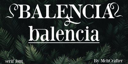 Balencia is an assertive and authentic serif font. It is PUA encoded which means you can access all of the amazing glyphs and ligatures with ease! Add it confidently to your favorite creations and let yourself be amazed by the outcome generated.
 - Murisa Mondriana by Murisa Studio,
$10.00 Mondriana is a cool and modern looking sans serif font. It will elevate a wide range of crafting ideas, from cards, to branding, labels and much more. Add it confidently to your favorite creations and let yourself be amazed by the outcome generated.
 - Aterline by AEN Creative Studio,
$15.00 Aterline is a simple but elegant slab serif font family. It will elevate a wide range of crafting ideas, from cards to branding, labels, and much more. Add it confidently to your favorite creations and let yourself be amazed by the outcome generated.
 - Kyrial Sans Pro by Mostardesign,
$- Designed in 2011 by Olivier Gourvat, this font family has generous proportions with a range of weights make it a versatile family for print, text, signage, branding and web design work. Kyrial Sans Pro offers lots of OpenType goodness and broad language support.
 - Visitor BRK Ten Pro by CheapProFonts,
$10.00 This is the first true pixel-font released by CheapProFonts. It may not be the first font based on a 5x5 pixel grid, but it probably has the best language support. The glyphs have all been optimized for Flash (by making the pixel shapes slightly overlapping) and should render sharp and perfect when set in 10px size (or multitudes of 10). As with all pixelfonts: make sure to place the text at coordinates with whole numbers, and always use left (and NEVER centered) alignment. ALL fonts from CheapProFonts have very extensive language support: They contain some unusual diacritic letters (some of which are contained in the Latin Extended-B Unicode block) supporting: Cornish, Filipino (Tagalog), Guarani, Luxembourgian, Malagasy, Romanian, Ulithian and Welsh. They also contain all glyphs in the Latin Extended-A Unicode block (which among others cover the Central European and Baltic areas) supporting: Afrikaans, Belarusian (Lacinka), Bosnian, Catalan, Chichewa, Croatian, Czech, Dutch, Esperanto, Greenlandic, Hungarian, Kashubian, Kurdish (Kurmanji), Latvian, Lithuanian, Maltese, Maori, Polish, Saami (Inari), Saami (North), Serbian (latin), Slovak(ian), Slovene, Sorbian (Lower), Sorbian (Upper), Turkish and Turkmen. And they of course contain all the usual "western" glyphs supporting: Albanian, Basque, Breton, Chamorro, Danish, Estonian, Faroese, Finnish, French, Frisian, Galican, German, Icelandic, Indonesian, Irish (Gaelic), Italian, Northern Sotho, Norwegian, Occitan, Portuguese, Rhaeto-Romance, Sami (Lule), Sami (South), Scots (Gaelic), Spanish, Swedish, Tswana, Walloon and Yapese.
 - Zomsenso by Pootis Type Corp.,
$31.99 Zomsenso is an angular, semi-modular typeface that supports OpenType alternates. The angular part means that the entire* font uses only angular segments and shapes. The alternate glyph shapes are under Stylistic Set 01. This font includes Seven Segment display (U+E000 to U+E07F) and arbitrary fractions (U+E1nd, n=numerator; d=denominator) that are mapped to the Private Use Area, so users can easily insert them via Unicode input. You can combine these fractions with the superscript and subscript numerals to create more fractions. This font can be used for essays, signs, logos, posters, commercial projects, videos, and many more. *except the circles in the Geometric Shapes block, which are still round
 - Socialite JNL by Jeff Levine,
$29.00Socialite JNL takes its cue from the Art Deco style of the 1930s with its clean, angular lines and stylized letter shapes. - MarkerMoe by JOEBOB graphics,
$- What happens when you write small characters with a huge marker? The answer is MarkerMoe; very irregular handwriting that's only just readable.
 - Cybersky by Typefactory,
$14.00 Cybersky is a sharp, angular, futuristic font in a retro style. Perfect for sci-fi themes, night street race and space adventures!
 - Master Script by Solotype,
$19.95An unusual angular vertical script. In late Victorian times it was seen mostly in advertising work, seldom in social stationery and announcements. - P22 Freely by IHOF,
$24.95 A loosely-written, slightly irregular but very legible handwriting style. Useful for the personal touch on menus, advertisements, greeting cards, flyers etc.
 - Cyclic by ArtyType,
$29.00 Cyclic is a stylish and modern slab serif in three practical, highly legible weights. The name ‘cyclic’ suits this typeface in several ways. Firstly because I wanted to create an ‘all-round’ typeface (pun intended) that could adapt to most applications, but also, as the dictionary definition explains - “occurring in circles, regularly repeated”. The basis for a lot of the characters did begin with a circle or sections of one; the equally distributed, rounded forms of this font are complemented however by the vertical strokes, and further counter-balanced by angular slab serifs on the remaining glyphs. Curved alternates with a celtic vibe are also included in the fonts and feature on the default slots in the separate Cyclic Uncial set. In summary, the whole Cyclic type family comprises a combined palette of circles and straight lines; something the cubist movement would have been proud of!
 - Cyclic Uncial by ArtyType,
$29.00 Cyclic is a stylish and modern slab serif in three practical, highly legible weights. The name ‘cyclic’ suits this typeface in several ways. Firstly because I wanted to create an ‘all-round’ typeface (pun intended) that could adapt to most applications, but also, as the dictionary definition explains - “occurring in circles, regularly repeated”. The basis for a lot of the characters did begin with a circle or sections of one; the equally distributed, rounded forms of this font are complemented however by the vertical strokes, and further counter-balanced by angular slab serifs on the remaining glyphs. Curved alternates with a celtic vibe are also included in the fonts and feature on the default slots in the separate Cyclic Uncial set. In summary, the whole Cyclic type family comprises a combined palette of circles and straight lines; something the cubist movement would have been proud of!
 - Barbou by Besnowed,
$19.99 Barbou was originally cut in 1925 by Monotype as a counterpart to Fournier, siblings that were different in design but both based on the work of Pierre-Simon Fournier. Whether by choice, accident or oversight, Fournier was preserved digitally, and Barbou was lost to history. Barbou was notably used by Stanley Morrison, in particular as the face of The Fleuron. I fell in love with Barbou when I saw it, and knew that I wanted to bring it to a new generation of designers and readers. This is a revival of Barbou, a faithful recutting with new weights, characters and many of the best features that modern font technology brings. Particular attention was paid to the original Monotype Barbou 178 specimen sheet. Originally only available in a single weight, Barbou has been recut with a variable weight, providing a large degree of flexibility between Regular and Bold. Barbou excels as a comfortable reading face for books, and the variable weight allows you to fine tune the darkness and texture of the page in a way never before possible. Barbou has a distinctive softness, and this revival of Barbou preserves much of the effect the medium of metal type had on the letterforms. This results in a subtly rounded yet defined type, elegant not worn, with the utmost attention and respect to the smallest of details. Barbou was originally cut with disparate x-heights for roman and italic, and this revival of Barbou features both the original italic, as well as a new italic redesigned at the same height as the roman. In Fournier’s time, roman and italic would not be mixed on the same line, but the type must change to meet the needs of a new generation. Barbou also features unique ligatures and alternates, old style numbers, small caps and a full Greek alphabet. Barbou is perfect for books and anywhere a comfortable reading face is required, and excels in flexibility.
 - Maiers Nr. 8 Pro by Ingo,
$27.00 A handwritten ”font for technicians“ from ca. 1900. Very geometrical, rigid forms borrowed from the typical characteristics of Jugendstil / Art Nouveau. This script is found in an old magazine which was issued sometime in the years shortly before WWI. The original copy, produced by means of a galvanized plate, is just 7 centimeters wide. It served as the model for technical professions in which, at that time, the captions of drawings were still done by hand. ingoFonts has not only digitized this beautiful typeface, we have also extended it to a whole family. In »Maier’s Alte Nr. 8« special attention was given to ensure the ”uneven“ edges, typical of handwritten script, remained effectively noticeable even in the digitized form. As a result, this ”technical“ font retains a handmade touch, while »Maier’s Neue Nr. 8« is the clean version with exact contours. The Art Nouveau forms, which are characteristic for the period of origin around the turn of the century around 1900, look especially pretty. The high degree of abstraction also seems strange in Maier's No. 8, especially when the age of the original is known. It is generally assumed that it was not until the Bauhaus in the late 1920s that such "modern" typefaces were created. Maier's No. 8 is a generation older! So many of today's supposedly "ultramodern" typefaces look quite old in comparison. In addition to the original two weights, Light and Bold, the Maiers Neue Nr. 8 got a regular and a extra-bold weight. Furthermore, the Neue is also available in italics. Although this is only a slanted version, unlike common practice, it is inclined to the left. Maier’s Nr. 8 Pro is suitable for all European languages. It includes ”Latin Extended-A,“ for Central and Eastern Europe incl. Turkish, and even Cyrillic and Greek, too. The font includes several stylistic alternates as well as a number of ligatures.
 - Fortima by Meat Studio,
$30.50 Fortima is a 12 style angular sans serif that utilises subtle modular shapes, designed by Stew Deane. The result is a font with character that adapts to a variety of sectors and brands, and is suitable for anything from advertising and branding to web and screen. The angular shapes help create a unique aesthetic that are instantly recognisable and have impact and character in large or small sizes.
 - Futura BT by Bitstream,
$39.99 Futura is the fully developed prototype of the twentieth century Geometric Sanserif. The form is ancient, Greek capitals being inscribed by the Cretans twenty-five hundred years ago at the time of Pythagoras in the Gortyn Code, by the Imperial Romans, notably in the tomb of the Scipios, by classical revival architects in eighteenth century London, which formed the basis for Caslon’s first sanserif typeface in 1817. Some aspects of the Geometric sanserif survived in the flood of Gothics that followed, particularly in the work of Vincent Figgins. In 1927, stimulated by the Bauhaus experiments in geometric form and the Ludwig & Mayer typeface Erbar, Paul Renner sketched a set of Bauhaus forms; working from these, the professional letter design office at Bauer reinvented the sanserif based on strokes of even weight, perfect circles and isosceles triangles and brought the Universal Alphabet and Erbar to their definitive typographic form. Futura became the most popular sanserif of the middle years of the twentieth century. Ironically, given its generic past, Futura is the only typeface to have been granted registration under copyright as an original work of art, and, further irony, given the key part played by the Bauer letter design office, the full copyright belongs to Renner and his heirs. This decision in a Frankfurt court implies that a further small group of older typefaces may also be covered by copyright in Germany, particularly those designed for Stempel by Hermann Zapf. This situation appears to be limited to this small group of faces in this one country, although protection of designers’ rights in newer typefaces is now possible in France and Germany through legislation deriving from the 1973 Vienna Treaty for the protection of typefaces. Mergenthaler’s Spartan is a close copy of Futura; Ludlow’s Tempo is less close. Functional yet friendly, logical yet not overintellectual, German yet anti-Nazi... with hindsight the choice of Futura as Volkswagen’s ad font since the 1960s looks inevitable.
 - NEON LED Light - Personal use only

- Future Earth - 100% free

- Syntha - Personal use only

- Syntha - Personal use only

- Grand Hotel - 100% free

- akaDora - 100% free

- pks-masry - 100% free


