10,000 search results
(0.043 seconds)
- CCS Neue Rinjani by Creative Corner Studio,
$29.00 Neue Rinjani is a all-caps sans serif with Wide Stretch contemporary typographic, vintage futuristic art-deco touch Streamline influence of the 1930s and 1940s. A mix from the old Euro-American signage/advertising letters and modern clean sans serif, carefully mousecrafted to bring you the genuine feel of the era. If you're into classic/vintage letter designs, then this typeface suits best for you.
 - Afrikana by Mina Arko,
$18.00 Afrikana is based on various African letters and signs. The main inspiration for making this typeface was the book by Saki Mafundikwa, Afrikan Alphabets. Letters were designed based on signs and characters from African alphabets. They were than cut out of cardboard, scanned, traced and put in a font. You are free to modify the font in any way and have fun with it.
 - Sukkergris by Bogstav,
$15.00 Need a catchy headline font with a clear handmade and organic look? Look no further, because Sukkergris is here to do the job! Each letter is handmade and manually cleaned up, but keeping the original quirky curves. I have added 6 different versions of each letter, which automatically cycle as you type. I also added a set of small caps, just because I think they look awesome!
 - Piano Music JNL by Jeff Levine,
$29.00 A 1910 collection of piano sheet music called “Presser’s Economy Group” had that name hand lettered in a fancy serif lettering style that could fall somewhere between Art Nouveau and semi-calligraphic. No matter the label you attach to the style, it makes for a wonderful digital type revival. The end result is Piano Music JNL, which is available in both regular and oblique versions.
 - Nationale by Greater Albion Typefounders,
$15.00 Nationale is inspired by the lettering of early 20th century share certificates and bonds. It includes a complete set of stylistic alternates for all letter forms, and two sizes of numerals. National speaks of the steam age, and the age of traditional design and engineering, when aesthetic concerns mattered just as much as function. Bring a touch of the elegant past to your work with Nationale.
 - Cartage Stencil JNL by Jeff Levine,
$29.00 The sheet music for the title song of the 1960 movie "Exodus" had the name hand lettered in a block stencil style with rounded corners and narrow "rails" [the breaks between the stencil parts]. Loosely based on this design and working from just the six letters of the title, Cartage Stencil JNL is available as a digital font in both regular and oblique versions.
 - Murisa Paula by Murisa Studio,
$10.00 Do you want a unique and attractive display font?. Murisa Paula is the answer. This very attractive font will make you happy and excited. It has a unique shape with the edges of the letters torn to shreds, like torn paper. This type of lettering will make it easier for you to design a display product with a cracked effect or something else. Get it now.
 - French Pastry JNL by Jeff Levine,
$29.00 A little ditty from France circa the 1940s called "J'ai Rêvé Dans Tes Bras" (which loosely translated means "I've Dreamed in Your Arms") offered up its title hand lettered in an interesting Art Deco sans. This formed the basis for French Pastry JNL, a tasty typographical tidbit further preserving the wide choice of lettering styles hand-crafted for popular sheet music of past decades.
 - Calrida by Muksal Creatives,
$12.00 Calrida is a modern high-class display serif font typeface. It includes all basic glyphs with international characters. This font will pair beautifully with a script, signature or handwriting style font. Calrida is perfect for headlines, titles, magazine headings, logos, presentations, posters, name cards, web layouts, invitations, books, branding, and more. Calrida Features: Uppercase Multilingual Letters Lowercase Multilingual Letters Numbers & Punctuation Ligatures Stylistic Alternates
 - Patinas Stencil by Inumocca,
$13.00 Patinas Stencil Family come with 3 Style Moon Star , Reguler and Slant. Modern Urban Serif Font, Powerfull and has a great Character, Good Font to use for covering your Project, like Branding, Headline Letter, Flyer, Signage, Quotes, Poster Typography, Bookcover, Magazine cover, Poster, Quotes Lettering, Logos, and more your project design. - Unique glyphs - Multilingual Characters Support - UPPERCASE - Lowercase - Numeric - Symbol - Punctuation Character inumocca type Studio
 - Hooptie Script by FDI,
$25.00 Two typefaces inspired by the car lettering of the Motor City. In contrast to other car script fonts, the Hooptie Script fonts make full use of modern OpenType technology. Just turn on contextual alternates and ligatures and watch how each letter pair always connects perfectly. The full package includes seven bonus vector images of vectorized hooptie cars. Check out the type specimen for more details.
 - High Hopes by Ana's Fonts,
$15.00 High Hopes is a quirky handmade serif font with variations that show up "randomly" through contextual alternates, true italics and ornaments. Use this font in designs such as postcards and notes, posters, logotypes, social media posts, branding and packaging. High Hopes includes: Regular font with three contextual alternates for each letter Italic font with three contextual alternates for each letter Ornaments font with swashes and frames
 - Quesky by CBRTEXT Studio,
$12.00 Quesky is a classy Handwritten Script in a casual and distinctive style that is perfect for your branding design, and will also be very beautiful in your wedding invitations and business cards and especially for your brand logo. Quesky has beautiful uppercase and lowercase letters, numbers, and very realistic binding standards. Quesky also has several alternative letters that can make your project look modern, luxurious and classy.
 - Prismatiq JNL by Jeff Levine,
$29.00Prismatiq JNL was modeled from lettering found in a French alphabet book from the turn of the last century - the type sample appearing online at an image sharing site. All of the imperfections of hand-lettering were left intact. This is a limited character set comprising A-Z, 1-0, basic punctuation, forward slash and dollar and cents signs, and is best used in large headline applications. - Brothership by Arterfak Project,
$20.00 Introducing Brothership. A freestyle brush font created by expanding my brush lettering artwork. This font visualizes flexible letterforms and natural strokes which gives it an energetic impression. Brothership is a display font equipped with some alternates characters and custom swashes to help you creating a beautiful custom lettering. Brothership is perfect for apparel, merchandising, labels, logotype, posters, quotes, book covers, sports, prints, and advertising needs.
 - Waterman by John Moore Type Foundry,
$20.00 Waterman is a display font, its form is based on the figure of a fluid, creating a texture of undulating forms, rhythmic and free to make reading a stream wave experience. Waterman comes in Regular and Bold. The letter shape was developed from the design of the letter "a" and “l” lower case. The curve model is related on a stylized form of a fluid wave.
 - Mister London by Sarid Ezra,
$13.00 Introducing, the all new font duo, Mister London! Mister London is my newest product that contain two fonts, the bold sans and a signature hand lettering script. You can use this font for every project. Suitable for branding logo, hand lettering, or for branding. This font duo also support multilingual, number and symbol, alternates, swash, and underline. Thank you! - Don't hesitate to ask me at saridezra@gmail.com
 - Janda Stylish Script by Kimberly Geswein,
$5.00 I love the trends in handwritten calligraphy and wanted to play with playful lettering. I've heard from many of my customers that they don't use Open Type software and feel limited in the cool features of OT scripts because of this, so I've replaced the | (bar key) with a left-sided tail to start the lowercase r and s in words that begin with those letters.
 - Mitona Script by Letterfreshstudio,
$19.00 Mitona Script Font is an urban retro font with the style like a logotype lettering. was created to help you designing logotype or lettering style for your Brand or your clients. it has an extensive lingual support, covering European and Asian Latin scripts. The font contains all characters you'll ever need, including all punctuation and numbers. Multilingual Support Alternates, Regular/Extrude/Outline/Shadow Thankyou
 - San Louis by Inumocca,
$25.00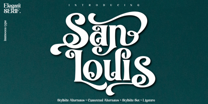 San Louis is an Elegant Serif typeface , Modern , Classy and Glamour Worlds. Awesome Stylictic Set, Beautiful Ligature and unique contecttual alternates, stylistic alternates. Really playful typeface to covering your Project, like Lettering, Website Interface, Magazine, Branding, Poster, wedding invitations, Quotes Lettering, Logos, and more your project design. - Unique glyphs - Multilingual Characters - UPPERCASE - Lowercase - Numeric - Symbol - Punctuation Character - Ligature - Contextual Alternates - Stylistic Alternates - SS01, SS02, SS03, SS04
 - Fast Lane by Supfonts,
$14.00 Fast Lane Script it is a Lettering chick font with exquisite accents. It is perfect for branding, wedding invitations and invitation cards and much more. It includes a full set of gorgeous uppercase and lowercase letters, numbers, a large selection of punctuation marks & ligatures. Includes: Latin languages support Uppercase and lowercase Numbers and punctuation Ligatures Check out my blog: https://www.instagram.com/di.zigner https://pinterest.com/dmitriychirkov7 Enjoy
 - Nord Express NF by Nick's Fonts,
$10.00Power, speed and modern creature comforts characterized rail travel in the 1930s. To reflect those characteristics, legendary French poster artist A. M. Cassandre employed strong graphic elements and a chiaroscuro letter treatment to the 1939 poster lettering that inspired this font. Both versions of this font contain the Unicode 1252 Latin and Unicode 1250 Central European character sets, with localization for Romanian and Moldovan. - Master Photograph by Subectype,
$17.00 Master Photograph is a Monoline Signature Font, font with a touch of handwriting style. This font is perfect for creating signature logos and watermarks for photography studio or wedding invitation. Master Photograph includes full set of beautiful hand lettered uppercase and lowercase letters, numerals, a large range of punctuation and many beautiful ligatures. You will get: Regular and Italic Version 100+ Ligatures Thank You, Subectype
 - Hostage Script by Letterfreshstudio,
$25.00 Hostage Script Retro Font is an urban retro font with the style like a logotype lettering. was created to help you designing logotype or lettering style for your Brand or your clients. it has an extensive lingual support, covering European and Asian Latin scripts. The font contains all characters you'll ever need, including all punctuation and numbers. Multilingual Support Alternates, Regular/Extrude/Outline Thankyou
 - SugarBoo by Inumocca,
$20.00 SugarBoo is A Reverse-Contrast letterform , Modern look, Fresh, eyecatching, strong character and power full. The Typeface comes with Stylistic Set Combinations Exellent typeface to use for covering your Project, like Branding, Movie Title, Headline Letter, Bookcover or Book Content, Magazine cover, Poster, Quotes Lettering, Logos, and more your project design. - Unique glyphs - Multilingual Characters Support - UPPERCASE - Lowercase - Numeric - Symbol - Punctuation Character - Stylistic Set inumocca type Studio
 - Kopius by Kontour Type,
$50.00 The Kopius™ family is a contemporary serif type that features friendly characteristics with round, open counters conveying a relaxed ambiance. The robustness of the characters supports a wide variety of applications including editorial and display use. The uniquely defined novel glyph construction and serif shapes convey an allusion to a brush stroke that bestows a contemporary, texture-rich appearance entirely in tune with functionality. The top and bottom slightly curved stems imply flow and reading direction. Kopius is an exuberant family with a genuinely multifaceted repertoire. This upbeat type comes with a multitude of weights to satisfy any fanciful appetite for a colorful typographic palette. With packaging solutions in mind the family includes sets of expandable and combinable box heading material for a boundless range of adjusted composites. In addition, pertinent labels, weight-adjusted arrows, and word logos complete the Kopius family. OpenType provides advanced layout features including figure sets, small caps, fractions, and more. Herbert Thannhaeuser’s Liberta, an Antiqua type family designed for the East German type foundry VEB Typoart between the middle to end 1950s, has stirred the initial inspiring force for Kopius. Baskerville-like open and modern typeface proportions further characterize Kopius’ letter dimensions. With its affable yet serious demeanor, Kopius is confidently assuming numerous tasks.
 - Limoncello Recipe by PeachCreme,
$19.00 Savor the perfectly imperfect strokes of "Limoncello Recipe," a handwritten font that embraces the charm of human touch in every line. Just like the handwritten notes of a well-used family cookbook, this font features delightfully uneven lines and a casual, unrefined style that brings an approachable, personal feel to any project. With 84 standard ligatures, "Limoncello Recipe" reflects the natural variations of handwriting, creating connections that are as authentic as they are unique. These connections celebrate the beauty of imperfection, making your text resonate with the warmth and originality of a handwritten letter. The font's assortment of beginning and ending swashes provides a variety of expressive flourishes, giving your words a laid-back elegance. These alternates allow for a playful freedom in your designs, echoing the spontaneous and joyful scribbles found in the margins of a secret family recipe. Ideal for designs that call for a touch of rustic charm and a dash of whimsy, "Limoncello Recipe" is a reminder that beauty often lies in the flaws. Whether you're designing a quirky brand identity, a charming event invitation, or packaging for artisanal products, this font proves that sometimes the best approach is a little bit carefree and wonderfully imperfect.
 - Raylig by Khaiuns,
$16.00 Raylig is a graceful serif but full of energy, Raylig is an experimental project full of selfishness in it, this project was designed by khaiuns in May 2021, he made it himself so it took about 4 months. Raylig is a desire to present the perfect font for your wide variety of projects so that this type of font can be selected for branding, especially in the UI / UX industry, also suitable for typographic layout for magazines, posters, books, etc. With hard work and spending a lot of time, comes the Raylig Serif font that has interesting things, such as: 10 styles: 5 Original, 5 Alternative 650 glyphs in each style Support for more than 190+ languages: Expanded Latin, and many other languages Each style has 33 really cool alternatives, and find something interesting Raylig also has classic characters, but it is also perfect for your modern design, you can see it on display, such as in thin body size (light), Raylig makes a neutral impression, but when the size is getting bigger (Bold), users are taken on a fun search to find interesting movements, graphic peculiarities, and unusual solutions. All letter patterns are perfectly adjusted. I hope you have a blast using Raylig. Thanks for use this font ~ Khaiuns X zelowtype
 - Stern Pro by Canada Type,
$49.95 Originally released in 2008, Stern is the only typeface to be produced and marketed simultaneously in digital and metal. In the twenty-first century, no less. It is also the last typeface Jim Rimmer ever completed. The process he used for its design and manufacture is the stuff of legend, and can be seen in the Richard Kegler documentary, Making Faces: Metal Type in the 21st Century. The design is a delicate upright italic named in memory of Chris Stern, the late artist and printer from Washington State. In 2013, Canada Type remastered and expanded the design's offerings to a glyphset of over 1200 characters, updated programming. Now Stern Pro includes the following features: - Small caps. - Caps-to-small-caps functionality, useful for setting mid-height caps alongside lowercase. - Tall caps. - Historical forms. - A wide variety of alternates for both uppercase and lowercase letters. - Plenty of ligatures. - Seven types of numerals, enclosers, cojoiners and currency symbols. - Automatic fractions. - A complete set of lowercase ordinals, from a to z. - Case-sensitive forms. - Language support for Greek and over 50 Latin languages. 20% of this font's revenues will be donated to the Canada Type Scholarship Fund, supporting higher typography education in Canada.
 - Rothorn by ROHH,
$35.00 Rothorn™ is a modern, minimalist geometric sans with its own personality derived for subtle design details, such as cut diagonal corners, pointed t, very small contrast and closed aperture. The letterforms give the typeface a lot of charisma, keeping a very minimal, clear and well balanced look at the same time. Its powerful and sharp shapes together with the variety of weights from Hairline to Black make it a perfect choice for headlines and branding. Generous x-height, careful spacing and distribution of weights give it a color and legibility great for long paragraphs of text. Rothorn is a geometric member of a large type system including such families as Montreux Grotesk (Swiss-style grotesk), Lütschine (narrow headline family) and Conthey (narrow headline unicase family). The Rothorn family consists of 10 weights with corresponding italic styles, giving a total of 20 styles. Italic styles were hand drawn to get sharp and fine letter shapes. It includes a 2-axis variable font letting you adjust the weight and italic slant to your exact needs. The family has extended latin language support, as well as broad number of OpenType features, such as, case sensitive forms, ligatures, contextual alternates, lining, oldstyle, tabular and circled figures, slashed zero, fractions, superscript and subscript, ordinals, currencies and symbols.
 - Magiona Display by Dora Typefoundry,
$20.00 Magiona Display - A modern classic serif font, perfect for creating bold & beautiful designs. Magiona Display is classic and sophisticated typography with 2 weights to captivate your next project. A very versatile font that works in both large and small sizes. This font is suitable for a wide variety of projects such as: headlines, logos, labels, branding projects, magazines, homeware designs, product packaging, mugs, quotes, posters, and more. It can also be more expressive and fun, thanks to the many alternatives and binders that combine harmoniously in this font and make it more interesting and versatile. Try to change alternatives, binders and you will get many options for your project which will make it bold & beautiful. Features: • Full set of uppercase, lowercase letters • 55 Ligatures • 245 Alternates • Big range of numbers, symbols & punctuation • Characters with accents • Supports Multiple Languages • PUA Encoded WHAT’S INCLUDED: • Magiona Display – Regular • Magiona Display – Outline This type of family has become a work of true love, making it as easy and enjoyable as possible. I really hope you enjoy it! I can't wait to see what you do with Magiona Display! Feel free to use the #Dora Typefoundry tag and # Magiona Display font to show what you've done visit my Instagram : https://www.instagram.com/doratypefoundry/ Thank You!
 - Holy Cream by Shakira Studio,
$17.00 Say hello to new serif font, Holy Cream! Holy Cream is a font that takes you back to the trendy retro era. With a classic display serif style but with a modern feel, Holy Cream emphasizes the uniqueness and elegance of each letter. The bold, contoured serif design provides a strong vintage touch, while stylish and quirky alternatives add a charming creative dimension. When using Holy Cream, you will feel a touch of fun nostalgia, but also explore ongoing design trends at the same time. Whether you want to feature your headline in a print ad, poster, or other graphic design, Holy Cream delivers a trendy, retro vibe that grabs attention with its ability to adapt to a variety of visual styles. So, with Holy Cream, make your design speak in a stylish and unique retro style, captivate the audience and make an unforgettable impression. Here's what you get: Holy Cream Regular and Italic All Multilingual symbol Opentype features ( ligature, alternate ) Accessible in the Adobe Illustrator, Adobe Photoshop, Adobe InDesign, even work on Microsoft Word. PUA Encoded Characters - Fully accessible without additional design software. Multilingual character supports : (Afrikaans, Albanian, Catalan, Croatian, Czech, Danish, Dutch, English, Estonian, Finnish, French, German, Hungarian, Icelandic, Italian, Lithuanian, Maltese, Norwegian, Polish, Portuguese, Slovenian, Spanish, Swedish, Turkish, Zulu)
 - Best Swashed by Gold Type,
$15.00 Best Swashed is a beautiful, versatile serif font. This font is characterized by a serif style with a luxurious style in a modern form, but also a friendly and playful style in bold, Best Swashed has glyphs to give crafters more options in designing. This modern style will make a design appear more classy, elegant, unique and edgy. Best Swashed is a font suitable for many projects, for modern or even retro vintage designs, branding, logos, crafts, stickers, sublimation, wedding invitations, and more. This font is suitable for a variety of projects such as logos, branding, magazines, signage, fashion, and many more. -Uppercase and lowercase letters, Numbers and punctuation, Multilingual support, PUA encoded fonts, Alternative styles and ligatures Language Support: Afrikaans, Albanian, Basque, Bemba, Bena, Bosnian, Catalan, Chiga, Congo Swahili, Cornish, Croatian, Czech, Danish, Dutch, English, Estonian, Faroese, Filipino, Finnish, French, Galician, Ganda, German, Gusii, Hungarian, Icelandic, Indonesian, Irish, Italian, Kabuverdianu, Kalenjin, Makonde, Malagasy, Malay, Manx, Morisyen, North Ndebele, Norwegian Bokmål, Norwegian Nynorsk, Nyankole, Oromo, Polish, Portuguese, Romanian, Romansh, Sena, Shambala, Shona, Slovak, Slovenian, Soga, Somali, Spanish, Swahili, Language Support: Breton, Catalan, Czech, Danish, Estonian, English, Finnish, French, German, Hungarian, Icelandic, Italian, Latvian, Lithuanian, Norwegian, Polish, Portuguese, Romanian, Scottish Gaelic, Slovak, Slovenian, Spanish, Swedish. Thank You
 - Sociato by insigne,
$35.00 Introducing Sociato: a typographic trendsetter. It's a quirky font that perfectly blends modernity and antiquity. The French Revolution was a period of uncompromising innovation in art and fashion, with celebrity artists, notably Jacques Louis David, creating propaganda for the new regime. This regime failed, but we have rare historical artifacts related to this historical upheaval. The typeface was inspired by a declaration published during the French Revolution that extolled the development of a new religion, the cult of the Supreme Being. It's a stunning piece of work, with a wild, baroque layout and hand drawn typography. Words leap off the page in a cascade of sounds and shapes, and quirky letterforms give it a lively, almost mischievous character. It's a veritable goldmine of typographic ideas. This typeface is based on the hand lettering in the original manuscript, but it has been enhanced by adding a full variety of characters. The typeface comes with a comprehensive range of diacritics, including old-style figures. The typeface is suitable for a wide range of uses, including titles and headers, and it should look beautiful in any typographic setting. Use Sociato to create a revolutionary identity, as bold and audacious as the French Revolution!
 - Vendetta by Emigre,
$69.00 The famous roman type cut in Venice by Nicolas Jenson, and used in 1470 for his printing of the tract, De Evangelica Praeparatione, Eusebius, has usually been declared the seminal and definitive representative of a class of types known as Venetian Old Style. The Jenson type is thought to have been the primary model for types that immediately followed. Subsequent 15th-century Venetian Old Style types, cut by other punchcutters in Venice and elsewhere in Italy, are also worthy of study, but have been largely neglected by 20th-century type designers. There were many versions of Venetian Old Style types produced in the final quarter of the quattrocento. The exact number is unknown, but numerous printed examples survive, though the actual types, matrices, and punches are long gone. All these types are not, however, conspicuously Jensonian in character. Each shows a liberal amount of individuality, inconsistency, and eccentricity. My fascination with these historical types began in the 1970s and eventually led to the production of my first text typeface, Iowan Old Style (Bitstream, 1991). Sometime in the early 1990s, I started doodling letters for another Venetian typeface. The letters were pieced together from sections of circles and squares. The n, a standard lowercase control character in a text typeface, came first. Its most unusual feature was its head serif, a bisected quadrant of a circle. My aim was to see if its sharp beak would work with blunt, rectangular, foot serifs. Next, I wanted to see if I could construct a set of capital letters by following a similar design system. Rectangular serifs, or what we today call "slab serifs," were common in early roman printing types, particularly text types cut in Italy before 1500. Slab serifs are evident on both lowercase and uppercase characters in roman types of the Incunabula period, but they are seen mainly at the feet of the lowercase letters. The head serifs on lowercase letters of early roman types were usually angled. They were not arched, like mine. Oddly, there seems to be no actual historical precedent for my approach. Another characteristic of my arched serif is that the side opposite the arch is flat, not concave. Arched, concave serifs were used extensively in early italic types, a genre which first appeared more than a quarter century after roman types. Their forms followed humanistic cursive writing, common in Italy since before movable type was used there. Initially, italic characters were all lowercase, set with upright capitals (a practice I much admire and would like to see revived). Sloped italic capitals were not introduced until the middle of the sixteenth century, and they have very little to do with the evolution of humanist scripts. In contrast to the cursive writing on which italic types were based, formal book hands used by humanist scholars to transcribe classical texts served as a source of inspiration for the lowercase letters of the first roman types cut in Italy. While book hands were not as informal as cursive scripts, they still had features which could be said to be more calligraphic than geometric in detail. Over time, though, the copied vestiges of calligraphy virtually disappeared from roman fonts, and type became more rational. This profound change in the way type developed was also due in part to popular interest in the classical inscriptions of Roman antiquity. Imperial Roman letters, or majuscules, became models for the capital letters in nearly all early roman printing types. So it was, that the first letters in my typeface arose from pondering how shapes of lowercase letters and capital letters relate to one another in terms of classical ideals and geometric proportions, two pinnacles in a range of artistic notions which emerged during the Italian Renaissance. Indeed, such ideas are interesting to explore, but in the field of type design they often lead to dead ends. It is generally acknowledged, for instance, that pure geometry, as a strict approach to type design, has limitations. No roman alphabet, based solely on the circle and square, has ever been ideal for continuous reading. This much, I knew from the start. In the course of developing my typeface for text, innumerable compromises were made. Even though the finished letterforms retain a measure of geometric structure, they were modified again and again to improve their performance en masse. Each modification caused further deviation from my original scheme, and gave every font a slightly different direction. In the lower case letters especially, I made countless variations, and diverged significantly from my original plan. For example, not all the arcs remained radial, and they were designed to vary from font to font. Such variety added to the individuality of each style. The counters of many letters are described by intersecting arcs or angled facets, and the bowls are not round. In the capitals, angular bracketing was used practically everywhere stems and serifs meet, accentuating the terseness of the characters. As a result of all my tinkering, the entire family took on a kind of rich, familiar, coarseness - akin to roman types of the late 1400s. In his book, Printing Types D. B. Updike wrote: "Almost all Italian roman fonts in the last half of the fifteenth century had an air of "security" and generous ease extremely agreeable to the eye. Indeed, there is nothing better than fine Italian roman type in the whole history of typography." It does seem a shame that only in the 20th century have revivals of these beautiful types found acceptance in the English language. For four centuries (circa 1500 - circa 1900) Venetian Old Style faces were definitely not in favor in any living language. Recently, though, reinterpretations of early Italian printing types have been returning with a vengeance. The name Vendetta, which as an Italian sound I like, struck me as being a word that could be taken to signifiy a comeback of types designed in the Venetian style. In closing, I should add that a large measure of Vendetta's overall character comes from a synthesis of ideas, old and new. Hallmarks of roman type design from the Incunabula period are blended with contemporary concerns for the optimal display of letterforms on computer screens. Vendetta is thus not a historical revival. It is instead an indirect but personal digital homage to the roman types of punchcutters whose work was influenced by the example Jenson set in 1470. John Downer.
 - Aero Blend by Design A Lot,
$25.00 Meet AeroBlend Display Font, a modern and futuristic typeface that brings a touch of sleekness to your creative projects. With its clean lines, intersecting curves, and contemporary vibe, AeroBlend is the perfect typography solution for bold and innovative projects. Designed with precision, this font strikes the right balance between style and readability. It offers a single weight/style that effortlessly combines elegance with a touch of technological sophistication. This makes it incredibly versatile and suitable for a wide range of design applications. From attention-grabbing headlines to memorable branding projects, AeroBlend Display Font helps you make an impact. Its strong presence adds a sense of modernity to your designs, ensuring that your message stands out from the crowd. With AeroBlend Display Font, you have access to an extensive character set. It includes lowercase and uppercase letters, numerals, special characters, accented characters, and a variety of symbols. This comprehensive collection gives you the freedom to express your creativity and bring your vision to life with clarity and precision. Crafted with meticulous attention to detail, this font is available in the .OTF (OpenType) file format, ensuring compatibility across various design software and platforms. One of the notable features of it is its set of alternates. Certain letters have carefully designed alternatives, adding even more versatility and creative possibilities to your designs. Whether you’re a graphic designer, web developer, or simply a typography enthusiast, AeroBlend Display Font is a must-have in your toolkit. It’s crafted to meet the demands of modern design, offering versatility, legibility, and a hint of futuristic charm. It’s perfect for branding, headlines, posters, packaging, monogram designs and more. Take your projects to the next level with AeroBlend Display Font and unleash your creative potential. Let AeroBlend add a touch of modern sophistication to your designs and create an unforgettable visual experience.
 - Superia Aurora by Putracetol,
$28.00 Introducing Superia Aurora - a unique and modern display font that brings a classic, fun, and trendy impression to your designs. This font features various styles, including ligatures, making it even more unique and distinct. Superia Aurora is inspired by elegant typefaces and posters with display themes, making it perfect for a wide range of display purposes, such as album covers, posters, labels, t-shirts, apparel, signage, quotes, logos, greeting cards, logotypes, and more. It also supports multi-language characters, making it accessible for designers around the world. Superia Aurora offers alternative characters that are divided into several Open Type features, including Swash, Stylistic Sets, Stylistic Alternates, Contextual Alternates, and Ligatures. These features can be easily accessed using Open Type savvy programs like Adobe Illustrator, Adobe InDesign, Adobe Photoshop, Corel Draw X version, and Microsoft Word. This allows you to customize and create unique lettering compositions that suit your design needs, giving you ample options for creative exploration. In your zip package, you'll find the Superia Aurora font files in otf, ttf, and woff formats, providing versatility for different design projects. The font includes uppercase and lowercase letters, numerals, punctuation, and symbols, ensuring that you have all the elements you need for your designs. Superia Aurora is also designed to support multi-language characters, making it suitable for designing in different languages. Whether you're creating designs in English, Spanish, French, or any other language, Superia Aurora has got you covered. In summary, Superia Aurora is a unique and modern display font that offers a variety of styles and Open Type features for customization. With its multi-language support and versatile design options, Superia Aurora is perfect for various display purposes. So, unleash your creativity with Superia Aurora and create eye-catching designs that stand out and make a statement! Thank you for choosing Superia Aurora from our collection. Happy designing!
 - Monarda by Monotype,
$29.99 Monarda™ is Terrance Weinzierl’s take on the loud and splashy brush scripts of the 1950s. It’s energetic, playful, and equally at home in hardcopy headlines as it is in interactive banners. In addition to the basic alphabet, OpenType® fonts of Monarda are also awash in super-sized swash caps, contextual alternate characters and ligatures. Pair Monarda with a mid-century structural sans like Trade Gothic® or a sturdy slab serif like Egyptian Slate™ to create typographic counterpoint that’s confident, compelling and memorable! Named for a riotous bright red flower that attracts butterflies and humming birds, Monarda is a rare combination of flamboyance and effortless beauty. Weinzierl describes it as “casual yet precise: a stiff denim jacket or perfectly white sneakers at a formal event.” Monarda clearly stands out – and always fits in. Well, almost always. Drawn for print, the design’s robust x-height, open counters and wide apertures also make Monarda screen-friendly. Monarda can be perfect for a wide variety of food and lifestyle applications as well as travel, stationery and packaging projects. Advertising campaigns and product branding are also well within its reach. Monarda works best when used large – but economically. Two or three words are its sweet spot. Think: product name, print headline or the lettering on the side of a truck. It could easily become your go-to design for projects that call for a script with a bright personality and fearless demeanor. The excellence of Weinzierl’s work has been recognized by the Type Directors Club and Print Magazine. When not working on creating new typefaces, he augments his professional practice through calligraphy, lettering, and letterpress printing. Monarda is another winner from Weinzierl’s creative mind and talented hand.
 - Hexonu by Ingrimayne Type,
$6.95 Hexonu is a weird, awkward, monospaced font family. In place of true lower-case letters, it has a second set of capitals that, through the magic of the OpenType contextual alternatives (calt) feature, automatically alternates with the set on the upper-case keys. If one wants to use only one set of letters, the contextual alternatives must be turned off and character spacing adjusted. Hexonu is another effort to create a font with alternating sets of letters (see PoultySign, Lentzers, and Caltic for others). The base shape for forming the letters is a lopsided hexagon that resembles an old coffin. In four of the six family members, the alternating shape is a distorted hour-glass. In the other two, coffin shapes heads-up alternate with coffin shapes heads-down. The family was created as an experiment with the calt feature and not for any particular use. It does not work as text but its bizarreness makes it appropriate for some poster and signage applications.
 - Auro Rumpthut by Khaiuns,
$10.00 Auro Rumpthut is a modern calligraphy font with contemporary, sophisticated accents. It is perfect for logo, badge, packaging, headline, poster, t-shirt/apparel, greeting card, and wedding invitation. The flowing characters are ideal to make attractive messages Auro Rumpthut includes full set of gorgeous uppercase and lowercase letters, numerals, a large range of punctuation and ligatures. All lowercase letters include beginning and ending swashes, giving realistic hand-lettered style. All uppercase letters include beginning swashes, that makes the font look fabulous! In order to use the beautiful swashes, you need a program that supports OpenType features such as Adobe Illustrator CS, Adobe Photoshop CC, Adobe Indesign and Corel Draw. Photoshop CC and higher have a glyph panel where you can access the swashes & alternates. Select the font and go to Window Glyphs and double-click on the glyph you want to use. For Illustrator choose Type Glyphs or Window Type & Tables Glyphs. Follow my instagram for update khaiuns Thanks and have a wonderful day.