10,000 search results
(0.03 seconds)
- VTG Juker by Voltage Ltd,
$35.00 Juker is a sturdy hand-drawn slab serif with proper country manners. Warm, hospitable, and just a little bit rough, Juker will lend its comfortable touch to a variety of projects. Activate the stylistic alternates feature to introduce slight variations in the letterforms.
 - Celtic Knots BA by Bannigan Artworks,
$14.95Create dynamic Celtic knot work strings with the Celtic Knotwork-BA font. Characters are sections of knots that are derived from ancient Celtic manuscripts such as the Book of Kells. Combine the characters to make an endless variety of Celtic knot configurations. - Ashura by Sipanji21,
$10.00 Ashura is a spectacular display font. A little bit quirky, this font looks incredibly adept on a wide variety of contexts, this font look incredible for any design, and suitable for heading, logotype, advertising, shirt design, packaging, cap design, and much more
 - KG Flavor And Frames Four by Kimberly Geswein,
$5.00 Fun frames and borders in a variety of styles. Note that the pennants can be typed in 2 lengths-- typing abab gives you a continuous pennant border. This works for all of the pennant and bunting styles-- abab, cdcd, efef, ghgh, ijij, etc... :)
 - Signs and Symbols by URW Type Foundry,
$39.99 Signs and Symbols is a collection of general purpose images for a variety of applications like climate and weather, nature, leisure, sports etc. Handy when you need some signs and symbols for your layout. Signs and Symbols was designed for the URW++ FontForum.
 - Brooky by Gatype,
$14.00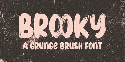 Brooky is a modern, handwritten font, with stylized characters that look unique but are attractive for use in a variety of modern designs such as clothing, invitations, book titles, stationery designs, quotes, branding, logos, greeting cards, t-shirts, packaging designs. , posters and more.
 - Radiohead by Cocodesign,
$10.00 The font is made with natural and elegant handwriting, suitable for the needs of those of you who want to use it for a variety of amazing purposes. Maybe you can use this in various media to make it look attractive and natural.
 - Greatest All of Time by Struggle Studio,
$16.00 Greatest All the Time - is a Duo Handwritten with Extras and petite (handwritten and modern look) Font Duo, featuring a sweet and gentle look. This original look will appeal to a variety of crafty ideas, from letterhead and titles to writing implements.
 - Tough Cookie by Hanoded,
$15.00 Tough Cookie is a handmade font that looks like it has been cut out. It comes in three varieties that work together really well. Use it for your book covers and product packaging, or (if you’re a tough cookie) for your christmas cards…
 - Absolute Adventure by Seemly Fonts,
$14.00 Absolute Adventure is a unique handwritten font. This font is a great choice for a wide variety of contexts! It looks amazing on greeting cards, business cards, logos, thank-you cards, quotes, greeting cards, and any other design that needs a creative spark.
 - Restrick by ZetDesign,
$15.00 Restrick is a strong display font. uses curved corners for flexible use on a variety of media displays. This font is very suitable for use as a headline in a newspaper, poster, or magazine. This font is available in regular and italic format.
 - Merchanto by Type Juice,
$19.00 Merchanto is a condensed sans serif display typeface made up of 8 fonts in a variety of styles and weights. Included are over 500 stylized alternate glyphs for creative control and customization. 8 fonts total Over 500 Alternates Multilingual Over 2300+ glyphs
 - Austin Antique by HiH,
$10.00 “More is better” may have been the motto of Richard Austin of Austin and Son’s Imperial Letter-Foundry on Worship Street at Finsbury Square in London when he designed and cut his Antique typeface. The year it was created is uncertain, but it is known to have appeared in a specimen book produced in 1827. At first glance, the upper case letters of Austin Antique look very much like Figgins Antique. But, upon examination, one will note that the Austin face is much darker. In general, the letters designed and cut by Richard Austin have fatter strokes, larger serifs and smaller counters -- more metal and less daylight. The premise was that the darker the letter, the more attention an ad using the typeface would receive. In old pictures of London and Paris one may see walls crowded with posters and “bills” -- competing for the attention of the passerby. Morris and Updike aside, the early nineteenth century marked the beginning of a commercial as well as industrial revolution. Patterns of commerce were changing. With new methods of marketing came the need for new typefaces to support the new methods. Foundries found the display types were very profitable and competed most energetically and creatively for the trade. There was a lot of trial-and-error. Some ideas faded away. Others, like the Antiques or Egyptians, were refined and developed. From them came the Clarendons that were to prove both popular and long lasting -- because they worked. Their job was to sell goods, not please the aesthetic sensibilities of the critics. They did their job well. Austin Antique has a full Western European character set, plus the following ligatures: ct, st, fi, fl, ff, ffi and ffl. Tabular numbers. Surprisingly readable.
 - Romanovsky by ParaType,
$30.00 Romanovsky is the font developed on the base of samples from the catalogue of Osip Lehman foundry in Sankt Petersburg. Original Latin design that was used for Romanovsky can be found in Feder Grotesk by Jacob Erbar. The current digital font is not a scanned version of Lehman’s samples but a newly drawn typeface that differs from the original in many details. Romanovsky is a sans serif typeface with narrow proportions and noticeable contrast. It will be good for headings and display matters. Character set covers languages of Western and Central Europe and Cyrillic-based languages. It also contains around 20 ligatures of uppercase letters for the most frequent combinations. Designed by Vasily Biryukov. The bold weight was developed together with Olexa Volochay. Released by ParaType in 2013.
 - Cinque Donne by Debi Sementelli Type Foundry,
$44.99 Cinque Donne means “Five Women” in Italian. It was inspired by the five sisters in my family as well as a group of five high school friends I have known for 46 years, aka “The Club Girls”. The Pro version has 3370 glyphs with all the bells and whistles! Women are connectors, encouragers and supporters. Young, old, shy, extroverted, when you put us together, somehow we make a beautiful impact on each other’s lives. This is what Cinque Donne does in a visual way. Some letters are simple and prefer to sit quietly. Others are flourished and proud and like the limelight in the middle of a word. And then there are alternates that are flexible and work in any number of surprising places. Stylistic sets can add a vivacious feel while contextual alternates bring better understanding. Classic or contemporary, subdued or flamboyant, these letters represent the variety of women that make life interesting for us all. Within the varied glyphs, I hope you find characters that remind you of the special women in your life. Let Cinque Donne salute them on the page! The Cinque Donne Family includes: Cinque Donne, Cinque Donne Bold, Cinque Donne Swash and Cinque Donne Pro. Check out the Buying Choices tab to see special discounted combinations! Crafters: All of my fonts have been specially coded for PUA (Private Use Area) so you can access all of the swashes and alternates using Character Map (PC) or Character Viewer (Mac) or with any number of apps including PopChar. If you would like to purchase PopChar at a special discount email me and I will send you the link. Cinque Donne Pro and Cinque Donne Swash include Swash, Stylistic and Titling Alternates, Contextual Alternates, Standard and Discretionary Ligatures, Roman Numerals & Fractions.
 - Sweet Square by Sweet,
$39.00The Engraver’s Square Gothic—like its rounder cousin, the engraver’s sans serif, Sweet® Sans,has been one of the more widely used stationer’s lettering styles since about 1900. Its minimal forms, made without curves, were popularized long ago by bankers and others seeking a serious, established feel to their stationery. One might argue that the design is a possible precursor to Morris Fuller Benton’s Bank Gothic® typeface. Sweet® Square is based on antique engraver’s lettering templates called “masterplates.” Professional stationers use a pantograph to manually transfer letters from these masterplates to a piece of copper or steel that is then etched to serve as a plate or die. This demanding technique is rare today given that most engravers now use a photographic process to make plates, where just about any font will do. But the lettering styles engravers popularized during the first half of the twentieth century remain both familiar and appealing. Referencing various masterplates, Mark van Bronkhorst has drawn Sweet Square in nine weights. The sources offered just uppercase, small caps, and figures, yet similar, condensed examples had a lowercase, making it possible to interpret a full character set for Sweet Square. Italics were also added to give the family greater versatility. The fonts are available as basic, “Standard” character sets, and as “Pro” character sets offering special characters, a variety of typographic features, and full support for Western and Central European languages. Sweet Square gives new life to an uncommon class of typeface: an early twentieth-century commercial invention that brings a singular verve to modern design. Its unique style is as useful as it is novel. Bank Gothic is a registered trademark of Grosse Pointe Group LLC. - Sweet Sans by Sweet,
$59.00 The engraver’s sans serif—strikingly similar to drafting alphabets of the early 1900s—has been one of the most widely used stationer’s lettering styles since about 1900. Its open, simple forms offer legibility at very small sizes. While there are digital fonts based on this style (such as Burin Sans™ and Sackers Gothic™, among others), few offer the range of styles and weights possible, with the versatility designers perhaps expect from digital type families. Sweet Sans fills that void. The family is based on antique engraver’s lettering templates called “masterplates.” Professional stationers use a pantograph to manually transfer letters from these masterplates to a piece of copper or steel that is then etched to serve as a plate or die. This demanding technique is rare today given that most engravers now use a photographic process to make plates, where just about any font will do. But the lettering styles engravers popularized during the first half of the twentieth century—especially the engraver’s sans—are still quite familiar and appealing. Referencing various masterplates—which typically offer the alphabet, figures, an ampersand, and little else—Mark van Bronkhorst has drawn a comprehensive toolkit of nine weights, each offering upper- and lowercase forms, small caps, true italics, arbitrary fractions, and various figure sets designed to harmonize with text, small caps, and all-caps. The fonts are available as basic, Standard character sets, and as Pro character sets offering a variety of typographic features and full support for Western and Central European languages. Though rich in history, Sweet Sans is made for contemporary use. It is a handsome and functional tribute to the spirit of unsung craftsmanship. Burin Sans and Sackers Gothic are trademarks of Monotype Imaging.
 - Sweet Square Pro by Sweet,
$59.00 The Engraver’s Square Gothic—like its rounder cousin, the engraver’s sans serif, Sweet® Sans,has been one of the more widely used stationer’s lettering styles since about 1900. Its minimal forms, made without curves, were popularized long ago by bankers and others seeking a serious, established feel to their stationery. One might argue that the design is a possible precursor to Morris Fuller Benton’s Bank Gothic® typeface. Sweet® Square is based on antique engraver’s lettering templates called “masterplates.” Professional stationers use a pantograph to manually transfer letters from these masterplates to a piece of copper or steel that is then etched to serve as a plate or die. This demanding technique is rare today given that most engravers now use a photographic process to make plates, where just about any font will do. But the lettering styles engravers popularized during the first half of the twentieth century remain both familiar and appealing. Referencing various masterplates, Mark van Bronkhorst has drawn Sweet Square in nine weights. The sources offered just uppercase, small caps, and figures, yet similar, condensed examples had a lowercase, making it possible to interpret a full character set for Sweet Square. Italics were also added to give the family greater versatility. The fonts are available as basic, “/fonts/sweet/square/” character sets, and as “Pro” character sets offering special characters, a variety of typographic features, and full support for Western and Central European languages. Sweet Square gives new life to an uncommon class of typeface: an early twentieth-century commercial invention that brings a singular verve to modern design. Its unique style is as useful as it is novel. Bank Gothic is a registered trademark of Grosse Pointe Group LLC.
 - Sweet Sans Pro by Sweet,
$79.00 The engraver’s sans serif—strikingly similar to drafting alphabets of the early 1900s—has been one of the most widely used stationer’s lettering styles since about 1900. Its open, simple forms offer legibility at very small sizes. While there are digital fonts based on this style (such as Burin Sans™ and Sackers Gothic™, among others), few offer the range of styles and weights possible, with the versatility designers perhaps expect from digital type families. Sweet Sans fills that void. The family is based on antique engraver’s lettering templates called “masterplates.” Professional stationers use a pantograph to manually transfer letters from these masterplates to a piece of copper or steel that is then etched to serve as a plate or die. This demanding technique is rare today given that most engravers now use a photographic process to make plates, where just about any font will do. But the lettering styles engravers popularized during the first half of the twentieth century—especially the engraver’s sans—are still quite familiar and appealing. Referencing various masterplates—which typically offer the alphabet, figures, an ampersand, and little else—Mark van Bronkhorst has drawn a comprehensive toolkit of nine weights, each offering upper- and lowercase forms, small caps, true italics, arbitrary fractions, and various figure sets designed to harmonize with text, small caps, and all-caps. The fonts are available as basic, Standard character sets, and as Pro character sets offering a variety of typographic features and full support for Western and Central European languages. Though rich in history, Sweet Sans is made for contemporary use. It is a handsome and functional tribute to the spirit of unsung craftsmanship. Burin Sans and Sackers Gothic are trademarks of Monotype Imaging.
 - Mifelin by Nathatype,
$29.00 Mifelin is a well-defined serif font. Serifs are small ornaments that appear at the ends of the lines of letters, giving them a neater, more structured appearance. The well-defined serifs in this font create an elegant and professional impression. This serif font has a balanced and harmonious proportion of height and width. The proportions ensure that each letter looks proportional and easy to read. The line of letters in this font has a smoothness and clarity that distinguishes each character. Sharp, clear lines give off a professional and organized impression. This clarity also helps strengthen the legibility of the font in a variety of design settings. This serif font with an elegant look has a classic style that remains relevant in modern designs. Despite having strong roots in traditional typographic design, this font is able to adapt to more contemporary design contexts and give it a touch of elegance and class. Even though it has a touch of elegance, this serif font still prioritizes good readability. Each letter is carefully designed to ensure that the text remains easy to read and understand for the reader. Prominent readability is the hallmark of this font. Enjoy the various features available in this font. Features: Stylistic Sets Ligatures Multilingual Supports PUA Encoded Numerals and Punctuations Mifelin is suitable for any designs that require a formal and official impression. This font is can be used in the design of books, magazines, reports, formal invitations, brand identities, and other design projects that require elegance and professionalism. Find out more ways to use this font by taking a look at the font preview. Thanks for purchasing our fonts. Hopefully, you have a great time using our font. Feel free to contact us anytime for further information or when you have trouble with the font. Thanks a lot and happy designing.
 - Devilish by Celebrity Fontz,
$24.99 Devilish is a digital revival of 2 decorative lettering sets. The uppercase letters are based on characters from the end of the 18th century, and the lowercase letters are based on characters from the 19th century. The letters are made up of light-hearted devilish figures engaged in playful and mischievous activities.
 - Moppetops LL by Leftover Lasagne,
$25.00 Moppetops is a sophisticated yet quirky handwritten typeface that comes with a huge amount of graphical elements, accented and even greek letters. The font features auto ligatures for duplicate letters, some connected letters, quite a few graphical elements that can be accessed by shortcuts (lowercase letter + number form 0-9) and smallcaps.
 - Key Largo JNL by Jeff Levine,
$29.00Key Largo JNL is a serif treatment of the lettering found in Gummed Letters JNL. - Southern Flight by Intellecta Design,
$9.00typeface based on old lettering by an 1930's advertise lettering in a Flight Magazine - Deutsche Poster Steinschrift by Intellecta Design,
$19.90inspired in plakat stijl, a german style of lettering used in 30's advertise lettering - Retro Signs JNL by Jeff Levine,
$29.00 Retro Signs JNL collects nearly 50 designs modeled from old water transfer sign decals once manufactured by the Duro Decal Company of Chicago, Illinois and adds in a generous amount of additional phrases newly-drawn in the same hand lettered style. These vintage sign panels are perfect for creating nostalgic signage to fit projects centered around the 1950s and early 1960s.
 - Molleta Script by Carpiola Studio,
$12.00 Molleta Script is an elegant timeless handwritten font. It is the best choice for creating attractive logos, branding, clothing designs and quotes. Each letter adds a unique and beautiful touch to your design, bringing it to life with a classy, elegant look and more flattering. This font is PUA encoded, which means you can access all of the glyphs and swashes with ease!
 - TD Balak by Tribox Design,
$10.00 Team Tribox Design created the font to improve the old font print of Doctrina Christiana. Each letter is designed for better readability even in small sizes, particularly for books, and is designed for poets, writers, and anyone who needs a font used in publishing. The font is personally designed and is intended for use by publishers and those seeking publication. Regine Ylaya: Art Director, Research Inu Catapusan: Font/Typeface Designer, Creative Director, Copywriter Faye Penetrante: Copy Editor
 - Alfrere Sans by Greater Albion Typefounders,
$12.50 Alfrere Sans is a clean Sans Serif display family inspired by a well-known 1950s television caption. The family of seven faces have been designed for independent use, but they also have an extra feature. All faces have identical metrics and can be overlaid with each other, to yield an unending range of multi-colored lettering effects. Bring a touch of the 50's to your next poster design. Better yet, explore the world of multi-colored overlaid typefaces....
 - Linotype Mailbox by Linotype,
$29.99Linotype Mailbox is part of the Take Type Library, chosen from the entries of the Linotype-sponsored International Digital Type Design Contests of 1994 and 1997. The typefaces was created by German designer Andreas Karl. An entire alphabet, only lower case letters, with the look of @ -- who doesn’t think of the Internet? If you want to give your headlines or short texts an unmistakable feel of the Internet, you could not do better than Linotype MailBox. - Austen Script by Tanya Cherkiz,
$20.00 Need beautiful letters for your love letter or wedding invitations? Look no more! Austen Script is an elegant and feminine typeface, named after Jane Austen, one of my favorite writers, who wrote so much about love. It includes uppercase and lowercase letters, numerals, punctuation, stylistic alternates, some ligatures and alternate uppercase letters, and multilingual support.
 - Fresh Paint by Graffiti Fonts,
$29.99 Super fresh paintbrush style lettering with a definite graffiti slant. Reverse italic and highly detailed these hand-made letters, splats, swipes, numbers and symbols give an energetic human feel to your custom text. This font is an all-caps style with no real lowercase letters however the single font actually contains 3 full alphabets (78 individual letters) so you can mix and match to create endless unique letter combinations. Fresh Paint also includes several highly detailed paint splatters, brush strokes and swipes to use along with your custom lettering. All glyphs are created from hand made, painted letters, all splatters and strokes are made from real specimens & have sufficient detail to work even at very large sizes.
 - Inola by WildOnes,
$12.00 Inola Hand Lettered Font in modern calligraphy style. It resembles actual handwritten letters that can make a great font for branding, logo design, and graphic identities. Inola includes ligatures and stylistic alternates for some letters and floral symbols to include in your designs, find them all in the glyphs panel. Inola Hand Lettered Font is perfect for logo design, branding, art prints, wedding cards and invitations, packaging, business cards, greeting cards, posters, magazines, social media, home decors, stationary, blogs, and website design, and more. Inola Hand Lettered Font contains all uppercase and lowercase letters from A to Z and numbers from 0 to 9. Latin Extended letters are supported together with other bonus characters.
 - Congrats 36 by Dmitriy Shchetinskiy,
$19.00 Congrats36 font consist of 36 calligraphic greetings letterings. Letterings are original and handwritten. This font makes it possible to use high quality calligraphy in your projects - greeting cards, certificates, invitation cards, letters of commendation etc.
 - Despatxada by Type-Ø-Tones,
$40.00 Despatxada letters are the scans of the alphabet of a manual rubber press. Letter by letter. Real prints. Real textures. You will not find another typeface like this. An heroic font in the digital era.
 - Prospector JNL by Jeff Levine,
$29.00 Prospector JNL is based on a lettering example found in an old Speedball-pen lettering handbook.
 - 1864 GLC Monogram by GLC,
$20.00 This family of two character monograms and initial letters was inspired from a French portfolio containing about two hundred examples of "Chiffres - deux lettres", destinated to engravers and jewelers, published in Paris in 1864, drawn by French engraver, C. Demengeot. Unfortunately, a large part of the pages were lost, so we have had to redraw about two thirds of the complete monogram family. Each package contains numerals and two complete sets of two-letter monograms, for example the A-B set, containing AA AB AC... corresponding to caps keys alphabet and BA, BB, BC... corresponding to lower case keys alphabet. We have added an Initial set, with two choices of single characters. Warning: I and J have strictly identical monograms.
 - Aspektogram by PizzaDude.dk,
$20.00A slim, crunchy and slightly worn-looking font. Comes with unique accented letters, ligatures for double letters and numbers along with OpenType alternate letters. You will need to use OpenType supporting applications to use the autoligatures. - P22 Nebiornaments by IHOF,
$24.95 P22 Nebiornaments contains over 100 ornaments based on the Italian Nebiolo Type Foundry designs of the 1950s. Many of these ornaments are designed to create complex patterns and continuous borders. The simple geometric shapes allow for endless combinations for a wide variety of uses.
 - P22 Folk Art by P22 Type Foundry,
$24.95 Primarily based on the work of German settlers in Pennsylvania, this collection showcases a variety of needlework and folk art styles of the early United States. Produced in conjunction with the Philadelphia Museum of Art, this set is a digital recreation of homespun Americana.