10,000 search results
(0.047 seconds)
- The Ladybach by pentagonistudio,
$19.00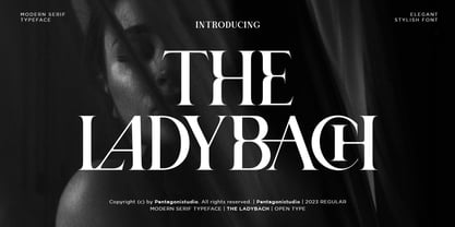 The Ladybach Is A Elegant Serif Font with Stylistic Alternates and Ligatures. SOFTWARE REQUIREMENTS : Fonts and alternate: No special software is required they may be used in any basic program /website app that allows standard fonts That's it, folks! You can go ahead and get cracking :) Follow My Shop For Upcoming Updates Including Additional Glyphs And Language Support. And Please Message Me If You Want Your Language Included or If There Are Any Features or Glyph Requests, Feel Free to Send me A Message. Have a Good Day!
 - Stoner PS by pentagonistudio,
$19.00 Stoner PS Is New Geometric Family Sans Inspired By Modern and Elegant Font. SOFTWARE REQUIREMENTS : Fonts and alternate : No special software required they may be used in any basic program /website apps that allows standard fonts That's it folks! You can go ahead and get cracking :) Follow My Shop For Upcoming Updates Including Additional Glyphs And Language Support. And Please Message Me If You Want Your Language Included or If There Are Any Features or Glyph Requests, Feel Free to Send me A Message. Have a Good Day !
 - Fluence PS by pentagonistudio,
$12.00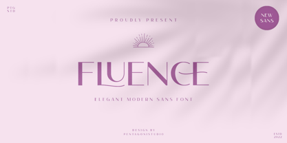 Fluence PS Is An Elegant Sans Serif Font Inspired By Feminine and Elegant Character. SOFTWARE REQUIREMENTS : Fonts and alternate : No special software required they may be used in any basic program /website apps that allows standard fonts That's it folks! You can go ahead and get cracking :) Follow My Shop For Upcoming Updates Including Additional Glyphs And Language Support. And Please Message Me If You Want Your Language Included or If There Are Any Features or Glyph Requests, Feel Free to Send me A Message. Have a Good Day !
 - Smart Play by Olivetype,
$18.00 Smart Play is a cute and playful handwritten font, perfect for your most creative projects and designs! Its characters are bold and very easy to read, so feel free to add this font to big or small text – it will look incredible anyway! This Font is supporting more than 66 languages, which include: Afrikaans Albanian Catalan Danish Dutch English Estonian Finnish French German Italian Norwegian Portuguese Spanish Swedish Zulu, and more. You will get : Basic Latin A-Z & a-z. Numbers, symbols, and punctuations Multilingual Support. Accented Characters ÀÁÂÃÄÅÆÇÈÉÊËÌÍÎÏÑÒÓÔÕÖØŒŠÙÚÛÜŸÝŽàáâãäåæçèéêëìíîïñòóôõöøœšùúûüýÿžß Thank you
 - Vapour PS by pentagonistudio,
$19.00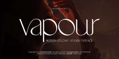 Vapour PS Is An Elegant/Modern Serif Font with Stylistic Alternates and Ligatures. SOFTWARE REQUIREMENTS : Fonts and alternate : No special software required they may be used in any basic program /website apps that allows standard fonts That's it folks! You can go ahead and get cracking :) Follow My Shop For Upcoming Updates Including Additional Glyphs And Language Support. And Please Message Me If You Want Your Language Included or If There Are Any Features or Glyph Requests, Feel Free to Send me A Message. Have a Good Day !
 - Binthan by Kartiny Type,
$12.00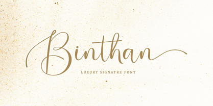 Binthan is a unique, elegant and modern handwritten font. which looks like a signature, this font is intentionally made with unique and alternating ligatures. This hand styled look makes it perfect to use in all your design projects be it logos, labels, packaging designs, blog titles, posters, wedding designs, social media posts, Instagram designs, etc. What's included? Contains full set: -Uppercase -Lowercase -Alternative -Ligatures -Punctuation -Number -Multilingual support. I hope you enjoy this font. If you have any questions, feel free to message me :) Thank you for your purchase!
 - Germania by Wiescher Design,
$29.50 Germania is a Sans font based on classic roman proportions and forms based on my Imperia font. But I added that distinct, rigid, no-nonsense German touch. This monoline font with its classic proportions and personality is good for lots of occasions. And – I designed three »real« italic typefaces – not just slanting the straight ones. I corrected the stroke thicknesses and changed the lowercase a, e, f, g and q. I put in a collection of very interesting uppercase ligatures for free. Your classical type designer - Gert Wiescher
 - Carafia by Khoir,
$15.00 Carafia is a bold sans serif font. It has its own uniqueness in its small, bound letters, Supported by several alternative and ligature fonts that make it cute, unique, suitable for all types of projects such as branding, logo design, cover design, web design, packaging, social media, and many more what are you waiting for! What's included? Uppercase Characters Lowercase Characters Support 75+ Language So what are you waiting for? immediately purchase this font, feel free to comment, or send me my PM or email at khoirtypework@gmail.com Thank you for seeing
 - Matter Sculpit by pentagonistudio,
$15.00 Matter Sculpsit Is A Classic Serif Fonts Inspired By Modern and Ligature Characters. SOFTWARE REQUIREMENTS : Fonts and alternate : No special software required they may be used in any basic program /website apps that allows standard fonts That's it folks! You can go ahead and get cracking :) Follow My Shop For Upcoming Updates Including Additional Glyphs And Language Support. And Please Message Me If You Want Your Language Included or If There Are Any Features or Glyph Requests, Feel Free to Send me A Message. Have a Good Day !
 - Philliper by Gatype,
$14.00 Philliper is a signature bold script font, masterfully designed to become a true favorite. It maintains its modern classy influences while feeling contemporary and fresh. Fall in love with it and bring your projects to the highest levels! Philliper is perfect for product packaging, branding project, megazine, social media, wedding, or just used to express words above the background. Fonts featured : Uppercase, Lowercase, Numbers, Symbols, Accents, Stylistic, Swash, and Ligatures also Multilingual Support Enjoy the font, feel free to comment or feedback, send me PM or email. Thank you!
 - Creating Balance by pentagonistudio,
$17.00 Creating Balance Is A Modern Serif Font Including Regular and Italic versions. SOFTWARE REQUIREMENTS : Fonts and alternate: No special software is required they may be used in any basic program /website apps that allow standard fonts That's it folks! You can go ahead and get cracking :) Follow My Shop For Upcoming Updates Including Additional Glyphs And Language Support. And Please Message Me If You Want Your Language Included or If There Are Any Features or Glyph Requests, Feel Free to Send me A Message. Have a Good Day!
 - Collingethon by Namara Creative Studio,
$20.00 Collingethon is chic handwritten script font with a calligraphy flair, Perfect for creating handwritten-style logos, wedding stationery, photographer watermarks logos, modern websites, and more. For those of you who are needing a touch of elegant, chic and modernity for your designs, this font was created for you! Font Features Full Set of standard alphabet and punctuation. Beginning and ending swashed lowercase. Alternates, ligatures and multilingual characters. PUA Encoded | no special software needed to access extra characters. Feel free to follow, like and share. Thanks so much for checking out my shop!
 - Vanilla Ravioli by pentagonistudio,
$19.00 Vanilla Ravioli Is A Chic Serif Fonts Inspired By Modern and Ligature Characters. SOFTWARE REQUIREMENTS : Fonts and alternate : No special software required they may be used in any basic program /website apps that allows standard fonts That's it folks! You can go ahead and get cracking :) Follow My Shop For Upcoming Updates Including Additional Glyphs And Language Support. And Please Message Me If You Want Your Language Included or If There Are Any Features or Glyph Requests, Feel Free to Send me A Message. Have a Good Day !
 - Elephant Party by Breauhare,
$19.99 Elephant Party playfully dances along its baseline in bold and rounded style. This warm and friendly whimsical design has lots of trunk space and is reminiscent of groovy ‘60s and ‘70s typography where letter spacing was admittedly tight, but cozy. Like snuggling up to a warm fire while toasting marshmallows. Like snuggling under a warm blanket. Like, well, you get the point. Elephant Party is an equitable font that includes a diversity of multilingual support, and will communicate your message with a funky, retro vibe and festive mood. It’ll break out into a happy dance across a wide variety of your design projects ranging from children’s books, t-shirts, posters, logotypes, product packaging, merchandise, branding and beyond. And it’ll groove across a variety of environments from print to digital media. So come on in, join the “Party”, it’s ELEPHANTASTIC! Digitized by John Bomparte.. ***Breauhare’s My Left Hand font makes a cameo appearance on the poster of Chocolola bars.
 - Lazy Dude by Gleb Guralnyk,
$14.00 Hi, introducing a creative bold font Lazy Dude. It's an all caps typeface with smooth curvy shape. Lazy Dude has a wide languages support with west european and cyrillic characters (check out all available characters on previews). Thank you and have a nice day!
 - Lancar by Twinletter,
$12.00 Lancar is a sans serif font family with lovely curving forms ideal for headings and text. The curves provide your project an exquisite and harmonious design, great for making your project look gorgeous. This font also comes with four families to help you with your job. With this typeface, you can make your project stand out. of course, your various design projects will be perfect and extraordinary if you use this font because this font is equipped with a font family, both for titles and subtitles and sentence text, start using our fonts for your extraordinary projects.
 - Lovers Pro by Scholtz Fonts,
$35.00 Lovers is a romantic, elegant handwritten calligraphic script, with well over 300 additional characters, including standard and discretionary ligatures, swashes and stylistic alternatives. Use of its extensive OpenType features enable the designer to create text that constantly changes, giving the impression of genuine handwriting, but handwriting that has all the flair and styling of hand-done calligraphy produced towards the end of the twentieth century. Lovers is based on traditional calligraphic ideals, but I've combined these with my own brand of relaxed, handwritten spontaneity, to design a font that is formal yet free and accidental, traditional yet contemporary. The font’s extravagant curves and swashes make it perfect for valentine’s day and wedding media, book covers, greeting cards, and certificates, in fact for any design work that requires a romantic or opulently elegant look. The range of stylistic alternatives and swashes enable users to create a wide range of moods in their work. In many ways it is a calligraphy toolkit. Lovers contains the accented characters used in the major European languages. What sets it apart from most other calligraphic fonts is that it appears so genuinely handwritten and avoids the uptight formality that characterizes so many of the fonts in this genre. Try Lovers, enjoy its wealth of OpenType features and let its vigorous yet elegant exuberance delight you and enhance your creativity!
 - The font "Soul Handwriting" free version, crafted by the creative minds at Fonts Cafe, exudes a deeply personal and authentic touch, reminiscent of a handwritten note from a cherished friend. In a di...
- Fairwater by Laura Worthington,
$29.00 Fairwater’s aesthetic derives from the cursive handwriting styles popularized in the early to mid-1900s, the simplified, forgiving letterforms of tattoo lettering – and the pictorial themes that informed early-to-mid 20th-century naval tattoos. The Fairwater family includes a script and sans face in three weights, four decorative serif faces and an ornamental font: DIY Lines. As with many of my fonts, I couldn’t resist adding a plethora of 465 swashes and alternates to the script version, that include ending forms on all letters, 34 beginning and isolated letters, an unconnected version and contextual alternates. Fairwater also includes a powerful decorative font entitled DIY Lines: 250 ornamental characters of ships, anchors, oars, knots, rope, botanicals, diamonds, arrows and more. With strokes and proportions that perfectly complement the type. See what’s included! http://bit.ly/2cJMUoe These fonts have been specially coded for access of all the swashes, alternates and ornaments without the need for professional design software! Info and instructions here: http://lauraworthingtontype.com/faqs/
 - Bizzle-Chizzle by Terry Biddle,
$20.00 Bizzle-Chizzle is an expansion of lettering sketches initially made for my personal website. Each glyph is drawn by hand and inked by brush to simulate the texture of letters chiseled out of stone. Bizzle-Chizzle is meant to be used for dynamic layouts and prefers to be as large as possible. Bizzle-Chizzle is an OpenType font package that consists of four individual fonts: 1. Bizzle-Chizzle Outline 2. Bizzle-Chizzle Front 3. Bizzle-Chizzle Sides 4. Bizzle-Chizzle Solo The first three combine to form Bizzle-Chizzle’s three dimensions, while Bizzle-Chizzle Solo can be used individually. Feel free to mix and match for fun effects!
 - HelenaDEMOVERSION - Personal use only

- Alonso Flair by BA Graphics,
$45.00This font, as indicated by its namesake, was designed and started by the late Bob Alonso. It represents the first of his unfinished work to be completed by friend and colleague John Bomparte, following Bob's passing in December of 2007. It is a font that speaks with a distinctively robust voice; and would be a great choice for a wide variety of uses. Central European languages are supported through OpenType, and Windows/Mac OSX TrueType versions. - Greene Designs by Woodside Graphics,
$19.95This font consists of 26 design elements derived and adapated from various architectural works of Charles and Henry Greene who created hundreds of designs for houses, furniture and decorative arts in their own unique interpretation of the "Arts & Crafts" style in the early years of the 20th Century, mostly in Pasadena, California. Many of the picture elements are designed to form distinctive borders, and the variety of designs contained in this font encourages their use in many creative ways. - Triump Rough by Latinotype,
$20.00 The Triump Rough typeface comes with 2 different subfamilies: Blur, a soft, delicate font with a vintage and hipster feel that gives your design a breath of fresh air; and Rock, a strong, hard font in upper and lower case well-suited for high-impact headlines. This version provides a wide variety of OpenType features, such as ligatures, alternates and catchwords as well as a series of ornaments and extras, which help give your artwork a different look!
 - French Armoire by DimitriAna,
$22.00 French Armoire is a subtle, modern calligraphy font that will give a casual chic look to your designs. It supports Central, Eastern, Western European, Baltic, Turkish and Greek languages and it is delivered in OpenType format. French Armoire has over a 1000 glyphs, with a variety of opentype features in Latin and Greek alphabet: Stylistic alternates, contextual (positional) alternates, swashes, 2 stylistic sets of initial and terminal forms and standard ligatures. The font is fully unicode-mapped (PUA encoded).
 - Casper Display by FoxType,
$10.00 Casper Display is a Unique Modern Elegant Typeface with Web-fonts. It's a very versatile font that works great in large and small sizes. Casper would perfect for branding, logos, headlines, Captions. or simply as a stylish text overlay to any background image. Strong capitals and a smooth, open lowercase are effective in a variety of applications. It's shown a clean, minimalist, warmth, quirky, yet still purposed to be versatile and easy to read. 9 Weights Included.
 - ZT Kofimoya by Zelow Type,
$14.00 ZT Kofimoya is a brand new font that offers two distinct styles to choose from. The first style features a stiffer sans concept with a somewhat square shape, giving it a modern and assertive appearance. The second style is a normal sans, with a slightly rounded shape, providing a softer and friendlier look. With these two different styles, ZT Kofimoya offers flexibility in design and can be used for a variety of purposes. Thanks for using this font ~ Zelowtype
 - Carmen Sans by StudioJASO,
$26.00 Carmen Sans is a Geometric Sans that expresses modern vigor based on simplicity and clarity. The Hangul font is designed to deliver the same tone as the Latin font with its light curvature and structure, and it is suitable for display purposes by arranging letter heights between the two character sets. With the total of 9 styles, Carmen Sans works seamlessly in a variety of media and omnidirectional graphic designs, from editing to integrated applications for your brand.
 - Shinokai by Lukas Schiltknecht,
$14.00 The Shinokai is a sans serif of two weights that is both dynamic and consequent. Originally concepted as a font for application letters by Lukas Schiltknecht it quickly became a more sophisticated piece of work. This Typeface is inspired by some of his favorite fonts the FF DIN and the ITC Officina. It is made to suit a variety of uses like advertising and packaging, film and tv, editorial and publishing as well as posters and billboards.
 - Sweet Dreams by Typestory,
$15.00 It looks beautiful on a variety of designs requiring a personalized style, such as wedding invitations, thank you cards, weddings, greeting cards, logos and so on. What’s Included : Web Font Ton of glyphs Ligature, Alternate & Swashes Works on PC & Mac Simple installations Accessible in the Adobe Illustrator, Adobe Photoshop, Adobe InDesign, even work on Microsoft Word. PUA Encoded Characters – Fully accessible without additional design software. Thank you for your purchase! That’s it !! Have fun using our font 🙂
 - Runsten by Fontron,
$35.00Adapted from Ronsten to make an acceptable chunky, more normal serif font retaining the serif alignment with the letter curves. An Italic is also available. - Kajju by Twinletter,
$15.00 Introducing Kajju, a premium font family designed to help you create visually stunning projects of any kind. Kajju San Serif comes in 18 different styles and has everything you need for your design projects. This is an all-in-one font pack with a wide variety of font styles to choose from. So whatever your needs, Kajju can do the job! of course, your various design projects will be perfect and extraordinary if you use this font because this font is equipped with a font family, both for titles and subtitles and sentence text, start using our fonts for your extraordinary projects.
 - Tijuf by Twinletter,
$15.00 Introducing our newest display font, Tijuf, this font designed with a unique and creative shape gives you the ease of use in a variety of your project needs. designed in a fun, cheerful, and unique style. When used in conjunction with other fonts in our collection, it gives you the ability to create unique, captivating, and highly impressive visual displays. of course, your various design projects will be perfect and extraordinary if you use this font because this font is equipped with a font family, both for titles and subtitles and sentence text, start using our fonts for your extraordinary projects.
 - Ginuk by Twinletter,
$15.00 Take your message to the next level with this Ginuk font. With its versatile style, this font can be used in a variety of ways in your projects so you can demonstrate your ideas in a captivating way. This font is equipped with the Latin ISO standard so you don’t have to worry about the completeness of the character. of course, your various design projects will be perfect and extraordinary if you use this font because this font is equipped with a font family, both for titles and subtitles and sentence text, start using our fonts for your extraordinary projects.
 - Angkora Volk by Skinny Type,
$18.00 Angkora Volk - a stylish OpenType rich serif with letters that seem to dance and swirl in harmony - to form a unique & elegant typographic design. A large selection of interwoven Opentype binders and replacements, meaning lots of choice and variety in your final look. To access these OpenType features, you need Opentype-enabled software such as: Word, Textedit, Photoshop, Sketch, Pages, Keynote, Numbers, iBooks Author, QuarkXPress, Indesign and Illustrator. A wide variety of useful glyphs are included - see preview images of all glyphs. Angkora Volk also includes the full set: -uppercase and lowercase letters -multilingual symbols -number -punctuation -alternative style -fastener
 - Gleamore by GlyphStyle,
$17.00 Gleamore is a decorative display font, looks stylish. The bold shape combined with the unique curve shape makes this font easy to read and looks beautiful. - Font feature Uppercase, Lowercase, Numerals & Punctuations, Stylistic Alt, Swash Ligature, Multilanguage
 - Ocean View by Mans Greback,
$59.00 Ocean View is a beautiful handwriting lettering. This script typeface is cute and feminine, optimized for a modern signature logotype with a genuine craft style. Its monolined strokes and hand drawn letterforms emits optimism and lightheartedness. Use underscore _ to make a swash. Example: Cle_arly Use multiple underscores to make different swashes. Example: Super__________star (Download required.) The Ocean View family consists of five high-quality cursive fonts: Thin, Light, Regular, Bold and Black The font is built with advanced OpenType functionality and has a guaranteed top-notch quality, containing stylistic and contextual alternates, ligatures and more features; all to give you full control and customizability. It has extensive lingual support, covering all Latin-based languages, from Northern Europe to South Africa, from America to South-East Asia. It contains all characters and symbols you'll ever need, including all punctuation and numbers.
 - Neon Love by Schriftlabor,
$29.99 Neon Love was designed originally for a circle coaster design with a quote by the Beatles’ “All you need is Love, Love is all you need”. The inspiration of the lettering was a neon sign style where a cursive script is kind of bended from those glass wires. The idea was to get the overall look and feel of neon signs into a font, as well as creating a good raw material to use for some further photoshop effects to enhance the visual presentation. Neon Love has many OpenType features that allow for choices that can make the lettering unique. Neon Love has two versions of the font a Smooth one which is connected and the Cutout version which can be used to create neons and for this it is in parts. Design by Roland Hüse and Schriftlabor team.
 - P22 Sniplash by IHOF,
$24.95 Sniplash is a lively font inspired by cartoons and comics of the 1960s and '70s. Casual and organic, this font features curly lines and irregular weights in Regular, Light and Bold styles. This design defies serious analysis and offers a fun attitude for lighthearted design. Excellent for parties, retro packaging or any number of uses.
 - CopperCanyonWBW - Unknown license


