10,000 search results
(0.035 seconds)
- Rough Marker by XTOPH,
$22.00 Rough Marker is an uppercase handwritten typefaces. It comes with 2 letter-variations, swashes & lines and a variety of bonus symbols.
 - KG Les Bouquinistes De Paris by Kimberly Geswein,
$5.00 Tall, masculine, French-inspired handwriting.
 - Mr Palker by Letterhead Studio-YG,
$35.00 A slab serif Mr Palker and grotesque Mr Palkerson build one superfamily together. These are blank types. In a way even the display ones. Typefaces for newspapers, announcements, cheap advertising and police posters. Mr Palker and Mr Palkerson will turn every language into a fence. And due to six types of faces one can choose what material should the fence be made from — from Thin steel rods to the Black stone blocks. In their simplest appearance Mrs P&P are intended for the solid blank composition in victorian or industrial style. They are quite decent, a bit old-fashioned slab serif and grotesque with closed aperture. All my types have layers. Walker and Palkerson also do. Besides the standard set of symbols, they have 4 add-ons. 1. Alternate glyphs, including unicase ones. 2. Ligatures with A letter. 3. Extra tall small caps. 4. Two-storey ligatures. All this options are intended for the complex composition. The additional letters are rather eccentric as their main function here is to imitate the victorian oddities. Imitate, parody, just not repeat. There are lower-case As and Es in the set in height of small caps and uppercases. They can turn every writing into the unicase. The lower-case A (as well as uppercase and small caps version of it) has deliberately by my taste grown a ludicrous tail. To compensate it I’ve built all the possible ligatures - ад, ал, ая. There are 35 of this ligatures all together. Take a closer look at the Russian letters D, L, K, Ya from the main set as well as their alternates. The additional glyphs are one more comic than the other — on purpose to imitate (not to repeat!) the victorian set. This sets have lowercase numbers. And small caps numbers as well. What a modern typeface without them. They also have an У-letter with a generously curvy tail. As if before the WWI. The Latin of course has alternates as well. It has letters to make the perfect French sound more like the russian provincial version of it. The tails of Js and Ts can be made a little bit more open — or a little bit closed. My favorite feature here, an invention of a kind - extra tall small caps. It allows to compose logos with the small caped uppercases directly from the keyboard. The small caps of this typefaces are usually much taller than the customary ones. This is the kind of small caps that Palker and Palkerson have. More to that, the strokes’ weight and the letters width are corresponded to the uppercases. Just a ready set for making a logo a la 1913 style. With a unicase, one has to mind! One more trick with the tall small caps is a possibility to make them work like lower uppercases. Their height is just in between of lower- and uppercases. Isn’t it great to have an additional set of uppercase working ponies in stock for the case of emergency. And finally — the trademark of Palkers family, two-storey ligatures. They are made in the height of uppercases and turn every writing into an ornament or a puzzle of a kind, while at the same time making them much shorter. Each face has 90 of them. Mainly those are twins: CC, BB, DD and so on. ll this things are for the unhasty compositing, even for lettering. Which means that for the things which are not there you always should have Command+Option+O and some patience. Also — among the two storey ligatures one also can find some belvedere villas. All my types are glasses from the one kaleidoscope. The P&Ps family was preliminary part of the victorian set, which already has 1 Cents and Clarendorf - optionally one can add Costro, Gordoni, Handy, Guardy, Surplus, Red Ring, Red Square, Babaev to the list. And also Sklad, Odessa, Dreamland, Romb, Platinum - here, at Letterhead’s, every second one is victorian. All together our typefaces can allow one to set advertisement of any kind, even the trickiest one, and compose everything, from the coffee place’s menu to the antiquarian magazine.
 - Mr Palkerson by Letterhead Studio-YG,
$35.00 A grotesque Mr Palkerson and slab serif Mr Palker build one superfamily together. These are blank types. In a way even the display ones. Typefaces for newspapers, announcements, cheap advertising and police posters. Mr Palker and Mr Palkerson will turn every language into a fence. And due to six types of faces one can choose what material should the fence be made from — from Thin steel rods to the Black stone blocks. In their simplest appearance Mrs P&P are intended for the solid blank composition in victorian or industrial style. They are quite decent, a bit old-fashioned slab serif and grotesque with closed aperture. All my types have layers. Walker and Palkerson also do. Besides the standard set of symbols, they have 4 add-ons. 1. Alternate glyphs, including unicase ones. 2. Ligatures with A letter. 3. Extra tall small caps. 4. Two-storey ligatures. All this options are intended for the complex composition. The additional letters are rather eccentric as their main function here is to imitate the victorian oddities. Imitate, parody, just not repeat. There are lower-case As and Es in the set in height of small caps and uppercases. They can turn every writing into the unicase. The lower-case A (as well as uppercase and small caps version of it) has deliberately by my taste grown a ludicrous tail. To compensate it I’ve built all the possible ligatures - ад, ал, ая. There are 35 of this ligatures all together. Take a closer look at the Russian letters D, L, K, Ya from the main set as well as their alternates. The additional glyphs are one more comic than the other — on purpose to imitate (not to repeat!) the victorian set. This sets have lowercase numbers. And small caps numbers as well. What a modern typeface without them. They also have an У-letter with a generously curvy tail. As if before the WWI. The Latin of course has alternates as well. It has letters to make the perfect French sound more like the russian provincial version of it. The tails of Js and Ts can be made a little bit more open — or a little bit closed. My favorite feature here, an invention of a kind - extra tall small caps. It allows to compose logos with the small caped uppercases directly from the keyboard. The small caps of this typefaces are usually much taller than the customary ones. This is the kind of small caps that Palker and Palkerson have. More to that, the strokes’ weight and the letters width are corresponded to the uppercases. Just a ready set for making a logo a la 1913 style. With a unicase, one has to mind! One more trick with the tall small caps is a possibility to make them work like lower uppercases. Their height is just in between of lower- and uppercases. Isn’t it great to have an additional set of uppercase working ponies in stock for the case of emergency. And finally — the trademark of Palkerson family, two-storey ligatures. They are made in the height of uppercases and turn every writing into an ornament or a puzzle of a kind, while at the same time making them much shorter. Each face has 90 of them. Mainly those are twins: CC, BB, DD and so on. ll this things are for the unhasty compositing, even for lettering. Which means that for the things which are not there you always should have Command+Option+O and some patience. Also — among the two storey ligatures one also can find some belvedere villas. All my types are glasses from the one kaleidoscope. The P&Ps family was preliminary part of the victorian set, which already has 21 Cents and Clarendorf - optionally one can add Costro, Gordoni, Handy, Guardy, Surplus, Red Ring, Red Square, Babaev to the list. And also Sklad, Odessa, Dreamland, Romb, Platinum - here, at Letterhead’s, every second one is victorian. All together our typefaces can allow one to set advertisement of any kind, even the trickiest one, and compose everything, from the coffee place’s menu to the antiquarian magazine.
 - Equalis by Eurotypo,
$44.00 From Latin aequālis (equal). The case conveying an equality with another noun. Equalis, sets its sights on applied mathematics. Equalis is a slab-serif typeface characterized by a tall x-height and very short ascenders / descenders. This OpenType font family comes in two weights and italics, with support for CE languages. Equalis can be used as display type. Suitable for body text, headlines, package & a wide range of projects.
 - Noa by Linotype,
$29.99The Danish designer Nina Lee Storm designed Noa for use on television and computer screens during the late 1990s. She began her six-member type family with the creation of bitmap fonts, developing their print outlines only secondarily. Noa’s letters exhibit a tall x-height, coupled with very short ascenders and descenders. Storm is proud to report that her typeface also looks very “Danish.” Why don't you give it a try? - Linotype Octane by Linotype,
$29.99Linotype Octane is part of the Take Type Library, selected from the contestants of Linotype’s International Digital Type Design Contests of 1994 and 1997. The font was designed by German artist Norbert Reiners, a tall, thin font with a narrow line width and marked stroke contrast. The regular and bold weights seem somewhat static while the italic cuts make a dynamic impression. Linotype Octane is available in four weights, each of which contains a number of ligatures. The cool and reserved Octane is best used for shorter texts and headlines in larger point sizes. - Nomenclatur by Aronetiv,
$9.99 The font was created under the influence of German tabular inscriptions. Especially, DIN font influenced on Nomenclatur graphic. It adds clarity and conciseness in the font. Nomenclatur is intended for use in architectural and design topics. It is also intended for a set of instructions and manuals. The font has the aesthetics of the Bauhaus and other constructivist movements. Characters of font are designed with high intelligibility, which makes it well readable in a small size. The lowercase letter "l" has a tail, so as not to confuse it with the capital letter "I", which has serifs. It avoids confusion in words like "Illinois". The font is well suited for the design of signs and navigation texts. A wide selection of styles allows you to design complex typography. The font family includes 15 styles. The font family has a variable font with two axes of weight and width. The font contains a set of alternative characters that will allow you to create different moods. The font contains Western European Latin and standard Cyrillic. The font has more than 3,600 kerning pairs configured. The font contains beautiful ampersand.
 - Cookie Powered by PizzaDude.dk,
$15.00 Tall, thin, grid, legible and handmade! What's not to like?! The font was made using a squared paper as a base for the lines. However, I managed to keep the free spirit of the handmade look, despite the guides. Play around with the 4 different versions of each letter and the swashes to make your text stand out!
 - Over Under by Ingrimayne Type,
$5.00 OverUnder is a two font family that plays with the capabilities of the Opentype feature of Contextual Alternatives to alternate two sets of characters. One set is on tall vertical slabs and the other set is on wide horizontal slabs, and when the sets are alternated, the result is a pattern that has a woven appearance.
 - Sweetener by Cyanotype,
$15.00 Add a sugary flavour to your designs with Sweetener; a sugary handwritten font inspired in modern brush lettering. Alternate between a script style and a non-connected style that keeps the same anatomy. Perfect for branding, titling, packaging, stationery, bullet journal, cards, magazine layouts and any project related with food, specially desserts and candies. Sweetener is PUA encoded, it has multilingual support for Latin and includes basic Cyrillic alphabet. Need a custom font? Mail me: damianguerrerocortes@yahoo.com
 - Lazy Dance by PizzaDude.dk,
$17.00 Check out these Lazy Dance moves - fits perfect to any dancefloor! A tall and thin font made with a brush - it has slightly rugged lines, and a kind of jumpy x-line. All in all it is a font that deserves a design with a handmade look. There are 4 different versions of each letter, and thanks to Contextual Alternates, these automatically cycle as you type. Making your text look really authentic and handmade! There is also multilingual support!
 - Arcandias Downtown by BlackLotus,
$20.00 Arcandias Downtown is a serif with high contrast combined with alternates so that it can match projects created using this font with trends in modern times.This font is made with precision for each character so as to create a quality font that is beautiful to look at. Arcandias Downtown can be used in various projects, both Magazine Titles, Posters, Newspapers, and others. This font has a variety of alternatives, so that any project that uses this font will look striking, beautiful, and modern.
 - Blagak by Twinletter,
$18.00 Add imagination and spice to your next design project with the Blagak font. This elegant font can be used in any project. With a wide variety of fasteners and alternatives, Blagak brings a bit of vintage charm to any design project. Take a trip down memory lane with the Blagak font. This elegant font combines vintage appeal with contemporary design sensibilities to create a whimsical yet professional look. Use this font in any design project to add your own sense of nostalgia.
 - Pauline by insigne,
$24.99 Pauline is a sans serif with a strong influence from retro scripts. Pauline is a geometric face formed with slow and deliberate rounded brush strokes. The tall ascenders give it a useful touch of naïveté. It’s a face suitable for some interesting titling and short bits of copy.
 - WTF Afroboy by Wasabib Type Foundry,
$11.00 Afroboy Display Font is an obese font with a simple, and modern look. Afroboy Display Font created with the vision of to attract the audience to your brand. The finest details of this typeface are methodically and mathematically created. Afroboy is created with all the tasks of a corporate font and also for the usage in a variety of projects, including branding, logos, titles, headlines, posters, screens, display, digital ads, and everything else.
 - Heroline by Graptail,
$15.00 Introducing Heroline, a retro-inspired font that evokes the 1950s to 90s nostalgia. This font is perfect for creating vintage-themed designs and giving it a touch of nostalgia and personality. Heroline features a soft, solid design with curved corners and a unique letter shape. This font also includes a variety of alternative characters and ligatures, allowing you to create many different looks with the same font.
 - Randu Sans by Yukita Creative,
$14.00 Randu Sans Serif Display Font Family is a sleek, modern font family with an elegant typography style. Created with clarity and boldness in mind, this font offers a variety of bold and italic styles, providing flexibility in its use. Whether used for titles, headings, or poster designs, the Candied Sans Serif Display Font Family provides the clarity and appeal needed to hold an audience's attention.
 - Reality Goals by Fikryal,
$22.00 Reality Goals is a beautiful and stylish handwritten display font that exudes creativity and inspiration. This font is perfect for a variety of projects, including branding, marketing materials, social media graphics, quotes, invitations, and more. The font features unique and eye-catching letterforms that are carefully crafted to convey a sense of playfulness and sophistication. The characters are designed to appear as if they were hand-drawn, with irregular lines and strokes that add a personal touch to any design. With a bold and modern look, “Reality Goals” is sure to catch the attention of your audience and make a lasting impression. It is versatile and easy to use, and can be paired with a variety of other fonts to create a unique and cohesive look. Reality Goals Multilingual Support Thank you
 - Mintage by Prioritype,
$19.00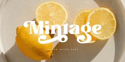 Introducing Mintage: Modern & retro font with a variety of alternative characters to make every word you make more eye-catching. Great for social media post designs, branding, merchandise, posters etc. Features: Uppercase, Lowercase, Numeral, Punctuation, Multilingual, Ligature, Alternates & PUA Encoded.
 - Celtic Beasts BA by Bannigan Artworks,
$19.95Create intertwining Celtic animal borders with the Celtic Beasts-BA font. Characters are sections of borders that are derived from ancient Celtic manuscripts such as the Book of Kells. Combine the characters to make a variety of Celtic animal borders. - ABTS Aviator by Albatross,
$19.95 ABTS Aviator is a font inspired by the 1950s and mixed with letterforms of the Art Deco era of design. It's simple, yet stylish and modern, yet retro. A nice mix of personality and geometry allowing for a variety of applications.
 - April Rain by Scrowleyfonts,
$16.00 April rain is a delicate, elegant font with teardrop line endings. It is designed to be interesting and a little unusual while remaining robust enough to be used in a variety of contexts from titling and lists to short paragraphs.
 - Caleb Mono by Brenners Template,
$19.00Caleb Mono Font Family It is originally inherited from Caleb Grotesk. And, It is a reinterpretation of the proportional and grotesque sensibility of Glphs with a more modern and rarity feeling. Monospace fonts are a great choice for any designer who wants to create a retro, and minimalist feel. The disadvantages of ambiguous readability due to its wide width and mechanical placement are clearly present, but still attractive and elegant. To overcome these shortcomings, this font family gave variable side bearing values to each glyph and adjusted the width of the glyphs themselves. It is designed with a more human sensibility. - Kutai by Eko Bimantara,
$18.00 Kutai is an explorative typeface that created to pursue unique display typeface fuse with ethnic look. It's consist of three styles or instance; Normal, Tall and Taller which have different height between each other, especially the x-height.
 - Free Zone by Aboutype,
$24.99A Sans serif design that follows a continental style with design characteristics that combine condensed and open counters. The lowercase has tall ascenders. Family includes common capitals and alternate lowercase characters. FreeZone requires subjective display kerning and compensation. - Bondie by Craft Supply Co,
$17.00 Bondie – Condensed Sans Serif is an Elegant Condensed sans serif with solid font files. it is based on the compact solid font, by combining a variety of styles. Suitable for Logo, greeting cards, quotes, posters, branding, name card, stationary, design title, blog header, art quote, typography
 - Meow ROB by TypeSETit,
$20.00 Meow ROB is a mono weight family with a variety of styles. Each font in the family could be considered a stand alone font, but combined, the whole family works eclectically and harmoniously to add a fun, whimsy look to your posters, ads, invitations and similar designs.
 - AC Honey Bee by Will Albin-Clark,
$35.00 Honey Bee is a type family developed over the course of 2020. Consisting of two sub-families that share the same DNA of two opposing styles. Honey Bee Serif is a transitional modern serif with some reference to fundamental letterforms. Honey Bee Sans is a low contrast semi-geometric sans serif with bold rounded letterforms. These typefaces were made in unison, designed for perfect font pairing for a variety of projects and intensions. It’s design is ideal for small and large scale, with the distinct characters of the Sans family and funky headlines or titles with the stylistic Serif Italic. Super legible and a variety of characters allow for multi-lingual use.
 - Meqhago by Tegaki,
$16.00 Meqhago created with stylish and modern brush characters. Meqhago is a modern brush script font that comes with Extended Latin Characters. This font was PUA encoded. Meqhago works perfectly for logos, display, product branding, wedding invitation card, stationary, packaging, clothing, flyer, apparel, magazines, brochures, lable, posters, badges, etc. Meqhago comes with 272 glyphs and 54 alternate characters contain with opentype features. Meqhago also comes with standard ligatures that allowing you to make stuff looks more exclusive and pro standard. If you need help or advice, please contact me by e-mail "tegakiscript@gmail.com" Thank you for your purchase!
 - Traveling _Typewriter - Unknown license

- Gringo Dingbats by Volcano Type,
$19.00Gringo is a type family that contains 27 different varieties. It is divided into three groups: Sans, Slab, and Tuscan = Europe - Texas. Due to its consistant structure, the single groups can be mixed as you wish. Furthermore every variety comes in Light, Medium, and Bold. There are three widths, from Narrow to Wide. Additionally, there is also a Dingbats font. The concept of Gringo is a fusion and a merging of type cultures to cross borders and create something new. Gringo won 3rd place in the "tdc2 2006 award" by the Type Directors Club New York. - Gringo Slab by Volcano Type,
$29.00Gringo is a type family that contains 27 different varieties. It is divided into three groups: Sans, Slab, and Tuscan = Europe - Texas. Due to its consistant structure, the single groups can be mixed as you wish. Furthermore every variety comes in Light, Medium, and Bold. There are three widths, from Narrow to Wide. Additionally, there is also a Dingbats font. The concept of Gringo is a fusion and a merging of type cultures to cross borders and create something new. Gringo won 3rd place in the "tdc2 2006 award" by the Type Directors Club New York. - Gringo Sans by Volcano Type,
$29.00Gringo is a type family that contains 27 different varieties. It is divided into three groups: Sans, Slab, and Tuscan = Europe - Texas. Due to its consistant structure, the single groups can be mixed as you wish. Furthermore every variety comes in Light, Medium, and Bold. There are three widths, from Narrow to Wide. Additionally, there is also a Dingbats font. The concept of Gringo is a fusion and a merging of type cultures to cross borders and create something new. Gringo won 3rd place in the "tdc2 2006 award" by the Type Directors Club New York. - Gringo Tuscan by Volcano Type,
$29.00Gringo is a type family that contains 27 different varieties. It is divided into three groups: Sans, Slab, and Tuscan = Europe - Texas. Due to its consistant structure, the single groups can be mixed as you wish. Furthermore every variety comes in Light, Medium, and Bold. There are three widths, from Narrow to Wide. Additionally, there is also a Dingbats font. The concept of Gringo is a fusion and a merging of type cultures to cross borders and create something new. Gringo won 3rd place in the "tdc2 2006 award" by the Type Directors Club New York. - Chimphand by One Fonty Day,
$6.00 Chimphand is an organic, natural and contemporary handwritten typeface with their tall x-height. Weights of light, regular and bold for both normal width and condensed allow you to play with the typeface more. In addition, you will have an access to their style sets ( Gap ) to add stencil-ish character to every weights. This gap style is much more subtle than normal stencils, but unique and nicely fit to the typeface. Gaps are more visible on larger fonts and bolder weights. Chimphand is good for any purpose, but works more on shorter text. Thanks and enjoy!
 - Katzenjammer by Hanoded,
$15.00 Katzenjammer is a German word meaning 'Cat's Wail' - it is used to describe a hangover. Katzenjammer font is a slightly eroded, squarish typeface, which would be ideal for headlines, packaging, posters and websites. This all caps font comes with different upper and lower case glyphs and a non-eroded set of alternates for the lower case - for those who like their alphabet nice and neat.
 - Stragie by Maculinc,
$16.00 Stragie is a unique serif font display with italics and formed on each glyps of uppercase letters, lowercase letters, numbers, symbols and other punctuation marks. For Uppercase and Lowercase made in the same form, this font also supports Multilingual system. Stragie consists of Uppercase, Lowercase, Numbering, Punctuation and Ligature. Please note that all available Ligatures are in Uppercase only. Mail support : maculinc@gmail.com Thank you! Maculinc
 - Nord Express NF by Nick's Fonts,
$10.00Power, speed and modern creature comforts characterized rail travel in the 1930s. To reflect those characteristics, legendary French poster artist A. M. Cassandre employed strong graphic elements and a chiaroscuro letter treatment to the 1939 poster lettering that inspired this font. Both versions of this font contain the Unicode 1252 Latin and Unicode 1250 Central European character sets, with localization for Romanian and Moldovan. - Merong by Yahya Type,
$22.00 Introducing Merong, a versatile serif font that adds a touch of elegance and sophistication to your design projects. Whether you're creating a print or digital design, Merong is the perfect typeface for capturing attention and delivering your message in style. With its variable font technology, Merong offers a range of styles, from regular and elegant to bold and dramatic. You can easily adjust the weight and width of the font to suit your needs, making it a flexible choice for a variety of projects. Merong is an excellent choice for a variety of design projects, from branding and marketing materials to editorial layouts and web design. It's a font that can adapt to your needs and help you achieve your desired aesthetic. WHAT’S INCLUDED? Numbers Punctuation Ligatures Multilingual support...
