10,000 search results
(0.026 seconds)
- Lord Story by Letterhend,
$19.00 Lord Story is a great display font with medieval middle age theme. This font is also suitable to be applied especially in logo, and the other various formal forms such as invitations, labels, logos, magazines, books, greeting / wedding cards, packaging, fashion, make up, stationery, novels, labels or any type of advertising purpose. Features : uppercase & lowercase numbers and punctuation multilingual alternates & ligatures PUA encoded We highly recommend using a program that supports OpenType features and Glyphs panels like many of Adobe apps and Corel Draw, so you can see and access all Glyph variations.
 - ASTYPE Ornaments Accolades C by astype,
$40.00 Accolades C and C2 share the same main ornaments but differ in finishing. Accolades C uses pearls and diamonds, C2 does not. Accolades CX is an additional fitting set of borders. All fonts are available in two variations. A clean one and a distressed, grungy version (old). The layout samples from the PDF-specimen are included in the font packages and stored in InDesign CS3 format. Mostly all of the featured fonts of the specimen are available on MyFonts, too. Have a look at Secca Art Std, Secca Saloon Std, Gracia, Battista and Prillwitz.
 - Sydney Tears by Allouse Studio,
$16.00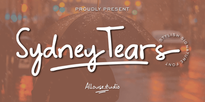 Proudly Presenting, Sydney Tears a Stylish Signature Font. Sydney Tears come with Swash, Underline Styles, and Multi-Lingual SUpport to fulfill your need. We highly recommend using a program that supports OpenType features and Glyphs panels like many of Adobe apps and Corel Draw, so you can see and access all Glyph variations. Sydney Tears is perfect for any tittle, logo, product packaging, branding project, megazine, social media, wedding, or just used to express words above the background. Enjoy the font, feel free to comment or feedback, send me PM or email. Thank You!
 - Sraben Grotesk by Yukita Creative,
$14.00 Sraben Grotesk is a beautiful, versatile font that's perfect for all kinds of projects! It features balanced and harmonious proportions, plus bold variations to make certain elements stand out. This font offers classic characteristics inspired by Grotesk typography, making it an ideal choice for posters, flyers, brochures, brand identity designs, and magazine layouts. Whether you're looking to create something new or bring a creative twist to an existing project, Sraben Grotesk can be the perfect choice. Let its clean aesthetic fuel your imagination and inspire you as you achieve your design goals!
 - Klamp 105 by Talbot Type,
$19.50 Talbot Type Klamp 105 is an elegant and streamlined, geometric sans-serif. A legible text font, its narrow proportions mean it’s economical with space; while at larger sizes it makes a confident, modern display face. Klamp 105 is available in a comprehensive family of seven weights, featuring an extended character set to include old style numerals, as well as accented characters for Central European languages. It is also available with some character variations as Klamp 205, most notably featuring a traditional, double-storey lower case a and g.
 - Dekomia by Keristyper Studio,
$14.00 Dekomia is a modern blackletter font that combines the traditional style of Gothic calligraphy with contemporary design elements. Its bold and sharp letterforms give it a strong and edgy appearance, making it perfect for branding, headlines, logos, and more. Featured: Standard Uppercase & Lowercase Numeral & Punctuation Multilingual : ä ö ü Ä Ö Ü ß ¿ ¡ Alternate & Ligature PUA encoded We recommend programs that support the Open Type feature and the Glyphs panel such as Adobe applications or Corel Draw, so you can use all the variations of the glyphs. Hope you enjoy our fonts!
 - Meliana Script by Arterfak Project,
$13.00 Meliana is a joyful handwriting font, created with a freestyle hand-lettering and a bit bouncy letterform that gives cute and friendly looks. Inspired by children's style and natural handwriting, Meliana Script is suitable for logo, packaging, quote, apparel, cards, invitation, wedding, branding, poster, and more! Meliana is equipped with lots of alternates, there are ligatures, alternates, and stylistic set 01 - 06 that you can mix and match to get more variation of typographic design! You can combine the font with Meliana Extras, containing the swash and doodles.
 - Rise Up With Fists by Ana's Fonts,
$15.00 Rise Up With Fists is a fun, sans serif font with lots of variations and extra drawings, inspired by protest posters. Use Rise Up With Fists in any design that needs a bold font, such as logotypes, quotes and social media posts, website and magazine layouts, and poster designs. Rise Up With Fists includes: Rise Up With Fists Regular, with 100 ligatures that makes this font look truly handmade and realistic (and fun to use!) A Filled alternative for a more bold look An Extras font with floral drawings and doodles
 - Fallena Moodesty by Duanolle Studio,
$18.00 Fallena Moodesty is a unique handwritten script font that looks elegant, modern, and stylish. Fallena Moodesty is perfect for branding projects, logos, product packaging, product design, labels, photography, watermarks, invitations, wedding designs, stationery, advertisements, social media posts and any project that requires a taste for classy handwriting. What's Included: Standard & Multilingual glyphs Ligature PUA encoded We highly recommend using a program that supports OpenType features and Glyphs panels like many of Adobe apps and Corel Draw, so you can see and access all Glyph variations. Hope you happy and enjoy with our font!
 - Kettonia by Keristyper Studio,
$14.00 Kettonia is a modern aesthetic serif font that is both memorable and stylish. This font is good for logo design, Social media, Movie Titles, Books Titles, short text even long text letters, and good for your secondary text font with sans or serif. **Featured:** * Standard Uppercase & Lowercase * Numeral & Punctuation * Multilingual : ä ö ü Ä Ö Ü ß ¿ ¡ * Alternate & Ligature * PUA encoded We recommend programs that support the OpenType feature and the Glyphs panel such as Adobe applications or Corel Draw. so you can use all the variations of the glyphs. Hope you enjoy our fonts!
 - Qonqueror by Wacaksara co,
$18.00 Qonqueror Typeface is a font inspired by writing on a blackboard. This font is very cool and can be mixed and matched with any ornament you like. this font is great for your next creative project such as blackboard menu design, book menus, sign boards, logos, printed quotes, invitations, cards, product packaging, headers, Logotype, Letterhead, Poster, Apparel Design, Label, and etc. Qonqueror Typeface comes with uppercase, lowercase, numerals, punctuations and so many variations on each characters include opentype alternates, and also ligatures to let you customise your designs.
 - Nuber Next by The Northern Block,
$39.95 Nuber Next is a modern geometric sans influenced by the popular neo-grotesques of the 1950s including Helvetica and Univers. Carefully remastered from the original Nuber type family to improve letter shape, overall uniformity and introduce a flexible width system capable of handling a wider variety of typographic applications. Details include 750 characters per font, nine weights and five widths with matching italics. Opentype features include seven variations of numerals, fractions, case-sensitive forms, stylistic alternates, ligatures, extended monetary symbols and language support covering Cyrillic, Western, South and Central Europe.
 - PRIMITIVE by JAF 34,
$1.90 PRIMITIVE is an attempt for an essential of urban culture, especially graffiti and the unique pixaçao. PRIMITIVE is also inspired by the ancient cultures, especially scandinavian tribes as an anagram to the present. This "vandalism" is viewed from several angles. PRIMITIVE is one of them. PRIMITIVE is one of the modern headline fonts which include a lot of alternates, a variation of one word for a comfortable use. Two weights, ligatures and stylistic sets are obvious. And this cheap price is a support to this independent culture from me.
 - Fulline by Letterhend,
$19.00 Fulline is a display typeface. This type of font perfectly made to be applied especially in headlines which is need a standout font, and the other various formal forms such as invitations, labels, logos, magazines, books, greeting / wedding cards, packaging, fashion, make up, stationery, novels, labels or any type of advertising purpose. Features : Solid version numbers and punctuation multilingual PUA encoded We highly recommend using a program that supports OpenType features and Glyphs panels like many of Adobe apps and Corel Draw, so you can see and access all Glyph variations.
 - Kopik by The Northern Block,
$49.50 Kopik is a modern hand-drawn script inspired by the 1960's architectural handwriting style practised by draftsmen. Originated using a Copic 1.0 Multiliner pen, then traced digitally using a stylus and tablet to help reduce imperfections. The result is a simple, readable, monolinear typeface with a marker pen quality suitable for a wide range of written applications. Details include 440 characters, three weights with matching italics, alternative a, g, and y four numerals variations. Opentype features inferiors, superiors, fractions and language support covering Western, South and Central Europe.
 - Starixo by Keristyper Studio,
$14.00 Starixo font is a modern and authentic display font. This font is good for logo design, Social media, Movie Titles, Books Titles, short text even long text letters, and good for your secondary text font with sans or serif. **Featured:** * Standard Uppercase & Lowercase * Numeral & Punctuation * Multilingual : ä ö ü Ä Ö Ü ß ¿ ¡ * Alternate & Ligature * PUA encoded We recommend programs that support the OpenType feature and the Glyphs panel such as Adobe applications or Corel Draw. so you can use all the variations of the glyphs. Hope you enjoy our fonts!
 - Achosmon by Mchcrafter,
$15.00 Achosmon font is a Modern Stylistic Serif typeface A new serif that we created specially for branding needs, with extra ligatures and alternates in a unique shape just to add value to your brand. It so nice to leverage designer or product owner that need solutions to make their design look more stylish and modern. And specially for Achosmon font, We prepared all the ligatures, and the alternates characters to help you create unlimited variations for your creative needs. Lovely Bastilla font includes: All uppercase & lowercase letters All numbers 0-9 & Punctuation
 - Glady Script by Letterhend,
$19.00 Introducing, Glady - A bold script based with standout look. Added with swashes to make this font even more unique. This type of font perfectly made to be applied especially in wedding invitation, labels, logos, magazines, books, greeting / wedding cards, packaging, fashion, make up, stationery, novels, labels or any type of advertising purpose. Features : uppercase & lowercase numbers and punctuation multilingual swash and ligature alternates PUA encoded We highly recommend using a program that supports OpenType features and Glyphs panels like many of Adobe apps and Corel Draw, so you can see and access all Glyph variations.
 - Klamp 205 by Talbot Type,
$19.50 Talbot Type Klamp 205 is an elegant and streamlined, geometric sans-serif. A legible text font, its narrow proportions mean it’s economical with space; while at larger sizes it makes a confident, modern display face. Klamp 205 is available in a comprehensive family of seven weights, featuring an extended character set to include old style numerals, as well as accented characters for Central European languages. It is also available with some character variations as Klamp 105, most notably featuring a more modern, single-storey lower case a and g.
 - Riverside Forest by Letterhend,
$14.00 Introducing, Riverside Forest is a hand drawn display font with organic looks. This font perfectly made to be applied especially in logo, and the other various formal forms such as invitations, labels, logos, magazines, books, greeting / wedding cards, packaging, fashion, make up, stationery, novels, labels or any type of advertising purpose. Features : Uppercase & lowercase Numbers and punctuation Alternates & Ligatures Multilingual PUA encoded We highly recommend using a program that supports OpenType features and Glyphs panels like many of Adobe apps and Corel Draw, so you can see and access all Glyph variations.
 - Eddieth Brush by Keristyper Studio,
$12.00 Eddieth Handbrush is a best-handwritten brush that is written casually and quickly. This font is good for logo design, Social media, Movie Titles, Books Titles, short text even long text letters, and good for your secondary text font with sans or serif. Featured: Standard Uppercase & Lowercase Numeral & Punctuation Multilingual : ä ö ü Ä Ö Ü ß ¿ ¡ Alternate & Ligature PUA encoded We recommend programs that support the OpenType feature and the Glyphs panel such as Adobe applications or Corel Draw. so you can use all the variations of the glyphs. Hope you enjoy our fonts!
 - Delaguerra by Scriptorium,
$18.00Delaguerra is based on a lettering style originating in the California Arts & Crafts period commonly associated with 'Mission Style'. It is still in common usage in signage at historical sites in California. This version is a sort of idealized hybrid of several different variations on the style from samples we were sent by a customer who wanted to use the font in a set of invitations. It features a basic character set on the lower case and then relief initial versions of the same characters for the upper case. - Coloria Muergad by Letterhend,
$17.00 Coloria Muergad is a typeface which is inspired by art deco style. Very suitable for for headline, logotype, apparel, invitation, branding, packaging, advertising etc with old school / vintage as well as modern theme. It comes with few bonus illustrations. Features : uppercase and lowercase numbers and punctuation multilingual alternates and ligatures PUA encoded We highly recommend using a program that supports OpenType features and Glyphs panels like many of Adobe apps and Corel Draw, so you can see and access all Glyph variations. How to access opentype feature : letterhend.com/tutorials/using-opentype-feature-in-any-software/
 - FS Joey Paneuropean by Fontsmith,
$90.00Kangaroo FS Joey was the offspring of a project with Rudd Studio to develop a logotype for an online streaming TV service, in 2008. While under wraps, the secret project was code-named Kangaroo. The logotype led to a second project, to design a corporate typeface for the service. It was the first big project Fernando Mello had worked on with Jason Smith. “Like any designer who just joined a team, I was very excited about it, drawing and sketching lots of ideas. I remember Jason and I experimenting with lots of possibilities, for both the logo and the typeface.” Online As the font for a Spotify-style, internet-based service, FS Joey needed to be highly legible on-screen, including at very small sizes. There had to be a range of weights, and they’d have to work well in print, too. It was also important that it felt corporate, not too quirky, while still having a strong character of its own. Quirkiest “We designed three weights specifically for use on the Web,” says Jason Smith. “There was the usual fight between me and my team. I wanted at least one identifiable letter that was a quirk. As always I went straight for the lowercase ‘g’, and it was drawn numerous times with lots of variation. I got the quirkiest one accepted by the client.” But, later in 2009, the Competition Commission blocked Project Kangaroo, and Fontsmith were left with a couple of weights of an as yet unused font. From Kangaroo, Joey was born. A favourite “Straight away, people started to notice the typeface,” says Jason. “I can take the credit for pushing the art direction and standing up for the quirks. But it was Fernando who was the key to pulling it all together and adding his own distinct flavour. Now it’s one of my favourite designs in our library.” Fresh and friendly, geometric and energetic, Joey is available in five weights, all with italics, all finely-tuned for both screen and print. - FS Joey by Fontsmith,
$80.00 Kangaroo FS Joey was the offspring of a project with Rudd Studio to develop a logotype for an online streaming TV service, in 2008. While under wraps, the secret project was code-named Kangaroo. The logotype led to a second project, to design a corporate typeface for the service. It was the first big project Fernando Mello had worked on with Jason Smith. “Like any designer who just joined a team, I was very excited about it, drawing and sketching lots of ideas. I remember Jason and I experimenting with lots of possibilities, for both the logo and the typeface.” Online As the font for a Spotify-style, internet-based service, FS Joey needed to be highly legible on-screen, including at very small sizes. There had to be a range of weights, and they’d have to work well in print, too. It was also important that it felt corporate, not too quirky, while still having a strong character of its own. Quirkiest “We designed three weights specifically for use on the Web,” says Jason Smith. “There was the usual fight between me and my team. I wanted at least one identifiable letter that was a quirk. As always I went straight for the lowercase ‘g’, and it was drawn numerous times with lots of variation. I got the quirkiest one accepted by the client.” But, later in 2009, the Competition Commission blocked Project Kangaroo, and Fontsmith were left with a couple of weights of an as yet unused font. From Kangaroo, Joey was born. A favourite “Straight away, people started to notice the typeface,” says Jason. “I can take the credit for pushing the art direction and standing up for the quirks. But it was Fernando who was the key to pulling it all together and adding his own distinct flavour. Now it’s one of my favourite designs in our library.” Fresh and friendly, geometric and energetic, Joey is available in five weights, all with italics, all finely-tuned for both screen and print.
 - Stancilo by Ardyanatypes,
$15.00 Stancilo is a type of serif font that offers uniqueness in its form. With a distinctive design and superior aesthetics, this font gives each character an elegant and modern touch. Stancilo font has nine different thicknesses, ranging from thin to bold, providing flexibility and variation. Thus, this font can be used for various design purposes, from main headings to body text, with the ability to adjust the desired intensity and emphasis. One of the advantages of Stancilo is the presence of alternate letters and ligatures that provide character variations for each letter. Allows users to combine alternate letters or use special ligatures to create more harmonious combinations and relationships between characters within words. This feature adds a sense of personalization and additional creativity to the design. Furthermore, Stancilo font also supports multiple languages, making it suitable for multilingual design projects. With the support of diverse languages, this font enables effective and comprehensive visual communication in various cultural contexts. Stancilo is a prominent serif font with a unique form, providing nine different thicknesses, alternate letters, and ligatures. These advantages make it suitable for elegant, modern designs and allow for creative exploration in using its letters. With support for multiple languages, this font becomes a versatile and inclusive choice for diverse design projects.
 - Artisinal by Stiggy & Sands,
$24.00 Artisinal, not to be confused with the term artisanal, is our revival of the Art Deco typeface known as Cubist Bold, by John W. Zimmerman for Barnhardt Bros. & Spindler in 1929, breathes new life into a classic. The original metal cast typeface was designed without a lowercase, as well as some wedge serif capitals made for not always perfect pairings. We've created a lowercase that blends well with the original design to give the typeface more usability. We've also created a fully sans version of the capitals as the default set, and moved the original wedge serif capital styles to a contextual alternates feature. And we created a few stylistic alternates for lowercase characters like the u and y and their accented styles. See the 5th graphic for a comprehensive character map preview. Opentype features include: - Full set of Inferiors and Superiors for limitless fractions. - A Standard lining figure set. - A collection of basic f Ligatures. - Stylistic Alternates for variations of several characters such as u and y. - Contextual Alternates for the original wedge variations of capitals that will mix in where appropriate. Approx. 450 Character Glyph Set: Artisinal comes with a glyph set that includes standard & punctuation, international language support, and additional features
 - KOEEYA by Product Type,
$13.00 Koeeya is a font with a charming Display Graffiti theme. Created to give your projects a touch of freedom and uniqueness, Available in three different variations, Koeeya provides flexibility and the opportunity to express your creativity in limitless ways. You can choose between solid and plain styles, dramatic shadows, or interesting textures. With eccentric designs and beautifully handwritten characters, Koeeya gives each design a different and memorable impression. This font combines the boldness and creativity of graffiti writing with the amazing smoothness and clarity of handwriting. By using Koeeya, you can give a unique and stylish touch to your promotional materials, posters, merchandise designs, and much more. This font exudes energy and freedom, capturing the attention of potential customers in an instant. Now is the time to let your imagination run wild and express yourself through eye-catching designs. Choose Koeeya as your main font and watch how your project becomes unique, interesting, and unforgettable. What’s Included : - File font - All glyphs Iso Latin 1 - Ligature, Alternate - We highly recommend using a program that supports OpenType features and Glyphs panels like many Adobe apps and Corel Draw, so you can see and access all Glyph variations. - PUA Encoded Characters – Fully accessible without additional design software. - Fonts include Multilingual support
 - Crucifix by Canada Type,
$39.95In June of 2004, Canada Type released Crucifix, a condensed three-tiers typeface that tried to bridge the gap between traditional blackletter forms and the traditional European gothics. The main goal of Crucifix was to have as many as 4 different variations on each letter form, so the original release consisted of three fonts: a main font with a standard character set, a small caps set, and a unicase variation. Now Canada Type presents the next generation of this typeface: Crucifix 2.0 and Crucifix Pro. This new version takes advantage of both Unicode and OpenType technologies to make Crucifix as versatile as ever. The PostScript Type 1 and the True Type version boast extended Latin character set support, including Western, Eastern and Central European, Turkish and Baltic, as well as two non-Latin scripts: Cryillic and Greek. The OpenType version, Crucifix Pro, goes even further by including all of above in one font, along with proper automation to accommodate on-the-fly ligatures, small caps, numerators, denominators, some fractions and a ton of stylistic and contextual alternates - all programmed to work with the latest OpenType-enabled programs. Unique, stark, and with more than 900 characters, Crucifix has that clinical sharpness and special dramatic wonder to make it perfect for mystery, gothic, and horror design settings. - ZT Bros Oskon 90 s by Zelow Type,
$13.00 ZT Bros Oskon 90s is a captivating typographic creation that seamlessly blends the aesthetic charm of the 1990s retro era with a modern touch. With unmatched serif elegance and a unique 90s style, this font offers 72 variations, including sharp Condensed forms, graceful Expanded, and captivating italic styles. Every character in ZT Bros Oskon 90s is meticulously crafted, creating a vintage ambiance that is truly enchanting. Featuring 6 font weights ranging from Extra Light to Bold, this font provides you with the flexibility to create a wide range of striking and memorable designs. Features of ZT Bros Oskon 90s: 72 Unique Variations Aesthetic Retro Vibes from the 1990s Elegant Serif Style Condensed, Expanded, and Italic Forms 6 Font Weights: Extra Light, Light, Regular, Medium, Semi-Bold, Bold Exceptional Creative Versatility ZT Bros Oskon 90s is the perfect choice for graphic design projects, branding, posters, and other promotional materials that require a captivating retro touch. Unleash limitless creativity with this font and infuse a nostalgic 1990s vibe into every one of your creations. ZT Bros Oskon 90s has 6 free styles, you can get them on my GUMROAD I hope you have fun using ZT Bros Oskon 90s. Thanks for using this font ~ Zelowtype
 - Sophima by insigne,
$10.00 What's Included : • Ligatures • Works for PC and Mac • Simple installation • 7 styles: 1 undistressed, 6 distressed • 500+ glyphs in each type • More than 75 languages are supported, including extended Latin. • Each style includes 12 OpenType features, including stylistic alternatives, ligatures, old-fashioned figures, and other helpful elements. • Two different swash ending varieties. • Non connected forms • All connected forms, including caps • Randomly selected character forms for organic looking textures. Sophima exudes languorous luxury. The writing glides around, changing elevation above and below the standard x-height, giving it a lively and raucous vibe. Sophima is designed for 3D printing. I required a contemporary script with technical elements that could be printed using a 3D printer. This necessitates the use of quite thick linking characters. Another result of this technology was the need that all letters, including caps, be linked. Such letters are included in optional Opentype style sets. The unusual technological limitation gave the design a new and distinct vibe. Sophima may be used for a variety of purposes, including headlines, weddings, social media, logos, posters, packaging, T-shirts, coffee shops, restaurants, magazine headers, signage, gift/post cards, cafés, and weddings. Designers have a plethora of alternatives from which to pick, giving them greater variety, power, and creative flexibility. Automatic ligatures for best character connections are supplied, as are alternate ending characters that appear at the end of words that lack connectors or have lengthy swash endings. Sophima is made up of five fonts: one standard and five texture variants that change the tone of the typeface. Each design has 500 characters and is available in more than 75 languages. The typeface has 15 OpenType features, such as stylistic alternates that change the look of characters, ligatures, and more. Constraints and a desire to solve challenges breed the finest creativity. And there's no question that Sophima came up with a solution to the situation. Now use Sophima to create your own designs.
 - Korge by Ferry Ardana Putra,
$19.00 Introducing "Korge", a captivating and versatile retro bold slab serif font that seamlessly marries vintage aesthetics with modern functionality. With its bold design, serif form, and a trio of regular, rounded, and extruded versions, Korge offers a wealth of creative possibilities for your design ventures. Korge is a font that transports your projects back to the golden eras of design. Its bold and distinct serifs evoke a sense of nostalgia, lending your creations a classic and enduring appeal. Korge provides not one, but three distinct styles to choose from. The regular version exudes a commanding presence, while the rounded variant softens the edges for a more approachable feel. The extruded version adds depth and dimension, giving your text a 3D, eye-catching quality. Korge is a font that speaks the language of design across borders. With its multi-language support and PUA encoding, it ensures your message resonates with audiences from diverse linguistic backgrounds. From logo design to branding, packaging, posters, and beyond, Korge adapts seamlessly to a wide array of design projects. Its bold slab serifs demand attention, making sure your message is delivered with both authority and style. Korge invites you to embark on a journey of creative exploration. Craft memorable headlines, iconic logos, or striking signage – this font is your canvas for pushing the boundaries of design. With Korge, the possibilities are limitless. Its vintage-inspired bold slab serif design, multi-language support, and versatile styles make it the ideal choice for designers seeking to infuse their projects with timeless charm and contemporary appeal. Get ready to bring your visions to life with Korge, where classic meets cutting-edge. ——— Korge features: A full set of Uppercase & Lowercase letters Numbers and punctuation Multilingual language support PUA Encoded Characters OpenType Features +237 Total Glyphs Rounded Style + Regular Style Extruded Style Korge Includes: Korge Regular Korge Regular Extruded Left Korge Regular Extruded Right Korge Regular Extruded Left Italic Korge Regular Extruded Right Italic Korge Rounded Korge Rounded Extruded Left Korge Rounded Extruded Right Italic Korge Rounded Extruded Left Korge Rounded Extruded Right Italic
 - Sanserata by TypeTogether,
$49.00 Dr. Gerard Unger expands the concept of Sanserata to a sans type family with Sanserata, adding specific characteristics which improve reading. Sanserata’s originality does not overtly present itself at text sizes. Rather, at those sizes, it draws upon its enormous x-height, short extenders, and articulated terminals to improve readability, especially on screens. Having articulated terminals means characters flare as they near their end, but readers likely won’t notice. What they would notice is that their ability to take in more content in a line of text is improved because the lettershapes are more defined. Articulation also makes clearer text from digital sources, where rectangular endings tend to get rounded by the emission of light from the screen. Lately there seems a whispered discontent with the lack of progress in the sans serif category. Designs can either stretch too far beyond what is accepted or be too bland to be considered new. Sanserata’s strength is in being vivid and unique without being off-putting. This bodes well for designers of paragraphs and of branding schemes since, with Sanserata’s two flavors, it is well able to capture attention or simply set the tone. Sanserata’s first voice is a generous, friendly, and even cheerful sans serif. But when using the alternate letterforms its voice becomes more businesslike, though still with nice curves, generous proportions, and a pleasant character. Sanserata comes in seven weights with matching italics, covers the Latin Extended character set, and is loaded with extras. Its OpenType features allow for the implementation of typographic niceties such as small caps, both tabular and proportional lining and oldstyle figures, ligatures, alternate characters, case-sensitive variants, and fractions. The complete Sanserata family, along with our entire catalogue, has been optimised for today’s varied screen uses. Dr Unger worked with Tom Grace on the production of Sanserata. For extended branding use with Sanserata, check out Sanserata, the contemporary, eclectic typeface drawn from roots in Romanesque Europe.
 - Steinweiss Script by Alphabet Soup,
$59.00 Steinweiss Script began its journey towards daylight when Michael Doret was asked by Taschen Publishing to do cover lettering for the huge commemorative edition they were putting together on the work of Alex Steinweiss—“The Inventor of the Modern Album Cover”. The lettering was to be created to appear similar to the famous “Steinweiss Scrawl” the calligraphy that Steinweiss had used on countless album covers. While designing this piece of lettering, Michael realized that there was great potential for a font that was designed in the spirit of that famous “scrawl”. Through his contacts at Taschen Publishing, he was fortunate enough to be able to contact the Steinweiss family, and get the official Steinweiss approval to proceed with his “Steinweiss Script” project. Michael decided that in addition to giving the font his name as an homage, that he would donate a portion of the proceeds from the sale of this font to the man himself: Alex Steinweiss. Read more about the background of Steinweiss Script in Steven Heller’s article in Imprint. Steinweiss Script is a family of fonts in three weights: Light, Medium, and Bold. Additionally, within each weight there are three variations: Simple, Fancy, and Titling. These variations relate to the size/ratio of the caps to the lowercase, the complexity of those caps, and the size of the ascenders/descenders on the lowercase characters. These variations add usefulness to the font, making it accessible not just for headlines, but for longer passages of text as well. For a better understanding of its unique features please download The Steinweiss Script Users Guide from the Gallery section. PLEASE NOTE: the three Steinweiss Script fonts are cross-platform fonts which depend to some extent on certain advanced OpenType features, therefore they can be used to their full potential only with programs that support those features. When setting Steinweiss Script one should almost ALWAYS select the “Standard Ligatures" and “Contextual Alternates” buttons in your OpenType palette. See the “Read Me First!” file in the Gallery section.
 - Instant Soup Mix by Utopiafonts is a font that captures the essence of casual creativity and quirky charm. Envisioned and designed to bring a playful and somewhat whimsical touch to various types of ...
- The Retro Signature font by Nirmana Visual stands out as a beautifully crafted typeface that encapsulates the essence of classic handwriting with a modern twist. The elegance and fluidity of this fon...
- Pea Nicole is a font that possesses a charming, handcrafted aesthetic, making it a delightful choice for a variety of design projects that aim to evoke a personal and intimate feel. Its whimsical nat...
- Wienerin by Sudtipos,
$49.00 The starter point of the Wienerin typeface is based on the work of Austrian designer and artist Carl Otto Czeschka who was part of The Wiener Werkstätte, an early twentieth century association of designers, architects, craftsmen, ceramists, jewelers and other graphic arts in his country. This collective of artists was influential for both Bauhaus, art deco and Scandinavian design. Wienerin is a revision and expansion of the Olympia typeface designed almost 100 years ago by Czeschka but adapted for contemporary use with the inclusion of numerous alternative signs and ligatures. Variable font technology allows a greater variety of weights to be achieved. One of the features of the original design was the inclusion of "eifassungen" or modules to create frames. Wienerin presents a repertoire of 500 in 3 weights. With an upward elongated design we have decided to also create a version of the typeface with a larger x-box that allows for a wider use of the typeface family. Because of its contrast it is ideal for use in delicate design pieces such as editorial design, elegant labels, stationery and fashion. All styles of the Wienerin typeface family cover most Latin languages.
 - Hallock by Arabetics,
$39.00 A text typeface design with completely isolated letters and extra emphasis on vertical feel and visual connectivity to aid easy reading. The Hallock font family is named after Homan Hallock, a New York based American type designer and typographer who created the first documented unified and isolated Arabic font design in July 1864. The Hallock font family has two styles, regular and left-slanted italic styles. This font family design follows the guidelines of Mutamathil Taqlidi type style with one glyph for every basic Arabic Unicode character or letter, as defined in the latest Unicode Standards, and one additional final form glyph, for the freely-connecting letters in traditional Arabic cursive text. Hallock employs variable x-height values. It includes only the Lam-Alif ligatures. Soft-vowel diacritic marks, harakat, are selectively positioned. Most of them appear by default on the same level, following a letter, to ensure that they would not interfere visually with letters. Tatweel is a zero-width glyph. Keying the tatweel key before Alif-Lam-Lam-Ha will display the Allah ligature. Hallock includes both Arabic and Arabic-Indic numerals, in addition to standard punctuations.
 - Elicit Script by Monotype,
$40.99 Elicit Script is a hybrid script family, that can be as casual or formal as the occasion demands. Created by Laura Worthington and Jim Wasco, the design is based on pointed pen Spencerian Script handwriting. “It’s like one of those German italics from the early 20th century, that have beautiful shapes that hold their own,” says Wasco. Elicit Script spans five weights, from Extra Light to Bold, and three styles – Formal, Normal and Casual. This makes it an incredibly versatile script design, easily paired with other typefaces and able to be dressed up or down, depending on what it’s used for. The monoline Casual style offers a more relaxed tone of voice, while Formal sits at the more decorative end of the spectrum. Designers can keep things straightforward, tidy and practical with the typeface’s simple caps, or add in swash caps if they need more exuberance and expression. Generous spacing means Elicit Script works well at smaller sizes as well. Elicit Script Variable Set is a single font file that features two axes: Weight and Contrast. The Weight axis has instances from Extra Light to Bold. The Contrast axis has instances from Casual (low contrast) to Formal (high contrast).