10,000 search results
(0.326 seconds)
- Galak Round by Luhop Creative,
$27.00 Galak Pro is a modern geometric sans serif family characterized by its simplicity and extensive functionality.consisting of 9 weights ranging from Hairline to Heavy with matching italics. It supports Extended Latin, Cyrillic and Greek. This blend produce a typeface of modern, clean and contemporary appearance that has implicit on its core a classic vibe, nourishing the text with a timeless elegance.In use, the form and function balance of its design allow it freely travel through a diverse range of fields and possibilities like short text settings, brands, headlines or signage systems with grace and naturality. Galak Pro is available in variable font format and in 18 different individual styles (9 weights), with a set of supports over 200 latin languages and including an extensive repertoire of opentype features like small caps, ligatures, stylistic alternates, proportional and tabular figures,and many other resources to please your typographic urges.
 - San de More by Kereatype,
$12.00 San de More is a Variable family Serif font. A Hype of summer-themed brings us to express a thirst for creating a product that can help you to choose fonts for your creations. Like as we are on the preview above, how the fonts can "stand" within your design. San de More is created on a 5 weight with italics style. You won’t be worried about which one fits your creative design. Also, You can Mix it up all of it without worrying about design collision. No special software is required to type out the standard characters of the Typeface. To access the Opentype Ligatures and Alternates you will need software that supports Opentype features in fonts. San de More Features: Multilanguage Alternates PUA Encoded Ligatures Very easy to use in any software (Instructions included). If you have any questions, please feel free to get in touch. Thank you
 - Lectio by Eurotypo,
$14.00 Lectio is a Roman font based on a Venetian Renaissance early typefaces, but with a modern and expressive design. His obvious calligraphic influence favors continuous text reading. The generous internal "eye" gives Lectio an appropriate legibility, its soft and organic modulation avoids fatigue, its robust character is attractive and stimulating in large bodies, especially for use in headlines. Lectio comes in two versions: Lectio and Lectio B. Lectio has seven weight and their corresponding slanted variables (true italics). Lectio B is composed only of Italics in six weight. The ascenders are slightly lower, the descending are more regular and the oblique trace of some letters have a more constant rhythm. Each of these faces has the optimum amount of contrast agains the background and clear and open internal letter shape. These fonts include diacritics for CE languages, Old Style figures, standard and discretional ligatures.
 - Exarros by Kotak Kuning Studio,
$15.00 Exarros is a unique and futuristic sans serif font family. The combination of futuristic and geometric elements renders a modern design. Exarros includes 4 fonts family with futuristic caps, thereby creating more variability. This font is suitable to use as a logotype, product designs, label, watermark, social media posts, apparel, invitation, signboard, sports club, motor/car, special events or anything that need handwriting taste. Exarros is encoded with Unicode PUA, which allows full access to all additional characters without having special design software. Mac users can use Font Book, and Windows users can use Character Map to view and copy one of the extra characters to paste into your favorite text editor/application. We hope you enjoy the font, please feel free to comment if you have any thoughts or feedback. Or simply send me a PM or email me at kotakkuningstudio@gmail.com. Thanks for purchasing and have fun!
 - Absentia Serif by DR Fonts,
$19.00 The Absentia collection welcomes this modern serif option to broaden its typographic horizons and offer designers greater versatility. The new member shares the traits and proportions that sets this family apart, such as the truncated capital ‘A’ apex, the calligraphic ‘l’ and the distinctive ‘g’. Yet Absentia Serif adds its own personality to the mix, integrating forward-looking attributes into traditional letterforms. Laid out as bilateral or one-sided configurations, the transitional serifs help maintain a tight, orderly baseline. The balanced stroke contrast increases in the bolder weights and exudes an elegant appearance. This finely crafted typeface promotes legibility at the smallest sizes and makes it the ideal solution for body text. Available in ten weights with matching italics and two variable fonts, Absentia Serif is loaded with OpenType features such as stylistic alternates, fractions, superscript, subscript, as well as standard and discretionary ligatures.
 - Glaw by Flavortype,
$15.00 Meets Glaw, A new carefully crafted Fonts from Ilham Herry to bring a new heavy look of Psychedelic Theme. The Ideas of this fonts are from 70s, Psychedelic, Funk, Hippie, Party, Music and Etc. Even though it’s a specific theme for this fonts. It doesn’t ruled out the possibility of creating a new style or themes. Glaw Created with a 3 Weight on the traditional OTF, Condensed, Regular and Expanded. Not Just that, If your software are support for Variable Fonts like Adobe Illustrator or Photoshop, The Weight are going to 100 Weight!. Glaw Best used for a Large Text such as Headline, Poster, Branding, Logos, Concert, Branding and Any other use that needs a Heavy looks for the Title. Our creation on the display to give you a reference what it looks like on your project. It shows that how Glaw will look on your design style.
 - Hunkster by Heypentype,
$20.00 HUNKSTER is heypentype journey to simplified a stencil fonts. Simplified means it must easy and fast to cut when creating stencil art. Hence, this typeface inspired a lot from stencil arts and fonts right from the beginning of its creations. When a lot of stencil fonts out there used to create political message and self-expression, Hunkster take it beyond that. This typefaces can be applied to anything, from motorsports, branding, logo or logotype, industrial design, products packaging, software, games, website headlines,etc. Whatever it will be used, the spirit of the stencil and street art remains. Include in this typeface family is plenty of ligatures because the nature of stencil and our design aims, easy-to-cut but still beautiful. Most importantly its thrown away an image of stencil fonts bound on military themes. This ligatures will be developed in the future release along with updates on Hunkster variable fonts.
 - Galak Pro by Luhop Creative,
$99.99 Galak Pro is a modern geometric sans serif family characterized by its simplicity and extensive functionality.consisting of 9 weights ranging from Hairline to Heavy with matching italics. It supports Extended Latin, Cyrillic and Greek. This blend produce a typeface of modern, clean and contemporary appearance that has implicit on its core a classic vibe, nourishing the text with a timeless elegance.In use, the form and function balance of its design allow it freely travel through a diverse range of fields and possibilities like short text settings, brands, headlines or signage systems with grace and naturality. Galak Pro is available in variable font format and in 18 different individual styles (9 weights), with a set of supports over 200 latin languages and including an extensive repertoire of opentype features like small caps, ligatures, stylistic alternates, proportional and tabular figures,and many other resources to please your typographic urges.
 - Quantificat by ROHH,
$39.00 Quantificat™ is a modern geo-humanist sans-serif typeface offering excellent legibility and strong personality. It is a fully featured text type family, well proportioned and uniform in color. It is designed to serve as a characterful display typeface, too, as it includes beautifully carved, flowing, calligraphy-inspired true italics, subtle, precise hairlines as well as modern, powerful and friendly heavy styles with emphasized ink traps. Quantificat family introduces advanced typographic OpenType features, such as stylistic alternates, swashes, small capitals, case sensitive forms, standard and discretionary ligatures, contextual alternates, lining, old style, tabular and small cap figures, slashed zero, fractions, superscript and subscript, ordinals, currencies and symbols. The complete family consists of 20 styles - 10 weights with corresponding true italics as well as 2 variable fonts. It supports extended latin languages. Quantificat is a part of one type system together with Qualion, Qualion Round and Bozon.
 - Forever Black is an evocative and potent typeface that has a magnetic pull, thanks to its bold and confident strokes. Designed to make a statement, it carries an air of unwavering assurance, making i...
- Nawin Latin by Letterjuice,
$66.00 Nawin is an informal Arabic typeface inspired by handwriting. The idea behind this design is to create a type family attractive and ownable for children but at the same time a design that keeps excellent letter recognition for reading. Handwriting has been a great source of inspiration in this particular typeface. By emulating the movements of the pen, we have obtained letter shapes that express spontaneity. A bright group of letters create a lively and beautiful paragraph of text. To get closer to handwriting and the variety of letter shapes that we draw while writing, this typeface offers a large number of alternative characters, which differ slightly from the default ones. Because we have programed the «Contextual Alternate» feature in the fonts, these alternate characters appear automatically as you set a text on your computer. For instance, in the Arabic variability on vertical proportions between letters Alef and initial Lam, create movement in text and avoid the cold mechanical feel of repetition. In the case of the Latin a part from having an entire alternate basic alphabet, there are also different letterforms for characters with diacritics, this way variability becomes even greater. Nawin is quirky and elegant at the same time. Letter recognition is relevant when reading continuous text. For this reason, in the Arabic, we have added another contextual alternate feature with alternate characters that help to avoid confusion when letters with similar or the same shape repeat inside one word. This is the case of medial «beh and Yeh» repeated three times continuously in the same word. The alternate characters change in shape and length, facilitating distinction to the reader. Since this typeface is inspired by handwriting and the free movement of the hand while writing, we considered ligatures a good asset for this design. The Arabic has a wide range of ligatures that enhance movement and fluidity in text making look text alive, while the Latin achieves this same effect via contextual alternates.
 - Adelle Mono by TypeTogether,
$36.00 The Adelle family continues its stylistic expansion with the release of Adelle Mono and Adelle Mono Flex by Veronika Burian and José Scaglione. Monospaced typefaces are the default choice for developers and programmers and are also an aesthetic choice for many designers and communicators. The Adelle Mono font family has two widths to serve both breeds and a variable font for the flexible spectrum in between. Monospaced typefaces are born of necessity rather than purely aesthetic values. Each glyph is constrained to a strict box, making the naturally smaller ones the same width as the naturally wider ones. While this serves the functional purpose of keeping text aligned in vertical and horizontal rows, it is completely unnatural in terms of readability. A monospaced ‘l, i’ are overblown compromises while ‘m, w’ become compressed mutations. The Adelle Mono family was therefore designed with both the developer and the aesthete in mind. Adelle Mono respects its necessary constraints while still being visually appealing and easily read. Activate it for use in Sublime, Swift, Terminal, or your IDE of choice and see how well it performs. Clarity will lead to less developer mistakes, and its aesthetic appeal will make your work enjoyable. Adelle Mono Flex is the proportional width version that works for any kind of normal text reading or a design intended to invoke “system or information aesthetics”. Opposite the demands of the monospace family, Flex is reader friendly and intended for branding, annual reports, paragraphs, UI, logos, posters, screens, tables, captions, and more. Employ the Mono version where monospace is needed and the Flex version where reading or coherence is priority. Adelle Mono’s experimental 20-style design explores the space between proportional and monospaced types. It boosts creativity and coherence by providing flexible options in the same family, including italics and the variable font format with an axis of weight and a spectrum axis between multi-width and monospaced characters. Combining Adelle Mono with either Adelle or Adelle Sans adds more layers and adaptability to your work.
 - Barbou by Besnowed,
$19.99 Barbou was originally cut in 1925 by Monotype as a counterpart to Fournier, siblings that were different in design but both based on the work of Pierre-Simon Fournier. Whether by choice, accident or oversight, Fournier was preserved digitally, and Barbou was lost to history. Barbou was notably used by Stanley Morrison, in particular as the face of The Fleuron. I fell in love with Barbou when I saw it, and knew that I wanted to bring it to a new generation of designers and readers. This is a revival of Barbou, a faithful recutting with new weights, characters and many of the best features that modern font technology brings. Particular attention was paid to the original Monotype Barbou 178 specimen sheet. Originally only available in a single weight, Barbou has been recut with a variable weight, providing a large degree of flexibility between Regular and Bold. Barbou excels as a comfortable reading face for books, and the variable weight allows you to fine tune the darkness and texture of the page in a way never before possible. Barbou has a distinctive softness, and this revival of Barbou preserves much of the effect the medium of metal type had on the letterforms. This results in a subtly rounded yet defined type, elegant not worn, with the utmost attention and respect to the smallest of details. Barbou was originally cut with disparate x-heights for roman and italic, and this revival of Barbou features both the original italic, as well as a new italic redesigned at the same height as the roman. In Fournier’s time, roman and italic would not be mixed on the same line, but the type must change to meet the needs of a new generation. Barbou also features unique ligatures and alternates, old style numbers, small caps and a full Greek alphabet. Barbou is perfect for books and anywhere a comfortable reading face is required, and excels in flexibility.
 - Nawin Arabic Ltn by Letterjuice,
$107.00 Nawin is an informal Arabic typeface inspired by handwriting. The idea behind this design is to create a type family attractive and ownable for children but at the same time a design that keeps excellent letter recognition for reading. Handwriting has been a great source of inspiration in this particular typeface. By emulating the movements of the pen, we have obtained letter shapes that express spontaneity. A bright group of letters create a lively and beautiful paragraph of text. To get closer to handwriting and the variety of letter shapes that we draw while writing, this typeface offers a large number of alternative characters, which differ slightly from the default ones. Because we have programed the «Contextual Alternate» feature in the fonts, these alternate characters appear automatically as you set a text on your computer. For instance, in the Arabic variability on vertical proportions between letters Alef and initial Lam, create movement in text and avoid the cold mechanical feel of repetition. In the case of the Latin a part from having an entire alternate basic alphabet, there are also different letterforms for characters with diacritics, this way variability becomes even greater. Nawin is quirky and elegant at the same time. Letter recognition is relevant when reading continuous text. For this reason, in the Arabic, we have added another contextual alternate feature with alternate characters that help to avoid confusion when letters with similar or the same shape repeat inside one word. This is the case of medial «beh and Yeh» repeated three times continuously in the same word. The alternate characters change in shape and length, facilitating distinction to the reader. Since this typeface is inspired by handwriting and the free movement of the hand while writing, we considered ligatures a good asset for this design. The Arabic has a wide range of ligatures that enhance movement and fluidity in text making look text alive, while the Latin achieves this same effect via contextual alternates.
 - TT Trailers by TypeType,
$39.00 Meet the new TT Trailers! The first version of TT Trailers was conceived as a font suitable for the film industry. The font harmoniously looks in posters, it is ideally suited for setting titles. However, the font has gained wide popularity among designers, and now you can find TT Trailers on the covers of magazines, on restaurant signs and on the main pages of websites. TT Trailers useful links: Specimen | Graphic presentation | Customization options Since 2019 when we released the first version, the TypeType studio team has released dozens of fonts, constantly improving our skills. In 2022, we decided to look at TT Trailers again, improving and expanding the font. In the new TT Trailers, we expanded the character set, corrected the contours, and improved the technical content. We have added extended Latin and Cyrillic characters, new symbols, and additional sets of numbers. The number of glyphs in one style has increased from 1081 to 1242. The inclined styles were long-awaited. The italics in TT Trailers are as eccentric as the upright fonts. The 15-degree tilt looks absolutely harmonious, complementing the character of the font family. We added italics to the variable font, so the new font changes along two axes at once, weight and slant. From the technical point of view, TT Trailers has become more modern and correct, and the number of OpenType features has increased from 29 to 42. We have added new alternative versions of glyphs and created a large number of localized features. The font retained all the qualities thanks to which designers fell in love with it, but became even more convenient. TT Trailers in the new version is suitable for titles and posters, for websites and printed materials. The font will embellish in restaurant and cafe signs and look beautiful in posters. There are 19 styles in TT Trailers: 9 upright, 9 italic and 1 variable font.
 - TT Bluescreens by TypeType,
$35.00 TT Bluescreens useful links: Specimen PDF | Customization options Please note! If you need OTF versions of the fonts, just email us at commercial@typetype.org Meet the upgraded TT Bluescreens! TT Bluescreens is a geometric sans serif with narrow proportions. The font has a memorable character, while remaining neutral, so it can be used in various design projects. The range of possibilities of the updated TT Bluescreens has become much wider! Condensed styles with narrowed proportions have been added. The classic styles of TT Bluescreens are universal and suitable for setting both in headings and in text arrays. Condensed styles are intended for non-standard design solutions. In small sizes, they are perceived as if having a texture, thanks to which they can become part of packaging or poster design. In large size they look extraordinary, but they are highly readable and convey information well. Variable font now changes along 3 axes: weight, width and slant. Even more options for those who love variety. The character set of TT Bluescreens was expanded, and additional extended Cyrillic and Latin characters were added. Expanded character set. Each style has 874 characters. This is 253 characters more than it there were in the previous version. New currency signs, arrows, punctuation and fractions were added. Number of OpenType features increased from 18 to 31! The font has become even more functional and convenient thanks to a large number of ligatures, stylistic alternatives and localizations. The quality of the contours has become even higher, diacritics were improved. The updated TT Bluescreens is suitable for the design of covers and posters, it will look aesthetically pleasing in packaging design. It can be used in the design of titles and disclaimers. Condensed styles are preferably used in large size. The TT Bluescreens font has 37 styles: 9 upright and 9 italics of standard width, 9 upright and 9 italics in Condensed, 1 variable style. Each style contains 874 characters. The font has 31 OpenType features, including ligatures, stylistic sets, and localizations.
 - The HeummPostcard132 font, designed by the Heumm foundry, is a charming and uniquely styled font that radiates a warm, inviting atmosphere reminiscent of handwritten postcards. This font embodies the...
- Magnies by Arterfak Project,
$22.00 Feel the sweetness with Magnies, a minimalist serif font with clean stencil looks. The feminine letterforms which are perfect for logotype, fashion, and display. Magnies was designed with a high contrast of the strokes and cut the thinner line to get the optical effect but still keep the legibility. Great choice with over 100+ alternates characters, that you can create many variations for your design.
 - Shtozer by Pepper Type,
$25.00 Shtozer is a retro-themed display typeface based on designs of 1960s and 1970s and additionally inspired by Cyrillic ornate lettering Vyaz. It comes in 8 weights, with 5 width variations each, all accompanied with respective obliques - making 80 styles altogether. Shtozer is a font family with extensive language coverage including Cyrillic script. It also contains numerous OpenType features and alternate glyphs to vivify the typesetting.
 - Christmas Deer by Arttype7,
$15.00 We just launched a new product font. charming fonts with a pretty christmas look, named "cristmas deer font". This font is inspired by deer antlers. has 3 beautiful swash variations. and also has more than 650 glyphs. This font also has a stylistic alternative for multilingual support. Perfect for logos, Christmas greeting cards, wedding invitations, web, t-shirts, souvenirs, quotes, graphic watermarks. thank you regards
 - Titch by wearecolt,
$9.00 Titch is a brush font, original glyphs drawn with a tombow brush pen. Special care has been taken to retain the individual characteristics of each glyph making Titch a beautifully unique display font. Titch is a small caps font available in both regular and slanted variations. This fun and versatile display font will add a hand made touch to your next packaging design or greetings card.
 - Lightyears by Match & Kerosene,
$25.00 Lightyears is a geometric typeface that features a highly stylized lowercase and variations of alternates to create titling results on the fly. You can set the typeface to all-caps for a simple look, or you can alternate uppercase and lowercase letters for a highly stylized title. Uppercase stylistic alternates have a “stereo” look as the crossbars and some stems are doubled in a non-traditional way.
 - DF Staple TXT by Dutchfonts,
$33.00 StapleTXT is a transformation from the monospaced typewriter font Staple mono into a text type. The 'mono' skeleton was used as much as possible but some characters were slightly altered in order to obtain more regularity without losing its specific typewriter atmosphere: little variation in character widths. The font has lining figures and works very well as text system in combination with the Staple mono.
 - Neubau Grotesque by TipografiaRamis,
$29.00 Neubau Grotesque is an upright italics variation of Neubau Sans and is built in three weights. The main difference of this typeface is that it presents a softer and more human look (less techno), while retaining the condensed geometric structure of its counterpart. Neubau Grotesque is recommended for use as a display font, and has been generated in a single OpenType format with Western CP1252 character set..
 - Trailmap by Atlantic Fonts,
$26.00 Whether you're comfortable in your hiking boots or booting up your computer, Trailmap gets you where you want to go with an engaging mix of lower and uppercase or all caps. For double letters, or anywhere that needs it, add extra variation by combining lower and uppercase letters. Trailmap coordinates naturally with Trailmap Pictures, a fantastically fun collection of wilderness icons from rainclouds to raccoons.
 - Kiti Cuties by Dikas Studio,
$15.00 Hi, i want to introduce my newest font Kiti Cuties. Kiti Cuties is a playful sans serif font, Kiti Cuties is a allcaps font with 4 variations letter in lowercase e,h,o,u that makes your design looks more cheerfull. Kiti cuties is made to help you create a kids and fun theme design such as birthday card, baby shower card, greeting card and many more.
 - Corkboard JNL by Jeff Levine,
$29.00Corkboard JNL is a bold, yet fun rounded-ends typeface that was popular in the 1970s and enjoying a revival amongst students and teachers via die-cut bulletin board letters. Five variations are offered—Regular, Slanted, Shadow, Shadow Slanted and Kiddies. Corkboard Kiddies JNL has a limited character set and eccentric spacing that emulates the way a child might put letters onto a bulletin board. - Mufteya by Azzam Ridhamalik,
$12.00 Mufteya Font is a modern serif with some retro touch and stylish font, you can combine to get any variations and unique shapes easily just in seconds. Use it as an perfect solution for your next vintage logo, layout design, vintage poster, magazine headers, or simply as a stylish text overlay to any background image. FEATURES : Uppercase Lowercase Number Punctuation Multilingual PUA Encode Opentype
 - Virtual by John Moore Type Foundry,
$25.00 Virtual is an experimental fantasy font based on a pseudo optical enclosure where a linear system that is not connected there. Virtual comes in three weights: regular. light, and thin also an virtual mix by mixing different thicknesses in a single font, with alternative variations through features of open type. Virtual is an experience based on play with the laws of the Gestalt of closing.
 - Angry Brush by Joy Studio,
$13.00 Introducing ANGRY BRUSH - a very bitter display brush font made for all your resentful ramblings. Available only in upper case (shout mode) and with 17 different unique variations of every single character so it always looks fresh, with no duplicated letters in sight. You can either manually choose your preferred character, or let the contextual alternates rotate through each stylistic set whilst you type.
 - Monopola Script by Wacaksara co,
$16.00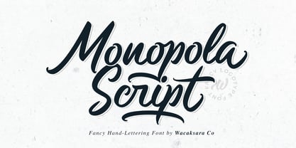 Monopola is a casual script font inspired by pop cultures and urban fashion. This font is great for your next creative project such as Logotype, printed quotes, invitations, cards, product packaging, headers, Letterhead, Poster, Apparel Design, Label, and etc. Monopola comes with uppercase, lowercase, numerals, punctuations and so many variations on each character include OpenType alternates, and common ligatures to let you customize your designs.
 - Killman by Grontype,
$12.00 Killman is a nice, neat and playful Font that is very useful for making Headline header or unique quotes or making flyer titles, even good for making company logo taglines. This font is made by adding some useful ligatures to create various font variations Features : All Character Set Numbering And Punctuations Ligatures Multilanguage Support Thankyou For Downloading This Font, Hope You Enjoy It Regard. Grontype
 - Mathylda Script by Eurotypo,
$24.00 Mathylda Script is an elegant and youthful handwritten calligraphic font with thin and thick strokes depending on the inclination of the pen. It has many stylistic variations, swashes and ligatures. “Mathylda” will allow you to create elegant works. Mathylda Script font is the great choice for any project from logos, magazines and book covers, children’s material, fashion, headlines, cards, posters, websites, packaging and, basically, anywhere you want.
 - Unpredictable by Putracetol,
$28.00 Unpredictable is a display sans font with variations of different heights and baseline position. In this font there are several heights and baselines that you can combine. For height (normal, low, and high), for the baseline (normal, above and below). This tyepeface is unique and very suitable for logos, Tshirt, apparel, quote, handwritten quotes, product packaging, tittle header, poster, merchandise, social media, labels, branding & greeting cards.
 - Old Union by Mysterylab,
$18.00 Old Union is a unique and creative modern font that is eye-catching and versatile. Elements of the design strongly reference Cyrillic typefaces of the early Soviet era, but with a distinctly modern look. Excellent for many uses including posters, banners, and logos. This design straddles the line between Didone-style elegance and vintage agit-prop. There are two variations in this package: Regular and Oblique.
 - Lava Cookies by Letterhend,
$17.00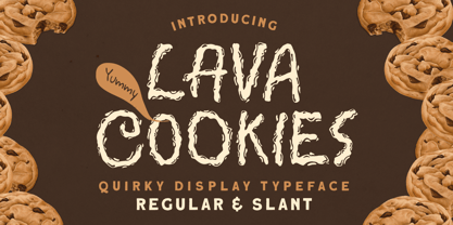 Introducing, Lava Cookies - A quirky display typeface. The unusual quirky style make this font looks great and standout for tittle, branding, logo, packaging, etc. Features : uppercase & lowercase numbers and punctuation multilingual alternates & ligatures PUA encoded We highly recommend using a program that supports OpenType features and Glyphs panels like many of Adobe apps and Corel Draw, so you can see and access all Glyph variations Thank You!
 - Sveglia by Wacaksara co,
$15.00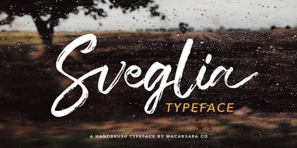 Sveglia is a hand brush casual script font inspired by urban fashion. This font is great for your next creative project such as Logotype, printed quotes, invitations, cards, product packaging, headers, Letterhead, Poster, Apparel Design, Label, and etc. Sveglia comes with uppercase, lowercase, numerals, punctuations and so many variations on each character include OpenType alternates, and common ligatures to let you customize your designs.
 - Honolulu by Ana's Fonts,
$12.00 Honolulu is a cute hand-drawn font with four variations: - Regular, filled, sans and sans filled - Plus jumpy versions of each font (accessed by activating contextual alternates). Each font includes: - Two sets of caps - Numbers and punctuation - Multilingual support Fresh and perfect for the summer, in any design that needs a bold hand-drawn feel, such as postcards, notes and quotes, logos and branding.
 - Three Horse by Alit Design,
$18.00 Introducing the "Three Horse" Vintage Letter Font Collection – a captivating journey into the artistry of yesteryears. This remarkable font family embodies the essence of vintage charm, offering 12 distinct font variations that encapsulate the character and nostalgia of classic letterforms. The "Three Horse" collection is your gateway to a world of timeless design, perfect for projects seeking to evoke the allure of eras gone by.
 - Dive Gear Stencil JNL by Jeff Levine,
$29.00 Some vintage 1960s-era packaging for dive gear (masks, swim fins, etc.) manufactured by the Voit division of AMF had various merchandise boxes hand-lettered [with some variation of design] in an interesting sans stencil. These packages formed the inspiration of Dive Gear Stencil JNL. Thanks once again to Gene Gable, whom on many occasions has provided Jeff Levine material for type design inspiration.