10,000 search results
(0.024 seconds)
- Bilton by Fettle Foundry,
$10.00 Bilton is a sans-serif typeface with the personality of serif and an incredibly large X-height. Intended for headlines and display sizes, Hutton can also be used at body sizes if needed. High contrast, sharp angles, and subtle serif-like flares are used throughout the design, making Bilton feel playful yet classy. Featuring ten styles – five roman and five matching italics – Bilton is suitable for a wide range of uses. The family supports more than 300 latin-based languages, and features contextual alternatives for character combinations and languages.
 - Ondo by JAM Type Design,
$23.00 Ondo is a low contrast geometric sans serif with large open counters which give the typeface a somewhat bold and contemporary appearance. This feature gives Ondo a fun yet sensible feel which can be used for both large chunks of text as well as for short headlines. Ondo comes with more than 370 glyphs, supporting a wide range of languages. With its 10 fonts, Ondo is an ideal font family for text, branding, signage, print and digital design. Give Ondo Demo Medium a try on your personal projects – completely FREE.
 - Fluence PS by pentagonistudio,
$12.00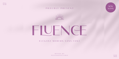 Fluence PS Is An Elegant Sans Serif Font Inspired By Feminine and Elegant Character. SOFTWARE REQUIREMENTS : Fonts and alternate : No special software required they may be used in any basic program /website apps that allows standard fonts That's it folks! You can go ahead and get cracking :) Follow My Shop For Upcoming Updates Including Additional Glyphs And Language Support. And Please Message Me If You Want Your Language Included or If There Are Any Features or Glyph Requests, Feel Free to Send me A Message. Have a Good Day !
 - Deco Design JNL by Jeff Levine,
$29.00 Hand lettering isn’t a perfect art form, and this is why it often has an appeal over formal typesetting. Individual interpretation can lead to variations in style, character shape and overall design concept. Case in point: The hand-drawn title for the1933 sheet music “Why Can’t This Night Go on Forever” is a simple Art Deco sans, however it mixes character widths and even angles the letter ‘C’ in a nonconventional way. Deco Design JNL is the digital version of this alphabet, which is available in both regular and oblique versions.
 - Helnore by Owl king project,
$39.00 Helnore is a sans serif font family with tapered accents in some of the letters giving it a modern and bold character, even being quite prominent in thin characters. This font aims to give an elegant impression and also looks so luxurious in short words for a letter-based title and logo. Helnore bring 20 style/Italic and support multi-languages, this font provides a wider range of exploration, which can be useful also for reading sentences and giving variety in each sentence by combining it with several sizes.
 - Ring Neck by Ochakov,
$9.00 Ring Neck incredibly elegant and at the same time effortless. Another graceful set of Ring font family! Introducing Ring Neck is a condensed sans serif which has styles from thin to black to make your design more variative and unique. Good for bold branding, titling and headline who has come to be seriously and fun. This typeface can be so serious, fun, and bold it depends on for what purpose. Ring Neck like an other fonts of Ring family is still ready to meet the challenges of everyday life.
 - Magnolia Cora Script by Get Studio,
$10.00 Introducing Magnolia Cora Script, a handwritten font with a casual and strong character crafted with real brush textures, giving you a custom-made feel to your design work. Magnolia Cora Script also comes with a smooth version it can be used for various types of design needs such as branding materials, Invitation, social media templates, t-shirts, business cards, logos, promotional flyers, posters, and more. With multilingual support, this font is also suitable to be combined with san-serif to get an extraordinary result for your design projects.
 - Barle by Locomotype,
$18.00 Big is beautiful. Barle font has an extremly heavy weight and wide shape. A sans-serif display font that's perfect for large headlines, posters, packaging and any graphic design that requires a font that will stand out to audiences. Barle font has two faces, a standard character and a sliced version which can be accessed through the Stylistic Alternates feature. This font consists of 4 fonts; upright and italic style in the normal version and the outlined version. If you just want to use the sliced version, you just need to purchase Barle Alt.
 - Stencil Creek by Resistenza,
$39.00 Stencil Creek font family is a rounded stencil typeface that comes in eight weights and two rough versions. It is inspired by classic sans serifs and influenced by street signs of the North West Pacific. You can also overlap some of the weights and get an extra inline font. Stencil Creek is a legible typeface family designed for contemporary typography, especially for use in headlines, but also for reading purposes, includes extensive language support and many more OpenType features. This font contains, different swashes and alternates. Check out also ‘Orbita’
 - Getih West by Twinletter,
$15.00 Getih West It’s a Halloween font, but there’s no need to fear. It’s not just for Halloween fans; You can use it to create cool designs and logos for everything from snowboarding gear to new products at work. Or, if you’re in a hurry, use it to make a fun invitation for your next party — because everyone loves an invitation that screams “Boo!” Of course with this font your various design projects will be perfect and amazing, get a beautiful title and start using our font for your special project.
 - Biotic by TypeUnion,
$25.00 Biotic is a dual-personality 18 style typeface which features two distinct design approaches that can be initiated with the flick of a switch. The natural design approach uses conventional forms for a geometric sans but when you switch to the engineered approach some key glyphs become squared to create an edgy approach in an instant. The characters that change are f, i, j, k, l, t and y, along with all punctuation and accents which switch to the square approach. Biotic covers extended latin and basic Cyrillic languages and includes many opentype features such as stylistic sets & alternates, two sets of arrows, circled & old-style numbers, along with case sensitive punctuation and much more.
 - Valet by Canada Type,
$29.95 Valet is deco moderne the way it was meant to be: Big, bold, classy, flashy, and clean at the seams. Its message is rich, strong, confident and reliable. Valet tells you that it’s used to thorns being part of every rose, that it can handle sharp objects just fine, and that it'd much prefer buying the tuxedo rather than renting it. This font grew out of an uncredited early 1970s all-cap film type called Expression. An appropriate deco lowercase was added, along with small caps, zippy titling caps, and Pan-European language support. With over 9250 glyphs, we bow our heads with the admission that we kind of got carried away with it.
 - Royal Tropic by Tom Chalky,
$18.00 Proudly Introducing ‘Royal Tropic‘ – An expressive, quick dry stroke, signature style brush script font. With multilingual support, ligatures, and an extra slanted style. Royal Tropic is great for when you want to grab attention, especially within print design; Packaging, branding, posters, book cover design, etc. The goal was to create a fast-flowing, legible script font with enough personality to take center stage and shine, and I think the end result has delivered exactly that! TIP: Through trial and error, I feel Royal Tropic works best with clean serif/sans-serif fonts. Any other 'handwritten' fonts can disturb the rough/clean contrast, taking with it some of the impact of your design.
 - Supra Extended by Wiescher Design,
$29.00 Supra Extended – designed by Gert Wiescher in 2013 – is the extended version to this new sans typeface family of eight weights. The extended version is designed for sheer elegance and has no italics because they didn't look nice to me. The light and normal weights and the dominant x-height with its high ascenders make for easy reading of long copy. The heavy and x-light weights are great for elegant headlines. Supra is an OpenType family for professional typography with an extended character set of over 700 glyphs. It supports more than 40 Central- and Eastern-European as well as many Western languages. Ligatures, different figures, fractions, currency symbols and smallcaps can be found in all cuts.
 - Destinys by Maulana Creative,
$14.00 Destinys Script and Sans Font Duo is a modern script and display sans font. With regular marker stroke and bold sans stroke, fun character with some of ligatures. To give you an extra creative work. Destinys Script and Sans font support multilingual more than 100+ language. This font is good for logo design, Social media, Movie Titles, Books Titles, a short text even a long text. Make a stunning work with Destinys Script and Sans font. Cheers, MaulanaCreative
 - Vienna Extended by ITC,
$29.00Vienna is the work of Dutch graphic designer Anthony De Meester, a light, elegant sans serif. Simplicity is the hallmark of Vienna and it can be used most effectively where a look of regal elegance is desired. - Home School by Fox7,
$10.00 Home School is a tall and cute, easy-to-read sans serif font. You can use it for various projects, such as blog posts, logos, branding, ads, invitations, greeting cards, planners, photo albums, decorations, and much more.
 - Metalmark Stencil JNL by Jeff Levine,
$29.00 A lot of interesting variations in lettering style can be found in sets of antique tin or brass marking stencils. One such set was the model for Metalmark Stencil JNL, a bold sans with a chamfered look.
 - Kindred by Rachel Kick,
$9.00 Kindred is an organic and hand-lettered sans typeface. It has a friendly and organic feel that works great for branding, social media, and marketing! Kindred is inspired by hand lettering art - incorporating many letters that fit into each other and swashes that add a hand-drawn feel. The corners are slightly rounded to give it an organic and friendly feel. With so many alternatives and ligatures, each word can be customized to fit the needs of your project. The Details: 34 Standard Ligatures: Enabled by default to create a hand-drawn feel! (Make sure your open-type features are enabled!) These can also be switched out depending on the look you're going for. Over 90 Alternatives: These are the perfect way to make the type look custom-made for your project. Add small details, change double letters, or add swatches that fit around surrounding letters. Language Support: Danish, English, French, German, Irish, Italian, Portuguese, Spanish, Swedish, & Swiss German.
 - Gothic Gothic by Typeco,
$29.00Gothic Gothic is a fusion of old and new that is both Gothic and Gothic. In typography Gothic can refer to German Blackletter or Old English styles. Gothic can also mean block or sans serif style lettering. By combining and balancing the elements from both of these ideas we have created a contemporary extended block letter typeface. The Gothic Gothic family contains 2 companion fonts. Gothic Gothic Text is a more minimal variation that has a more roman looking style while still retaining some Blackletter feel. Gothic Gothic Black is a bolder version designed to tend more toward the Blackletter style of Gothic with more contrast of stroke and a few of the more unusual Blackletter forms thrown in for flavor. Gothic Gothic has been honored with an award of Excellence in Type Design from Association Typographique International (ATypI) in 2001. Typeco has updated this font and has released it as an expanded family. Gothic Gothic is a crepuscular family of 3 fonts - Modal Stencil by Schriftlabor,
$42.00 Modal Stencil is the companion to Modal type family. It brings an extra expression for different uses. It can be used for Display better than Modal. It has all the styles that Modal so it can be used together harmoniously.
 - Winter Animal by Seemly Fonts,
$14.00 Winter Animal is an incomparable display font. It can easily be matched to an incredibly large set of projects, so add it to your creative ideas and notice how it makes them stand out!
 - Yolissa by JprintStudio,
$14.00 Yolissa is an elegant and modern sans serif font with an undeniably clean feel. With its neat and beautiful arrangement of letters, this typeface will look outstanding in both formal and non-formal designs.
 - Mellow Sunshine by Seemly Fonts,
$12.00 Mellow Sunshine is an incomparable display font. It can easily be matched to an incredibly large set of projects, so add it to your creative ideas and notice how it makes them stand out!
 - Jumping World by Seemly Fonts,
$14.00 Jumping World s an incomparable display font. It can easily be matched to an incredibly large set of projects, so add it to your creative ideas and notice how it makes them stand out!
 - Krul by Re-Type,
$99.00 ‘Krul’ is a typographic interpretation of the lettering style created by Dutch letter painter Jan Willem Joseph Visser at the end of the 1940s, which decorated the traditional brown bars of Amsterdam. In the beginning, these letters were strongly associated with the pubs connected to the Amstel brewery, given that Visser was the company’s official painter. As the years passed, the style became increasingly popular, and various business owners in Amsterdam and other Dutch and Belgian cities also commissioned its use. In the 1970s and 1980s, Leo Beukeboom, another talented letter painter, continued and expanded this lettering tradition while employed under the Heineken brand. Much of his work can still be found in the Jordaan and De Pijp neighborhoods in Amsterdam. The Amsterdamse Krulletter, or Amsterdam’s curly letter, is strongly inspired by the calligraphic works of the 17th century Dutch writing masters, of which Jan van den Velde was a central figure. However, distinct characteristics of this style, for example, its unusual and beautiful ‘g’, originate from a model that was published by Johannes Heuvelman in 1659, which J. W. J. Visser referenced. Typographic circles have somehow overlooked the Amsterdamse Krulletter and its heritage. The Dutch calligraphic hands preceded and influenced the formal English penmanship which has inspired numerous typefaces in the Copperplate style. In contrast, the models from van den Velde, Heuvelman, and Jean de la Chambre, among others, are a missing chapter in Dutch typographic history, and had never been turned into typefaces until now. Conscious of the cultural and identity issues that arise in reviving a unique style, and concerned about the speed with which the lettering style was disappearing, Ramiro Espinoza focused the project of designing ‘Krul’ on digitally recreating the calligraphic complexity of these beautiful letters. Created through several years of research, ‘Krul’ is not a direct digitization of the Amsterdamse Krulletter, but instead, an interpretation that incorporates numerous alternative characters absent in the original model, and improves upon details where necessary, resulting in an optimal performance on the printed page. The typeface is presented in Open Type format, with an abundance of intricate ligatures, fleurons, and swashes, which permit the creation of numerous calligraphic effects. The very high contrast and rhythm of the strokes in this typeface make it especially suited for media applications conveying a sense of elegance and sophistication. Designers of feminine magazines, advertisements, and corporate identities within the fragrance and fashion industries will find in this typeface to be an extremely useful and appropriate resource.The great Amsterdamse Krulletter is finally back, and we are proud to make it available to you.
 - DeBorstel Brush Pro by Ingo,
$49.00 A personalized cursive written with the pointed brush The strange name of this font means nothing other than ”brush,“ but only the Dutch understand it. The typeface is spirited, amusing and flashy. I made the handwritten original of DeBorstel Brush quickly and without interruption with a pointed brush. In the capitals, DeBorstel Brush appears to be almost too balanced for handwriting. In contrast, the lower case letters are intentionally very individual and uneven. A bit more life is added to the typeface with ligatures activated which are constructed with alternative letter forms — and as a result, a number of problematic letter-combinations are improved. And if this typeface is still not lively enough for you, the additional alternative character forms a e g i j l n o s t u z are available with the Open Type-Function ”Discretional Ligatures“. DeBorstel Brush is suitable for all European languages. It includes ”Unicode Latin Extended-A,“ for Central and Eastern Europe incl. Turkish, and even Cyrillic and Greek, too.
 - Edelgotisch by HiH,
$10.00 Edelgotisch is a bold Jugendstil design that shows its strong blackletter roots. This typeface, along with a set of initial letters, was released by Schelter & Giesecke of Leipzig, Germany about 1898 and is very similar to Eckmann-Schrift released by Rudhard'schen Giesserie (later Klingspor) during the same period. One suspects they may have been in direct competition. The decorative devises of the initial letters for Edelgotisch have a simpler, bolder line than for Eckmann. In the initial letter set, the ligatures aesc (AE) and ethel (OE) were generated by embedding the ‘A’ and ‘O’ respectively inside the upper left corner of the ‘E.’ The accented caps were given similar treatment, with the exception of the cedilla. Regarding the I-diaeresis, we considered rotating the accent ninety degrees to avoid and possible misconstruction. On further reflection however, we realized it was silly and unnecessary. No one would look at the accented letterform and see anything but what it is. We have also included four decorative ornaments and a frame with each font.
 - Urbane Rough by Device,
$39.00 Urbane Rough is a distressed version of Urbane, giving it an urgency and immediacy reminiscent of photocopied flyers or inky printing. A versatile all-purpose sans-serif family of six weights plus italics, it explores the same idea-space as early geometric modernist sans such as Futura, Erbar, Spartan and Elegant Sans, with a single-story a, a contemporary high x-height and very slightly condensed bowls. Perfect for headlines and running text, it is clear, classic and authoritative. Unusually for a geometric moderne sans, letter-widths are optically balanced, giving an even colour in setting. Includes a full international character set, lining, tabular and old-style numerals.
 - MVB Emmascript by MVB,
$39.00Kanna Aoki drew the letters for MVB Emmascript while on a picnic near the Conservatory of Flowers in San Francisco’s Golden Gate Park. Mark van Bronkhorst adapted the writing as a font that maintains a very natural scrawl. Later a bold weight was added. MVB Emmascript has been used to add a lighthearted, human touch to everything from fiction paperbacks to potato chip packaging. The typeface is named for Aoki's 1968 Volkswagen, Emma. - Molabrista by Jehansyah,
$15.00 Molabrista Display this is a very beautiful serif font, you can enjoy it as an extraordinary work, make this font design your choice as your favorite font, with several alternates that you can combine into the shape you want, to add an elegant and luxurious impression to your design. show, very suitable for any project Include : Numeric Punctuation Latin Alternate Thank you very much
 - Madita by Hubert Jocham Type,
$39.00 Madita started with the idea of an upright sans script. Unlike other script typefaces, some of the characters look fairly constructed. The endings are either vertical or horizontal. On the other hand there are the swashes of a flowing script woven into the sans stroke that create an interesting tension. Madita is surprisingly legible, even in smaller sizes. The upper case letters even work in all caps.
 - Neue Frutiger Paneuropean by Linotype,
$79.00During planning for the new Roissy Charles de Gaulle airport in Paris at the beginning of the 1970s, it was determined that the airport's signage system had to include the clearest and most legible lettering possible. The development of all signage was put into the hands of Adrian Frutiger and his studio. The team carried out their task so effectively that a huge demand for their typeface soon arose from customers who wanted to employ it in other signage systems, and in printed materials as well. The Frutiger® typeface not only established new standards for signage, but also for a range of other areas in which a clear and legible design would be required, especially for small point sizes and bread-and-butter type. The typeface family that which emerged as a result of this demand was added into the Linotype library as "Frutiger" in 1977. Frutiger Next, created in 1999, is a further development of Frutiger, not necessarily a rethinking of the design itself. It was based on a new concept, the most obvious visual characteristics of which is the larger x-height, as well as a more pronounced ascender height and descender depth for lower case letters in relation to capitals. This new design created a balanced image and included considerably narrower letterspacing. Frutiger Next meets the demand for a space-saving, modern humanist sans. 2009's Neue Frutiger is a rethink of the 1977 Frutiger family, now revised and improved by Akira Kobayashi in close collaboration with Adrian Frutiger. Despite the various changes, this "New Frutiger" still fits perfectly with the original Frutiger family, and serves to harmoniously enhance the weights and styles already in existence. The perfect mix, guaranteed Neue Frutiger has the same character height as Frutiger. As a result of this, already existing Frutiger styles can be mixed with Neue Frutiger where necessary. Likewise, Neue Frutiger is perfect for use alongside Frutiger Serif. Newly added are the "Neue Frutiger 1450" weights. Especially for the requirements of the newly released German DIN 1450 norm we have built together with Adrian Frutiger specific weights of the Neue Frutiger. The lowercase l" is curved at the baseline to better differentiate between the cap "I", additionally the number "0" has a dot inside to better differentiate between the cap "O", and the number "1" is now a serifed 1. The font contains additionally the origin letterforms from the regular Neue Frutiger font which can be accessed through an Opentype feature." - Neue Frutiger Cyrillic by Linotype,
$89.00During planning for the new Roissy Charles de Gaulle airport in Paris at the beginning of the 1970s, it was determined that the airport's signage system had to include the clearest and most legible lettering possible. The development of all signage was put into the hands of Adrian Frutiger and his studio. The team carried out their task so effectively that a huge demand for their typeface soon arose from customers who wanted to employ it in other signage systems, and in printed materials as well. The Frutiger® typeface not only established new standards for signage, but also for a range of other areas in which a clear and legible design would be required, especially for small point sizes and bread-and-butter type. The typeface family that which emerged as a result of this demand was added into the Linotype library as "Frutiger" in 1977. Frutiger Next, created in 1999, is a further development of Frutiger, not necessarily a rethinking of the design itself. It was based on a new concept, the most obvious visual characteristics of which is the larger x-height, as well as a more pronounced ascender height and descender depth for lower case letters in relation to capitals. This new design created a balanced image and included considerably narrower letterspacing. Frutiger Next meets the demand for a space-saving, modern humanist sans. 2009's Neue Frutiger is a rethink of the 1977 Frutiger family, now revised and improved by Akira Kobayashi in close collaboration with Adrian Frutiger. Despite the various changes, this "New Frutiger" still fits perfectly with the original Frutiger family, and serves to harmoniously enhance the weights and styles already in existence. The perfect mix, guaranteed Neue Frutiger has the same character height as Frutiger. As a result of this, already existing Frutiger styles can be mixed with Neue Frutiger where necessary. Likewise, Neue Frutiger is perfect for use alongside Frutiger Serif. Newly added are the "Neue Frutiger 1450" weights. Especially for the requirements of the newly released German DIN 1450 norm we have built together with Adrian Frutiger specific weights of the Neue Frutiger. The lowercase l" is curved at the baseline to better differentiate between the cap "I", additionally the number "0" has a dot inside to better differentiate between the cap "O", and the number "1" is now a serifed 1. The font contains additionally the origin letterforms from the regular Neue Frutiger font which can be accessed through an Opentype feature." - Neue Frutiger 1450 by Linotype,
$71.99 During planning for the new Roissy Charles de Gaulle airport in Paris at the beginning of the 1970s, it was determined that the airport's signage system had to include the clearest and most legible lettering possible. The development of all signage was put into the hands of Adrian Frutiger and his studio. The team carried out their task so effectively that a huge demand for their typeface soon arose from customers who wanted to employ it in other signage systems, and in printed materials as well. The Frutiger® typeface not only established new standards for signage, but also for a range of other areas in which a clear and legible design would be required, especially for small point sizes and bread-and-butter type. The typeface family that which emerged as a result of this demand was added into the Linotype library as "Frutiger" in 1977. Frutiger Next, created in 1999, is a further development of Frutiger, not necessarily a rethinking of the design itself. It was based on a new concept, the most obvious visual characteristics of which is the larger x-height, as well as a more pronounced ascender height and descender depth for lower case letters in relation to capitals. This new design created a balanced image and included considerably narrower letterspacing. Frutiger Next meets the demand for a space-saving, modern humanist sans. 2009's Neue Frutiger is a rethink of the 1977 Frutiger family, now revised and improved by Akira Kobayashi in close collaboration with Adrian Frutiger. Despite the various changes, this "New Frutiger" still fits perfectly with the original Frutiger family, and serves to harmoniously enhance the weights and styles already in existence. The perfect mix, guaranteed Neue Frutiger has the same character height as Frutiger. As a result of this, already existing Frutiger styles can be mixed with Neue Frutiger where necessary. Likewise, Neue Frutiger is perfect for use alongside Frutiger Serif. Newly added are the "Neue Frutiger 1450" weights. Especially for the requirements of the newly released German DIN 1450 norm we have built together with Adrian Frutiger specific weights of the Neue Frutiger. The lowercase l" is curved at the baseline to better differentiate between the cap "I", additionally the number "0" has a dot inside to better differentiate between the cap "O", and the number "1" is now a serifed 1. The font contains additionally the origin letterforms from the regular Neue Frutiger font which can be accessed through an Opentype feature."
 - EB Humboldt by Fenotype,
$9.95 Humboldt is an ultra fat headline face. How bold can you go? Humboldt is an experiment to push the boundaries of character recognition: Its forms are extremely bloated yet highly distinctive. Open type savvy features provide an unexpected embellishment: small capitals, both lower case and upper case figures and several alternate glyphs are intrinsic in the design. Humboldt makes nice headlines and striking poster typography or logotypes. It can to some extent be used for setting even short phrases of text.
 - Nestine by Craft Supply Co,
$20.00 Introducing Nestine – Elegant Sans Serif High Contrast Elegance Nestine – Elegant Sans Serif is more than just a font; it’s a visual masterpiece with high contrast that effortlessly exudes an air of elegance and luxury. The Epitome of Elegance Moreover, Nestine epitomizes elegance. Its striking contrast between thick and thin lines creates a visual appeal that is both refined and sophisticated, making it the perfect choice for luxury designs that demand attention. A Minimalist Marvel Nestine’s high contrast design is a minimalist marvel. It relies on the purity of its design to convey sophistication and elegance, proving that simplicity can be the essence of opulence. Ideal for Luxury Design Additionally, Nestine is tailor-made for luxury design projects. From high-end branding to upscale packaging, it adds a touch of opulence and refinement that leaves a lasting impression of sophistication. In Conclusion In summary, Nestine – Elegant Sans Serif is the epitome of high-contrast elegance. It’s the font that effortlessly combines the art of sophistication and luxury. With Nestine, your designs achieve a minimalist yet opulent quality that captivates the viewer, leaving an indelible mark of refined taste and aesthetic beauty.
 - Rodia by Monotype,
$25.00 Rodia is an Oddball Geometric Sans Typeface consisting of nine weights in both roman and oblique. It’s a geometric sans with a twist that’s perfect for branding and identity projects – it will also give your body text a unique voice. Inspiration came from the iconic “RADIO” signage that was once in place at 5041, Pico Boulevard, Los Angeles in 1985 (documented at https://tinyurl.com/y2krt2ox). With its distinctive leg, the /R/ provides a personality trait to define the style of the character set. You can clearly see how this characteristic separates Rodia from other geometric sans families – the /k/v/w/x/y/K/R/V/W/X/Y/ glyphs all display the distinctive ‘feet’ and ‘hands’ as terminals to legs and arms. Then there is the /A/ with its triangular crossbar – this triangular motif has been used to embellish alternates in Stylistic Set 1 for /A/E/F/G/H/Q/S/ glyphs. These will add another layer of versatility for your typographic projects. Rodia features an extensive character set covering all Latin European languages. Key features: 9 weights in Roman and Oblique Full European character set (Latin only) 400+ glyphs per font.
 - Benhard by Holis.Mjd,
$14.00 BENHARD is a display font with masculine characteristics suitable for old or modern styles, this font can be combined with a sans-serif font suitable for poster fonts, logos, headlines, titles on book covers, films, content and others.
 - Chive Turkey JNL by Jeff Levine,
$29.00Chive Turkey JNL is a solid version of Jeff Levine's inline font, Toucan Tango JNL. This bold and sassy sans serif has the great retro look of hand lettering and can really add some punch to ad copy.