10,000 search results
(0.032 seconds)
- TT Firs Text by TypeType,
$39.00 Specimen | Graphic presentation | Customization options TT Firs Text includes 23 font styles: 11 roman, 11 italic, and 1 variable font. Each font style consists of 898 characters, counting in the characters of the expanded Latin and Cyrillic writing systems. The font has 31 OpenType features, among which are localization features for various languages, circled numerators, and stylistic alternate for the ampersand.
 - Air Circus JNL by Jeff Levine,
$29.00 A 1930s advertising poster for the Inman Brothers Flying Circus offered up an interesting hand lettered Art Deco design that’s a cross between both squared and rounded character shapes. Because of it's 'futuristic look', the resulting type style can also lend itself to 1970s and 1980s retro projects as well as those from the 1930s and 1940s. Now a digital font, Air Circus JNL is available in both regular and oblique versions. A “Flying Circus” is a troupe of ‘barnstormers’ (stunt pilots) who performed aerial tricks either individually or as a team along with selling airplane rides to the general public.
 - Air Factory Rounded by Khaito Gengo,
$22.00 Air Factory Rounded was made for soft looking version of the original font Air Factory. Air Factory Rounded is a very simple and modern sans-serif and consisting of four weights. This contemporary typefaces would be good for restaurants, in retail, books, posters, etc. Air Factory Rounded also features various ligatures, stylistic alternates, fractions, and languages as well.
 - HWT Bon Air by Hamilton Wood Type Collection,
$24.95 Bon Air was one of a series of script typefaces cut into wood by the Hamilton Manufacturing Company for the Morgan Sign Machine Co. (makers of the Line-o-Scribe showcard press) in the mid 20th Century. These were some of the last new designs cut into wood by Hamilton until the museum revival in the early 2000s. Bon Air was created in 1958 and trademarked in 1961. The wood type made for Morgan was used largely in department stores to make their own signage. The script styles are reminiscent of sign painters alphabets and evoke a Mad Men era advertising aesthetic. The font was only cut in four sizes: 12, 18, 36 and 72 line. It was distributed by Morgan for use in their presses, but as type high wood type, it could be used on any press. The font was issued with several alternate letters and ligatures to simulate the effect of hand lettering. Its lively strokes and odd details give it an exotic flavor suitable for advertising display work. The digital version includes all of the original alternates plus new characters to fill out a full European character set.
 - Far Space AT by Andrew Tomson,
$10.00 Hi, friends! Sitting under the starry sky, I thought about extraterrestrial life and was inspired. I imagined if there was extraterrestrial life and their means of communication. The outline of this font popped up in my mind and I quickly sketched it out so I wouldn't forget it! This font is great for logos, quotes, space-themed inscriptions, it's also just pleasing to the eye and makes you think about the extraterrestrial!
 - Vantely by Din Studio,
$29.00 Vantely is a modern sans serif font. Made for any professional project branding. It is perfect for printing, branding and quotes. Every letter has a unique and beautiful touch. Includes: Vantely (OTF) Features: PUA Encoded Multilingual Support Numerals and Punctuation Thank you for downloading premium fonts from Din Studio
 - Anti by Type Firm,
$39.99 If we look up the definition of the word "grotesque", we find the following: "Odd or unnatural in shape, appearance, or character; fantastically ugly or absurd; bizarre." Following this definition, the design for Anti aims to create an un-compromised version of a grotesque sans-serif – where decorative details live in balance with brutalist shapes. The result is an alphabet with a slightly modernist feeling and an eccentric touch, that work wonders at small sizes. The typeface comes with four weights – light to bold – and features a character set supporting Central and Eastern European as well as Western European languages.
 - Vani by Microsoft Corporation,
$49.00 - Fifty Famous Fairy Tales by Funk King,
$20.00 Fifty Famous Fairy Tales was inspired by lettering on the cover of a children’s book of the same name published by Whitman Publishers back in the 50s or 60s.
 - Novel Sans Hair Pro by Atlas Font Foundry,
$50.00 Novel Sans Hair is the new package of 24 ultra light weights of Novel Sans Pro, the humanist grotesque typeface family within the largely extended award winning Novel Collection, containing Novel Pro, Novel Sans Pro, Novel Sans Hair Pro, Novel Sans Condensed Pro, Novel Mono Pro, Novel Sans Rounded Pro and Novel Sans Office Pro. Novel Sans Hair has a carefully attuned character design and a well balanced weight contrast. Classic proportions and the almost upright italic makes Novel Sans Pro being a modern humanist with the calligraphic warmth of a real italic. Many similarities with the other typeface families within the Novel Collection enable designers to combine the families and reach highest quality in typography. Novel Sans Hair [1020 glyphs] comes in 24 styles and contains small caps, an extra set of alternate glyphs, many ligatures, lining figures [proportionally spaced and monospaced], hanging figures [proportionally spaced and monospaced], small caps figures [proportionally spaced and monospaced], positive and negative circled figures for upper and lower case, superior and inferior figures, fractions, extensive language support, arrows for uppercase and lowercase and many more OpenType™ features.
 - Caslon Initials - Unknown license

- Unity Dances - Personal use only

- Cheshire Initials - Unknown license

- Roycroft Initials - Unknown license

- Dutch Initials - Unknown license

- Wrenn Initials - Unknown license

- Acorn Initials - Personal use only

- Chaucerian Initials - Unknown license

- UltraBlack Initials - Unknown license

- Gingerbread Initials - Unknown license

- Paxil Initials - Unknown license

- Chaucerian Initials by Scriptorium,
$12.00 - RMU Initials by RMU,
$20.00 Four fonts entirely of decorative initials of which the uppercase basic letters of RMU Initials One are occupied by Walthari initials, the lowercase ones by Eckmann initials, both released first by Rudhard’sche Gießerei, Offenbach, Germany, about 1900. RMU Initials Two consists of Jubilaeumsinitialen in the uppercases and Augsburger Initialen in the lowercases. RMU Initials Three comes with floral ornaments, whereby the lowercase initials can be colorized by yourself due to non-joining elements. RMU Initials Four consists of hand drawn initials by Rudolf Koch and letters of a former Klingspor font called Queen.
 - Venice Initials by Wiescher Design,
$39.50 Venice Initials are my redesign of a 15th century venetian original by an unknown calligrapher. Unfortunately only parts of the letters existed, so I had to design about half of them myself. Of course I enjoyed doing that. Yours Gert Wiescher
 - Eller Initials by SoftMaker,
$7.99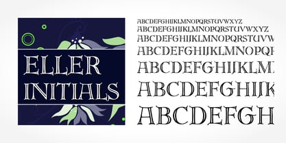 Eller Initials is a typeface published by SoftMaker.
 - Modesto Initials by Parkinson,
$20.00 Modesto Initials had existed as a single font for several years. I recently added a fill font to put color in the Inlines. The Inline font still works by itself. The Fill font works alone too, as an ultra Modesto on steroids. They work best together. Modesto is a loose-knit family based on a signpainters lettering style popular in the late-19th and early-20th centuries. It evolved from the lettering I used for the Ringling Bros. and Barnum & Bailey Circus Logo. The Modesto family was not planned. It just happened, a few fonts at a time over about fifteen years. In 2014 seven new Italic fonts and two Chromatic families were added. There is a downloadable MODESTO USER MANUAL PDF in the Gallery section for this family.
 - Anita Honey by Rezastudio,
$9.00 Anita Honey is an adorable quirky handwritten font. It will add an incredibly joyful touch to your designs. Fall in love with its playful style and use it to create beautiful stationary art, eye-catching social media posts, and much more!
 - 1512 Initials by GLC,
$20.00 This set of initial decorated letters is an entirely original creation, drawn inspired by Italian renaissance patterns. It contains two roman alphabets : one drawn in white on black background and the other in black on white. We have included a few fleurons and decorative elements. It can be used as variously as web-site titles, posters and flyers design, publishing texts looking like ancient ones, or greeting cards, all various sorts of presentations, as a very decorative, elegant and luxurious additional font... This font supports strong enlargements remaining very smart and fine. It's prefered height is about one inch equivalent to about four lines of characters. This font may be used with all blackletter fonts, but works especially well with 1543 Humane Jenson, 1557 Italique and 1742 Civilite, without any anachronism.
 - Fleurons Initials by Wiescher Design,
$39.50Fleurons Initials is a set of elegantly decorated blocked initials, reminiscent of old Jazz and Circus Posters. I have added one set of flat underlays and one of blocked underlays, so you can easily add a little colorful touch here and there. Easy because those underlays have the the same spacing! Have fun. Your elegant designer, Gert Wiescher - Innsbruck Initials by SoftMaker,
$10.99 Blackletter is the classic “German” printing type. Starting in the 16th century and lasting well into the 20th century, most works in Germany were printed using blackletter types. Today, blackletter fonts are mainly used decoratively. If you want to communicate a feeling of old-world quality or nostalgia, blackletter fonts are the preferred choice – use them on signs, in brochures or on invitation cards. “Innsbruck Initials” is a classic blackletter font of its epoch which inspires you to create vintage-looking designs with ease.
 - Schneidler Initials by GroupType,
$29.00 Schneidler-Initialen (initials) was designed in 1936-37 by Friedrich Hermann Ernst Schneidler (1882-1956). Originally known as Schneidler Mediaeval, the font was revived and released by GroupType in 1994.
 - Clockwork Initials by Scriptorium,
$12.00 - Curwen Initials by ARTypes,
$30.00Transcribed from letters designed by Jan van Krimpen for The Curwen Press at Plaistow, London, in 1925; printed on pages 49, 51 & 53 of A Specimen Book of Types and Ornaments in Use at The Curwen Press (1928). A setting at 120 pt is recommended to match the size of the original. - Carved Initials by Gerald Gallo,
$20.00 Carved Initials, under the character set, are initials that appear to have the background carved away so the initial appears protruding. Under the shift + character set the initials appear to be carved into the background so the initial appears to be recessed. There are two sets of initials, protruding and recessed, a through z and 0 through 9 for a total of 72 characters.
 - Renaissance Initial by Kaer,
$19.00 This is a new classic Renaissance Initial font. Renaissance Initial font is perfect for premium design labels, medieval print, antique posters, etc. The fonts are presented in usual and color versions. Only uppercase letters from A to Z and numbers set (36 characters)
 - Jugendstil Initials by HiH,
$16.00 Jugendstil Initials were designed by Heinrich Vogeler around 1905, based on the German blackletter tradition. A similar set of initials by Vogeler, but based on roman letters was released by Rudhardsche Geisserei of Offenbach at about this time. I believe the originals were woodcuts. The backgrounds to the letterforms may be seen as examples of Heimatkunst, an art movement within Germany that drew deliberate inspiration from the rural countryside. Like the Arts and Crafts Movement in England a little earlier, Heimatkunst may be seen, in part, as a romantic rejection of urban industrialization, while at the same time representing a back-to-roots nationalism. Like any river, it was fed by many streams. Jugendstil Initials is an experiment with which I am most pleased. It is far and away the most complex font HiH has produced and I was uncertain whether or not it could be done successfully. To oversimplify, a font is produced by creating outlines of each character, using points along the outline to define the contour. A simple sans-serif letter A with crossbar can be created using as few as 10 points. We decided to make a comparison of the number of points we used to define the uppercase A in various fonts. Cori, Gaiety Girl and Page No 508 all use 12 points. Patent Reclame uses 39 and Publicity Headline uses 43. All the rest of the A’s, except the decorative initials, fall somewhere in between. The initial letters run from 48 points for Schnorr Initials to 255 for Morris Initials Two, with 150 being about average. Then there is a jump to 418 points for Morris Initials One and, finally, to 1626 points for Jugendstil Initials. And this was only after we selectively simplified the designs so our font creation software (Fontographer) could render them. The average was 1678, not including X and Y. There was no X and Y in the original design and we have provided simple stand-ins to fill out the alphabet, without trying to imitate the style of the orginal design. We did a lot of looking to find a compatible lower case. We decided that Morris Gothic from the same period was the best match in color, design and historical context. We felt so strongly about the choice that we decided to produce our Morris Gothic font for the purpose of providing a lower case for Jugendstil Initials. The long s, as well as the ligatures ch and ck are provided. at 181, 123 (leftbrace) and 125 (rightbrace) respectively. This font was a lot of work, but I think it was worth it. I hope you agree.
 - Malutzki Initials by Spirit & Bones,
$15.00 In 1980, Peter Malutzki, Heidi Hübner-Prochotta and Manfred Prochotta founded the FlugBlatt-Presse and began producing broadsheets, which they called FlugBlätter and which also gave their press its name. They were mostly woodcuts or linocuts, combined with hand-set typography. When they finished the series in 1984 there were 67 FlugBlätter. During a Frankfurt Book Fair in the 1980s the collector Rob Saunders acquired FlugBlatt No. 37 along with other prints. Later they became part Letterform Archive, a non-profit museum and special collection library in San Francisco, which Rob Saunders founded in 2014. In 2021, Letterform Archive posted the FlugBlatt No. 37 on social media, where type designer Lena Schmidt saw it, immediately fell in love with it, and developed the plan to bring it into the digital world. After contacting Peter Malutzki – who is still working as a book artist today – and in close consultation with him, Schmidt translated the letterforms into a font series, Malutzki Initials. The three fonts can be used for black (single-color) text using the Regular style, or for multicolor text by applying different colors to the Letter Layer and Figure Layer styles.
 - Vanny Onesha by Youngtype,
$18.00 Vanny Onesha script is a hand brush font made with brushes and ink. This typeface is ideal for use in thick watercolour designs or handwriting styles, such as blog titles, posters, wedding elements, t-shirts, clothing, book covers, business cards, greeting cards, branding, merchandise etc. Contains full set: - Uppercase - Lowercase - alternative - Ligatures - Punctuation - number - multilingual support. How to access all alternative characters, using Windows Character Map with Photoshop: - https://www.youtube.com/watch?v=Go9vacoYmBw How to access all alternative characters using Adobe Illustrator: - https://www.youtube.com/watch?v=XzwjMkbB-wQ Thank you!
 - Cloister Initials by GroupType,
$29.00 Cloister Initials™ have become FontHaus's most popular decorative initials font since we began selling it in 1993. First released in 1919 for ATF, Goudy's "Cloister Initials", sometimes called Goudy Initials is recognized as "one of the most beautifully designed set of initials ever made". We agree. Our digital revival is historically accurate because it was referenced from the actual ATF 144-point brass matrices acquired at the now legendary and final ATF auction in Elizabeth, New Jersey in 1993. The exquisite design of each character inspire it's use. Perfect for holiday invitations, elegant note pads, as drop caps or in period design. We've even sold these initials for use as company logos.
 - Viking Initials by Wiescher Design,
$19.50 Viking Initials are pure brute-force blackletter initials of the time just before the Nazis started to rule, somehow these initials are typical for that period. I made one alphabeth-set with rough edges on the uppercase keys and a second set with sharp edges on the lowercase keys. For you to choose. Your historical designer Gert Wiescher


