10,000 search results
(0.026 seconds)
- Futurex Arthur - Unknown license

- Futurex Arthur - Unknown license

- Domestic Manners - Unknown license

- Sans Serif Shaded - Unknown license

- Linotype Venezia by Linotype,
$29.99Linotype Venezia Initiale is part of the Take Type Library, selected from the contestants of Linotype’s International Digital Type Design Contests of 1994 and 1997. Designed by German artist Robert Kolben, the font is based on the classic forms of Roman writing in the 1st and 2nd centuries found chiseled on countless buildings and monuments. Linotype Venezia Initiale is a timeless, elegant font particularly well-suited to headlines or as initials in combination with other fonts, working especiall well with sans serif alphabets. - Kahlo Rounded by Latinotype,
$25.00 Kahlo Rounded is a new version that plays hipster style with a Latin flavor. It was inspired by the strong influence of Mexican decorative elements as you can see in the set of ornaments and patterns. Kahlo Rounded has four weights and italics, initial capital letters, some alternate characters and ending. It works well for magazine headlines, posters, logos, cosmetics packaging, advertising etc. Salud! Languages include: Basic Latin, Western European, Euro, Catalan, Baltic, Turkish, Central European, Romanian and Pan Africa Latin.
 - Sonetto by TupiType,
$33.00 Sonetto is a typeface designed for the making of poetry books comprised of two styles: Regular, for setting prose, and Italic for verses. It is the result of a typographical exploration carried out at the UBA Type Design Master’s which sought to relate italics and cursive italics. Initial drawings were based on Griffo’s italics and early 16th century italian manuscripts that showcased connections between letters. Sonetto is in fact a historical revival, not of a particular style, but rather of a broader concept.
 - LTC Globe Gothic by Lanston Type Co.,
$24.95 This series of faces was designed initially by Morris Fuller Benton, circa 1900. The design is a refinement of Taylor Gothic from 1897. It features a sans serif thick and thin design with angular stems. Pre-dating art deco, this design feels quaint, yet it still has a touch of modernism. Frederic Goudy designed a bold version of Globe Gothic in 1905 for ATF. The Bold and Bold Italic digital versions have been added to the LTC library in early 2007.
 - Quanika by Artisan Studio,
$17.00 Quanika a work that is purely a result of handwriting, has a natural characteristic. this is perfect for invitations, signatures, blogs, social media, business cards, product brands. Quanikahas Stylistic standard, Stylistic Initial, Stylistic Teminal and ligatures. and includes uppercase and lowercase letters, numbers and punctuation marks. FILE INCLUDE Quanikay (OpenType,PUA) Multilingual Support OpenType smart programs such as Adobe Photo Shop, Adobe Illustrator, Adobe Indesign, Corel Draw and Microsoft Office. special greetings for all, all of us all smoothly in running the routinent
 - Shedaytia by Josstype,
$12.00 Shedaytia is a handwritten typeface with classic root. a beautiful formal script and elegant touch. It works perfect in the world of weddings, logos, greeting cards, branding, print ads, quotes, signage, magazines etc. Shedaytia features 312+ glyphs and 147 alternate characters, including initial and terminal letters, alternates, swashes, ligatures and multiple language support. To enable the OpenType Stylistic alternates, you need a program that supports OpenType features such as Adobe Illustrator CS, Adobe Indesign & CorelDraw X6-X7, Microsoft Word 2010 or later versions.
 - OC Revolt by OtherwhereCollective,
$99.00 -OC Revolt is a variable display font made for the protest graphics of the NYC based T*#@p Brexit era Non-Complicit project who initially made guerrilla type with masking tape applied directly in situ or to silk screens. An uppercase only font there are alternate versions of each character on the lowercase keyboard. Double letter ligatures are used to prevent direct mechanical repetition of letters in the static styles and the Shift axis can be used to make each letter variably unique.
 - Jazzy Croquette by Art Grootfontein,
$19.00 Jazzy Croquette is a friendly handwritten all-caps family made for jazzing up your designs! It was initially designed by illustrator Art Grootfontein for lettering his speech bubbles. Some cool Opentype ligatures give its distinctive organic jazzy feel. Jazzy Croquette is a professional tool designed to support Central and Eastern European as well as Western European languages. This font would be honored to be used on comic book, games, press, food products, advertising and all kind of stationery! Caps only Fonts.
 - Denita Script by Solidtype,
$16.00 Denita Script is highly legible calligraphy font, a simply beautiful, classy and elegant typeface. Can be used for various purposes.such as logos, wedding invitation, t-shirt, letterhead, signage, news, posters, badges etc. Denita Script features Opentype with alternate characters, including initial and terminal letters, alternates, ligatures and multiple language support. To enable the OpenType Stylistic alternates, you need a program that supports OpenType features such as Adobe Illustrator CS, Adobe Indesign & CorelDraw X6-X7, Microsoft Word 2010 or later versions. Thank you.
 - Modny by Tour De Force,
$25.00 Modny is a simple and elegant sans serif family with high contrast strokes. By its characteristics, Modny is gentle, smooth and geometric at the same time, neutral to blend into every project. Comes in five weights with tall x-height, file stylistic sets, bunch of ligatures, initials and terminal forms, containing more than 600 glyphs for all Latin languages support. Special addition is an Inline version made out from Bold weight, to increase the effect of decorative elements in each letter.
 - Kidplay by ZetDesign,
$6.00 Hey Guys! My new Font Kidplay is a funny and playful sans serif, perfect for child magazine cover, comic creations, branding projects, headlines, posters and packaging! Kidplay font has three styles allow unique and versatile design options! Furthermore it is a unicase font, so you can also play with uppercase and lowercase initials. But that's not all! it is equipped with multilingual accents, so it can be used in several Latin languages. I hope you enjoy my creation. Thank you!
 - Kids Script by Tipo Pèpel,
$32.00 Kids Script is based on the calligraphic models used in Spanish’s primary school in the 40’s. The result is a fresh and naive typography perfect for use in children’s oriented publishing. Taking advantage of Opentype functions, it’s possible to get different styles of writing, adding initials, ligatures, contextual characters and alternatives, plus a complete set of uppercase letters. The font contains three different weights for solving the most common issues, working with perfect legibility and readability in all sizes.
 - Interstellar by Loshaj Foundry,
$10.00 Interstellar is inspired by science fiction movies and writings. My initial idea for the font was to be used for signage and user interfaces that would appear on spaceships and bases. However, Interstellar is very flexible and can be used in many creative ways. For example, it is perfectly suited for graphic design applications ranging from editorial, corporate, web, interaction, and product design. The font contains 400+ glyphs which includes uppercase letters, numbers, symbols, accented characters, and multiple language support. Check it out.
 - Balder by Linotype,
$29.99Linotype Balder is a part of the Take Type Library, winners of Linotype’s International Digital Type Design Contest. Designed by Lutz Baar, Balder is reminiscent of advertisement and poster typefaces of the 1950s and 1960s. It is composed of only capital letters, making it perfect for initials and headlines. Balder looks as though it were written with a broad tipped pen. Its light serifs at the tops of the characters and the slant of some of the strokes give Balder a dynamic feel. - Zathira by Gian Studio,
$12.00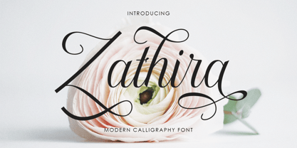 Zathira is a modern calligraphy font. This font is made for those of you who need a touch of elegance and a reflection of modern style in their designs. You can use Zathira for various purposes such as logos, brochures, business cards, wedding invitations, packaging, letterhead, labels, news, posters, and more. Zathira is built with OpenType features and includes initial and final swash, alternative swash characters for most lowercase letters, numbers, punctuation, alternatives, ligatures and also supports some western languages.
 - Grafilone by Linotype,
$29.99Linotype Grafilone is part of the Take Type Library, which features winners of Linotype’s International Digital Type Design Contest. In creating his font, Bo Berndal combined elements of the constructed and Art Deco styles. Slender and angular, Grafilone is mechanically exact and coolly resesrved. A distinguishing characteristic is the combination of angular and sloping strokes, which give the font a dynamic feel. Grafilone is particular good as a headline font and for initials when combined with constructed sans serif fonts. - Adriane Swash by Typefolio,
$59.00 The Swash version of Adriane Text features the best characteristics of this lineage, without losing the strong personality and elegant design featuring in your text styles, Adriane Swash brings a fancy look to this classic style. The family comes with a complete character set in Uppercase, Lowercase and Small Caps, and the Swash option can be activated through the OpenType features panel, including glyphs initial, intermediate and final, plus a wide range of stylistic ligatures, alternate glyphs, ornaments and languages.
 - Werdet Script by Tipo Pèpel,
$26.00 Werdet Script is a calligraphic typeface, inspired by the samples of the calligraphy “Batarde” created the first half of the 19th century by the French calligrapher Père Werdet. It has expanded on the original samples, creating a complete typographic family with five weights. The typeface explores the power of Opentype to simulate a manual writing. Thanks to the "contextual alternates” function, ligatures, alternate figures, initials and final forms, are automatically configured to offer an aspect with human decisions to mechanically written texts.
 - VVDS Praliner by Vintage Voyage Design Supply,
$15.00 PRALINER – New elegant font family with a lot of stylish alternates and ligatures. Really good looked for branding projects, packaging, headers, posters and signs. Playful and Stylish. Uppercase and lowercase initials. You can use it as for modern style typography and also it looks good in a vintage style projects. Especially when you combine strokes with shadow. A lot of alternates and ligatures give you a many unique variations for the same words. Comes with three widths with stroke styles.
 - Valentia by Eurotypo,
$59.00 Valentia is an elegant font, casual and readable, this new script typeface is based on Copperplate style. Valentia has been drawn with spontaneous strokes and slightly contrasting thicknesses.The capital letters are full of expressiveness, with very dynamic "ductus" and linked ends, which allow to decorating with subtle and finishing touch. Contains small caps and titling. Decoration variables with its own terminal forms and initial forms. You can use Standard and discretionary ligatures, swashes, stylistic and contextual alternate, old style figures, CE languages andornaments.
 - MFC Klaver Monogram by Monogram Fonts Co.,
$299.00 The source of inspiration for Klaver Monogram is a delightfully elegant initial letterset adorned with clover tipped flourishes from a vintage embroidery publication. Originally intended to adorn handkerchiefs and other linens, this digital revival opens it up to a whole new realm of possibilities. This is one of many monogram designs from the late 1800's to early 1900’s that is loaded with panache. Download and view the MFC Klaver Monogram Guidebook if you would like to learn a little more.
 - Goudy Lombardy by CastleType,
$19.00 Based on drawings of Medieval versals (capitals used at beginning of verses in manuscripts) by Frederic W. Goudy. Works beautifully as initials with Goudy Text Oldstyle. Uppercase only, no numerals or punctuation; several letters have alternates. Framed, inversed caps are also included. This version of Lombardy Capitals is purposely less regular and clean-cut than some available to maintain a more hand-drawn look similar to the irregularities that would be found in a Medieval manuscript. The alternates help contribute to that look.
 - Nawin Arabic by Letterjuice,
$43.00 Nawin is an informal Arabic typeface inspired by handwriting. The idea behind this design is to create a type family attractive and ownable for children but at the same time a design that keeps excellent letter recognition for reading. Handwriting has been a great source of inspiration in this particular typeface. By emulating the movements of the pen, we have obtained letter shapes that express spontaneity. A bright group of letters create a lively and beautiful paragraph of text. To get closer to handwriting and the variety of letter shapes that we draw while writing, this typeface offers a large number of alternative characters, which differ slightly from the default ones. Because we have programed the «Contextual Alternate» feature in the fonts, these alternate characters appear automatically as you set a text on your computer. The proportions and letter shapes are flexible, escaping from tradition to increase expressivity and personality in the design. For instance, variability on vertical proportions between letters Alef and initial Lam, create movement in text and avoid the cold mechanical feel of repetition. Nawin is quirky and elegant at the same time. Letter recognition is relevant when reading continuous text. For this reason, we have added another contextual alternate feature with alternate characters that help to avoid confusion when letters with similar or the same shape repeat inside one word. For instance, this is the case of medial «beh and Yeh» repeated three times continuously in the same word. The alternate characters change in shape and length, facilitating distinction to the reader. Since this typeface is inspired by handwriting and the free movement of the hand while writing, we considered ligatures a good asset for this design. The typeface has a wide range of ligatures that enhance movement and fluidity in text making look text alive.
 - Besley Clarendon by HiH,
$12.00 Besley Clarendon ML is our version of the Clarendon registered by Robert Besley and the Fann Street Foundry in 1845. Besley Clarendon ML represents a significant change from the slab-serif Antiques & Egyptians that had become so popular in the prior three decades. Like Caslon’s Ionic of 1844, it brackets the serifs and strongly differentiates between the thick and thin strokes. Besley Clarendon is also what today is considered a condensed face, as a comparison to the various contemporary Clarendons will show. Robert Besley’s Clarendon was so popular that many foundries quickly copied it, a fact that caused him to complain vigorously. The reason it was so widely copied is simple ó it was extremely useful. It provided the attention-getting boldness to highlight a word or phrase, yet at the same time was compact and easier to read than the fat faces and antiques of the period. It wasn't until sixty years later that the concept of a typeface family of different weights was developed with DeVinne and Cheltenham. Until then, Clarendon served as everyone’s all-purpose bold face. It can be used for ads, flyers, headers or even short text. Don't leave home without it. Besley Clarendon ML includes the following features: 1. Glyphs for the 1250 Central Europe, the 1252 Turkish and the 1257 Baltic Code Pages. Added glyphs to complete standard 1252 Western Europe Code Page. Special glyphs relocated and assigned Unicode codepoints, some in Private Use area. Total of 353 glyphs. 158 kerning pairs. 2. OpenType GSUB layout features: pnum, salt, liga, dlig, hist and ornm. 3. Inclusion of tabular (std) and proportional (opt) numbers. 4. Kreska-accented letters.
 - Cotton by Typodermic,
$11.95 Cotton is the perfect addition to your graphic design arsenal. With a vintage t-shirt texture, this casual typeface captures the spirit of the twentieth century. Its unique and informal style will make your message stand out from the crowd. And if you’re tired of plain and repetitive characters, Cotton has got you covered. Its OpenType-savvy apps feature letter pair ligatures that break up the monotony and add a touch of style to your designs. So why settle for boring fonts when you can have Cotton? Let this retro-inspired typeface take your designs to the next level and create a look that’s uniquely you. Most Latin-based European writing systems are supported, including the following languages. Afaan Oromo, Afar, Afrikaans, Albanian, Alsatian, Aromanian, Aymara, Bashkir (Latin), Basque, Belarusian (Latin), Bemba, Bikol, Bosnian, Breton, Cape Verdean, Creole, Catalan, Cebuano, Chamorro, Chavacano, Chichewa, Crimean Tatar (Latin), Croatian, Czech, Danish, Dawan, Dholuo, Dutch, English, Estonian, Faroese, Fijian, Filipino, Finnish, French, Frisian, Friulian, Gagauz (Latin), Galician, Ganda, Genoese, German, Greenlandic, Guadeloupean Creole, Haitian Creole, Hawaiian, Hiligaynon, Hungarian, Icelandic, Ilocano, Indonesian, Irish, Italian, Jamaican, Kaqchikel, Karakalpak (Latin), Kashubian, Kikongo, Kinyarwanda, Kirundi, Kurdish (Latin), Latvian, Lithuanian, Lombard, Low Saxon, Luxembourgish, Maasai, Makhuwa, Malay, Maltese, Māori, Moldovan, Montenegrin, Ndebele, Neapolitan, Norwegian, Novial, Occitan, Ossetian (Latin), Papiamento, Piedmontese, Polish, Portuguese, Quechua, Rarotongan, Romanian, Romansh, Sami, Sango, Saramaccan, Sardinian, Scottish Gaelic, Serbian (Latin), Shona, Sicilian, Silesian, Slovak, Slovenian, Somali, Sorbian, Sotho, Spanish, Swahili, Swazi, Swedish, Tagalog, Tahitian, Tetum, Tongan, Tshiluba, Tsonga, Tswana, Tumbuka, Turkish, Turkmen (Latin), Tuvaluan, Uzbek (Latin), Venetian, Vepsian, Võro, Walloon, Waray-Waray, Wayuu, Welsh, Wolof, Xhosa, Yapese, Zapotec Zulu and Zuni.
 - PMN Caecilia Sans by Monotype,
$50.99 Few projects are outside the range of PMN Caecilia® Sans. Drawn specifically for on-screen imaging, the family benefits from a large suite of weights, each with several stylistic variations. This is a design ideally suited to building digital interfaces, complex websites, apps, games, kiosks, HTML ads and large-scale brand identities. “My goal was to create a, friendly, versatile, ageless, yet discerning typeface family that will serve the needs of many users,” says Peter Matthias Noordzij. the typeface’s designer. “It is not intended to be eye-catching, but generous: enabling numerous visual and typographical expressions.” The use of Noordzij’s earlier design, PMN Caecilia, in Amazon’s Kindle® wireless reading devices, gave him the opportunity to study the behavior of the slab serif typeface in an on-screen environment. Although based on his earlier design, Noordzij incorporated fundamental changes to optimize PMN Caecilia® Sans’ digital performance. While PMN Caecilia has proven to be a steadfast serif typeface in print and on screen, the addition of a sans serif counterpart gives designers more flexibility when creating complex hierarchies. The combination of serif and sans serif makes the PMN Caecilia family a good choice for everything from print editorial projects to complicated web sites. A broad range of typefaces pair well with PMN Caecilia Sans. Humanist serif typefaces, such as Agmena™, Dante®, and Frutiger® Serif, set up dynamic typographic harmony, while designs like ITC New Veljovic™ Masqualero™ and Perpetua®, will create a striking counterpoint. And, of course, PMN Caecilia is a natural design partner – as are other slab serif typefaces, like the Aptifer™ Slab, Joanna® Nova and Soho® families.
 - P22 Underground Pro by P22 Type Foundry,
$49.95 The P22 Underground Pro font family started in 1997 as the first and only officially licensed revival of Edward Johnston’s London Underground railway lettering. The original design by Richard Kegler sought to be as true to the original as possible. In 2007 P22 revised and expanded the fonts into a massive character set with additional weights, language support, and stylistic alternates. Endeavoring to make this font family a more versatile and useful tool for a designer, P22 sought to add true italics to this stalwart type design. The only other existing italic interpretation of Johnston’s Underground type was executed by the inimitable Dave Farey and Richard Dawson at Housestyle Graphics. We asked Dave Farey to imagine an Underground italic that would pair well with the P22 Underground, done as if Edward Johnston himself might approach the design challenge. This new italic version was then expanded for all six of the existing P22 Underground weights and characters sets by James Todd of JTD Type. Final mastering of the P22 Underground Pro roman and italic with a streamlined yet still expansive language coverage by P22 partner Patrick Griffin of Canada Type. These refinements remain true to the original Johnston design while employing contemporary typographic finesse to create six weights with optional alternates to increase legibility. The new P22 Underground Pro family is now a rock-solid and very versatile humanist sans serif font family that should be a cornerstone of any designer’s typographic toolkit. After five years in development, the new P22 Underground Pro is the most iconic and useful font family ever presented by P22 Type Foundry.
 - Neon Street by Ditatype,
$29.00 Neon Street is a captivating display font that takes inspiration from the dazzling glow of neon lights found on vibrant city streets. With its bold uppercase letterforms and neon-style inline elements, this typeface exudes energy and creates a visually stunning experience. Each letter is meticulously crafted with neon-inspired strokes that run through the center, adding a dynamic and luminous effect. This inline style brings a sense of urban excitement and nostalgia, evoking the vibrant atmosphere of neon-lit cityscapes. Inspired by the enchanting allure of neon signs, Neon Street infuses a sense of liveliness and modernity into each character. The font captures the captivating glow of neon lights, casting a radiant and vibrant hue that is both eye-catching and mesmerizing. This neon style adds a touch of urban energy, making the font truly stand out with its electrifying charm. The uppercase letter forms of Neon Street are bold and assertive, commanding attention with their distinctive design. Enjoy the various features available in this font. Features: Alternates Multilingual Supports PUA Encoded Numerals and Punctuations Neon Street is perfect for headlines, signage, logos, and any design that aims to make a bold statement with a touch of neon-inspired flair. This font will also inject your project with a vibrant and captivating element, whether you're creating posters, branding materials, digital artwork, or anything in between. Find out more ways to use this font by taking a look at the font preview. Thanks for purchasing our fonts. Hopefully, you have a great time using our font. Feel free to contact us anytime for further information or when you have trouble with the font. Thanks a lot and happy designing.
 - Crystal Sky by Set Sail Studios,
$16.00 Add a little sparkle to your designs with Crystal Sky! A clean & modern signature-style font set, perfect for creating authentic hand-lettered text quickly & easily. With exaggerated strokes and an extra bouncy baseline, Crystal Sky has an unmistakable charm; perfect for logos, wedding stationery, cards, gift designs, product packaging and handwritten quotes. ★ New Update • Crystal Sky Hearts! Add some passion to your Crystal Sky text with Crystal Sky Hearts, a new font included in your download! These bonus designs add a beautiful, flowing decorative heart at the beginning, middle & end of your Crystal Sky Script text at the click of a button. Crystal Sky is packed full of great features to give you plenty of customisation options; Crystal Sky Alt • This font includes an entire alternate lowercase glyph set. If you wanted to avoid letters looking the same each time to recreate a custom-made style, or try a different word shape, simply switch to this font for an additional layout option. Crystal Sky Caps • Have you ever noticed that script fonts tend to be a bit tricky when it comes to typing in all-caps? 'Crystal Sky Caps' includes a totally separate set of A-Z letters - designed to work in harmony with each other during those moments when you need to hit your caps-lock button and go a bit wild! ★ New! Crystal Sky Hearts • Simply install this as its own separate font, and type any a-z or A-I character in this font to generate 1 of 35 heart decorations, designed to pair beautifully with the Crystal Sky Script font. (Please see the image above for a use guide).
 - Ramolina Script by Mega Type,
$14.00 Ramolina Script is an elegant calligraphy script font that comes with lovely alternates character. a mixture of from copperplate calligraphy with handlettering style. Designed to convey style elegance. Ramolina is attractive like a smooth, elegant, clean, feminine, sensual, glamorous, simple and highly legible typeface. Its classic style is perfect to be applied in any type of formal pieces such invitations, labels, certificate, menus, Logos, fashion, make up, stationery, letterpress, romantic novels, magazines, books, greeting / wedding cards, packaging, badges etc. Ramolina Script features 400+ glyphs and 200+ alternative characters. including multiple language support. With OpenType features with stylistic alternates, ligatures and swash characters, that allows you to mix and match pairs of letters to fit your design. To enable the OpenType Stylistic alternates, you need a program that supports OpenType features such as Adobe Illustrator CS, Adobe Indesign & CorelDraw X6-X7, Microsoft Word 2010 or later versions. (Windows), Font Book (Mac) or a software program such as PopChar (for Windows and Mac). How to access all alternative characters using Adobe Illustrator: https://www.youtube.com/watch?v=XzwjMkbB-wQ How to use stylistic sets fonts in Microsoft Word 2010 or later versions: https://www.youtube.com/watch?v=NVJlZQ3EZU0 There are additional ways to access alternates / swashes, using the Character Map (Windows), Nexus Font (Windows) Font Book (Mac) or a software program such as PopChar (for Windows and Mac). How to access all the alternative characters, using the Windows Character Map with Photoshop: https://www.youtube.com/watch?v=Go9vacoYmBw If you need help or advice, please contact me by e-mail "megatype04@gmail.com" Thank you for your purchase & Happy Designing!
 - Ringo by typoland,
$9.00 Whassup y’all! Me and my bros got this li’l gang together: we is Ringo, and we got da bling, yo! We is da typeface family for ya all! We got some real sweet stuff for ya, some nice characters. We got all ’em OpenType features like fractions and proportional figgers, we even got da cubic root, man! And check out da question mark, man, is real sweet. And the ampersand, yeah! I luv ’em ampersands. Now my brothers over here got some light action for ya, and they got some real bold action for ya. We got some nice foxy curves goin’ on, some nice tension, and some nice relaxation. My bro Light over here is kind of like the subtle guy, ya know. He’s in for the female fans, ya know. Heh! Hell, yeah! And man, we speak like 84 languages: we speak the German, and the French, and the Spanish, and we speak the Polish, and the Czech, and the Hungarian, and we even speak Shambala and Swahili and Rundi, and we got some Esperanto thing as well for ya. And check out my bro Black right over here, he’s like the action superhero, man! He’s got impact, man! Yeah yeah, but you know, my bros Regular and Bold are the real deal. Them is like da word of da street, man! Like da word of you, and you. And we got a message for y’all: life is hard, life is real, but you should work your mojo, be smooth, be nice, chill. We got all them kerning pairs, and all them weights, and we got ’em alternate letters. So check us out, yo!
 - Gotti by Resistenza,
$39.00 Introducing Gotti. Where Timeless Precision Meets Seventies Flair We are thrilled to unveil our latest creation, Gotti font family, born and meticulously crafted during an inspiring journey to Goteborg. This typeface seamlessly fuses the Bauhaus essence with the spirited vibes of the seventies, resulting in a font that's not just a visual treat but a design experience. Gotti draws its creative fuel from the geometric elegance of the Bauhaus movement, prioritising functional simplicity and razor-sharp lines. However, its design journey doesn't end there. Imbued with the unmistakable energy of the Seventies, Gotti emerges as a font family that encapsulates both nostalgic charm and contemporary boldness. At its core, Gotti boasts a geometric skeleton that has been intricately designed to redefine precision. Ranging from light to black, the weight variations offer a broad spectrum of expressive possibilities. Gotti is perfect for display use, advertising, and branding, it transforms your creative vision into a visual masterpiece. Stand out with confidence, whether it's a captivating logo, a compelling headline, or an unforgettable advertisement. Elevate your brand identity with Gotti. It brings strategic branding to life, communicating sophistication and modernity. Your advertising materials become memorable works of art, leaving a lasting impression on your audience. Curious about the magic Gotti can bring to your designs? Our showcase reveals real-world applications, demonstrating its adaptability and aesthetic appeal. See for yourself how this font family turns ordinary designs into extraordinary visual experiences. Follow us on social media for updates, inspiration, and a glimpse behind the scenes. Have questions or just want to share your thoughts? We're here for you!
 - Deadfall by Mofr24,
$11.00 Discover Deadfall, the ultimate horror display font that will send shivers down your spine! What sets Deadfall apart is its unique blend of fear-inducing aesthetics and multilingual capabilities. This Monospace typeface exudes a captivating dripped and splash style, adding an extra layer of terror to your designs. Notably, Deadfall supports the Cyrillic alphabet, making it an ideal choice for a global audience. Deadfall offers both regular and italic variations, granting you even more creative possibilities. Whether you're designing posters, crafting marketing materials, conjuring chilling movie titles, creating Death metal logotypes, or working on Halloween-themed crafts, Deadfall will infuse your projects with a bone-chilling atmosphere. To ensure versatility, consider pairing Deadfall with related font families or other typefaces that complement its macabre charm. Its functional aspects include an extensive character set and special features, making it suitable for a wide range of applications. The design concept behind Deadfall revolves around the idea of capturing the essence of horror. The font's distinctive dripped and splash style adds a sense of chaos and unease to any composition, immersing the viewer in a world of terror. The inclusion of the Cyrillic alphabet reflects our commitment to providing a font that caters to diverse audiences, bringing fear to every corner of the globe. We created Deadfall to meet the demand for a truly spine-tingling font that conveys a sense of horror and foreboding. Whether you're a graphic designer looking to evoke fear or a Halloween enthusiast seeking to amplify the spooky atmosphere, Deadfall is here to unleash terror in your designs. Get ready to embrace the darkness with Deadfall - the ultimate font for all things haunting and macabre!
 - AS Palmer by Andrey Sharonov,
$24.00 AS Palmer Script & Sans This pair was inspired by the spirit of the past, when manual labor was common, and technology was just beginning to develop. It was crafted by hand specially for traditional typography lovers and anyone who want to add natural handmade feeling in brand identity. It comes with Regular and Aged versions that expands its posibilities in use. Opentype features Script font has 151 stylistic alternates and 3 variations of end-swashes with about 10 lengths of each style. Stylistic Alternates. The easiest way to get alternate character is to add number for example 2, 3 or 4 after any Uppercase. Each of them has from two up to five alternates. This combination works with activated Standard Ligatures option in Opentype panel (Photoshop / Illustrator). End-swashes. AS Palmer Script has 3 variants of end-swashes and about 10 lengths of each style. It works like Stylistic Alternates with activated Standard Ligatures in Opentype panel. Just add special combination at the end of the word, to get needed swash element and its length. Underscore, double underscore or slash is swash style. Number is length. For example: _3, __5, /6. Just try, it's easy. AS Palmer Sans - different Double letters. This feature work automatically with activated Contextual Alternates in Opentype panel. Note, that this features are not available in Miscrosof Word. Palmer is very good looking in logo, labels, t-shirt prints, product packaging, invitations, advertising and others. I've designed some examples, so you can see how it can be used. Multilingual support (Western European characters). English, Danish, Dutch, Estonian, Faroese, Filipino, Finnish, French, German, Hungarian, Icelandic, Irish, Italian, Norwegian, Polish, Portuguese, Spanish, Swedish, Turkish.
 - Bubble Brown by Alit Design,
$20.00 Introducing Bubble Brown, an exciting and playful bubble display font that will add a touch of whimsy to your designs. This font features a unique alternate ligature style that combines bubbles and letters, creating a fun and engaging visual experience. With its lively appearance, Bubble Brown is perfect for various design projects, especially those aimed at children, toys, games, or anything that requires a cheerful and vibrant aesthetic. This font is carefully crafted with 710 characters, ensuring versatility and multilingual support. Whether you're designing in English, French, Spanish, German, or any other language, Bubble Brown has got you covered. The font includes special characters, punctuation marks, numerals, and a wide range of glyphs, allowing you to express your creativity without limitations. One of the standout features of Bubble Brown is its support for PUA Unicode. This means that you can access the font's extensive character set through private use area codes, giving you even more freedom to customize and personalize your designs. Let your imagination run wild as you combine different characters and ligatures to create captivating typographic compositions. Bubble Brown will bring joy and excitement to any project it graces. Whether you're designing posters, logos, packaging, websites, or any other creative endeavor, this bubble display font is bound to make a lasting impression. Its alternate ligature style adds a touch of uniqueness and flair, setting your designs apart from the crowd. So why wait? Get your hands on Bubble Brown today and unlock a world of creativity, fun, and boundless possibilities. Let this font take your designs to new heights and bring smiles to the faces of your audience.
 - Dever by insigne,
$24.00 Dever’s brute, industrial lines are rounded up in this new typeface from Jeremy Dooley. Dever combines plenty of inspirations. It’s the flair of the Wild West melded with a shout out to the sign painters and package lettering artists of the 1800s. Dever’s big, bold, and handy frame moves through all three of the family’s strapping members. First is the sans. No doubts on what this brother’s like. Dever Sans is as straight-forward as you’ll find in this family with its four separate weights and numerous distressed options. The second of the kin’s a bit of half-breed, you might say. Pointed serifs bring a sharpness to this outfit. Rounding out the family is Dever Wedge, a bit of wild rodeo all its own. This poke’s a quick draw with any of its 107 font, and with it’s auto-replacing alternates, no two repeating characters are alike. You’re guaranteed a great show anytime Dever leaves the chute. The route to Dever was long, with many a switchback. The Wedge variant was designed first, shelved, then developed into Plathorn. But I wanted to return to those brutish forms and decided to round out the family with a sans, serif and plenty of other options. Any of the Dever family have an extended character set including Central and Eastern European languages. The strong faces have specially adapted sub-families, too, so they’re bound and determined to have an outstanding impact at whatever size you use ‘em. It’s a hard ride ahead corralling all those words. Be sure and add these able-bodied boys to your posse today!


