10,000 search results (0.014 seconds)
  1. Boldu by Ryzhychenko Olga, $4.00
    Boldu is a simple grotesque font. I created it using simple forms. I love geometry and tried use only one size of lines. Boldu was created being impressed by works of beginning of 20th century - period of strict and geometric forms
  2. Too Many Secrets - Unknown license
  3. Quo Vadis Quasimodo - Personal use only
  4. Blueberry Powder Variative by OKSHUtypeCO, $12.00
    Blueberry Powder Variable - variable font, support multilanguage. brand, trend, cards, etc. Very suitable for greeting cards, branding materials, business cards, quotes, posters, and more!This font are perfect for wedding postcard. Or you can create perfect and unique design of your logo, blog, stationery, marketing, magazines and more 🙂
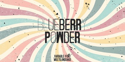
  5. Ste-ani Font - Unknown license
  6. Architype Van Doesburg by The Foundry, $99.00
    Architype Konstrukt is a collection of avant-garde typefaces deriving mainly from the work of artists/designers of the inter-war years, whose ideals have helped to shape the design philosophies of the modernist movement in Europe. Due to their experimental nature character sets may be limited. Architype Van Doesburg derives from the 1919 experimental geometric alphabet by Theo van Doesburg, whose work was heavily influenced by De Stijl theories, specifically rectangularity. The typeface has been constructed on the same 5 x 5 grid, and is limited by his ‘single alphabet’ theory.
  7. Van Wyck JNL by Jeff Levine, $29.00
    Van Wyck JNL was inspired by some old printing found in a catalog.
  8. Van Condensed Hebrew by Vanarchiv, $40.00
    The original version from this display sans-serif typeface was Van Condensed, published during 2004 (Latin, Greek and Cyrillic). Van Condensed Hebrew is the last script update, where the Hebrew characters follow the same design approach from the Latin characters (geometric structure, round corners). The only big difference between the Latin and Hebrew characters is the contrast, Hebrew letterforms contain reverse contrast.
  9. Van Alt JNL by Jeff Levine, $29.00
    Looking similar to a Deco-era classic typeface, Van Alt JNL has slightly different character shapes, but pays due respect to its inspiration by the original...
  10. HWT Van Lanen by Hamilton Wood Type Collection, $24.95
    In 2002 Matthew Carter was commissioned to create a new design to be cut in wood by the then nascent Hamilton Wood Type Museum. This was significant in that this was the one format for which Carter had not yet designed type. The new design emerged as a two-part chromatic type to be cut specifically in wood. Originally called Carter Latin, the font was renamed Van Lanen after one of the Museum's founders. The first cutting and printing of the type took place in late 2009 and although it has been available through the Museum, contemporary wood-type production is expensive and few have acquired this font in wood. The digital version of the pair of Van Lanen fonts is now available. The design recalls Antique Latin wood type, but with a refined sensibility and intentional quirks (like the sideways ampersand). It is a wonderful addition to Carter's oeuvre, and to the ongoing history of wood type.
  11. Van Dijk SH by Scangraphic Digital Type Collection, $26.00
    Since the release of these fonts most typefaces in the Scangraphic Type Collection appear in two versions. One is designed specifically for headline typesetting (SH: Scangraphic Headline Types) and one specifically for text typesetting (SB Scangraphic Bodytypes). The most obvious differentiation can be found in the spacing. That of the Bodytypes is adjusted for readability. That of the Headline Types is decidedly more narrow in order to do justice to the requirements of headline typesetting. The kerning tables, as well, have been individualized for each of these type varieties. In addition to the adjustment of spacing, there are also adjustments in the design. For the Bodytypes, fine spaces were created which prevented the smear effect on acute angles in small typesizes. For a number of Bodytypes, hairlines and serifs were thickened or the whole typeface was adjusted to meet the optical requirements for setting type in small sizes. For the German lower-case diacritical marks, all Headline Types complements contain alternative integrated accents which allow the compact setting of lower-case headlines.
  12. Paris Van Java by Fikryal, $25.00
    Introducing this very simple sans serif font that is Paris Van Java, the font Family. I created this font with the inspiration of simplicity and it is very friendly to look at, with four versions, namely regular, italic, bold, bold italic. Very suitable to be applied in various aspects of design, Also it’s perfect for logo, branding, title, social media posts, advertisements, product packaging, product designs, label, photography, watermark, special event, magazine, web designs, etc. Features : Symbols multilingual support If you have any questions please don’t hesitate to contact me follow my Instagram: @fkryall Thank you
  13. Van Dijk SB by Scangraphic Digital Type Collection, $26.00
    Since the release of these fonts most typefaces in the Scangraphic Type Collection appear in two versions. One is designed specifically for headline typesetting (SH: Scangraphic Headline Types) and one specifically for text typesetting (SB Scangraphic Bodytypes). The most obvious differentiation can be found in the spacing. That of the Bodytypes is adjusted for readability. That of the Headline Types is decidedly more narrow in order to do justice to the requirements of headline typesetting. The kerning tables, as well, have been individualized for each of these type varieties. In addition to the adjustment of spacing, there are also adjustments in the design. For the Bodytypes, fine spaces were created which prevented the smear effect on acute angles in small typesizes. For a number of Bodytypes, hairlines and serifs were thickened or the whole typeface was adjusted to meet the optical requirements for setting type in small sizes. For the German lower-case diacritical marks, all Headline Types complements contain alternative integrated accents which allow the compact setting of lower-case headlines.
  14. Moving Van JNL by Jeff Levine, $29.00
    Moving Van JNL is a classic sign painter's block Roman with angled [instead of rounded] corners and slab serifs. This style of lettering was most popular in the 1920s and 1930s.
  15. Shorelines Script Bold - Personal use only
  16. DIST Inking Bold - Unknown license
  17. D3 Biscuitism Bold - Unknown license
  18. Goulong Bold Outline - Unknown license
  19. Ashby Extra Bold - Unknown license
  20. DDD Pipe Bold - Unknown license
  21. D3 Euronism Bold - Unknown license
  22. Monday Bold (sRB) - Unknown license
  23. Spylord Bold Expanded - Unknown license
  24. Phat Grunge Bold - Unknown license
  25. Pecot Outline Bold - Unknown license
  26. BN Pinky Bold - Unknown license
  27. Walkway Oblique Bold - Unknown license
  28. D3 Honeycombism Bold - Unknown license
  29. Yukon Tech Bold - Unknown license
  30. Samson Bold Oblique - Unknown license
  31. D3 LiteBitMapism Bold - Unknown license
  32. Walkway Condensed Bold - Unknown license
  33. Bagad Bold Tryout - Unknown license
  34. GF Matilda bold - Unknown license
  35. Spylord Bold Italic - Unknown license
  36. Rowling Stone Bold - Unknown license
  37. Walkway UltraCondensed Bold - Unknown license
  38. Walkway Expand Bold - Unknown license
  39. Walkway Bold RevOblique - Unknown license
Looking for more fonts? Check out our New, Sans, Script, Handwriting fonts or Categories
abstract fontscontact usprivacy policyweb font generator
Processing