10,000 search results
(0.214 seconds)
- Caligendings by Prioritype,
$15.00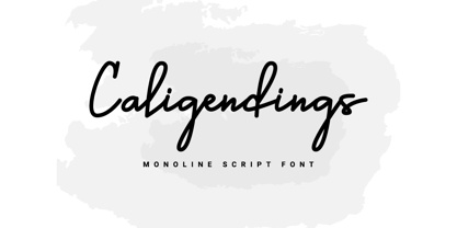 An elegant looking font that's perfect for your project and supports multilingualism. Can be applied to brochures, creative posts, boutiques and salons, women's jewelry, wedding invitations, business cards, photographer watermarks, clothing, and more. For reference, see preview. Features: -Uppercase -Lowercase -Numeral -Punctuation -Ligature -Multilingual
 - Bertolessi by Greater Albion Typefounders,
$12.50 Bertolessi is a Roman face made fun, with a healthy dose of filigree curves thrown into the mix. It's an ideal compliment to our extensive Bertoni family, but can be used anywhere a bit of humour and flair is required. Get with the curls!
 - Kid Knowledge by 38-lineart,
$6.00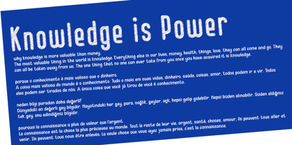 Kid Knowledge is a striking family. It includes 5 amazing styles which can be combined perfectly, giving you the opportunity to create multiple unique designs in an instant. It was inspired by children’s science projects and will give a playful touch to your designs.
 - Auntie Lee by Dawnland,
$13.00 Meet Auntie Lee - a hand drawn and playful sans serif! An upper-case-only font with upper-case-variants on the lower-case letters. With three happy versions - regular, outline & thin - you just can't go wrong! Don't forget to pay Uncle Lee a visit!
 - The Ruttmey by Balevgraph Studio,
$12.00 The Ruttmey is an elegant and unique sans serif font. With its neat and beautiful arrangement of letters, this typeface will look outstanding in both formal and non-formal designs. What's Included? Uppercase & Lowercase Numbers & Punctuation Ligatures & Alternates Multilingual Support PUA Encoded Regular & Italic
 - Camellina by Ajibatype,
$12.00 Camellina Script is a clean and beautiful script font. Featuring lovely swashes with irregular baselines, this font will be an incredibly asset to your fonts’ library. It is also PUA encoded which means you can access all of the glyphs and swashes with ease!
 - Wardrum by Letterhend,
$13.00 Wardrum is an expanded sans with four style! Use this font for your new project. Suitable for branding, poster, or your headline! This font contain uppercase only with number, symbol, punctuations and also support multi language! Email us to letterhend@gmail.com for some questions!
 - Anayu by Rashatype,
$11.00 Anayu is an elegant, whimsical and uniquely shaped lettered handwritten font. This font is PUA encoded which means you can access all of the glyphs and swashes with ease! Add it confidently to your favorite creations and let yourself be amazed by the outcome generated.
 - FT Graphitum by Foxys Forest Foundry,
$9.00 This is a powerful graphic rough sans-serif typeface with four different styles. Two linear, one with an aged texture and one basic, for your experiments. It makes a bold impression, feels like a strong simple typeface. Looks great in short inscriptions, headlines, posters.
 - Sign Lettering JNL by Jeff Levine,
$29.00 In the 1909 edition of the Atkinson Sign Painters’ instruction books is an extra bold sans serif alphabet and numerals called “Advertisers’ Thick and Thin Plug”. This hand lettered display face is now available digitally as Sign Lettering JNL in both regular and oblique versions.
 - Flashie by Gerald Gallo,
$20.00 Flashie is an all caps, very bold contemporary sans serif font. Under the lowercase keys are alternate characters for A, C, E, F, K, L, M, N, R, S, U, W, X, Y. It is ideal for headlines, titles, branding and small blocks of text.
 - Psychoscout by Absoluut Designers,
$30.00 Psychoscout is an initial cap font, originally developed for the Psychoscout record by Flat Earth Society (2006). In 2011 the font was updated for commercial use. It's highly recommended for headlines or posters. It can also be used as a stencil for decorating walls etc.
 - Zamon by Java Pep,
$17.00 Proudly present the newest modern serif font called Zamon. This font is elegant and perfect for the headline, title, logotype, fashion, quote text, publishing, etc. Zamon also comes in an oblique style so you can pair it to make contrast and to highlight purpose.
 - Elite Sport by Alphabet Agency,
$10.00 Alphabet Agency presents Elite Sport Expanded, a super bold sans serif font inspired by college sports lettering. The font has a strong character defined by the straight edges and corners. Elite Sport Expanded is an all caps font. The font contains Latin Simple characters.
 - FT Moonshine Script by Fenotype,
$19.95 An inky script font written by a madman from the cabin deep in the forest. Moonshine Script has a regular set of uppercase and lowercase script letters but also condensed capital letters that you can access by switching SmallCaps on and writing with CAPS.
 - Quastro by Almarkha Type,
$29.00 Hello Introducing, Quastro - Elegant & Stylish Display Serif is an unique font that uses ligatures to smoothly link letters. Perfect for adding a unique twist to word-mark logos, monograms or pull quotes.Quastro has 12 ligatures can be turned off if required standard writing needs.
 - Picture Show JNL by Jeff Levine,
$29.00 An ad promoting the 1919 silent film comedy “Back Stage” starring Roscoe “Fatty” Arbuckle was hand lettered in a thick-and-thin sans style with Art Nouveau influences. This lettering is now available digitally as Picture Show JNL, in both regular and oblique versions.
 - Beauty Switzerland Duo by Lettersiro,
$18.00 Beauty Switzerland is an elegant, delicate and distinct script font. It will add a luxury spark to any design project that you wish to create! This font is PUA encoded which means you can access all of the amazing glyphs and ligatures with ease!
 - Aire by Lián Types,
$37.00 Aire is what Sproviero would call a < big display family >. We recommend seeing its user’s guide. After his success with Reina, Sproviero comes out with this big family of 7 members: Each of them loaded with lots of sophisticated ligatures, alternates and the entire cyrillic alphabet. The overall impression that the font gives is lightness and delicateness; that’s the reason the designer chose to call it Aire, or Air, in English. "Aire was somehow having a rest from my fat face Reina [...] It started as a really thin style of Reina, but it rapidly migrated from it and grew up alone. And how it grew..." The inspiration came from his own past creations: “The heavy strokes of Reina were shouting for a more delicate thing. Something more feminine. More fragile. Something which had a lot of elegance and fresh air inside”. Aire responds to this: Sproviero found that many of the typefaces of nowadays which are used for headlines (best known as display fonts) have almost always just one, maybe two weight styles. This was his opportunity to try something new. Aire makes it easier for the user to generate different levels/layers of communication thanks to its variety of styles. With this font you can solve entire decorative pieces of design with just one font, and that was the aim of it. Aire was designed to be playful yet formal: While none of its alternates are activated it can be useful for short to medium length texts; and when the user chooses to make use of its open-type decorative glyphs, it can be useful for headlines with dazzling results. On March of 2012, Aire was chosen to be part of the most important exhibition of typography in Latinoamerica: Tipos Latinos 2012. TECHNICAL Aire is a family with many members. In total, the user can choose between almost 6,000 (!) glyphs (1,000 per style). Each member has variants inside, which are open-type programmed: The user decides which glyph to alternate, equalizing the amount of decoration wanted. Every decorative glyph has its weight adjusted to the style it belongs to. Exclusively for decoration, Aire Fleurons Pro is an open-type programmed set of ornaments. And last but not least, remember Aire is delicate. What’s my point? It is not recommended to activate all the alternates at the same time. It is typo-scientifically proved: A maximum of 3 or 4 alternates per word would be more than enough.
 - Guillermo by Homelessfonts,
$49.00 Homelessfonts is an initiative by the Arrels foundation to support, raise awareness and bring some dignity to the life of homeless people in Barcelona Spain. Each of the fonts was carefully digitized from the handwriting of different homeless people who agreed to participate in this initiative. Please Note: these fonts include only the latin alphabet; no accented characters, no numbers or punctuation. MyFonts is pleased to donate all revenue from the sales of Homelessfonts to the Arrels foundation in support of their mission to provide the homeless people in Barcelona with a path to independence with accommodations, food, social and health care. Guillermo was born in Argentina. And after crossing four continents and travelling in more than twenty countries, he still has his accent. His luck ran out on the streets of Barcelona. But despite his circumstances, he hasn’t lost a bit of his wit or articulacy. “The worst thing about the street is something that touches your heart, your brain. Not being able to have sex, not having any privacy until it leaves you empty.” On the street he follows his passion for art and writing as best he can, using old cardboard when he can’t find paper and listening to the music that comes to him. His way of thinking and expressing himself leaves people wide-eyed and open-mouthed, but even so he admits he’s a solitary man. “Solitude is an individual word. A solitary type like me can’t bring the word solitude to the whole world.”
 - Pondicherry by Hanoded,
$15.00 Pondicherry is a nice city in the South-East of India. It has changed colonial hands over time, but after the last colonial power (the French) left in 1954, it reunited with India. I have always liked the name Pondicherry. It evokes something happy and exotic and I guess I had the same feeling when I developed this font. Pondicherry font is an outlined affair with an uneven baseline and an overall 'happy' feel. It is an all caps font, but upper and lower case differ and you can use them together. Pondicherry comes with a treasure chest full of diacritics.
 - Bannock Brae Gothic by Red Rooster Collection,
$45.00 Bannock Brae Gothic is a sans serif typeface. It is an original creation of Steve Jackaman (ITF) and was created for the Red Rooster Collection in 1999. The typeface was loosely inspired by a typeface from an old obscure wood type specimen book from the turn of the 20th century. Due to its turn-of-the-century roots, Bannock Brae Gothic has an informal 1920’s art deco look. It finds an ideal home in lighthearted projects concerning crafts, food, festivals, and music, but its alternates still give it the flexibility to showcase a classic and timeless feel in any project.
 - Once upon a playful page, there dwelt a font named Pupcat, crafted by the whimsical digital alchemist, Ray Larabie. Imagine, if you will, a bubbly concoction of letters leaping with joy across the sc...
- Postale by Dear Alison,
$24.00 I recently came across an old travel journal I’d misplaced, and in it was a really rough sketch of an Italian post office. The sign lettering caught my eye while flipping through the pages, and while not my forte, I thought I’d take my stab at recreating sans-serif lettering as a font. The Postale family recaptures that old post signage and the vintage flair that appeals to me. A little reminiscing is always a good thing. You’ll find the Stylistic Alternates feature changes up the retro styled letters to a more modern sans serif styling for a handful of letterforms, if the vintage style of certain letters isn’t your cup of tea.
 - Rundigsburg by Ingrimayne Type,
$9.95 Is Rundigsburg a calligraphic face morphing into sans serif or sans serif reverting back to a medieval, calligraphic face? The letters are angular and some retain traces of older letter forms, but the ornamentation is gone. Rundigsburg is decorative but also very legible, suitable for both display and some text purposes. The family has four weights, each with an italics style. There are two shadowed versions and each has an "inside" style designed for uses in layers with its shadowed style to add color. These "inside" style are similar to the light style but the spacing matches its shadowed complement. Among Rundigburgs OpenType features are a few basic fractions and some alternative letter forms.
 - Welcome Ramadhan by Letterara,
$16.00 Welcome Ramadhan is an Arabic-styled display typeface. This font features irresistible characters which make this font unique because it looks like the standard Arabian alphabet or is written in Arabic style. This Islamic Ramadhan Arabic font is perfect for any graphic design related to the Islamic style. Using this font, you will get an Arabic feel for every text you type. Made with serif characters so that it can be read internationally and does not have to be able to read by Arabic characters It is PUA encoded which means you can access all of the glyphs and swashes with ease! Add it confidently to your projects, and you will love the results.
 - Victory Speech by Comicraft,
$49.00 It's that time of year again, isn't it? And yes, we're speaking rhetorically, because our true intent is to rouse voters into action, claim a significant gain in support over our nearest rivals and lead the nation, perhaps The World, into a new era of prosperity, one in which our once proud nation can become great yet again! An era of Hope, a time of peace and an end to war! Because never, in the field of human conflict, have so many, given so much and gained so little so that the have nots can reward themselves and those that have and-and... Victory, and Hope, and Greatnessness! Related font: Victory Speech Lower
 - Rotulo by Huy!Fonts,
$35.00 Rotulo is a contrasted sans family which combines the Thick & Thin signpainter's style and some 70s feeling in a huge font family with 90 styles. A visit to an exhibition of Spanish movie posters by Jano was the beginning of Rótulo (Spanish for Sign) project. Classic thick & thin signpainter style was featured in many letterings of those posters, as it was a very common style in 60s and 70s Spanish design. Unfortunately, today very few Contrasted Sans are seen, something that was quite common years ago has fallen into disuse in favor of Helvetic monotony. Rótulo recapture all that personality, with an extense range of weights and widths to be used in striking headlines and short texts.
 - Sworded by Fabulous Rice,
$35.00 Sworded is a font family of 8 fonts that was inspired by such diverse things as architecture, tombstones, video games, watching old movies or reading comic books. The art of creating beautiful letters has slowly declined with the rise of the digital age and its solid-colour, 2D fonts. And most of the time, the care given to typography in cultural products just isn't what it used to be anymore. This was the inspiration for Sworded, a family of 4 layerable fonts that can bring a feeling of depth to its letters, and offers endless possible combinations. Sworded Regular is the basic shape of all the characters. Sworded Deep gives an impression of depth to characters or acts on its own as an illusion. Sworded Bright can be used as the bright side of a bevel. Sworded Dark can be used to flesh out the dark side of a bevel. Sworded Shadowed is a contour font with a shadow effect. Sworded Wire is a wire font without depth indication. Sworded Outline is an outline font. Sworded Hatched is a variation of Sworded Shadowed with lines giving a gradient illusion. But of course, any font can be combined with any other font(s) to obtain various results. There are hundreds possible combinations with these eight fonts. Have fun!
 - Bryce Pro by SoftMaker,
$15.99 While most script typefaces are slanted, Bryce is an upright script. Bryce can be used everywhere where an informal, handwritten style is desired, for example in signage and on posters. SoftMaker’s Bryce Pro typeface comes with a huge character set that covers not only Western European languages, but also includes Central European, Baltic, Croatian, Slovene, Romanian, and Turkish characters. Case-sensitive punctuation signs for all-caps titles are included as well as many fractions, an extensive set of ligatures, and separate sets of tabular and proportional digits.
 - Avaleigh by Asenbayu,
$15.00 Avaleigh is an elegant high-end serif fonts family in 3 styles. Avaleigh is a tall narrow serif font with an impressive appearance. Each letter is carefully crafted which will give the impression of an extraordinary visual experience. Avaleigh font can help you complete various projects such as brand logos, headlines, products, social media posts, web and much more. Avaleigh fonts feature opentype, kerning, ligature and alternate packed in 3 styles: Light, Regular and Bold. Avaleigh fonts include uppercase letters, lowercase letters, numeral, punctuation and multilingual support.
 - Elido by Kontour Type,
$50.00 Elido (Odile in reverse) is the sans counterpart to the Odile type. Together they form a sans/serif superfamily with a wide range of variations for editorial use. Elido follows Odile’s proportions and matches the weight and typographic color of its serif twin. Elido is a sans with classical proportions. A slight geometric hint and open counters convey an airy feel. Elido’s family structure and relations within echo the conceptual approach of Odile. The arched stroke low off the stem reveals a script characteristic most pronounced in the Elido Upright Italic. This particular interpretation is gradually diminished in the Italic and becomes even less emphasized in the Regular. Six balanced weights, from an elegant Light to a pronounced Black, are in tune with three display solutions and a set of beautiful Ornaments. These variants allow for a diverse and multifaceted typography for the discerning type user. Sans serif initials amount to a rare finding. The charming monolinear Elido Initials come in two flavors, elaborate and rational, designed to hold their own in editorial and headline sizes. This type design boasts an extensive character set, many OpenType features including roman and italic Small Caps, five sets of numerals, beautiful ligatures, and many more. OT stylistic variants (with accents) offer a one-story “a” for the roman weights, alternate “g” and “s” designs for the italics, and a variant glyph “s” for the Upright Italic. These distinct qualities with its versatile and sincere traits make Elido an excellent choice for text and display use.
 - Gryffensee by Catharsis Fonts,
$30.00 Gryffensee is designed to be the Futura of blackletter, combining the time-honored gravity and relentlessness of the Gothic script with the clean, contemporary freshness of the geometric sans. Built from a tightly controlled inventory of lines, arcs, sharp cuts, and OpenType features, Gryffensee was born and raised in the digital age, yet retains the powerful charisma and human warmth of its mediaeval blackletter ancestors. As a result, it excels in a wide range of display settings, logotypes, and short text. Unlike most conventional blackletters, it even handles all-caps usage with grace, and includes an extensive Cyrillic character set (in the Pro version). Apart from a generous range of automatic ligatures and contextual alternates, Gryffensee offers stylistic alternates that allow users to customize its appearance to their tastes. The capital letters |AGHIKZ| come in alternate cuts that trade traditional shapes for increased legibility, while the letter |s| appears in three cuts, each with a unique, distinct flavor. All these options are accessible through OpenType stylistic sets in the main Latin font, Gryffensee Eins. For easy use in applications without OpenType support, we provide two additional Latin fonts (Gryffensee Zwei and Drei) in which these options replace the default cuts. Finally, Gryffensee Pro offers all the functionality of Gryffensee Eins, plus Cyrillic support. My intention to devise a contemporary geometric blackletter was inspired by four hand-painted letters, |ABCD|, in Sasha Prood�s online portfolio. I later found out that he had, in turn, taken those letters from an existing font, Bastard, by Jonathan Barnbrook. Luckily, by that time my project had taken on a life of its own. Gryffensee is an original design that bears only the most superficial resemblance to Bastard. Gryffensee is a mediaeval spelling of the lake Greifensee near which I grew up. It is pronounced [?gri?f?n?se?], or "GRIEF-un-say" in English approximation. This font is dedicated to Simone.
 - Plakato Pro by Underware,
$50.00 Plakato, a stencil love affair Plakato is a family of display fonts, consisting of various eye-catching styles, each of them very bold. Plakato is an identity toolkit, a heavyweight building block in case you need a strong personality, a small stencil font family to cut out your best ideas and grab all the attention. But just as with many other creations, its outcome is as divers as its multiple origins. Plakato comes in 16 eye-catching styles. The default stencil style comes in Regular & Italic. They both have 2 variations: one version, named Plakato Stencil, automatically creates borders around the text, putting any text into a graphic stencil in this way. Another version, the extruded three-dimensional version, guarantees even more attention for your message. Next to this there is also the Inline version, which is an optical play with a lot of lines. Plakato Inline has a supportive background layer, a separate font in case you want to add a background in a different colour. Then there is Plakato Paper, a manually teared version of Plakato offering a more physical look. This small family of eye-catching display fonts also contains a Neon font, an independent design in Plakato style, which can actually be used for making neon signs due to its construction. Plakato Neon comes with its own Dingbat font for that extra flush-flush. Plakato has also been redrawn on a C64, and with all its accompanying limitations been ported back and turned into a font: Plakato Game. Also this font comes with its own Dingbat font, full of emoji’s and icons for oldskool pleasure. Last but not least there is Plakato Build, constructed out of blocks. As if that wasn’t enough, there are various dynamic versions in the Plakato Play package, which offer a whole new range of possibilities for typographic expression, with new animation and interaction opportunities.
 - Aguellera by Letterara,
$12.00 Aguellera is an elegant font with a romantic appeal; this font is for those who are in need of an elegant and appropriately modern calligraphy script. Aguellera will turn any creative idea into a true piece of art! This font is PUA encoded which means you can access all of the amazing glyphs and swashes with ease! It also features a wealth of special features including alternate glyphs and ligatures.
 - Blanc by Latinotype,
$26.00 Blanc is a functional humanist sans typeface with a marked personality and great style that make it ideal for use in headlines. Blanc is an ode to neutrality: a geometric face characterised by low contrast between thick and thin strokes with calligraphic features that emphasise specific glyphs. Blanc comes with 8 weights and an inline version that make it well-suited for headings and subheadings, corporate designs, advertising, publishing, etc.
 - Koliba JY by JY&A,
$39.00Inspired by architecture and hand-lettered posters of the 1940s, JY Koliba makes a statement that is very 21st century. With an ultra-light weight plus an elegant book and bold, Koliba was designed to be flexible. Fine-tuned with a full Latin glyph complement, and Windows kerning support for designer Jure Stojan’s Slovenian mother tongue, Koliba is set to be one of the foundry’s best-loved sans serifs. - Bauziet by Halbfett,
$30.00 Bauziet is a modern grotesk available in 12 styles with variable support. The weight range of Bauziet is significant due to its most distinctive design element: the prominent ink traps. As the Bauziet weight increases, these ink traps become more pronounced. This aspect makes Bauziet an excellent resource for designers to explore, as its substantial ink traps can swiftly evolve into an iconic feature within a branding system.
 - Orecla by Maulana Creative,
$13.00 Orecla is an all caps font. With 3 weights stroke, fun character. To give you an extra creative work. Orecla font support multilingual more than 100+ language. This font is good for logo design, Social media, Movie Titles, Books Titles, a short text even a long text letter and good for your secondary text font with sans or serif. Make a stunning work with Orecla font. Cheers, Maulana Creative
 - Spinosa BT by Bitstream,
$50.99Stephen Chick, of In Your Typeface Productions (IYTP) foundry, has created this rather prickly type design. Although for display, it is surprisingly legible at smaller point sizes. There is an Inline version, and also an Inline Extra version, which has only the inner contours of the Inline itself, which can be combined with the Regular to create cool two-color effects. The extended glyph set supports Central Europe.