10,000 search results
(0.037 seconds)
- Morality by Sensatype Studio,
$15.00 Morality is a Modern Elegant Sans Serif Font that perfect for branding, logotyp, poster design, etc A new San Serif Font that we created special for Headline, Title and more stand out typography needs. It's so perfect to add your style and headline overview. And specially for Headline font, we crafted for unique style and modern feels so enjoy to create any project that will show your main idea out. Morality Modern Elegant Sans Serif Font ready with: Any options to get creative variations Preview as a inspirations that you can do with Morality font Ready with All characters Wish you enjoy our font. :)
 - Easter Flower by AEN Creative Studio,
$15.00 Easter Flower is an adaptable and sweet display font. No matter the topic, this font will be an incredible asset to your fonts’ library, as it has the potential to elevate any creation. This font is PUA encoded, which means you can access all of the glyphs and swashes with ease!
 - Zennor by ITC,
$29.99Zennor is the work of British designer Phill Grimshaw, a bold italic brush script with slick, dashing letterforms with an almost globular quality. Its uppercase can be used alone or as initials with a strong, authoritative lowercase. Zennor is an ideal choice for work requiring a casual yet confident look. - Pink by ITC,
$29.00Pink is the work of British designer Timothy Donaldson, a sans serif in a style typical of the 1990s. Capitals are slightly condensed and feature unusual variations in stroke widths and the lowercase has an even more irregular stroke pattern, yet an even texture is produced when used in word settings. - Modern Appliances JNL by Jeff Levine,
$29.00 If there s a back-story about the design inspiration for Modern Appliances JNL, it's lost to time. An unfinished design for quite a while, this clean sans with an Art Deco flair was recently completed, and the design quality should speak more for its appeal than any promotional blurb.
 - Rossela by Letterena Studios,
$17.00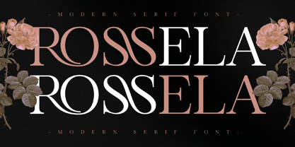 Rossela is an elegant, distinct and stylish serif font. This typeface is perfect for an elegant & luxury logo, book or movie title design, fashion brand, magazine, clothes, lettering, quotes, and so much more. It is also PUA encoded which means you can access all of the glyphs and swashes with ease.
 - Freestyle Script by ITC,
$29.99 Freestyle Script is the work of designer Martin Wait. It is an informal display typeface which perfectly renders the spontaneous qualities of hand-rendered brush lettering. Its capitals can be used alone in word settings and are complemented by an extensive lower case alphabet which includes ligatures of every imaginable variety.
 - Legasov by AlfaBravo,
$25.00 Legasov is an original font family designed for logos, titles, book covers, and branding identity. You can also use it for small text fragments. Legasov is a modern geometric grotesque inspired by the Ukrainian modernism of the last century. It has a dynamic shape of characters and an avant-garde nature.
 - Spyced by Essqué Productions,
$35.00 This stylized font was inspired by the personal style of the designer’s sister. It has a mixture of Gothic, Arabian, & Persian styles, with elements inspired by thorns and smoke. It can be ideal for projects that require an air of mystery or intrigue, or have an exotic or dangerous flare.
 - Ragtime by ITC,
$29.00Ragtime was designed by Alan Meetks, an all capital condensed sans serif typeface. It features thick/thin weight variances and fine line casing adornment which recalls magazine styles of the 1940s. This typeface should not be letter spaced too closely. Ragtime is excellent for anything requiring an elegant, refined look. - Arlette by TypeTogether,
$49.00 Pilar and Ferran based Arlette on the fast stroke of one letter from a Roger Excoffon family, but along the way they abandoned that starting point in favour of experimentation. Many sans serifs are like a svelte black dress: functional, beautiful, and the unfussy outfit for a nice evening get together. The Arlette family isn’t like this. It’s a stunner — an incandescent reimagining of what defines a sans and how it can look. Arlette explores the boundaries of the sans serif landscape and returns with forms developed from gestural vigour. Thinking of it as “painterly” may at first seem to fit, but it underestimates Arlette’s ability to master an unseen world of countless emotions and physical applications: magazines, branding, editorial, teen and young adult works, book covers, and a host of products and packaging whose content will be amplified with Arlette’s voice. Not only does Arlette use its eight weights plus italics to speak in Latin-based scripts, it is also fluent in Thai and has six weights (hairline through bold) with which it meets that challenge, whether in text or display. Arlette Thai’s modern nature is seen in two features for the script. One is the decorative Thai characters that are based on original palm leaf manuscripts. Another is a version of the Latin numerals adapted to the height of the script due to their wide use in Thailand. Arlette Thai has been meticulously developed, including contextual kerning to avoid mark clashes. Arlette’s OpenType capabilities include mathematic and scientific figures, positional forms, pointers, arrows, and oldstyle, lining, and tabular lining numerals. In addition to all this, it’s packed with swashes and swash ligatures in both scripts for enthusiastic typesetting. Because it pushes experimentation without compromising readability, both Arlette Thai and Latin are surprisingly legible in small sizes and arrestingly beautiful when their details can be seen.
 - Quarantype by Zetafonts,
$- Trapped home during the Coronavirus outburst of March 2020 the Zetafonts team found some solace from the world-wide anxiety by designing letters for the #36daysoftype challenge. To fight dark thoughts and spread some good karma we decided to add a free font twist, selecting the best glyphs drawn to develop a collection of ten free typefaces for download. We did our best to make this little gift to the community valuable, though developed in record time: although playful and excessive, these typefaces all stem from our current research in contemporary trends and historical design solutions, bridging calligraphy and design. The typefaces have been published daily starting Monday, March 30. You can download and use the typefaces in any way you desire, as they are totally free for commercial and non-commercial use. We are not asking anything back, but feel free to share the good karma and, if you want, please consider a donation for hospitals.
 - Mountella by Kereatype,
$14.00 Mountella is a modern editorial serif font family that includes 18 fonts, uprights, italic, and 2 variable font from Extra Light to Black which has more than 500 characters, and still has all the nostalgic vibes!. Mountella is a beautiful serif family that includes many visual details, adding uniqueness that looks incredible in both large and small settings as a display and body text. Mountella can be used in high-end branding, logo designs, magazines, product packaging & invitations. One thing to note about Mountella is the letter spacing. It was intentionally for clean reading if you wanted to use it for the body type, so I recommended setting the spacing a little tighter for display use (around -10 to -50 should do!). Design Tips: combine the regular and italic, whether all in one word or body text for logo or quote. Adjust your letterspacing to add more groove! Tighter letterspacing for large headers.
 - Sandwich by Suitcase Type Foundry,
$85.00The all-caps display face Sandwich was inspired by historic, hand lettered sans serif alphabets with slightly sloping terminals, as found in showcard lettering and on billboards. Besides a number of alternate glyphs located in the lowercase area of the font, the typeface features about forty 'ligatures'. These are not ligatures in the traditional sense of the word, but short two- or three-letter combinations — mostly prepositions, conjunctions, articles and so on — in different languages, which are positioned vertically, not horizontally. Since the number of such pre-fabricated ligatures in a font is limited and cannot possibly cover all the desired combinations, a special algorithm programmed into the OpenType font permits the user to compose any two- or three-letter words, provided no accented characters are used. This is why Sandwich includes five versions of each letter. Using the full possibilities offered by the OpenType format, the automatic vertical aligning of glyphs is based on a combination of optional ligatures, style sets, and modified kerning. - Orchid Key by Missy Meyer,
$12.00 I built the Orchid Key font family from the ground up with the idea that there would be several different styles; the Inline Spurs style was the first to be built, which let me then subtract the spurs, inline slices, or both to make the other styles. I've never made a font quite like this before, which shows in the time it took - it's been over 5 months since I started construction! Each style contains the same character set, with 700 total glyphs. Each has the usual basics: letters, numbers, and punctuation; plus over 300 extended Latin characters for language support, and almost 200 alternates for tons of variety! There's a swash alternate for every uppercase letter, at least 6 alternates for every single lowercase letter, and a set of 10 extra swashes and flourishes so you can customize! Whether you're looking for a western or country look, a retro look, or a modern hipster look for your project, check out Orchid Key!
 - Pratfall by Jeff Levine,
$29.00 For 138 years, the Milton Bradley Company (of Springfield, Massachusetts) has been the leading producer of board games, toys and educational/instructional materials. The company was acquired by Hasbro in 1984. It was merged with the also-acquired Parker Brothers in 1991 and became Hasbro Games until both brand ID's were dropped in 2009. “The Moving Picture Game” was a 1920s-era board game created by Howard R. Garis (credited as ‘the author of the Uncle Wiggily game’) and capitalized on the still-new motion picture industry. On top of the storage box is the game’s name – hand lettered in a free-flowing Art Nouveau sans serif that more closely resembles the titles found within animated cartoons or in the ‘bubble letters’ a school child doodles on notebook paper. Recreated as a digital typeface, Pratfall JNL (named after the slips, trips and falls taken by silent era film comedians) is available in both regular and oblique versions.
 - Gianis by Obelisk Gestalt,
$34.00 OBL Gianis is a family of compact geometric sans-serif typefaces designed with a strong focus on headline utility while infusing a touch of subtle naivety. We drew inspiration from the rigid yet rhythmic construction principles found in late 20th-century geometric classics like Avant-Garde, Futura, and Kabel. OBL Gianis seeks to salvage and build upon the legacy of geometric typefaces as they continue to evolve in the 21st century. We've considered various real-world scenarios and use cases, adapting to the ever-changing visual culture. This evolution has given OBL Gianis its unique quirks, including a larger x-height to accommodate bold usage in tighter typesetting, a compact double contour to balance the larger x-height, and shorter descenders and ascenders in lowercase characters. With extensive Latin character support (over 1000 glyphs) and 18 different weights and accompanying italics, OBL Gianis is well-equipped to meet the ever-changing demands and trends in headline typesetting.
 - Ponderosa by Adobe,
$29.00Ponderosa font is a joint work of the typeface designers K.B. Chansler, C. Crossgrove and C. Twombly, who also created Rosewood, Zebrawood and Pepperwood together. As the name suggests, it is so-called wood type. The origins of this kind of typeface can be found in the early 19th century. Called Italian or Italienne, these typefaces quickly became very popular. They are distinguished by square serifs whose width is larger than the stroke width of the characters. When the letters are set together, the heavy serifs build dark horizontal bands. The distinguishing characteristic of Ponderosa lies in its extremely fine figures between heavy serifs. The designers approached the boundaries of the impossible with this contrast. The typeface is reminiscent of the Wild West with its shootouts and heroes as well as of the 1970s with their platform shoes and wild hair-dos. When used carefully in headlines, Ponderosa font will surely attract attention. - Simplified by Redy Studio,
$19.00 Simplified – Casual Chic Font Simplified is a casual and natural font, with a spirit of clean-cut modern and classic. This typeface has been specially designed to give a feeling of casual luxury. This is not easy typography! We have done a lot of effort to build this font. In the past, we have experimented with a ton of fonts that are similar to Simplified, and Simplified is better in every aspect that I have found, including some OpenType features and ligatures, lowercase beginning & ending swashes that you can use to make your own style. In short, it’s a typeface that you must have! Simplified features: A full set of upper & lowercase characters Numbers & punctuation 63 Gorgeous ligatures Lowercase beginning swashes Lowercase ending swashes Multilingual symbols PUA Encoded Characters – Fully accessible without additional design software. Feel free to give me a message if you have a problem or question. Thank you so much for taking the time to look at one of our products.
 - Blimone by Degarism Studio,
$40.00 Blimone Inspired from beautiful Art Nouveau styled and pop culture, Blimone approach with geometric shapes and dynamic humanist blends several calligraphic concepts to create a modernist style but with a strong and unique look. The subfamily Blimone ink-traps and the italic characters to appear monumentally "Sharp" in large sizes and jaggedly imperfect in small sizes. The Bilmone font family includes 24 fonts, Support for the variable version of the font, you can choose the individual thickness and the slopes. Support has many fancy ligatures, common standard ligatures are found in some fonts include fi, ff, ffi, fy, ti, tt, ty, tti, ttl , ffk, ft and the discretionary ligatures are gi, ggi, gt, gk, gj, gl, ggl, gh, gti,ct, cti, cty, et, eti, ety, st, and more. all intended to create a natural look that imitates the flow and spontaneous joins of handwriting.OpenType also supports tabular lining numbers, fractions, Numerator and Denominator.
 - Atiku by Twinletter,
$15.00 For the next generation, Atiku is the font of choice. This one-of-a-kind and opulent font family was designed from the ground up with beauty and exoticism in mind. Customers recognize the value, sophistication, and uniqueness of your brand with just one glance. Each style in this impressive collection was created to help you get the most out of your designs: ads, posts, and a slew of other creative projects are all made easier with this lovely typeface. This font can be easily optimized for any project or client thanks to its many OpenType features and 18 different styles. With our newest font family, you’ll be able to create stunning looks in minutes. of course, your various design projects will be perfect and extraordinary if you use this font because this font is equipped with a font family, both for titles and subtitles and sentence text, start using our fonts for your extraordinary projects.
 - Bum Steer JNL by Jeff Levine,
$29.00 In older American slang, a "bum steer" is a bad tip, some bad advice or being sent in the wrong direction (to name a few examples). Bum Steer JNL was modeled from some playful hand lettering found on a piece of early 20th Century sheet music entitled "When Uncle Joe Plays a Rag on His Old Banjo". It's very possible that "Hobo" (a popular type design of the time) was a strong influence on the sheet music's style of title lettering. It seems that songwriters in those bygone days were prone to cramming as many words from a line of their song into the title itself. Another such example of a wordy song title which coincidently is in keeping with the theme of a "bum steer" (pun intended) is a novelty number from 1915: "Cows May Come and Cows May Go but the Bull Goes on Forever" (words by Vincent Bryan, music by Harry Von Tilzer). [It's kind of self-descriptive, don't you think?]
 - Little Delights by Set Sail Studios,
$16.00 Why not treat yourself to some Little Delights? This super playful & versatile brush font includes 429 glyphs in total - and is designed to perfectly recreate natural, free-flowing brush script lettering while maintaining a relatable charm. Hand painted with a real paintbrush, and packed with 48 Ligatures, you're bound to enjoy this go-to brush font for years to come on a variety of projects. As well as a full alternate set of upper & lowercase characters in it's own separate font, Little Delights also includes a set of 6 Swashes, ideal for underlining your lettering and adding that extra 'custom' style. Swashes can be accessed via a glyphs panel. Accessing Ligatures; These 48 unique double letter combinations will help letters connect and flow more naturally. The ligatures will automatically generate when using the Little Delights fonts with most software. Language Support; English, French, Italian, Spanish, Portuguese, German, Swedish, Norwegian, Danish, Dutch, Finnish, Indonesian, Malay, Hungarian, Polish, Croatian, Turkish, Romanian, Czech, Latvian, Lithuanian, Slovak, Slovenian.
 - Big Brush by Canada Type,
$20.00Big Brush is the result of me seeing Brush Script everywhere around me. Toronto signage is full of Brush Script. My last two trips to the West Coast showed me mostly Brush Script. Brush Script must be the most widely overused North American script font of all time. Don't we all know at least one restaurant or bar with its sign made in Brush Script? And aren't you just sick of the weird F, Q and T of Brush Script? Well, out with the old and in with the new. Big Brush was made as a replacement for Brush Script, and then some. While Brush Script has only the single familiar letters we all know, Big Brush comes in two fonts, so you can keep the design fresh the neat and keep them guessing at the same time. The next time you want to design something that calls for strong, fast brush calligraphy, do the world's bored eyes a favor and use Big Brush instead. - Jeanne Moderno by steve mehallo,
$32.00Jeanne Moderno is a revisionary type family. A synthesis of Bodoni Italic and 19th Century Ultra-Bold "Fat Faces"—distilled with personality taken from early 20th Century Modernists; the Futurists, Dadaists, Suprematists, Constructivists. Historically, Jeanne Moderno could have appeared on the scene around 1918—after the First World War—when new cultural movements, manifestos, theories and countertheories shaped art, industry and society. Spatter in a few later influences—from De Stijl, the Bauhaus, the types of Herbert Bayer, Josef Albers, Paul Renner—plus a twist of Art Deco and High Fashion—Jeanne Moderno is a remanifestation of 19th + 20th Century Modernist thinking; traditional + revisionist, raw and elegant! Jeanne Moderno can best be used for magazines, advertising, posters, flyers, fashion reports, letterpress experiments, silkscreen endeavors, exhibitions, DMV signage, paper money, revolutionary political statements as well as formal declarations of peace or war. Jeanne Moderno is about the future, the past. The Avant-Garde. Humanist geometry + vintage footwear. Form, function, style, art and life. - Butterie by Krafted,
$10.00 Introducing Butterie - A Calligraphy Font Butterie, a modern calligraphy font, designed with the mix of modern and classic vibe. It’s a must have font for your classy website, for your social media branding, Pinterest banners, printed invitations, and more! Butterie Calligraphy font is a timeless font, will never go wrong for your audience, clients, guests or anyone around you! What you’ll get: Multilingual & Ligature Support Full sets of Punctuation and Numerals Compatible with: Adobe Suite Microsoft Office KeyNote Pages Software Requirements: The fonts that you’ll receive in the pack are widely supported by most software. In order to get the full functionality of the selection of standard ligatures (custom created letters) in the script font, any software that can read OpenType fonts will work. We hope you enjoy this font and that it makes your branding sparkle! Feel free to reach out to us if you’d like more information or if you have any concerns.
 - Handsome by Shinntype,
$50.00 Handsome was the first digital typeface to resemble nice, ordinary, fully cursive handwriting. Or neon. In 2005, Handsome Pro was one of the first script typefaces to utilize the OpenType format to simulate the natural quality of writing, by automatically substituting alternate contextual glyphs. The effect follows the conventional “joining rules” of calligraphy, which are a formalization of the way in which letter forms are modified in cursive handwriting for the sake of speed and efficiency—and also perhaps to make life more interesting. For the look of real handwriting, Handsome is most convincing at around 15 pts. At much smaller or larger sizes it works differently. At display size, the feel of the non-nib styles is very slick, more like a speedball Kauffman, owing to the smoothness of the finish. As script fonts go, Handsome has a relatively large x-height, which can be useful if you don't want the “writing” to look too small.
 - PM Doorbuster Casual by Paper Moon Type & Graphic Supply,
$17.00 The PM Doorbuster Collection is based on retro hand-painted paper signs primarily seen in grocery stores from the 1940s through today. We meticulously hand-drew each font, modeling the spacing and uneven baseline found in vintage sign painting. The purposely organic ascenders and descenders, along with a huge set of ligatures/contextual alternates to avoid the same letters repeating when paired, give it a real hand-lettered look. PM Doorbuster Casual is perfect for both vintage-inspired and contemporary marketing, branding, and packaging designs. It's a classic uppercase sign painter font that has been used from the 1950s thru today. You've probably seen hand-lettered versions used in tattoo studios, workshops, and chalkboard menus. Now it's available in a digital format with all of the authentic look and feel of actual hand-painted letters. Check out a few of the samples included in the thumbnails to see what can be done with it.
 - Linotype Franosch by Linotype,
$29.99Linotype Franosch™ is a three weight display typeface designed by artist/graphic designer Max Franosch. Around the time of making the initial sketches, Franosch was looking a lot at Arabic newspaper and magazine headlines. He was drawn to their bold and very graphic" type. A common feature was the "floating" dots which added a rhythmic quality to the text. This came to influence the use of dots in Linotype Franosch™. Apart from this influence, Linotype Franosch also has a very clean and futuristic feel to it, due mainly to the highly geometric nature of the characters and the uniform stroke weight. More about the usability of this typeface can be seen at the Font of the Week of Linotype Franosch. Linotype Franosch is perfect for party flyers, headlines, and internet banner ads. All three faces in the Linotype Franosch family are part of the Take Type 4 collection from Linotype." - Pignatelli by Create Big Supply,
$17.00 Unleash your creativity with Pignatelli and explore its versatility. Whether you're designing stunning wedding invitations, crafting beautiful stationery art, or creating engaging social media posts, this font will add a touch of refinement and charm to your projects. Its seamless blend of uppercase and lowercase characters, combined with its extensive set of numbers and punctuations, ensures a seamless and cohesive visual experience. Pignatelli Script Font is not bound by language barriers. With its multilingual support, you can express your creativity in various languages, reaching a global audience. Additionally, the font is PUA encoded, granting you effortless access to its wide array of amazing glyphs and ligatures. Add a touch of uniqueness to your designs and explore the endless possibilities. Elevate your typography game with Pignatelli Script Font. Its full character set offers a comprehensive range of symbols, ensuring you have everything you need to create visually stunning designs. Embrace the elegance and grace of Pignatelli Script Font and let your designs speak volumes.
 - 112 Hours by Device,
$9.00 Rian Hughes’ 15th collection of fonts, “112 Hours”, is entirely dedicated to numbers. Culled from a myriad of sources – clock faces, tickets, watches house numbers – it is an eclectic and wide-ranging set. Each font contains only numerals and related punctuation – no letters. A new book has been designed by Hughes to show the collection, and includes sample settings, complete character sets, source material and an introduction. This is available print-to-order on Blurb in paperback and hardback: http://www.blurb.com/b/5539073-112-hours-hardback http://www.blurb.com/b/5539045-112-hours-paperback From the introduction: The idea for this, the fifteenth Device Fonts collection, began when I came across an online auction site dedicated to antique clocks. I was mesmerized by the inventive and bizarre numerals on their faces. Shorn of the need to extend the internal logic of a typeface through the entire alphabet, the designers of these treasures were free to explore interesting forms and shapes that would otherwise be denied them. Given this horological starting point, I decided to produce 12 fonts, each featuring just the numbers from 1 to 12 and, where appropriate, a small set of supporting characters — in most cases, the international currency symbols, a colon, full stop, hyphen, slash and the number sign. 10, 11 and 12 I opted to place in the capital A, B and C slots. Each font is shown in its entirety here. I soon passed 12, so the next logical finish line was 24. Like a typographic Jack Bauer, I soon passed that too -— the more I researched, the more I came across interesting and unique examples that insisted on digitization, or that inspired me to explore some new design direction. The sources broadened to include tickets, numbering machines, ecclesiastical brass plates and more. Though not derived from clock faces, I opted to keep the 1-12 conceit for consistency, which allowed me to design what are effectively numerical ligatures. I finally concluded one hundred fonts over my original estimate at 112. Even though it’s not strictly divisible by 12, the number has a certain symmetry, I reasoned, and was as good a place as any to round off the project. An overview reveals a broad range that nonetheless fall into several loose categories. There are fairly faithful revivals, only diverging from their source material to even out inconsistencies and regularize weighting or shape to make them more functional in a modern context; designs taken directly from the source material, preserving all the inky grit and character of the original; designs that are loosely based on a couple of numbers from the source material but diverge dramatically for reasons of improved aesthetics or mere whim; and entirely new designs with no historical precedent. As projects like this evolve (and, to be frank, get out of hand), they can take you in directions and to places you didn’t envisage when you first set out. Along the way, I corresponded with experts in railway livery, and now know about the history of cab side and smokebox plates; I travelled to the Musée de l’imprimerie in Nantes, France, to examine their numbering machines; I photographed house numbers in Paris, Florence, Venice, Amsterdam and here in the UK; I delved into my collection of tickets, passes and printed ephemera; I visited the Science Museum in London, the Royal Signals Museum in Dorset, and the Museum of London to source early adding machines, war-time telegraphs and post-war ration books. I photographed watches at Worthing Museum, weighing scales large enough to stand on in a Brick Lane pub, and digital station clocks at Baker Street tube station. I went to the London Under-ground archive at Acton Depot, where you can see all manner of vintage enamel signs and woodblock type; I photographed grocer’s stalls in East End street markets; I dug out old clocks I recalled from childhood at my parents’ place, examined old manual typewriters and cash tills, and crouched down with a torch to look at my electricity meter. I found out that Jane Fonda kicked a policeman, and unusually for someone with a lifelong aversion to sport, picked up some horse-racing jargon. I share some of that research here. In many cases I have not been slavish about staying close to the source material if I didn’t think it warranted it, so a close comparison will reveal differences. These changes could be made for aesthetic reasons, functional reasons (the originals didn’t need to be set in any combination, for example), or just reasons of personal taste. Where reference for the additional characters were not available — which was always the case with fonts derived from clock faces — I have endeavored to design them in a sympathetic style. I may even extend some of these to the full alphabet in the future. If I do, these number-only fonts could be considered as experimental design exercises: forays into form to probe interesting new graphic possibilities.
 - Intellecta Ribbons by Intellecta Design,
$16.90 Intellecta Ribbons is an elegant set of ribbons ready for many applications. With this set you can make tags, shopping sale designs, diverse invitations, discount seals, banners, posters or anything you want.
 - Rat Infested Mailbox by Hanoded,
$10.00 Rat Infested Mailbox is a strange, exaggerated typeface with a seriously worn-out look. It can be used for posters, cards and websites. It will certainly give your designs an unusual touch.
 - Local Jeweler JNL by Jeff Levine,
$29.00 Local Jeweler JNL was inspired by an online image of a vintage 1940s-era store sign. This type design features a thin Art Deco sans serif in both regular and oblique versions.
 - Amie by Greater Albion Typefounders,
$14.00 Amie is a friendly Sans Serif display face, with a hint of hand drawn flair. Ideal for poster work, album covers, book covers and for bringing an element of friendly style anywhere.
 - Golden Treasure by Gleb Guralnyk,
$14.00 Golden Treasure is a vintage font with an original, decorative look and seamless connected letters. All available characters you can see on the 5th screenshot. Thank you and have a great day!
 - Arnel by Craft Supply Co,
$20.00 Arnel Vintage Font is a striking sans-serif typeface that effortlessly embodies the rustic charm of vintage stamps, capturing a raw and hand-drawn aesthetic. This font is tailor-made for all your vintage display needs, exuding an authentic and weathered appearance that harks back to yesteryears. With Arnel, you can effortlessly transport your audience to an era of nostalgia and authenticity. Its rough edges and irregularities in letterforms evoke the tactile feel of aged ink stamps, giving your designs a genuine vintage appeal. Whether you’re creating posters, labels, or any project that calls for a touch of vintage character, Arnel Vintage Font adds a unique and nostalgic flair. It’s like unearthing a hidden treasure in the world of typography, making it the perfect choice for projects that aim to evoke a bygone era’s timeless charm and authenticity.
 - Bebas Neue - 100% free

- Salom by Schriftlabor,
$44.00 Salom was designed by Austrian type designer Igor Labudovic during his year at Reading University. Besides Latin, it originally included Arabic and Hebrew. The peaceful coexistence of both writing systems in his fonts led him to combine the words Salaam and Shalom to the font family name. Salom’s sibling, Salom Sans, features the same letter proportions and therefore allows a rich spectrum of diverse typography, yet keeping the harmony between all styles. The sans has an additional light weight, while the serif comes with an expressive stencil style.
 - Dope Display by Designova,
$9.00 Dope is a unique typeface perfect for headlines, big text, branding, logotypes & display usage. This font can be an excellent choice for creating outstanding logos, promotional content, and marketing graphics that can bring uniqueness and freshness at its level best. The typeface will be perfect for creating unique monograms, logos, and identities with these combinations. Please see the examples shown above to get an idea of the capability of this typeface. The typeface comes with Extended Latin character sets including Western European, Central European, and South-Eastern European character sets (total of 281 glyphs).
