10,000 search results
(0.025 seconds)
- FingerSpeller BF by Bomparte's Fonts,
$40.00 Many years ago I studied American Sign Language in an effort to better communicate with some friends of mine within the deaf community. I found ASL to be a beautifully expressive language from a vibrant and active culture. Out of that attempt came this stylized depiction of the manual alphabet used in finger-spelling. Until recently it had only existed in analog form, born of pen and ink on paper. So now I'm glad to say it’s turned digital. Typing a period (.) will reveal the sign for “I Love You” (a combination of the letters I, L and Y), which fits nicely within the shape of a heart. Holding down the shift key while again typing period (greater symbol) will reveal the heart in its filled-in form, which can serve as an underlay. Use these in an application that supports layering in order to create different color combinations. There’s a stylistic alternate letter “S” and an “OO” ligature which can be accessed in OpenType-savvy apps.
 - P22 Morris by P22 Type Foundry,
$24.95 William Morris (1834-1896) was probably the most influential figure in the decorative arts and private press movements of the late 19th and early 20th century. In reaction to the increasing lack of quality that the industrial revolution brought on, Morris sought a return to the ideals of the medieval craftsman. Dissatisfied with the commercially available typefaces of the day, he undertook the design of the fonts for his books himself. The P22 Morris font set features new versions of Morris's famous type designs for his Kelmscott Press. The two main fonts include full international character sets for Western European languages. P22 created MORRIS GOLDEN with a rough edge to simulate the look of printing on handmade paper. There is a more "refined" recent version of Golden, but its sterile digitization does not approach the effect that Morris achieved in his Kelmscott books. You'll notice the handmade effect less in the smaller sizes but will find it quite decorative in the larger sizes. (Morris cut his Golden type in only one size for the Kelmscott Press, approximately equal to 14 points.) P22's version of MORRIS TROY is more smooth than Morris Golden and is true to the original Morris design. It is based on the Kelmscott Troy type (an 18 point font) and its smaller counterpart, the Chaucer type (a 12 point font). American Type Founders made an unauthorized version of Troy, "Satanick," 189?, contrary to Morris's wish that it not be made available commercially.(Legend has it that the naming of Satanick comes from William Morris telling the agent inquiring about making copies of his fonts available to go to hell) Several digital versions of Troy (and Satanick) have appeared over the years. The P22 version offers a much more accurate rendering than any previous version. Morris designed the original Troy font to be spaced very tightly; our version reflects and honors his intention. The MORRIS ORNAMENTS are based on those Morris designed and used in his Kelmscott Press books. Characters in the positions of the letters A to Z are decorative drop cap initials. Characters in the number key positions reproduce other Morris embellishments. (See the accompanying key chart.) As with all headline fonts and complex dingbats characters, this font is best used at larger point sizes (e.g., 48, 72, 120). Use in body text or at small point sizes on-screen may not achieve desired results. P22 is grateful to William S. Peterson, Steven O. Saxe and the Lightsey-Offutt Library who gave invaluable research assistance to this project.
 - Year 2000 Replicant - Personal use only

- Costa Brava by Letterhead Studio-YG,
$15.00 Costa Brava and Costa Dorada are devoted unforgettable days on beaches of tender Mediterranean sea in Catalonia. Enjoy! Both fonts were originally created in the summer 2003. The OpenType version, with extended Latin characters, was released in 2009.
 - Costa Dorada by Letterhead Studio-YG,
$15.00 Costa Brava and Costa Dorada are devoted unforgettable days on beaches of tender Mediterranean sea in Catalonia. Enjoy! Both fonts were originally created in the summer 2003. The OpenType version, with extended Latin characters, was released in 2009.
 - Fty OLD SPORT by The Fontry,
$15.00 Beyond the halls of the ivy league, a vintage sport font from the days of old. A complete family for all of your layout needs. Includes a layered COLLEGE effect to stack up and command those team colors.
 - Spring Display by Yoga Letter,
$14.00 "Spring Display" is a cute and unique display font. This font is equipped with uppercase, lowercase, numerals, punctuations, and multilingual support. This font is perfect for Easter, summer, winter, holidays, spring, back to school, mother's day, and more.
 - Kasuga by insigne,
$21.99Kasuga, Japanese for spring day, is a contemporary script with eastern influence. Kasuga's pointed and fluid brush strokes evoke the orient with just a hint of the west. Kasuga is perfect for designs that need an Asian atmosphere. - Electrasonic by Device,
$29.00 Electrasonic is a neon linking script in fine, X fine and XX fine weights that whispers slyly of louche backstreet glamour and medicinally strong day-glo cocktails. Use with a cosmopolitan to hand and Suede on the ipod.
 - Carita by Goodigital13,
$20.00 Great to use for logos, inspirational quotes, t-shirt graphics, typography art, apparel, labels, posters, business cards, stylized wedding invitations, prints, signs, book cover designs headlines, titles, etc. Beauty Influencer, Interior Designer, or run a Cooking YouTube channel – looking for a way to stand out from your competition. Maybe you feel like your birthday e-cards are missing that “something”. If you can say “yes” to any of these then hold on to your seats and get ready for a modern, fun, and delightful experience!
 - Bowie by Latinotype,
$19.00 The name of this typeface comes from the surname of James (Jim) Bowie, American pioneer and inventor of the famous Bowie knife. This is exactly what inspired English rockstar David Jones to change his stage name to David Bowie. Bowie is thenew font by Bercz and Latinotype Team. The typeface is a type system that reflects a strong personality, an urban feel and an unprejudiced style. Bowieis well-suited for publishing projects, branding and packaging. This font family is composed of three sections: a group of sharp-shaped uppercase fonts (smallcaps and all caps) in 5 weights, each with matching regular/back slant italics,providing users with 15 different styles for multiple combinations; a set of script catchwords and eclectic sets of dingbats and flags that communicate the blue-sky thinking and feel of the project. Bowie —a collaborative project between Bercz and Latinotype Team—was developed by Leonidas Loyola, Valentina Vega, Rodrigo Fuenzalida, César Araya and Bruno Jara, under the supervision of Dany Berczeller, Daniel Hernández y Luciano Vergara.. Bowie consists of 5 weights, ranging from Thin toBlack, and comes with a 439-character set that supports 206 languages.
 - MonkeyLove - Personal use only

- Swollen - Unknown license

- TX Signal Signifier by Typebox,
$39.00Eight designers present a set of icons that indicate the fun and fantastic world of signage. Each collaborator's solution represents a completely different interpretations on signage vernacular. Akira Kobayashi's "Subsumption", obscured by foliage, offers a perspective that signs on Japanese roads can be vague and beautiful. M.A.D.'s "People Signs" is a graphical association of people signage with a variety of well known situation symbols. Cynthia Jacquette's "Honest Arrows" are a series of arrows that attempts to honestly tell you how to get from point A to Point B in a big, confusing city. Mike Kohnke's "Road Kill" and the "Bump & Bruise" highlight how signs make for perfect targets when unloading a round of buckshot, and the licking a contruction barrier often endures. Joachim Muller-Lance's "Traffic Blends" places faces on things! Hey, didn't you give your first car a nickname? Cars are alive, you know - they guzzle and smoke all day. Jean-Benoît Lévy's "Inner-State" was inspired while reading the California driver handbook to pass a driver's test. Kevin Roberson's "Tail Lighting" reminds us to drive carefully and not to forget to signal. Diana Stoen's "Drivers Out There" shows us "driver personality archetypes", including the lil'ol lady that everyone tries to avoid. - Radona by insigne,
$29.00 Radona is a blast from the 80’s that's rader than rad. Radona is the typeface version of Synthwave, an electronic music subgenre that takes influence from the 1980s but builds on it, resulting in a construct that lives in the minds of both those who have experienced it and those who haven't. Radona expresses a nostalgia for 1980s culture, attempting to replicate and appreciate the era's vibe, but extends it further with something new. This sans family has plenty of 80's flavor, but with some fresh twists to push it to the limit. Radona is a geometric sans-serif typeface. Radona has a few quirky characteristics, but it has a generally neutral tone and structure that makes it ideal for usage in print, especially when a contemporary look is desired. It looks amazing in both body text and headlines. The geometric grotesques that were popular in the 1980s served as inspiration. It's a typeface that's been crafted for usage in a range of design fields, from branding to packaging, and it can be used in anything from interfaces to apps. Radona is an excellent typeface for use on websites and other digital applications. Radona comes with a wide variety of styles and a large selection of stylistic alternatives, ligatures, small caps and other special features. Along with parachute pants, synthesized guitar riffs, and VHS scanlines, Radona brings back the 1980’s.
 - Summer Landscape by Selvia Design,
$15.00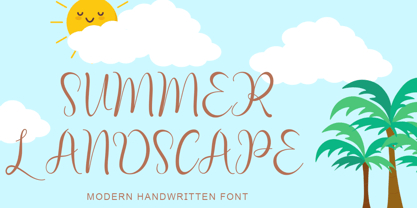 "Summer Landscape" is a beautiful and unique handwritten font. This font is equipped with uppercase, lowercase, numerals, punctuation, signatures, and multilingual support. It is suitable for summer, holidays, vacations, traveling, Father's Day, graduation, the 4th of July, and others.
 - Simply Royal by Gleb Guralnyk,
$14.00 Introducing a vintage font Simply Royal. This typeface has a victorian medieval look. It's an all caps typeface with decorative classic style. Simply royal has three layer fonts for more conenient recoloring. Thank you and have a nice day!
 - Benjamin by Solotype,
$19.95Fonts without curved lines were quite popular in Victorian times. We drew this one back in the days of T-squares and triangles, and based it on a type that we felt could stand to be improved. (Arrogant, eh?) - Mantika Informal Paneuropean by Linotype,
$67.99Jürgen Weltin's Mantika Informal is pretty difficult to categorize, but very easy to like. This particularly reader-friendly typeface in regular and bold weights, brings to the table the informal fluidity of a script, the consistency of an inclined italic, and the open and airy forms and contrast of a humanist sans. The result is a warm, approachable, and very legible typeface that is never static and staid, but rather invites an attentive, reading eye. The original idea behind Mantika Informal lay in the challenge to create a typeface for setting children's books. German designer Jürgen Weltin aimed to create a reading typeface for those just starting to learn how to read. On the one hand, it should help create clear word-images; on the other, its letterforms should remain uncomplicated but resist mechanical and industrial sterility. Mantika?s subtle cursive lines stress the printed word's connection with handwriting, in addition to making the transition from school writing exercises to printed texts seamless and effortless. The resulting slightly organic and cursive forms that developed during the design process are so captivating that Mantika Informal may be used for a multitude of unintended applications - anywhere a friendly and informal yet sophisticated character could lend a helping hand, Mantika is there, giving a fresh accent to anything from packaging design to food products. With a broad character set encompassing support for Cyrillic and Green, Mantika Informal's two fonts make for a versatile and dynamic typeface that surely will find its place in a broad range of applications. - Mantika Informal by Linotype,
$50.99 Jürgen Weltin's Mantika Informal is pretty difficult to categorize, but very easy to like. This particularly reader-friendly typeface in regular and bold weights, brings to the table the informal fluidity of a script, the consistency of an inclined italic, and the open and airy forms and contrast of a humanist sans. The result is a warm, approachable, and very legible typeface that is never static and staid, but rather invites an attentive, reading eye. The original idea behind Mantika Informal lay in the challenge to create a typeface for setting children's books. German designer Jürgen Weltin aimed to create a reading typeface for those just starting to learn how to read. On the one hand, it should help create clear word-images; on the other, its letterforms should remain uncomplicated but resist mechanical and industrial sterility. Mantika?s subtle cursive lines stress the printed word's connection with handwriting, in addition to making the transition from school writing exercises to printed texts seamless and effortless. The resulting slightly organic and cursive forms that developed during the design process are so captivating that Mantika Informal may be used for a multitude of unintended applications - anywhere a friendly and informal yet sophisticated character could lend a helping hand, Mantika is there, giving a fresh accent to anything from packaging design to food products. With a broad character set encompassing support for Cyrillic and Green, Mantika Informal's two fonts make for a versatile and dynamic typeface that surely will find its place in a broad range of applications.
 - Baba Jaga by MKGD,
$13.00 Baba Jaga is a font you may want to turn to if you’re in need of something eye catching, if not, eye gouging! Thinking of something horrific? Something distressing? Baba Jaga is your go to font, Whether you’re putting together a flyer for a Halloween party, or trying to put a little “oomph” into a poster that needs a little something jarring, Baba Jaga may just be what you’re looking for. See for yourself…if you dare! (ok, that was a bit corny, but it wouldn’t have been if it was set in Baba Jaga!) There is no lower case for Baba Jaga as it is a display font. The Upper case version serves both the upper and lower case keys. Baba Jaga has a glyph count of 390 and supports the following languages; Afrikaans, Albanian, Asu, Basque, Bemba, Bena, Bosnian, Catalan, Chiga, Colognian, Cornish, Croatian, Czech, Danish, Embu, English, Esperanto, Estonian, Faroese, Filipino, Finnish, French, Friulian, Galician, German, Gusii, Hungarian, Icelandic, Indonesian, Irish, Italian, Kabuverdianu, Kalaallisut, Kalenjin, Kamba, Kikuyu, Kinyarwanda, Latvian, Lithuanian, Low German, Lower Sorbian, Luo, Luxembourgish, Luyia, Machame, Makhuwa-Meetto, Makonde, Malagasy, Malay, Maltese, Manx, Meru, Morisyen, North Ndebele, Norwegian Bokmål, Norwegian Nynorsk, Nyankole, Oromo, Polish, Portuguese, Romanian, Romansh, Rombo, Rundi, Rwa, Samburu, Sango, Sangu, Scottish Gaelic, Sena, Shambala, Shona, Slovak, Slovenian, Soga, Somali, Spanish, Swahili, Swedish, Swiss German, Taita, Teso, Turkmen, Upper Sorbian, Vunjo, Walser, Zulu
 - Spooky Witch by Arkrist Letter,
$13.00 Spooky Witch is the latest Halloween font from Arkrist Letter studio. A serif font designed with elegant characters, but looks scary. Spooky Witch font is suitable for design, logo, greeting card, invitation, etc. make your day more spooky with Spooky Witch!
 - Plastic Waist by PizzaDude.dk,
$20.00 Plastic Waist is just a wordplay - a wordplay that hopefully sets your mind to the huge amount of plastic waste we're experiencing these days. Be aware of how much plastic you use, recycle and don't throw your plastic in nature.
 - Typewrither by PizzaDude.dk,
$20.00Typewrither is not your every-day-typewriter-font. It comes with almost 200 different ligatures to help avoiding repeating letters - this includes ligatures for both lowercase, uppercase and numbers. You will need to use OpenType supporting applications to use the autoligatures. - Florry by Gleb Guralnyk,
$14.00 Florry is a modern, trendy, display typeface with a lot of ligatures that helps to make each word unique. It has a multilingual support. All available characters you can see on the 5th screenshot. Thank you & have a nice day!
 - Sycaba by Vernacular,
$9.99In a large neighborhood that crosses two cities in the metropolitan region of Belo Horizonte, Brazil, all streets are still in Tupi-Guarani language. The shop signs are hand painted. And people, every day, come and go along Sycaba Avenue. - Sweety Pie by LePine Studios,
$10.00 Originally designed as a companion font to a series of illustrations by Phillip LePine, this font stands beautifully on its own. Featuring letterforms with curls and varied line weight, it captures a feeling of the carefree days of our youth.
 - Banquet by Solotype,
$19.95In our early days of type hunting, we considered this to be the prize of our collection. Fonts of this late Victorian period seem to have less ruffles and flourishes than the earlier ones, which makes them easier to read. - Catch Words JNL by Jeff Levine,
$29.00In the days of wood type, suppliers offered words such as 'and', 'at', 'for', 'each' and numerous others as stock cuts called "catch words". This collection of twenty-six were re-drawn using a vintage type catalog page as a model. - Zar Brush by SzarDesign,
$19.95 ZarHand began as my "speedball" showcard lettering font, used when the boss brought in a pile of urgent work at the end of the day. We would get out our "4 o'clock brushes" hoping to finish at a reasonable hour.
 - Thai Foon NF by Nick's Fonts,
$10.00One in the series of fonts celebrating the Halcyon Days of Handlettering. Thai Foon, a fun-loving, freewheeling script, is based on a font presented in the book "Lettering of Today" (today being 1933), by W. Ben and Ed C. Hunt. - Tropical Beach by Yoga Letter,
$15.00 "Tropical Beach" is a very simple handwritten font that is curly in uppercase. Equipped with uppercase, lowercase, numerals, punctuation, and multilingual support. This font is perfect for summer, holidays, vacations, father's day, teachers, the 4th of July, graduation, Christmas, and others.
 - Sock Hop JNL by Jeff Levine,
$29.00Back in the 1950s and 1960s a popular event was the sock hop - when kids would meet in the school gymnasium, kick off their shoes and dance to the popular records of the day. Sock Hop JNL recalls those simpler times. - Whoopee Cushion NF by Nick's Fonts,
$10.00One in the series of fonts celebrating the Halcyon Days of Handlettering. Whoopee Cushion is a slightly wacky headline font, based on a work by lettering artist Samuel Welo from the 1931 version of his "Studio Handbook for Artists and Advertisers." - RMU Koralle by RMU,
$25.00 Koralle was an abundant family of grotesque font styles which had been released by Schelter & Giesecke in the first quarter of the previous century. Out of this family four of the most impressive styles were revived, whereby I stuck as close to the original as possible. All styles contain even the weird-looking capitalized German double-s of which I am a strong opponent.
 - Hokkien by AdultHumanMale,
$12.00 HOKKIEN is an all caps sister to my other font Penang. It was inspired by some old pieces of Art Deco signage I had discovered in Penang Malaysia, The font is available in one weight for now. The font is loaded with plenty of foreign extras and currency symbols. I have also included an alternate cap S which works better visually in blocks of copy.
 - Rekord Antiqua by RMU,
$30.00 Rekord Antiqua, regular and semibold, released 1911 by Wagner & Schmidt, is a perfect body text partner for Art Nouveau display fonts. Both styles come with a long s, which can be reached by the OT feature of historical forms or by typing [alt] + b. In addition, you find two framing elements on [alt] + P and [alt] + p, and an oblique style was added too.
 - Poster by MP&A,
$22.00 Poster is the first type created by this team. Its an experiment. This geometric typeface is based on bold and clean rounded rectangles. It’s soft and friendly look lends itself to a number of applications. It´s a good choice for company logotypes, magazine headlines and, of course, posters applications. This font was designed to be used in large sizes, so you can appreciate the little details.
 - Garth Graphic by Monotype,
$29.99Released by the Compugraphic Corporation in 1979, the Garth Graphic font family is based on a design by John Matt from the 1960's, reworked by Renee LeWinter and Constance Blanchard. Garth Graphic was named after Bill Garth, a founder of Compugraphic. A fairly strong old style face suitable for text setting; the heavier weights and condensed forms are most used for display work. - Mazurka NF by Nick's Fonts,
$10.00Two typefaces from the 1923 Barnhart Brothers & Spindler specimen book have been combined to produce this gem. Swagger Capitals, designed by Carl S. Junge, for the uppercase and Gothic Novelty Title for the lowercase. Named for a lively dance from the nineteenth century. Both versions of this font contain the Unicode 1252 Latin and Unicode 1250 Central European character sets, with localization for Romanian and Moldovan.


