4,003 search results
(0.019 seconds)
- Regional News JNL by Jeff Levine,
$29.00 A roughened and worn version of Daily Tabloid JNL was originally created as a non-exclusive custom font for a client. The design emulates the look of old letterpress wood type and has now been released commercially as Regional News JNL; available in both regular and oblique versions. A special acknowledgement goes to Michael Hagemann of Font Mesa Fonts who partnered with Jeff Levine Fonts for the original project. His creativity and skill resulted in the textured look needed for the typeface. For some beautiful antique typefaces or fine text face collections, please visit Font Mesa Fonts.
 - Monckeberg by Latinotype,
$29.00 Monckeberg is an expressive font with a strong personality which is based on 15th century classic Venetian typefaces. High contrast between thin and thick strokes, calligraphic features and diagonal stress are its most striking characteristics. Monckeberg is ideal for short text and paragraphs, and specially designed for logos, branding, editorial design and web use. Monckeberg consists of 2 subfamilies of 9 weights, from Thin to Heavy, with matching italics, resulting in a total of 36 fonts. The basic family is classic and elegant while the alternative version allows for greater design freedom. Monckeberg contains 511 characters that support over 200 Latin-based languages.
 - Harmonia Sans by Monotype,
$34.99 The Harmonia Sans™ typeface is a fine blend of contemporary geometric sans serif lettershapes and classic calligraphic proportions. Jim Wasco, who was aided by George Ryan in the production of the typeface family, began the design of Harmonia Sans with a single goal in mind. "I wanted to create a simple and legible typeface by pulling the best aspects of classic geometric sans designs, such as Futura and ITC Avant Garde Gothic," Wasco explained. The result is a design suitable for virtually all typographic applications, from text on low-resolution displays to high-resolution print and even architectural signage.
 - Black Radiant by Sohel Studio,
$14.00 Black Radiant is a retro display serif font that exudes a classic charm and bold character. With its design inspired by retro styles, this font brings an elegant touch and evokes a sense of the past. Each letter is meticulously crafted with careful attention to detail and proportion, resulting in a visually appealing and unique appearance. Black Radiant is perfect for projects that require a vintage feel, such as posters, logos, packaging, and promotional materials that aim to capture a nostalgic and sophisticated atmosphere. This font will add a special touch to your designs and captivate viewers with its retro allure and distinctiveness.
 - Frastha by Ekahermawan,
$20.00 Frastha font is unique and beauty display family with 7 weights from Thin to Bold. Frastha also includes a bunch of alternate characters (PUA Encoded) and ligatures to give you a wide range for create an excellent typographic design results for many different projects such as logo, branding, poster, magazines, labels, merchandise, invitation, presentation, advertising, quotes and so much more! FEATURES: OpenType support Playfull to use (with ligatures and alternates options) Multilingual support PUA Encoded If you need support or more information about this item please kindly contact me : ekahermawanputu@gmail.com Thank you so much.. I really hope you enjoy when using it!
 - Neutraliser Sans by HamburgerFonts,
$20.00 The Neutraliser family is a versatile collection of geometric-based fonts with 24 styles. The 6 Alternate styles are suitable for headlines and are complemented by the Sans and Serif styles suitable for small amounts text. The Caps styles allow for extra typographic variation within the family. Neutraliser is a direct result of the designer's initial exploration of typography and is uncompromising in its geometric nature. As the name suggests, the typeface celebrates the precision of the digital medium as a drawing tool in which the critical points that make up a letterform can be almost ‘plotted’ according to a grid-based logic.
 - Lombriz by Sudtipos,
$79.00 Lombriz attempts to bridge the gap between different kinds of typography - including packaging, signage, and sporting. The result is a heavy, yet casual, 1950s-inspired semi-connected script. The freestyle Lombriz feels friendlier, more readable, and a touch more ‘real’ than most scripts of its kind. In certain settings, the thickness of the stroke in the capital letters accentuates, while the lowercase flows like casual, brush-drawn letters should. Lombriz comes equipped with more than 50 alternates and custom ligatures. These extras are conveniently tucked into the OpenType version for those programs that support such functionality.
 - Naerya by IbraCreative,
$17.00 Naerya, a modern stylish serif font, effortlessly blends sophistication with contemporary design elements. With its sleek and clean lines, Naerya exudes a sense of timeless elegance, making it an ideal choice for projects that demand a touch of class. The font’s well-crafted serifs add a distinctive flair, striking a perfect balance between tradition and modernity. Naerya’s letterforms showcase a harmonious interplay of curves and straight lines, resulting in a balanced and refined aesthetic. Whether used for editorial design, branding, or digital applications, Naerya stands out as a versatile and visually pleasing serif font that lends a touch of sophistication to any project.
 - VLNL Gaufre by VetteLetters,
$35.00 VLNL Gaufre is a pixel-based font with holes designed by Donald Roos. Each character is built on a grid of doughnut-like elements, which makes it look like a kind of dried dog food, or Belgian waffles. Despite the grid Gaufre still has enough warmth due to the doughy, slightly rounded corners. And because it’s prepared with a hot waffle iron of course. The end result is a merry, chunky typeface that smells of doughnut. Use it for logos or headlines, just add butter and sugar or, better still, top it with whipped cream and cherries. Yummie!
 - Neutraliser Caps by HamburgerFonts,
$20.00 The Neutraliser family is a versatile collection of geometric-based fonts with 24 styles. The 6 Alternate styles are suitable for headlines and are complemented by the Sans and Serif styles suitable for small amounts text. The Caps styles allow for extra typographic variation within the family. Neutraliser is a direct result of the designers' initial exploration of typography and is uncompromising in its geometric nature. As the name suggests, the typeface celebrates the precision of the digital medium as a drawing tool in which the critical points that make up a letterform can be almost 'plotted' according to a grid-based logic.
 - Zim by Scholtz Fonts,
$19.00 Zim is a bold, earthy font, named for the Great Zimbambwe ruins (a World Heritage site). Its solid silhouette represents the timelessness of this ancient structure. The font is very readable, and its bold, rugged shape make it ideal for display purposes, for posters and headlines. Fully professional, it contains a complete set of 255 characters — Upper and Lower case, all numerals, punctuation, symbols and accented characters. It is suitable for layout work in all major European languages — Spanish, Portuguese, German, French, Swedish and Italian (to name a few). The characters are spaced for readability and have been carefully kerned.
 - Magasin by Type-Ø-Tones,
$50.00 Magasin is a high contrast display typeface inspired by the pointed pen calligraphy, yet with a retro-chic twist. It combines a sense of script with geometric and slightly condensed structure resulting in idiosyncratic curves softly connecting the vertical elegance of its forms, ideally suited to use at large sizes in headlines for magazines, posters or packaging. Magasin boasts a rich set of OpenType features that provide a better flow such as Ligatures, Stylistic Alternates, Contextual Alternates, and Final Forms. It also includes a set of capital Swashes. Please check the ‘Read me’ file located in the gallery for more specifications.
 - Burma by Runsell Type,
$25.00 Burma perfectly represents vintage aesthetics sans serif display typefaces. This project is inspired by beautiful lettering on old label. It come with 4 style (regular, soft, rough and outline). Some letters contain beautiful stylistic alternates characters (ss01 - ss04) and feature ligatures. Burma can be applied in designs such as logotypes, posters, packaging, branding, quotes, badge and more custom design. It features uppercase, lowercase, numeral, punctuation & symbol, ligatures, alternates, multilingual support, and is PUA encoded (fully accessible without additional design software). How to get access alternate glyphs with designing software to open type fonts check this link: http://adobe.ly/1m1fn4Y
 - Ciroke by Hazztype,
$16.00 Ciroke is a distinctive modern blackletter typeface that seamlessly fuses the classic elegance of blackletter with the clean and contemporary aesthetics of sans serif fonts. This unique fusion results in a visually striking and versatile typeface that effortlessly bridges tradition and modernity. Ciroke is an ideal choice for projects that demand a modern yet timeless aesthetic. It works well in branding, editorial design, packaging, and any application where a balance between tradition and contemporary style is desired. The font's versatility ensures that it can be used across various design platforms, from digital screens to print media.
 - Work Crew Stencil JNL by Jeff Levine,
$29.00 In the 1949 Paramount comedy "My Friend Irma" (a film based on the popular radio series that introduced America to Dean Martin and Jerry Lewis), an opening gag set-up involving excavation work utilizes street barricades which inspired Work Crew Stencil JNL. Placed along the site, different advisories are stenciled upon barricades warning of the work in progress. The scatterbrained Irma (Marie Wilson) walks straight through the construction, oblivious as to what's going on around her and steps right into the open hole dug into the sidewalk (a scene she reprises in 1950's "My Friend Irma Goes West").
 - P22 Cusp by IHOF,
$24.95 This typeface was originally inspired by Art Deco lettering. During the development of the letterforms a strick DeStijl grid was imposed. The lowercase letterforms were created with the influences of rave/techno design styles. The result is a distinctly contemporary display font. The P22 Cusp Family contains 4 fonts: P22 Cusp Round, P22 Cusp Round Slant, P22 Cusp Square, P22 Cusp Square Slant. This font was designed as a display font and may be a bit taxing on the eye at smaller point sizes. The P22 Cusp family is licensed exclusively to P22 type foundry/International House of Fonts.
 - Mocombo JNL by Jeff Levine,
$29.00Mocombo JNL is a slightly modified version of one of the numerous alphabets created by the late Alf R. Becker for Signs of the Times Magazine during the period of the 1930s through the 1950s. Tod Swormstedt of ST Media—who is also the curator of the American Sign Museum in Cincinnati, Ohio—supplied Jeff Levine a wealth of source material from which this font is derived. The angular style of this typeface was originally referred to as “German Poster Lettering” by Becker, but it can represent many styles from 1940s night clubs to African safaris and just about anything in-between. - Lilatia by Zaki Creative,
$10.00 Please welcome Lilatia. Lilatia is a display serif font. Lilatia is specially designed to make your typography design result looks more beautiful with tons of alternates and ligatures characters. Lilatia is versatile font for many different projects such as logo, branding, poster, magazines, labels, merchandise, invitation, presentation, advertising, quotes and so much more! FEATURES: TTF File Playfull to use (with ligatures and alternates options) Multilingual support PUA Encoded If you need support or more information about this item, please kindly contact me : zakicreative6@gmail.com Thank you so much.. I really hope you enjoy when using it!
 - Couturier by Latinotype,
$29.00 Couturier font is all about haute couture: classy ready-to-use characters for each project, perfectly drawn curved shapes and well-balanced counterforms. Elegantly embroidered ligatures, alternative glyphs and beautiful swashes give the font an extremely elegant look. Couturier comes in 4 weights, ranging from Regular to Black, with matching italics, resulting in a total of 8 fonts that help you achieve a strong composition in your publishing projects. Its true italics with a humanist feel give each design a chic personality. The font contains a set of more than 1,200 characters that support over 200 languages.
 - Quincy by Wiescher Design,
$12.00 »QUINCY« started as an art project. I was stitching roughly cutout letters together on a piece of wooden board, but I didn’t like the result! So I ended up with a font in three cutout styles. I thought it was so unusual and really beautifully ugly, that I finished it, adding flashes here and there. Now I am offering this absolutely unusual font as a packet of three for you to enjoy. Have at least as much fun working with it as I had designing the packet. The font is great for packaging or posters, or whatever comes to your imaginations.
 - Radix by TOMO Fonts,
$20.00 TOMO Radix gracefully merges the enduring charm of mid-century modernism with the captivating allure of pronounced inktraps. Inspired by the clean lines and geometric aesthetics of the Bauhaus movement, as well as the distinctive lowercase forms of Futura, this typeface embodies a harmonious fusion of classic and contemporary design. Featuring seven (7) weights, Radix showcases an extensive collection of spurless characters that delicately embrace and enhance the inktraps, resulting in a visually captivating and balanced composition. Complementing its versatility, the typeface offers alternate glyphs accessible through opentype stylistic sets, further expanding its expressive potential for any design project.
 - Alianza by Corradine Fonts,
$24.95 This is a complex typographic system which includes three different but complementary styles so far: Slab, italic and script, with nine weights each one; plus three sets of ornamental fonts: labels, negative labels and ornaments. The soul of the family is a slab feeling applied judiciously to the italic and script styles to make it coherent with the whole system. Each style has three sets of figures: Proportional lining, tabular lining and old style. You can mix the three styles in a single piece to obtain more expressive results without worring about the uniformity and complementing the design by using the ornamental sets.
 - Conglomerate by Typetanic Fonts,
$39.00 Sans or serif? Square or rounded? Calligraphic or geometric? Conglomerate is both all and none of these things — a subtle yet unorthodox blend of typographic traits resulting in a clean, unique, and versatile font family with large, open counters for legibility in text yet crisp, sharp details that sparkle at display sizes. Conglomerate is sturdy but never stiff, crisp but never stark — perfect for projects that require a more contemporary feel than either a traditional serif or geometric sans might bring. Conglomerate received a PRINT Magazine Best in Class award, and was one of Typographica’s Favorite Typefaces of 2016.
 - M Comic HK by Monotype HK,
$523.99 M Comic is a humanistic script design characterised by its modern, stiff, free and blocky construction. M Comic incorporates free and irregular characteristics of M Cute. Crossbars (橫) and stems (豎) are straight and slightly slanted. Entry and finial points of strokes are squarish and parallel without flare. Contrast of stroke is low, together with its bold stems (豎), making it suitable for large display text to catch attention. The result is a loosely coupled line of text of free, stiff and blocky glyphs. It is best for casual and humanistic display, illustrations, set upright, non-condensed.
 - Gaspo Slab by Latinotype,
$26.00 Gaspo Slab is a fresh slab serif typeface that features esthetically pleasing curves, strong serifs, ample counters, humanist proportions and ink traps. The result is a very functional font with a contemporary design and highly readable at small sizes. Gaspo Slab consists of 7 weights, from Ultra Light to Black, with matching italics. This family comes with a 434-character set that includes European diacritics, tabular figures, alternative characters, numerators and fractions, making it possible to use the font in 128 different languages. The font is well-suited for headlines, medium-length text, magazines, newspapers, advertising, corporate use and product design.
 - Soccer SS by Sensatype Studio,
$15.00 Soccer is a Modern Sport Logo font that created special for Logo, Title and more stand out typography for sport and action. It's so perfect to add your style and headline overview for sport, technology, actions, and fighting theme. And specially for this font, we crafted for bold action style and modern feels so enjoy to create any project that will show your main idea out. Soccer Modern Sport Logo font ready with: Creative characters prepared to get best results Preview as a inspirations that you can do with Soccer font Ready with All Uppercase characters Wish you enjoy our font. :)
 - Acherone by Runsell Type,
$17.00 Introducing Acherone - A New Elegant Retro Display Typeface Acherone perfectly represents vintage esthetics in a contemporary serif typeface. It includes allcaps characters with over 500 glyphs with beginning swashes and ending swashes, a full set stylistic alternates ss01 - ss10, some ligatures features that makes the font look more esthetics. The Acherone matches applies in some designs such as the logotype, brand, magazine, website or blog headlines, packaging, branding, quotes, business cards and more custom design. It features uppercase, lowercase, numeral, punctuation & symbol, ligatures, stylistic alternates, multilingual support and is PUA encoded (fully accessible without additional design software).
 - Mexborough by Greater Albion Typefounders,
$11.50 Tradition meets tomorrow in Mexborough. Mexborough owes its origins to a challenge from a client of ours- they wanted a clear and easily readable typeface to use for signage in public spaces, but with enough flair and style to be suitable for use in heritage precincts. The result is a family of six Roman faces in a single weight, encompassing Regular, Text, Flamboyant, Small Capitals, Capitals and Title forms. These faces combine legibilty with traditional character, ideal for signage and poster work, where dignity and character are required. Mexborough's simple clean lines also lend themselves readily to web and online use.
 - Bhostra Lala by Ekahermawan,
$15.00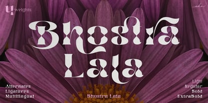 Bhostra Lala is an unique and versatile font family. Bhostra Lala comes with alternates characters (PUA Encoded) and ligatures in 4 weights that will support your creativity in creating the perfect design result for many different projects such as logo, branding, poster, magazines, labels, merchandise, invitation, presentation, advertising, quotes and so much more! FEATURES: OpenType support Playfull to use (with ligatures and alternates options) Multilingual support PUA Encoded If you need support or more information about this item please kindly contact me: ekahermawanputu@gmail.com Thank you so much I really hope you enjoy when using it!
 - Castrelon by Ekahermawan,
$15.00 Castrelon is a elegant serif family with a bunch of alternates and ligatures. Castrelon including with more than 200+ alternative characters (PUA Encoded) that give you a wide range of typographic design results. Castrelon is a versatile font for many different projects such as logo, branding, posters, magazines, label, merchandise, presentation, advertising, cards, quotes and so much more! FEATURES: OpenType support Playful to use (with ligatures options and alternates options) Multilingual support PUA Encoded If you need support or more information about this item please kindly contact me : ekahermawanputu@gmail.com Thank you so much I really hope you enjoy using it!
 - Obvia Narrow by Typefolio,
$29.00 'Obvia' appeared as a result of direct observation on typefaces classified as geometric and the plan to explore for the first time width axes Condensed, Narrow, Normal, Wide and Expanded. The idea behind 'Obvia's design was to create a distancing from geometrically pure shapes, in this case, square shapes. Then some details were added, such as subtle inktraps, concave endings of the stems and carefully drawn alternate characters, giving a 'geohumanist' tone to the font. This first family of 'Obvia' has 9 weights ranging from Thin to Black, delivering a strong typographic identity, from the paper to the pixel.
 - Rhumba by Stiggy & Sands,
$24.00 A Lost Art Deco Style Reborn and Multiplied Rhumba began as a digitization of a film typeface from LetterGraphics in the early 70's known as "Barrio Lined". Originally only a single typeface, represented by our Rhumba Lined style, it was fun and offered more diversity to expand out the styles of this gem. Playing off the stylings of fonts like Prisma, Rhumba fills in gaps between the various lines of the original to offer 3 alternate looks. The Rhumba family contains 382 characters per font. A comprehensive character map preview is at the end of the poster graphics collection.
 - Narrow Deco JNL by Jeff Levine,
$29.00 The hand lettered word ‘puzzles’ from the box cover of a 1940s set of metal “connected” puzzle pieces manufactured by the A.C. Gilbert Company was the initial typographic model, but some additions and changes were made. Instead of the right side of the ‘P’ being a semi-circle, it was changed to a more conservative ‘’squared’ look. After drawing out all of the necessary glyphs, the overall height of the characters was extended to make the letters and numbers appear taller and narrower. The end result is Narrow Deco JNL, which is available in both regular and oblique versions.
 - ArchiType by Archiness,
$10.00 With the famous and much used Eurostile and Bank Gothic in my mind I wanted to design a mono-line font as simple and legible as possible. A square with rounded corners, i.e., the letter ‘o’ as its basis. From there on back to basics, so straights remained simple straights with 90° endings, whatever the angle. Numbers are monospaced. The result seems to be a pleasantly balanced and neutral font. Excellent for display purposes and surprisingly legible in even small sizes. This perhaps typical approach by an architect led to the name of the font: ArchiType.
 - Laxory by PizzaDude.dk,
$20.00 My handwriting with a speedmarker turned into a font - well, not really, to be honest! Personally I did do all the writing of letters, but in order for the letters to fit perfectly together, I manipulated them - just a tad! But the result is a hasty set of letters! When I say I wrote all the letters, I mean it literally!!! All letters are unique, meaning all the accented characters are unique! On top of that, Laxory comes with ligatures for both double lowercase letters and numbers! You will need to use OpenType supporting applications to use the autoligatures.
 - Diskanila by Ekahermawan,
$12.00 Diskanila is a romantic swirly script font. This beautiful script including with more than 300+ alternative characters (PUA Encoded) that gives you a wide variety of romantic typography design results. Diskanila comes with bold and light swirly alternatives to make your many different projects such as logo, feminine branding, poster, magazine, label, merchandise, presentation, advertising, and invitation card more beautiful ! FEATURES: OpenType support Playful to use (with ligatures options and alternatives options) Multilingual support PUA Encoded If you need support or more information about this item please kindly contact me : ekahermawanputu@gmail.com Thank you so much I really hope you enjoy using it!
 - Linotype Killer by Linotype,
$29.99Linotype Killer is part of the Take Type Library, selected from the contestants of Linotype’s International Digital Type Design Contests from 1994 and 1997. Designed by German artist Andre Nossek, the font seems to describe the Technosound of the 1990s with its electronically produced sights and sounds. It represents repetition, mass production and conformity. The alphabet consists exclusively of capital letters, all based on a rectangular form, all of the same height, and, with the exception of the I’, all of the same width. The cool and distant Linotype Killer is best suited to short headlines. - Brrrrr by Ingrimayne Type,
$14.95 Brrrrr is supposed to represent snow-covered letters, though it could also be letters covered with frosting. The lower case letters are identical to the upper-case letters. Buried in the font is another set of letters on Christmas tree ornaments. (They are on unicode characters in the 2400 block, circled digits and letters. See here.) The OpenType Stylistic Sets feature makes accessing these letters easier than using unicode, and another font, InsideLetters-Christmas, develops them further. The Brrrrr-Icing style can be used in a layer over Brrrrr to give the snowcap any color, not just the background color.
 - Double Frames by Putracetol,
$22.00 Introducing Double Frames - Display Font, a font with unique shape. there are two styles – standard and decorative. The modern and powerful display font you've been looking for. Each character is carefully crafted until the result is perfect. A lot of detail is preserved when characters are digitized, so uppercase looks fantastic up close Come with open type feature with a lot of alternates, its help you to make great lettering. best uses for wedding invitation, invitations, signature, typography lettering, branding, label, poster, logos, quotes, product packaging, header, merchandise, social media & greeting cards and many more. Double Frames is also support multi language.
 - M Comic PRC by Monotype HK,
$523.99 M Comic is a humanistic script design characterised by its modern, stiff, free and blocky construction. M Comic incorporates free and irregular characteristics of M Cute. Crossbars (橫) and stems (豎) are straight and slightly slanted. Entry and finial points of strokes are squarish and parallel without flare. Contrast of stroke is low, together with its bold stems (豎), making it suitable for large display text to catch attention. The result is a loosely coupled line of text of free, stiff and blocky glyphs. It is best for casual and humanistic display, illustrations, set upright, non-condensed.