4,003 search results
(0.019 seconds)
- TDL Ruha Crown by Tipos Das Letras,
$15.00 TDL Ruha Crown is a decorative, modern and mechanical display typeface and it results from the development of the stencil RUHA. Being the first typeface of the family, sets the basic concepts to be developed further, on each version to come. There is an rigid geometrical connection with the Roman du Roi design approach, since the letterforms are imposed by the constraints of the RUHA ruler. The main typographic proportions are connected with the modern typefaces, like Didot or Bodoni.
 - Orphic by Flawlessandco,
$9.00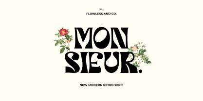 Orphic is a display retro font with a fun and bold style that perfect for your boho-themed projects such as poster design, branding materials, t-shirt, business cards, logo, photography, quotes, and more. Try out some alternate characters for another visual result! This font support for some multilingual. Also contains uppercase A-Z and lowercase a-z, alternate character, numbers 0-9, and some punctuation. If you need help, just write me! Thanks so much for checking out my shop!
 - Fashion Signature by Letterara,
$14.00 Fashion Signature is an enchanting handwritten font. This versatile Monoline font has a wide spectrum of applications ranging from greeting cards, fashion, weddings, posters, beauty cosmetics, and logos to headlines and is guaranteed to add a romantic or casual feel to your next project. Add it confidently to your projects, and you will love the results. This font is PUA encoded which means you can access all the beautiful glyphs and swashes with ease! Add to your collection for future Design and projects!
 - Litto by VladB,
$12.00 The name of the font is taken from the concept "Littoral zone" - this is the part of the sea that is close to the shore. The width of the shore varies as a result of the tides. Hence the idea of my font family — changing the width of a character from condenced to extra expanded. Litto is a modern sans serif geometric font, includes upper and lower case characters, Latin and Cyrillic. Graphically, the characters have uniform thickness for all family.
 - Byte 105 by Talbot Type,
$15.00 Byte 105 is a modular font, resulting from experiments in creating a practical, legible font from a minimum set of geometric components on a uniform grid. It has full upper and lower case character sets and includes all accented characters for Western and Central European languages. It's available in three styles – 105, 205 and 305. Each style has different corners, 105 is square, 205 is bevelled and 305 is round. Each style is available in three weights, Light, Medium and Bold.
 - Duffy Script by Shinntype,
$39.00 An interpretation of the lettering of contemporary illustrator Amanda Duffy. Each font contains four glyphs for each character (including all numbers, punctuation, and symbols), which OpenType coding sets in “random” order for a subtle, natural effect. Use a curved path to further accentuate the bounced quality of the letters. Try out different combinations of glyphs by inserting the cursor in front of your headline and hitting the space bar repeatedly: each time,the text will be represented by a different sequence of glyphs.
 - Ongunkan Old Turkic Yenisei by Runic World Tamgacı,
$50.00 The Yenisei Inscriptions consist of a total of 158 Turkish inscriptions, kurgans (graves) and rock stones that have been found along the Yenisei River, which passes through the Khakasya, Tuva and Altai Autonomous Republics in Russia. The inscriptions were written with Turkish Stamps, which we know as the Orkhon Alphabet. In addition, there are dozens of versions of the Turkish Runic script, apart from the Yenisei inscriptions and the Orkhon inscriptions. I will present the other versions here as soon as possible.
 - Mystery Shot by PizzaDude.dk,
$17.99 Mystery Shot is not your every day all-caps comic font. It is handdrawn with a permanent marker, which explains the sometimes rough edges. I've made 2 versions that mixes for great results. The stroke of the outline version is designed to fall slightly off here and there, and that was done on purpuse to enhance the handmade look of the regular version. What's more is that I added 5 slightly different versions of each letter, and the font has multilingual support!
 - Peacher by Edignwn Type,
$12.00 The Peacher perfectly represents crafted stuff of vintage script. This project was inspired by beautiful old labels. The product includes 4 styles (regular, rounded, rough and textured). This matches applies in some designs such as the logotype, poster, label, badge, packaging, branding, quotes and more custom design. Peacher includes : 4 style typefaces (regular, rounded, rough and textured) Uppercase, lowercase, numeral, punctuation and symbol 7 sets of alternates and swashes 25 ligatures Multilingual PUA Encoded Thank you for your support and choosing us.
 - Invocation AOE by Astigmatic,
$19.95 Made from a simple font incantation, the Invocation typeface was born. Inspired by an old Atari game called Necromancer where trees uprooted and came after the wizard, or something like that. The end result, a thematic typeface spawning roots. On darkened night, the moon eclipsed, a cryptic verse does pass my lips, from ancient parchment, edges worn, this Invoctation font is born... Sometimes we need an evil look for our designs, so why not summon this typeface into your hands today!
 - Heinch by Almarkha Type,
$29.00 Hello Everyone, Introduce our new collection, Heinch - Expanded Sans Family,inspired by famous logos of Technology and brands that have very strong characteristics, Heinch has 5 Fonts that allow you to get a job with satisfying results. very suitable for posters, t-shirt, packaging, branding, logotype and more. Heinch font with strong and challenging nuances. very suitable for the title, typography, clothes, Poster, magazines, brochures, packaging,Websites and much more for your design needs, making your designs more modern and professional
 - Beautiful rain by Sulthan Studio,
$12.00 Beautiful rain made in the rainy season I made an irregular handwritten font at will with beautiful and attractive results full of love and affection in it, making this font very attractive to use in your photos with two words that go hand in hand or also to connect your own name or partner's name because Having a swash heart that can be connected is very suitable for use on greeting cards, wedding invitations, magazines, logos, clothes, stickers, and many more.
 - Kids Script by Tipo Pèpel,
$32.00 Kids Script is based on the calligraphic models used in Spanish’s primary school in the 40’s. The result is a fresh and naive typography perfect for use in children’s oriented publishing. Taking advantage of Opentype functions, it’s possible to get different styles of writing, adding initials, ligatures, contextual characters and alternatives, plus a complete set of uppercase letters. The font contains three different weights for solving the most common issues, working with perfect legibility and readability in all sizes.
 - Office Visit JNL by Jeff Levine,
$29.00 Dan Hardie, a Miami-based graphic artist and creative consultant at Mutiny, Inc. shared an image he’d spotted online of some interesting signage formerly on the front of the Miami Medical Building. Comprised of hand-cut metal characters (with a thoroughly avant-garde “Art Deco meets Modernist” approach), this instantly became a font design idea unusual and quirky enough to develop as a digital typeface. The end result is Office Visit JNL, which is available in both regular and oblique versions.
 - Campton by René Bieder,
$30.00 Campton is an unconventional typeface based on the first steps of the newly born sans serif genre in the early twentieth century. Its character draws inspiration from Gill Sans and Johnston Sans while combining it with contemporary elements. The result is a modern and unorthodox family that is perfectly suited for graphic design application ranging from editorial and corporate design to web and interaction design. Campton comes in nine weights with matching italics and is equipped with a wide range of opentype features.
 - Aqua Casual by Scholtz Fonts,
$18.00 The script equivalent of the cool, header font. This font is essentially embedded, by its styling, in the 20th century. Inspired by fragments of some pre-20th century script fonts, I modernized it and added lower case characters. The result captures the cool elegance of the 1920s & 30s, yet also embodies the free optimism of the 60s. Aqua Casual is a fully professional font, carefully letterspaced and kerned. All upper and lower case characters, punctuation, numerals and accented characters are present.
 - Peanut Slap by PizzaDude.dk,
$16.00 I love peanuts! Actually I eat peanuts every day, in the shape of Peanut Butter ... and it kind of slaps me in the face with energy and good taste! What a good way to start the day! The same thing could fit to this font: a good way to start your day is with a good design ... using my Peanut Slap font: Mix the 3 versions with your favourite colorscheme, play around with the transparency...and voila! Great results awaits you!
 - Bluenote Demi by Wiescher Design,
$39.50 Bluenote is a font based on Franklin Gothic condensed. In the 60s and 70s the record label Blue Note published all those classic jazz records of my youth. Someone at their arts department cut letters to ribbons and designed wonderful record covers with those fragmented glyphs. I recently had a look at my music collection and rediscovered these letters. Being a hard-working type designer I couldn't resist the challenge, here is the result from your dilligent designer Gert Wiescher
 - Trend Hand Made by Latinotype,
$20.00 Trend & Trend Hand Made is a font made of layers, taking as a basis a sans and a slab font. It is the result of observation, search and study of the last global trends. Trend tries to capture the aesthetics of fashion or even fashion itself, integrating elements of a very popular and current trend. It is a typeface designed to be used without need to add anything external to it, because it has all components required for this. Trend is trending.
 - Retroica by Runsell Type,
$21.00 The Retroica perfectly represents vintage aesthetics display typeface. This project inspired by beautiful lettering in old label. Some letter contains beautiful alternates characters (ss01 - ss04) and some ligatures The Retroica matches applies in some designs such as the logotype, poster, packaging, branding, quotes, badge and more custom design. The features uppercase, lowercase, numeral, punctuation & symbol, ligatures, alternates, multilingual support, PUA encoded (fully accessible without additional design software). How to get access alternate glyphs with designing software to open type fonts, klik here.
 - Fd Bored To Death by Fortunes Co,
$19.00 This font is inspired by a horror film title or opening, taking inspiration from underground bands, made from watercolor brushes and so you get sharp textured results, with its defiant shape, rough edges and unadulterated imperfections. and give a spooky, firm, horror impression. There are several unique ligatures that can make sentences more unique. Regular Stylistic alternates SS01-SS03 Ligatures os, St, fl, ff, ffi, ffl, ae, si, ss, ha Multilanguge Support Latin Pro Uppercase & Lowercase Numerals & Punctuation 443 glyphs
 - Patron by Milieu Grotesque,
$99.00 Patron is a sans serif influenced by two dissimilar type designers, Günther Gerhard Lange and Roger Excoffon. Patron is a sans serif influenced by two dissimilar type designers, Günther Gerhard Lange and Roger Excoffon. Patron unites their contradictory approaches to create an expressive, yet versatile grotesk. As a result, Patron is characterised by a generous x-height, flared stroke endings and an unconventional shift in balance, inspired by Excoffon and a rigorously precise, modern interpretation for which Lange was most famous.
 - Byte 305 by Talbot Type,
$15.00 Byte 305 is a modular font, resulting from experiments in creating a practical, legible font from a minimum set of geometric components on a uniform grid. It has full upper and lower case character sets and includes all accented characters for Western and Central European languages. It's available in three styles – 105, 205 and 305. Each style has different corners, 105 is square, 205 is bevelled and 305 is round. Each style is available in three weights, Light, Medium and Bold.
 - Tsubu by Takehiko Ono,
$5.00 “Tsubu” (つぶ) means something small and round, like a fruit seed or a grain of rice in Japanese. All characters are completely geometric, consisting of no more than 5 x 12 dots, with a few exceptions. And proportional and monospace styles are available. It is recommended that letter spacing be set to 0 to maintain dot pitch. When the line height is set to 100%, the dot pitch is aligned horizontally and vertically, resulting in a beautiful geometric display.
 - Emillisa by Yoga Letter,
$13.00 Emillisa is a modern handwritten font that is made with a subtle touch resulting in a high quality font. This font is very beautiful and elegant which is suitable for all kinds of your work. This font is perfect for all wedding needs (wedding invitations, wedding photography, decorations, and other wedding designs). It is also suitable for promoting your business (hotels, villas, vacation spots, products, services or other promotions. Also suitable for promo updates, logos, branding, posters, or status updates on social media.
 - LTC Holiday Ornaments by Lanston Type Co.,
$24.95 Assembled for those less commercialized holidays, LTC Holiday Ornaments features over 80 printers' ornaments from Lanston Monotype and other historical foundries such as BBS and ATF. Holidays include Easter, Valentine's Day, St. Patrick's Day, April Fool's Day, Thanksgiving and 4th of July. There¹s even a pirate to represent international "Talk Like a Pirate" day. LTC Holiday Ornaments joins the Lanston Collection alongside the popular LTC Halloween and Christmas Ornaments. LTC Holiday Ornaments contains additional Halloween and Christmas ornaments as well.
 - Feltboard JNL by Jeff Levine,
$29.00Feltboard JNL was drawn from images of letters and numbers contained in a felt board (also known as a flannel board) sign kit from the 1940s or 1950s. The irregularity of stroke widths and character shapes is representative of the actual shapes of the die-cut pieces found within this kit. Note: The cap height is slightly smaller than normal for the respective point size. This will give the effect of wider line spacing - similar to that of hand-made signs. - Rosemont by Scriptorium,
$24.00Rosemont is a playful new font which hovers on the bordeline between Arts and Crafts style and Art Nouveau style. It has the narrowness of Art Nouveau fonts like Adresack, Spoonbill and Coloma, with the curls and unique character forms of Art Nouveau fonts like Beauvoir or Acadian. The result is an interesting looking font which could be at home in either design environment. Rosemont features two sets of upper case characters, one with more decoration and one which is more plain. - Eloisa by StuArt,
$9.00 Eloisa is based on the penmanship of Andrea Stuart's eponymous aunt. The slow, meticulous strokes with which Eloisa writes is the result of formal (and meticulous) instruction in cursive writing back in her secondary education in an exclusive all-girls school. The interesting mix of smooth curves and sharp strokes combined with the slanted orientation make for an elegant yet dynamic visual appeal. Eloisa is perfect for branding, invitations, greetings, or any classy rendering of text you may imagine. Be classy!
 - TR Reqnad Display by Tondi Republk,
$17.00 Reqnad Display is part of a series of typefaces by Tondi Republk, inspired by modern industrial design and architecture. The Reqnad Display type system consists of seven typefaces with varying visual styles and weights which can be used interchangeably to create harmonious, versatile and impactful visual communication systems. Used alongside well curated imagery and grid based layouts it adds a modern appeal to written sentiments. To view more examples of layouts created with Reqnad Display search for the #ReqnadDisplay hashtag on social media.
 - Down Home JNL by Jeff Levine,
$29.00 In the October 31, 1920 edition of Wid's Daily (the predecessor to The Film Daily), a block of ad copy from a 1920 film called "Down Home" had the text printed in such a fluent pen-lettered style that a bit of a shortcut was used at the beginning of the design process for this typeface. Normally, font inspirations are redrawn [and not by simply using auto-trace] except under specialized circumstances like this one where that feature is a help, rather than a replacement for the creative process. The entire block of text copy was auto-traced, then the necessary letters were selected from the available wording and cleaned up to remove any sharp points and irregular curves in an effort to make the end results as close to the original and unusual hand-drawn text. From there the missing characters needed to produce a finished type font were created utilizing the standard methods of drawing and font construction. The end results turned out very well. Using the film's title as its namesake, this design is now available digitally as Down Home JNL in both regular and oblique versions.
 - Cooper Screamers by Wordshape,
$- In 1925, at the request of Barnhart Brothers & Spindler, the foundry he worked for, Oswald Bruce Cooper designed a wide selection of "screamers", oversized exclamation points used to grab attention in display advertising. The foundry rushed the screamers into production, much to Cooper's dismay. Cooper was disappointed with the final form of the screamers– they were designed in assorted weights to match the assorted Cooper series of typefaces, as well as in a variety of other formal solutions- squaredoff, incised, wavy, Tuscan, and rounded. Cooper's working design methodology was to re-draw his projects a number of times in order to refine the formal results. However the screamer project was hastily cut by the head of BB&S's matrix engraving room in fourteen sizes from the initial sketches, causing Cooper to fire off a fiery missive stating, "Everything I draw is bum the first half-dozen times I draw it; the trouble with these is that I drew them only once!" This typeface is the result of researching Cooper's original drawings and series of engraved proofs for the screamers, as well as the original Screamer type specimen. Cooper Screamers have never been available before in digital format.
 - Romp by Positype,
$30.00 With all ego aside, Romp was designed and influenced by my daughter, Angel. For some time now, she has wanted me to design a font based on her handwriting. But each time I sit down to do it, I run into more that she needs to do and redo. On a recent attempt, I ran into the same situation again. Instead of moving on to something else, I decided to whip out a sumi brush and start making letters...for me, type design is something a little ‘serious’ and never a time to just have fun. This typeface proved that notion wrong—it really was fun. As a result, each letter encouraged another and the design grew...and grew! The happy result spawned 3 separate sets of letters & numerals (small caps and some ligatures too!). Using the beauty of OpenType, these 3 sets have been fused into one, randomly generating font set. If you are using any type of OpenType enabled application, then the Romp Pro typeface is the way to go. They include everything found in the 3 separate variants for each style as well as entirely expanding offering of additional small cap and ligature sets.
 - Rolfter by AlienValley,
$13.00 Introducing Rolfter, a classic serif typeface with many features including ligatures, tons of alternates and multilingual support. All the ligatures and alternates can be accessed by installing just one font file. LIGATURES & CONTEXTUAL ALTERNATES We recommend that you turn on both ligatures and contextual alternates for best results. You can do this in either Photoshop or Illustrator. Photoshop: Open the "Character" panel via Window - Character and check the standard ligatures and contextual alternates icons at the bottom left corner of the panel. Illustrator: Open the "OpenType" panel via Window - Type - OpenType and also check the standard ligatures and contextual alternates at the bottom of the panel. OPTIONAL ALTERNATES These are optional alternates that can be used depending on your current design. We recommend moderate use of these for optimal results as using too many can easily make the font unreadable. To access these you need to open the following panels depending on your software: Photoshop: Window - Glyphs (Note that this panel may not be available in earlier PS versions) Illustrator: Type - Glyphs You will then have access to all the glyphs inside the font file to use them as you like.
 - Fungia by Ivan Petrov,
$30.00 Fungia is the result of an experiment to remelt loose natural forms to a coherent structure of a typeface. The idea appeared as a kind of joke: what letters look like if based on the shape of mushrooms. In a sense the structure of�mushroom has some affinity to the structure of�a letter: a cap and a stalk remind�a serif and a stem respectively. So it was pretty easy to design such straight letters like I, E, L, F. The captivating challenge was to apply the idea on round letters (O, C, D, G), letters with diagonal (N, M, Z) and signs without serifs (digits, @, &). The result exceeded expectations. The typeface turned sophisticated and vibrant but absolutely consistent. It became capital-only font in one weight. Because of its opulent forms Fungia performs best in large size and short inscriptions. However it provides readability in small size as well. Fungia is more likely thing-in-itself. Initially it wasn't intended to solve specific design challenges. But the alleged scope could include book covers, posters and billboards, street signs, magazin spreads and all situations that demand�expressive typography. Fungia supports extended latin and russian cyrillic script systems.
 - Carve by Scholtz Fonts,
$19.00 Carve is an African font that was inspired by fonts such as Othello and Neuland designed in the mid-1920s. Rather than attempting to re-create these fonts in a digital form as so many others have done, I have tried to capture the “spirit” of the period and emphasize the “woodcarving” style of the font, while simultaneously giving it a contemporary feel. As a result the characters differ markedly any of the original styles and have much less of an “Art Deco” look to them. To further modernize Carve, I have included all the characters required for a full character set (lower case, as well as all punctuation, numerals, diacritics, special characters etc). The result is a thoroughly modern re-interpretation. The numbers (0 to 9) bear no relation to any originals but, I believe, are fully in keeping with the upper and lower alphabetic characters of my font. Carve comes in two styles: --Regular: contemporary, angular African style --Incised: exaggerating the chunky, hand-carved "woodcut" effect. The "in-line" effect has been hand-crafted to avoid the mechanical effect of computer-generated inline effects.
 - Schmalfette CP by CounterPoint Type Studio,
$29.95 SchmalfetteCP is the result of another collaboration between designers Jason Walcott and Rob King. King suggested that Walcott revive this wonderful and somewhat forgotten sans serif typeface from the mid 1950s. Originally designed by Walter Haettenschweiler in 1954, Schmalfette Grotesk was used for many years in the German magazine "Twen". The typeface was notoriously hard to acquire at the time and graphic designers in the USA often resorted to cutting letters from the Twen magazines and reusing them in their own designs. Later, when digital type came along several typefaces very similar were created that claimed to be digital revivals of Schmalfette Grotesk. However, they are actually only loosely based on the original. The proportions are different and in some cases a lower case was added. The original font was all caps. At Rob King's suggestion, Jason Walcott has strived to recreate the most faithful digital revival possible of the original Schmalfette Grotesk with the new version of SchmalfetteCP. In some cases small changes were made to accommodate today's digital needs (e.g. web fonts), but anyone who has ever searched for this typeface now has a version available that most closely resembles Haettenschweiler's original work. Schmalfette CP comes in OpenType format in both .ttf and .otf files and offers support for all Latin based and Eastern European languages.
 - Oriental View by Lime is a unique font that encapsulates the essence and beauty of East Asian calligraphy within the framework of contemporary typeface design. It stands out for its elegant mixture o...
- As of my last update in April 2023, the font named Krizia Uomo, designed by Levi Halmos, may not be widely recognized in main font repositories or among popular digital font libraries. However, let m...
- The "Hackers" font, as its name intriguingly suggests, is a typographical representation that evokes feelings of technological prowess, underground digital cultures, and the audacious spirit of cyber...