4,003 search results
(0.018 seconds)
- Vivala Unicase by Johannes Hoffmann,
$15.00 Vivala Unicase is a modern, rounded linear grotesque that is easy to read even in small font sizes. The composition of uppercase and lowercase letters results in a unique typeface. The new version contains five weights, including a boldface, which greatly expands the design possibilities. With an extensive set of characters and symbols, it is ideal for posters, t-shirt design, promotional products, car design, labeling, trademarks and headlines.
 - Soldier Slab Stencil Dstrssd by Alphabet Agency,
$15.00 Soldier Slab Stencil Dstrssd. is a grungy military stencil font. The bold slab characters provide a great base to present the distressed effect. The font has been developed from a war related computer game project. The font contains 26 letters of the English alphabet in capitals and alternative capitals are represented when typing in lowercase letters. Each font also contains numbers, punctuation and a range of Latin characters as displayed.
 - Sporty Vista by Letterena Studios,
$17.00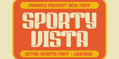 Sporty Vista is a classic serif font with a unique style and modern look. It is perfect for elegant and luxury logos, book or movie title design, fashion brands, magazines, clothes, lettering, quotes, and much more. Add it to any of your creative projects, and you will be amazed by the results. This font is PUA encoded, which means you can access all of the glyphs and swashes with ease!
 - Viktor by Librito.de,
$10.00 The design for the font "Viktor" is based on original woodcut letters I purchased on a Flea Market. I handprinted the letters and converted the result into a font. The font preserves the rough and handmade character of the printed letters. To make the font more useful especially for packaging I designed in addition to the original font an outline version, a shadowed version and a striped font.
 - Oh November by Supfonts,
$15.00 This new font was inspired by the game with different signature styles. I also added 102 ligatures to it. The result is a light and nice font that looks completely hand-drawn. Oh November will look beautiful on Christmas and holiday invitations, wedding invites and stationery, logos, and more. I love using it for emphasis words and pairing it with serifs Check out my blog: https://www.instagram.com/zloillev pinterest.com/dmitriychirkov7
 - Fun Play Arabic by FunFont,
$17.00 Fun Play Arabic is sibling of Fun Play comes with Arabic version ; Arabic, Urdu, Persian, Kurdish and Jawi. Fun Play is a Fun and Playful display typeface family with 5 wights variant; from Light to Bold. Comes with many features; Multilingual Support, Ligatures, Stylistic Alternate and more. Each character represents a child's joy. ‘Fun Play’ can be used for branding, packaging, headline and all styles of children-related design.
 - Carole Serif Variable by Schriftlabor,
$120.00 Carole is an interpretation by Matz Gasser of the old-style serif model. It explores the early serif typefaces and how handwriting still had a significant influence on the shapes. The result is a dynamic serif text font to use in small sizes and make reading comfortable. It was designed to work for text sizes, but you might find it in packaging or food brands because of its robust design features.
 - Al American Legend by Aluyeah Studio,
$125.00 Hello Aluyeaholics! So we tried playing with the script, we hope you like it. American Legend is inspired by vintage handwriting. Comes with 220+ stunning alternates and ligatures. Super easy to use alternates and ligatures. Super Easy to Use alternates - You can easily call alternates using special combination like a.2 a.3 b.5 e.r a.r l.l etc. To get results like the preview just type Ame.rican Leg.9end
 - Highbary Sunfest by Letterena Studios,
$17.00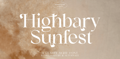 Highbary Sunfest is a classic serif font with a unique style and modern look. It is perfect for elegant and luxury logos, book or movie title design, fashion brands, magazines, clothes, lettering, quotes, and much more. Add it to any of your creative projects, and you will be amazed by the results. This font is PUA encoded, which means you can access all of the glyphs and swashes with ease!
 - Theridge by Asenbayu,
$9.00 Theridge is a multipurpose condensed font that comes in 3 weights: light, normal, and bold. Inspired by hiking trips and forest views, Theridge represents a sense of clean highland adventure. These fonts themed retro, adventure, urban, hipster, vintage but still modern. These fonts are great for creating desired projects like logos, posters, headlines, albums, quotes, apparel and more. These fonts are perfect for you who need clean condensed typeface! Thank you!
 - Opheline by Nasir Udin,
$19.00 Opheline is modern display serif family of 9 fonts. The family consists of 9 weights, ranging from thin to black. The thin version reflects elegance and soft texture, while the black version represents modern and strong appearance. The vast range of Opheline family will help you to tackle your designs problem that need professional or classical touch; from the professional-look branding of law firm to classic-historical product branding.
 - Krydderi by PizzaDude.dk,
$15.00 A touch of spice is often what makes a good meal even better. In Danish, spice is called "krydderi" I chose that particular name for this font because it is the kind of brush font that most likely could spice up your next design. I've added 6 different versions of each letter, and they automatically cycle as you type, leaving the result like authentic brush written text. All Caps Fonts.
 - Victorian Alphabets H by Intellecta Design,
$20.00 Victorian Alphabets H is an incredibly cool and classic display font. Elegant and distinct, this font will most certainly elevate your creations. Add it confidently to your projects, and you will love the results. You have a great set of letters "H" using the uppercases, lowercases and numbers keys on the keyboard. Plus, acquiring the Titivilus font you get GREAT DUO combinantion, like you can see i the banners
 - Mestizo by Volcano Type,
$35.00 Mestizo is a term traditionally used in Latin America and Spain for people of mixed heritage or descent. In some countries it has come to mean a mixture of European and Amerindian. The font Mestizo is based on a strict grid system – but combines it with ethnic symbolism. Six weights can be combined in various ways. Accius, Alerio & Amias display the basic geometric shapes, Balbo, Belus & Borba represent the playful icons.
 - Driveway Stencil JNL by Jeff Levine,
$29.00We've all seen the informational markings on commercial driveways or roadways instructing us which way to turn, where to park, etc. They are usually in stencil lettering 16 inches or taller, with compressed letters that make the horizontal strokes look slightly thicker than the vertical ones. By condensing the lettering in Narrow Stencil JNL by 20 percent, the result is Driveway Stencil JNL - a digital emulation of those painted road markings. - Alcapone by Adam Fathony,
$17.00 Alcapone, a name based from legendary donuts on some brand, It's crunchy and melty. So, I've created this fonts while eating this meal. The Concept is Groovy, Retro & Psychedelic look. Created with a base on standard Serif fonts, playing with melted on the serif itself giving more weight to represent the grooviness and retro-ish look. Alcapone are good for Display, Header, Headline, Poster, Logos, or etc on a big typography.
 - Suitnice by Flawlessandco,
$9.00 Suitnice is a retro font type with a fun and bold style that is a perfect fit for your retro vintage-themed projects. Try out some alternate characters for another visual result! There's some connected letters and some alternates suitable in graphic design projects such as branding materials, t-shirt, print, business cards, logo, poster, t-shirt, photography, quotes etc. These fonts have multilingual support, and alternate characters.
 - Kenwyn by Talbot Type,
$19.50 Kenwyn is a bold, geometric, Egyptian style slab-serif display font. It comes in two variations — Single Dot and Double Dot — each with an accompanying Stencil variation. Essentially a blend of circles and squares, Single Dot features a circular counter at the centre of each character, while Double Dot uses a lower and upper circle. Although the two variations are similar in principle, the results are visually quite different.
 - Energetica by Balpirick,
$15.00 Energetica is a Modern Handwritten Font. Energetica is a delicate, elegant and flowing handwritten font. It has beautiful and well balanced characters and as a result, it matches a wide pool of designs. Add it to your most creative ideas and notice how it makes them come alive! Energetica also multilingual support. Enjoy the font, feel free to comment or feedback, send me PM or email. Thank you!
 - Element 120 by Hanoded,
$15.00 Element 120 (Unbinilium) is a hypothetical chemical element in the periodic table. You can forget about that, I just thought it was a cool name for a font. Element 120 is a hand drawn Ultra Bodoni. I drew all the glyphs by hand, then gave them a good grunge makeover and the result is what you see before you. Comes with a periodic table of diacritics as well!
 - Wamelo by Groen Studio,
$16.00 Wamelo, a work that is purely a result of handwriting and writing by using a liquid ink pen, has a natural characteristic. This is perfect for invitations, signatures, blogs, social media, business cards, product brands. OpenType features can be accessed by using OpenType smart programs such as Adobe Photo Shop, Adobe Illustrator, Adobe Indesign, Corel Draw and Microsoft Office. They can also be accessed through the character map.
 - Domosed Slab Serif by Etewut,
$29.00 Domosed Slab Serif typeface was build during lockdown. As a result of home sitting it appears in two weights. It refers to Italian futurism when all generation understand global changes of industrial revolution. The forth industrial revolution appears with new rules but the main idea is the same – simplifying the processes. Causing the vibe of a bright phenomenon I want you to use my font to match to zeitgeist.
 - Monster Movies JNL by Jeff Levine,
$29.00 A 1967 ad for Aurora “Monster Scenes Custom Builder Kits” featured the drippy, gooey hand lettering long associated with science fiction and horror movies. The letters in the ad were auto-scanned and additional characters were completed with the end result being a horror-themed font with sharper angles and lines instead of drips. This is now available as Monster Movies JNL, which is available in both regular and oblique versions.
 - Helena Handbasket NF by Nick's Fonts,
$10.00The 1888 edtion of James Conner's Sons United States Type Foundry specimen book listed this little gem simply as "Antique Light". Its original, rather anemic outlines have been beefed up and its serifs have been rounded, with the result that this face will get noticed wherever it goes. Both versions of this font include the complete Latin 1252 and CE 1250 character sets, with localization for Romanian and Moldovan. - Kymmera Deco NF by Nick's Fonts,
$10.00The dreams that you dare to dream really can come true when you perk up your headlines with this re-imagining of Saul Bass's 1982 glitzy Deco classic, Rainbow Bass. For best results at large sizes, choose the TrueType version, rendered at a full 2,048 UPM. Both versions include the complete Latin 1252, Central European 1250 and Turkish 1254 character sets, as well as localization for Moldovan and Romanian. - Ziletti Pop by RM&WD,
$20.00 ZILETTI POP is a font used by Girolamo Ziletti in Venice in mid/late 1500. A typographic caracter characterized by a Venetian style cage with slight geometrical imperfections but with a great perceptual level. This is a multilayered variant with a wide range of possibility in variations in terms of end results. With the use of the color your artworks will have news optical effects. Ideal for Covers, Posters, Logos…
 - Piano Keys by Funk King,
$10.00 Piano Keys is a musically-inspired font. It can be used for commercial as well as educational projects. In other versions, I tried to accurately replicate the pattern of black and white keys across the character set. Of course when used, the randomness of text and characters often produced less than realistic results when needed. This version allows black and white keys to be accurately arranged, if desired.
 - Christmas Worship by Letterara,
$14.00 Christmas Worship is an enchanting natural handwritten font. This versatile script font has a wide spectrum of applications ranging from greeting cards, logos to headlines and is guaranteed to add an elegant or romantic feel to your next project. Add it confidently to your projects, and you will love the results. This font is PUA encoded which means you can access all the beautiful glyphs and swashes with ease!
 - Advertising Stencil JNL by Jeff Levine,
$29.00 An ad spotted in a 1964 issue of Billboard magazine with the words “STAND BACK…” introduced the first record album from then-new stand-up comedian Bill Cosby. The lettering of those two words was in a stencil sans serif design that was a perfect candidate for developing into a digital font. The end result is Advertising Stencil JNL, which is available in both regular and oblique versions.
 - Cogenta Text by SRS Type,
$25.00 Cogenta Text is a geometric sans-serif typefaces. It showcases reduced contrast and a more neutral appearance compared to the lowercase joint of Cogenta. Its low cap height makes it an ideal choice for mobile and web applications. Precise kerning enhances readability, ensuring a satisfying user experience. Cogenta Text effortlessly complements diverse design applications, including logos, branding, posters, editorial design, websites, and more, consistently delivering exceptional quality results.
 - The NFL Packers font captures the spirit and passion of the Green Bay Packers, one of the most storied franchises in the National Football League (NFL). This font is not merely a set of characters; i...
- The Iron Lounge Smart Dot 2 font, created by PizzaDude, is a distinctive typeface that captures the essence of modern design with its unique blend of style and accessibility. This font stands out for...
- CAC Shishoni Brush is a distinctive font that captures the essence of artistic freedom and expressive brush strokes. Its design reflects a raw, unrefined aesthetic that is both captivating and versat...
- Menhart by Monotype,
$29.99Czech designer Oldrich Menhart (1897-1962) devoted his life to making letters. He was a calligrapher, lettering artist, and typeface designer with over twenty faces to his credit. The Monotype typeface, Menhart, was the second of his designs. Menhart began work on the design in the early 1930s and turned over his final artwork to the Monotype Drawing Office in 1934. The first size cut was 14 Didot (Didot points are the traditional European system of type measure, and are roughly equivalent to the point system commonly used by today's digital fonts). The 14D font was followed by 18D and 24D, indicating that the design was considered most suitable for display work. However, a 10D size was later cut from the same master drawings at the request of a Monotype customer. Menhart's design was light and open, with an even color and a slight squareness" to its round shapes. Because the Czech alphabet has 15 accented letters, Menhart included these diacritics as an integral part of his design, not as an afterthought. As a result, accented copy set in Menhart has a cohesive quality rarely seen in other typefaces. Monotype's new digital release of Menhart is the first revival since the hot metal fonts were cut. Menhart Display is based on the original Monotype drawings, while a slightly heavier, re-spaced version has been created for text sizes. Both versions offer the full capabilities of the OpenType format, such as the automatic insertion of old style figures, ligatures and small caps. In addition to English, the extended character set supports most Central European and many Eastern European languages. One of Menhart's lifelong goals was to share the richness of his Czech culture by drawing typefaces that uniquely served Czechoslovakia literature. In his words: "I believe that a Czech style of type comes above all from the spirit in which it was designed, which gives it its 'signature,' and not so much from decorative composition, and even less from the geographic location of its creation." The typeface Menhart is a tribute to his values. Now, Menhart Pro and Menhart Display Pro capture the unique personality of this timeless design while greatly extending its range of use. " - FS Koopman by Fontsmith,
$80.00 FS Koopman is a hard-working typeface. A crossbred workhorse that draws on inspiration from Swiss grotesks, American gothics and early British grotesques. It refuses to fit neatly into any of these categories, it’s neither one nor the other, but all of the above. It’s kinda Swiss meets American… (but with a slight Yorkshire twang).
 - The Ground by Balevgraph Studio,
$10.00 The ground is a minimal and neat sans serif font with plenty of stylistic alternatives. This typeface is perfect for an elegant & luxury logo, book or movie title design, fashion brand, magazine, clothes, lettering, quotes, and so much more. What's Included? Uppercase & Lowercase, Number, Punctuation Ligatures & Alternates Multilingual support PUA Encoded Reguler & Italic TTF
 - Quarter Braille by Echopraxium,
$20.00 Presentation QuarterBraille (Abbreviated as "QB" thereafter) is a decorative, steganographic and lattice font. Its core design concept is that Braille dots are represented as "quarters of a square"[1]. This is illustrated by posters 1 and 2 (NB: these glyph parts will be called "QB dots" thereafter). The other glyph parts (see poster 3) are purely decorative and meaningless in terms of Braille dots encoding[2]. All glyph parts are meant to generate a wide variety of patterns from horizontal and vertical combinations of glyphs. There is also a graphic convention to differentiate uppercase from lowercase letters with the presence or absence of shape subparts (in the "endings", "quarter of a circle with a ring" and "quarter of a diamond with a small square in the middle") like shown by poster 4. This font is suitable for very short texts (e.g. logos, acronyms, quotes, ambigrams, pangrams, palindromes, etc...) but on the other hand it may be used for steganographic purpose like geocaching as well as fictive alphabets (e.g. Alien/SciFi/Fantasy/Antique civilizations). Posters 1. Font Logo: the displayed text is " Quarter " followed by " Braille". There's a rainbow layer above the text to highlight the "QB dots", this is achieved by A..Z glyphs with "only QB dots" (codes 230..255) 2. Anatomy of a Glyph (L) and "QB Dots" (quarters of a square) 3. Glyphs Parts: Square and Cross (Inverted square), Circle and Inverted Circle (with or without the small circle in the middle), Diamond (with or without the small square in the middle), Inverted Square and Circle, Shape combos, Ending 4. Uppercase vs Lowercase (tiny shape subparts are shown in red) 5. Sample 1: Bathroom sink with QB tiles on the credence 6. Sample 2: Hands knuckle tatoos: "LOVE/HATE"[4] 7. Sample 3: Poker Hand: pocket Aces. It's an Ace of Hearts (Ah) on the left and an Ace of Spades (As) on the right. Like in regular cards, the card value (e.g. Ah) is displayed twice: at the top and rotated by 180 degrees at the bottom. This poster also illustrates that QB could be used to print embossed playing cards with tactile and visual display of card values. 8. Sample 4: Pangram: "Adept quick jog over frozen blue whisky mix" 9. Sample 5: Latin Magic Square: "SATOR AREPO TENET OPERA ROTAS" (NB: for compensation of the 2/3 glyph ratio, letters on each line are separated by a space: "S A T O R", ...). 10. Sample 6: Quote of Mahatma Gandhi: "Learn as if you will live forever, live like you will die tomorrow.". This is also a demonstration of border glyphs combinations. 11. Sample 7: Steganography use case: the text is a sequence of 64 aminoacids (1 Letter notation), this protein was described in a research paper "The complete Aminoacid sequence of an amyloid fibril protein AA of unusual size (64 residues) 1975". 12. Sample 8: Border Glyphs with the provided styles and mixed styles. The words are the same than in poster 9 ("SATOR AREPO TENET OPERA ROTAS"). Despite the 2/3 glyph ratio, the "TENET cross" was achieved by both inserting spaces in horizontally ("T ENE T") and by using the "thin borders glyphs". Notes a. Border glyphs[3] are meant to enhance the esthetics of text samples displayed with QB b. Special characters (e.g. *$()[].,;:&@# ...) are provided and follow the NABCC (North American Braille Computer Code) convention. c. A..Z Glyphs with only the "QB dots" are provided as demonstrated by posters 1 and 2 (A/N: this was very useful to create them). d. Glyph Map: 32..64: Special characters - 161..187: "Thin variant" of Border glyphs, 192..229: Border glyphs, 230..255: A..Z with only the "QB dots" - Codes 176 an 181 are "regular SPACE" (empty glyph). Footnotes 1. There is indeed two shapes which represent the braille dot: the "quarter of a square" and the "quarter of a cross". It's because a cross may be considered as an "inverted square" because the square corners are merged in the center. 2. That's why the SPACE glyph is only made of decorative/meaningless glyph parts (i.e. no "QB dots"). 3. For other fonts with border glyphs, please take a look at my other "decorative Braille fonts" (GoBraille, HexBraille, KernigBraille, StackBraille, MaBraille, DiamondBraille, LorraineBraille). 4. LOVE/HATE knuckle tatoos are inspired by the anthology scene from "The Night of the Hunter" movie (Charles Laughton 1955), it also appearead in "Do The Right Thing" movie (Spike Lee 1989). Disclaimer This font is not appropriate and not meant to print text documents in Braille for the blind readers audience.
 - Origami by Monotype,
$29.99In spite of its angular appearance, Origami is composed almost exclusively of curves. Designer Carl Crossgrove derived the typeface from experiments in designing a low resolution type. The resulting face is reminiscent of Eastern European expressionist designers such as Oldrich Menhart and Vojtech Preissig. It is paired with an equally angular chancery italic. Origami works effectively for short blocks of text or at display sizes, while the capitals are especially suitable for titles. - Period Borders NF by Nick's Fonts,
$10.00 Here’s a collection of border elements taken from the pages of nineteenth and early twentieth century type specimen books of various American foundries. Download the PDF provided for each font for simple guides to constructing various borders. All characters have identical widths, so use spaces between left and right-side elements. For best results, set solid (no extra leading) and use flush left, flush right or center justification to assure proper alignment.
 - Gibbs by Typetanic Fonts,
$39.00 Gibbs is a tough, sophisticated sans, inspired by the unique cast aluminum signs found on board the 1950s luxury liner SS United States and named for its designer, William Francis Gibbs. The design is appropriately transatlantic, somewhere in between industrial American vernacular lettering and English humanist styles. The result is both uniquely stylish and comfortably readable in both text and display sizes. Gibbs received a Type Directors Club award for excellence in 2015.