10,000 search results
(0.031 seconds)
- Wonderful JNL by Jeff Levine,
$29.00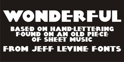 A little bit of thick-and-thin Art Deco hand lettering is offered up in Wonderful JNL, based on some promotional text found on an old piece of sheet music.
 - Ongunkan Greek Hollow Script by Runic World Tamgacı,
$75.00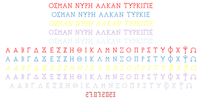 I added the hollow model of the font he developed by taking an example from the ancient Greek inscriptions found in Turkey to my fonts. Use it in good works.
 - Comicrazy by Comicraft,
$99.00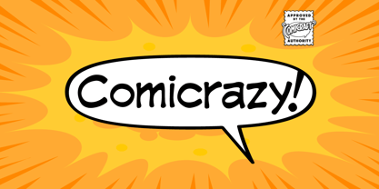 Originally created for exclusive use in Image's wildly successful GEN-13 title, Comicrazy was eventually made commercially available in response to inquiries from comic book creators all around the world!
 - Ps Snackbar Prn by Fontopia,
$12.99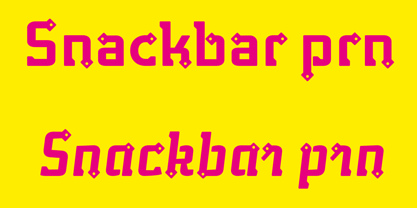 Snackbar prn is a typeface with a humorous slant. The font has its origins in an art project. It is now made available for design around festifals, parties, invitations, etc.
 - Quite Delicious by Bogstav,
$17.00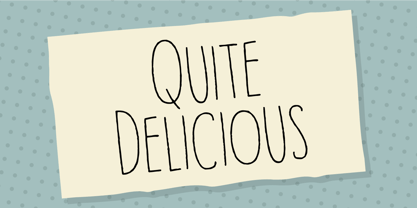 "It is quite delicious" - a quote by an English speaking kid, aged 3 in the kindergarten in which I work. Not only is that a very fine way of expressing your self (and remarkable at the age of 3!) But "Quite Delicious" also appear in the song "Why can't I be you" by The Cure.
 - Chocolate Pro by Sudtipos,
$79.00Most everyone agrees that chocolate is irresistible. Now the Koziupa & Paul tag team is offering you a choice of three irresistible flavors, from the bittersweet Amargo, to the mouth-watering Dulce, you now have three different possibilities for the pleasure of your taste buds. The OpenType versions includes de 3 flavors all in one. - Morfem by Allouse Studio,
$16.00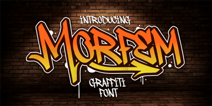 Proudly Presenting, Morfem A Graffiti Tagging Font Morfem is perfect for any titles, logo, product packaging, branding project, megazine, social media, wedding, or just used to express words above the background. Morfem also come with Multi-Lingual Support. Enjoy the font, feel free to comment or feedback, send me PM or email. Thank You!
 - Berlinsa by FadeLine Studio,
$15.00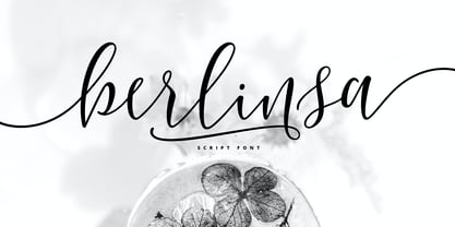 Berlinsa is a modern script font. It has smooth strokes to give character of a simple, sweet and realistic handwritten style. Berlinsa is perfect for logos, branding projects, homeware designs, product packaging, mugs, quotes, posters, shopping bags, logo's, t-shirts, book covers, name card, invitation cards, greeting cards, and all your other lovely projects.
 - Klute by Alias Collection,
$60.00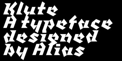 Klute references stylised forms of writing; historic Germanic, blackletter letterforms and graffiti and tagging. Its references are based on a personal idea of lettering - the action of writing is more personal and human than the craft of calligraphy or the mechanics of typing. These references suggest the idea of saying something particular and personal.
 - Hokia by Allouse Studio,
$16.00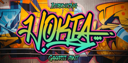 Proudly Presenting, Hokia a Tagging Graffiti Font. Hokia is perfect for any titles, logo, product packaging, branding project, megazine, social media, wedding, or just used to express words above the background. Hokia also come with Multi-Lingual Support. Enjoy the font, feel free to comment or feedback, send me PM or email. Thank you!
 - Ballin by Surplus Type Co,
$14.00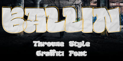 Ballin is a throwie style graffiti font that features super tight spacing and overlapping characters to create an authentic street style look. This font could be straight from a tag under a bridge or on a train car. Ballin would be perfect for apparel projects, band merch, sports content & lots of other creative work.
 - Nutty Noisses by Gassstype,
$25.00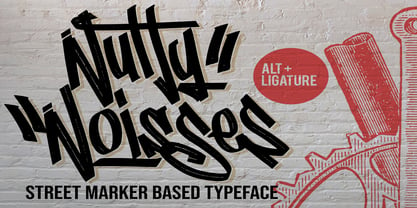 Here comes our new font Nutty Noisess Inspired from old skool graffiti tagging, street art, we created this Typeface, drawn in Procreate app, then vectorized and crafted carefully. Nutty Noisess Suitable for many design project, branding, packaging, logo, wall art, headline, template, banner, poster, and many more projects. These include all caps, punctuation, and numerals.
 - Boomsplash by Allouse Studio,
$16.00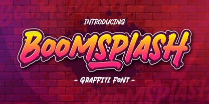 Proudly Presenting, Boomsplash a Tagging Graffiti Font. Boomsplash is perfect for any titles, logo, product packaging, branding project, megazine, social media, wedding, or just used to express words above the background. Boomsplash also come with Multi-Lingual Support. Enjoy the font, feel free to comment or feedback, send me PM or email. Thank you!
 - Dark Sider by Sipanji21,
$18.00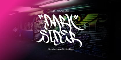 Hello, this is Dark Sider- Natural Handwritten Graffiti Tag Font! This font designed so that users can use it more easily and make graffiti designs easier. Dark Sider is very suitable for use in various media such as; packaging, logos, labels, posters, shirt designs, bulletins, typography, and many other media, especially with graffiti look.
 - De Rotterdam by Roland Hüse Design,
$20.00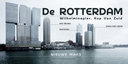 This font is a clean, modern sans serif bold. Named after “De Rotterdam”* this huge and super cool building (read the story below). Great for headlines, Posters, Flyers but also well legible at small size in large texts. Contains All European language accents and characters. --- The Story --- *This complex is located in the Kop Van Zuid district of Rotterdam, on Wilhelminapier. I was lucky to see this building from the beginning (2009) growing up (2013) That time when I was working and living here. I was always amazed by the design and how huge it is every time I took a look at it while driving or walking on the Erasmus Bridge. When I was going to work or just hiking around the city. It has a special meaning and message for me: I started creating fonts in my free time in 2010 when I came to this city to work. I was factory worker, dishwasher etc. I grew together with this amazing construction from brick to brick, step by step. By the time its construction finished, I was able to quit my day job and become a full time freelance designer.
 - VLNL Vondelpark by VetteLetters,
$35.00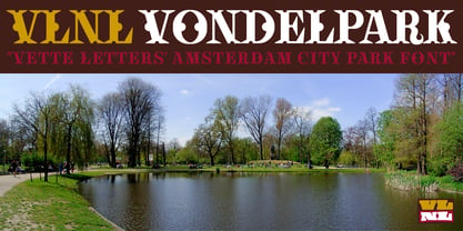 The Vondelpark is the famous Amsterdam city park, 47 hectares stretching out from Leidseplein to the Amstelveenseweg. It was founded in 1864 when a group of well-to-do Amsterdam citizens got together and bought land at the (then) edge of the city centre in order to create a park ‘for riding and strolling’. Designed by architect J.D. Zocher, it opened officially in 1865. The park received its name two years later when a statue of Dutch writer Joost van den Vondel was placed in the park. In the 1960s and 1970s the Vondelpark became a symbol and epicenter of the hippie flower power era. The park was declared a state monument in 1996. Donald DBXL was intrigued by the handmade iron nameplate lettering on the park’s entrance gates, and decided to design VLNL Vondelpark in its glory. The somewhat clumsy iron letters were not revived as is but optimized to turn it into a useful typeface. The all-caps serif with a deliberate constructed feel, contains a Positional Open Type feature that places half circles on the vertical stems, at the beginning and end of a word, to enliven the rhythm.
 - Hammer Horror by Comicraft,
$29.00Those footsteps you hear as you walk down that dimly lit Victorian street...? That flapping of leathery wings in the air...? The howl of some kind of Wolf-man in the countryside...? Those sounds that chill your spine and triphammer your heart are the sounds of unspeakable, terrifying terrors.... some might say horrifying horrors, scarifying scares... hammering, uh, hammers and now there's a font to capture them... a font that wants to suck your blood. Custom made for Ian Churchill's Awesome comic, THE COVEN. - Drone by Barnbrook Fonts,
$30.00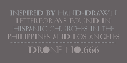 Drone is a deliberately misproportioned typeface, inspired by hand-drawn lettering found in Spanish/Hispanic Catholic churches in the Philippines and Los Angeles. These naive letterforms appeared to be ‘copies of copies’ – and in aiming to recreate the beauty of the Vatican and the Sistine Chapel they instead created something unique with its own charm and beauty. As a curious aside, the forms are reminiscent of those found in 16th century English calligraphy too. Drone is available in two styles: No.666 and No.90210.
 - MVB Chanson d'Amour by MVB,
$39.00An old book found at a Paris bouquiniste contained samples of the typeface “Caractère de finance,” a bâtarde design by 18th century typefounder Pierre Simon Fournier. Rather than revive the type, Kanna Aoki decided to reinvent it, using a felt pen to achieve a rustic, handwritten quality, departing from the 18th century model as she saw fit. MVB Chanson d'Amour conveys a soulful elegance that stops short of the ostentatious, overwrought found in many formal scripts. It is lovely and sweet, but never saccharine. - Remontoire by MAC Rhino Fonts,
$36.00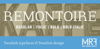 The original sketches who formed the base for Remontoire is known as one of the first typefaces drawn by Karl-Erik Forsberg . It was a result of a competition set up by various typographic organizations in the early 1930. The typeface was never completed and sketches are only to be found on paper. Made only as a single font but some the character can later on be found in other of examples of his work; Carolus and Ericus. MRF developed and expanded the family into 5 weights.
 - Promotional Copy JNL by Jeff Levine,
$29.00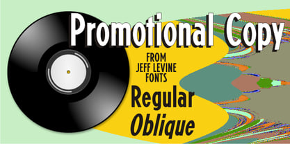 The typeface which inspired Promotional Copy JNL can be found on hundreds of 45 rpm records from the 50s through the 80s, as well as in headlines from articles found in one of the music industry’s leading publications throughout their older issues – it was a favorite and a workhorse. Now’s your chance to create a facsimile of the record label you always wanted to have with your garage band… or at the very least, utilize this font for some clean and crisp text or headline projects.
 - RAN by URW Type Foundry,
$35.99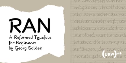 RAN Reformed Typeface for Beginners by Georg Salden - a headstrong and courageous approach to an improved handling of handwriting. Diverse and sometimes irreconcilable theories exist about how beginners are supposed to learn writing and reading. This has led to fierce discussions among experts already. We don’t want to pour more oil on the fire, but hope to create a new awareness for this topic, which is important to everyone of us. For beginners the combination of single characters (sounds) to whole words is essential during the acquirement of reading and writing. In this process they develop the skill to recall entire terms from memory. Therefore, after current practice, every word shall be written in a single stroke without lifting the pen in between. Georg Salden contradicts this postulate and warns, that coercively holding the pen down within a word can easily lead to exaggerated loop formations and a general meandering of the written text. The intellectual process in connecting single sounds to words while writing would happen anyway and the prohibition to lift the pen would often lead to tensions. To still support the necessary connections in general and to simplify the connecting, he teaches to write all round letters like a, e, g, o with inclusion of the connecting stroke, so that the spacing and combining with the next character arise by themselves. By settling the stroke at certain points and with a clear and logical writing method, a conscious and careful contact with the various strokes arises. All this automatically leads, together with a certain deceleration, to an increase of beauty and readability in the handwriting. The repeatedly discussed topic »connected or unconnected« appears to be solved in the most comfortable way as, depending on the particular character combination, both solutions are possible.
 - FS Untitled Variable by Fontsmith,
$319.99Developer-friendly The studio has developed a wide array of weights for FS Untitled – 12 in all, in roman and italic – with the intention of meeting every on-screen need. All recognisably part of a family, each weight brings a different edge or personality to headline or body copy. There’s more. Type on screen has a tendency to fill in or blow so for each weight, there’s the choice of two marginally different versions, allowing designers and developers to go up or down a touch in weight. They’re free to use the font at any size on any background colour without fear of causing optical obstacles. And to make life even easier for developers, the 12 weight pairs have each been designated with a number from 100 (Thin) to 750 (Bold), corresponding to the system used to denote font weight in CSS code. Selecting a weight is always light work. Easy on the pixels ‘It’s a digital-first world,’ says Jason Smith, ‘and I wanted to make something that was really functional for digital brands’. FS Untitled was made for modern screens. Its shapes and proportions, x-height and cap height were modelled around the pixel grids of even low-resolution displays. So there are no angles in the A, V and W, just gently curving strokes that fit, not fight, with the pixels, and reduce the dependency on font hinting. Forms are simplified and modular – there are no spurs on the r or d, for example – and the space between the dot of the i and its stem is larger than usual. The result is a clearer, more legible typeface – functional but with bags of character. Screen beginnings FS Untitled got its start on the box. Its roots lie in Fontsmith’s creation of the typeface for Channel 4’s rebrand in 2005: the classic, quirky, edgy C4 headline font, with its rounded square shapes (inspired by the classic cartoon TV shape of a squidgy rectangle), and a toned-down version for use in text, captions and content graphics. The studio has built on the characteristics that made the original face so pixel-friendly: its blend of almost-flat horizontals and verticals with just enough openness and curve at the corners to keep the font looking friendly. The curves of the o, c and e are classic Fontsmith – typical of the dedication its designers puts into sculpting letterforms. Look out for… FS Untitled wouldn’t be a Fontsmith typeface if it didn’t have its quirks, some warranted, some wanton. There’s the rounded junction at the base of the E, for example, and the strong, solid contours of the punctuation marks and numerals. Notice, too, the distinctive, open shape of the A, V, W, X and Y, created by strokes that start off straight before curving into their diagonal path. Some would call the look bow-legged; we’d call it big-hearted. - FS Untitled by Fontsmith,
$80.00 Developer-friendly The studio has developed a wide array of weights for FS Untitled – 12 in all, in roman and italic – with the intention of meeting every on-screen need. All recognisably part of a family, each weight brings a different edge or personality to headline or body copy. There’s more. Type on screen has a tendency to fill in or blow so for each weight, there’s the choice of two marginally different versions, allowing designers and developers to go up or down a touch in weight. They’re free to use the font at any size on any background colour without fear of causing optical obstacles. And to make life even easier for developers, the 12 weight pairs have each been designated with a number from 100 (Thin) to 750 (Bold), corresponding to the system used to denote font weight in CSS code. Selecting a weight is always light work. Easy on the pixels ‘It’s a digital-first world,’ says Jason Smith, ‘and I wanted to make something that was really functional for digital brands’. FS Untitled was made for modern screens. Its shapes and proportions, x-height and cap height were modelled around the pixel grids of even low-resolution displays. So there are no angles in the A, V and W, just gently curving strokes that fit, not fight, with the pixels, and reduce the dependency on font hinting. Forms are simplified and modular – there are no spurs on the r or d, for example – and the space between the dot of the i and its stem is larger than usual. The result is a clearer, more legible typeface – functional but with bags of character. Screen beginnings FS Untitled got its start on the box. Its roots lie in Fontsmith’s creation of the typeface for Channel 4’s rebrand in 2005: the classic, quirky, edgy C4 headline font, with its rounded square shapes (inspired by the classic cartoon TV shape of a squidgy rectangle), and a toned-down version for use in text, captions and content graphics. The studio has built on the characteristics that made the original face so pixel-friendly: its blend of almost-flat horizontals and verticals with just enough openness and curve at the corners to keep the font looking friendly. The curves of the o, c and e are classic Fontsmith – typical of the dedication its designers puts into sculpting letterforms. Look out for… FS Untitled wouldn’t be a Fontsmith typeface if it didn’t have its quirks, some warranted, some wanton. There’s the rounded junction at the base of the E, for example, and the strong, solid contours of the punctuation marks and numerals. Notice, too, the distinctive, open shape of the A, V, W, X and Y, created by strokes that start off straight before curving into their diagonal path. Some would call the look bow-legged; we’d call it big-hearted.
 - Telepath by Coniglio Type,
$19.95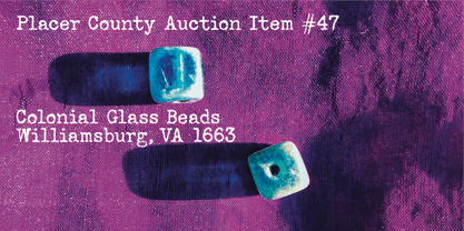 TELEPATH Telepath by Coniglio Type, first appeared in 1998. It is now in opentype .otf as of 2021. Telepath is a master sampling of a Royal office typewriter of industrial strength provided by the Miller Furniture store, of Dunkirk, New York. It had a baseline set of numbers to make accounting practices easy and line up nicely on the statements. (No gentile old fashioned numerical ascenders and descenders.) Yet, for a a rather old and stolid machine, it was very luxurious and built to definitely take the test of time. Cudo's for Royal Typewriter Company, is all I can say. The set of images were very carefully gathered and has fallen into the preferred category for a typewriter font that has it all. The font has exceptional value as a text font -and- a display font. It contains a great deal of graphic information and doesn't spike at higher sizes. Telepath presents a strikingly handsome typewriter font with a uniquely intuitive difference. Unlike the original source material—scans of monospaced typewriter copy, every font is painstakingly hand kerned for your most demanding copy fitting work in justified or casually ragged settings for print or the web. All Coniglio Type fonts are 100% embeddable. It will get you there.
 - New Ayres by MaGo Fonts,
$20.00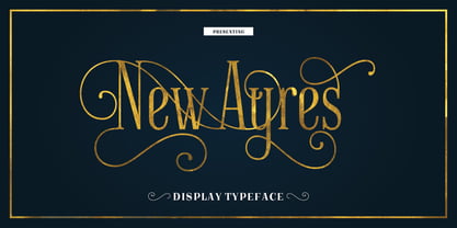 Based on my very first font creation, New Ayres keeps the same feel, but raised to high-quality level. Its long clean lines and soft curves merge old style and modern, giving a new meaning to timeless elegance. Perfect for titling; with at least five alternates per letter, the possibilities become endless. Choose the one better suited for your project and make your text stand out immediately! 703 glyphs take part in this font, including a large set of alternates, ligatures and swashes for you to choose from. With accents and special characters for languages, New Ayres supports 88 languages: Afrikaans, Albanian, German, Swiss German, Upper Sorbian, Asu, under Sorbian, Bemba, Bena, Norwegian Bokmal, Bosnian, Catalan, Czech, chiga, cornic, Creole Cape Verdean, Creole Mauritian, Croatian, Danish, embu, Slovak, Slovene, Spanish, Esperanto, Estonian, Euskera, Faroese, Filipino, Finnish, French, Rialan, scottish Gaelic, Galician, Greenlander, gusii, Hungarian, Indonesian, Irish, Icelandic, Italian, Kalenjin, Kamba, Kikuyu, Kinyarwanda, Kiroundi, kölsch, latvian, lithuanian, luo, luxembourgish, luyia, machame, makhuwa-meetto, makonde, malay, malagasy, maltese, manx, meru, Northern ndebele, nyankole, norwegian nynorsk, oromo, polish, portuguese, romeo, rombo, romanian, rwa, samburu, sango, sena, shena, shamble, Shona, rope, somali, swedish, swahili, taita, teso, Turkmen, vunjo, walser, zulu. This font is PUA encoded: this means each character has a unicode name, and you may access any of them through this codes. Open Type features on the open type file: easy access for alternates and ligatures! The download includes both .otf and .ttf files, so you may choose which one suits you better. With a strong personality, but yet adaptable into many styles, New Ayres is everything you are needing for your projects!!
 - Burger Elbow by Putracetol,
$24.00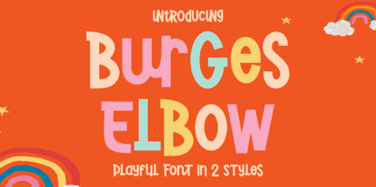 Burges Elbow - Playful Font In 2 Styles Created with the idea of bringing happiness and joy to any project, Burges Elbow is a perfect choice for those who want to add a touch of playfulness to their design. To use Burges Elbow to its full potential, it would be great for designs aimed towards children such as book covers, posters, and flyers. Its playful and quirky nature would also make it a great choice for branding aimed at a younger audience or products that want to add a sense of fun and whimsy. Burges Elbow comes with a variety of features, including uppercase and lowercase characters, opentype alternates and ligatures, and support for multiple languages. These features allow for a wide range of creative possibilities and make it easy to use in various projects. Included in the zip package are three different file types: OTF, TTF, and WOFF, which can be used in any design software that supports font installation. With these different file types, you can use Burges Elbow on any platform or device, making it a versatile choice for any project. Add a touch of fun and playfulness to your design with Burges Elbow. Its cute and whimsical nature will surely make your design stand out and bring a smile to anyone's face. In summary, Burges Elbow is a playful font in 2 styles that is perfect for designs aimed at children or those looking to add a sense of fun and whimsy to their branding. With its various features and file types, Burges Elbow is a versatile choice that can be used in any design project.
 - Hill House - 100% free

- TypographerGotisch Schmuck - Unknown license

- Saphire by Yumna Type,
$16.00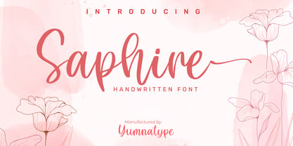 Saphire is a elegant handwritten font with a natural and unique design will make your project more beautiful. The font is suitable for your branding project, printing, logos dan wedding. Included: Saphire (OTF) Features: Standard Ligatures Stylistic Sets Multilingual Support PUA encoded Numeral and Punctuation by Yumnatype
 - Fairgrid Urban by Ditatype,
$29.00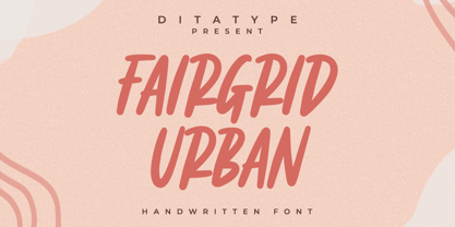 Fairgrid Urban is a modern handwritten font. With a classy and natural handwritten style, it brings a classy and chic typeface. Fairgrid Urban is best used for weddings, branding, logotype, and quotes. Includes: - Fairgrid Urban (OTF) Features: - Beautiful Ligatures - PUA Encoded - Multilingual Support - Numerals and Punctuation
 - Sweet Brownie by Yumna Type,
$16.00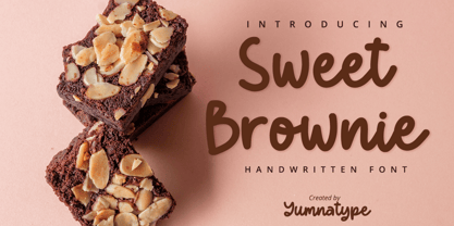 Sweet Brownie is a elegant handwritten font. Made for any professional project branding. It is the best for logos, branding and quotes. Every letter has a unique and beautiful touch. Includes: Sweet Brownie (OTF) Features: Standard Ligatures PUA Encoded Multilingual Support Numerals and Punctuation by Yumnatype
 - Popy Jelly by Yumna Type,
$16.00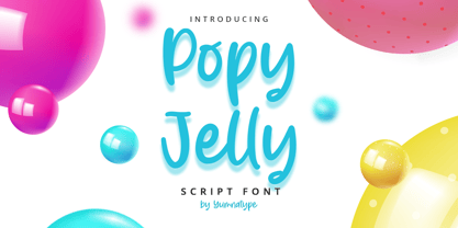 Popy Jelly is a elegant handwritten font. Made for any professional project branding. It is the best for logos, branding and quotes. Every letter has a unique and beautiful touch. Includes: Popy Jelly (OTF) Features: Standard Ligatures PUA Encoded Multilingual Support Numerals and Punctuation by Yumnatype
 - Ice Valley by Good Java Studio,
$25.00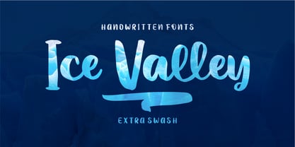 Introducing Ice Valley Hand-drawn Fonts The Ice Valley hand-drawn font is perfect for logos, invitations, stationery, wedding designs, social media posts, advertisements, product packaging, product designs, label, photography, watermark, special events or anything. This font includes: Ice Valley OTF font file, Ligatures, and Multilingual support.
 - The Outlander by Daily Studio,
$14.00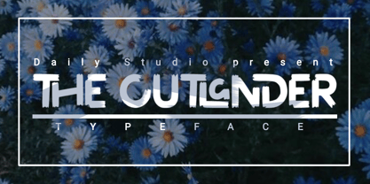 The Outlander - Design by Daily Studio This ttypeface can make your design look strong. Simple accessible on any of yor projects. Is great for headers, logos, and quotes. Comes with a full uppercase, lowercase, punctuation, and standard multilingual support. With 255 glyphs and in OTF format.
 - Cloudy Wavy by Yumna Type,
$16.00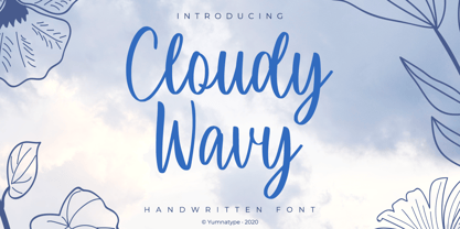 Cloudy Wavy is a beautiful handwritten font. Made for any professional project branding. It is the best for logos, branding and quotes. Every letter has a unique and beautiful touch. Includes: Cloudy Wavy (OTF) Features: Standard Ligatures PUA Encoded Multilingual Support Numerals and Punctuation by Yumnatype
 - Fox Grotesque Pro by TipografiaRamis,
$39.00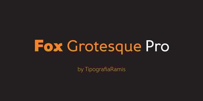 Fox Grotesque Pro is follow-up version of Fox Grotesque family. Typeface consists of ten font styles with extended support for most Latin languages plus Cyrillic. Fox Grotesque Pro release in OTF format and includes some opentype features – proportional/tabular, lining/oldstyle figures, slashed zero, ligatures, fractions...
 - Mermaid Monogram by MonogramBros,
$12.00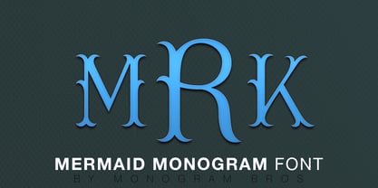 Mermaid Monogram Font is a perfect shaped monogram font consisting of 52 letters. With just a single font file you will be able to create beautiful monograms in just a matter of minutes after the purchase! Mermaid Monogram Font comes with font file in OTF format.
 - Emberclaws by Zamjump,
$13.00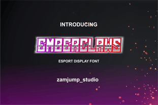 Emberclaw is a futuristic diplay font designed with uppercase characters. This font is perfect for logos, posters, product labels, or anything else. This logo is available in OTF formats. Features: Standard multi language characters, Uppercase Punctuation & Numbers, Support on Mac and Windows OS Easy to install
 - Bear Claw by Ira Natasha,
$10.00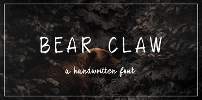 Bear Claw is a handwritten script font. A new fresh handmade font with rough edges. This font is support multi language and available in OTF file. This font will perfect for many different project ex: quotes, logo, blog header, poster, branding, fashion, apparel, letter, invitation, stationery, etc….

