10,000 search results
(0.022 seconds)
- Poppin by Kustomtype,
$20.00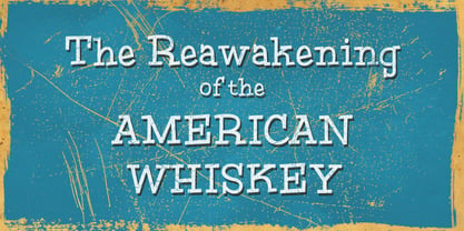 Poppin is a playful font-type that you can comfortably use in all kinds of styles, from modern to old school. A combination of a few names on an old movie poster is what triggered the creation of this font type. Because it had such a strong rock and roll character, I decided to dedicate a font-type to it. The Poppin font is completely hand-drawn and then digitized. It results in being an extremely user-friendly, complete and modern font that you can use in all your graphic applications. Poppin is a font from the subculture that has been updated to a hip and classy font, ideal for eye-catching designs. Poppin comes in 4 styles, regular, bold , round & bold round. Poppin makes everyone smile!
 - Baldufa Cyrillic by Letterjuice,
$66.00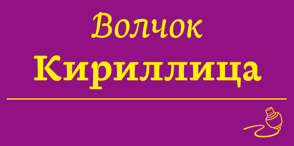 Baldufa is a charming typeface with strong personality, which looks very comfortable in text. There is a search to obtain complicated curves and detailed features, which gives the typeface a touch of beauty and elegance. However, this is also a self-conscious design that claims through the rounded serifs and irregular vertical stems appreciation for quirkiness and human imperfection. The letterforms are inspired by the slight distortions and idiosyncrasies that came with old printing methods. It has distinct, features such as rounded serifs, irregular vertical streams, ink traps and extremely thin junctions. In the Italic, serifs have been removed to enhance movement and expressivity. These experiments in form have not come at the cost of legibility: The typeface remains suitable for both small and display text.
 - Baldufa Greek by Letterjuice,
$47.00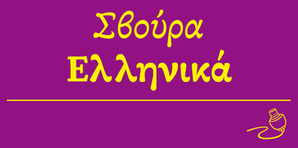 Baldufa is a charming typeface with strong personality, which looks very comfortable in text. There is a search to obtain complicated curves and detailed features, which gives the typeface a touch of beauty and elegance. However, this is also a self-conscious design that claims through the rounded serifs and irregular vertical stems appreciation for quirkiness and human imperfection. The letterforms are inspired by the slight distortions and idiosyncrasies that came with old printing methods. It has distinct, features such as rounded serifs, irregular vertical streams, ink traps and extremely thin junctions. In the Italic, serifs have been removed to enhance movement and expressivity. These experiments in form have not come at the cost of legibility: The typeface remains suitable for both small and display text.
 - Occam by Veil of Perception,
$20.00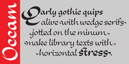 Occam is an informal calligraphic script face. The letter forms were drawn and constructed rather than penned or brushed but reflect a definite flat pen influence. The ascenders and descenders incorporate an abstract implied loop form. Some curves that would normally be round are pointed and some transitions that would normally be sharp and pointed have been made round. A few exit strokes curve back instead of moving up and out for a little different look. This font could be put to good use as a contrasting style combined with sans and serif faces in applications such as newsletters, brochures, invitations and annual reports. It could be used for heads, subheads, pull quotes, drop caps and as a title font for covers.
 - Simpliciter Sans by Cercurius,
$19.95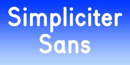 Simpliciter Sans is a typeface based on the lettering used in the 20th century on technical drawings, either written by free hand or using templates. The lettering was made with a round pen, therefore all lines got rounded ends. All lines had the same thickness in uppercase, lowercase and small caps. The upright style was used on construction drawings and the italic style on machine drawings. The backslant style was used on maps for names of water bodies — seas, lakes, rivers etc. — and for water depth. Simpliciter Sans is primarily intended for texts on drawings, diagrams, charts and maps, but it can also be used for signs and labels. It also works surprisingly well as a body type in smaller sizes.
 - Sansduski by Ingrimayne Type,
$9.00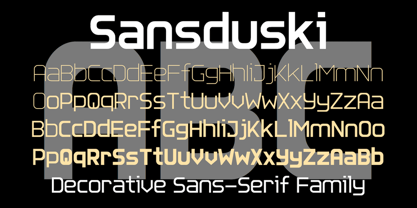 Sansduski is a sans-serif decorative/display family. Its very high x-height and tight spacing make it more suitable for use at large point sizes than small point sizes. (There are better options if one wants a readable text font.) It comes in nine weights and one outline style, with an oblique style accompanying each of these ten styles to give a total of 20 styles in the family. The letter O is a rectangle with rounded corners and this shape motif is carried over to other characters that are usually rounded. For a monospaced rather than proportional version of this design idea, see SansduskiMono. Sansduski is appropriate for titles, posters, advertising, and other uses that benefit from simple letter forms that are geometric and clean.
 - Derpache by Edignwn Type,
$18.00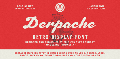 The Derpache Font is inspired by authentic typefaces in old labels. This font collections contain script and serif font. Every font comes with 4 style typefaces (regular, rounded, rough and stamp). Derpache gives more extras nautical and pirate in one pack illustrations. This script font includes some alternates. The Derpache matches apply in some designs such as the logo, poster, label, badge, packaging, t-shirt, branding, quotes and more custom design. Derpache features : 4 style typefaces (regular, rounded, rough and stamp) Uppercase, lowercase, numeral, symbol, punctuation and alternate in script font All-caps, numeral, symbol and punctuation in serif font Multilingual PUA Encoded Derpache includes : 9 fonts (script, serif and dingbat) 26 hand-drawn illustrations in dingbat Check out Duhline which is a great pair for Derpache.
 - Cell by Type Minds,
$7.50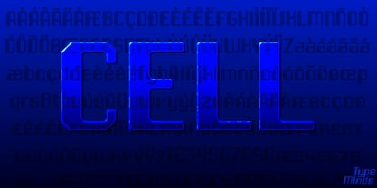 Cell is a sturdy, geometric typeface with many potential applications. Though it is best suited to display sizes, its construction is simple enough for use in smaller settings. Its octagonal, almost mechanical design is softened by rounded corners. The face is characterized by a single thick stroke in each letter, lending it a unique appearance. It also features an oblique counterpart with several italic-style glyphs. Both members of the family also include small capitals mapped to the Private Use Area. Cell was designed to be at once simple and unique. Its grid-based structure is enhanced by slight adjustments for optical consistency. Glyphs which are normally round instead have 45-degree angles at the corners, sticking to the grid system without losing legibility.
 - Revolution Gothic by Dharma Type,
$19.99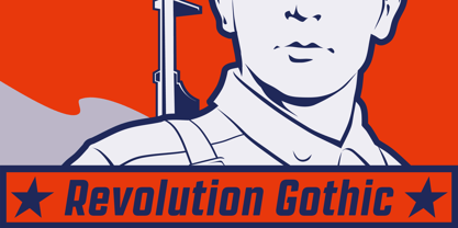 This font family is an arranged and extended version of PAG Revolucion released from Prop-A-Ganda type foundry in 2008. The original font is inspired by retro propaganda posters and wallpainting in Cuba from the 60s to 80s. And the original PAG Revolucion is the most popular font from Prop-A-Ganda. In redesigning this font, their detail and spacing was modified and new weights with matching slanted and also lowercase in each style were added to fit contemporary design needs. Then, Revolution Gothic became big family containing 10 styles and will be perfect family for your retrospective project. Be sure to check out distress version Revolution Gothic P.
 - OregonDry - Unknown license

- DB Foliage by Illustration Ink,
$3.00DB Foliage is more than just ground cover. This DoodleBat offers great borders or adornments for your creative projects. - Wahed by Khalid Jassim,
$27.00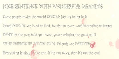 I used Arabic letters to give the same sound of each letter in the English Alphabet (a, b,c,….)
 - Collegiate by K-Type,
$20.00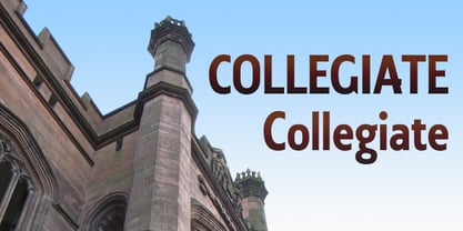 Collegiate is a full font based on the lettering around an old mosaic tile badge at Liverpool Collegiate School.
 - Public Works JNL by Jeff Levine,
$29.00Public Works JNL emulates the hand-made lettering found on older signs printed by silk screen for local governments. - Pencil Pusher JNL by Jeff Levine,
$29.00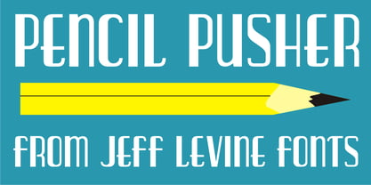 The unusual hand lettering found on a piece of 1940s sheet music forms the basis for Pencil Pusher JNL.
 - Taca by Rúben R Dias,
$42.00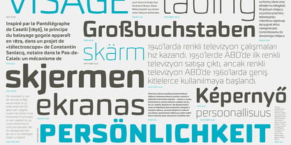 Taca is a typeface built around a shape that Portuguese designer Rúben R Dias calls a “squircle” — neither square nor circle. We usually associate the rounded, convex box with the television screens of the 1960s and Aldo Novarese’s classic typeface, Eurostile. But whereas Eurostile is cold and machined, Taca is warm and rugged, as if it was molded from clay or carved from stone. Taca’s organic nature is also derived from another unique feature: rounded crotches at the right angles where perpendicular strokes meet. This subtle finish, along with blunt stroke endings, softens the otherwise rigid skeleton. With such a strong conceptual vision, Taca could be relegated to the bin of experimental designs, severely limited in their application. But that fate is usually born of a less experienced maker. As a teacher, designer, and letterpress printer, Dias is a type user, keenly aware of the functional requirements of good type. Taca is therefore not a slave to its concept, but a working font family, effective in various sizes and environments. Its lettershapes break away from the base shape whenever it makes sense for legibility, while still maintaining the flavor of the design as a whole. That said, a set of squircle-shaped alternates give the user the flexibility to get more stylized if the situation calls for it. Fitting to its functional aims, Taca has many of the features one expects of a proper text font: upper and lowercase figures, case-sensitive punctuation, and Extended Latin language support. The simplicity, openness, and squareness of Taca’s forms also make it an ideal design for the pixel grid of screen displays.
 - sir william - Unknown license

- Caslon Calligraphic Initials - Unknown license

- QuaNauticale_Initials_No1 - Unknown license

- Broadway by Bitstream,
$29.99In 1928, the application of pure geometric form to sanserifs and slabserifs was in full swing. Morris Fuller Benton applied geometry to the Modern letterform to arrive at Parisian and Broadway for ATF. - P.T. Barnum by Bitstream,
$29.99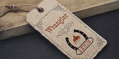 One of the original nineteenth century designs, cut at Barnhart Brothers & Spindler in Chicago about 1880, passed on to us through ATF. Unlike most Circus types, the serifs of P.T. Barnum are bracketed.
 - Parisian by Bitstream,
$29.99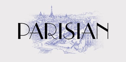 In 1928, the application of pure geometric form to sanserifs and slabserifs was in full swing. Morris Fuller Benton applied geometry to the Modern letterform to arrive at Parisian and Broadway for ATF.
 - Americana by Bitstream,
$29.99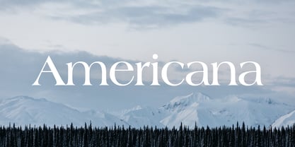 An original design by Richard Isbell for ATF; in exaggerating the tapered stroke introduced eleven years earlier in Hermann Zapf’s Optima, Isbell created the first flareserif to achieve popularity in the United States.
 - Ad Lib by SoftMaker,
$15.99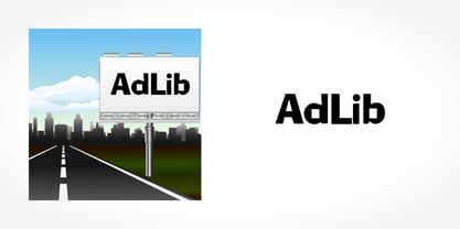 Ad Lib was created by Freeman Craw for ATF in 1961. Sporting irregular character shapes, this informal typeface makes a good impression when a 1960s look is desired in advertising and display work.
 - Moyers by Areatype,
$13.00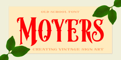 Moyers typeface is Vintage Design, old-fashioned, elegant. This font good for vintage design, Display, t-shirt, logo, labels, posters and etc. Features: -Uppercase -Lowercase -Numerals -Basic punctuations Available in OTF formats. Thanks!
 - Gridlite PE Variable by Rosetta,
$290.00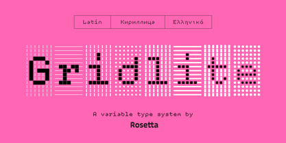 The two great technical constraints a type designer can tackle are low resolution, which limits detail and dictates proportions between negative and positive shapes, and uniform width, which restricts each letter to a fixed horizontal space. Wrestle with both at once, and each letter becomes a black-and-white chessboard that challenges every design decision. Sometimes battling these constraints gets in the way of a good idea, but other times, tinkering with fewer options can make the job irresistibly easy and lead straight to a grid addiction. Gridlite, an experiment with a modular negative space, is the side effect of such an addiction. It’s simplified, monospaced, and variable: foreground and background alike are ready to be animated, typed, scaled up, scaled down, rounded, or otherwise deformed. Gridlite is primarily a variable font with axes that control the size of the elements, their shape, and the background (one for the rectangular field and one for the compact envelope around the letters). The fonts cover Cyrillic, Greek, and Latin scripts. Small caps are included, for no apparent reason ... and there is a monospaced elephant, too.
 - Omnipop by Fenotype,
$20.00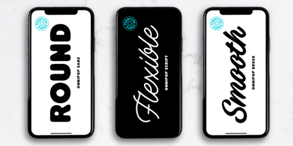 Omnipop is a potent display pack with three styles. All the fonts have firm yet clean and velvety character. Omnipop Brush is a forward leaning brush script with a somewhat heavy complexion. It has a large x-height and it makes nice smooth and even texts. Omnipop Brush is equipped with Standard Ligatures and Contextual Alternates that are automatically on as they should be kept. In addition it has Swash, Stylistic and Titling Alternates for extra show-off. Omnipop Script is a monoline connected script simulating a smooth felt-tip pen. Script is equipped with Standard Ligatures and Contextual Alternates to keep the connections smooth. In addition Omnipop Script has Swash, Stylistic and Titling Alternates and even more extra characters can be found in the glyphs window. Omnipop Sans is a sturdy rounded all caps sans with a sort of geometric vibe to it. Anything you type with Omnipop Sans will look cheery and approachable. Omnipop fonts rock on their own but they also play great together in any order.
 - Sticky Written by Yumna Type,
$16.00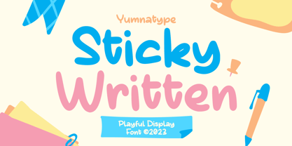 Sticky Written is a round, soft display font expressing funny, cute, fun nuances in every design. The letters look like soap bubbles flying around in the air in flowing shapes and balanced proportions. The Sticky Written font will live up and charm your designs in order to suggest positive and cute vibes to your target audience. You can apply this font, which provides a clipart as a bonus, for big text sizes to make it more legible and attractive. In addition, you can make use of some available features here. Features: Multilingual Supports PUA Encoded Numerals and Punctuations Sticky Written fits best for various design projects, such as brandings, headings, magazine covers, quotes, printed products, merchandise, social media, etc. Find out more ways to use this font by taking a look at the font preview. Thanks for purchasing our fonts. Hopefully, you have a great time using our font. Feel free to contact us anytime for further information or when you have trouble with the font. Thanks a lot and happy designing.
 - Snare by In-House International,
$5.00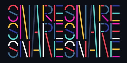 A typeface that celebrates marching to the beat of your own drum. Snare is a jazzy little display type that presents like a stencil but behaves in its own way.Featuring angled section breaks and variable heights, Snare keeps each character’s footprint steady as as its heights change, revealing unique crossbars, periscoping capitals and deep-sinking descenders. Because each character follows its own rules, the more each word grows, the more it shows the beautiful rhythm of variety. Or stretch individual characters to shape the contours of your words. Beyond just being playful, fun to dress in colors, and delightfully useful for tight spaces,Snare’s lanky verticals and nervous energy reflect the time it was created. In this second pandemic spring, Snare brings up the drumroll-expectant heartbeat of our uncertainty, and the wish that when we can all meet again, our newfound weirdnesses will find a home in the world. The Snare font family includes one uppercase alphabet with two lowercase variants and comes in ten standard weights-which-are-just-really-heights (.otf) and as a variable type(.ttf) for designers using compatible platforms. Snare was designed by Alexander Wright and In-House International and developed byRodrigo Fuenzalida at FragType. In-House International’s foundry was launched in the summer of 2020 to offer bold, experimental, display typefaces that tell a story. Our previous releases have been featured on Design Milk, DesignBoom, Slanted and all sorts of exciting places.
 - Bhontage by Picatype,
$12.00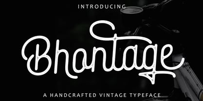 Bhontage is a powerful multipurpose handwritten font script that is suitable for all types of projects. It contains 333 total glyphs and 148 alternative characters that are divided into several OpenType features such as Ligature, alternatives, swash, style sets and alternative styles that allow you to mix and match letter pairs that match your design. You can access all these alternative characters by using OpenType smart programs such as Adobe Illustrator and Adobe InDesign. Bhontage Script is available in 2 different styles (Regular and Italic) in the .OTF, TTF format. Bhontage Features : Multi-language Ligatures Alternates PUA Encoded Bhontage features OpenType stylistic alternates, ligatures and International support for most Western Languages is included. To enable the OpenType Stylistic alternates, you need a program that supports OpenType features such as Adobe Illustrator CS, Adobe Indesign & CorelDraw X6-X7, Microsoft Word 2010 or later versions. How to access all alternative characters using Adobe Illustrator: *https://www.youtube.com/watch?v=XzwjMkbB-wQ Bhontage is coded with PUA Unicode, which allows full access to all the extra characters without having special designing software. Mac users can use Font Book , and Windows users can use Character Map to view and copy any of the extra characters to paste into your favourite text editor/app. How to access all alternative characters, using Windows Character Map with Photoshop: *https://www.youtube.com/watch?v=Go9vacoYmBw If you need help or have any questions, please let me know. I'm happy to help :) Thanks & Happy Designing!
 - Werd by Putracetol,
$24.00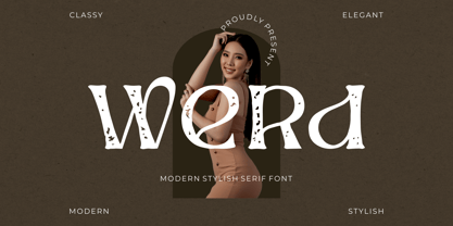 Introducing Werd - a modern stylish serif font inspired by elegant and luxury typography. With its unique and beautiful design, Werd is perfect for adding a professional touch to your designs. This versatile font can be used in various design projects, such as headings, flyers, greeting cards, product packaging, book covers, printed quotes, logotypes, apparel designs, album covers, and more. Werd features alternative characters that are divided into several OpenType features, including swashes, stylistic sets, stylistic alternates, contextual alternates, and ligatures. These OpenType features can be accessed using software programs that support OpenType, such as Adobe Illustrator, Adobe InDesign, Adobe Photoshop, Corel Draw X version, and Microsoft Word. This allows you to customize your typography and create unique compositions that suit your design needs. In your zip package, you'll receive the Werd font files in otf, ttf, and woff formats, providing flexibility for different design projects. The font includes uppercase and lowercase letters, numerals, punctuation, and symbols, ensuring that you have all the essential elements for your designs. Werd also supports multilanguage characters, making it suitable for designing in different languages. Whether you're creating designs in English, Spanish, French, or any other language, Werd has got you covered. In summary, Werd is a modern stylish serif font that offers elegant and luxury typography for various design purposes. With its OpenType features and multilanguage support, Werd provides versatility and customization options for your designs. Thank you for choosing Werd from our collection. Happy designing!
 - Berfa by Typespec,
$32.00 Berfa is an ultra-black display sans with a grounded temperament and a warm heart. Stern but fair, she’s remarkably agile for her size, ideal for any occasion calling for weighty headlines and a strong character. Berfa also has a quirkier side, sometimes swapping her conventional forms for eccentric alternatives, upon polite request of course. Berfa comes in OpenType (.otf) format for Mac and Windows. Features: Berfa supports the following OpenType features: Standard ligatures, discretionary ligatures, ordinals, custom fractions, numerators, denominators, superscript, scientific inferiors, proportional and tabular lining figures, and a slashed zero. There are also two stylistic sets containing alternate glyphs. Language Support: Each weight has a 528 glyph character set for use in the following Latin languages: Albanian, Afrikaans, Basque, Bosnian, Breton, Catalan, Croatian, Czech, Danish, Dutch, English, Esperanto, Estonian, Faroese, Finnish, French, Gaelic, German, Greenlandic, Hungarian, Icelandic, Indonesian, Irish, Italian, Latvian, Lithuanian, Luxembourgish, Maltese, Norwegian, Occitan, Polish, Portuguese, Romanian, Sami, Serbian (Latin), Slovak, Slovene, Sorbian, Spanish, Swedish, Swahili, Turkish, Walloon and Welsh.
 - Rafaella by Lián Types,
$37.00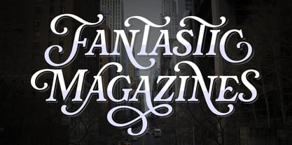 To Rafaella, a menina dos cachos. We, designers, have grown accustomed to seeing that lowercase letters—not only in calligraphy but also in typography (1)—may be very playful and decorative. Almost every part of them can become a potential swash, ligature or decorative accolade (2) if the designer has some expertise regarding this matter. However, since we are living in an era that elevates the status of handcrafts, lettering has gained a lot of ground in different kinds of mediums, and with it there’s a sort of overuse of capitals. This may be due to the reason that lettering pieces need a high impact to convey their messages and many times why big capitals are the only solution. With this in mind, I started Rafaella: A font consisting entirely of capitals which go from unadorned to very decorative. Rafaella has ductus and forms vaguely based on the 1970s Bookman-like styled fonts. The presence and behaviour of serifs and ball terminals in this style were the perfect excuse to make really attractive aternates which the user can choose from the glyphs panel. The result is a font full of life. Able to be both very playful and formal due to its roman style which can be combined with (and between) a wide range of other styles of expressive scripts or geometric fonts with nice results (3). Also try Rafaella Shade Solo combined with Rafaella or Rafaella Bold for a layer effect to emphasize any given word or phrase. NOTES (1) See my fonts Erotica from 2013 or Dream from 2014. (2) Accolades is a wonderful word that refers to the ornaments made around the words in the spencerian style of calligraphy (3) Combinations often seen in different pieces of lettering were usually a contrast of style is wanted.
 - Paintbrush - Unknown license

- Arcitectura - Unknown license

- Tink by Suomi,
$25.00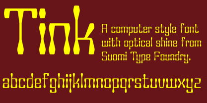 I was playing around with computer style forms, and suddenly noticed an optical effect in this style. There you go!
 - Sales Book JNL by Jeff Levine,
$29.00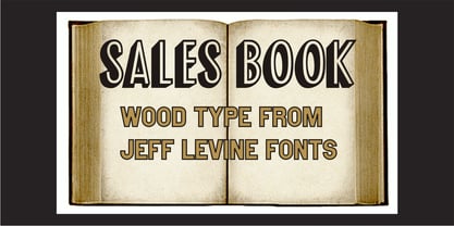 Sales Book JNL was recreated from sample letters found in the wood type section of an old printer's supply catalog.
 - Road Art by The Tree is Green,
$40.00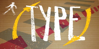 Road Art derives from painted lettering found on roads in the UK. Each character has been created from original photography.
 - Schabernack One by XTOPH,
$20.00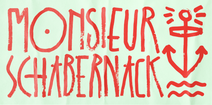 Schabernack One is a handwritten brushfont. If you are looking for a funky, doodle style fontface you have found it!
 - Horsfords by Coffee Bin Fonts,
$20.00This font was inspired by lettering found on the cover of an old Almanac style cookbook from the 19th century.


