10,000 search results
(0.022 seconds)
- Satero Serif by Linotype,
$29.99 Satero was designed by Prof. Werner Schneider in 2007. Never before have we had so much written material to consume; this is the age of mass-communication. Unfortunately, the decision of which typeface to use is too often made lightly. The typeface is one of the most elementary means of language, and it can play a major role in a text's legibility and the amount of time the reader needs for it. The Satero Type System offers a high degree of legibility due to its dynamic and forms. The individual characters have been based on classical concepts. They are clearly made, and leave all unnecessary elements behind. The type works to create an environment of extreme legibility. Essential parts of the a, c, e, s, and r are to be found at the x-height line, which is the most important area of a line of text in determining legibility. The Satero Type System includes two members whose basic forms are the same. The Sans Serif members are more horizontally differentiated than common grotesques, which aides their legibility. The Serif design employs asymmetrical serifs, avoiding elephant feet" altogether. Their dynamic is progressive. The condensed nature of the seriffed counterparts is optimal for newspaper and magazine applications, where space is at a premium and paper must be saved. All fonts in the Satero Type System include a number of alternate glyphs, as well as ligatures and proportional lining figures; all weights except the Heavy and Heavy Italic fonts are also equipped with small caps, small cap figures, and oldstyle figures as OpenType features. "
 - Satero Sans by Linotype,
$29.99 Satero was designed by Prof. Werner Schneider in 2007. Never before have we had so much written material to consume; this is the age of mass-communication. Unfortunately, the decision of which typeface to use is too often made lightly. The typeface is one of the most elementary means of language, and it can play a major role in a text's legibility and the amount of time the reader needs for it. The Satero Type System offers a high degree of legibility due to its dynamic and forms. The individual characters have been based on classical concepts. They are clearly made, and leave all unnecessary elements behind. The type works to create an environment of extreme legibility. Essential parts of the a, c, e, s, and r are to be found at the x-height line, which is the most important area of a line of text in determining legibility. The Satero Type System includes two members whose basic forms are the same. The Sans Serif members are more horizontally differentiated than common grotesques, which aides their legibility. The Serif design employs asymmetrical serifs, avoiding elephant feet" altogether. Their dynamic is progressive. The condensed nature of the seriffed counterparts is optimal for newspaper and magazine applications, where space is at a premium and paper must be saved. All fonts in the Satero Type System include a number of alternate glyphs, as well as ligatures and proportional lining figures; all weights except the Heavy and Heavy Italic fonts are also equipped with small caps, small cap figures, and oldstyle figures as OpenType features. "
 - Busted by Canada Type,
$24.95 Busted is the very strange and out-of-character outburst of Bill Troop, a guy who was classically trained in everything, from classical piano and literature to classical photography and type design. As far as we could tell, Bill Troop is the kind of guy whose appearance and voice instantly trigger thoughts of black and white photos, fedoras, and pre-industrial age Europe. A few years ago, he even moved from the United States to England, where it took him less than a week to feel at home and start sounding like a Norwich native. Then something happened and the poor dude just snapped. Busted is the controversial result of the blood rushing to his head. If you know what exactly happened to him, please let us know. Concern, consideration and human interest story aside, Busted is a fascinating thing. It is a set of four interchangeable thick outline fonts where the same letter forms turn from wild to wilder to broken to somewhat clean. Mix them up in a setting and you have words that snarl with a sneer. Life's too short. Take it all with a grain of salt. Scream whenever you feel like it. Busted Pro is a single font combining all four character sets, and rigged with an OpenType pseudo-randomizer in the contextual alternates feature, which you can disable or enable anywhere in your setting for maximum visual shock just the way you like it. Works just as well in PAL or SECAM. Don't be fooled by imitations, and don't get caught with your drawers down.
 - Moliere by Eurotypo,
$44.00 The life of Molière is a story of struggle, hard work, domestic unhappiness, death and burial in obscurity and almost in shame. Molière left behind a body of work that not only changed the face of French classical comedy, but has also come to influence the work of other dramatists from around the world. Despite his own preference for tragedy, which he had tried to further with the Illustre Théâtre, Molière became famous for his farces, which were generally in one act and performed after the tragedy. Both the comic and the serious drama were powerfully affected by the work of Molière, not only in his own age and country but everywhere and up to the present time. Didot is a name given to a group of typefaces named after the famous French printing and type producing family. The classification is known as modern, or Didone. The typeface we know today was based on a collection of related types developed in the period 1784–1811. Firmin Didot cut the letters, and cast them as type in Paris. Along with Giambattista Bodoni of Italy, Firmin Didot is credited with establishing the use of the "Modern" classification of typefaces. The types that Didot used are characterized by extreme contrast in thick strokes and thin strokes, by the use of hairline serifs and by the vertical stress of the letters. As in the extreme contrasts of the literature of Molière, in Didione's typefaces, thick and thin strokes, straight and curved, are the most relevant characteristic for an era marked by the changes.
 - Modern Techno by Nirmana Visual,
$24.00 Introducing our cutting-edge techno font, designed to add a futuristic and sleek aesthetic to your designs. Inspired by the sleek designs of technology and the digital age, this font captures the essence of innovation and progress. Its clean and precise letterforms, along with its distinct futuristic style, make it an excellent choice for technology-based branding, gaming graphics, sci-fi posters, and digital interfaces.
 - Golovolomka by Alexandr Galuzin,
$30.00 This font is reminiscent of the Middle Ages texture fonts. But geometric shapes make it more modern. It will work well in large and short inscriptions. The large array of text readability is reduced due to the characteristic rhythm of the font. It has the standard ligatures and ligature to failed pairs. There are two sets of numbers: the proportional and the Old style.
 - Carolina by Linotype,
$29.99Carolina is a part of the 1990 program Type before Gutenberg, which included the work of twelve contemporary font designers and represented styles from across the ages. Linotype offers a package including all these fonts on its web page, www.fonts.de. Gottfried Pott designed his Carolina in the tradition of the Carolingian Minuskel. The rhythmic flow of the font gives text a light and elegant feel. - Candida by Bitstream,
$29.99German designer Erbar drew the Candida typeface for the Ludwig & Mayer foundry shortly before his death in 1935. The typeface was released posthumously in 1936. An italic designed by Walter Höhnisch was published the following year and a reworked version was produced in 1945. Bold weights followed in 1951. Thanks to its clarity and readability in small sizes, the Candida family remained popular in the digital age. - Ademo by astype,
$48.00 Ademo is a classic, shaded and perspective looking display font. The design is based on two typefaces designed by Carl Albert Fahrenwaldt and published between 1931– 1932 by the German Schriftguss AG type foundry. pdf specimen Ademos special Fill fonts can be used for building multi colored text or for special finishing needs like blind imaging, embossing, stamping, partial UV coating and laser cutting.
 - Bronzino by Greater Albion Typefounders,
$8.95 Bronzino’s roots lie in the Arts and Crafts movement, and in the traditions of letterpress printed fine quality books. It’s ideal for legible headings which have just that hint of charm and difference outside of the normal and mundane. It’s formal enough to go anywhere yet it has a spirit of fun, it brings a world of bygone care and quality to the modern age.
 - Kelyon by Valentino Vergan,
$16.00 Kelyon is a sophisticated and modern serif, inspired by the late Middle Ages and early renaissance period. Kelyon was designed with a very thin hairline and long serifs, this reflects the charm and feel of the 14th century. With over 60 stylistic ligatures, Kelyon is great for headlines and short to medium texts. Kelyon is compatible with 93 languages and contains 439 glyphs, including several alternatives.
 - Slatterine by Greater Albion Typefounders,
$11.95 Slatterine is a retro-futuristic family, inspired by the second streamline era of the 1950s It's ideal for any design work that needs to suggest bygone visions of the future, or to have a retro-space-age effect. Slatterine's horizontally shaded glyphs give a strong sense of motion, whether coupled with the regular form's sharply leaning oblique angle, the perpendicular form, or the reverse leaning 'Lefty'.
 - DIN Next Arabic by Monotype,
$155.99 DIN Next is a typeface family inspired by the classic industrial German engineering designs, DIN 1451 Engschrift and Mittelschrift. Akira Kobayashi began by revising these two faces-who names just mean ""condensed"" and ""regular"" before expanding them into a new family with seven weights (Light to Black). Each weight ships in three varieties: Regular, Italic, and Condensed, bringing the total number of fonts in the DIN Next family to 21. DIN Next is part of Linotype's Platinum Collection. Linotype has been supplying its customers with the two DIN 1451 fonts since 1980. Recently, they have become more popular than ever, with designers regularly asking for additional weights. The abbreviation ""DIN"" stands for ""Deutsches Institut für Normung e.V."", which is the German Institute for Industrial Standardization. In 1936 the German Standard Committee settled upon DIN 1451 as the standard font for the areas of technology, traffic, administration and business. The design was to be used on German street signs and house numbers. The committee wanted a sans serif, thinking it would be more legible, straightforward, and easy to reproduce. They did not intend for the design to be used for advertisements and other artistically oriented purposes. Nevertheless, because DIN 1451 was seen all over Germany on signs for town names and traffic directions, it became familiar enough to make its way onto the palettes of graphic designers and advertising art directors. The digital version of DIN 1451 would go on to be adopted and used by designers in other countries as well, solidifying its worldwide design reputation. There are many subtle differences in DIN Next's letters when compared with DIN 1451 original. These were added by Kobayashi to make the new family even more versatile in 21st-century media. For instance, although DIN 1451's corners are all pointed angles, DIN Next has rounded them all slightly. Even this softening is a nod to part of DIN 1451's past, however. Many of the signs that use DIN 1451 are cut with routers, which cannot make perfect corners; their rounded heads cut rounded corners best. Linotype's DIN 1451 Engschrift and Mittelschrift are certified by the German DIN Institute for use on official signage projects. Since DIN Next is a new design, these applications within Germany are not possible with it. However, DIN Next may be used for any other project, and it may be used for industrial signage in any other country! DIN Next has been tailored especially for graphic designers, but its industrial heritage makes it surprisingly functional in just about any application. The DIN Next family has been extended with seven Arabic weights and five Devanagari weights. The display of the Devanagari fonts on the website does not show all features of the font and therefore not all language features may be displayed correctly.
 - Eskapade by TypeTogether,
$53.50 The Eskapade font family is the result of Alisa Nowak’s research into Roman and German blackletter forms, mainly Fraktur letters. The idea was to adapt these broken forms into a contemporary family instead of creating a faithful revival of a historical typeface. On one hand, the ten normal Eskapade styles are conceived for continuous text in books and magazines with good legibility in smaller sizes. On the other hand, the six angled Eskapade Fraktur styles capture the reader’s attention in headlines with its mixture of round and straight forms as seen in ‘e’, ‘g’, and ‘o’. Eskapade works exceptionally well for branding, logotypes, and visual identities, for editorials like magazines, fanzines, or posters, and for packaging. Eskapade roman adopts a humanist structure, but is more condensed than other oldstyle serifs. The reason behind this stems from the goal of closely resembling the Fraktur style to create harmony in mixed text settings. Legibility is enhanced by its low contrast between thick and thin strokes and its tall x-height. Eskapade offers an airy and light typographic colour with its smooth design. Eskapade italic is based on the Cancellaresca script and shows some particularities in its condensed and round forms. This structure also provided the base for Eskapade Fraktur italic. Eskapade Fraktur is more contrasted and slightly bolder than the usual darkness of a regular weight. The innovative Eskapade Fraktur italic, equally based on the Cancellaresca script previously mentioned, is secondarily influenced by the Sütterlin forms — an unique script practiced in Germany in the vanishingly short period between 1915 and 1941. The new ornaments are also hybrid Sütterlin forms to fit with the smooth roman styles. Although there are many Fraktur-style typefaces available today, they usually lack italics, and their italics are usually slanted uprights rather than proper italics. This motivated extensive experimentation with the italic Fraktur shapes and resulted in Eskapade Fraktur’s unusual and interesting solutions. In addition to standard capitals, it offers a second set of more decorative capitals with double-stroke lines to intensify creative application and encourage experimental use. The Thin and Black Fraktur styles are meant for display sizes (headlines, posters, branding, and signage). A typeface with this much tension needs to keep a good harmony between strokes and counters, so Eskapade Black has amplified inktraps and a more dynamic structure seen in the contrast between straight and round forms. These qualities make the family bolder and more enticing, especially with the included uppercase alternates. The Fraktur’s black weights are strident, refusing to let the white of the paper win the tug-of-war. It also won’t give away its secrets: Is it modern or historic, edgy or amicable, beguiling ornamentation or brutish presentation? That all depends on how the radically expanded Eskapade family is used, but its 16 fonts certainly aren’t tame.
 - DIN Next Devanagari by Monotype,
$103.99DIN Next is a typeface family inspired by the classic industrial German engineering designs, DIN 1451 Engschrift and Mittelschrift. Akira Kobayashi began by revising these two faces-who names just mean ""condensed"" and ""regular"" before expanding them into a new family with seven weights (Light to Black). Each weight ships in three varieties: Regular, Italic, and Condensed, bringing the total number of fonts in the DIN Next family to 21. DIN Next is part of Linotype's Platinum Collection. Linotype has been supplying its customers with the two DIN 1451 fonts since 1980. Recently, they have become more popular than ever, with designers regularly asking for additional weights. The abbreviation ""DIN"" stands for ""Deutsches Institut für Normung e.V."", which is the German Institute for Industrial Standardization. In 1936 the German Standard Committee settled upon DIN 1451 as the standard font for the areas of technology, traffic, administration and business. The design was to be used on German street signs and house numbers. The committee wanted a sans serif, thinking it would be more legible, straightforward, and easy to reproduce. They did not intend for the design to be used for advertisements and other artistically oriented purposes. Nevertheless, because DIN 1451 was seen all over Germany on signs for town names and traffic directions, it became familiar enough to make its way onto the palettes of graphic designers and advertising art directors. The digital version of DIN 1451 would go on to be adopted and used by designers in other countries as well, solidifying its worldwide design reputation. There are many subtle differences in DIN Next's letters when compared with DIN 1451 original. These were added by Kobayashi to make the new family even more versatile in 21st-century media. For instance, although DIN 1451's corners are all pointed angles, DIN Next has rounded them all slightly. Even this softening is a nod to part of DIN 1451's past, however. Many of the signs that use DIN 1451 are cut with routers, which cannot make perfect corners; their rounded heads cut rounded corners best. Linotype's DIN 1451 Engschrift and Mittelschrift are certified by the German DIN Institute for use on official signage projects. Since DIN Next is a new design, these applications within Germany are not possible with it. However, DIN Next may be used for any other project, and it may be used for industrial signage in any other country! DIN Next has been tailored especially for graphic designers, but its industrial heritage makes it surprisingly functional in just about any application. The DIN Next family has been extended with seven Arabic weights and five Devanagari weights. The display of the Devanagari fonts on the website does not show all features of the font and therefore not all language features may be displayed correctly. - DIN Next Cyrillic by Monotype,
$65.00DIN Next is a typeface family inspired by the classic industrial German engineering designs, DIN 1451 Engschrift and Mittelschrift. Akira Kobayashi began by revising these two faces-who names just mean ""condensed"" and ""regular"" before expanding them into a new family with seven weights (Light to Black). Each weight ships in three varieties: Regular, Italic, and Condensed, bringing the total number of fonts in the DIN Next family to 21. DIN Next is part of Linotype's Platinum Collection. Linotype has been supplying its customers with the two DIN 1451 fonts since 1980. Recently, they have become more popular than ever, with designers regularly asking for additional weights. The abbreviation ""DIN"" stands for ""Deutsches Institut für Normung e.V."", which is the German Institute for Industrial Standardization. In 1936 the German Standard Committee settled upon DIN 1451 as the standard font for the areas of technology, traffic, administration and business. The design was to be used on German street signs and house numbers. The committee wanted a sans serif, thinking it would be more legible, straightforward, and easy to reproduce. They did not intend for the design to be used for advertisements and other artistically oriented purposes. Nevertheless, because DIN 1451 was seen all over Germany on signs for town names and traffic directions, it became familiar enough to make its way onto the palettes of graphic designers and advertising art directors. The digital version of DIN 1451 would go on to be adopted and used by designers in other countries as well, solidifying its worldwide design reputation. There are many subtle differences in DIN Next's letters when compared with DIN 1451 original. These were added by Kobayashi to make the new family even more versatile in 21st-century media. For instance, although DIN 1451's corners are all pointed angles, DIN Next has rounded them all slightly. Even this softening is a nod to part of DIN 1451's past, however. Many of the signs that use DIN 1451 are cut with routers, which cannot make perfect corners; their rounded heads cut rounded corners best. Linotype's DIN 1451 Engschrift and Mittelschrift are certified by the German DIN Institute for use on official signage projects. Since DIN Next is a new design, these applications within Germany are not possible with it. However, DIN Next may be used for any other project, and it may be used for industrial signage in any other country! DIN Next has been tailored especially for graphic designers, but its industrial heritage makes it surprisingly functional in just about any application. The DIN Next family has been extended with seven Arabic weights and five Devanagari weights. The display of the Devanagari fonts on the website does not show all features of the font and therefore not all language features may be displayed correctly. - DIN Next Paneuropean by Monotype,
$92.99DIN Next is a typeface family inspired by the classic industrial German engineering designs, DIN 1451 Engschrift and Mittelschrift. Akira Kobayashi began by revising these two faces-who names just mean ""condensed"" and ""regular"" before expanding them into a new family with seven weights (Light to Black). Each weight ships in three varieties: Regular, Italic, and Condensed, bringing the total number of fonts in the DIN Next family to 21. DIN Next is part of Linotype's Platinum Collection. Linotype has been supplying its customers with the two DIN 1451 fonts since 1980. Recently, they have become more popular than ever, with designers regularly asking for additional weights. The abbreviation ""DIN"" stands for ""Deutsches Institut für Normung e.V."", which is the German Institute for Industrial Standardization. In 1936 the German Standard Committee settled upon DIN 1451 as the standard font for the areas of technology, traffic, administration and business. The design was to be used on German street signs and house numbers. The committee wanted a sans serif, thinking it would be more legible, straightforward, and easy to reproduce. They did not intend for the design to be used for advertisements and other artistically oriented purposes. Nevertheless, because DIN 1451 was seen all over Germany on signs for town names and traffic directions, it became familiar enough to make its way onto the palettes of graphic designers and advertising art directors. The digital version of DIN 1451 would go on to be adopted and used by designers in other countries as well, solidifying its worldwide design reputation. There are many subtle differences in DIN Next's letters when compared with DIN 1451 original. These were added by Kobayashi to make the new family even more versatile in 21st-century media. For instance, although DIN 1451's corners are all pointed angles, DIN Next has rounded them all slightly. Even this softening is a nod to part of DIN 1451's past, however. Many of the signs that use DIN 1451 are cut with routers, which cannot make perfect corners; their rounded heads cut rounded corners best. Linotype's DIN 1451 Engschrift and Mittelschrift are certified by the German DIN Institute for use on official signage projects. Since DIN Next is a new design, these applications within Germany are not possible with it. However, DIN Next may be used for any other project, and it may be used for industrial signage in any other country! DIN Next has been tailored especially for graphic designers, but its industrial heritage makes it surprisingly functional in just about any application. The DIN Next family has been extended with seven Arabic weights and five Devanagari weights. The display of the Devanagari fonts on the website does not show all features of the font and therefore not all language features may be displayed correctly. - Senohraby by Spurnej Type Foundry,
$19.00 Senohraby is an uppercase display typeface inspired by the old sign at Senohraby train station that is now slowly chipping away. Senohraby is available in three interconnected styles that freely various ages of the sign. “Paint” is a more or less preserved font written with a flat brush and featuring slight scratches and errors. The other styles, “Dirt” and “Trash”, follow up on this style and are increasingly marked by age, damage and erosion... In each style one can use simple alternation with lowercase letters, context-based alternation to eliminate repetition of adjacent characters, and a broad range of language support. As a result, each letter offers six variations that can be combined. These can be used as another alternation within a single word or as different bold weights. As a bonus, a fourth, additional style named “Crap” is freely available and as the name implies, it contains a wide array of various impurities.
 - Snow White by NJ Studio,
$19.00 Hi...Thank for your visit :) Snow White a script font is a beautiful script font with beginning and ending swash. It features White-themed characters that will take your projects to the next level! This font is PUA code which means you can easily access all the glyphs and alternates that are full of love! It also features many special features including glyphs and alternate. font designs that are made for various vector designs, printing such as digital wedding blogs, online shops, social media, while printing can be used in the field of product clothing, accessories, bags, pins, logos, business cards, watermarks and many others ... so it can make your product look cute and attractive, and also Multilingual support!!! Happy design ...
 - Bigbox by Gassstype,
$23.00 Here comes a New font,Introducing BIG BOX It's Unique Display Font is a Typeface Style and classy style, this font is great for your creative projects such as watermark on photography, and perfect for logos & branding, invitation,advertisements,product designs, stationery, wedding designs,label ,product packaging, special events or anything that need handwritting taste. BIG BOX a natural Hand Drawn feel. This handmade font will make your design has a beautiful natural touch for each details. It is perfect for any design project as Invitation,logo, book cover, craft or any design purposes,photos, photography overlays, signs, window art, scrapbooking, tags and so much more! That is has charming, authentic and relaxed characteristic more natural look to your text.
 - Yseult by Scholtz Fonts,
$9.00 Yseult is a ultra-romantic, elegant handwritten font, reminiscent of pre-Raphaelite beauties and classical paintings. It refers to the opera Tristan und Isolde (also spelt as Yseul, Isolda etc.) in three acts by Richard Wagner. The opera was based largely on the romance by Gottfried von Strassburg. Its design was influenced by Genevieve and, less directly, by Silver Dagger. Suggestions for use: - wedding stationery - greeting cards - valentines day media - beauty product media - lingerie tags - women's magazine pages - classical music media - theatre posters The font is fully professional: carefully letterspaced and kerned. It contains over 235 characters - (upper and lower case characters, punctuation, numerals, symbols and accented characters are present). (It has all the accented characters used in the major European languages).
 - Elegist by Nathatype,
$29.00 It’s the ultimate way to be you. Elegist is a sans serif font that match your every design projects. Through this font, it creates simple, clean yet versatile looks. It is also cleanly designed font that’s easy to read and will look great in a variety of sizes. Features: Alternates Lower and uppercases Numerals and Punctuations This font is perfectly used for many design projects, such as poster, logo, book cover, branding, heading, printed product, merchandise, quotes, social media campaign, etc. Get more inspiration about how to use it by seeing the font preview. Thank you for purchasing our fonts. Please don’t hesitate to contact us, if you have any further question or issues. We’re happy to help. Happy Designing. Tags
 - Flash Script by FadeLine Studio,
$19.00 Flash Script is a modern script font. This is a beautiful font with slanted handmade style. Made by soft and slowly aims to give the character of modern writing that is smooth, cute, simple, stylish, sweet and dancing. This font can be used anywhere as the main font or as a pairing font. With a style like this, this font will be suitable in use for lettering logo's, branding projects, homeware designs, product packaging, mugs, quotes, posters, shopping bags, t-shirts, book covers, name card, invitation cards, greeting cards, and all your other lovely projects. Available 611 glyphs in it! So you can freely and comfortably use it when you make your best design work. This Font support with Opentype Feature! Thank you
 - TwentyFourNinetyOne by steve mehallo,
$19.91 TwentyFourNinetyOne [2491] is a reinterpretation of the alphabet of 1919 by Theo van Doesburg; the original a true rendering of the thinking of the Dutch-based art movement “de Stijl.” Jump forward to 1980 and prop lettering used on the Buck Rogers in the 25th Century television series; a vernacular typeface that was a utilitarian mix of geometry and pixel-based forms, used to symbolize the futuristic universe of 2491. At times it would appear on spaceships, laser guns, signage at space ports or in one episode, a Spandex tapestry. It only seemed logical to combine and rethink the letterforms, add ligatures + other extras, and see what the results would be. Futuristic, fun and bold to read! 2491: In the future, all type will look like this.
 - Aalama by Gassstype,
$22.00 Here comes a New font,Introducing AALAMA It's Rough Display Font is a Authentic Style and classy style, this font is great for your creative projects such as watermark on photography, and perfect for logos & branding, invitation,advertisements,product designs, stationery, wedding designs,label ,product packaging, special events or anything that need handwritting taste. AALAMA is a natural Hand Drawn feel. This handmade font will make your design has a beautiful natural touch for each details. It is perfect for any design project as Invitation,logo, book cover, craft or any design purposes,photos, photography overlays, signs, window art, scrapbooking, tags and so much more! That is AALAMA has charming, authentic and relaxed characteristic more natural look to your text.
 - Eye Quirky by Sohel Studio,
$14.00 Eye Quirky is a Modern elegant serif typeface with Unique alternative , multilingual support with perfect kerning. This typeface is perfect for an elegant & luxury logo , classy editorial design, women's magazine, fashion brand , cosmetic brand, fashion promotion , modern advertising design, invitation card, art quote, home decoration , book/cover titles, special events, Tote bag, T-shirt, Advertising and much more. Eye Quirky Features: • Uppercase And Lowercase • Alternates And Ligatures • Numerals & Punctuation • Accented characters • Multilingual Support • Unicode PUA Encoded While using this product, if you encounter any problem or spot something we may have missed, please don't hesitate to drop us a message. We'd love to hear your feedbacks in order to further fine-tune our products. Thanks and have a wonderful day .
 - Antodits by Gassstype,
$23.00 Here comes a New font,Introducing Antodits is Authentic Hand Drawn Typeface is a Signature Style and classy style, this font is great for your creative projects such as watermark on photography, and perfect for logos & branding, invitation,advertisements,product designs, stationery, wedding designs,label ,product packaging, special events or anything that need handwritting taste. Antodits a natural Hand Drawn feel. This handmade font will make your design has a beautiful natural touch for each details. It is perfect for any design project as Invitation,logo, book cover, craft or any design purposes,photos, photography overlays, signs, window art, scrapbooking, tags and so much more! This font is PUA encoded which means you can access all of ligatures and Alternate glypsh.
 - Honey Mushroom by Gassstype,
$23.00 Here comes a New font,Introducing Honey Mushroom is Another Display Cartoon is a Signature Style and classy style, Cute Cartoon Font,Bold Display , Inspired from Modern logos of brands that have very strong characteristics, this font is great for your creative projects such as watermark on photography, and perfect for logos & branding, invitation,advertisements,product designs, stationery, wedding designs,label ,product packaging, special events or anything that need handwritting taste. Honey Mushroom a natural Hand Drawn feel. This handmade font will make your design has a beautiful natural touch for each details. It is perfect for any design project as Invitation,logo, book cover, craft or any design purposes,photos, photography overlays, signs, window art, scrapbooking, tags and so much more!
 - Leaves and Twigs by Ana's Fonts,
$15.00 Leaves and Twigs is a quirky handwritten font trio and floral illustrations collection with fun variations, that is perfect for logotype design, branding and packaging, and social media posts. Just in time for the holidays, Leaves and Twigs is also perfect for homemade seasonal designs (such as postcards, prints, and present tags). Included in this collection: a tall, all-caps sans serif font - with a slant alternative a small, spaced sans serif font - with a jumpy alternative a spaced script font - with a slant alternative a floral illustrations dingbat font - with a blackout alternative All written with the same pen, at the same size, so that the line width is consistent throughout the collection, for easy pairing (floral illustrations are sized down by 4x).
 - Unfollow by Gassstype,
$23.00 Here comes a New font,Introducing Unfollow is Rough Display Font is a Authentic Style and classy style, this font is great for your creative projects such as watermark on photography, and perfect for logos & branding, invitation,advertisements,product designs, stationery, wedding designs,label ,product packaging, special events or anything that need handwritting taste. Unfollow a natural Hand Drawn feel. This handmade font will make your design has a beautiful natural touch for each details. It is perfect for any design project as Invitation,logo, bo ok cover, craft or any design purposes,photos, photography overlays, signs, window art, scrapbooking, tags and so much more! This font is PUA encoded which means you can access all of ligatures and Alternate glypsh.
 - Black Bone Script by Skinny Type,
$15.00 Black Bone Signature font is a classy, stylish, simple and elegant signature font. Specially designed with the concept of script fonts with natural pen strokes. The impression of soft line will be visible. I keep this font looks stylish, elegant, classy, modern, easy to use, and lots of combination options. This font easy to use and friendly for designer and it is PUA encoded which means you can access all of the glyphs and swashes with ease!. Black Bone Signature font is perfect for use as signature, branding, logos, quotes, card, wedding, social media, watermark, name tag, and many other project. Features: -Upper and Lowercase -Numerals & Symbols -Multilingual Support -Ligatures -Swash Please send a message if you have questions. Thank you !
 - Bright Little Star by Gassstype,
$22.00 Here comes a New font,Introducing Bright Little Star It's Unique Display Font is a Typeface Natural Style and classy style, this font is great for your creative projects such as watermark on photography, and perfect for logos & branding, invitation,advertisements,product designs, stationery, wedding designs,label ,product packaging, special events or anything that need handwritting taste. Bright Little Star a natural Hand Drawn feel. This handmade font will make your design has a beautiful natural touch for each details. It is perfect for any design project as Invitation,logo, book cover, craft or any design purposes,photos, photography overlays, signs, window art, scrapbooking, tags and so much more! That is has charming, authentic and relaxed characteristic more natural look to your text.
 - Revoluta by Gassstype,
$25.00 Here comes a New font,Introducing REVOLUTA It's All Caps Display Font is a Textured Natural Style and classy style, this font is great for your creative projects such as watermark on photography, and perfect for logos & branding, invitation,advertisements,product designs, stationery, wedding designs,label ,product packaging, special events or anything that need handwritting taste. REVOLUTA a natural Hand Drawn feel. This handmade font will make your design has a beautiful natural touch for each details. It is perfect for any design project as Invitation,logo, book cover, craft or any design purposes,photos, photography overlays, signs, window art, scrapbooking, tags and so much more! That is has charming, authentic and relaxed characteristic more natural look to your text.
 - Curled Corner by Kaer,
$14.00 I’m here for you with my new colored font Curled Corner! Alphabet made of letters with curled corner. It’s looks like negative space style icons. Colorful gradient note paper. Modern clean vector origami font for your stickers, crypto app, nft identity, and tags. All the letters in this font are colored brightly and vividly with corner overlay. --- *You can use color fonts in PS since CC 2017, AI since CC 2018, ID since CC 2019, QuarkXPress since 2018, Pixelmator, Sketch, Affinity Designer Since macOS 10.14 Mojave, Paint.NET Windows only.* *Please note that the Canva doesn't support color fonts!* --- What's included? * Colored and B&W styles * A-Z & Numbers * BONUS icon (ligature) set If you have any questions or issues, please contact me: kaer.pro@gmail.com Best, Roman.
 - Terrible Brush by Gassstype,
$25.00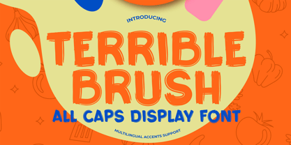 Here comes a New font,Introducing Terrible Brush It's All Caps Display Font is a Textured Natural Style and Authentic Brush style, this font is great for your creative projects such as watermark on photography, and perfect for logos & branding, invitation,advertisements,product designs, stationery, wedding designs,label ,product packaging, special events or anything that need handwritting taste. Terrible Brush is a natural Hand Drawn feel. This handmade font will make your design has a beautiful natural touch for each details. It is perfect for any design project as Invitation,logo, book cover, craft or any design purposes,photos, photography overlays, signs, window art, scrapbooking, tags and so much more! That is has charming, authentic and relaxed characteristic more natural look to your text.
 - ITC Conduit by ITC,
$45.99 A no-nonsense modern sans serif design, the ITC Conduit type family embodies an earnest vernacular spirit. Its designer, Mark Van Bronkhorst, explains: “It’s the kind of lettering you might find on boilers, assembly diagrams, and desiccant packets,” he explains. “It’s plain, grid-based, visually incompetent, yet legible and direct.” Brilliantly assembled from a typographic kit of parts, ITC Conduit's letterforms project a coolness, without feeling austere or unapproachable. It's an excellent choice for publication, packaging, or even wayfinding design systems. The ITC Conduit collection is available in 14 styles, with weights from extra light to black—all with matching italic designs. An easy, efficient way to bolster your go-to typographic arsenal, add it to your type library today!
 - Morning Holiday by Gassstype,
$23.00 Here comes a New font, Introducing Morning Holiday It's Weird Display Font is a Natural Style and Authentic classy style, this font is great for your creative projects such as watermark on photography, and perfect for logos & branding, invitation,advertisements,product designs, stationery, wedding designs,label ,product packaging, special events or anything that need handwritting taste. Morning Holiday is a natural Hand Drawn feel. It is perfect for any design project as Invitation,logo, book cover, craft or any design purposes,photos, photography overlays, signs, window art, scrapbooking, tags and so much more! It is perfect for any design project as Invitation,logo, book cover, craft or any design purposes. It also features a wealth of special features including You can activate 11 Ligatures OpenType panel.
 - Monalliza by Ardyanatypes,
$20.00 "Monalliza" comes with an aesthetic style, and its serif-type tagline is Vintage and elegant. "Monalliza" is also equipped with the latest professional characteristics that present a sleek and attractive identity for your company or project for business purposes. It goes well with modern serifs and scripts that depict or stand firm as a title and brand representative for an elegant look. "Monalliza" also comes with multiple languages, making any country and language easy to use. It also comes with alternative Ligatures and styles to make your designs more attractive. "Monalliza" is suitable for branding projects and various design purposes such as business cards, name tags, and uniforms as a brand enhancement. Advertisements, posters, invitations, branding, logos, magazines, merchandise, presentations, etc.
 - Kunjani by Scholtz Fonts,
$21.00Kunjani, (the Zulu word for "How are you?") is a feisty, contemporary "African Renaissance" font, vibrant and richly decorative, embodying the spirit of modern Africa. The characters are full of movement and excitement, combining a hand-carved look with contemporary elegance. Traditional and contemporary designs are used to make the upper-case alphabet essentially African, while lending variety to the already interesting structure. The font is a must for creators of the contemporary look of Africa. It is perfect for music media & promotions, film media & promotions, clothing hang tags & promotions, posters for "Support Africa" events, and indeed, any project that has its focus on Africa. The font has been carefully letterspaced and kerned. All upper and lower case characters, punctuation, numerals and accented characters are present. - Slash Roller by Colllab Studio,
$19.00 "Hi there, thank you for passing by. Colllab Studio is here. We crafted best collection of typefaces in a variety of styles to keep you covered for any project that comes your way! Introducing, Slash Roller, it marks a new era in graffiti font. The slashing zig zag tape gives it an authentic DIY feel. The slashed tape is prominent but not overdone, adding an interesting layer to the blocky rough letters. Slash Roller is an attempt to create a lettering style that seems like it was made with a spray can and a brush, but keeps the appearance of a slightly imperfect and distorted typeface. It looks like the work of a vandal, but the slashed typography is actually intentional. A Million Thanks Colllab Studio www.colllabstudio.com