10,000 search results
(0.101 seconds)
- Celtic Knots by Clanbadge,
$20.00 While it is obvious that this is an ornamental style font, it is more than that: it is a Celtic Knotwork design tool! Irish, Scottish, Welsh, even Norse and Viking cultures have used knotwork designs for millenia. These ancient traditional interwoven designs are experiencing a revival as Celtic culture gains exposure in the modern world. Intricate Celtic knots are featured everywhere from jewelry to tattoos. While many enjoy them simply for their beauty and fascinating twists, they can also be used to add an air of myth, magic and mystery to any project. The interlaced lines make them perfect for wedding invitations, borders, dividers and rules, web graphics, and logos. I began using Celtic knotwork designs in my own work as part of my knifemaking and jewelry making hobbies. I read all of the books I could find about Celtic knots and at first I drew them by hand with pencil and paper. Then as I realized how nice it would be to have "undos" I switched over to using Corel Draw. Draw proved to be a natural for this type of artwork with tools like contour and the trim function. But even with these great tools, it was still tedious to create these designs. I noticed that I was able to reuse a lot of parts in repetitive sections. I developed a small library of reusable bits and chunks of Celtic designs. I found them so useful and fun to work with that I began thinking about ways to market my Celtic design kit. I thought about CDR and EPS formats, but then I thought of creating this toolset as a True Type Font. That way anyone with ANY program that uses fonts could easily create Celtic knotwork designs. Word processors, embroidery programs, engraving programs, jewelry design programs, CAD/CAM programs...almost every program can use fonts. I was also interested in CNC work and thought that this font would work well for applications such as laser etching, vinyl signs, and machining. With that in mind, I designed each character of the font with extremes of accuracy. If one character from the font is used at one inch tall, every control point will be placed to an accuracy of better than 0.0001 inch. I wanted every piece to meet exactly with the next, with no possibility for misalignment. The different styles are all very carefully created to fit accurately with each other. So the Filled Style fits exactly into the Outline Style, and the Inverse Style fits precisely around the Outline Style so as to make up the background behind the knotwork. Combining the styles allows you to have complete creative control. By assembling the nearly 200 pieces it is quite easy to produce very complex designs. It is actually a bit like playing with a puzzle and many people really enjoy putting the pieces together to make designs. In fact, I have had many customers tell me of how they love playing with this font and making knots into the wee hours of morning. If you like puzzles then you will absolutely love this font! And creating the patterns is just the beginning of the fun! If you apply your favorite Photoshop tricks on them you can make anything from dazzling chrome knotwork to carved stone. Photoshop plug-ins like SuperBladePro are great for converting knotwork text into corroded bronze or rusted iron. Use your knotwork to add texture to a virtual landscape, or add them as surface embelishments on architecture and furniture. You can also make round knotwork by using this font with "WordArt" (WordArt is included with every copy of Microsoft Word. See http://clanbadge.com/round_knots.htm for a tutorial on how to make round knotwork). For Crafters there are limitless uses for this font. It has been used for embroidery, jewelry, leatherwork, stencils, stained glass, quilting, painting, pyrography, woodcarving and lots more. We have even sold copies to monks for use in decorating handmade books!
 - Binder by Grype,
$16.00 Our Binder Family is a revival and expansion of Binder-Style, a typeface designed by Joseph Binder and released by D. Stempel AG in 1959. It originally was a single weight. In later film type adaptations, a bold style, and an outline with drop shadow style were made available. However, this typeface never really had a true sense of family or larger language compatible character set. The original Binder-style typeface found revived popularity with its super condensed style when it appeared on the movie poster for "Silence of the Lambs". It was always a disappointment to me how this typestyle had never gained more traction in use. And so, many years later, we decided to revive the original typestyle, and expand it with a range of weights and obliques to pair with those weights. We've moved most of the unusual lowercase forms to a Stylistic Alternates feature, along with unicast alternates for the Capitals. The family includes a full standard character set with expansive international support of latin based languages, and 4 weights jumping from Thin to Bold, along with 4 accompanying obliques. This family is ready for you to eat it up with a nice glass of Chianti. Here's what's included with the Binder Family: 538 glyphs per style - including Capitals, Lowercase, Numerals, Punctuation and an extensive character set that covers multilingual support of latin based languages. 4 weights: Thin, Light, Regular, & Bold. Accompanying Obliques with each weight/width style. TTF formatted fonts have been hinted for optimal performance. Here's why the Binder Family is for you: You're in need of a stylish condensed font with a variety of weights and obliques for your designs You're a fan of the typographic works of Joseph Binder, but wish there was more to them You love the style of Agency and Bank Gothic, but want something uber-narrow You are desperate to recreate the movie poster from Silence of the Lambs You just like to collect quality fonts to add to your design arsenal
 - Divina Proportione by Intellecta Design,
$29.00 Divina Proportione is based from the original studies from Luca Pacioli. Luca Pacioli was born in 1446 or 1447 in Sansepolcro (Tuscany) where he received an abbaco education. Luca Pacioli was born in 1446 or 1447 in Sansepolcro (Tuscany) where he received an abbaco education. [This was education in the vernacular (i.e. the local tongue) rather than Latin and focused on the knowledge required of merchants.] He moved to Venice around 1464 where he continued his own education while working as a tutor to the three sons of a merchant. It was during this period that he wrote his first book -- a treatise on arithmetic for the three boys he was tutoring. Between 1472 and 1475, he became a Franciscan friar. In 1475, he started teaching in Perugia and wrote a comprehensive abbaco textbook in the vernacular for his students during 1477 and 1478. It is thought that he then started teaching university mathematics (rather than abbaco) and he did so in a number of Italian universities, including Perugia, holding the first chair in mathematics in two of them. He also continued to work as a private abbaco tutor of mathematics and was, in fact, instructed to stop teaching at this level in Sansepolcro in 1491. In 1494, his first book to be printed, Summa de arithmetica, geometria, proportioni et proportionalita, was published in Venice. In 1497, he accepted an invitation from Lodovico Sforza ("Il Moro") to work in Milan. There he met, collaborated with, lived with, and taught mathematics to Leonardo da Vinci. In 1499, Pacioli and Leonardo were forced to flee Milan when Louis XII of France seized the city and drove their patron out. Their paths appear to have finally separated around 1506. Pacioli died aged 70 in 1517, most likely in Sansepolcro where it is thought he had spent much of his final years. De divina proportione (written in Milan in 1496–98, published in Venice in 1509). Two versions of the original manuscript are extant, one in the Biblioteca Ambrosiana in Milan, the other in the Bibliothèque Publique et Universitaire in Geneva. The subject was mathematical and artistic proportion, especially the mathematics of the golden ratio and its application in architecture. Leonardo da Vinci drew the illustrations of the regular solids in De divina proportione while he lived with and took mathematics lessons from Pacioli. Leonardo's drawings are probably the first illustrations of skeletonic solids, an easy distinction between front and back. The work also discusses the use of perspective by painters such as Piero della Francesca, Melozzo da Forlì, and Marco Palmezzano. As a side note, the "M" logo used by the Metropolitan Museum of Art in New York City is taken from De divina proportione. “ The Ancients, having taken into consideration the rigorous construction of the human body, elaborated all their works, as especially their holy temples, according to these proportions; for they found here the two principal figures without which no project is possible: the perfection of the circle, the principle of all regular bodies, and the equilateral square. ” —De divina proportione
 - Das Riese by Intellecta Design,
$22.90 Das Riese, a type specimen by the most productive Brazilian type foundry, Intellecta Design, is a mix of victorian and art deco influences. A beautiful display type for tiling with uppercases only. It's shadows and volumes refer to pre-modern age whereas its surface to last century 20's. This heavy sans serif strokes characters have a particular appearance, a parallel line texture that reminds Bifur, typeface created in 1929 by A. M. Cassandre. The sideways absence of volume at some leaning letters right side in addition to the patchy darkness of shadows support its handmade design. A type full of historical references designed to small titles printed in big sizes. It's impossible not to think about posters when you look at Das Riese strong face. - (source Slanted Magazine #8)
 - ITC Goudy Sans by ITC,
$29.99 Frederic W. Goudy designed three weights of this friendly-looking sans serif font from 1922-1929 for Lanston Monotype in the United States. Goudy was attempting to impart freedom and personality to the sans serif form at a time when geometric sans serifs, such as Futura, were gaining rapid world-wide popularity. To achieve this challenging goal, he looked to lapidary inscriptions and manuscript writing for inspiration. He included elements such as slight swellings of terminal strokes, slab serifs on a few of the caps, alternate uncial forms, and a few swash strokes. The result is uniquely Goudy: charming, instinctive, and just right for adding warmth to magazine or advertising layouts. The design staff at ITC updated and filled out the family for a total of eight styles in ITC Goudy Sans. ITC Goudy Sans® font field guide including best practices, font pairings and alternatives.
 - Rosanthie by Anomali Creative,
$19.99 Greeting the new day! Start with a new handwriting, it will make your work more creative! Introducing Rosanthie - Signature Script Font by Anomali Creative! Rosanthie is Signature script is handmade signature style font with stunning characters. Ideal for logos, name tag, handwritten quotes, product packaging, merchandise, social media & greeting cards. It contains a full set of lower & uppercase letters, a large range of punctuation, numerals, and multilingual support. This font can be used with all software that can read standard fonts. ------------------------------------------------------ Check out my instagram: www.instagram.com/anomali_studio Thanks so much for checking out my shop! All the best, Krisna Teja
 - Doublethink by Barnbrook Fonts,
$30.00 Doublethink was developed from lettering drawn in the 1960s by Vinko Ožić-Pajić and used on the shop fronts of Yugoslavian state-owned clothes company Standard Konfekcija. The original design has been reinterpreted and expanded and is offered as a two weight typeface—Doublethink Medium and Doublethink Bold Inline. Standard Konfekcija was established first as a military fabric company and later became the premier fashion brand outlet in the Communist state of Yugoslavia. It is famous for being the first shop in the country to offer plastic bags (Standard Konfekcija stores ceased trading after the fall of Communism).
 - 1669 Elzevir by GLC,
$42.00 This family was inspired from the set of font faces used in Amsterdam by Daniel Elzevir to print the famous “Tractatus de corde...” the study on earth anatomy by Richard Lower, in 1669. The punch cutter was the famous Dutch Kristoffel Van Dijk. In our two styles (Normal & Italic), font faces, kernings and spaces are scrupulously the same as in the original. This Pro font covers Western, Eastern and Central European languages (including Celtic), Baltic and Turkish, with standard and “long s” ligatures in each of the two styles. The Roman (Normal) style contains a U stylistic alternate, and the Italique style A.
 - JesusLovesYouAll by LucasFonts,
$19.00 Almost every type designer feels the need, from time to time, to interrupt his or her serious work on complex text type systems for something more playful. In Luc(as)'s case this has often meant designing more typefaces. In the early 1990s, while working on Thesis, Luc(as) drew several display faces which were based on the shapes of TheSans but were either de(con)structive versions or experimental variations. Jesus Loves You All is a heretic thorny typeface vaguely based on the outlines of TheSans. Jesus Loves You was given a remarkable three-dimensional treatment in Abbott Miller's Dimensional Type project.
 - Circulaire by Canada Type,
$24.95 Circulaire is a set of initial caps designed by Sjoerd Hendrik de Roos in 1926, and digitized in 2009 by Hans van Maanen. Unusual serifs, spurs and swashes make for interesting continuity points in the familiarly angled shapes, while adding a unique calligrapher's touch to the beheld forms. As far as initials go, this set contains the extra touch of personality needed to lead into a paragraph, which is preferable to the usual swashed italics that are widely used. Circulaire is available in all popular font formats and includes extended support for a wide variety of Latin-based languages.
 - Calathos by Gassstype,
$25.00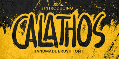 Introducing Calathos– Handmade Brush Font is a Signature Style and classy style, this font is great for your creative projects such as watermark on photography, and perfect for logos & branding, photography, invitation, watermark,advertisements,product designs, stationery, wedding designs,label ,product packaging, special events or anything that need handwritting taste. Calathos a natural handwritten feel. This handmade font will make your design has a beautiful natural touch for each details. It is perfect for any design project as Invitation,logo, book cover, craft or any design purposes. photos, photography overlays, signs, window art, scrapbooking, tags and so much more!
 - Duckface by Raditya Type,
$15.00 Duckface. Fun display font. A cartoon font. Fonts for cheerful and explosive mood. Duckface consists of three font styles. Regular, outline and black. Bold and fun font display with lots of impact! Use it as a comic book font. Use it as a cartoon font. It's fun and powerful. Suitable for children's and children's equipment but still cool and unique for products with character bags. And impact! Create your own fantastic design! Perfect for designs including comic fonts or cartoon fonts. That's good!!! Multilingual Fonts Full uppercase characters. It is also multilingual and contains all standard Western, Central and Southeast European language support.
 - Reslaby by Letterayu Studio,
$19.00 Reslaby is a Vintage Slab Serif font that will make your designs look unique and fun. It's perfect for labels, quotes, posters, DIY projects, branding, packaging, greeting cards, websites, photos, photographic overlays, signs, window art, scrapbooking, tags and more! What's Included : + Standard glyphs + Web Font + Multilingual Accent + Works on PC & Mac + Simple installations Accessible in the Adobe Illustrator, Adobe Photoshop, Adobe InDesign, even work on Microsoft Word. PUA Encoded Characters - Fully accessible without additional design software. Fonts include multilingual support Image used : All photographs/pictures/vector used in the preview are not included, they are intended for illustration purpose only. Thank You
 - Sultana by Gassstype,
$23.00 Here comes a New font, Introducing Sultana It's Fun Hand Drawn Font is a Natural Style and Authentic classy style, this font is great for your creative projects such as watermark on photography, and perfect for logos & branding, invitation,advertisements,product designs, stationery, special events or anything that need handwritting taste. Sultana is a Hand Drawn feel. This handmade font will make your design has a beautiful natural touch for each details. It is perfect for any design project as Invitation,logo, book cover, craft or any design purposes,photos, photography overlays, signs, window art, scrapbooking, tags and so much more!
 - Linotype Sjablony by Linotype,
$29.99Linotype Sjablony is part of the Take Type Library, chosen from the entries of the Linotype-sponsored International Digital Type Design Contests of 1994 and 1997. Designed by Dutch artist Mark van Wageningen, the typeface with its interrupted strokes has the characteristics of the stencils seen on crates and barrels. The difference lies in the raw contours of this font, which make the characters look as though they were slowly eroded away by water and wind. Linotype Sjablony is composed exclusively of heavy capital letters and is particular suitable for initials and headlines with point sizes of 18 and larger. - Morning Magpie by Ana's Fonts,
$15.00 Morning Magpie is a cute handmade brush font with matching illustrations and decorative elements. With an alternates character set, it is perfect for any design that needs a quirky handwritten feel, such as logotypes, postcards and tags, social media quotes. The illustrations will also look great in patterns, in wrapping paper and backgrounds. Morning Magpie includes: Morning Magpie, a brush font with ligatures for a more natural handwritten look Morning Magpie Alternate, a set of alternative characters for A-Z, a-z and 0-9 Morning Magpie Ornaments, a set of 52 drawings, swashed and underlines
 - Linotype Laika by Linotype,
$29.99Linotype Laika is part of the Take Type Library, chosen from the entries of the Linotype-sponsored International Digital Type Design Contests of 1994 and 1997. This fun font was created by Dutch designer Mark van Wageningen, who based its forms on those of a sans serif font but gave them wavy, irregular contours. They look almost as though they lie just under the surface of a pool and the movement of the water gives them their undulating appearance. The dynamic Linotype Laika is especially good for headlines in larger point sizes or shorter texts in point sizes of 14 or larger. - Blom by The Northern Block,
$29.95 Blom is a humanist sans with subtle squarish character in reverse contrast. The combination of heavy horizontals and modern geometry give the typeface a unique visual aesthetic whilst making small text perfectly readable. Blom bucks the trend of conventional letterforms in favour of a versatile typeface with bags of originality, that is both inventive in style yet completely functional in a wide range of intended uses. Details include 463 characters, six weights with matching italics and five variations of numerals. Opentype features include inferiors, superiors, fractions, slashed zeros, case-sensitive forms, ligatures and language support covering Western, South and Central Europe.
 - Gillcy by Scratch Design,
$9.00 Gillcy is a Modern script font with a beautiful shape and natural on each character comes with unique alternative glyphs and has multilingual support. Gillcy it's a very unique font that works great in large sizes with any background colors. Gillcy is perfect for Wedding invitations, Magazine Headlines, Branding Projects, Prints, labels, Price Tags, Clothing & Fashion Branding. Just open your Opentype features while using the script font to use the ligatures and swashes. As you type, your text will look like a natural and authentic script. Features: Stylistic Alternates & Ligatures Numerals & Punctuation Swashes Accented characters Format File: TTF, OTF, Web Multiple Languages Supported
 - Rodrigues by Mans Greback,
$59.00 Rodrigues is a casual signature script, designed by Amin Mario and Mans Greback in 2020. A font full of personality and curves, created using quick strokes to for a natural handwritten effect, which to gives the font an organic look in a digital world. The typeface comes with OpenType features such as alternates and ligatures, a bold style and multiple decorative elements. Use { } < > [ ] anywhere in a word to create a swash. Example: Mag[ical The font has extensive lingual support, covering all European Latin scripts. It contains all characters you'll ever need, including all punctuation and numbers.
 - Hardwired by FadeLine Studio,
$20.00 Hardwired a new handmade script with a style elegant, sweet and simple. Made with great care to provide the natural and modern elements. This font has many advantages although it looks ordinary. The great thing about this font is you can find some style when you use it, examples such as natural handwriting style, unique, simple, elegant and bold. With a style like this, this font will be suitable in use for logo's, branding projects, homeware designs, product packaging, mugs, quotes, posters, shopping bags, logo's, t-shirts, book covers, name card, invitation cards, greeting cards, and all your other lovely projects.
 - Blaue Brush by Beige Type,
$29.00 Blaue Brush is a handmade typeface painted with a Japanese brush marker on smooth paper. While the font was digitalised, special care was taken to retain its handmade character; as a result it is rough and authentic. Blaue Brush offers a complete font set in one weight that can be used in many languages, with uppercase, lowercase and a full range of decorative characters – a set of five decorative borders, arrow segments and many image characters. Blaue Brush is suited for use in packaging design for labels, tags, posters, unique occasions, music band styles and whatever else. Embrace the brush!
 - Asita Signature by madjack.font,
$17.00 Asita Signature is beautiful and simple handwriting, contemporary and fashionable, Asita Signature looks elegant for various designs. This elegant font is legible and looks great as a title or body text. This font will be perfect for various designs for magazine headlines, social media, branding, wedding invitations, cards, etc. The Asita Signature font includes ligatures, capital letters, and alternate letters. You need a program that supports OpenType features such as Adobe Illustrator CS, Adobe Photoshop CC, Adobe Indesign and Corel Draw X6/X7. and you can also access alternative glyphs via Font Book (Mac users) or Windows Character Map (Windows users). tags
 - Dalgonis Brush by ijemrockart,
$15.00 Dalgonis Brush is handmade script font with stunning characters. Ideal for logos, name tag, handwritten quotes, product packaging, merchandise, social media & greeting cards. It contains a full set of lower & uppercase letters, a large range of punctuation, numerals, and multilingual support. The font also contains several alternatives for lowercase characters, accessible in the Adobe Illustrator Glyphs panel, or under Stylistic Alternates in the Adobe Photoshop OpenType menu. But If you don't have any opentype specific software, you can still use Collatin as is with its standard lowercase and uppercase letters. - Files Included Dalgonis Brush.otf Dalgonis Brush.otf Thank You.
 - Bitter Kiss by Gassstype,
$22.00 Here comes a New font,Introducing Bitter Kiss - Lovely Handwritten Font with a natural style and dramatic movement. Crafted manually with love and passion, This font is great for your next creative project such as logos, printed quotes, invitations, cards, product packaging, headers, Logotype, Letterhead, Poster, Label, and etc. Bitter Kiss a natural Hand Drawn feel. This handmade font will make your design has a beautiful natural touch for each details. It is perfect for any design project as Invitation,logo, book cover, craft or any design purposes,photos, photography overlays, signs, window art, scrapbooking, tags and so much more!
 - Architype Aubette by The Foundry,
$50.00 Architype Konstrukt is a collection of avant-garde typefaces deriving mainly from the work of artists/designers of the inter-war years, whose ideals have helped to shape the design philosophies of the modernist movement in Europe. Due to their experimental nature character sets may be limited. Architype Aubette is based on Theo van Doesburg’s 1928 signage lettering for the Café Aubette in Strasbourg. A collaborative project with Jean and Sophie Arp, the design and decoration of the entire restaurant and leisure complex was one of the largest projects to exemplify 1920s avant-garde, and the theories of Dutch De Stijl.
 - Bomb Da Gone by Prioritype,
$69.00 Start creating new moves. Make cool designs in urban graffiti style. You can apply them to your designs such as t-shirt designs, skateboards, album covers, merchandise, tote bags, landing pages, social media posts, posters, stickers, events etc. See some of the previews above for reference. Features: -Uppercase -Numeral -Punctuation -Multilingual -PUA Encoded -Opentype Features Note: To access the Opentype feature, it would be better if you use a program that supports it and is available with a glyph panel so you can see various alternative characters. Examples of programs such as Adobe Illustrator, Corel Draw or Inkscape. Thanks.
 - Hop Serif Hand Lettering by Joanne Marie,
$10.00 Here’s another font family for your hand lettering projects. Hop Serif Hand Lettering is a font family consisting of 3 styles: 1.) Hop Serif Hand Lettering Regular 2.) Hop Serif Hand Lettering Lines 3.) Hop Serif Hand Lettering Shadow This font family is all authentically hand drawn from pencil and paper to the digital screen and is perfect to include on designs for apparel such as mugs, t-shirts, bags, notebooks, inspirational quotes for the home and office, and more. Each font is multi-lingual too! I love using this font in my hand lettering designs and I hope you will too!
 - Print Shop Parts JNL by Jeff Levine,
$29.00 Print Shop Parts JNL has a nostalgic assortment of blank sign panels, a pointing hand, decorative embellishments and even an assortment of "Made in U.S.A.", "Made in America" and "Made in United States" emblems located on the 1-9 keys. All are from vintage type catalogs and sign painting instruction books from the early 1900s. When scaled up, the blank sign panels can be used for small signs or price tags as originally made in years past. During the early part of the 20th Century, it was common to create show cards in attention-getting shapes matched with beautiful hand lettering.
 - Naga by Canada Type,
$24.95 Naga is Hans van Maanen's original creation of art deco shapes interected with intricate mazes of what could be Celtic or Mesoamerican knotwork art. The totality of the typeface borders on the mysterious, exotic and yet clearly discernible as far as readability is concerned. Naga comes with a companion outline style that emphasizes its intricacy. Both fonts hold up quite strongly when combined with photo/illustration masks. The Naga family comes in both OTF and TTF formats, and includes an extended range of characters covering most Latin-based languages. A few unicase forms are also included.
 - Thirteenth Classmate by Gassstype,
$22.00 Introducing Thirteenth Classmate – Handmade Brush Font is a Authentic Natural and classy style, this font is great for your creative projects such as watermark on photography, and perfect for logos & branding, photography, invitation, watermark,advertisements,product designs, stationery, wedding designs,label ,product packaging, special events or anything that need handwritting taste. Thirteenth Classmate a natural handwritten feel. This handmade font will make your design has a beautiful natural touch for each details. It is perfect for any design project as Invitation,logo, book cover, craft or any design purposes.photos, photography overlays, signs, window art, scrapbooking, tags and so much more!
 - Arshila by Bykineks,
$12.00 Introducing Arshila Typeface the Modern Serif Bykineks, designed by Dede Kurniawan, the newest typeface family with 54 font styles! With over 700 glyph options and a multilingual, Cyrillic, Greek writing system, this typeface offers a complete typography. easily adaptable to designs in the fashion industry such as magazines, logotypes, wedding invitations, label tags, posters, and many more. gives you a modern, professional and unique style. with various features such as ligatures, alternative characters, numerator, and denominator. You can create a completely unique design that is sure to stand out from the rest. Get creative with arshila typeface, and bring your designs to life!
 - Caflisch Script by Adobe,
$35.00Caflisch Script was designed by Robert Slimbach in 1993. The design is based on the handwriting of Max Caflisch, one of the foremost graphic designers of this century. Caflisch, a teacher of graphic arts for over three decades in Zurich, is author of several books on typography and designer of the 1952 Columna typeface. Caflisch�s handwriting has a free flowing yet disciplined character, the result of years of practice and devotion to the calligraphic arts. Slimbach retained the subtleties and natural letter joins of Caflisch�s original handwriting while adapting it into a typographically sound and highly practical script typeface. Caflisch Script is a multiple master typeface with a weight axis that allows the typeface to transition smoothly from light to heavy weights, maintaining legibility and visual appeal at a full range of point sizes. Caflisch Script can be used anywhere the appearance of a fine hand is desired, as well as more sophisticated and practical situations such as display work in books and copysetting for advertisements. - Factum by Fontop,
$14.00 Factum is a classical style serif typeface that sets the mood and evokes emotions before you read the text. Interchanging thick and thin lines, especially in Medium and Bold styles, creates an elegant silhouette and a rhythm in title sheet, cover art or poster. Yet Light and Regular styles look great in large type as well as headlines. Another speciality of the font family is Stencil styles that help you play around your typography and logotypes. Rich heritage and cultural experience behind the classical design make Factum font perfect for texts and messages connected to glamour, fashion, arts, literature, architecture, science, education, travelling, fine dining, cosmetics, beauty and etc. Timeless pattern and variety of weights and styles will make you use the font family again and again in different projects: creating logo, articles in magazines, branding, wedding invitations, quotes, posters, advertisements, monograms and many more. Character set of each font includes all European Latin-based glyphs, numbers, punctuation and OpenType features like standard ligatures, discretionary ligatures and fractions.
 - Guild of Professional Actors - Unknown license

- Barcis by insigne,
$24.75 Take your reader far away to a tropical morning, where the inviting aroma of a fresh roast introduces them to a gentle breeze and the first, warm light of day. Take them there with Barcis. This organic face with its tall x-height and neo-humanist attributes shows its free spirit through unique terminals, calligraphy-inspired strokes, and a rich variety of OpenType alternates All insigne fonts are loaded with OpenType options. Barcis is geared up for pro typography. The font features many numeral sets, with fractions, old-style figures, superiors and inferiors. OpenType-capable programs like Quark or the Adobe suite allow you to quickly change ligatures and alternates. You can see these options shown in the .pdf brochure. Barcis also features the glyphs to aid a variety of languages, together with Central, Eastern and Western European languages. In all, Barcis supports around forty languages that utilize the Latin script, earning Barcis the pick for for multi-lingual publications and packaging. Barcis features three different widths and seven weights from exceptional Light-weight to dense Black. Each of these individual fonts offers its own authentic italics and alternate glyphs as well. With its high versatility, Barcis is without a doubt an amazing titling font, a great choice for journals, a solid option for web use, or even for clearly defining your mark in logotype. Bring Barcis into your library, and use it to carry your audience away.
 - Well, imagine if a jar of honey and a bouquet of flowers had a baby on a sunny spring afternoon. That baby would be the font "Feelin Sweet" by Ardian Nuvianto. It's like every letter was dipped in a ...
- Krul by Re-Type,
$99.00 ‘Krul’ is a typographic interpretation of the lettering style created by Dutch letter painter Jan Willem Joseph Visser at the end of the 1940s, which decorated the traditional brown bars of Amsterdam. In the beginning, these letters were strongly associated with the pubs connected to the Amstel brewery, given that Visser was the company’s official painter. As the years passed, the style became increasingly popular, and various business owners in Amsterdam and other Dutch and Belgian cities also commissioned its use. In the 1970s and 1980s, Leo Beukeboom, another talented letter painter, continued and expanded this lettering tradition while employed under the Heineken brand. Much of his work can still be found in the Jordaan and De Pijp neighborhoods in Amsterdam. The Amsterdamse Krulletter, or Amsterdam’s curly letter, is strongly inspired by the calligraphic works of the 17th century Dutch writing masters, of which Jan van den Velde was a central figure. However, distinct characteristics of this style, for example, its unusual and beautiful ‘g’, originate from a model that was published by Johannes Heuvelman in 1659, which J. W. J. Visser referenced. Typographic circles have somehow overlooked the Amsterdamse Krulletter and its heritage. The Dutch calligraphic hands preceded and influenced the formal English penmanship which has inspired numerous typefaces in the Copperplate style. In contrast, the models from van den Velde, Heuvelman, and Jean de la Chambre, among others, are a missing chapter in Dutch typographic history, and had never been turned into typefaces until now. Conscious of the cultural and identity issues that arise in reviving a unique style, and concerned about the speed with which the lettering style was disappearing, Ramiro Espinoza focused the project of designing ‘Krul’ on digitally recreating the calligraphic complexity of these beautiful letters. Created through several years of research, ‘Krul’ is not a direct digitization of the Amsterdamse Krulletter, but instead, an interpretation that incorporates numerous alternative characters absent in the original model, and improves upon details where necessary, resulting in an optimal performance on the printed page. The typeface is presented in Open Type format, with an abundance of intricate ligatures, fleurons, and swashes, which permit the creation of numerous calligraphic effects. The very high contrast and rhythm of the strokes in this typeface make it especially suited for media applications conveying a sense of elegance and sophistication. Designers of feminine magazines, advertisements, and corporate identities within the fragrance and fashion industries will find in this typeface to be an extremely useful and appropriate resource.The great Amsterdamse Krulletter is finally back, and we are proud to make it available to you.
 - Penabico by Intellecta Design,
$23.90 After 13 months of hard work, Iza W and Intellecta Design are proud to announce Penabico. This is a free interpretation of the copperplate script styles to be found in the Universal Penman . London, 1741 , the monumental publication of engraved work by George Bickham (along with collaborators Joseph Champion, Wellington Clark, Nathaniel Dove, Gabriel Brooks, William Leckey and many others). This enhanced OpenType version is a complete solution for producing documents and artworks which need this kind of calligraphic script: 100s of stylistic alternates for each letter (upper- and lowercase), accessed with the glyph palette; 250 ornaments and fleurons (mostly in the copperplate roundhand renaissance style) encoded in the dingbats range and accessed with the glyph palette (plus a special set with over 50 of these ornaments accessed with the ornaments feature); an extensive set of ligatures (100s of stylistic and contextual alternates plus discretionary ligatures) providing letterform variations that make your designs really special, resembling real handwriting on the page; complete, intricate, ready-made calligraphic words; abbreviations (in many languages). The principal font contains the complete Latin alphabet, including Central European, Vietnamese, Baltic and Turkish with all diacritic signs, punctuation marks (including interrobang ). The German ‘ß’ (germandbls, eszett, sharp s) even has over six different alternate forms. And we don't forget to add the unconventional germandbls uppercase. In non-OpenType-savvy applications it works well as an English commercial script style font. Because of its high number of alternate letters and combinations (over 1500 glyphs), we suggest the use of the glyph palette to find ideal solutions to specific designs. The sample illustrations will give you an idea of the possibilities. You have full access to this amazing stuff using InDesign, Illustrator, QuarkXpress and similar software. However, we still recommend exploring what this font has to offer using the glyphs palette. Two last things — we have placed some of the ornaments, catch-words and other material in supplementary fonts, for easier access in non-OpenType-savvy programs. They are: Penabico Words (see the pdf user guide in “Gallery”), Penabico Abbreviations (free font), and Penabico Extras (free font). And, when buying Penabico you get the 'Penabico EPS Bonus Set", a gift pack containing various highly intrincated frames in EPS format, easy and ready to work with your preferred vector design software like Corel or Illustrator (see the pdf in the Gallery). Know too our other superscript font : Van den Velde Script at http://new.myfonts.com/fonts/intellecta/van-den-velde-script/
 - Clover by KA Designs,
$12.00 Clover is a modern retro font with a light, bubbly feel! This font is perfect if you are after a fun script font that has a lot of edge! The versatility of this font reaches wide. Use this one for branding, logos, advertisements, shirts, stickers, social media, invitations and more! The complete package includes a complimentary shadow version for easy and perfect layering every time! Clover will take you right back to the 70's but still provide a fresh look to your designs!
