10,000 search results
(0.03 seconds)
- Augmento by R9 Type+Design,
$35.00 Augmento™ is a large contemporary font family from R9 Type+Design. We designed this typeface right smack on the sweet spot between formal and casual. The rounded rectangular structure gives Augmento the corporate, trustworthy look while the quirky stems add the fun, playful feel. This unique, versatile type family is excellent for a variety of applications such as posters, packaging, editorials, and web design. The completed Augmento™ family consists of 3 widths, 6 weights, 36 styles, and over 550 glyphs each, and packs with OpenType features such as stylistic alternates, case-sensitive punctuations, and date vs fraction recognitions. It also comes with 3 sets of figures (Proportional lining, Proportional Oldstyle and Tabular lining), and supports most Latin-based languages. With all these features in your toolbox, you can make your design sing as loud (or soft) as you’d like. To find out more about Augmento™ Opentype features and type specimen, please visit www.r9typedesign.com
 - Marat by Ludwig Type,
$45.00 Although originally conceived as a magazine face – with strong serifs and open character shapes for good legibility in small sizes, and compact letter forms optimized for narrow columns and tight headlines – Marat evolved into a comprehensive family for general use. This specific construction and the round forms of the letters create an elegant, soft and friendly appearance. The typeface suits a wide range of typography, e.g. editorial, brochures, packaging and corporate design. In particular, in bold weights it works surprisingly well, which is not always the case with serif faces. Marat includes oldstyle and lining figures (both proportional and tabular), a wide range of language support and various OpenType features (e.g. ligatures, case-sensitive forms, fractions, superiors and inferiors). It is the perfect companion for Marat Sans, a clean and lively sans serif typeface. Marat has been selected by the Type Directors Club of New York to receive the Certificate of Excellence in Type Design 2008.
 - MFC Phonograph Monogram by Monogram Fonts Co.,
$19.00 The inspiration source for MFC Phonograph Monogram is a vintage monogram specimen named “Kent” showing only a CBA sample. It was a style I could find no other reference for, but was desperate to recreate this record like styling of monogram. Finally, it all comes to life in MFC Phonograph Monogram. I even threw in a little dog and phonograph icons hidden in the font as decorative icons reminicent of old Victrola records. Phonograph Monogram supports two and three letter monograms, although the two letter style break from the circular record design and creates a zulu style shield design. MFC Phonograph Monogram uses the Ligatures feature, available in most OpenType savvy applications, such as Adobe Illustrator CS (see Fig. 1). The Ligatures feature is typically enabled automatically, but you may need to confirm this in your program if you are not certain. If any second lowercase letter typed does not automatically switch to form the right side of the rounded form, you do not have Ligatures enabled.
 - ITC Adderville by ITC,
$29.99On a cold winter's night, George Ryan, of Galápagos Design Group, began musing on the possibilities for a “truly original” sans serif typeface. What came out of his musing, and his always-present sketchpad, was ITC Adderville, a typeface whose visual impact is immediate and strong. Ryan explains how he did it: “The rounded ends of its strokes and their skewed baseline contact create an illusion of dancing feet. The tops of lowercase stems emit serif buds, suggesting transition into or out of the serifed form. The spear-like lowercase stroke terminators, along with other distinctive elements such as the stylized reticulation of the lowercase 'g' segments, the salute of that same character's spur, and the bold, non-self-conscious 'i' and 'j' dots, all contribute to the playful and unique nature of this design.” The result is a friendly, lively type family whose graduated weights -- book, medium, and heavy -- lend themselves especially well to use at small display sizes and in short blocks of text. - Tatty by Scrowleyfonts,
$- Tatty is a sans serif, monoline font that is distinguished by the gentle, rounded, backward curves on the ascenders. I created it because I had a picture in my mind of a font that I wanted to use when designing images and logos for clients' websites but I could never find one that was just exactly right. Many years ago I worked for a sign-writing company. My job was to copy and enlarge letter sets from printed copy and then cut masks for airbrushing. One morning I arrived at my desk to find that the airbrush artist had written on a rough, rubbed out, scribbled on drawing of the letter ‘a’ - “make a letter happy, make it beautiful”. That was the brief I set myself in the design of Tatty - to make every letter happy and beautiful. The result is a flowing, elegant yet simple type which I believe works particularly well for poetry.
 - Vaguely Repulsive is a distinctive font that lives up to its intriguing name through a design aesthetic that boldly pushes the boundaries of conventional attractiveness. At first glance, this font ch...
- Decipher by Mans Greback,
$69.00 Decipher, designed by Mans Greback, is an edgy graffiti-inspired font that captures the essence of street art and hip-hop culture. With its cool, calligraphic and marker-style handwriting, Decipher brings the energy and speed of urban life into your designs. Perfect for projects that require a touch of street-smart attitude, this font will take your creations to the next level. The typeface comes in four styles: the Regular style and the Symbols style, both provided in Bold. The Symbols style is a unique addition, offering a variety of tag elements such as swashes, arrows, stars, and crowns to enhance your designs further and unleash your creativity. The font is built with advanced OpenType functionality and has a guaranteed top-notch quality, containing stylistic and contextual alternates, ligatures, and more features; all to give you full control and customizability. It has extensive lingual support, covering all Latin-based languages, from Northern Europe to South Africa, from America to South-East Asia. It contains all characters and symbols you'll ever need, including all punctuation and numbers. Mans Greback is a Swedish typeface designer dedicated to crafting diverse and versatile fonts. With a passion for a wide range of typographic styles, he has developed a range of fonts that are appreciated and utilized by designers around the world.
 - TELETYPE 1945-1985 - Unknown license

- Nurnberg Schwabacher by Intellecta Design,
$29.95"I digitized and to revitalize NurnbergSchwabacher by the extinct Haas'sche Schriftgiesserei, a German/Swiss foundry established in 1790 and based in Basel/Münchenstein. Many of its shares were acquired by D. Stempel in 1927. On the Luc Devroye site this foundry is listed on the Extinct Foundries of the 18th century page. This design is very similar to another Intellecta best seller: Hostetler Fette Ultfraktur Ornamental, both drawn from the classical type specimen book from Hostetler. The ornamental frame that completes the font is a fantastic baroque ornament that I found in another old book, unfortunately lost now. Luc Devroye, whose book is the source for all of my fonts, writes this about Rudolf Hostettler: He was a Swiss type designer, author of “The Printer’s Terms” designed by Jan Tschichold, of "Technical Terms of the Printing Industry" (5th edition was printed in 1995), and of "Type: eine Auswahl guter Drucktypen; 80 Alphabete klassischer und moderner Schriften" (Teufen, Ausser-Rhoden: Niggli, 1958). He also wrote "Type: A Selection of Types" (1949, fgm books, R. Hostettler, E. Kopley, H. Strehler Publ., St. Gallen and London) in which he highlights type made by European houses such as Haas, Enschedé, Deberny and Nebiolo. Jost Hochuli wrote his biography. - Idiom by Reserves,
$39.99 Idiom is an extra-condensed, tightly spaced display face with congruent forms exuding a strong sense of rhythm and elevation. The basic stenciled geometric shapes are reminiscent of the decorative style found with P22 Albers and Futura Black. Careful consideration of each letter's construction, relative to all characters, lends Idiom a decided sense of cohesion and sophistication. The included non-traditional 'weights' (Medium and Bold) are completely blacked out, creating entirely new letterforms that exhibit a very stark, contemporary sense. Increasing the versatility of the Idiom family, a selection of OpenType features allow access to a set of contrasting linear punctuation forms, unconventional ligatures, case-sensitive punctuation and more. Features include: Basic Ligature set including 'f' ligatures (ae, oe, fi, fl, ff, fh, fj, ft, fa, ct, st, rt, ot, ta, sa, mi, si, vi, su, oc, oo, ru, ib) Alternate characters (M, W, T, ß, _, $, @, (), {}, [], /, \, |, -, –, —, +, -, ±, ≤, ≥, , «, », and more) Case forms (shifts various punctuation marks vertically to a position that works better with all-capital sequences, in this case the numerals or letters with ascenders) Slashed zero Full set of numerators/denominators and superscript/subscript Automatic fraction feature (supports any fraction combination) Extended language support (Latin-1 and Latin Extended-A) *Requires an application with OpenType and/or Unicode support.
 - Art Gothic HiH by HiH,
$10.00 Art Gothic was attributed to the Central Type Foundry of St. Louis, Missouri, USA by Henry Lewis Bullen, writing in INLAND PRINTER in 1907, with a reproduction shown in Kelly’s American Wood Type. The typeface appears on the cover of an issue of “The Superior Printer” pictured in Typology by Heller and Fili dated in the 1870s. Art Gothic was designed in 1884 by Gustav Schroeder and proved to be one of the more popular and enduring of the American-designed Victorian display faces of the period, appearing frequently in ads in various publications. The Hamilton Mfg. Co showed a very similar wood type, No. 232, with a modified and rather heavy-handed upper case in 1892. As late as 1897, it may be found in the advertising section of The Ivy of Trinity College of Hartford, Connecticut and was included in the Norwood Press 1902 Specimen Book. Our font includes a complement of five upper case and four lower case alternatives as follows: 123=C, 125=E, 135=H, 137=S, 172=c, 175=e, 215=m and 247=s. Great for period pieces. ART GOTHIC HIH is clean, readable, and surprisingly modern-looking; unlike so many overly complex Victorian display fonts, it can be used in text sizes.
 - P22 Atomica by P22 Type Foundry,
$24.95 Atomica looks back to the dawn of the nuclear era when fall-out shelters were all the rage. This font contains 62 Atomic Age symbols and Civil Defense emblems.
 - Graffiti Bomerang by Nirmana Visual,
$22.00 Graffiti Bomerang is a bold display font that captures the rebellious spirit of street art. Its thick, uppercase letters feature jagged edges and unique embellishments that evoke the look of spray-painted graffiti. This font is perfect for creating eye-catching titles and headlines for urban-inspired designs, music posters, and other projects that require an edgy and daring style. The font’s bold and unapologetic personality is sure to make a statement.
 - Bloody Skinny by Mvmet,
$12.00 Bloody Skinny is a kids friendly blood drips display font! Not only can be used for Halloween theme needs, you can use it too for other things for example graffiti tag or street style art needs. Use it on t-shirts and clothing, for your scary book designs, greeting cards, stickers, posters, banners, or anything that needs a fun touch. Try it to create fabulous designs and feel the fun and cool vibes with it!
 - Broughtes by Sulthan Studio,
$10.00 Broughtes is a beautiful, hand-drawn font duo. Script and sans that create a casual, yet stylish combination. This font would be suitable for logos, branding projects, homeware designs, product packaging, mugs, quotes, posters, shopping bags, logos, t-shirts, book covers, business cards, invitation cards, congratulations. cards, and all your other beautiful projects. Contains a full two set of lowercase and uppercase letters, punctuation, numbers, and multilingual support. This font also includes Ligatures and Swashes
 - DeLumary by FadeLine Studio,
$15.00 DeLumary is a new unique and funny display font. This font adopts a bold, cute, firm, and trendy style. Very suitable to meet your various design needs that are trending now. With a style like this, this font will be suitable in use for comics, logos, branding projects, homeware designs, product packaging, mugs, quotes, posters, shopping bags, t-shirts, book covers, name card, invitation cards, greeting cards, and all your other lovely projects.
 - Walbert by FadeLine Studio,
$12.00 Walbert is a bold and bold new display font. This blocky font creates a brave and strong style. It is suitable to meet your various design needs that are currently trending. With a style like this, this font will be suitable in use for comic, logo's, branding projects, homeware designs, product packaging, mugs, quotes, posters, shopping bags, logo's, t-shirts, book covers, name card, invitation cards, greeting cards, and all your other lovely projects.
 - Rogertt by Sulthan Studio,
$10.00 Hi true font connoisseur I introduced my second font Rogertt this is a modern handwriting that is unique and cute ... please try it is definitely fun and you will be happy. good luck.. With a style like this, this font will be suitable in use for logo's, branding projects, homeware designs, product packaging, mugs, quotes, posters, shopping bags, logo's, t-shirts, book covers, name card, invitation cards, greeting cards, and all your other lovely projects.
 - Raittens by Gassstype,
$22.00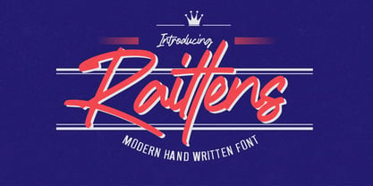 Introducing Raittens is Modern Handwritten Font is a Authentic Style and classy style, Raittens a natural handwritten feel. This handmade font will make your design has a beautiful natural touch for each details. It is perfect for any design project as Invitation,logo, book cover, craft or any design purposes,photography overlays, signs, window art, scrapbooking, tags and so much more! This font is PUA encoded which means you can access all of ligatures.
 - Scramble Storm by Gassstype,
$27.00 Introducing of our new product **Scramble Storm** Horror brush Font is handmade Rough Brush Font with ligature and Multilanguage support. Can make it easier to convey the message in your design. use for awesome display, labeling, movie sceen, poster, movie title,quotes, posters, DIY projects, branding, packaging, greeting cards, websites, photos, photography overlays, signs, window art, tags and so much more! Best for project that need horror vibes , horror poster, childrenbook, cartoon, comic etc
 - Shoebox by Atlantic Fonts,
$26.00 Shoebox font is crafty and sweet. It’s hand-drawn with double letter ligatures for upper and lower case. It works great in all-caps, and the lower case is a funky mix up with some interlocking ligatures too. Shoebox is rough with an occasional curl, and is paired with Shoebox Shapes; a unique picture font of Amy Dietrich illustrations (featuring boxes, bags, cats, stars, familiar household items, and for some reason, a forgetful octopus).
 - Bertrade by NJ Studio,
$19.00 Hi...Thank for your visit :) Bertrade monoline stylish script Fonts are font designs that are made for various vector designs, printing such as digital wedding invitations, blogs, online shops, social media, while printing can be used in the field of product clothing, accessories, bags, pins, logos, business cards, watermarks and many others ... Bertrade is equipped with complete alternates, so it can make your product look elegant and attractive, and also Multilingual support!!! Happy design ...
 - Atlantic Time by Dierstudio,
$16.00 Introducing Atlantic Time is a Script font with a which gives a strong and vintage touch to your projects. with 6 sets of styles that will make this font more Interesting Atlantic Time font is to use for any kind of design such as branding projects, logos, social media posts, advertisements, product packaging, product designs, labels, poster, photography, t-shirt, watermarks, paper bag, stationery, and any projects. Features: - Swash - 6 Stylistic Set - ligature - Multilingual Support
 - Roti Bakar by Prioritype,
$25.00 Introducing Roti Bakar - A Swirly Display Fonts Display fonts with a unique and fun style. With a variety of alternative letters that you can use optimally and easily. Great for use in craft design, t-shirt design, tote bag design, merchandise, logos, product packaging design, book covers, creative social media posts, advertising / promotions, etc. See some of the previews above for reference. Features: • Uppercase • Lowercase • Numeral • Punctuation • Multilingual • PUA Encoded • Opentype Features Thanks.
 - Annadalea by EVCco,
$12.00 This typeface pays homage to numerous Victorian and Art Nouveau predecessors, while straying somewhat beyond their usual conventions. All lowercase letters ascend in unison, whereas capitals descend below the baseline. A rigid set of uniform strokes keeps the chaos reigned in, while various calculated inconsistencies affect a vaguely hand-drawn quality to this quirky, downright decadent font. Comes packaged with the standard complement of alpha-numeric glyphs, punctuation marks, mathematical symbols, and Western European diacritics.
 - Technical Forest by Maciej Świerczek,
$- Design style ready to use in headlines, tags and quotes refering to technology, sci-fi, modern economy and more recent themes. The name of this font is connected to its simplicity and combination of its soft and sharp style in lines - just like tree branches and leaves. Also inspired by block form of runes - related to nature in its full floral character. However kept in clear and precisely designed form of technical font.
 - Rinature by Lemonthe,
$13.00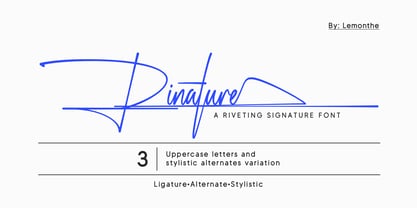 Rinature is a riveting and stylish signature font. It comes with 3 variations of uppercase letters and complete lowercase stylistic alternates from a to z, allowing you to easily combine them. This font is carefully crafted to maintain an elegant, stylish, readable, and easy to use. Rinature font is highly suitable for various design projects such as logo and branding, business cards, labels, cover designs, tags, or any design that requires a signature touch.
 - Nasty Graffiti by Mvmet,
$12.00 Nasty Graffiti is a very cool graffiti tag font, inspired by California street art movement scenes mixed with horror and Halloween vibes. It will elevate a wide range of design projects to the highest level. You can use this font for many design ideas such as stickers, t-shirt designs, amazing logo designs, magazine or book covers, comics, cartoon drawings, and many more. This font will add a cool touch to your designs!
 - Nullomis by Kulturrrno,
$5.00 Nullomis is a modern display font inspired by Soviet Period, anti-utopia and Ancient Rome (I don't know why). It was originally planned to create an ultracondensed headliner, but now it’s a flexible font set with 49 styles or just one Variable Font with all capabilities. Best using for posters, headlines and tags. Extended latin glyph set 7 weights 3 widths Alternate crossbar heights or all of this and more in one Variable font
 - MVB Emmascript by MVB,
$39.00Kanna Aoki drew the letters for MVB Emmascript while on a picnic near the Conservatory of Flowers in San Francisco’s Golden Gate Park. Mark van Bronkhorst adapted the writing as a font that maintains a very natural scrawl. Later a bold weight was added. MVB Emmascript has been used to add a lighthearted, human touch to everything from fiction paperbacks to potato chip packaging. The typeface is named for Aoki's 1968 Volkswagen, Emma. - ITC Aram by ITC,
$29.99Jana Nikolic was finishing her degree program at the Faculty of Applied Arts, in Belgrade, with a final project that would combine her two majors: type and book design. Three stories from William Saroyan's My Name Is Aram would provide the text for the book, to be set in a typeface that Nikolic would design. Nikolic knew something special was happening the moment she put pen to paper. The letters just emerged," she recalls. "I started to explore a few new pens and found one I loved. I was able to make its tip bend with pressure." Like the family Saroyan writes about, the design flowing from Nikolic's pen would be simple but a little quirky. "When there were a whole bunch of little black letters around me," continues Nikolic, "I saw that this was going to be a very interesting typeface family." Nikolic drew Latin and Cyrillic letters, lowercase and capital letters, wide letters and narrow letters. She was surprised at how quickly and easily the design came. "There were no badly written letters," she says. "I hardly had to rework them and they fit together remarkably well." ITC Aram's standard character complement consists of one set of lowercase letters and two sets of capitals: one narrow and the other wide. The wide caps can be used with the standard lowercase, or mixed with the narrow caps for a variation on "cap and small cap" copy. The ITC Aram create the opportunity to mix and combine the letters into playful typographic expressions. Words and sentences that twinkle; text that seems light and alive - one runs the risk of creating work that is both delightful and charming when setting copy in ITC Aram." - Ability by Scholtz Fonts,
$15.00 Ability is a family of stylish and contemporary handwriting fonts that combine the vigor of hand-drawn fonts such as Affable with the elegance of fonts such as Blythe. What is unusual about Ability is that it enables a word to be formed from a group of letters in a variety of ways: not only the conventional linking of letters as in a cursive script or the placing of letters close to each other on a common baseline, but it uses the overlapping of the swashes and swirls that contribute to the individuality of the characters to integrate the letters into a single word. Ability comes in a number of styles: Legacy - Regular (medium weighted and the basic type of the other styles); - Black (a vigorous and dramatic version of Regular); - Condensed Medium - Condensed Light - Linear 45 (medium-weight font made from a mono-width line) - Linear 25 (light-weight font made from a mono-width line) Suggestions for use: - wedding stationery - greeting cards - valentines day media - beauty products media - lingerie tags - women’s magazine pages - classical music media - award certificates - magazine pages The font is fully professional: carefully letterspaced and kerned. It contains over 235 characters - (upper and lower case characters, punctuation, numerals, symbols and accented characters are present). It has all the accented characters used in the major European languages.
 - Tradewinds JNL by Jeff Levine,
$29.00Tradewinds JNL is based on one of many innovative alphabets designed by the late Alf R. Becker for Signs of the Times magazine between the 1930s and 1950s. Thanks go to Tod Swormstedt of ST Media (who is also the curator of the American Sign Museum in Cincinnati, Ohio) for supplying the reference material used to make this font. - Herold by ParaType,
$30.00 The typeface was designed at ParaType (ParaGraph) in 1993 by Vladimir Yefimov based on Herold Reclameschrift by Heinz Hoffman of H. Berthold (Berlin), 1901, and Russian Herold typeface of the Berthold typefoundry (St. Petersburg). The bold style based on Herold Heavy of H. Berthold (Berlin), 1904, of the same designer. Advertising and headline typeface in Art Nouveau style.
 - Euripedes JNL by Jeff Levine,
$29.00 The Greek-influenced hand lettering on a 1930s WPA (Works Progress Administration) poster for the Federal Theater presentation of "Trojan Incident" inspired Euripedes JNL. The play was based on Homer and Euripedes, and was presented at the off-Broadway St. James Theatre (which opened in 1927 at 246 W. 44th Street on the site of the original Sardi's restaurant).
 - Hermes by ParaType,
$30.00 The typeface was designed at ParaType (ParaGraph) in 1993 by Tagir Safayev. Based on Placard typeface (Hermes Grotesk) of the Lange type foundry (St.-Petersburg), an adaptation of Hermes Grotesk, of the Woellmer type foundry (Berlin, middle of the 19th century). This sans serif with its old-fashion stability looks well in advertising and display typography.
 - Spectrum by Monotype,
$29.99Spectrum font is based on a design by Jan van Krimpen, who worked on his font from 1941 to 1943 for use in a Bible of the Spectrum publishing house in Utrecht. The bible project was later cancelled but the font was so beautifully formed and universal that the Monotype Corporation in London completed it. Distinctive are the reserved elegance and unmistakeable beauty of form. The italic was kept fine and is a wonderful complement to the other weights, making it perfect for emphasis in text. The form of the lower case italic g is reminiscent of van Krimpen's italic for Lutetia and Romanée. A similar font in form is the Perpetua from Eric Gill. It displays not only similar forms to those of Spectrum, both fonts also have uniquely designed old style figures. The 7 is particularly unusual with its slanted horizontal stroke and marked bend to the left in the lower third of the form. Spectrum is an extremely legible font even in smaller point sizes and is just as suitable for headlines as for long texts. - Linotype Rezident by Linotype,
$29.99Flyers, Intros from James Bond films and PlayStation games as well as the typeface Senator from Zuzane Licko inspired the Dutch designer Paul van der Laan to create his font Linotype Rezident. To its design, van der Laan says, I was designing a business card for a friend and I had a certain mood in mind for the typography. I tried to capture this mood in a couple of sketches, drew a few characters directly onscreen and just expanded them into a typeface." And so began Linotype Rezident, with its cool, technical and constructivist appearance which brings to mind computers and virtual reality. And the name? " The name of the font comes from the game Resident Evil. One of the main characters in the game is called Leon and the typeface was initially drawn for a friend of mine called Leon. It also refers to the city of The Hague - where I live and got my education - since it's often called 'de residentie'", where the queen and parliament of The Netherlands are seated." - Forrest by Fenotype,
$20.00 Typographers — and clients alike — are often obsessed with novelty. Be it self-consciously peculiar details with made-you-look appeal — or just austere, detached minimalism, constant seek for novelty in typography often becomes an end in itself. A lot of times, an old trick is better than a bagful of new ones — all you might actually need would be a good, reliable font family with soul, providing that comforting, familiar feel. This is where Forrest comes in: a type family born out of a lifelong passion for digging into old archives of fonts, in search for that good ol’ type — simple, honest, made with love. But make no mistake, Forrest is as savvy as fonts come, packed with smart features. Handsome swashes, cute small capitals and old style figures all add a bit of flair and enable a highly sophisticated and contemporary approach to typography.
 - Praitor by Scriptorium,
$18.00Praitor is based on a devotional inscription to the goddess Diana found a short distance from Rome in 1887. It is an early style from before 100 BC and has some characteristics of Etruscan lettering. It's a rough, strong font which works very well for distinctive titles.
