9,238 search results
(0.112 seconds)
- Thyne by Typotheticals,
$3.50 Thyne A rounded serif typeface Hand crafted Hand spaced Hand kerned
 - Kilshon MF by Masterfont,
$59.00 A 3 weights family, round geometric forms - ideal for headlines, signage.
 - Xantigo by PizzaDude.dk,
$20.00Xantigo is a fun, smooth and romantic font with rounded edges. - A Year Without Rain by Kimberly Geswein,
$5.00 The handwriting of a teen girl- bubbly, round, legible, and cute.
 - Ekela by AukimVisuel,
$9.00 Ekela family has 216 styles in 5 versions: Normal, Round, Circle, Punch and Round Punch. Ekela family is a neat, unique sans serif simple font with minimal and round letters. It can easily be combined with an incredibly large set of projects, so add it to your creative ideas and notice how it sets them apart! Suitable for a wide variety of designs thanks to its neat styling, Ekela family has the potential to become your favorite font, whatever the occasion!
 - Growing Boy by Brenners Template,
$19.00 Growing Boy Display Font Family is designed with a rather high x-height and consists of cute and creative glyphs. Nine weights include regular and rounded styles, the rounded styles are designed for soft edge. The really uniquely drawn glyphs can work well with any composition to create the layout you want. In addition, rounded styles increase readability and simplicity, so they can be applied in a variety of ways, including editorial publishing, logo design, brand identity, and on-screen channels.
 - Speeding Bullet by Comicraft,
$19.00 Introducing... SPEEDING BULLET -- featuring SPEED TRAILS for increasing the, ah, speed of your bullets! Quick as The Flash, slicker than Quicksilver, the latest in our popular line of silver age display fonts could probably outrun a locomotive AND jump buildings in a single bound. It’s ASTOUNDING, it’s STARTLING, it’s ELECTRIFYING, PERAMBULATING, DISCOMBOBULATING and RETROFITTING. It really is Faster than a Speeding Bullet. Try it out for yourself. Under adult supervision, natch'.
 - RM Luceat by Ray Meadows,
$19.00 With a nod to the Golden Age of children's stories, this delightful font will have many uses. 'Luceat' is the Latin for 'shine' and we arer sure you will agree that this is a shining example of the genre. Due to the modular nature of this design there may be a very slight lack of smoothness to the curves at extremely large point sizes (around 200 pt and above).
 - Cora by TypeTogether,
$49.00 Cora is a sans serif with an experimental bent, offering a large x-height, some contrast of stroke weight, and capitals inspired by classical lettering. The large x-height gives it a voice with a little more volume so that those in the back of the room have no trouble hearing. Because the letters seem slightly large, Cora remains clear at smaller point sizes. It is a typeface intended to perform well on screen without losing its attraction in print and the nature of its shapes allows for condensation or expansion without becoming severely distorted. The uppercase exhibits classical proportions found in ancient Roman inscriptions, which provides opportunities for setting titles in all caps. Cora Opentype Pro has a full range of numerals for every use, small caps, the most common open type features and supports many languages that use the latin extended alphabet. It is available in a range of three weights plus Italics. CoraBasic is a reduced version of Cora. It is still an OT-font but without any particular features except of a set of ligatures, class-kerning and language support including CE and Baltic.
 - Kostic Serif by Kostic,
$50.00 Kostic Serif is a classic transitional typeface (like Baskerville, Bookman, Caslon, Times) with tall, clean characters and a large glyph set to support all European languages - Greek and Cyrillic script included. Excellent for setting multiple pages of text and packed with OpenType features (proportional lining and oldstyle numbers, tabular figures, superscript and subscript, numerator and denominator figures, fractions and 31 ligature in 659 characters), it should meet the demands of even the most demanding typographic works. Kostic Serif is made with fairly large x-height, so the text is legible in very small sizes. Zoran began the work on Kostic Serif around 2002 and after completing Regular, Bold and matching italics, he wasn’t too pleased with the design, so he dropped further work on it to make other fonts. In 2010 Nikola came upon unfinished files for Kostic Serif, and decided to redesign the letters, while retaining basic proportions and widths that Zoran established earlier. When they were both pleased with the new look of the font, they made Medium and decided to add CE and Greek script to the glyph set, to make it pan-european.
 - Starx by Koray Özbey,
$11.00 Starx is a variable display typeface with angular lines, offering a futuristic and dynamic aesthetic. It consists of three axes: angular, rounded, and slanted. The bold version embodies a strong and high-tech expression, while the italic and rounded versions convey a dynamic, sporty, and futuristic impact.
 - Beround by NicolassFonts,
$35.00 Beround is a modern family based on Willgray font family with redesigned and improved glyphs for the rounded font. It comes in 16 weights, 8 uprights, and matching italics. Beround have softly rounded corners. This family is ideally suited for packaging, headlines, advertising, and corporate identities.
 - Autoprom Pro by Stefan Stoychev,
$29.88 AutopromPro is a modern sans serif display font with a geometric touch contains 24 styles. It comes in 6 weights and its matching rounded and italics. The Thin weight and Black Rounded Italic is a free of charge, so you can use them to your projects.
 - Turia by Eurotypo,
$48.00 Turia is a casual script font with a lot of OpenType features, which let you create your own design logo or lettering artwork. This font contain 768 glyphs: discretional and standard ligatures, stylistic and contextual alternates, small caps, titling, swashes, old style figures, ornaments and support CE languages. The Turia font has been thought especially for an expressive and dynamic design. Its glyphs are carefully drawn without loosing readability for use in a large text. This font could be used in a advertising, booklets, children books, labels, packaging, logotypes, cards or whatever your imagination wants to fly.
 - Ongunkan Iberian Script by Runic World Tamgacı,
$50.00 The Iberian scripts are the Paleohispanic scripts that were used to represent the extinct Iberian language. Most of them are typologically unusual in that they are semi-syllabic rather than purely alphabetic.[1] The oldest Iberian inscriptions date to the 4th or possibly the 5th century BCE, and the latest from end of the 1st century BCE or possibly the beginning of the 1st century CE. The characters in this font do not contain all the characters of the Iberian script. If there are friends who need all the characters, contact me so that I can install the font on the system.
 - Snail n Ink - Unknown license

- Landmark by Oporto Design,
$29.90 Landmark is a modern bold font that mix rounded and square angles.
 - Nourd by Hanken Design Co.,
$30.00 A sans serif with rounded features that softens its strong geometric outline.
 - This by Suomi,
$40.00 An all new rounded type family with Sans, Serif, Geometric and Blackletter!
 - Techstencil by Stereo Type Haus,
$20.00 A futuristic stencil typeface characterized by its extended forms and rounded terminals.
 - Stencil Allround by Letterwerk,
$20.00 Stencil Allround is a rounded capital letter font made for display use.
 - Annabel Lee by Jonahfonts,
$25.00 A rounded-joined-script font, well suited for invitations and greeting cards.
 - MindCrime AOE by Astigmatic,
$19.95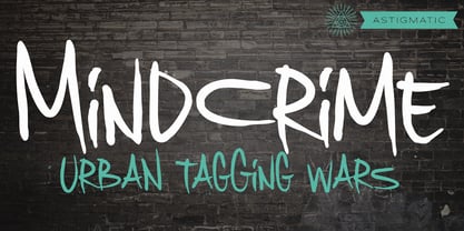 An offbeat graffiti tag-style font.
 - Fling by ITC,
$29.00 Michael Gills, formerly a resident designer at Letraset, created the Fling typeface in 1995. Fling's letterforms are based on the Ronde --or round--script style from France. The design includes intricate and generous capital letters, which are contrasted with a more reserved lowercase letters. This allows for a sophisticated and elegant appearance in text. Fling's letterforms are highly legible for those of a script face, and it is a typeface with many uses. Aside from short amounts of running text, Fling's capital letters serve well as initials. In the Opentype font are extra ligatures and alternative letterforms thatoffer expanded typesetting possibilities.
 - Mister Dangerous by Arterfak Project,
$16.00 Introducing Mister Dangerous, inspired by the graffiti tags found in urban street art. Designed with dynamic freestyle flair, it brings the spirit of graffiti to your creative ideas. This font is the perfect choice to add an urban touch to your designs, including films, posters, stickers, labels, flyers, apparel, packaging, and more. Mister Dangerous features All-Capitals with numerous special characters for endless combinations, along with additional swashes to make your work stand out. Embrace the artistic power of Mister Dangerous for unforgettable and edgy designs. What you'll get : All-capitals characters Numbers & punctuation Stylistic alternates
 - FF Berlage Burcht by FontFont,
$58.99 FF Berlage started as a research project about the typography of the prominent Dutch architect Hendrik Pieter Berlage (1856 1935). Donald Beekman based the design on a great number of sources, but mainly lettering found in two of Berlage s most quintessential buildings, the Amsterdam Commodities Exchange building (called Beurs van Berlage), and the ANDB building for the Amsterdam diamond cutters union (called De Burcht). Berlage is considered the father of modern architecture in The Netherlands due to his revolutionary theories on architecture and design, that would greatly influence many Dutch architect groups, like the Amsterdam School and De Stijl.
 - Work Crew Stencil JNL by Jeff Levine,
$29.00 In the 1949 Paramount comedy "My Friend Irma" (a film based on the popular radio series that introduced America to Dean Martin and Jerry Lewis), an opening gag set-up involving excavation work utilizes street barricades which inspired Work Crew Stencil JNL. Placed along the site, different advisories are stenciled upon barricades warning of the work in progress. The scatterbrained Irma (Marie Wilson) walks straight through the construction, oblivious as to what's going on around her and steps right into the open hole dug into the sidewalk (a scene she reprises in 1950's "My Friend Irma Goes West").
 - FF Berlage Beurs by FontFont,
$58.99 FF Berlage started as a research project about the typography of the prominent Dutch architect Hendrik Pieter Berlage (1856 1935). Donald Beekman based the design on a great number of sources, but mainly lettering found in two of Berlage s most quintessential buildings, the Amsterdam Commodities Exchange building (called Beurs van Berlage), and the ANDB building for the Amsterdam diamond cutters union (called De Burcht). Berlage is considered the father of modern architecture in The Netherlands due to his revolutionary theories on architecture and design, that would greatly influence many Dutch architect groups, like the Amsterdam School and De Stijl.
 - Deco Nights JNL by Jeff Levine,
$29.00 Sheet music for the tune "Put Your Arms Around Me Honey" (from the 1937 film "Coney Island" starring Betty Grable, George Montgomery and Cesar Romero) has the song title hand lettered in a condensed Art Deco sans serif design. This became the basis for Deco Nights JNL, which is available in both regular and oblique versions. For trivia buffs, the song was written by Junie McCree and Albert Von Tilzer and was first featured in the Broadway show "Madame Sherry" in 1910 and was revived for a second time in the 1949 Judy Garland -Van Johnson film "In the Good Old Summertime".
 - Hanniel by Daily Studio,
$16.00 Hanniel - a modern geometric sans serif font. This font has an elegant and smooth rounded edge style. Specifically developed to be suitable for logos, headlines, titles, branding, visual identity, business cards, and posters. Round out your fonts collection with this gorgeous typeface and make your design look exceptional.
 - Mough by Krntype Studio,
$16.00 a bold marker display font. Font with round and fat style. Mough imitate round marker pen in a clean way, this font fits perfectly into any background. Mough is perfect for many design such as merch, T-shirts, titles, book covers, social media posts, websites, events, and many more
 - SBB Power Grid by Sketchbook B,
$9.00 Powerful and angular. Power Grid comes in four versions: Regular, Stencil, Inline and Rounded. Inspired by 1920s constructivist posters, it's perfect for industrial and bold applications. Power Grid is all caps and includes a handful of alternate glyphs. 8 fonts 4 styles: Regular, Stencil, Inline and Rounded Alternate characters
 - Rocket Queen by Ferry Ardana Putra,
$19.00 Unleash your inner street artist with Rocket Queen! The definitive font for urban self-expression. Inspired by the bold strokes of tagging graffiti markers found on city walls, this font encapsulates the raw energy of the streets. Its uppercase and lowercase characters ensure versatility, while support for foreign languages guarantees global appeal. Graffiti artists worldwide adore its iconic rounded tip marker style for its unique and entertaining aesthetics. Rocket Queen's "Urban Tags" font is more than just a typeface; it's an urban art form. Designed with a nod to the vibrant world of graffiti scenes, this font embodies the spirit of tagging graffiti markers, creating a gritty, authentic experience. With full support for foreign languages and both uppercase and lowercase characters, Rocket Queen empowers your creativity. Its iconic rounded tip marker style, favored by graffiti artists globally, offers a unique and entertaining touch to your designs. Plus, it's enriched with street graffiti ornaments for that added urban flair. Rocket Queen is more than a font; it's the language of rebellion and urban creativity. Drawing inspiration from the bustling streets and tagging graffiti markers, this font captures the raw spirit of street art. Its iconic rounded tip marker style, beloved by graffiti artists worldwide, sets your designs apart with a unique and captivating aesthetic. Supporting foreign languages and featuring a complete set of uppercase and lowercase characters, Rocket Queen is your canvas for bold, edgy statements. Step into the world of street art with Rocket Queen, a font that embodies the raw spirit of urban graffiti. Inspired by the legendary rounded tip marker style, this font captures the essence of tagging in the streets. Its captivating, one-of-a-kind design is favored by graffiti artists across the globe. With support for foreign languages and a full set of uppercase and lowercase characters, Rocket Queen is the ultimate choice for artists who want their work to resonate with the vibrant, rebellious energy of the graffiti scene. And, don't forget to explore the collection of street graffiti ornaments to take your designs to the next level! "Rocket Queen" font is perfect for a wide range of creative and artistic applications. Here are some ideal uses for this unique and edgy font: Graffiti Artwork: Use "Rocket Queen" to create authentic graffiti-style artwork on canvas, walls, or digital platforms. Its street-inspired design will add an urban, edgy vibe to your work. Streetwear Brand Logos: Design logos and branding materials for streetwear clothing lines or urban fashion brands. The font's bold and expressive style is a great match for this niche. Event Posters and Flyers: Create eye-catching event posters and flyers for music concerts, art exhibitions, or street festivals. "Rocket Queen" will help your event materials stand out and evoke a gritty, streetwise feel. Album Covers: Design album covers for music genres like hip-hop, rap, punk, or any style that demands a rebellious and energetic look. The font can give your cover artwork an authentic street vibe. Tattoo Lettering: Tattoo artists and enthusiasts can use "Rocket Queen" for lettering in tattoos. Its unique graffiti-inspired characters can create distinct and personalized tattoos. Skateboard Deck Graphics: Use the font to design custom graphics for skateboard decks, reflecting the rebellious and urban culture of skateboarding. Street Art Installations: If you're creating street art installations, "Rocket Queen" can be used for text elements within the artwork, giving it an authentic urban graffiti feel. Urban Magazine Titles: "Rocket Queen" can be an ideal choice for magazine titles and headlines in publications that focus on urban culture, street art, or graffiti. Video Game Titles and Graphics: Design video game titles, logos, or in-game graphics for games with an urban or street culture theme. The font's distinctive style can enhance the game's visual appeal. YouTube Channel Branding: Content creators with a street art or urban lifestyle focus can use "Rocket Queen" for their channel logos, banners, and thumbnails. Product Packaging: For products targeting a youthful, urban audience, the font can be used in product packaging design, making the brand and product look fresh and exciting. Digital and Print Advertisements: Incorporate "Rocket Queen" in advertising campaigns that aim to connect with a young, rebellious, or urban demographic. The "Rocket Queen" font is versatile and can be adapted to a wide range of applications where a bold, streetwise, and artistic look is desired. It's all about bringing an authentic graffiti vibe to your creative projects. ——— Rocket Queen features: A full set of uppercase and lowercase Numbers and punctuation Multilingual language support PUA Encoded Characters OpenType Features Layered Style +345 Total Glyphs +100 Graffiti Swashes and Ornaments included!
 - Nouveau Signage JNL by Jeff Levine,
$29.00 Occasionally a type design is started - then set aside for whatever reason - before eventually being completed. More often than not, the original source material is forgotten, so proper attribution cannot be made. Such is the case for a hand lettered Art Nouveau alphabet likely found within the pages of an early Speedball lettering book from around the 1920s. This playful and casual design is now digitally reproduced as Nouveau Signage JNL, and is available in both regular and oblique versions.
 - Ripped Bam Boom by Comicraft,
$19.00 It’s stronger than the Thing AND the Hulk! It can bench press 500 pound gorillas and send them scurrying into the corner. RIPPED BAM BOOM is a font that can tear through the alphabet faster than you can say “A to Z” and will work your chest, shoulders and triceps and help YOUR characters gain upper-body strength and muscle mass! Features alternate uppercase characters, Western & Central Europe, Vietnamese & Cyrillic support, Crossbar I Technology™ and 18 Chinese Sound Effects
 - Urban Grotesk by Suitcase Type Foundry,
$75.00 Urban Grotesk attempts to follow the best of traditions of Grotesk typefaces: rounded arches, slightly thinner connecting strokes and a vertical shadowing axis, where outstrokes are terminated strictly in perpendicular to the stroke direction. The primary characteristics are the connection of the rounded stroke to the stem, a round dot, lower and more thrifty uppercase, and generous numerals. The width proportions of characters is almost unified, the text colour creates a unified grey area on a page. An airy metric aids good legibility in shorter texts.
 - Pero by Dharma Type,
$24.99 Pero is a condensed rounded sans-serif family designed by Ryoichi Tsunekawa and the whole family consists of 7 weights from ExtraLight to ExtraBold.The range of styles provides flexibility for title, headline and body text. And the large x-heights add to legibility. The basic skeleton of the letterform was designed modularly and minimalized by removing unnecessary stems and ends were rounded out. The minimalized modular design gives this family contemporary urbane taste and rounded corners make this family warm and friendly. This rounded feature will also accentuate your design work moderately. Pero supports almost all European languages: Western, Central, South Eastern Europeans and afrikaans. And superior figures, inferior figures, denominators, numerators and fraction can be accessed by using OpenType features.
 - Diablo by Monotype,
$29.99Jim Parkinson's Diablo typeface is a single weight display design. The look comes from samples found in early 20th century books on hand-lettering books, as well as general poster lettering styles from that same of the period. Diablo has a touch of the Arts and Crafts" movement in its appearance, and it also looks rather heavy. It is a unicase design, in that there is no real "lowercase." Some glyphs on the uppercase keys are alternates to the capital-style forms found on the lowercase keyboard, like A, E, F, H, J, K, M, N, Q, R, V, W, and Z. In fact, the uppercase itself is a bit more decorated and round than the lowercase. Nevertheless, the upper and lowercase letters may be freely interchanged with each other to create the best possible image for the text. The name of the typeface, Diablo, is another term for the devil, or Satan." - Worthington Arcade by Device,
$39.00 Worthington Arcade is a classically-proportioned capitals-only type incorporating a selection of ligatures and alternates. It loosely resembles the hand-painted architectural lettering of the 30s to the 50s, exemplified by the likes of Percy Smith’s interior signage for the BBC or George Mansell’s lettering for the University of London and the signs found on London’s bridges. However, rather than a slavish copy of any historical model, it is more an examination and evocation of certain idiosyncratic quirks of civic lettering of the period, and an attempt to create a peculiarly English titling typeface. The round letters, for example the O, Q and C, are wider than the perfect circle usually found in such designs, while the straight-sided characters, usually drawn on a square, are narrower. This lends the whole a subtle elegance that is also emphasized by the raised crossbars on the H, E and F and extended lower leg of the E. Includes old-style numerals.
 - Afronaut PRO by Borutta Group,
$39.00 Afronaut PRO (New version of typeface published in 2019) was inspired by vernacular Latin & Arabic typography in St. Louis (on Senegal-Mauretania Border, Africa). Geometric forms working well and contrasting with smooth, round elements. After reading "Afronautics – from Zambia to the Moon" by Bartek Sabela (about Zambian conquest of space) a breif was set to create typeface that looks like mix between: vernacular Arabic script, futuristic typography and some special lettering that I found in Africa during my travels to Guinée, Bissau, Gambia, Senegal, Mauritania and West Sahara. Afronaut has seven weights, also many letters have 3 different forms. Afronaut PRO can work as regular version of my Yalla Typeface.
