9,111 search results
(0.063 seconds)
- Compacta by ITC,
$39.00 Compacta is the work of Fred Lambert and is reminiscent of the extremely narrow, sans serif stencilled fonts of the 1920s, then intended as titles or headlines for magazines and posters. The characters of all cuts are narrow and the space between letters is very small. The white spaces between strokes are perceived almost as only small white stripes and dots which stand out from the black bands of the lines of text. Compacta is not meant for longer texts but is impressive in titles and headlines.
 - Asher Punk by Allouse Studio,
$16.00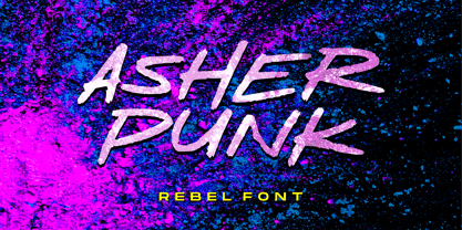 Proudly Presenting, Asher Punk a Rebel Handwritten Font. Asher Punk is perfect for any tittles, logo, product packaging, branding project, megazine, social media, wedding, or just used to express words above the background. Asher Punk also come with Multi-Lingual support. We highly recommend using a program that supports OpenType features and Glyphs panels like many of Adobe apps and Corel Draw, so you can see and access all Glyph variations. Enjoy the font, feel free to comment or feedback, send me PM or email. Thank You!
 - Asteria Royalty by Letterhend,
$19.00 Introducing, Asteria Royalty - A font made by natural handwriting. Perfectly to be applied to the other various formal forms such as invitations, labels, logos, magazines, books, greeting / wedding cards, packaging, fashion, make up, stationery, novels, labels or any type of advertising purpose. Features : uppercase & lowercase numbers and punctuation multilingual alternates, swash & ligatures PUA encoded We highly recommend using a program that supports OpenType features and Glyphs panels like many of Adobe apps and Corel Draw, so you can see and access all Glyph variations.
 - Chaviera by Handpik,
$15.00 Hello, this time we would like to introduce a new product. namely "Chaviera", a Serif display font that has a classic, feminine, and elegant style wrapped with a beautiful Alternate stylist. The Chaviera font is perfect for various projects like logos & branding, invitations, stationery, wedding designs, social media posts, advertisements, printed quotes, product packaging, product designs, labels, photography, watermarks, special events or anything else. Feature Uppercase Lowercase Numeral Functional Ligature Stylistic Multilingual Suitable for use All adobe software Coreldraw Microsoft office Mac Or Windows
 - Dehors by Letterhend,
$19.00 Dehors is a western display typeface. It is suitable for design needs with a touch of classic western, especially in logo, and the other various formal forms such as invitations, labels, logos, magazines, books, greeting / wedding cards, packaging, fashion, make up, stationery, novels, labels or any type of advertising purpose. Features : numbers and punctuation multilingual PUA encoded We highly recommend using a program that supports OpenType features and Glyphs panels like many of Adobe apps and Corel Draw, so you can see and access all Glyph variations.
 - Naofumi by Allouse Studio,
$16.00 Proudly Present, Naoufumi a Rough Brush Font. Naofumi come along with Multi-Lingual Support to fulfill your need. We highly recommend using a program that supports OpenType features and Glyphs panels like many of Adobe apps and Corel Draw, so you can see and access all Glyph variations. Naoufumi is perfect for any tittle, product packaging, branding project, megazine, social media, wedding, or just used to express words above the background. Enjoy the font, feel free to comment or feedback, send me PM or email. Thank You!
 - Compacta MT by Monotype,
$29.00 Compacta is the work of Fred Lambert and is reminiscent of the extremely narrow, sans serif stencilled fonts of the 1920s, then intended as titles or headlines for magazines and posters. The characters of all cuts are narrow and the space between letters is very small. The white spaces between strokes are perceived almost as only small white stripes and dots which stand out from the black bands of the lines of text. Compacta is not meant for longer texts but is impressive in titles and headlines.
 - Bellanda by Balevgraph Studio,
$14.00 Bellanda is a modern, whimsical and relaxed paint brushed script font. Its authentic handwritten look and feel will add a personal and realistic feel to your designs. Fall in love with this font’s incredibly versatile style and use it to create spectacular designs! What's Included : - Uppercase, Lowercase, Numerals & Punctuations - Ligature & Alternate - Works on PC & Mac - Simple installations - Multilingual support - (PUA Encoded) Compatible with Silhouette Studio, Cricut Design Space, Scan N Cut, Adobe Illustrator and other cutting and design programs. Hope our fonts can help your project.
 - Smudger by ITC,
$39.00 Smudger, from designer Andrew Smith, is oriented toward a young generation who does not want to mind the rules. The font invites unconventional and playful use. The figures seem to be almost coincidentally shaped. Letters alternate between thin and thick strokes alternate and give the font the smudged look that inspired its name and gives the font its unmistakable character. Smudger is a font that just cannot settle down. It is best used for headlines and short texts in point sizes of 12 or larger.
 - Just Married by Gatype,
$12.00 Just Married Script is a feminine font and handwritten with fun characters. Good for greeting cards, wedding invitations, quotes, posters and many other projects. ♥ You just need to enable Contextual Alternates. Usually Adobe Photoshop and other programs enable it by default. It's your signature - unique and original. Ligatures Stylistics alternates PUA (personal use area) Compatible with Silhouette & Circut Languages currently supported: Albania, Netherlands, France, Indonesia, Hungary, Ireland, Romania, and Spain. Hope you like it! Any feedback is always welcome and very much appreciated :)
 - Bittermoon by Prioritype,
$12.00 Modern script font with an elegant and captivating concept. You can use it in designs such as logos, photographer watermarks, business cards, creative posts, branding, business, wedding invitations, crafts and many more because they have interesting features and characters. See some of the previews above for reference. Features: -Uppercase -Lowercase -Numeral -Punctuation -Multilingual -Ligature -Alternate -Swash Note : Open with a program that supports the Opentype feature and an glyphs panel is available to see more alternative characters. Sample programs like Adobe Illustrator and the like!
 - Streamers NF by Nick's Fonts,
$10.00This curly, swirly antique offering is based on a Victorian-era typeface called "Fillet". Opening and closing flourishes can be found at the brace and bracket positions, and the ribbon effect can be carried between words by using the underscore character in place of a space. Due to the highly ornate nature of this font, it does not contain math operators, fractions or superior numbers. Both versions of the font include 1252 Latin and 1250 CE (with localization for Romanian and Moldovan) character sets. - CA Mystery Girl by Cape Arcona Type Foundry,
$29.00 Elegance meets accident. A sturdy distressed all caps typeface that gives you the feeling of the happy little incidents that may happen when you print with silkscreen or letterpress. A whole bunch of alternative letters embedded in a pseudo-random OpenType feature does the magic. Get yourself surprised CA Mystery Girl speaks a lot of languages, at least all those covered by the extended Latin character set. Which means you can travel to Iceland, Turkey, France or Poland, this girl will always be your interpreter.
 - Sekhmet by Three Islands Press,
$29.00Stylish, elegant, and alluring, Sekhmet got its name from the lion-headed war goddess of ancient Egypt. And the typeface does possess a kind of feline, forward-directed energy - a result of its calligraphic detailing combined with a very slight slope in the roman. Sekhmet is essentially a display face; still, it's as carefully crafted as any of the designer's text fonts and so also works well in reasonably large text blocks, especially at larger point sizes. Comes with a book-weight roman and calligraphic italic. - Prop Ten by Galapagos,
$39.00Some years ago we developed a monospaced 12 pitch sans serif for a client. We also created a 10 pitch version that was later discarded. PropTen is the 10 pitch version modified to proportional widths. The name PropTen refers to 'Proportional 10 Pitch'- which is a technical impossibility. It does have a slight 'its time to vote' twist to it. You know, after you pick your candidate you also need to vote yes or no on the following Propositions, don't forget Prop10, the team needs those uniforms. - Paramaribo by Fontop,
$11.00 Meet Paramaribo, a hand lettered, cute and decorative font. Paramaribo family includes two fonts with stylistic substitutions and 28 ligatures. Perfect for designing ads, logos, prints, social media texts, blogs, wedding branding, quotes and so much more. Stylistic substitutions (those cute swashed end/beginning letters) are controlled by switching on/off OpenType feature as well as being accessible through glyphs panel in Adobe apps. Really very easy to use! Paramaribo has Latin multilingual support as well as uppercase letters, lowercase letters, numbers and basic punctuations.
 - Romantic Soulmate by Letterhend,
$17.00 Romantic Soulmate is a sophisticated condensed serif typeface. Perfectly to be applied to the other various formal forms such as invitations, labels, logos, magazines, books, greeting / wedding cards, packaging, fashion, make up, stationery, novels, labels or any type of advertising purpose. Features : Regular & Italic style lowercase uppercase numbers and punctuation multilingual alternates PUA encoded We highly recommend using a program that supports OpenType features and Glyphs panels like many of Adobe apps and Corel Draw, so you can see and access all Glyph variations.
 - Grindylow by Hanoded,
$15.00 In English folklore (in particular that of Yorkshire and Lancashire), Grindylow is a creature that dwells in rivers and lakes and is said to grab children who come too close to the water’s edge and drown them. It is thought the name Grindylow may be connected to the monster Grendel. Grindylow font does not grab children; it is a rather messy handmade brush font. I used a cheap brush and Chinese ink to create the glyphs. Comes with discretionary double letter ligatures for the lower case.
 - Block Atella by Scratch Design,
$12.00 Block Atella is a retro, vintage and playful typeface that has a quirky and cute characteristic. This font will be suitable for logos, labels, packaging, invitations, branding, advertising and other designs that need stand-out typeface for the design. What you'll get: Uppercase and lowercase Numbers and punctuation Multilingual support Unique Ligatures We highly recommend using a program that supports OpenType features and Glyphs panels like many Adobe apps so that you can see and access all Glyph variations. We hope you enjoy our font!
 - Alison Phillips by Letterhend,
$16.00 Introducing Alison Phillips, a Casual handwritten font designed to bring a touch of authenticity and personal flair to your projects. With its textured brush look, this font exudes an organic and intimate feel, allowing your designs to evoke a sense of uniqueness and character. Features : Uppercase & lowercase Numbers and punctuation Alternates & Ligatures Multilingual PUA encoded We highly recommend using a program that supports OpenType features and Glyphs panels like many of Adobe apps and Corel Draw, so you can see and access all Glyph variations.
 - Vintage Waves by Raditya Type,
$16.00 Introducing Vintage Waves. A retro bold serif which will bring you back to 60s feel. This font perfectly made to be applied especially in logo, and the other various formal forms such as invitations, labels, logos, magazines, books, greeting / wedding cards, packaging, fashion, make up, stationery, novels, labels or any type of advertising purpose. We highly recommend using a program that supports OpenType features and Glyphs panels like many of Adobe apps and Corel Draw, so you can see and access all Glyph variations.
 - Sinfonieta by Sudtipos,
$79.00 The unmistakable brush of Angel Koziupa does its unique work again, this time with the elegant strokes made for branding or packaging projects that entail the use of many design elements, and so require clear and simple artistic alphabet to represent the brand elegantly, without clashing with the overall design. Methodical and disciplined, Sinfonieta accentuates the collage just enough to convey class and comfort, art and elegance. Sinfonieta includes alternates that come in handy to help with the precision usually required for logotypes and wordmarks.
 - DBE-Beryllium - Personal use only

- Batman Beat the hell Outta Me - Unknown license

- LD Werewolf by Illustration Ink,
$3.00Who says Werewolves don't exist? Well, they do here! LD Werewolf looks like it was clawed and scratched into the very paper it's printed on. Adds a nice touch to a spooky Halloween Party invitation or accompanying fun memories! - Atlantis by Solotype,
$19.95This is Solotype's alternative sans serif version of the once popular caps-only font Atlanta issued by the Central Type Foundry in St. Louis in 1885. As we often do, we have created a lowercase, adding to its versatility. - Gallard by Type-Ø-Tones,
$40.00 Gallard is a two weights family that contains the display type of the great cartoonist and illustrator Miguel Gallardo. In addition, as we usually do for this kind of author fonts, there is a collection of drawings called Victims.
 - SoftTimes Roman by Wiescher Design,
$39.50 Designing SoftTimes has been easy on my nerves after the strain of HardTimes. The harder the Times are the more do we need some soft typefaces, this one is the soft counterpart for HardTimes. -Your softspoken typedesigner, Gert Wiescher
 - Martie by Canada Type,
$25.00From the heart of the Blue Ridge Mountains, by way of Toronto, comes Martie's handwriting. Martie Byrd is a school teacher in Roanoke, Virginia, and a friend of Canada Type's Rebecca Alaccari. After years of admiring the cheer and clarity of Martie's handwriting, we asked her to write out full alphabets for some cool font treatment. The intent was to do three different versions of her writing in two different pens, then use the auto-magic of OpenType to determine letter sequences and rotate character sets on the fly when the fonts are in use. A successful endeavor it was. Take a look at the images in the MyFonts gallery to see the character rotation in action, along with a visual explanation of why Martie is not just another handwriting font. Unlike other available felt tip and ballpoint handwriting fonts, the regular and bold variations are style-based, not weight-based. They are the handwritten expressions of two different Sharpie pens: The fine point one (Martie Bold), and the ultrafine one (Martie Regular). The style-based variation considerably helps the realism needed in design pieces that take advantage of the contrast of two different handwriting fonts. Weight thickening in handwriting is an obvious mechanical effect that only happens with computers. Weight changing by replacing pens is what happens in the real world. Martie Pro and Martie Pro Bold each contain three different character sets in a single font. Language support includes Western, Central and Eastern European languages for all three sets. This translates into each Pro font containing over 750 characters. Add OpenType code and stir, and you have true handwriting fonts with versatility unavailable out there in anything else of the genre. A software program that supports OpenType features is needed to use the randomization coded in Martie Pro and Martie Pro Bold. Current versions of QuarkXpress and Adobe applications (Photoshop, Illlustrator, InDesign) do contain support for the randomization feature. But if you don't have one of these apps, you can still use the interchangeable Type 1 or True Type fonts and change the characters manually to achieve the appearance of true handwriting. The Martie fonts come in a variety of price packages, from the affordable single fonts to value-laden complete sets. All the proceeds from these fonts received by Canada Type will be donated 50/50 to two primary schools: One in Roanoke (where Martie teaches), and one in Toronto (where the 10-year old, real Canada Type boss goes). So next time a design project needs a handwriting font, do the write thing and use Martie to keep it real. - Gladifilthefte - 100% free

- Brewsky - 100% free

- Alpenkreuzer - 100% free

- SquircleCirquare - Unknown license

- Venice Initials by Wiescher Design,
$39.50 Venice Initials are my redesign of a 15th century venetian original by an unknown calligrapher. Unfortunately only parts of the letters existed, so I had to design about half of them myself. Of course I enjoyed doing that. Yours Gert Wiescher
 - Dortmunder Ecke by Hanoded,
$15.00 Dortmunder Ecke ("Dortmund Corner") is a clean, all caps font inspired by Cubism. It really has nothing to do with the city in Germany, but the name stuck and I kept it that way. Comes with a square amount of diacritics.
 - Skratzy by PizzaDude.dk,
$20.00I had a cramp in my hand doing this font! Contains authentic scribbling! :) Comes with more than 80 different ligatures, to make it look more like real scribbling! You will need to use OpenType supporting applications to use the autoligatures. - Barracuda by Wiescher Design,
$39.50 Barracuda has this sharp, sharky look and I do a lot of diving with my best friend. What else is there to say? If you see a shark say hello from me. Yours from under the Red Sea, Gert Wiescher
 - Misty by Gaslight,
$20.00 Misty - a two weight wild west style serif with numerous alternatives, swashes and irregular alternatives for numerous characters in SC style. Interchanging regular characters with alternatives and vice versa, it allow you to do slightly strange inscriptions. Plus deco style.
 - Toolbox by Adobe,
$29.00Brian Strysko, a graphic design student at California Polytechnic State University, came up with an idea for a typeface crafted from everyday gadgets and tools. After much poking around in do-it-yourself" books and friends' garages, Brian created Toolbox." - HiH Firmin Didot by HiH,
$10.00 Before Bodoni, there was Didot. With the publication by Francois Ambroise Didot of Paris in 1784 of his prospectus for Tasso’s La Gerusalemme Liberata, the rococo typographical style of Fournier de Jeune was replaced with a spartan, neo-classical style that John Baskerville pioneered. The typeface Didot used for this work was of Didot’s own creation and is considered by both G. Dowding and P. Meggs to be the first modern face. Three years later, Bodoni of Parma is using a very similar face. Just as Bodoni’s typeface evolved over time, so did that of the Didot family. The eldest son of Francois Ambroise Didot, Pierre, ran the printing office; and Firmin ran the typefoundry. Pierre used the flattened, wove paper, again pioneered by Baskerville, to permit a more accurate impression and allow the use of more delicate letterforms. Firmin took full advantage of the improved paper by further refining the typeface introduced by his father. The printing of Racine’s Oeuvres in 1801 (seen in our gallery image #2) shows the symbiotic results of their efforts, especially in the marked increase in the sharpness of the serifs when compared to their owns works of only six years earlier. It has been suggested that one reason Bodoni achieved greater popularity than Didot is the thinner hairlines of Didot were more fragile when cast in metal type and thus more expensive for printers to use than Bodoni. This ceased to be a problem with the advent of phototypesetting, opening the door for a renewed interest in the work of the Didot family and especially that of Firmin Didot. Although further refinements in the Didot typeface were to come (notably the lower case ‘g’ shown in 1819), we have chosen 1801 as the nominal basis for our presentation of HiH Firmin Didot. We like the thick-thin circumflex that replaced the evenly-stroked version of 1795, possible only with the flatter wove paper. We like the unusual coat-hanger cedilla. We like the organic, leaf-like tail of the ‘Q.’ We like the strange, little number ‘2’ and the wonderfully assertive ‘4.’ And we like the distinctive and delightful awkwardness of the double-v (w). Please note that we have provided alternative versions of the upper and lower case w that are slightly more conventional than the original designs. Personally, I find the moderns (often called Didones) hard on the eyes in extended blocks of text. That does not stop me from enjoying their cold, crisp clarity. They represent the Age of Reason and the power of man’s intellect, while reflecting also its limitations. In the title pages set by Bodoni, Bulmer and Didot, I see the spare beauty of a winter landscape. That appeals to a New Englander like myself. Another aspect that appeals to me is setting a page in HiH Firmin Didot and watching people try to figure out what typeface it is. It looks a lot like Bodoni, but it isn't!


