10,000 search results
(0.03 seconds)
- Freeform 721 by Bitstream,
$29.99Auriol font was the basis for the lettering used by Hector Guimard for the entrance signs to the Paris Metro. Bitstream’s Freeform 721 with his brush stroke look, is well-suited to display settings. - Ardilas by TM Type,
$12.00 Ardilas is a modern and flowing handwritten font. It features varied bases, smooth lines, gorgeous glyphs, and stunning alternatives. Fall in love with its incredibly versatile style, and use it to create spectacular designs!
 - Wood Island by WAP Type,
$20.00 Inspired by traditional ethnic feel and visuals. Great for fun and casual thematic visuals, games, logos, branding, products, campaigns, events, seasonal promotions, traditional concepts, explore different sides of your brand using wood island font.
 - Display Crisp by Gerald Gallo,
$20.00 Display Crisp is a display font not intended for text use. It was designed specifically for display, headline, logotype, branding, and similar applications. Display Crisp has tall and short cap alphabets, numbers, and punctuation.
 - Kakikukeko by Tigade Std,
$35.00 Kakikukeko embodies fun, uniqueness and authenticity. This enchanting display font will turn any creative idea into a true standout. Get creative with its unique playfulness, and use it to brighten up any crafting project.
 - Hexadot Light by Konst.ru,
$6.00Font with hexagonal dots for texts, names, logotypes, titles, headers, topics etc. Big sizes of this font can be used for posters, t-shirts and other surfaces. Also good for the three-dimensional inscriptions. - Nikela Famous by Gatype,
$12.00 Nikela Famous is a versatile font with a clean, sleek shape. The overall typeface is strong to bring order and harmony between letters. Best used as Instagram, poster, web design, magazine, logo or product.
 - Hexadot by Konst.ru,
$-Font with hexagonal dots for texts, names, logotypes, titles, headers, topics etc. Big sizes of this font can be used for posters, t-shirts and other surfaces. Also good for the three-dimensional inscriptions. - Well Hope by Seemly Fonts,
$12.00 Well Hope is a cute and simple lettered handwritten font that can be used for all chalkboard quotes or teaching material! Its authentic look will add a personal and realistic feel to your designs.
 - Pretty Berelly by MJB Letters,
$17.00 Pretty Berelly is a beautiful and cursive script font. It has a lively, elegant and modern look that can be used for logos, branding, invitations, stationery, wedding designs, social media posts, and much more!
 - Caramel Candy by Creativework Studio,
$14.00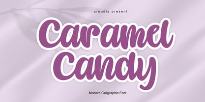 Caramel Candy is a flowing handwritten font, described by an elegant touch, perfect for your favorite projects. Fall in love with its incredibly distinct and timeless style and use it to create spectacular designs!
 - Agashi Signature by Nirmalagraphics,
$14.00 Agashi Signature features a handwritten style. This font is suitable for a variety of uses including magazines, brochures, flyers, Instagram posts and anything that might compliment a feminine touch. It includes multi-lingual support.
 - Sangkury by Stringlabs Creative Studio,
$29.00 Sangkury is a unique display font. It features a spooky feel that makes it perfect for any project that requires a horror-themed. Use it for movies, flyers, posters, Halloween’s craftings and much more!
 - Equalizer by Negara Studio,
$17.00 EQUALIZER is a bold font. The capitals have a set of alternates that can be used to give more personality when needed. EQUALIZER is great for display projects such as packaging, posters and branding.
 - Ballestro by Rex Face,
$19.99 Ballestro is a playful, versatile display font. Its name is a nod to the characters being constructed using a grid-like pattern of balls. Ballestro is great for headlines, signage, logos, packaging and more.
 - Crayon En Folie by Hanoded,
$15.00 Crayon En Folie ('Pencil Madness' in French) is a straightforward pencil font, created with an extra thick black pencil. Use it for books, posters and packaging. Comes with a coloring box full of diacritics.
 - Splendid Moment by Seemly Fonts,
$12.00 Splendid Moment is a cute and simple lettered handwritten font that can be used for all chalkboard quotes or teaching material! Its authentic look will add a personal and realistic feel to your designs.
 - Happy Moment by Seemly Fonts,
$12.00 Happy Moment is a cute and tall lettered handwritten font that can be used for all chalkboard quotes or teaching material! Its authentic look and feel will add a realistic feel to your designs.
 - Gietta by AEN Creative Studio,
$14.00 Gietta is a sweet, soft hand-lettered font. Fall in love with its authentic feel and use it to create gorgeous wedding invitations, beautiful stationary art, eye-catching social media posts, and sweet logos.
 - 4 Point Deco by Deniart Systems,
$20.00 A whimsical array of deco pointers (up/down/left/right) - great for adding directions or pointers to documents, maps, posters, greetings, or simply used as decorative elements. See also 4Point Florals and 4Point GreekFret.
 - Killer Elephant by Fenotype,
$19.95 Killer Elephant is a heavy-as-hell all-caps font that'll trample all over your design. Killer Elephant is recommended to use in posters and flyers and in anything mutant, jungle or superhero related.
 - School Desk JNL by Jeff Levine,
$29.00 School Desk JNL is a block-style sanserif based on die-cut cardboard letters used in classrooms during the 1940s and 1950s for making various projects and teaching children the basic shapes of letters.
 - Aliya Jayner by Liartgraphic,
$15.00 Aliya Jayner was created by Liartgraphic Studio and is a modern script concept with many alternative, multi-lingual choices. This typeface is good for use on product brands, magazines, book covers, packaging, and others.
 - MPI Sardis by mpressInteractive,
$5.00 Sardis is based on a family of wood type called "Lydian," designed for American Type Founders Company by Warren Chappell in 1938. The strokes have angled ends, referencing the use of a calligraphy nib.
 - Ratched by ARToni,
$18.00 Ratched is a delicate and elegant handwritten font. Its distinct and well balanced letters make this font a masterpiece. Fall in love with its incredibly versatile style and use it to create spectacular designs!
 - Bucanera Antiqued by Corradine Fonts,
$24.95 Bucanera Antiqued is the black ship of Bucanera's family, sure you will use it in any dark or dirty project. Try the Open Type version to reach its numerous swashes, flourished and alternate characters.
 - Pagi Senja by Stringlabs Creative Studio,
$29.00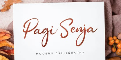 Pagi Senja is a flowing handwritten font, described by an elegant touch, perfect for your favorite projects. Fall in love with its incredibly distinct and timeless style and use it to create spectacular designs!
 - Stable by WAP Type,
$15.00 stable logo font stable is a new font for design of sharp and powerful logos. The font is suitable for creating wordmarks, Logo, titles, taglines. Use alternates to emphasize separate letters in your text.
 - VAG Rounded Cyrillic by Linotype,
$67.99Designed for Volkswagen AG in 1979, VAG Rounded is a modification of 19th-century grotesques. Exceptional in this typeface are the rounded stroke endings. Use this typeface for technical texts, instruction manuals, or advertising. - Sisterhood - Personal use only

- Garava - 100% free

- Sassoon Handwriting Starter by Sassoon-Williams,
$45.99 Sassoon fonts package for handwriting starters The three upright "infant" fonts developed to meet the demand for letters to produce pupil material for handwriting as well as for reading. Letters have extended ascenders and descenders ideal on screen and print. They facilitate word recognition. The exit strokes link words together visually, also crucially, they space the letters for improved legibility. The "joined" font puts the skills gained into practice producing joined-up handwriting. Together these typefaces provide a valuable resource for Teachers to create consistent material across the curriculum. Sassoon Infant Tracker B font: This font with its direction arrows helps pupils to start in the correct place. Motor movements can be refined by keeping inside the line. When starting and direction is no problem, the arrow font can be dropped and the Dotted font used. Sassoon Infant Dotted B font: Writing over the dots of this font refines motor skills. The aim here is to give confidence by reinforcing starting points, exits and to now encourage fluidity. Sassoon Infant font: With some words in this font and a baseline beneath to copy onto, pupils can use their learned starting points and exit strokes to write freely along the baseline - still unjoined. Once learned, this leads to spontaneous joins along the baseline leading logically to a joined-up hand. Sassoon Joined font: Having learned to write letters with correct starts and exits, this is when the joined font for teaching handwriting can be used. With some words in this font and a baseline beneath to copy onto, pupils can use their learned starting points and simply extend their exit strokes to make joined-up writing. The default joins the font provides are recommended, however there are alternative letterforms that are so important for some Teachers which can be accessed. Create ‘pen lifts’ anytime too! NOTE: Fonts display unjoined by default on this website and are delivered that way - joining is controlled by your text editing application such as Word or TextEdit, read more for instructions… Free to download PDF resources: Stylistic Sets and how to access the alternative letters feature in these OpenType fonts. Using the separate letter fonts Using the joined font Teachers copybooks using these fonts: How to teach pre-cursive Copybook How to teach cursive handwriting Copybook
 - Generic by More Etc,
$15.00 The Generic Typeface Collection is a series of sans-serif typefaces inspired by the craftsmanship of graphic design, typesetting, and printing in the analogue era – before Adobe, Macintosh computers and desktop publishing – when dinosaurs ruled the earth. With the use of various typesetting apparatuses or dry transfer type, photo copiers, and shooting layouts and paste-ups to film, the printed results was not as exact, precise and predictable as it is today. When examining old prints, it is difficult not to like the way that characters in over- or underexposed film have a special type of vibe to them that is often sadly lost in today’s pursuit of total perfection. Encouraged by this, I saw a need for a collection of typefaces that are non-clinical and non-conformist, and some that are coarse, rough and distorted – errors that might come from poor exposure when put on film, enlargements from small point texts, or maybe quality loss from successive generations of photocopies. Or all of the above. This is an attempt to incorporate spirit and personality into a set of typefaces without losing distinction. You might call it a homage to non-perfection. I call it human. The Generic Typeface Collection consists of 11 fonts divided into four series. The three standard series – the Formal Release series, the Coarse Copy series, and the Rough Display series – all contain three fonts each. The Extra Splendor series contains a couple of shadow fonts for that little extra sparkle. Formal Release – Handcrafted & Clean The Formal Release series features sans-serif typefaces for everyday use. They are handcrafted and clean, human and uncomplicated. The Formal Release series contains three typefaces that add tons of personality to any text. G10 FR ‘Slim’ – a slightly under-exposed and clean typeface in a regular weight (228 glyphs - 1 alternate) G20 FR ‘Classic’ – a properly exposed clean typeface in a bold weight (228 glyphs - 1 alternate) G30 FR ‘Bulky’ – a heavily over-exposed clean typeface in an ultra weight (228 glyphs - 1 alternate) Coarse Copy – Dirty & Rough The Coarse Copy series features non-conformist typefaces that are worn and rough, maybe after going through that bad copier a few times too much. The Coarse Copy series contains three sans-serif typefaces that add tons of spirit to any text without compromising too much on legibility. Try them on in poster-sizes and everyone will know that you mean business. G40 CC ‘Slender’ – an under-exposed coarse typeface in a regular weight (228 glyphs - 1 alternate) G50 CC ‘Typic’ – a properly exposed coarse typeface in a bold weight (228 glyphs - 1 alternate) G60 CC ‘Huge’ – a heavily over-exposed coarse typeface in an ultra weight (228 glyphs - 1 alternate) Rough Display – Faded & Decorative The Rough Display series features attention-seeking decorative typefaces in three feature-packed fonts. Faded and gritty like the image distortion and degradation from successive generations of photocopies, they are eye-catching typefaces intended to stand out in bigger point sizes. Use these typefaces for signage, headlines and similar situations were a strong typographic statement is desired. We have packed no less than 1,334 alternate characters and 212 discretionary ligatures into this series for a greater chance of not having characters that look exactly the same more than once. G70 RD ‘Slinky’ – an under-exposed rough and decorative typeface in a regular weight (741 glyphs – 448 alternates – 66 discretionary ligatures) G80 RD ‘Standard’ – a properly-exposed rough and decorative typeface in a bold weight (748 glyphs – 448 alternates – 73 discretionary ligatures) G90 RD ‘Swollen’ – a heavily over-exposed rough and decorative typeface in an ultra weight (748 glyphs – 448 alternates – 73 discretionary ligatures) Extra Splendor – Sparkling & Extraordinary The Extra Splendor series features two shadow typefaces for that little extra sparkle. One clean shadow to be used with G20 FR ‘Classic’, and one rough shadow to be used with G80 RD ‘Standard’. Having the shadows separate from the main typeface adds another layer of expressiveness in that you can try out color combinations for that extra splendor. Tips for matching (applies to both the base font and the shadow font): Set the kerning to Metric, not optical. Increase tracking to accommodate for the shadows extra width. G25 ES ‘Classic Shadow’ – a clean shadow to be used with G20 FR ‘Classic’ (228 glyphs – 1 alternate) G85 ES ‘Standard Shadow’ – a rough shadow to be used with 80 RD ‘Standard’ (227 glyphs) OpenType features – alternate characters and discretionary ligatures – can be accessed by using OpenType friendly professional design applications, such as Adobe Illustrator, Adobe InDesign, and Adobe Photoshop.
 - HD Anomie by HyperDeluxe,
$40.00 HD Anomie is a modern geometric sans built in 18 styles with variable support and is brought to you by HyperDeluxe®. Its subtle forms and nuanced curves create a simple structure that could be perceived as mundane, but our goal was to create a typeface that is both mechanical and organic in its forms so it seamlessly fits within the environment it is placed. It's clean, minimal approach gives it a wide array of offline uses such as branding, editorial & print, but its modern design and detailed build makes it perfect for UI & digital applications. The clean visual structure of the letter forms give it great readability at smaller sizes, while also being happy to be shown off at larger sizes. Built to be robust and as versatile as possible we have around 1150 Glyphs per weight including extended Latin & Cyrillic support as well as basic Greek. Anomie also features extras such as 2 arrow sets, circled numbers as well as stylistic alternates and case sensitive forms. Find beauty in the Mundane. Meet HD Anomie.
 - Archemy by Sonic Savior,
$90.00Archemy is a restricted and obscure branch of Alchemy that deals specifically with the life, generation and transmutation of Metals. The Archemy font is primarily a magical and alchemical alphabet. It was created on initiative of Senior Zadith, in order to properly quote older alchemical manuscripts, without the need to insert handwritten symbols. The font combines a unique and elegant Roman alphabet with a set of the most frequently used planetary and alchemical symbols that are common in the Western Mystery Tradition, and as used by those involved in the Royal Art. The Archemy font contains a selection of symbols that are still used by practitioners of the Art today, and for the sake of completeness, a selection of less used and more arcane symbols that can be found in older alchemical texts. In addition a Hebrew Alphabet is included, which will supply practitioners of the Art with the glyphs related to Cabalistic studies. The Hebrew Alphabet in this font does not include vowel points, since they have no place in ancient Hebrew, nor in the Western Mystery Tradition. A selection of the most distinct glyphs as used in the Antediluvian font family - the Alphabet of the Ancients - is included for those that wish to include the archetypal and arcane quality of these glyphs from the dawn of history. By our knowledge there exists at this time no font that includes a selection of Alchemical symbols, let alone combines all of the above mentioned archetypal symbols of occult language in a single package. In that respect Archemy can be considered to be an “Arch” font. - Whitenights by Linotype,
$29.99Whitenights is a contemporary text family, which was developed by the prolific Swedish typographer Lars Bergquist in 2002. Containing five weights (11 different fonts total), this family contains every tool you need to set splendid text. The base font of the family is Whitenights Regular, a reliable face designed in the old style manner. It ships in OpenType format, with old style figures. Whitenights Ligatures Regular is a supplementary font, which contains many extra ligatures (e.g., ffb, ffk, tt, and fj) whose use will improve the color" of a page of text set in Whitenights Regular. Whitenights Regular may be accented by combination with Whitenights Small Caps, Whitenights Italic, Whitenights Bold, and/or Whitenights Bold Italic. The Whitenights Italic, Bold and Bold Italic styles all have supplementary Ligature fonts available for purchase, similar to the Whitenights Ligatures Regular face described above. For larger, headline text, the specially designed Whitenights Titling is quite useful. This titling font has been optically redrawn and respaced for use in large sizes. Naturally, it has its own supplementary Ligature font as well. In books, magazines, and newsletters this font is a great display companion to the rest of the Whitenights family. Its use in conjunction with the text faces will make your typographical compositions more sophisticated. Last but not least in the Whitenights family is Whitenights Math, which contains many additional mathematical and logical glyphs not found in a standard font's character set. Used together, the above 12 styles can set almost any text or math-based document. The entire family is included in the Take Type 5 collection from Linotype GmbH." - Whisper Script by Ferry Ardana Putra,
$15.00 Whisper is a stunning hand-lettered dry brush font. This typeface is very unique! It has an unique natural dry-brush feel which will outstand your project with ease! Combine it with its remarkable swashes which you can choose dozens of them! This typeface is perfect for creating elegant branding and headlines for handmade, food & beverage and artisan goods, quotes, invites, t-shirts, Logos, or use it to make your social media feed into another level! Whisper features: A full set of upper & lowercase characters Numbers & punctuation Multilingual language support PUA Encoded Characters Dozen of Swashes OpenType Features Whisper includes: ——— ⚠️To enable the OpenType Stylistic alternates, you need a program that supports OpenType features such as Adobe Illustrator CS, Adobe InDesign & CorelDraw X6-X7, Microsoft Word 2010 or later versions. There are additional ways to access alternates/swashes, using Character Map (Windows), Nexus Font (Windows), Font Book (Mac) or a software program such as Pop Char (for Windows and Mac). ⚠️For more information about accessing alternative, you can see this link: http://adobe.ly/1m1fn4Y ——— 🔑Important tutorial from the author: Tutorial for Mollusca font trio: https://lnkd.in/d984CQD6 How to use Midway | Retro Script Font on illustrator: https://lnkd.in/eusbZd7s How to use Midway | Retro Script Font on Photoshop: https://lnkd.in/evsYrwgs ——— ❤️Get in touch with the author: Instagram: https://www.instagram.com/ardana619 Behance: https://www.behance.net/ardana619 ——— 🔥Thankyou for purchasing our product, hope you like and have fun with our product. If you have any queries, questions or issues, please don't hesitate to contact us directly. If you satisfied with our product, please give 5 stars rating. ——— 😊Happy Designing...
 - Jeles by Tour De Force,
$25.00 Inheriting the beauty and style of old type classics from this genre, Jeles is blended with very elegant modern approach featuring soft corners, round slab serifs and tasty ball terminals. Jeles is designed mostly for display use and it is highly recommended to get the whole family if you want to get the best result. It is designed in two styles Condensed and Normal. The Condensed version is developed in two weights each coming with corresponding italics. While the Normal styles are three ranging from Regular, Bold and Black. The total of 7 separate fonts inside the family are quite enough if you look for diversity and flexibility at one place. You could use the uprights for more serious and strong headlines while the Italics work perfectly for more fresh and live subheads. Of course editorial design is only one of the many directions where Jeles family could be used successfully as we all know typefaces with so visible contrast between thin and thick and combined with classic elegance, could be easily used in every design of cosmetic industry, fashion, food, jewelry, etc. Try to design a stylish boutique shop signboard and you will surely discover its beauty and potential. Easy-to-read, it is good for print design, revealing its authentic letterpress-like character as well as perfect for screen use note that the thin strokes and serifs are not that thin to vanish on a low resolution monitor. Professionally designed, they are solid enough yet very elegant and even gentle making Jeles a desired family design of attractive web banners, web sites, apps and e-books.
 - Burger Elbow by Putracetol,
$24.00 Burges Elbow - Playful Font In 2 Styles Created with the idea of bringing happiness and joy to any project, Burges Elbow is a perfect choice for those who want to add a touch of playfulness to their design. To use Burges Elbow to its full potential, it would be great for designs aimed towards children such as book covers, posters, and flyers. Its playful and quirky nature would also make it a great choice for branding aimed at a younger audience or products that want to add a sense of fun and whimsy. Burges Elbow comes with a variety of features, including uppercase and lowercase characters, opentype alternates and ligatures, and support for multiple languages. These features allow for a wide range of creative possibilities and make it easy to use in various projects. Included in the zip package are three different file types: OTF, TTF, and WOFF, which can be used in any design software that supports font installation. With these different file types, you can use Burges Elbow on any platform or device, making it a versatile choice for any project. Add a touch of fun and playfulness to your design with Burges Elbow. Its cute and whimsical nature will surely make your design stand out and bring a smile to anyone's face. In summary, Burges Elbow is a playful font in 2 styles that is perfect for designs aimed at children or those looking to add a sense of fun and whimsy to their branding. With its various features and file types, Burges Elbow is a versatile choice that can be used in any design project.
 - Erotique Sans by Zetafonts,
$39.00 Designed by Cosimo Lorenzo Pancini and Maria Chiara Fantini with the help of Solenn Bordeau, Erotique Sans is the sans serif version of Erotique: a typeface that evolved the original design of Lovelace mixing its romantic curves with the glitchy & fluid aesthetic of trans-modern neo-brutalist typography with the aim of creating a design that was feminine in an assertive and self conscious way. With its restrained, didonesque elegance, Erotique Sans is mostly thought for display use. Its high-contrast design is ready to take center stage in projects where a subtle elegance and an edgy, contemporary touch are required. All its weights (regular, medium, bold and monoline) have been paired with an Alternate version to give immediate access to a wide array of exotic alternate letterforms, available as Open Type Stylistic Sets in the standard family. For logo design and titling use Erotique Sans is paired by Erotique Flourishes, a set of whiplike fleurons that can not only be added to some letters, but also be used as interlocking patterns. For editorial use, since its high contrast requires big text size, the family is complemented by the Erotique Text weight that allows for longer text typesetting thanks to streamlined design, lower contrast and better readability. With a character set of over 500 glyphs, all the the weights of Erotique cover almost 200 languages using extended latin, and include advanced Open Type features as Stylistic Alternates, Standard and Discretionary Ligatures, Positional Numerals, Swash and Case Sensitive Forms. If you liked Erotique, you won't be able to avoid falling in love with Erotique Sans - the font that can't keep its serifs on...

