10,000 search results
(0.14 seconds)
- TT Bluescreens by TypeType,
$35.00 TT Bluescreens useful links: Specimen PDF | Customization options Please note! If you need OTF versions of the fonts, just email us at commercial@typetype.org Meet the upgraded TT Bluescreens! TT Bluescreens is a geometric sans serif with narrow proportions. The font has a memorable character, while remaining neutral, so it can be used in various design projects. The range of possibilities of the updated TT Bluescreens has become much wider! Condensed styles with narrowed proportions have been added. The classic styles of TT Bluescreens are universal and suitable for setting both in headings and in text arrays. Condensed styles are intended for non-standard design solutions. In small sizes, they are perceived as if having a texture, thanks to which they can become part of packaging or poster design. In large size they look extraordinary, but they are highly readable and convey information well. Variable font now changes along 3 axes: weight, width and slant. Even more options for those who love variety. The character set of TT Bluescreens was expanded, and additional extended Cyrillic and Latin characters were added. Expanded character set. Each style has 874 characters. This is 253 characters more than it there were in the previous version. New currency signs, arrows, punctuation and fractions were added. Number of OpenType features increased from 18 to 31! The font has become even more functional and convenient thanks to a large number of ligatures, stylistic alternatives and localizations. The quality of the contours has become even higher, diacritics were improved. The updated TT Bluescreens is suitable for the design of covers and posters, it will look aesthetically pleasing in packaging design. It can be used in the design of titles and disclaimers. Condensed styles are preferably used in large size. The TT Bluescreens font has 37 styles: 9 upright and 9 italics of standard width, 9 upright and 9 italics in Condensed, 1 variable style. Each style contains 874 characters. The font has 31 OpenType features, including ligatures, stylistic sets, and localizations.
 - PF DIN Serif by Parachute,
$36.00 DIN Serif: Specimen Manual PDF The DIN Type System: A Comparison Table This is the first ever release of a true serif companion for the popular DIN typeface. DIN Serif originated in a custom project for a watchmaking journal which required a modern serif to work in unison and match the inherent simplicity of DIN. As a result, a solid, confident and well-balanced typeface was developed which is simple and neutral enough when set at small sizes, but sturdy and powerful when set at heavier weights and bigger sizes. It utilizes the skeleton of the original DIN and retains its basic proportions such as x-height, caps height and descenders, whereas ascenders were slightly increased. DIN Serif makes no attempt to impress with ephemeral nifty details on individual letters, but instead it concentrates on a few modern, functional and everlasting novelties which express an overall distinct quality on the page and set it apart from most classic romans. This is a low contrast typeface with vertical axis and squarish form which brings out a balance between simplicity and legibility. Its narrow proportions offer economy of space which is critical for newspaper body text and headlines. At small sizes the text has an even texture, it is comfortable and highly readable. The serifs are narrow at heavy weights and when tight typesetting is applied at large sizes, the heavier weights become ideal for headlines. DIN Serif was inspired by late 19th century Egyptian and earlier transitional roman faces. Bracketed serifs were placed on the upper part of the letterforms (this is where we mostly concentrate our attention when we read) whereas small clean square serifs were placed on and under the baseline to simplify the letterforms. In order to reduce visual tension at the joins and make reading smooth and comfortable, a slight hint of bracketed serif was added at the joins in the form of a subtle angular tapered serif, which softens the harsh angularity. These angular tapered serifs tend to disappear at smaller sizes (or smooth out the joins) but stand out at bigger sizes exuding a strong, modern and energetic personality. What started out as a custom 2 weight family, it has developed into a full scale superfamily with 10 styles from Regular to ExtraBlack along with their italics. Additional features were added such as small caps, alternate letters and numbers as well as numerous symbols for branding, signage and publishing. All weights were meticulously hinted for excellent display performance on the web. Finally, DIN Serif supports more that 100 languages such as those based on the Latin, Greek and Cyrillic alphabet.
 - Pictypo by Typogama,
$19.00 Pictypo is a functional set of dingbat fonts, created with an open, rounded style, that contains a large range of symbols, from the usual arrows, to weather or office icons or mobility vehicles.
 - Prana Pro by URW Type Foundry,
$49.99 Prana Pro is a modern, young and fresh slab serif created by Christoph Ulherr during his studies with Prof. Gertrud Nolte at the faculty of design of the Hochschule Würzburg under the direction of Volker Schnebel, URW's type director. Prana Pro is an excellent headline and display font while, at the same time, very well readable at small sizes. It can be used for any kind of publication including posters and book covers.
 - Royalana by Kufic Studio,
$15.00 Royalana is a modern royal font with a minimalist factor. A complete font set containing all the important glyphs. Royalana has been inspired by the very minimalist and compact designs in trend to deliver a new look and yet keeping the professional outlook of any design or print. Royalana font set includes; Royalana Light, Royalana Light Italic, Royalana Regular, Royalana Italic, Royalana Bold, Royalana Bold Italic, Royalana Extra Bold & Royalana Extra Bold Italic. Kufic Studio is a platform that provides professional and high-quality designs & fonts to fill the gap that has been missing in the market.
 - Rever by ParaType,
$30.00 Rever is an experimental typeface by a young designer Sasha Smirnov. It clearly alludes to 19th century typefaces with reverse contrast, but still the character shapes are as simple and geometric as possible. Rever answers the question “What can a reverse-contrast typeface look like today?” Its set of styles is non-traditional: in addition to a regular one, there are also an oblique (slanted to the left, not to the right!) and a stencil styles. The typeface can work for typographic experiments of any kind -- web, print or motion design. The font was released by Paratype in 2019.
 - Kevlar by Letterbox,
$50.00 Kevlar was initially inspired by an obscure logo discovered in a 1960s radio-fan magazine. Of immediate interest was that the upper half of the typeface appeared to be a sans while the lower half appeared as a curious blend of a slab serif imbued with a script-like quality. First came Kevlar Bold in 2003, closely followed by its text weight companion Kevlar Regular. The original source of the inspiration as then revisited to develop the third in the set, Kevlar Slab, a truly individual mix of script-like fluency with the heavy weight base of a slab serif.
 - Baradig by Asenbayu,
$15.00 Baradig is a versatile grotesque sans serif font family. Baradig provides a unique collection of glyphs with wide spacing and strong yet subtle geometric outlines. Baradig will give you an extraordinary modern visual experience. These fonts also have alternate and ligature features which are perfect for completing various projects such as logos, brands, products, labels, websites, posters, and many more. Baradig fonts feature Open Type Format, kerning, ligature and alternate packed in 10 styles: Light, Light Italic, Regular, Italic, Medium, Medium Italic, SemiBold, Semibold Italic, Bold and Bold Italic. Baradig fonts include uppercase letters, lowercase letters, numeral, punctuation and multilingual support.
 - Okaluera by Hishand Studio,
$15.00 Okaluera Sans Serif font seamlessly blends elegance and luxury with a touch of minimalism, creating a sophisticated visual experience. Its sleek and graceful letterforms exude opulence, making it ideal for projects that demand a touch of class. The font's minimalist design adds a sense of modernity, ensuring it remains versatile for various applications. Whether used in print or digital media, Okaluera effortlessly captures attention, making a bold statement with its refined aesthetics. Good for logos, branding, invitations, stationery, wedding designs, social media posts, and much more. Complete with ligatures alternates regular italic icon kerning multilingual support
 - Westbourne Serif by Typetemp Studio,
$20.00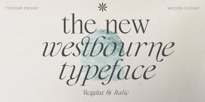 Westbourne Modern Serif Typeface is a stylish font It has both modern look. Comes with alternatives and ligatures, helps to create stunning logos, quotes, posts, blog posts. branding projects, magazine imagery, wedding invitations, and much more. WHAT'S YOU GET ? Westbourne Regular and Italic Unique Letterforms Works on PC & Mac Simple Installations Accessible in the Adobe Illustrator, Adobe Photoshop, Microsoft Word Fully accessible without additional design software. I really hope you'll get pleasure using Westbourne font and it will be perfect addition to your font collection! Contact me with an inbox message If you have any question. Thank you! Happy Creating.
 - Ned by Linotype,
$29.99Ned Std. is part of a series of typographic experiments from the young Swiss designer Michael Parson. Using a wide, horizontal hexagonal grid, Parson created the system of letters that make up this font. Text set in Ned Regular takes on a modular, honeycomb-like appearance. For an interesting effect, try overlapping individual letters, or use a few letters together as elements in a logo. A great companion face to Ned Std. is Linotype's Hexatype Bold. Both Ned Std. and Hexatype Bold have been included in the Take Type 5 collection, along with eight further constructions from Parson." - Anavio by Greater Albion Typefounders,
$14.95 Anavio is named in honor of the ancient Roman name of an English Derbyshire town. Anavio is a classically inspired family of Roman faces, emphasizing simplicity of form and elegance. Regular and Bold weights are offered, along with condensed forms. Anavio is offered in both upper and lower case and small capitals faces. Its simple lines are immediately legible, lending it to both text and display uses. A range of ligatures, both standard and discretionary, are included as are stylistic alternates and two styles of numerals. Use Anavio to lend that indefinable air of elegance to your next project.
 - ATF Wedding Gothic by ATF Collection,
$59.00 Sporting broad, unadorned caps and just a dash of flair, ATF Wedding Gothic is like an engravers gothic at a black tie affair. It comes from the same tradition as other social gothics from the turn of the twentieth century, such as Engravers gothic and Copperplate. But where these are the faces of business cards and common announcements, ATF Wedding Gothic is a special occasion. Its swaying ‘R’ and ‘Q’, its characterful figures, and spritely-yet-sturdy insouciance make ATF Wedding Gothic well suited for tasteful engagements of all sorts. Yet there is much more here than the name implies. Originally offered long ago as metal type in a single, wide weight, this digital interpretation expands what was once a novelty design into a surprisingly versatile family of nine weights. An additional, narrower, standard width brings the count to eighteen fonts. From Thin to Medium, ATF Wedding Gothic retains the airy elegance of its source, while the heavier side of the family takes on an altogether different feel, more reminiscent of wooden poster type.
 - Helsa Display by ParaType,
$39.00 Helsa is a slim and eccentric serif for headings and short texts. It’s a modern interpretation of the narrow Elseviers of the early 20th century. The letterforms are based on Dutch samples, and in the details there are references to both American type catalogs and letters from the foundries of Wolf and Herbeck. Due to the compact proportions of characters and the high contrast of strokes, Helsa doesn’t take up much space in the line and allows you to increase the type size freely, drawing the viewer's attention to the text. The typeface is suitable for branding museums and exhibitions, alternative music bands, independent clothing and perfume brands, and for any topic related to design or history. Helsa’s character set has more than 1600 characters. It supports hundreds of languages, including extended Cyrillic, Greek, and Vietnamese, as well as many OpenType features: fractions, ligatures, old style and tabular numerals, titular letter alternates, and more. There are variants of dashes and other punctuation marks specifically for uppercase typing. In addition to letters, the typeface contains arrows, numbers in circles (in fact, in ovals), symbols of various types of plastic, card suits and much more. Helsa typeface was made at Paratype in 2020-2022.
 - Novel Pro by Atlas Font Foundry,
$50.00 Novel Pro is the humanist Antiqua typeface family within the largely extended award winning Novel Collection, also containing Novel Sans Pro, Novel Sans Hair, Novel Sans Condensed Pro, Novel Display, Novel Display Condensed, Novel Display Extra Condensed, Novel Display Compressed, Novel Display Extra Compressed, Novel Mono Pro, Novel Sans Rounded Pro and Novel Sans Office Pro. Classic proportions of a Renaissance Antiqua combined with modern details let Novel appear as a friendly and elegant but functional typeface. The almost upright letters of the narrow Italics create a vital contrast to the generous construction of the roman. All typeface families of the Novel Collection have a carefully attuned character design and a well balanced weight contrast. The fine gradation of 12 weights enable designers to create fine legible typography and combine the design with other members of the Novel Collection to reach highest quality in typography. Novel Pro [914 glyphs] comes in 12 styles and contains small caps, an extra set of alternate glyphs, many ligatures, lining figures [proportionally spaced and monospaced], hanging figures [proportionally spaced and monospaced], small caps figures [proportionally spaced and monospaced], positive and negative circled figures for upper and lower case, superior and inferior figures, fractions, extensive language support, arrows for uppercase and lowercase and many more OpenType™ features.
 - Mayberry by Ascender,
$92.99The Mayberry® is an extensive family of 14 OpenType fonts. Mayberry was initially designed by Steve Matteson to emulate the technical behavior of a font family called Tiresias™ for use in set top TV devices and user interfaces. Mayberry is a significant improvement in aesthetics and functionality over Tiresias. Mayberry includes true italics and a wide range of weights to provide the highest quality and readability on low resolution devices, while also featuring a range of OpenType features that will appeal to creative professionals. Mayberry is a slightly condensed humanist sans serif which allows for more readable text in a narrower column. Open counters and upright stress help keep the design of Mayberry readable at low resolutions. A significant amount of care has been given to design subtleties allowing the design to function well at large sizes. The Mayberry character set supports Cyrillic, Greek, Central and Eastern European, Turkish and Baltic, Mayberry also includes a slashed zero for use where absolute distinction between 'O' and zero is a concern. Also included are typographic features such as old-style figures, fractions, superior and inferior numbers for use with applications that provide advanced OpenType typographic support. A set of closed captioning symbols and arrows add to the font's versatility in interface design. - ITC Merss by ITC,
$29.99ITC Merss proves that sometimes accidents work out just fine. Late one evening Eduardo Manso, an Argentinean graphic and type designer, spilled coffee on his desk. When he began to wipe up the mess, he noticed that one of the splashes looked like a roman letter 'l' - complete with serifs. This triggered his imagination. “What if a complete alphabet was created with this same irregular flow to the character designs?” ITC Merss was the result of Manso's experiments with “fluid” letter shapes. The oddly handsome design looks aged and spontaneous at the same time. Its irregular texture is striking-the result of careful modeling of character shapes. While Manso wanted to maintain the free-form character of spilled liquid, he also knew the individual letters had to work together with an underlying harmony. When not experimenting with typefaces - or spilled coffee - Manso creates award-winning graphic and publication designs. A contributor to the design magazine el Huevo (the Egg), he also writes articles on type and typography and is part of the publication's design team. - Story Lovers by Forberas Club,
$16.00 A font that is purposely made for writing romantic memories or important stories.
 - ATF Alternate Gothic by ATF Collection,
$59.00 ATF Alternate Gothic is a new, significant digital expansion of Morris Fuller Benton’s classic 1903 type design. Originally available in one bold weight, the metal typeface came in three slightly different widths for flexibility in copy-fitting layouts. ATF Alternate Gothic has impact at any size. Its letterforms are instantly familiar: Benton’s original metal type family was used throughout the 20th century in newspapers, magazines, and advertising, providing “strong and effective display” in a compact space. Monotype issued its own metal version for machine typesetting, and Alternate Gothic likely served as inspiration for Linotype’s ubiquitous Trade Gothic® Bold and Bold Condensed. ATF Alternate Gothic expands on the characteristics that perhaps made Trade Gothic so popular, providing a wider range of weights and widths to address the needs of today’s designers and technologies. The space-saving clarity of ATF Alternate Gothic brings readability to the world of advertising typefaces. With its finely graded range of ten weights, with four widths of each weight (40 fonts total), this extensive type family can be used to pack a lot into a narrow space, and the range makes it easy to create variations of an advertisement or announcement for different formats and media. The tall x-height and narrow proportions, combined with a relatively low waist and springy, tension-filled forms, make ATF Alternate Gothic strong and effective in display. All ten weights have been carefully spaced for readability, caps and lowercase work well together, while attention-grabbing all-caps settings are clear and never crowded, no matter how narrow.
 - Monotalic by Kostic,
$30.00 Monotalic was created as a fun experiment, exploring better solutions for the monospaced type design. Most monospaced (fixed-width) typefaces have the same main design problem regarding the lowercase – filling the empty space around l, f, i, j and r. That usually brings the addition of slab serifs to those narrow characters, causing many monospaced fonts to look and feel alike. Monotalic solves that problem by adopting the handwritten (or cursive) form for those problematic characters, which allows them to be defined in more strokes, thus getting a better distribution of form in that fixed-width space. On the other hand, cursive writing usually lacks the legibility of a Roman (Regular upright) style, so Monotalic was created to be a hybrid, taking the best of both worlds. Monospaced fonts today are mostly used for coding. Modern code editors use colored text in order to differentiate between different kinds of code. So, in that environment there’s actually no need for traditional text styling by adding Italics, Bold or other styles, because the code lines are overstated as it is. That is why Monotalic focuses on one style only, in three widths and four weights. The weights allow users to choose the perfect contrast of text on screen, depending on their monitor resolution and background color in the editor. Movie scripts are almost exclusively set in 12pt Courier. It became the industry standard because when set in the specific “screenplay format" it helps with the breakdown of the schedule and budgeting process of the film production. Although it looks completely different, text set in Monotalic (Normal width) will take the same amount of space as Courier.
 - Garalda by TypeTogether,
$49.00 Type designer Xavier Dupré’s Garalda is a charming 21st century family that renews a legacy of finesse. As paragraphs on a page, Garalda’s overall impression is of a workaday personality, committed to the main purpose of the job: easy long-form reading. But setting it in display sizes proves something different: This reinvented Garamond is anything but basic. The Garalda story begins with the serendipitous finding of a book typeset in a rare Garalde, called Tory-Garamond, with which Dupré was not immediately familiar. This Garamond was used in bibliophile books in the decades surrounding 1920, but after that it became déclassé for an unknown reason. Dupré found the italic styles especially charming and discovered the family was probably the mythical Ollière Garamond cut from 1914. He obtained low resolution scans of the typeface and used them, rather than high resolution scans, as the basis for his new type family. This allowed Dupré the mental freedom to experiment and remix as he saw fit, culminating in a contemporary family with heritage. As seen in the simplistic rectangular serifs, Garalda is a humanist slab serif, but with a mix of angles and curves to give the classic shapes a fresh, unorthodox feeling. While almost invisible in paragraph text, these produce a graphic effect in display work. The set of ligatures in the roman and italics lend themselves to unique display use, such as creating lovely logotypes. In the italics, some swashes inspired by different historic Garamonds are included, sometimes breaking their curves to be more captivating. Just look at how the italic ‘*-s’ ligatures create ‘s’ with a cursive formation rather than merely a flowing slant. And how the roman ‘g’ link swings as wide as a trainer’s whip. These are all balanced by squared serifs in the roman to keep an overall mechanised regularity. The Garalda family comes in eight styles, includes some of the original arrows and ornaments, and speaks multiple languages for all typesetting needs, from pamphlets to fine book printing. The complete Garalda family, along with our entire catalogue, has been optimised for today’s varied screen uses.
 - Stockville JNL by Jeff Levine,
$29.00 Stockville JNL is a total rebuild of the wood type design originally found in Arvada JNL. All angular lines were straightened to give the lettering a more classic look. Bold, brash and block style, this headline typeface is available in both regular and oblique styles.
 - Catseye by Device,
$39.00 A casual sans that harks back to the very English style of book jacket and poster art of the late 50's and early 60's. The turned-in terminals are reminicent of Stephenson Blake's Grotesque 9, and the italic provides unique cursive versions of the lowercase characters. Available in a "narrow" version as well as two standard weights, this face lends itself to the wider letterspacing that evokes hot metal.
 - Thawed by Larin Type Co,
$13.00 Thawed This is a display font of a narrow specialization, its letters seem to have melted and flowed, but at the same time it retains the shape of the letters and is well read. It is perfect for branding, logos, labels, short display inscriptions and advertising materials from flyers to billboards. This font includes drops of style, they make it possible to make the font more voluminous and give detail.
 - 1906 Fantasio Auriol by GLC,
$38.00 We have created this family inspired from the set of well known Auriol fonts used by the French popular "cheerful" satirical magazine Fantasio (1906-1948). The present version contains Normal, Italic, Bold and Bold Italic styles, in use for texts, plus narrow titlings and normal outlined with upper and lower case, both in use for titles. This family may be used together with 1906 French News, 1906 Titrage and 1890 Notice.
 - Tecnica Slab Stencil by Graviton,
$20.00 Tecnica Slab Stencil font family is the stencil version of Tecnica Slab font family, it has been designed for Graviton Font Foundry by Pablo Balcells in 2014. Tecnica Slab Stencil consists of 8 styles. The 4 “Stencil 1” styles contain a narrow stem for big sizes type and/or rigid materials printing, and the 4 “Stencil 2” styles contain a wide stem for small sizes type and/or light materials printing.
 - Tecnica Stencil by Graviton,
$20.00 Tecnica Stencil font family is the stencil version of Tecnica font family, it has been designed for Graviton Font Foundry by Pablo Balcells in 2014. Tecnica Stencil consists of 8 styles. The 4 “Stencil 1” styles contain a narrow stem for big sizes type and/or rigid materials printing, and the 4 “Stencil 2” styles contain a wide stem for small sizes type and/or light materials printing.
 - Alternate Gothic Pro EF by Elsner+Flake,
$35.00 In 1903, the typeface family Alternate Gothic was developed for ATF (American Type Foundry) by Morris Fuller Benton. It was Benton’s intent to solve many diverse layout problems with the development of a narrow Sans with different width values. The Alternate Gothic enjoys great popularity to this day. Therefore, Elsner+Flake re-worked the typeface family, added all European fixed accents and complemented it with an Antique version.
 - Digot 02 by Fontsphere,
$16.00 Digot 02 is a pixel-style, grid-based, display typeface. This is another version of Digot typeface. Compared to Digot, it is characterized by a more slender form, the letters are taller and narrower, which makes the font lighter. The font is characterized by its simplicity, attention to detail, and original form. You can use it in a wide variety of projects. It gives many possibilities for creating graphics.
 - New Berolina MT by Monotype,
$29.99 Martin Wilke designed the dynamic calligraphic typeface New Berolina in 1965. The light line of the strokes and the strong stroke contrast lets New Berolina dance across the page. Broad, generous capitals complement beautifully the narrower lower case characters with their low x-height. The capitals can also be used as initials. Used carefully and with generous line spacing, New Berolina will lend any text a fresh, lively look.
 - Speedometer by Dharma Type,
$19.99 Speedometer is derived from Dimensions font family that is most narrow and black font for titling and logo. This Speedometer is more elegant by its contrast between the thickness of stem and thinness of the arms than Dimensions. This contrast makes more vigorous and speedy impressions too. All 6 weights and italics have upper and lower cases, accented characters and small capital glyphs that can be used with OpenType smcp feature.
 - Andulka Sans by Storm Type Foundry,
$55.00 Andulka was drawn in 2004 for the purposes of publication and visual identity. Her peaceful expression also excels in poetry and fiction. It reads so smoothly that you won’t even know that its width proportion is actually narrowed, so it’s very suitable for magazines, newspapers and thickest volumes of scientific literature. Her serif counterpart is Andulka. The entire Andulka system can easily build a typography of the entire publishing house.
 - Alternate Gothic Pro Antique by Elsner+Flake,
$35.00 In 1903, the typeface family Alternate Gothic was developed for ATF (American Type Foundry) by Morris Fuller Benton. It was Benton’s intent to solve many diverse layout problems with the development of a narrow Sans with different width values. The Alternate Gothic enjoys great popularity to this day. Therefore, Elsner+Flake re-worked the typeface family, added all European fixed accents and complemented it with an Antique version.
 - Verger Junior by David Engelby Foundry,
$25.00 Verger Junior is a serif font designed for editorial design, books, and magazines. But not constrained by anything but your fantastic imagination! Verger Junior is a part of the Verger Font Family. Junior is a moderate redesign with a ... specifik Ten-version for small text (footnotes, picture texts etc.) slightly narrower width a more conventional italic style new swash family Don't let its classic look fool you. It’s a working horse!
 - Selina by ParaType,
$30.00 A universal text type was designed by Natalia Vasilyeva for ParaType in 2007. The type family is consist of 8 styles. Also corresponding decorative italic with calligraphic swash capitals was developed. The type has low contrast characters and narrow proportion. It is rather space-saved but very legible even in small sizes. For use in text and display typography. The upgraded version with extended character set was released in 2010.
 - Kleist Fraktur by RMU,
$25.00 In the late 1920s Walter Tiemann cut this font for Klingspor Brothers in Offenbach am Main. It comes close to Luthersche Fraktur and, though quite slender, possesses a good gray value and readability. This blackletter font fits excellently into narrow columns. Kleist Fraktur contains a bunch of useful ligatures, and by typing 'N - o - period', marking this combination and activating OT feature Ordinals you get an oldstyle numbersign.
 - PF Press by Parachute,
$45.00 Press combines aesthetic and functional attributes which make written text highly readable. It was originally designed for a newspaper with medium contrast to withstand harsh printing conditions. Its structure is quite narrow which makes this typeface ideal for body text and headlines where space is at premium. Supports Latin and Greek. This is a modern serif typeface which may be the right choice for newspapers, magazines and corporate communications.
 - CCS Levior by Creative Corner Studio,
$19.00 CCS Levior is a classic modern font that is both stylish and unique with Narrow smooth curves and beautiful ligatures, tons of special alternative glyphs, ornament and multilingual support. It's a very versatile font that works great in large and small sizes. CCS Levior is perfect for branding projects, Logo design, Clothing Branding, product packaging, magazine headers, or simply as a stylish text overlay to any background image.
 - Driveway Stencil JNL by Jeff Levine,
$29.00We've all seen the informational markings on commercial driveways or roadways instructing us which way to turn, where to park, etc. They are usually in stencil lettering 16 inches or taller, with compressed letters that make the horizontal strokes look slightly thicker than the vertical ones. By condensing the lettering in Narrow Stencil JNL by 20 percent, the result is Driveway Stencil JNL - a digital emulation of those painted road markings. - HU Specialmovie KR by Heummdesign,
$25.00 HU SpecialmovieKR is a retro, wide square typeface, characterized by streamlined, narrow stroke ends such as 'ㄴ,ㅅ,ㅈ'. The first consonants are designed to be large with full modules to improve readability. The grapheme 'ㅇ', which is the face of the font, is in the form of a square in harmony with straight lines and curves, expressing a solid and simple feeling overall. HU SpecialmovieKR includes Korean.