4,735 search results
(0.022 seconds)
- Antonella by Bosstypestudio,
$14.00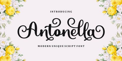 Antonella is a modern script with handwriting, decorative characters, and dancing baselines! It's very suitable in use like blog headers, t-shirts, and for weddings, social media, product design, stationery, advertising, clothing, book covers, business cards, greeting cards, branding, merchandise, invitations and handmade quotes and more. Antonella features OpenType stylistic alternates, ligatures and International support for most Western Languages is included. To enable the OpenType Stylistic alternates, you need a program that supports OpenType features such as Adobe Illustrator CS, Adobe Indesign & CorelDraw X6-X7, Microsoft Word 2010 or later versions. How to access all alternative characters using Adobe Illustrator: https://www.youtube.com/watch?v=XzwjMkbB-wQ Antonella is coded with PUA Unicode, which allows full access to all the extra characters without having special designing software. Mac users can use Font Book , and Windows users can use Character Map to view and copy any of the extra characters to paste into your favourite text editor/app. How to access all alternative characters, using Windows Character Map with Photoshop: https://www.youtube.com/watch?v=Go9vacoYmBw If you have any question, don't hesitate to contact me by email :bosstypestudio@gmail.com Thank you!
 - Berlianda Script by Alpha Bento,
$12.00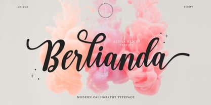 Berlianda Script is a modern calligraphy typeface with a handwritten style, decorative characters, and a dancing baseline! Berlianda Perfect for use such as blog headers, branding, t-shirts, weddings, social media, product design, stationery, advertisements, clothing, book covers, business cards, greeting cards, branding, merchandise, handcrafted invitations and quotes and many more. Berlianda Script featuring an alternative to OpenType styles, ligatures and International support for most Western Languages is included. To activate the OpenType Stylistic alternative, you need a program that supports OpenType features such as Adobe Illustrator CS, Adobe Indesign & CorelDraw X6-X7, Microsoft Word 2010 or a later version. How to access all alternative characters using Adobe Illustrator: https://www.youtube.com/watch?v=XzwjMkbB-wQ Berlianda Script is coded with PUA Unicode, which allows full access to all additional characters without having to design special software. Mac users can use Font Book, and Windows users can use Character Map to view and copy any additional characters for pasting into your favorite text editor / application. How to access all alternative characters, using the Windows Character Map with Photoshop: https://www.youtube.com/watch?v=Go9vacoYmBw Thank you!
 - Silver Raven by Ferry Ardana Putra,
$12.00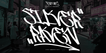 Hello there! We are introducing our new font - Silver Raven! This font is font created and inspired from the street writing of New York, and generated by creative hands of graffiti addictions. It has an incredibly unique design that can be perfect for a range of creative branding and packaging projects. Take your designs to the next level with this stunning font! You can apply this font to t-shirt designs, posters, covers, video thumbnails, merchandise, wall, and so on to make it look special. ——— Silver Raven features: A full set of uppercase and lowercase Numbers and punctuation Multilingual language support PUA Encoded Characters OpenType Features Layered Style +257 Total Glyphs Graffiti Swashes and Ornaments included! ——— Silver Raven Includes: Silver Raven (OTF/TTF) ——— ⚠️To enable the OpenType Stylistic alternates, you need a program that supports OpenType features such as Adobe Illustrator CS, Adobe InDesign & CorelDraw X6-X7, Microsoft Word 2010 or later versions. There are additional ways to access alternates/swashes, using Character Map (Windows), Nexus Font (Windows), Font Book (Mac) or a software program such as Pop Char (for Windows and Mac). ⚠️For more information about accessing alternative, you can see this link: http://adobe.ly/1m1fn4Y ———
 - Becky by W Type Foundry,
$22.00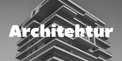 Becky is a versatile display type designed to appeal to to a young audience of creative, up-to-date people. Geared towards the world of advertising and retail. It is well-suited for large headlines, branding, logos, publishing and short texts. With a modern look inspired by such geometric classics as Futura and an overall edgy, informal quality (seen in details like the subtle curve of its verticals), Becky stands out as a fun, unique type. Becky is a 10-variant type family that comes in 5 weights: light, regular, medium, bold and extra bold. It features 445 characters in total. Becky features 2 alternative stylistic sets: SS1 in which the diagonals in the letters X, Y, V, W, R, K, y,x,v,w and k shift from curved to straight in order to achieve a more formal look, especially useful for smaller texts. SS2 offers alternate glyphs for I, E, J, e, j and t, further expanding the possibilities of the typography. Learn about upcoming releases, work in progress and get to know us better! On Instagram W Foundry On facebook W Foundry wtypefoundry.com
 - Mack Dutch by LetterStock,
$25.00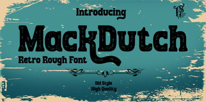 MackDutch MackDucth font pair was inspired by old magazine that i saw at barbershop. It was crafted by hand specially to add natural handmade feeling in its brand identity than i make it clean with pentool. We add some rough to make it retro feel, this font is bold so it can look strong if you use it for branding or even title for your retro poster design. Opentype features MackDucth font is a great retro rough font that will looks good in logotype, labels, t-shirt prints, product packaging, invitations, advertising and others. If you looking for retro rough font style, this font is a great choice for you to make your design awesome and flawless. This fonts works with folowing languages: Afrikaans, Albanian, Asu, Basque, Bemba, Bena, Chiga, Cornish, Danish, English, Estonian, Filipino, Finnish, French, Friulian, Galician, German, Gusii, Indonesian, Irish, Italian, Kabuverdianu, Kalenjin, Kinyarwanda, Low German, Luo, Luxembourgish, Luyia, Machame, Makhuwa-Meetto, Makonde, Malagasy, Malay, Manx, Morisyen, North Ndebele, Norwegian Bokmål, Norwegian Nynorsk, Nyankole, Oromo, Portuguese, Romansh, Rombo, Rundi, Rwa, Samburu, Sango, Sangu, Scottish Gaelic, Sena, Shambala, Shona, Soga, Somali, Spanish, Swahili, Swedish, Swiss German, Taita, Teso, Vunjo, Zulu Thank you for using this font. LS
 - Kimilove by Aldedesign,
$17.00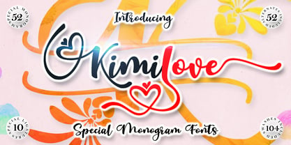 Kimilove // Monogram Script font is a stunning font with a stylish and lovely font that features a varying baseline, smooth line, modern, and with a depth love. For those of you who need a touch of love and modernity for your designs or branding, it can be used for various purposes such as headings, wedding, invitation, signature, logos, branding, t-shirt, letterhead, signage, labels, news, posters, badges, etc. We have a special font namely "Kimilove // Monogram Script font". The font design looks simple without losing its elegance and warmness. The function of the font is to show that you have a modern spirit to serve high-quality products and services. We design this font with Open Type features to give an artistic touch on it. This font is also applicable for numbers, punctuation, and other languages. It is also a multi-functions font where you can use for a business logo, branding, wedding invitation, and anything you want. We have more great and artistic fonts. Just check my font collection by visiting Our Profile. Then, pick your most favorite font and use it to reach your goals.
 - Mariachi by FontMesa,
$25.00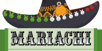 Mariachi is a new condensed version of our Maison Luxe font which is a revival of an old 1800's classic ornate French font. This new 2021 condensed version takes this old classic to an all new level by adding small caps, italics and a new solid black version. Mariachi is perfect for headlines and logos from advertising to product labels, t-shirt lettering and restaurant menus. Fill fonts are also part of this family, new to this font style is the half fill font for creating a two color effect on the letters, you'll need an application that works in layers to use the fill fonts in Mariachi. The regular fill font for Mariachi isn't meant to be used as a stand alone font so we've created a solid black version with thicker serifs on top and adjusted outlines throughout for a better appearance as a solo font. The difference between Mariachi and our Mi Casa font is that Mariachi has a squared off shadow on the top half of the letters. We hope you enjoy Mariachi as much as we did making it. Mariachi is a trademark of FontMesa LLC
 - Lattolatoo by Zamjump,
$17.00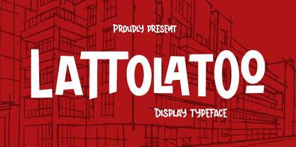 Lattolatoo is a unique modern display font with a fun and trendy kind of street style twist. From poster designs to t-shirts and packaging, Lattolatoo will give your designs an alternative to the minimal look and supercharge your creative work. Lattolatoo is hand-drawn, having an almost handwritten appearance; the characters skip the baseline giving it a charming yet modern look and feel. Alternative All characters A to Z one alternative. To make your text look less repetitive, you can substitute the letters for something else—this makes your design look more like handwriting. Ligature Lattolatoo has standard ligatures, 7 of them in total. You can activate it through the glyph panel in Adobe applications. The binder makes a huge difference in the look of Beautiful Freak. It switches the order of two popular letters making your design look more individual. opentype Please note: Alternatives and Binders use OpenType features. Therefore, you'll need a design application to access these options—an application such as Adobe Photoshop, Illustrator, or InDesign. Included : - Uppercase glyphs only (This font is unicase) - Punctuation, Symbols, and Numbers - Alternate A-Z characters (1 character) - 7 Ligatures - Support for Central, Western, and Southeast European characters
 - Graphit by HVD Fonts,
$40.00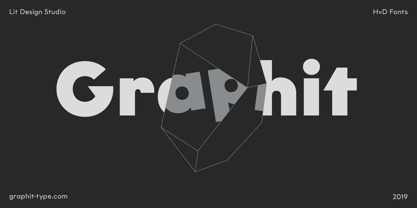 Graphit is a typeface designed by Lit Design Studio & curated by HvD Fonts. It combines clear, geometric shapes with edgy yet finely-crafted details. Graphit features uncompromising characters such as G, Q, f, k and 1. It works well both for impactful headlines and for reading sizes. The type family consists of six weights plus matching italics. In early 2018, Livius Dietzel & Tom Hoßfeld started developing the typeface’s essential character and released a free font named after the studio, Lit. Just a few months later, Hannes von Döhren had a look at the typeface and suggested expanding it into a family – then publishing it with HvD Fonts. They drew every single letter from scratch, and also decided to give the font a new name — Graphit. The family features six low-contrast weights, ranging from Black to Thin. Every character has been crafted to give it a distinctive and individual feel. Medium, Regular and Light are optimized for usage in copy text. For smaller font sizes & longer body copy, the alternate character set features a double-story a and a simplified Q, f, r and t for improved legibility. All fonts are manually hinted for optimal performance on digital devices.
 - Galapogos BRK Pro by CheapProFonts,
$10.00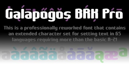 A very chunky and rounded font. I have shortened the r and t, increased the size of the dots, and tweaked a little here and there - before expanding the character set substantially. I actually like the font so much that I also used it for the CheapProFonts logo! ALL fonts from CheapProFonts have very extensive language support: They contain some unusual diacritic letters (some of which are contained in the Latin Extended-B Unicode block) supporting: Cornish, Filipino (Tagalog), Guarani, Luxembourgian, Malagasy, Romanian, Ulithian and Welsh. They also contain all glyphs in the Latin Extended-A Unicode block (which among others cover the Central European and Baltic areas) supporting: Afrikaans, Belarusian (Lacinka), Bosnian, Catalan, Chichewa, Croatian, Czech, Dutch, Esperanto, Greenlandic, Hungarian, Kashubian, Kurdish (Kurmanji), Latvian, Lithuanian, Maltese, Maori, Polish, Saami (Inari), Saami (North), Serbian (latin), Slovak(ian), Slovene, Sorbian (Lower), Sorbian (Upper), Turkish and Turkmen. And they of course contain all the usual "western" glyphs supporting: Albanian, Basque, Breton, Chamorro, Danish, Estonian, Faroese, Finnish, French, Frisian, Galican, German, Icelandic, Indonesian, Irish (Gaelic), Italian, Northern Sotho, Norwegian, Occitan, Portuguese, Rhaeto-Romance, Sami (Lule), Sami (South), Scots (Gaelic), Spanish, Swedish, Tswana, Walloon and Yapese.
 - Nigthwel by Picatype,
$14.00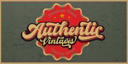 Nigthwel Script is inspired by retro style and combination with Hand Lettering style. Nigthwel has many OpenType features like a stylistic alternatives, stylistic sets, ligatures and swash so you can mix and match like a you want. Nigthwel Script is good for logotype, poster, badge, book cover, t-shirt design, handwritten quotes, product packaging, header, poster, merchandise, social media & greeting cards. To enable the OpenType Stylistic alternates, you need a program that supports OpenType features such as Adobe Illustrator CS, Adobe Indesign & CorelDraw X6-X7, Microsoft Word 2010 or later versions. How to access all alternative characters, using Windows Character Map with Photoshop: https://www.youtube.com/watch?v=Go9vacoYmBw How to access all alternative characters using Adobe Illustrator: https://www.youtube.com/watch?v=XzwjMkbB-wQ Nigthwel Script is coded with PUA Unicode, which allows full access to all the extra characters without having special designing software. Mac users can use Font Book , and Windows users can use Character Map to view and copy any of the extra characters to paste into your favourite text editor/app. Thanks so much for looking and please let me know if you have any questions.
 - Heirloom Artcraft by Baseline Fonts,
$29.00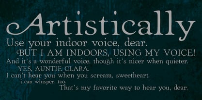 Presenting Heirloom Artcraft-- by Baseline Fonts within the Grit History B series. Like an auntie who insists on baking cookies from scratch every time you visit, Heirloom Artcraft is a beacon of tradition and consistent delight with every letterform. Gentleness and subtlety keep this font far away from kitsch. This font sincerely says "ma'am" and "sir" and is perfect for business cards, custom stamps, coffeetable books, letterhead, invitations and anywhere you or your client wish to make an extremely well mannered and charming statement. There are many alternate ligatures available within the font including capital alternates for T, A, P, B, D, and N. It also boasts a full symbol set and the most darling little swashes scattered tastefully throughout the character map you ever did key. Heirloom Artcraft is available in Thin, Thin Italic, Book, Book Italic, Demi Italic, Black, and Black Italic. It also features Metrics and Optical kerning - metrics displays characters with letterpress-traditional spacing that is pleasantly askew, or more rigid optical kerning which displays characters at identical distances for times when the importance of readability exceeds that of stylistic merit.
 - Black Dread by Ferry Ardana Putra,
$39.00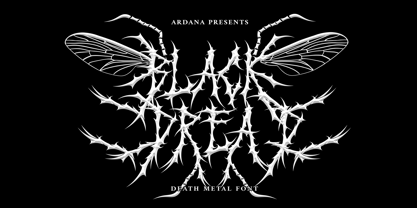 Introducing our first death metal font! We called it Black Dread! This brutal death metal font is can be used for logos or branding and your metal band name without having to pay for expensive logo-making services. Just by buying this font, you can immediately make your own band or brand logo name. Combine it with the death metal ornaments and make your own death metal design with ease! This black metal typeface is perfect for logotypes, t-shirts, vintage badges, branding, packaging, posters, clothing brands, posters, horror movies, album covers, and many more! ——— Black Dread features: A full set of uppercase Numbers and punctuation Multilingual language support PUA Encoded Characters OpenType Features +313 Total Glyphs +Death Metal Ornaments included! ——— Black Dread includes: Black Dread Regular Black Dread Outline ——— ⚠️To enable the OpenType Stylistic alternates, you need a program that supports OpenType features such as Adobe Illustrator CS, Adobe InDesign & CorelDraw X6-X7, Microsoft Word 2010, or later versions. There are additional ways to access alternates/swashes, using Character Map (Windows), Nexus Font (Windows), Font Book (Mac), or a software program such as Pop Char (for Windows and Mac).
 - Diphthong by Diphthong Type Foundry,
$10.00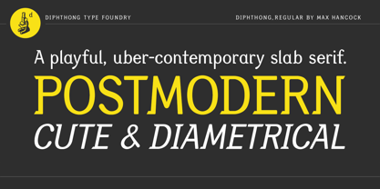 The challenge was to create a single typeface weight that was versatile enough without a large font family, and could be put to use with a variety of media formats, from book text to advertising spreads, all while remaining legible and delightful to read. Originally designed between the years 2002 and 2004, the inspiration for the design originated from the concepts of Stefano Giovannoni's uber-contemporary industrial designs and architecture. Where to start with such a font design was obvious to Diphthong Regular's designer, Max Hancock; to create a transitional, slab serif form that was corky and serious, interchangeably. The characteristics of the font followed a postmodern playfulness, popular in many sub-cultures looking for an alternative to the harsher, cut-shape, deconstructivist styles. And, the unique objective behind the design was to make it so that the usual difficult combination of the t and h (hth) in language was legible as well as pleasant to look at, thus the reason for the name. The soft, subtle roundings add a flair of utilitarianism while the cut edge ascenders help to blur the line between cute and diametrical mannerisms.
 - Angel Heart by Great Studio,
$15.00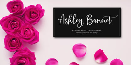 Angel Heart Script is a modern script with handwriting, decorative characters, and dancing baselines! It's very suitable in use like blog headers, t-shirts, and for weddings, social media, product design, stationery, advertising, clothing, book covers, business cards, greeting cards, branding, merchandise, invitations and handmade quotes and more. Angel Heart Script features OpenType stylistic alternates, ligatures and International support for most Western Languages is included. To enable the OpenType Stylistic alternates, you need a program that supports OpenType features such as Adobe Illustrator CS, Adobe Indesign & CorelDraw X6-X7, Microsoft Word 2010 or later versions. How to access all alternative characters using Adobe Illustrator: https://www.youtube.com/watch?v=XzwjMkbB-wQ Angel Heart Script is coded with PUA Unicode, which allows full access to all the extra characters without having special designing software. Mac users can use Font Book , and Windows users can use Character Map to view and copy any of the extra characters to paste into your favourite text editor/app. How to access all alternative characters, using Windows Character Map with Photoshop: https://www.youtube.com/watch?v=Go9vacoYmBw If you have any question, don't hesitate to contact me by email : greatstudio92@gmail.com Thank you!
 - EraMax 123 by Our House Graphics,
$15.00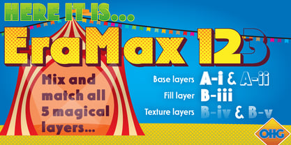 EraMax 123 is a multi-layered display geometric sans serif, meant to be set BIG, for large, colourful statements. It's the perfect face for packaging, posters & branding, where a strong, colourful voice is needed... Did I mention posters? The "Max" in EraMax comes from the ultra bold weight, but also, and mainly as a tip of the hat to Peter Max, the designer and artist, known for creating so many images which have come to be emblematic of the sixties and seventies. The bold gradient effects in some of his posters were the inspiration behind the dotted and striped layers. This font's vintage flavour truly stand out in a retro setting, but also has a modern flavour that lends it the flexibility to work well in a more contemporary context. This is the second of what is to be an extended family of typefaces based on the original hand painted signage found in the T. H. & B Railway station in Hamilton Ontario, a classic Art Moderne building, designed by the New York architectural firm of Fellheimer and Wagner for the Toronto Hamilton and Buffalo Railway line and completed in 1933.
 - Retromax by Debut Studio,
$15.00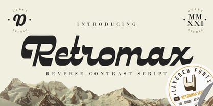 Debut Studio Presents The Retromax.... This Script is a special script or typeface in which the emphasis is reversed from the norm: instead of the vertical lines being wider or thicker than the horizontal lines, which is normal in Latin alphabet writing and especially printing, horizontal lines are the thickest. It's quirky and fun, you can use for any project. Retromax is also a Layered Fonts, Layered fonts have letters that appear raised, or stacked in multiple layers of different shades or colors. Some layered fonts actually include multiple files for each layer. With layered font families, we can create novel combinations of 3D with Shade. Features: Uppercase & Lowercase Number & Punctuation Multiple Language & Stylistic Alternate Files Included: Retromax Regular Retromax Offset Retromax 3D Retromax Shade I hope you like my latest product, This collection will be perfect for creating posters, art prints, apparel and t-shirt designs, Instagram and other social media posts, and many more. if you have questions and problems when using it, please leave a message in the comments or via direct message, I will be very happy to reply, Happy Designing!
 - Novelia Pro by Joelmaker,
$20.00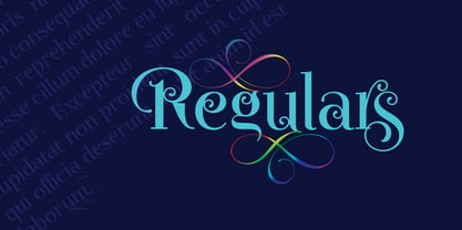 Novelia Pro & Novelia Pro Small Cap is a multi purpose serif font, with a swirly blend that is very spoiled in the eyes, unique and elegant, and ready to accompany and play around with you in preparing the next design project. Novelia can be used for various purposes such as posters, logos, t-shirt, signage, business card, magazines, book cover, wedding invitation, greeting cards etc. Novelia Pro & Novelia Pro Small Cap allow you to create custom dynamic text. You can access by turning on; Stylistic Alternates, Titling,Swash, as well as ligatures in Photoshop, Adobe Illustrator, Adobe InDesign or through a panel of glyphs such as Adobe Illustrator, Photoshop CC, Let's switch from the regular character into character alternative to get the text with the layout of your dreams. Novelia Pro also includes glyphs, punctuation, numbers, and multilingual. Novelia Pro & Novelia Pro Small Cap features +1000 glyphs and has given PUA encoded (specially coded fonts), with tons of alternate characters. The pack can be accessed in full by any crafter or designer, without the requirement for extra design software, COMPATIBLE WITH SILHOUETTE & CRICUT DESIGN SPACE.
 - Shirelda Script by Picatype,
$12.00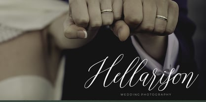 Say hello to Shirelda Script - A contemporary calligraphy, with a vintage feel, style calligraphy with moving baseline and elegant touch. That makes the font look fabulous! Can be used for various purposes.such as headings, signature, logos, wedding invitation, t-shirt, letterhead, signage, lable, news, posters, badges etc. Shirelda Script features OpenType stylistic alternates, ligatures and International support for most Western Languages is included. To enable the OpenType Stylistic alternates, you need a program that supports OpenType features such as Adobe Illustrator CS, Adobe Indesign & CorelDraw X6-X7, Microsoft Word 2010 or later versions. How to access all alternative characters using Adobe Illustrator: https://www.youtube.com/watch?v=XzwjMkbB-wQ Shirelda Script is coded with PUA Unicode, which allows full access to all the extra characters without having special designing software. Mac users can use Font Book , and Windows users can use Character Map to view and copy any of the extra characters to paste into your favourite text editor/app. How to access all alternative characters, using Windows Character Map with Photoshop: https://www.youtube.com/watch?v=Go9vacoYmBw If you need help or have any questions, please let me know. I'm happy to help :) Thanks & Happy Designing!
 - Situgintu by FallenGraphic,
$15.00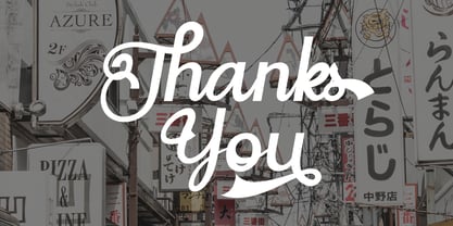 Situgintu Calligraphy has lots of alternate characters, swashes and ligatures. It has also a bunch of tails with different shapes and widths to give the logotype or sports look to your design. You can design beautiful, elegant and diverse typographic elements with it. It’s well suited for logos, lettering artwork, t-shirt designs, editorial illustrations to name a few. Features : -PUA Encoded 100% Acessibility -Stylistic Alternates -Standard Ligatures -Stylistic set SS01-SS07 If you don’t have a program that supports OpenType features such as Adobe Illustrator and CorelDraw X Versions, you can access all the alternate glyphs using Font Book (Mac) or Character Map (Windows).To Access Alternate Characters Click The Link Below: How to access alternates in Adobe illustrator CS https://www.youtube.com/watch?v=geL0Ye02Ryk How to access alternates in Adobe illustrator CC https://www.youtube.com/watch?v=V25yiUh8BcE How to access alternates in Ms Wordhttps://www.youtube.com/watch?v=HxkhZiCuwEw How to access alternates in Coreldraw X7 https://www.youtube.com/watch?v=UBVsufJjons How to access alternates in Indesign CS https://www.youtube.com/watch?v=HgZTCxKG14Q How to access alternates in Adobe Photoshop CC https://www.youtube.com/watch?v=BYKXl58AdNY
 - Katastrofe by PizzaDude.dk,
$20.00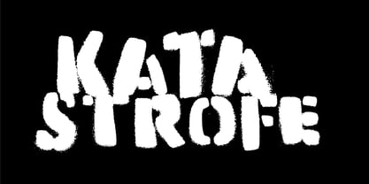 Katastrofe is danish for … well, catastrophe - you may have guessed that! This font was almost a catastrophe to make! I cut out all the letters in a cardboard, and went outside to spray the letters with a spraycan. Everything went smooth as planned, but suddenly the wind started to blow and the papers started to fly away! Luckily I found some stones I used to make the papers stay in place. Lucky for me - otherwise it would have been a catastrophe! Seconds after finishing this font project, it started to rain…I just avoided a catastrophe! But is this font really a catastrophe, or does it just mimic punk/spray/grunge/riot? Make your own statements using Katastrofe, or perhaps your very own punk sayings like “Punk is not dead”, “Anarchy Rebel” or what suits you the best. Whatever you choose to write, you will definitely get that real punk look! Perhaps you could even do a t-shirt print that says “Katastrofe” :) Comes with different upper and lowercase letters along with alternate versions of each letter - and of course a lot of foreign letters, because punk is not dead and punk is universal!
 - As of my last update, Saarland, designed by Uwe Borchert, might not be a widely recognized or extensively documented font in mainstream typographic resources or among popular font libraries. However,...
- CartoGothic Std, created by FontSite, is a prominent typeface that embodies a blend of modernity and functionality. At its core, CartoGothic Std is a sans-serif font, known for its clean lines and un...
- Atyp BL by Suitcase Type Foundry,
$39.00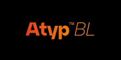 The sources of inspiration for the Atyp typeface are spread out widely both stylistically and chronologically. The basic proportions of the uppercase refer to the elementary geometric constructions of the Bauhaus. The subtle details in the drawing of the characters and the microscopic adjustments, which evoke the illusion of uniformity and mechanical purity, pay homage to the rationalism of the typefaces popular in the International Style. The increased contrast of the joints of the bowls and shoulders in the Display weight, which in certain diagonal curves transition into almost deconstructive permutations. For a change these take delight in doing things on purpose, teasing readability and breaking the rules of the new millennium's typography. Atyp was created by adapting a typeface originally made for a commercial television station. The potential of the neutral grotesque, proven by its excellent readability on screens, gave the impetus for its preparation into an extremely wide character set. Coherence across all eight key masters lays the groundwork ideally for using the variable font format. The key benefits of this technology are a significant reduction in data consumption in the case of web fonts, as well as an unlimited access to the full range of styles, which in turn is a significant benefit in the area of responsive design.
 - Malden Sans by Monotype,
$49.00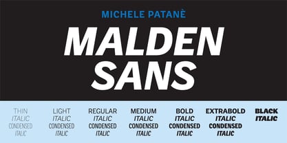 Malden Sans is a mischievous grotesque sans serif with charming details that gives designers a solid typographic voice. It was created by Michele Patanè with regular and condensed widths, as a utilitarian typeface family for print and digital environments. It was originally designed as part of a type system for cinema magazines, and embodies the devil-may care attitude of the silver screen. Designer Michele Patanè looked back to an earlier era of typography to create the typeface, embracing unusual details, rather than ironing them out. “There is a very naive way of using typography in the 30s and 40s, something not as clean as how it’s used in the late 50s and 60s when everything passed through a rationalisation of the typographic palette,” he explains. “In film magazines you can still see a bit of roughness, and I like that.” This is a design that’s desperate to be used in editorial environments, and has been created to stand up to lower quality paper. It would be equally at home on posters, packaging, and even in digital environments where designers are looking for something more expressive than another geometric sans serif. Malden Sans includes a Normal and Condensed range, with 7 weights in the normal and 6 in the Condensed, both including italics.
 - Seriguela by Latinotype,
$29.00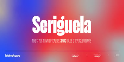 Seriguela is an ultra condensed sans serif typeface with a unique personality. It comes in normal and display versions, each with 9 weights, as well as italics and reverse italics totaling 54 fonts. Seriguela is flavor in motion and each part of its system works together to captivate you, combining emotion and usability, allowing you to create attractive and unique designs. Seriguela followed a very distinctive recipe to design its alphabet: it started with a grotesque base and applied movement and joy in a very original way. The blacker and more contrasted, the tastier. The contrast in its display version is one of the most important features of Seriguela: the unconventional relationship between thick and thin lines, as it does not strictly follow any historical model of contrast construction and makes it noticeable. Its high contrast is not present in every single character and it is often in the “wrong” places. The original charm of Seriguela is maintained throughout all its styles. With peculiar details: the verticality and its proportions, as well as terminals that resemble hooks in some curves, a characteristic that breaks with the vertical modular rhythm. Seriguela is a versatile font system, designed primarily for display uses with a need of visual impact.
 - Solanel by Nootype,
$45.00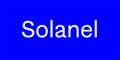 Solanel is a neo-grotesque with flawless curves. This is a low contrasted and smooth sans serif with subtle and effortless details. One of the main particularity is its italic, which is not a rendition of a slanted roman, but a mix of a rotated and slanted version, which give a “rotalic” feel. The large range of style, from UltraThin to Black help to give flexibility to this family. This family contains many OpenType features, such as Alternates, Small Caps, Proportional Figure, Tabular Figures, Numerators, Superscript, Denominators, Scientific Inferiors, Subscript, Ordinals and Fractions, which make that typeface useful in various projects. Larsseit family supports Latin and Cyrillic, all these languages are covered: Latin language support: Afar, Afrikaans, Albanian, Asturian, Azeri, Basque, Bosnian, Breton, Bulgarian, Catalan, Cornish, Corsican, Croatian, Czech, Danish, Dutch, English, Esperanto, Estonian, Faroese, Filipino, Finnish, Flemish, French, Frisian, Friulian, Gaelic, Galician, German, Greenlandic, Hungarian, Icelandic, Indonesian, Irish, Italian, Kurdish, Latin, Latvian, Lithuanian, Luxembourgish, Malagasy, Malay, Maltese, Maori, Moldavian, Norwegian, Occitan, Polish, Portuguese, Provençal, Romanian, Romansch, Saami, Samoan, Scots, Scottish, Serbian, Slovak, Slovenian, Spanish, Swahili, Swedish, Tagalog, Turkish, Walloon, Welsh, Wolof Cyrillic language support: Adyghe, Avar, Belarusian, Bulgarian, Buryat, Chechen, Erzya, Ingush, Kabardian, Kalmyk, Karachay-Balkar, Karakalpak, Kazakh, Komi, Kyrgyz, Lak, Macedonian, Moldovan, Mongol, Permyak, Russian, Rusyn, Serbian, Tatar, Tofa, Tuvan, Ukrainian, Uzbek
 - FF Signa Slab by FontFont,
$72.99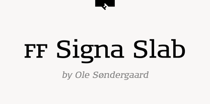 FF Signa is a typically Danish typeface, rooted in architectural lettering rather than book typography. Originally designed for signage—hence the name—FF Signa is now a typographic family with three widths. All weights include italics, small caps, and several styles of figures. Because of the quality of this “vernacular-lettering-into-typeface” conversion, FF Signa received a Danish Design Prize in 2002. FF Signa is radically different from most sans serif text typefaces that were published during the 1990s. It neither belongs in the “humanist sans” category, nor is it on the list of typefaces based on 19th-century grotesques. Its concise letterforms and a minimum of detail produce clear and harmonious word images. Yet its proportions are classical, and the underlying geometry has been subtly adjusted in order to create letterforms which are at once interesting, harmonious, and contemporary. These features make FF Signa pleasant for reading, even at very small sizes. The typeface has developed into a versatile family, with Condensed, Extended, and Correspondence versions. Later on Signa Serif, Stencil variants and a Signa Slab family added even more versatility. The resulting FF Signa type system may be used for corporate identities, brochures, magazines, communication, books, and on-screen publications.
 - Hybi5 by Hybi-Types,
$12.50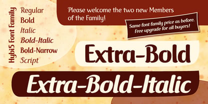 The Hybi5 font family can be described as a “crossover” between Antiqua, Grotesque and Brushscript with characteristics from all of this genres. My aim was to design friendly and versatile fonts, which can be used for headlines or slogans as well as for some longer texts. To make the fonts useful for as many languages as possible, I added a lot of exotic accents. All styles contain the whole “Adobe Latin 3 (CE)” character set plus a few letters from “Adobe Latin 4”. A lot of ligatures prettify the look of the fonts. Alternate uppercase letters in the script style might do the same. If you are a professional designer, you will surely appreciate the thousands of kerning pairs within each style, which will make your work easier. I recommend to set Kerning to “metric” and spacing to “zero” in your layout app. Back in 2015 I worked on the first sketches of “Hybi5” using Adobe Illustrator. “Fontself Maker”, an extension for Illustrator, was used to convert the drawings into font-files. This tool can only create “OTF” font files. For this reason there are no “TTF” versions. It’s not the first font I have ever made, but the first to be distributed commercially.
 - Pepper Sans by VIDI Visual Design Studio,
$17.99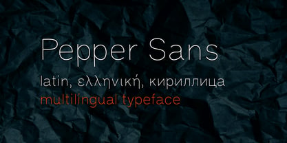 The core design of Pepper family, designed by VIDI Visual Design Studio, is the fingertip handwriting style inspired by children’s writings on windows. This distinctive low-contrast typeface combines characteristics from neo-grotesque and organic models. Warmer than most Helvetica inspired typefaces, Pepper has organic shapes, playful strokes, rounded endings, and a generous x-height which makes Pepper easy to read. This family could be used well for food packagings, content aimed for children, book covers, branding, high-impact titles and small body texts, advertising, editorial design and more. What makes Pepper Sans Vol.1 competent and more spicy then some other fonts is that it contains a set of more than 900 characters for each of 5 weights that support many Latin-based languages, Greek and Cyrillic. As the weight decreases, the typeface gains impact with becoming elegant, giving titles in (Hair, Thin or Light) a breath of fresh air. We derived a typeface family consisting of Hair, Thin, Light, Regular, Semi Bold in this Vol.1 edition. Typeface features: • 5 weights: Hair, Thin, Light, Regular, Semi Bold • Latin, Greek & Cyrillic multilingual support • More than 900 characters for each of 5 weights Font Specs: • Created: August 2020 • Files type: .ttf
 - Kamber by Studio Buchanan,
$24.00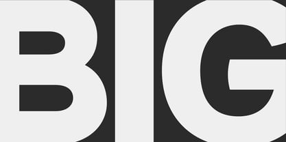 Kamber is a playful and approachable, neo-grotesque sans-serif with a handful of humanist flourishes. Subtle convex terminals and a curved structure create it's friendly personality and bouncy rhythm. If you're looking for a warm typeface that's affable without straying into cliché, then Kamber is your new best friend – like the labrador of typefaces. Kamber's balanced yet quirky nature makes for a fun and interesting display face, without compromising on legibility at smaller sizes. The lowercase letters have an elevated x-height, sitting at around 70% of the cap height – this means running copy remains clear and readable. Available in 8 weights, each with a corresponding italic, Kamber is a widely functional typeface that can hold it's own, regardless of the use case. It includes all the usual open type features for further adaptation and variation, including small caps, ligatures, stylistic alternates and more. The primary numerals are lining figures, but tabular figures, old style figures, and a combination of both are also included. If you're looking for something to stand out from the sea of overly geometric faces and soulless helvetica variants, then Kamber is ready and waiting. Perfect for editorial design, branding or anywhere you use text – Kamber is the typeface that smiles.
 - Imagine stumbling into a whimsical, quirky little coffee shop in the heart of an artsy neighborhood, where every nook and cranny is packed with charm and character. That’s the essence of Miss, a font...
- As of my last update in April 2023, Instrumenta, attributed here to an entity named Yautja, appears to be a fictional font, as there's no widely recognized typeface by that name in contemporary typog...
- Keep Calm by K-Type,
$20.00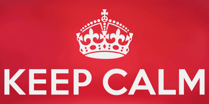 Keep Calm is a family of fonts developed from the now famous World War 2 poster that was designed in 1939 but never issued, then rediscovered in 2000. As well as the original Keep Calm font, the medium weight of the poster, new weights are now available – Keep Calm Book (regular weight), Heavy and Light – and each weight comes with a complimentary italic. Version 2.0 (2017) is a comprehensive update which consists of numerous refinements and improvements across all weights. The family now contains a full complement of Latin Extended-A characters, Welsh diacritics and Irish dotted consonants. The four italics have been optically corrected with revised, ‘true italic’ forms of a and f. The crown motif from the top of the Keep Calm poster is located at the plus minus ± and section § keystrokes (Alt 0177 and Alt 0167 on Windows). The lowercase g follows the Gill/Johnston eyeglass model, but also included is an alternative, single-story g at the Alt G keystroke (Alt 0169 on a Windows keyboard), the normal location of the copyright symbol which has been relocated elsewhere in the fonts. An alternative lowercase t, without the curved wedge cutaway, is provided at the Alt T (dagger) keystroke (Alt 0134 on Windows). When I first saw the Keep Calm and Carry On poster, I wrongly assumed the letters to be Gill Sans. Recent research at the National Archive by Dr. Bex Lewis of Manchester Metropolitan University has revealed that the original poster was hand drawn by the illustrator and painter, Ernest Wallcousins. The Gill Sans influence is apparent, in the R particularly, the M’s perfectly pointed vertex is redolent of Johnston’s Underground, and the most anomalous character, the C, resembles the ‘basic lettering’ of engineers that provided the vernacular sources for the Gotham typeface. Developing the Keep Calm typeface has been an exercise in extrapolation; an intriguing challenge to build a whole, high quality font family based on the twelve available capitals of the Keep Calm poster, and on similar lettering from the other two posters in the original series. This has required the creation of new lowercase letters that are believably 1939; that maintain the influence of Gill and Johnston while also hinting at the functional imperative of a wartime drawing office. Wallcousins’s lettering balanced intuitive human qualities and the pure pleasure of drawing elegant contemporary characters, against an underlying geometry of ruled lines, perfect circles, 45° terminals, and a requirement for no-nonsense clarity.
 - We The People by K-Type,
$20.00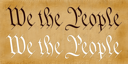 This typeface is extrapolated from the ‘We the People’ calligraphy of the handwritten US Constitution Preamble which employed a style based on German Text and Square Text exemplars from George Bickham’s penmanship copy-books, the most celebrated being The Universal Penman published in 1743. The original Constitution document was transcribed onto parchment by Jacob Shallus, a Pennsylvania Assistant Clerk, over a weekend in 1787. Shallus’s biographer, Arthur Plotnik (The Man Behind the Quill, 1987), notes that he was paid $30, a modest monthly wage at the time. He also suggests that the calligraphic headings, ‘We the People’ and ‘Article’, may have been inserted by Shallus’s 14 year old trainee son, Francis, “The manner in which the ‘Article’ headings are squeezed into the space Shallus allowed for them suggests a second hand—and perhaps not a very experienced one.” The unconventional backslant of the headings would seem to support this contention, and at the end of the document there is perhaps a novice’s inconsistency in the structure of the letter n between that used for ‘done’ and those used for ‘In Witness’. However, one has to admire the elegant swagger of the wavy t, h and l which the K-Type font extends to the b, f and k. Also, the simpler, Schwabacher-style W, an enlarged version of the lowercase w, is a little less flamboyant than the capital W from the German and Square texts in Bickham’s manuals. For designers using OpenType-aware applications, the typeface includes some Alternates, including a Bickham-style W, the letters t, h and n with added flourishes, two simpler forms of the A, and a few roman numerals for numbering articles. Also some ornamental flourishes and a round middle dot/decimal point. Punctuation marks are drawn in square, calligraphic style, but an alternative round period/full stop, for use with currency and numerals, is available at the period centered position (though placed on the baseline), accessed by Shift Option 9 on a Mac, or Alt 0183 on Windows. The full phrase, ‘We the People’, has been placed at the trademark keystroke and can be accessed by Option 2 (or Shift Option 2) on a Mac, or Alt 0153 on Windows. For designers who find the backslant awkward or unpleasant, the licensed typeface also includes two additional fonts which have a vertical aspect that may be more conducive to graphic design layouts. ‘We The People Upright’ and ‘We The People Upright Bold’ both retain the distinctive style, and the heavier weight is only slightly emboldened, just enough to add some punch.
 - Bruney by Sensatype Studio,
$15.00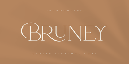 Bruney is a Classy and Unique font for brand and logo design. Based on our experience as a graphic designer who works for a lot of companies, we often are requested to design a logo in a unique style but with an elegant shape. So, we try to brainstorming and create this font to make the idea is going out. This is perfect for BRANDING and LOGO DESIGN. You will get classy, elegant, and certainly unique logos with this font. To make it look more classy and unique, here we prepared some ligatures: KA KI KU KE KO LA LI LU LE LO RA RI RU RE RO EB EH EP ER EK HB HP HK HR TB TD TE TF TP TR TT UB UD UF UK UM UN UP UR VA WA AB AD AR AV AW CK OO OC CA CY EA EB ED ES GB GH GK GB GR HB HP HR HK KB KD KS EY FY LS ME MU MB MD MF MH MK MP MR NN SO RS SB SD SE SF SP SY SR ST SS LL UN CS Bruney is also included full set of: uppercase letters multilingual symbols numerals punctuation Wish you enjoy our font. :)
 - TT Polls by TypeType,
$29.00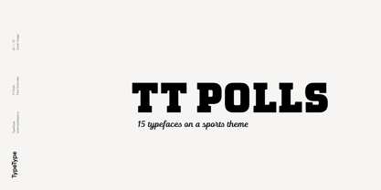 TT Polls useful links: Specimen | Graphic presentation | Customization options About TT Polls family: TT Polls emerges as a modern modular slab serif inspired by American sports graphics. As we wanted to create a really special and remarkable project, we've decided to broaden the character palette and implement the OT features support, and also to add a traditional handwritten script in several weights to the slab serif. Although TT Polls and TT Polls Script subfamilies are stylistically contrasting each other, they perfectly match thanks to the appropriate proportions both in the thickness of vertical strokes and the general width of characters. TT Polls subfamily consists of 5 weights and 5 italics. In it, we've implemented a ligatures set and broad support of OpenType features: calt, salt, liga, dlig, case, frac, sinf, sups, dnom, numr, tnum. Thanks to stylistic alternates it is possible to significantly change the nature of the font, making it more technological. TT Polls Script subfamily is a handwritten script in 5 weights. Geometric swashes created for all characters of basic Latin and Cyrillic alphabets contribute to its authenticity. A lot of OpenType features (swsh, liga, calt, case, frac, ordn, sinf, sups, dnom, numr, tnum, onum, pnum) are also integrated into the TT Polls Script. Although we've been considering the use of TT Polls in sports-related design—be that inscriptions on baseball players' shirts or numbers on a race car’s side—while creating the font family, we have to admit that the final version of TT Polls is also a great fit to a more casual design and application spheres. TT Polls language support: Acehnese, Afar, Albanian, Alsatian, Aragonese, Arumanian, Asu, Aymara, Banjar, Basque, Belarusian (cyr), Bemba, Bena, Betawi, Bislama, Boholano, Bosnian (cyr), Bosnian (lat), Breton, Bulgarian (cyr), Cebuano, Chamorro, Chiga, Colognian, Cornish, Corsican, Cree, Croatian, Czech, Danish, Embu, English, Erzya, Estonian, Faroese, Fijian, Filipino, Finnish, French, Friulian, Gaelic, Gagauz (lat), Galician, German, Gusii, Haitian Creole, Hawaiian, Hiri Motu, Hungarian, Icelandic, Ilocano, Indonesian, Innu-aimun, Interlingua, Irish, Italian, Javanese, Judaeo-Spanish, Judaeo-Spanish, Kalenjin, Karachay-Balkar (lat), Karaim (lat), Karakalpak (lat), Kashubian, Khasi, Khvarshi, Kinyarwanda, Kirundi, Kongo, Kumyk, Kurdish (lat), Ladin, Latvian, Laz, Leonese, Lithuanian, Luganda, Luo, Luxembourgish, Luyia, Macedonian, Machame, Makhuwa-Meetto, Makonde, Malay, Manx, Maori, Mauritian Creole, Minangkabau, Moldavian (lat), Montenegrin (lat), Mordvin-moksha, Morisyen, Nahuatl, Nauruan, Ndebele, Nias, Nogai, Norwegian, Nyankole, Occitan, Oromo, Palauan, Polish, Portuguese, Quechua, Rheto-Romance, Rohingya, Romanian, Romansh, Rombo, Rundi, Russian, Rusyn, Rwa, Salar, Samburu, Samoan, Sango, Sangu, Scots, Sena, Serbian (cyr), Serbian (lat), Seychellois Creole, Shambala, Shona, Slovak, Slovenian, Soga, Somali, Sorbian, Sotho, Spanish, Sundanese, Swahili, Swazi, Swedish, Swiss German, Swiss German, Tagalog, Tahitian, Taita, Tatar, Tetum, Tok Pisin, Tongan, Tsonga, Tswana, Turkish, Turkmen (lat), Ukrainian, Uyghur, Vepsian, Volapük, Võro, Vunjo, Xhosa, Zaza, Zulu.
 - The Hello Ween font by Billy Argel is a captivating typeface that exudes an eerie charm, making it perfect for projects that require a touch of mystery or spookiness. This font stands out with its un...
- Zombie Food Demo by NihStudio is a font that, as its name suggests, captures the essence of horror and survival themes, wrapping them in a quirky and distinctive style. This font appears as if it has...
- The font "St37k" by Uwe Borchert is a fascinating example of typeface design that likely carries a unique blend of aesthetic and functional characteristics. While direct information about this font i...