10,000 search results
(0.075 seconds)
- Splendor Pro by RMU,
$35.00 Finally the light version of Wilhelm Berg’s hot-metal classic which had found its way from Schriftguss to Typoart can be released for nowaday’s use.
 - Hearts And Swirls Too by Outside the Line,
$19.00 48 whimsical hearts and swirls, some solid, some line but lots of little graphics for your Valentine needs. Many ways to say "I Love You".
 - dearJoe 2 by JOEBOB graphics,
$19.00 DearJoe 2 is the second of four handwritten scripts by JOEBOB graphics. A complete character set with numbers and most (but not all) special signs.
 - SwirlityText by Ingrimayne Type,
$9.95 SwirlityText is a fussy, over-the-top calligraphic typeface with lots of curves and wiggles. It comes in two weights, each with an oblique style.
 - Midnightman - Personal use only

- Boule Plus by Ingo,
$33.00 CAPITALIZED, geometric, bold and round. If the typographer sees a font like that, it's enough to make his toes curl. But sometimes it just has to be that way. Geometrically constructed fonts do not necessarily have to be pointed and angular; It also works consistently around. And if I say it consistently, then in this case, that's done consistently. The basis for the BOULE is the circle. The letters are drawn with constant line width, the “corners“ and endings all have the same radius, the lines are all the same thickness. The BOULE consists only of capitals. There is only one difference in the use of uppercase and lowercase letters: in the uppercase letters, the round letters are circular, while the lowercase letters are narrow. The character set of the Boule contains all letters and accents to support the Western, Northern, Central and Eastern European languages with Latin alphabet. The BOULE is not only very fat, it also runs very tight; that is, the glyphs are very close to each other. To avoid "holes" due to unfortunate letter combinations, the BOULE contains ligatures for FT, ST, TT and TZ. There are also other versions of the font: BOULE Brillant on the one hand. In this version, simple highlights simulate a light incidence from the top right. These light edges give the font a decorative effect that makes it easy to think of wet sausages or balloons in some shapes. And finally the BOULE Contour. As the name implies, it is the outer contour of the letters, combined with a shadow at the bottom left. The name BOULE (French for ball) says it already: this font is globated. Therefore, it is also very suitable for all three-dimensional alienation effects. With simple light and shadow you can achieve a very convincing 3D effect with little effort.
 - Classica Pro by URW Type Foundry,
$35.99 Classica Pro by Bernd Möllenstädt A real alternative for letterpress printing A masterpiece It was only after many years, shortly before the end of his life, Bernd Möllenstädt brought out these early drafts of his Classica Light and Light Italic from his drawer, and asked me to produce for him on the computer a Bold and Bold Italic, from which we later wanted to interpolate further cuts like Regular and so on. The boldening of letters with an oblique axis and with hairlines which should not grow to the same extent as the general line widths, is hard to cope with perfectly, even for the smartest computer program, and even more so, when it concerns an as complicated set of data as those conceived by Bernd. The automatically generated result could therefore only be a first step that had to be improved manually later. This was about the stage that we had reached when Bernd died in March 2013, leaving me behind with comprehensive corrections on proofs of this automatically generated Bold. Although I was aware that it would mean a lot of work to complete the project, I did not want to leave it unfinished and decided to finalize and publish the Classica, also in Bernd‘s honor. In the course of the two years that I worked on this font family it somewhat naturally became also my own. New details were added and some of the existing changed. A book typeface requires the supreme and forgives rarely, it represents a true masterpiece. My intention and my ambition were to create a real alternative for letterpress printing, with a font family that contains all the typographic options for an excellent typesetting, and is better readable and has a better appearance than other existing typefaces. Whether this was achieved, the reader may decide. Volker Schnebel, Hamburg, december 2014
 - Rens Gazet by Ingrimayne Type,
$9.50 RensGazet is a decorative blackletter typeface with elaborate upper-case letters and condensed lower-case characters. It was inspired by the masthead of a short-lived weekly newspaper, The Rensselaer Gazette, which was published from 1857 until 1860. I could not find any existing digitized fonts that replicated this old typeface, so I decided to create an interpretation of it. I had samples of few letters in large point sizes and a number of others at a small point size, though these were blurry and not sharply defined. As a result, this typeface is undoubtedly considerably different from the original. Also, my spacing is much tighter than that in the source samples.
 - Wola by Monotype,
$50.99 Wola™, by Franciszek Otto, is not for the typographically timid. It creates vibrant digital headings, banners and navigational links, in addition to commanding print headlines and subheads – but it is not shy, reserved or demure. The design blends the stroke weight stress of Bodoni with the urgency of handwritten letterforms, conveying the energy and immediacy of a design that’s bigger than life – and outside the fence. OpenType® Pro fonts of Wola provide for the automatic insertion of ligatures and alternate characters. These are in addition to a character set supporting most Central European and many Eastern European languages, including Cyrillic and Greek. All this makes Wola a comfortable – if boisterous – world traveler.
 - Duktus by Eurotypo,
$49.00 Duktus is a script typeface with a 1940’s flavour. It is a delicate script with letters not quite connected, having large, flourished capitals and small lowercase with long ascenders and descenders. It has a crisp, precise appearance, but is not rigidly formal. The design was inspired by the typeface Donatello by Wagner & Schmidt in 1935 and published by Società Nebiolo, Torino. Some other Influences: 1927 Trobadour by Wagner & Schmidt 1927 Liberty Script by Willard T. Sniffin 1933 Trafton Script by Howard Allen Trafton, 1937 Coronet designed by Robert Hunter Middleton Duktus fonts come with plenty of alternates small caps, old style numerals, ornaments and swashes. They include also CE language support.
 - AI Wood by Alphabets,
$17.95These six faces are interpreted from examples shown in Rob Roy Kelly's "American Wood Types" They are not merely scanned copies, but have been redrawn from scratch with various optical adjustments. Kelly points out that the true glory of the American Wood Types are the negative spaces, which are, in their dynamic active forms, the antithesis of the anemic flimsy letters produced by type foundries in the 19th century. The Alphabets Wood Types are designed with digital manipulation in mind. Stretch, curve and distort at will! These designs were released prior to similar revivals from Adobe. Each font has two full alphabets (one full height, one smaller) and numerals. However, certain points and accents will not be found. - Beletrio by Storm Type Foundry,
$29.00 Beletrio was made as companion to Beletria, it has many shapes in common. We already have plenty of sans-serif fonts with classical proportions in the Stormtype library, such as John Sans, Sebastian or Andulka, but Beletrio is certainly the most peaceful of the bunch – it shares not only the feel of its serif originator, but its soft curves provide lovely visual caress as well. The smooth endings are not visible at first, they are balanced for easy reading as they solve some critical relations such as "rv, ry, rt", but in larger sizes you'll fully enjoy the picturesque details. It handles the smallest point sizes as well as large billboards, fashion magazines and philosophic tractates.
 - Bettrisia Script by Great Studio,
$18.00 Bettrisia Script is a modern and elegant calligraphy script font that comes with very beautiful character changes, a kind of classic decorative copper script with a modern touch, designed with high detail to bring stylish elegance. Bettrisia Script Interesting scripts as smooth, clean, feminine, sensual, glamorous, simple and very easy to read, because there are many fancy and simple letter connections. I also offer a number of alternative styles that are appropriate for many letters. This font style is perfect for various designs of your work, such as invitations, labels, restaurant menus, logos, fashion, makeup, stationery, novels, magazines, books, greeting cards / wedding, packaging, labels and others. Bettrisia Script has 680+ glyphs and 487 alternative characters, including various language support. With the OpenType feature with alternative styles and elegant ties. The OpenType feature does not function automatically, but you can access it manually and for the best results needed for your creativity in combining this Glyph variation. The OpenType features can be accessed using OpenType savvy programs such as Adobe Illustrator, Adobe In Design, Adobe Photoshop versions of Corel Draw X, and Microsoft Word. And this font has given PUA unicode (special code font) so that all alternative characters can be easily accessed in full by craftsmen or designers. Need help? If you need help or advice, please contact me by e-mail at greatstudio92@gmail.com Thank you for your purchase!
 - Fnord by Monotype,
$23.99 Fnord is a contemporary humanist serif typeface, it is ideally suited for display purposes, titling, headline copy and branding. The family has been designed to be highly versatile, containing a total of 23 fonts. Each font features discretionary ligatures, swash alternates and true small caps. The overall design is clean and simple with a little bit of rebelliousness thrown in for good measure – Fnord does not conform to the traditional serif blueprint. Fnord’s design has been strongly influenced by the complex, thought-provoking and mischievous works of authors Robert Anton Wilson and Robert Shea from the 1970s. I was re-reading their work while sketching the initial letterforms and realised that some of the proportions and angles were coinciding with some themes that run through the books – particularly the numbers 5, 17, 23, 40 and 93, which are key to this font family’s spacing and geometry. I found it both very interesting and enjoyable to play with a specific theme and purpose for creating this typeface. I am sure you will enjoy working with it in your own design projects. Key features: • 5 Weights in 4 Styles – Roman, Italic, Condensed and Extended • 3 Additional Display Styles in 1 Weight – Engraved, Inline and Woodcut • Small Caps, Alternates, Swashes and Discretionary Ligatures • Full European character set • 680 glyphs per font.
 - Orena - Personal use only

- Spac3 halftone - Personal use only

- Basica v.2012 - Personal use only

- Djs symbols - Personal use only

- Equ - Personal use only

- Capital regular - Personal use only

- Hello Stylish by Get Studio,
$15.00 Hello Stylish is a chic script font with sweet flowing and natural pressure. This font is a great choice for a watermark on photography, signature logo design, quotes, album cover, business cards, and many other design projects. Includes a full set of gorgeous uppercase and lowercase letters, numerals, a large range of punctuation, OpenType Features such as Stylistic Alternate, Contextual Alternate, and a lot of ligatures.
 - Sunny Bay by Gleb Guralnyk,
$12.00 Introducing a hot summer font Sunny Bay. It's a bold typeface with a smooth vintage look. Sunny Bay font has a west european multilingual support and additional swash characters. To access swash glyphs, just type underscore character and number 1-9, like this _1. Using "standard ligature" feature this symbols will be automatically replaced with one of the swash symbols. Thank you and have a nice day!
 - Dogfight by Tigade Std,
$8.00 Dogfight is a hand-crafted brush font which created from scratch by using a brush pen on a paper. It is not too sharp with sharp edges, but rather with a softer rounded shape. It is suitable as a display font for printed or digital products. Mainly as an advertisement or video production. It comes with Regular and Italic Multilingual characters AllCaps Ligatures Alternate characters
 - Authority by Juncreative,
$15.00 Authority i a script elegant font, handwrittien perfect for your projects. It has lots of alternate characters that you can find in the glyphs panel. This font is suited for branding projects, as well as packaging. FEATURES Alternate Characters Uppercase and Lowercase letters Numbering and Punctuations Multilingual Support Works on PC or Mac Simple Installation Support Adobe Illustrator, Adobe Photoshop, Adobe InDesign, also works on Microsoft Word
 - Nightcap JNL by Jeff Levine,
$29.00 It's not a new idea - combining two typefaces into one design, but when it works, it makes for an interesting novelty font. Nightcap JNL is a fun typeface that can be used by itself, or along with the two original fonts that comprise it (Parkitecture JNL and Typesetter Oblique JNL) to create some wonderful retro headlines. Nightcap JNL contains only the alphabet, numbers and basic punctuation.
 - VVDS London Oatmeal by Vintage Voyage Design Supply,
$15.00 London Oatmeal - a new stylish font duo, an elegant modern art-deco inspired sans with a lot of ligatures with retro look stylish brush script. It's nice font pair for use it in blogs, posters, magazines, logo’s or greeting/wedding cards. The sans has caps lowercase, so you can combine them in many ways. More than 100 OpenType features as Alternates, Swashes and Ligatures.
 - Thursday Afternoon by Bogstav,
$15.00 Nothing is as it really should be with Thursday Afternoon. The x-height is jumpy, letters are not in their right places, lines are crunchy, serifs are uneven...the list goes on...but in the end, Thursday Afternoon turns out as a legible and functional font. It has most of the moves from classic serif fonts, but then again it has a mind of its own!
 - Sugar Free by PizzaDude.dk,
$17.00 Don't be afraid to taste something sugar free - most times you will be surprised how good it tastes! My Sugar Free font may not look as very much at first glance - but play around with the Regular and Italic versions (and notice the 4 different versions of each letter, that automatically cycles as you type!) and you will see how lively the font is!
 - Futureboy by PizzaDude.dk,
$17.00 Futureboy is my ALL-CAPS worn comic font. At first glance it may look monospaced, but it's not! Despite its worn look and jumpy baseline/x-height, it is surprisingly legible. Use it for your comics, invitations, posters or perhaps flyers! The font uses contextual alternates - each letter has 4 different versions which automatically cycles as you type. Of course there is multilingual support! :)
 - Umbriago NF by Nick's Fonts,
$10.00No mystery here: this typeface is based on the not-often-seen Cooper Black Swash Italic, designed by Oswald Bruce Cooper. Swash variants are the norm with this font, but enabling Contextual Alternates will prevent collisions between the swash “tails” and letters with descenders. Both versions of this font contain the Unicode 1252 (Latin) and Unicode 1250 (Central European) character sets, with localization for Romanian and Moldovan. - Virtual by John Moore Type Foundry,
$25.00 Virtual is an experimental fantasy font based on a pseudo optical enclosure where a linear system that is not connected there. Virtual comes in three weights: regular. light, and thin also an virtual mix by mixing different thicknesses in a single font, with alternative variations through features of open type. Virtual is an experience based on play with the laws of the Gestalt of closing.
 - Queen Veronica by Putracetol,
$28.00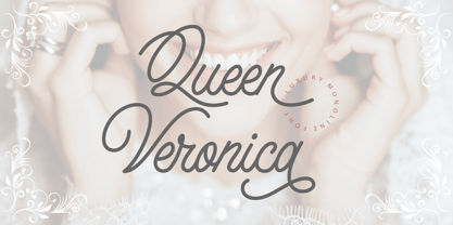 Queen Veronica is a elegant, luxury and stylish monoline script font. A handwritten and script style make this font looks natural and perfect for any projects that need handwriting taste Queen Veronica perfect for signature,quote, branding, wedding invite and card, elegant logo, poster, packaging, stationery, website, and many more. Come with open type feature with a lot of alternates, it's help you to make great lettering.
 - Stink Buster by Bogstav,
$16.00 There’s nothing stinky about this font, don’t worry! But what’s is up with Stink Buster is a whole lot of serifs gone bad! Each letter is loosely based upon the classic slab serif style, but influence by grafitti and comics just made them crooked and off the grid. But despite that, the font works great if you have a message that you want shouted out loud!
 - After Nightfall by Hanoded,
$10.00 After Nightfall is a handmade fairytale font. It was called Bunting Nook first (after a spooky story of a black dog that haunts a town in Britain), but I figured it was a bit of a weird name, so I settled for After Nightfall. This font comes with some lovely swashes, which should be used sparingly. But that, of course, is entirely up to you.
 - Ps Willy by Fontopia,
$13.99 Willy is a typeface with a wink. This display font is based on existing piquant form from the immediate vicinity. It is sexy, if you have an eye for. But it also should not be taken too seriously, especially because it has a humorous slant. The font has its origins in an art project. It is now made available for design around festifals, parties, invitations, etc.
 - Breakdance Reborn by Trustha,
$15.00 Breakdance is inspired by dance moves, the first font created with this concept is sans serif with a curved shape in one direction. Curves are made not too extreme, so that they maintain the shape balance. And now Breakdance comes in several styles and is divided into three typesface, namely script, sans and serif. Each typeface has several different styles and the total is 18 fonts.
 - Little Boy Blue by Hanoded,
$15.00 I believe it was Picasso who had a Blue Period between 1901 and 1904. It seems that I have one myself - really not comparing myself to Picasso btw… Recently I created Blue Sheep font and now this one: Little Boy Blue. Little Boy Blue is a very legible, easy-on-the-eye font for texts, books, covers and packaging. Comes with 50 shades of diacritics.
 - Stompedwide by KuleType,
$5.00 Stompedwide is a modern/futuristic and minimal looking typeface that surely will give your designs unique look and catch the eye of the reader. It works very well in projects such as logos, banners, magazine headlines. Since It's a display font It works best at big scale and It's not suitable for longer texts. It pairs nicely with modern, geometric fonts such as Montserrat. 2 weights available
 - Clarize Display by Seventh Imperium,
$24.00 Clarize Display is based on the Black style of Clarize. This version has lots of alternate characters. You can easily access them by opentype features (given PUA code). This font is perfect for designers who are working in fashion, magazine, blog, advertising, packaging, branding, etc. The family includes 2 styles: base and engraved and are multilingual. Be creative and create your best displays with those fonts.
 - Bellagium by Silverdav,
$18.00 Introducing “Bellagium font” is a serif font that is truly unique, with a more modern style and unique curves that add a special and glamorous feel to your designs. There are lots of alternates that you can use to make your designs more beautiful and charming, plus ligatures, of course, your designs will be more charming. If you have any questions, please contact us


