1,144 search results
(0.014 seconds)
- Street Rats Monoline by Sipanji21,
$18.00 Street Rats is a Handwritten font with a Realistic monoline graffiti style, with awesome swash perfect for your awesome urban designs. It will elevate a wide range of design projects to the highest levels, be it branding, headings, designs, invitations, signatures, logos, labels, and much more! Features: Uppercase Punctuation Swash PUA Encoded open Support for MAC or PC Simple installation for Adobe Illustrator, Corel Draw, Photoshop, or Procreate (New Updated) That's it! If you have any questions don't hesitate to ask! Stay Classy!
 - Hillshort by Ergibi Studio,
$20.00 Hillshort is a font type brush with additional fonts as the outline and solid that you can adjust the color to make this font look more perfect. Hillshort is ideal for urban design, logos, apparel,T-shirt,Hoodie, graffiti,quotes, product packaging, or anything which needs a typographic turbo-boost. Hillshort features comes with All Caps Uppercase & Lowercase, Numeral, Punctuation, Stylistic/Alternate Characters, and also Support Multi Language. if you have any Question please Message Me. Thank you ERGIBI STUDIO
 - Rusthack by Arterfak Project,
$18.00 Rusthack is a friendly brush font, created with the playful feels of freestyle brush-lettering. This font comes from the manual brush stroke which has an informal stroke thickness that makes the font looks more natural. The versatile design, a combination of brush lettering, and handwriting that you can apply in many themes such as urban, apparel, youth, sports, holiday, food, fashion, vintage, you name it! Fonts featured : Uppercase Lowercase Numbers Punctuation Accented characters SS01 - SS02 Ligatures Thank you for watching
 - Scarfish by Epiclinez,
$19.00 Scarfish is an urban-style handwritten brush font, with a unique brush texture. It is the best choice for creating eye-catching logos, branding, and quotes. The name scarfish was inspired by the legendary movie, scarface. The font Scarfish contains 198 glyphs. Supporting more than 66 languages, from English to Zulu. It is also PUA encoded, multilingual, and has open-type features such as ligatures. Scarfish is casual, carefree, and authentic. Handcrafted with passion and love for your awesome projects.
 - Quickat by deFharo,
$18.00 Quickat is a handwritten font, thick, condensed calligraphic style has several sets of terminal ornaments for decoration of phrases and titles. This font is drawn by hand with a pen following proportions based on the numbers of Perrin applied completely to the capital letter H and from this letter all the proportions of the rest of the alphabet are calculated according to mathematical formulas that I have been perfecting and putting into practice in my last fonts, is ideal for designing greeting cards or weddings, posters, flashy headlines or small texts.
 - Evie Sans by KTStudio,
$23.99 Evie Sans was developed in 2020 by Katy Thompson as a typeface to be used for her customisable planner / diary company PLANNER.STUDIO. The fonts have geometric proportions and subtle Art Deco influences in several of the uppercase characters, including a lowered crossbar on the H, lowered middle arm on the F and deepened bowl on the P. The family includes 6 weights in regular, italic and condensed variations, each with 216 glyphs. Evie Sans is perfect for modern branding and logo design, editorial design, web design, packaging and other projects.
 - Velour by SilkType,
$35.00 Velour is an elegant display typeface, with thin, bracketed serifs. The typeface’s main features are the curved crossbar on ‘A’ and ‘H’, the long, sophisticated legs of ‘K’ and ‘R’ including an alternative ‘k’ automatically substituted in appropriate places, providing a consistent flow of text and a romantic feel. The typeface comes with a beautiful set of both standard and old-style numerals, two different ampersands and alternates with less complicated letterforms. Velour is available in 6 weights, from Thin to Bold, and supports Western, Central and South Eastern European languages.
 - RMU Gilgengart by RMU,
$30.00 RMU Gilgengart is a revival of Hermann Zapf’s beautiful calligraphic blackletter font which was cut and first released by Stempel in 1952. This font comes with fine ligatures and swash letters. Before working with this font it is recommended to activate both OT features Standard and Discretionary Ligatures in order to get access to all ligatures. RMU Gilgengart contains the following swash letters: D, L, h, f, g, k, round s, and t, whereby you should use the small letters at the end of a word or slogan only.
 - Reforma Grotesk by ParaType,
$30.00 PT Reforma Grotesk was designed for ParaType in 1999 by Albert Kapitonov based on the letterforms of Russian pre-revolutionary hand composition typefaces: Uzky Tonky Grotesk («Condensed Thin Sans»), Poluzhirny Knizhny Grotesk («Semibold Book Sans») and Reforma, of H. Berthold and O. Lehmann foundries (St.- Petersburg). This extra compressed sans serif with distinctive letter shapes is typical for display fonts of the late 19th and early 20th centuries. For use in advertising and display typography. The face got 'Galina' prize at Kirillitsa'99 International Type Design Competition in Moscow.
 - Winery JNL by Jeff Levine,
$29.00 A rubber stamp printing set from the 1930s (or possibly earlier) was the model for Winery JNL. Containing a pleasant serif font, it also provided a few little touches unusual for such toy sets of the time. The horizontal crossbar of the H has a diamond embellishment, as does the horizontal stroke of the number 3. Additionally, the lower right tail of the G curves away from the letter and the Q has a spiral tail. Re-drawn from scans of the original stamp impressions, this typeface is available in both regular and oblique versions.
 - Page No. 508 by HiH,
$10.00 Page No. 508 was designed by William Hamilton Page in 1887 as one of a series of designs for die-cut wood types for the firm of Page & Setchell of Norwich, Connecticut. Page & Setchell was the successor to The William H. Page Wood Type Company and was sold to the Hamilton Manufacturing Company of Two Rivers, Wisconsin in 1891. 508 is a heavy all-caps font designed for headline work. It has a strong presence that reverses out well (light-colored type on a dark background). Great for retro style posters.
 - Omiwa by Orenari,
$14.00 Omiwa is a playful Display font with a unique character that is perfect for all design purposes. With unique alternate characters you can combine it into awesome waves! - This font is semi-ALL-Caps font, because some characters have lowercase (f, g, i, j, r). - The characters with Stylistic Alternates : A, H, K, M, N, R, U, V, W, X, Y I really hope your projects will be cool with this font, and please don't hesitate to drop me a message if you have any questions or you wanna share some jokes!
 - Wood Type Calendar JNL by Jeff Levine,
$29.00 Wood Type Calendar JNL is a set of components for making monthly calendar pages. Based on a set of vintage wood type numbers, the dates 1 through 31 are found on the "A-Z" and "a-e" keys; the 23/30 and 24/31 ligatures are on the "f" and "g" keys. On the "h" and "i" keys are blank outline and solid blocks for balancing the calendar layout. The "j" through "u" keys have the names of the months, and the "1" through "7" keys contain the days of the week.
 - Architectuur NF by Nick's Fonts,
$10.00Letterpress type, crafted by H. Th. Wijdeveld, founding editor and chief designer of the legendary Dutch art and architecture magazine Wendingen, provided the inspiration for this typeface. The original design graced a 1925 issue examining the work of Frank Lloyd Wright, and Wijdeveld created his typeface by assembling bits of standard brass rules. This version features several of the meanders typical of Wijdeveld’s graphic design in the dagger, double dagger, ASCII tilde and ASCII circumflex positions. Both versions of the font include 1252 Latin, 1250 CE (with localization for Romanian and Moldovan). - Academy by ParaType,
$30.00 Academy was designed circa 1910 at the Berthold type foundry (St.-Petersburg). It was based on Sorbonne (H. Berthold, Berlin, 1905), which represented the American Type Founders rework Cheltenham of 1896 (designers Bertram G. Goodhue, Morris F. Benton) and Russian typefaces of the mid-18th century. A low-contrast text typeface with historical flavor. The modern digital version was designed at Poligrafmash type design bureau in 1989 by Lyubov Kuznetsova. Corrections and additions were done later in ParaType in early 2000th. Reworked version with Bold Italic style was released in 2009.
 - Larch by Mans Greback,
$29.00 Larch is a clear and crisp high quality script typeface. It consists of five weights: White, Bright, Shaded, Dark & Black. Each style is working great separately, but they make the perfect combination together. Larch is designed by Måns Grebäck in 2016. The font supports hundreds of languages. It contains contextual and stylistic alternates, swashes and ligatures. Write # after any lowercase letter to make swashes! You can also write % after the following letters to make left swashes: b d f h i j k l t Example: Black% Lar#ch
 - Al Badlooking Brush by Aluyeah Studio,
$90.00 Badlooking Brush, the ugly duckling modern script font. Coming with 52 alternates, 9 stunning swash and super easy to use alternates. Very suitable for magazine, headline, website, ads, product package and all type of design project you have. Features: OpenType support Multilingual support (15 languages) PUA Encoded Super Easy to Use alternates - It's OpenType support but you can easily call alternates character using special combination like A.2 R.2 a.2 h.2 etc so you don't need a special software. To get results like the preview just type Badloo.2king B.2ru.2sh
 - FHA Modernized Ideal Classic by Fontry West,
$25.00 Frank H. Atkinson's book Atkinson Sign Painting was published in 1909. For decades, this book served as the manual for sign painters - a handbook for hand lettering. Atkinson’s book described techniques, layouts and several sample alphabets. Modernized Ideal Classic was inspired by one of these demonstration alphabets. Although Classic has its beginnings in art deco, it is very comfortable in any period or style of design. It is most appropriate in headline and display text, poster copy and signs. We've included some nice stylistic alternates and an interesting array of ligatures.
 - Charlonka by PleasureFonts,
$22.00 I‘d like to introduce “Charlonka“ to you. When my daughter finished high school, she wanted to get rid of her entire school stuff. So I saved a few sheets of her beautiful handwriting and promised her to create a typeface out of it. That‘s how the idea of Charlonka was born, a typeface family out of Charlotte‘s handwriting (by the way: that‘s her name). Some characters of Charlonka have extended crossbars, like in upper case A or H, and reduced descenders, like in lower case g or y.
 - Thorowgood by Linotype,
$29.99Thorowgood was originally released by the Stephenson Blake typefoundry in the UK. The types were first cut by the English typefounder Robert Thorne, predecessor of William Thorowgood, and first shown in his specimen books in the early nineteenth century. The fat face was revived in roman (1953) and italic. The S and the C appear to be smaller than the other capitals. Most serifs are flat and thin horizontals. In the italic the main strokes of h, k, m, n, and r are curved inwards at the foot. - As of my last update in April 2023, I should note that specific details about a font named "Melbylon" by Graham H. Freeman may not be widely documented or recognized in popular font directories or am...
- Awardos by upirTYPO,
$6.00 Awardos is a complete solution for awards, badges and all kind of certificates. This font allows to mix various borders, laurels and icons to create a very unique badges. To quickly create an unique badge, type any number, any uppercase character and any lowercase character, for example 0Aa, 5Gk, 9Kl, 7Fr etc. To add starfield, start with a symbol (!"#$%&'()*+,). Glyphs included: 12x starfields - characters: ! " # $ % & ' ( ) * + , 16x borders - characters: 0 1 2 3 4 5 6 7 8 9 : ; < = > ? 36x laurels and outer elements - characters: A B C D E F G H I J K L M N O P Q R S T U V W X Y Z À Á Â Ã Ã Ä Å Ç È É Ê 12x crown icons - characters: a b c d e f g h i j k l 12x cup icons - characters: m n o p q r s t u v w x 12x number one digits - characters: y z à á â ã ã ä å ç è é ê It is not required to use a symbol from every category. For example only laurel with crown icon can be used, or only starfield with the cup icon. Awardos Inverse is an inversed version. The outline borders are still included, used symbols are: [ \ ] ^ _ { | } ~ ¢ £ ¤ ¥ ¦ § €
 - Blackout - 100% free

- End of Path - Unknown license

- Rubbed - Unknown license

- Nova Caere by Eurotypo,
$39.00 Nova Caere is a typical urban calligraphy, gestural with its fast lines, with short and slightly noticeable ascender and descender traits. Condensed lower case and rounded capital letters are quite similar in height. Nova Caere has been studied for alternating upper and lower case inside the words of the text, so as to reinforce their expressive content. Stylistic variations that combine particular couples of letters have been developed, as well as some descender traits have been highlighted that can be employed to characterize words and phrases.
 - The Eldians by Maculinc,
$16.00 The Eldians is a script font inspired by films and urban life. This font is great for your next creative project such as logotypes, printed quotes, invitations, cards, product packaging, headers, letterheads, posters, clothing design, labels, etc. The Eldians are available with many variations on each character in OpenType including Uppercase, Lowercase, Numbers and Punctuation, Style, Ligature, and Titling to make it look more natural than standard fonts. You will also find additional swash added to give your text a finishing touch. Mail support: maculinc@gmail.com
 - Adventuros by Abo Daniel,
$21.00 introducing ADVENTUROS - a fresh dry brush font - This font is great for branding, packaging, logos, cards, apparel, quotes, banner, social media, and another project that needs urban style. Adventuros is All Capital fonts, but the uppercase and lowercase characters are totally different. You can combine them as you like. I also created 52 swash to complete this product. They will be a perfect combination. Features: Uppercase Lowercase Number & Punctuations International language Swash PUA Encoded Hope you love it. Grab it fast! regards, Abo Daniel Studio
 - Step Better by Ronny Studio,
$19.00 Step better font Inspired by street graffiti markings, Urban Tag comes with the iconic round tip markers, this style is often used by several graffiti artists around the world because of its very unique style, very fun to write on markers. Perfect if you want a realistic street art or hip hop style for your designs, posters, props, etc. Features : All Caps numbers and punctuation multilingual Swash / Ornament PUA encoded Please contact us if you have any questions. Enjoy Crafting and thanks for supporting us! :) Thank you
 - Azarosa by Trifásica Studio,
$9.00 Azarosa (a.sa.ˈɾo.sa) is a display font inspired by the work of the urban artist Arkano in Bogotá (Colombia). The orthogonal shapes of a continuos line adapt themselves pretty well to the architecture of the city, and the not common ductus of the letters gives a very attractive visual texture, which is always seen before read. Visually, Azarosa is related to the graffiti movement pichação in Brasil and with some nordic runes; this is why this visually "encrypted" font is not easy to read, ideal for underground purposes.
 - Gallardo by Motokiwo,
$23.00 Gallardo is custom brush lettering font with tons of alternates. It's clean, strong, and elegant script that very useful for various projects. It's great for urban style and also for vintage. You can easily customize your words with Gallardo because this font has been PUA Encoded and also support special characters for multilingual. You will also get the Prototype Version, a rough version of Gallardo. Features: Stylistic Alternates Stylistic Sets (ss01, ss02, ss03, ss04, ss05, ss06, ss07, ss08, ss09, ss10) Swash Access All Alternates PUA Encoded
 - Shinkoya by Arterfak Project,
$18.00 Shinkoya is a vintage font inspired by retro signage, carefully designed with 'one stroke brush' in all-caps letterforms, highly recommended for display. Shinkoya is a versatile font that you can use for many categories such as automotive, urban, sport, food, fashion, drinks, and more. Shinkoya has smooth round forms and natural touch that suitable for logo, apparel, logotype, retro poster, labels, signage, menu design, books, and much more! Equipped with OpenType features that you can mix and match to gives your design more playfully!
 - Yorso Square JNL by Jeff Levine,
$29.00By any stretch of the imagination, Yorso Square JNL is an imperfect font...by design! Taking a page from the elementary school projects of years past, this sans serif face is square and blocky... looking as if it was manually constructed in haste with a ruler and pencil - just as a student might do for a book report cover, science fair project or class poster. If you need a type face that shows the innocence of youth, or possibly a bit of urban audacity - Yorso Square JNL is your choice of lettering! - Street Tag vol1 by Tomatstudio,
$17.00 Street Tag vol1 is inspired from graffiti tag in urban areas in Jakarta, i also draw graffiti, tag and throw up since high school. This is originally my style, inspired from some my favourite graffiti artist, my tag style is not so tidy and i think you guys should adjust the kerning manually again, because it’s impossible to adjust them to be tidy. I also create special letter "G",“Y” and “T” in vector base, so you can edit the path as you like, combine with the original font, you can see the sample.
 - Demagogue by Hanoded,
$15.00 I was listening to the radio and a song caught my attention. It was ‘Demagogue’ by a band called the Urban Dance Squad. That song brought back memories from when I was a student, so I decided to name this font after it. Demagogue was made using a Sharpie pen and a piece of expensive paper. The result is a very legible, very neat and very bold font. Demagogue is ideal for when you want to get your message across, but hopefully not in a demagogue-ish way! ;-)
 - North Zone by Ergibi Studio,
$20.00 NORTH ZONE Urban Font is a supercharged, with extra attention to quick strokes and sharp details, NORTH ZONE It contains uppercase, lowercase and swash. NORTH ZONE is ideal for logos, apparel, t-shirts, hoodies, quotes, product packaging, or anything that needs a typographic turbo-boost and you’ll get a unique swash to accompany the font. Language Support - We've added in a great deal of extra characters to support many different languages. If there is a problem, question, or anything about my fonts, don't hesitate to ask! Big Thanks Ergibi Studio
 - Inferno Corner by Sipanji21,
$15.00 "Inferno Corner" is a 3D layered graffiti font characterized by sharp corners. Fonts like this incorporate multiple layers to create a three-dimensional effect and emphasize angular or pointed edges, often enhancing the font's dynamism and visual impact. This font is particularly fitting for various street-related projects where a bold and edgy typographic style is desired. Whether used in posters, street art, or any design endeavor aimed at the urban environment, "Inferno Corner" can lend a striking and attention-grabbing aspect to your text, contributing to the overall street-style aesthetics of your project.
 - Jocker Block by Figuree Studio,
$21.00 Introducing Jocker Block! Jocker Block is natural and strong hand-drawn brush font that combines attractive curves with a fresh urban edge; delivering a stylish brush font that is guaranteed to add an eye-catching appeal to your logo designs, brand imagery, handwritten quotes, product packaging, merchandise, social media post, or website font. Features: All Caps Font Support for MAC or PC PUA Encoded Versatile for branding, headline, or printing product Detailed dry brush markers I hope you enjoy this font. If you have questions, don't hesitate to give me a message :) Thank You!
 - Astogria Bejha by Figuree Studio,
$18.00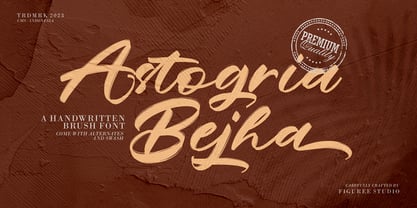 Introducing Astogria Bejha! Astogria Bejha is modern hand-drawn brush font that combines attractive curves with a fresh urban edge; delivering a stylish brush font that is guaranteed to add an eye-catching appeal to your logo designs, brand imagery, handwritten quotes, product packaging, merchandise, social media post, or website font. Features: Uppercase and Lowercase Number and Punctuation Ligature Stylistic Alternate Swash Versatile for branding, headline, or printing product Detailed dry brush markers I hope you enjoy this font. If you have questions, don't hesitate to give me a message Thank You!
 - Shary by Alit Design,
$12.00 Inspired by the modern and futuristic sans serif concept, the Shary font is bold and cool. Shary font has 54 families from thin to heavy. Besides that, the urban concept is very cool when combined with the Shary font. Apart from using capital letters for the display font, Shary also contains small letters which are cool and suitable for text. Multilingual various languages are also supported. For logotype or esport, the logo fits perfectly with this font style. Let's make Shary font as your cool font collection for future and current projects.


