4,997 search results
(0.014 seconds)
- Tattooflash Fingers by Otto Maurer,
$15.00 Tattooflash Fingers is a special Font for Finger-Tattooing. The Glyphs come in 3 Sizes for short fingers, normal fingers and long fingers. The Font is made for the little Space on a Human Finger. You can make your own Tattooflash! To Color your Tattooflash take the PART version!. After Install the Fonts you can use the part-version in Photoshop or better in Affinity Photo or Affinity Designer to color your Flash. Use the Swashes to make your tattoo flash better, make your own TattooDesign! You are a Tattooartist? This Fonts are made for YOU!
 - VLNL Thueringer by VetteLetters,
$30.00 We cannot imagine anyone not liking beer. Especially on a warm summer night there is simply little that can top an ice cold brewski. And with the current wave of home-brewed ales and lagers, Vette Letters decided to not stay behind and brew its own brand. Just so we can design our own beer bottle label using our own font. VLNL Thueringer comes from the drawing board of Jacques Le Bailly (a.k.a. Baron von Fonthausen), the German-French specialist in the fields of both beer and type design. One day Jacques got inspired by Albrecht Dürers 15th century Fraktur (blackletter) alphabet, and decided to design a contemporary rounded version of it. Although the historic context is clearly visible, Thueringer definitely stands its own ground. It's a modern techno-style blackletter with a (beer)truckload of interesting design details. Thueringer contains a number of ligatures and an alternate set of numbers. Apart from the regular uses like logos, posters, flyers and headlines we definitely would like to see our Thueringer used on beer bottle labels and crates, but also cafés and hipster bars would do well with this modern-day blackletter. Hell, even wine or liquor labels, football team jerseys, Oktoberfest flyers, it's just too much to mention. As long as it is accompanied by a cold beer.
 - Imagine if fonts could dance. Well, if any font were to throw on a pair of dancing shoes and hit the dance floor, Unity Dances by S. John Ross would be busting moves that would make even the most res...
- TV Western JNL by Jeff Levine,
$29.00 In the 1889 Franklin Type Foundry specimen book is a type face called “Armenian”. With lighter weight horizontal slab serifs than more traditional Western fonts, it could be pictured as being used as copy on wanted posters or town notices. This is now available as TV Western JNL in both regular and oblique versions.
 - Fine Dining JNL by Jeff Levine,
$29.00 The lettering for Fine Dining JNL was inspired by the opening titles for the 1940 Barbara Stanwyck-Fred MacMurray film "Remember the Night". A stylized Art Deco sans, the typeface conjures up images of elegant dining, being out on the town and all we warmly associate with the night life of the 1930s and 1940s.
 - Payback by Subectype,
$16.00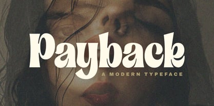 Introducing "Payback" Modern Serif font, that has own unique style & casual look. This font is perfect for an elegant & luxury logo, branding, title project, fashion brand, magazine, clothes, lettering, quotes, and so much more. Thank You. Subectype
 - Richard Samuels by Letterena Studios,
$17.00 A serif modern and classic typeface that his own unique style & modern look. This typeface is perfect for an elegant & luxury logo, book or movie title design, fashion brand, magazine, clothes, lettering, quotes, and so much more.
 - Lonely Cowpoke by 10four,
$20.00 Inspired by circus billboards, old west posters and torn paper constructs, "Lonely Cowpoke" is an oddity of bold graphic forms and cheerful curving lines. Revelling in its own quirky nature, this playful font lightens up any mood.
 - Baginda by Arendxstudio,
$12.00 Baginda is a minimalist with hand-written characters that have their own distinct characteristics that differ from previous font designs and which carries confidence. This font is very appropriate for you to put into your project designs.
 - Pickfair JNL by Jeff Levine,
$29.00Pickfair JNL is based on the vintage wood type Vandenburgh Tuscan (circa 1867), and gets its name from the mansion owned by Douglas Fairbanks and Mary Pickford—two of the founding partners of United Artists movie studios. - ITC Viner Hand by ITC,
$29.99ITC Viner Hand is the work of British designer John Viner, and it is based on his own handwriting. The warmth and familiarity of this informal script will lend a relaxed and personal touch to any application. - Rahere Esoteric by ULGA Type,
$25.00 Rahere Esoteric is a gothic-flavoured, quasi-Roman display font with an eccentric persona and more quirks than a Tim Burton film. A member of the extended Rahere typeface family, it’s the enigmatic cousin of Rahere Roman Display & Rahere Sans. This is a niche display font that doesn’t try to please everyone. Rahere Esoteric revels in its mystical aura, using a bewildering array of ligatures to magically transmute itself as characters loop, curl, jerk and strut, randomly connecting and disconnecting into words like a retro-futuristic steam train clattering along a disused railway track, challenging and delighting the reader at the same time. To add more sparkle, there are alternatives, inferior and superior caps plus a [Wicca] basketful of symbols, ornaments, weird faces and even a snake-infused ampersand. Whilst Rahere Esoteric has been designed primarily as an all-caps font, the lowercase slots contain small caps with corresponding numerals. However, because this is an arcane, unpredictable font, order and regularity are frowned upon, which means there are no tabular numerals – so company reports or accounts are a solid no! Unless they’re for the Golden Circle of Alchemists PLC or Gothic Blackstar Corporation. It is ideal for all things pagan, esoteric, alchemy, other-worldly or magic-related projects and particularly useful for music genres across the Gothic / Darkwave / Ethereal spectrum. What about legibility? Hey, look into my eyes: Esoteric is all about the mystique. If a secondary font is needed for the important stuff, I recommend its cousin, Rahere Sans, which pairs beautifully with this display font and is perfect for long passages or small text. The initial idea for Rahere Esoteric came about during a visit to Whitby, a small coastal town in Yorkshire, UK and famous for its inclusion in Bram Stoker’s novel, Dracula. A Steampunk festival was in full swing and the narrow streets of the town centre were teeming with people adorned in a glorious fusion of clothing and accessories influenced by a love of 19th-century life, science fiction, horror, fashion and art. I was fascinated by the juxtapositions of colour, patterns, material and style – archaic mechanical Sci-fi, gothic, the American Wild West and romantic Victorian. But what intrigued me the most, somehow, all the disparate elements worked as a whole. Thus, like Frankenstein, this font jolted into existence. Supported languages include Western Europe, Vietnamese, Central/Eastern Europe, Baltic, Turkish and Romanian.
 - ITC Astro by ITC,
$29.99ITC Astro is the typeface that proves you can get your work done while watching cartoons. “It all started as a series of doodles while I was watching The Jetsons,” recalls Sasa Petricic. “The show's impossibly simplistic vision of the twenty-first century cried out for a font that fit into that world -- a world where everyday objects can carry far more fun and personality than they should.” ITC Astro is the first commercial typeface design from Petricic, whose “day job” is working as a reporter for the Canadian Broadcasting Corporation. Petricic has filed stories from across Canada and around the world for CBC's flagship evening newscast, The National. His reports have also appeared on CNN and BBC Television. Petricic's work as a correspondent and video journalist have taken him to six continents, covering everything from famine and genocide in Africa to the war in Iraq. With such serious matters filling the hours of Petricic's day as a journalist, it's not hard to see why he conceived Astro as a welcome blast of whimsy. “As I began to draw the design,” he says, “I decided that every part of Astro should be a cartoon character unto itself.” Each character has its own baseline shadow (or coaster, or circular antigravity generator, depending on how you look at things). The angular caps dance jauntily, rocking from left to right, while a suite of companion small caps provide backup. The end result is a design quite unlike any other, with surprising charm and versatility. ITC Astro comes in a two-weight family of White and Black. - Quarter Braille by Echopraxium,
$20.00 Presentation QuarterBraille (Abbreviated as "QB" thereafter) is a decorative, steganographic and lattice font. Its core design concept is that Braille dots are represented as "quarters of a square"[1]. This is illustrated by posters 1 and 2 (NB: these glyph parts will be called "QB dots" thereafter). The other glyph parts (see poster 3) are purely decorative and meaningless in terms of Braille dots encoding[2]. All glyph parts are meant to generate a wide variety of patterns from horizontal and vertical combinations of glyphs. There is also a graphic convention to differentiate uppercase from lowercase letters with the presence or absence of shape subparts (in the "endings", "quarter of a circle with a ring" and "quarter of a diamond with a small square in the middle") like shown by poster 4. This font is suitable for very short texts (e.g. logos, acronyms, quotes, ambigrams, pangrams, palindromes, etc...) but on the other hand it may be used for steganographic purpose like geocaching as well as fictive alphabets (e.g. Alien/SciFi/Fantasy/Antique civilizations). Posters 1. Font Logo: the displayed text is " Quarter " followed by " Braille". There's a rainbow layer above the text to highlight the "QB dots", this is achieved by A..Z glyphs with "only QB dots" (codes 230..255) 2. Anatomy of a Glyph (L) and "QB Dots" (quarters of a square) 3. Glyphs Parts: Square and Cross (Inverted square), Circle and Inverted Circle (with or without the small circle in the middle), Diamond (with or without the small square in the middle), Inverted Square and Circle, Shape combos, Ending 4. Uppercase vs Lowercase (tiny shape subparts are shown in red) 5. Sample 1: Bathroom sink with QB tiles on the credence 6. Sample 2: Hands knuckle tatoos: "LOVE/HATE"[4] 7. Sample 3: Poker Hand: pocket Aces. It's an Ace of Hearts (Ah) on the left and an Ace of Spades (As) on the right. Like in regular cards, the card value (e.g. Ah) is displayed twice: at the top and rotated by 180 degrees at the bottom. This poster also illustrates that QB could be used to print embossed playing cards with tactile and visual display of card values. 8. Sample 4: Pangram: "Adept quick jog over frozen blue whisky mix" 9. Sample 5: Latin Magic Square: "SATOR AREPO TENET OPERA ROTAS" (NB: for compensation of the 2/3 glyph ratio, letters on each line are separated by a space: "S A T O R", ...). 10. Sample 6: Quote of Mahatma Gandhi: "Learn as if you will live forever, live like you will die tomorrow.". This is also a demonstration of border glyphs combinations. 11. Sample 7: Steganography use case: the text is a sequence of 64 aminoacids (1 Letter notation), this protein was described in a research paper "The complete Aminoacid sequence of an amyloid fibril protein AA of unusual size (64 residues) 1975". 12. Sample 8: Border Glyphs with the provided styles and mixed styles. The words are the same than in poster 9 ("SATOR AREPO TENET OPERA ROTAS"). Despite the 2/3 glyph ratio, the "TENET cross" was achieved by both inserting spaces in horizontally ("T ENE T") and by using the "thin borders glyphs". Notes a. Border glyphs[3] are meant to enhance the esthetics of text samples displayed with QB b. Special characters (e.g. *$()[].,;:&@# ...) are provided and follow the NABCC (North American Braille Computer Code) convention. c. A..Z Glyphs with only the "QB dots" are provided as demonstrated by posters 1 and 2 (A/N: this was very useful to create them). d. Glyph Map: 32..64: Special characters - 161..187: "Thin variant" of Border glyphs, 192..229: Border glyphs, 230..255: A..Z with only the "QB dots" - Codes 176 an 181 are "regular SPACE" (empty glyph). Footnotes 1. There is indeed two shapes which represent the braille dot: the "quarter of a square" and the "quarter of a cross". It's because a cross may be considered as an "inverted square" because the square corners are merged in the center. 2. That's why the SPACE glyph is only made of decorative/meaningless glyph parts (i.e. no "QB dots"). 3. For other fonts with border glyphs, please take a look at my other "decorative Braille fonts" (GoBraille, HexBraille, KernigBraille, StackBraille, MaBraille, DiamondBraille, LorraineBraille). 4. LOVE/HATE knuckle tatoos are inspired by the anthology scene from "The Night of the Hunter" movie (Charles Laughton 1955), it also appearead in "Do The Right Thing" movie (Spike Lee 1989). Disclaimer This font is not appropriate and not meant to print text documents in Braille for the blind readers audience.
 - Midkaiser by Konstantine Studio,
$19.00 Behold the allure of Midkaiser – where innovation converges with design mastery, creating an experience that transcends the ordinary. Prepare to be captivated by the future of typography! Midkaiser is not just a font; it’s a testament to visionary design. Elevate your creations with a futuristic allure that has already earned accolades across the design universe. Crafted with precision, Midkaiser boasts a seamless blend of boldness and sophistication. Empowers your brand to stand out, leaving an indelible imprint on your audience’s perception. Covers a wide variety of languages, included Vietnamese. See the details in the preview images. Ignite your creativity, transform your designs, and leave a lasting impression with Midkaiser – Your Gateway to Futuristic Tech Fonts!
 - Postale by Dear Alison,
$24.00 I recently came across an old travel journal I’d misplaced, and in it was a really rough sketch of an Italian post office. The sign lettering caught my eye while flipping through the pages, and while not my forte, I thought I’d take my stab at recreating sans-serif lettering as a font. The Postale family recaptures that old post signage and the vintage flair that appeals to me. A little reminiscing is always a good thing. You’ll find the Stylistic Alternates feature changes up the retro styled letters to a more modern sans serif styling for a handful of letterforms, if the vintage style of certain letters isn’t your cup of tea.
 - Rusticana by Linotype,
$29.99Rusticana is a part of the 1990 program Type before Gutenberg, which included the work of twelve contemporary font designers and represented styles from across the ages. Linotype offers a package including all these fonts on its web page, www.fonts.de. Rusticana was designed by Adrian Frutiger and appeared with Linotype in 1993. Its historical roots go back to the Roman Capitalis, the all caps engraved writing of ancient Rome which reached its peak in the first century. From this style evolved other Roman forms, and one, Rustica, proved particularly good for text on bronze, as opposed to in stone. The Rusticana of Frutiger has open, seemingly irregular forms which lend a distinctive rhythm to text. - Kardia by Rodrigo Fuenzalida,
$50.00 Kardia is a versatile type family that lets you compose a wide range of texts, from extensive reading materials to striking, eye-catching headlines and titles. Features include ample proportions that have been revised to maintain similar line performance across all its weights. It also has an elevated x-height which facilitates reading in small bodies, in addition to help building solid headlines. Inspired by brush lettering, it takes many features from calligraphic strokes and the foundational style, adapted to a contemporary typographic language. It has 4 weights, all of them including their corresponding italics, small caps and character set that supports Central, Western and South Eastern European, Afrikaans and many more.
 - Rotato Sans by VIP Graphics,
$8.49 Rotato Sans is a geometric sans-serif typeface that brings a fresh, modern look to any design. This minimalist but distinctive font is defined by its crisp composition and symmetrical elements — designed for optimal legibility at all sizes. Available in three different weights, Rotato leaves an understated impression of elegance & futurism! Currently available in three standard weights (more coming soon): Rotato Sans Bold – Strong and futuristic Rotato Sans Regular – Clean and crisp Rotato Sans Light – Elegant and modern FEATURES Three (3) Font Weights + Italics Numbers & Punctuation Special Characters Rotato Sans is a dynamic font that works great across various applications: from branding & logos to technology & fashion — whether in a giant heading, or paragraphs of body text.
 - Core Rhino by S-Core,
$29.00 Core Rhino is a contemporary typefamily designed by S-Core. The fonts have the mood of brushed feeling and come across as soft and gentle. Core Rhino displays warmth through its roundness and curved letterforms. Also it is legible in prints and on screens. The Core Rhino family consists of 7weights (Thin, Extra Light, Light, Regular, Bold, Heavy, Black) plus matching italics. The OpenType fonts contain complete Latin 1252, Cyrillic, Central European 1250, Turkish 1254 character sets. Each font includes proportional figures, tabular figures, numerators, denominators, superscript, scientific inferiors, subscript, fractions. If you are looking for a sans serif style font which is practical and friendly, get this family and save your time.
 - Italienne by Linotype,
$29.99Inspired by the large American wood type of the Wild West, Richard Yeend created Italienne Std in 2002. Italienne Std is both very condensed and very decorative. It sports heavy, band like serifs, reminiscent of other italienne-style fonts, like Westside. Italienne-style fonts rose in popularity during the early 19th Century, when designers were first beginning to experiment with extreme contrast within letterforms, and across lines of text. Interestingly enough, letterforms with similar designs were just as common during the 1970s as during the 1870s, so you may use Italienne Std for applications ranging from country music concerts to disco parties. Italienne Std is part of the Take Type 5 collection from Liinotype GmbH." - Neue June by Matt Chansky,
$21.00 Four years of development imbue Neue June with its uniquely crafted high x-height, enabling designers to literally and figuratively elevate layout designs. In today’s highly competitive brand marketplace, readability across communication platforms and memorability go hand in hand towards target audience retention. Neue June comes in six weights, from elegant thin to full-bodied emphatic bold, plus italics. You’ll find a robust selection of highly refined multilingual glyphs. In addition to a suite of ligatures, there are a number of extra characters, such as the estimated symbol, the number sign, and directional arrows. When the creative direction calls for sophisticated and memorable tactics—leverage the versatile 385 glyph count for big messages and easily consumable body copy.
 - Yearling by Chank,
$99.00 The Yearling fonts are inspired by old propaganda poster letter forms of the 20th century. However, they're also intended to work well in modern communications as well. Yearling was originally created to look good via fax (LOL!), and because it's based on a very rigid grid (like pixels on your screen), this font family also works well on smartphones and modern tablets, too. Short on curves and diagonals, these letterforms are a celebration of horizontal and vertical. But most importantly, this font is simple and clean and clear and direct. Nothing fancy here, just the facts, as modern as can be. Recently updated with extra language support for many voices across the world.
 - Kelaskin by Product Type,
$17.00 Introducing Kelaskin, a classic serif font that exudes elegance and sophistication. Its timeless design is perfect for any project that requires a touch of old-world charm. Kelaskin features a stylistic set that alternates on both uppercase and lowercase letters, giving you more options to customize and create unique designs. This font is versatile and perfect for a wide range of applications, from branding to editorial design. Its multilingual support ensures that your message can be conveyed across various languages and cultures without any hiccups. With Kelaskin, you can bring a touch of timeless class to your design projects. Get Kelaskin now and elevate your design to a new level of beauty and professionalism.
 - Ekeras by Type Innovations,
$39.00 Ekeras is an original design by Alex Kaczun. It is a display font not intended for text use. It was designed specifically for display headlines, logotype, branding and similar applications. Primarily a display, this extremely versatile font has generous proportions, large counters and loose fitting which also allow the font to work well across a wide range of text sizes. The entire font has an original look which is strong, dynamic, machine generated and can be widely used in publications and advertising. Ekeras is a futuristic, techno-looking and dynamic typeface with an appearance of machined-like parts with sharp and rounded edges. The large Pro font character set supports most Central European and many Eastern European languages.
 - Neue Frutiger Thai by Linotype,
$79.00 Neue Frutiger Thai was created by Anuthin Wongsunkakon and a team of designers and font engineers from the Monotype Studio, under the direction of Monotype type director Akira Kobayashi. The family is available in 10 weights from Ultra Light to Extra Black in both Traditional (loop terminals) and Modern (loop-less terminals) styles. Neue Frutiger Thai embodies the same warmth and clarity as Adrian Frutiger's original design, but allows brands to maintain their visual identity, and communicate with a consistent tone of voice, regardless of the language. It is part of the Neue Frutiger World collection, offering linguistic versatility across environments – suited to branding and corporate identity, advertising, signage, wayfinding, print, and digital environments.
 - Reverie OT by District,
$20.00 Reverie is a cheerful band of letters that bounce across the page and get together to create words in four weights. Generous spacing and a modest x-height project an airy typeface that's open but not frail. Quirky without being too whimsical. Use the regular weight for surprisingly readable text or put the light and heavy weights to use for decorative headlines and titles. Reverie OT is the follow-up to the popular Reverie. This version comes loaded with new features: ligatures, small caps, swash caps, a larger numeral set, more language glyphs, and a fourth, heavy weight. This all adds up to a vastly more functional and flexible family of fonts.
 - King Melody by Say Studio,
$15.00 King Melody is a vintage blackletter font that gives focus on contemporary display type. This vintage-made new typeface is unmistakably blackletter, However, it is accessible enough to be used across many projects, and stylistic alternates to make you design looks more attractives and italic version included King Melody Font is ideal for headings , flyers, greeting cards, product packaging, book covers, printed quotes, logotype, apparel design, and album covers, branding, Instagram, print posters, magazines, Fashion, whatever. FEATURES : - Uppercase and Lowercase letters - Numbering and Punctuations - Multilingual Support - Works on PC or Mac - Simple Installation - Support Adobe Illustrator, Adobe Photoshop, Adobe InDesign, also - works on Microsoft Word Hope you Like it. Thanks. Say Studio
 - Eagle Lake Pro by Stiggy & Sands,
$29.00 A Practical Calligraphic Hand. Eagle Lake Pro is based on the calligraphic lettering style known based on the practical Running Book Hand. It has shorter capitals that create a visually taller x-height lending to high legibility and fluidity. Classic, clean, and casual, Eagle Lake Pro fits a lot of design uses. The SmallCaps and extensive figure sets only work to further expand the usefulness of the typeface across a wider breadth of applications. See the 5th graphic for a comprehensive character map preview. Opentype features include: - SmallCaps. - Full set of Inferiors and Superiors for limitless fractions. - Tabular, Proportional, and Oldstyle figure sets (along with SmallCaps versions of the figures). - Stylistic Alternates for Caps to SmallCaps conversion.
 - Neue Frutiger Devanagari by Linotype,
$99.00 Neue Frutiger Devanagari was created by Mahendra Patel and Kimya Gandhi and a team of designers and font engineers from the Monotype Studio, under the direction of Monotype type director Akira Kobayashi. The family is available in 5 weights from Light to Extra Black, with matching italics to support the Devanagari script and languages such as Hindi. Neue Frutiger Devanagari embodies the same warmth and clarity as Adrian Frutiger's original design, but allows brands to maintain their visual identity, and communicate with a consistent tone of voice, regardless of the language. It is part of the Neue Frutiger World collection, offering linguistic versatility across environments – suited to branding and corporate identity, advertising, signage, wayfinding, print, and digital environments.
 - Da Bronx Sans by Good Gravy Type Co,
$9.00 DaBronx is an downright nifty condensed grotesque font family. It comes with 12 righteous weights. DaBronx is ready for a wide range of uses. It would look great scrolling across a screen and would give extra presence to titles and headlines in a number of different applications. DaBronx is like a finely tailored suit for your content, upright, spiffy and slick. It has been painstakingly tweaked to perfection in the Good Gravy lab to make it so easy on the eyes. It looks stellar in an ad campaign, logo design, apparel, or anything else that requires a sleek modern look. DaBronx would pair well with Koozie Script, another one-of-a-kind Good Gravy font!
 - Glimp Variable by OneSevenPointFive,
$60.00 Variable version of 'Glimp' font family Glimp Variable supports 3 axis flexibility across width, weight and italic in a single font. It also comes with the static styles available as options in the font style selection menu. It features rich set of opentype features such as stylistic sets, contextual alternates, case sensitive forms, superscripts, subscripts, fractions, and more. Glimp Variable is made to be your go-to choice for a wide range of projects, whether you're working on branding, web design, print materials, or presentations. It elevates your designs or brand effortlessly, embracing your creative vision. Variable Axis Ranges: Width - wdth - 75 to 100 Weight - wght - 100 to 900 Italic - ital - 0 to 1
 - PIXymbols Signet Shadow by Page Studio Graphics,
$29.00Monogram font provides a striking effect, giving your monogram or business logo a custom-designed look. A bordered font includes a choice of components to project your own individuality. The parts align automatically as you press the keys. - Mogula by Letterena Studios,
$17.00 A serif modern and classic typeface that has its own unique style & modern look. This typeface is perfect for an elegant & luxury logo, book or movie title design, fashion brand, magazine, clothes, lettering, quotes, and so much more.
 - Gajkley by Letterena Studios,
$17.00 A serif modern and classic typeface that has its own unique style & modern look. This typeface is perfect for an elegant & luxury logo, book or movie title design, fashion brand, magazine, clothes, lettering, quotes, and so much more.
 - Malkana by JprintStudio,
$10.00 Introducing Malkana, Malkana is inspired by classic typography and brings its own unique style to any design project. It will take your designs to the next level! Ready to use for projects, texts, letters, or whatever you want!
 - Magic Bright Script by Typestory,
$10.00 Magic Bright is a stunning and comprehensive duo font (script and serif), ideal for giving your projects a branded but friendly feel. The two included styles can be combined together perfectly but are also beautiful on their own.
 - The Wobliy by Letterena Studios,
$9.00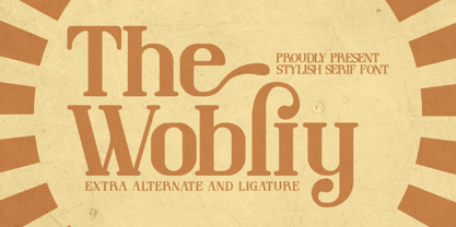 Wobliy is a classy serif font that has its own unique style & modern look. This typeface is perfect for an elegant & luxury logo, book or movie title design, fashion brand, magazine, clothes, lettering, quotes, and so much more.
 - Party Mush by PizzaDude.dk,
$20.00You can't take anything for granted when it comes to the Party Mush font - every single letter has got its own personality...and madness! This is a font that will definately kick those party invitations the right way! - Giamatti by Febri Creative,
$10.00 Giamatti is a handwritten font made with its own uniqueness. Unique, beautiful, simple font but looks elegant and professional. This font is perfect for use as logos, signatures, product names, company names, brands, promotional adverts, and much more.