6,045 search results
(0.036 seconds)
- Grand Rapids NF by Nick's Fonts,
$10.00This disarming beauty is based on a typeface named "Archer" from the 1905 specimen book from Barnhart Brothers & Spindler. The original was a rather light face; this beefed-up version highlights the face’s charming quirks quite nicely. Both versions of the font include 1252 Latin, 1250 CE (with localization for Romanian and Moldovan). - Tushy Perfume by Forberas Club,
$16.00 It's Tushy not stussy, even it's Pretty but ain't lazy. yoo what's up, this font is dedicated for you to be your crafting material. Super ready for any craft project as branding image, any tags, card maker, invitation card, greeting card, wedding decoration for your farmhouse wedding or rustic look, or decorative material.
 - Dominatrix BB by Blambot,
$20.00Dominatrix is a dirty little font who won't let up until you say the safe word. And I'm not telling you what the safe word is. This font comes with autoligatures so consecutive duplicate letters won't look identical. It also has more European characters than you can shake a leather whip at. - Joy by Yasmina Creates,
$33.00 Joy is sure to spice up your text life! She overflows with style and personality. She loves to be center stage on headlines, flirting with her readers eyes. There are over 100 ligatures, creating words with some letters connecting and others standing on their own. This creates a modern, fresh, handwritten look.
 - Hardcore by Garisman Studio,
$20.00 Hardcore is made with a fresh urban edge; delivering a stylish script which is guaranteed to add an eye-catching appeal to your logo designs, brand imagery, quotes, product packaging, merchandise, social media posts, and more. Features: - All Caps letters - Numbers & Punctuation - Simple installation Work for PC and MAC - PUA Encoded Open
 - Weedy Beasties NF by Nick's Fonts,
$10.00In Issue Number 84 of Push Pin Graphic, Seymour Chwast offered up this rather odd variant of his own extrablack, superbold in-your-(type)face, Blimp. Not recommended for body copy, but makes interesting and unusual headlines. Both versions of the font include 1252 Latin, 1250 CE (with localization for Romanian and Moldovan). - Modern Fantasy by Hanoded,
$15.00 I have no idea why I named this font Modern Fantasy: it just popped up in my head and it stuck. I don’t consider myself to be ‘modern’ (but I’m certainly not old fashioned!), nor do I have particularly modern fantasies… Modern Fantasy is an elegant all caps font: thin, tall and lovely.
 - Doohickey by Comicraft,
$19.00So your widget’s stuck between the framistat and the whatchamacallit, there’s a spanner in the works and your avengers just won't assemble. Hey, if you want to get any more work done, you know you're gonna have to hook the hoojamajigger up to the doohickey! See the families related to Doohickey: Doohickey Lower. - Rahella by Balevgraph Studio,
$12.00 Rahella is an enchanting handwritten font. This versatile script font has a wide spectrum of applications ranging from greeting cards to headlines and is guaranteed to add a romantic feel to your next project. What's Included : - Uppercase, Lowercase, Numerals & Punctuations - Ligature & Alternate - Works on PC & Mac - Simple installations - Multilingual support - PUA Encoded
 - Oishigo by GlyphStyle,
$16.00 Oishigo is a freeform handwritten font, it has a tail that goes up and down randomly which makes this font look different and beautiful. This font has many different ligatures, more than 50 ligatures and additional alternates and swashes Font feature Uppercase, Lowercase, Numerals & Punctuations, Stylistic alternate, Ss01, Ss02 50+ igature, Swashes, Multilanguage
 - Better Wednesday by Letterhend,
$14.00 Better Wednesday is a handwritten script with brush textured. This type of font perfectly made to be applied such as invitations, labels, logos, magazines, books, greeting / wedding cards, packaging, fashion, make up, stationery, novels, labels or any type of advertising purpose Features : - Uppercase & lowercase - Numbers and punctuation - Alternates & Ligatures - Multilingual - PUA encoded
 - Spikle by Valentino Vergan,
$14.00 Spikle is a unique mixed display typeface that is very eye catching. Spikle contains a mix-up of different uppercase letters from different typestyles, these distinct letter combinations will make your next project really standout. Spikle is perfect for creative project such as: branding, logos, quotes, titles, product packaging and much more.
 - Vettom by Typesketchbook,
$55.00 Vettom is a rounded-geometric typeface made up of 16 fonts across 8 weights. It’s a unique and modern sans typeface, which is well suited for a variety of typographic applications such as headlines and small texts. The Vettom font family supports multiple languages and is available as both webfont and desktop font.
 - Aldenburg by Mozatype,
$11.00 Aldenburg is a natural brush font. Aldenburg would be perfect for sports, music festivals, quotes, special events, or anything. What’s Included : - Works on PC & Mac - Easy to use ( Installations ) - Compatibility Windows, Apple, Linux, Cricut, Silhouette, and Other cutting machines Thank you for purchasing this font. Please appreciate, if you like this. ENJOY it :)
 - ClickBits by Fonthead Design,
$25.00ClickBits is a comprehensive set of web-related icons for online and print applications. The ClickBits system is made up of 792 icons and arrows in 11 fonts. Whether you need a web 2.0 starburst, icons for your blog, or graphics for your e-commerce application, ClickBits will have what you need. - NailsNStaples by Ingrimayne Type,
$14.95 In NailsNStaples the letters are made up of nails and staples. (The staples are not the staples one uses to join paper, but the kind one hammers into wood.) It is not often that one needs a typeface made of nails and staples, but if one does, there is a font for that.
 - Miamour by Tigade Std,
$35.00 Miamour is a cartoon-like and quirky display font. Get creative with its childlike style, and use it to brighten up any project. It will add an incredibly joyful touch to your designs. Add this beautiful display font to each of your creative ideas and notice how it makes them stand out!
 - Moody by Sealoung,
$12.00 Hello Moody is a fun and pretty handwritten font. This font has two forms. Fall in love with his very versatile style which has an up and down style with each letter. Use it to create gorgeous wedding invitations, beautiful stationery art, great social media posts, logos, posters, comics, funny stories and more!
 - Kathryn by Typehill Studio,
$14.00 Kathryn attracts a typeface that is smooth, clean, unique, elegant, modern, feminine, sensual, glamorous, simple and very easy to read. Classic style is very suitable to be applied in various formal forms such as invitations, labels, menus, logos, fashion, make up, stationery, letterpress, romantic novels, magazines, books, greeting/wedding cards, packaging, labels.
 - ASTYPE Ornaments Thanksgiving by astype,
$39.90 Thanksgiving uses the following OpenType features to set up to four different color layers. Small Caps/changing direction Superscript/Superior (Apples) Subscript/Inferior (Leaves) Numerator (Loops) Denominator (Flowers) Note: To get the most out of this ornament font you should use an application capable of handling different leadings like Adobe InDesign or Illustrator.
 - Whirled Peas NF by Nick's Fonts,
$10.00In his book Showcard Alphabets, Dan X. Solo called this little gem "Whitestone Scrawl". This version is beefed up slightly and the letter proportions have been altered somewhat, but it's still LOADS of fun. The Opentype version of this font supports Unicode 1250 (Central European) languages, as well as Unicode 1252 (Latin) languages. - Taniesha by Rillatype,
$17.00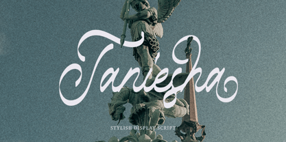 Introducing, Taniesha. Taniesha is a stylish display font with swash! This font has up to 8 alternates character set to make your design looks more eye catching! This font is perfect for logo, wedding invitation, magazines, books, packaging, stationery, novels, etc. Features : uppercase & lowercase numbers and punctuation multilingual ligatures alternates PUA encoded
 - Filmtone by Olivetype,
$18.00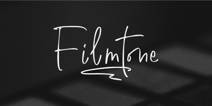 Create beautiful work with Filmtone, the perfect typeface for adding a touch of personality to your designs. With its casual style, Filmtone is perfect for headlines, invitations, posters, and more. So what’s included : Basic Latin Uppercase and Lowercase Numbers, symbols, and punctuations Multilingual Support. Simple Installations works on PC & Mac Thank You.
 - Kartoon Kutz NF by Nick's Fonts,
$10.00These charming little cartoon figures, known in the trade as "midgets", added a little extra oomph to everything from business cards to matchbook covers from the 1920s to the 1950s. Each font contains 52 different cuts, ready and waiting to spice up your layouts, and each carefully hand drawn from authentic historical sources. - Uravika Classy by Dumadi,
$14.00 URAVIKA CLASSY is a font with colorful nuances in your designs. In this amazing font you can collaborate with projects such as t-shirt designs, logos, book designs, titles, advertisements, social media branding, event titles and others. I hope you have a nice day, keep your spirits up, greetings Toni Dzulham -Dumadistyle 2020
 - Fictional Friend by Hanoded,
$15.00 No, I don’t have a fictional friend, nor an imaginary one. Never had! But that name popped up in my head and I used it for this font. Fictional Friend font is a handwritten ‘comic book’ font - sort of. It’s very legible, soft and rounded and comes with all the accents you want!
 - Old Number Ten NF by Nick's Fonts,
$10.00 Here is a faithful revival of Gothic Number Ten, released by the Cincinnati Type Foundry in the late 1800s. Not your garden-variety sans-serif, its quirky caps will warm up your headlines. Both flavors of this font feature the 1252 Latin, 1250 Central European, 1254 Turkish and 1257 Baltic character sets.
 - Zero Output by PizzaDude.dk,
$15.00 You may recognize the shapes of this font - it's because it's my Universitet font, but this time it took some beating, and turned into a grunge font! The output was Zero Output! It has 5 different versions of each letter and of course multilingual support! Go ahead and grunge up your next project!
 - Brothers Typeface by Almeera Studio,
$17.00 Introducing the new Brothers Display Typeface!!! is a luxury and glamour display typeface,certainly not the kind of typeface you see everyday and Utterly unique.This font is both modern and nostalgic and works great for logos, magazine, social media,etc. Already matched up and ready to be used together for your next design!
 - Backstreet by Letterara,
$12.00 Backstreet is a purely handwritten typeface with its own unique characteristics. It has an elegant, feminine style with good readability. Perfect for Valentine day, neon design, signatures, invitations, titles, and much more! To stay up to date for my latest job, follow me and let’s be friends because there will be many promos.
 - Bunken Tech Sans by Buntype,
$49.00 The Bunken Tech Sans superfamily: A reminiscence of constructed fonts of the modern age designed with considerably cleaner forms. Bunken Tech Sans follows in the best tradition of the straight-lined and somewhat angular structures of its predecessors while offering a much more open and mild design. The shapes of the letters are therefore reduced to the most essential elements: The spurs on a, b, n and other lower case letters occur just as little as decorative or style details, the lightly rounded inside edges are more pleasing to the eye than certain historic role models and make for a harmonic, flowing style. Use In particular Bunken Tech Sans stands out as an easy, distinctive headline font with its straight-lined, technical design. Open counters and large x-height make it equally suited for use in shorter texts. It is also perfectly complemented by Bunken Sans or Bunken Slab in longer texts (available soon). Features Available in 10 styles with widths ranging from Light to ExtraBold with associated Italics. All of the styles are very extensive: Support for at least 58 languages, Small Capitals, 9 number sets (e.g. Lining, Oldstyle, Tabular and Small Cap Figures), ligatures, alternate characters, numerous Opentype functions, and lots of other small features that make it more pleasant to work with the font on a daily basis as well as fulfilling typographic desires. Each style contains more than 870 characters! Each style is available in a professional (Pro) and standard (Std) edition with a reduced range of functions. (Language support, OpenType features and number of glyphs). Details can be found on the respective pages. Bunken Tech Sans is part of the Bunken Tech superfamily and is available in Condensed, Normal and Wide. Also of interest: The slab serif variation Bunken Tech Slab Features in Detail: 12 Weights: -Light -Book -Medium -SemiBold -Bold -ExtraBold and corresponding Italics 3 Widths: -Condensed -Normal -Wide Alternate Characters: A, E, F, L, S, e, f, t, s, y, etc. Small Capitals 5 Sets of Figures: -Lining Figures -Old Style Figures -Tabfigures -Old Style Tabfigures -Small Cap Figures Automatic Ordinals Automatic Fractions Extended Language Support and more...
 - Vinyle by Lián Types,
$37.00 Bold, rounded and super cool. Those are the attributes of my latest font “Vinyle”, french for vinyl. In this epoque where all fields of Design are giving a lot of importance and attention to Typography and Lettering, I felt it was my duty to contribute with something that could really stand alone and ‘say something else’ that just words to be read. I've found that lately in the world, regarding a finished piece of design, the role of Typography (and of letters in general) went from being secondary, (like a minor player or a supporting actor) to the most important one. People are starting to understand the beauty of a well-done letter: they want their storefronts with unique scripts, they want to drink coffee surrounded by lettered blackboards, they want to buy books with astonishing covers with swashes ‘por doquier’. I'm more than happy to be alive in a present where even the most unimaginable friends of mine, (who couldn't spot differences between comic sans and helvetica before) are now conscious of the importance of a letter, or let’s say: Of the ‘voice’ of Typography. With Vinyle I tried to make a font with power. Following the nowadays trend of, let me say, “the vintage sans renaissance”. This time I put my brushes and nibs aside and experimented with something new. It wasn't easy, if you will pardon, for me to see swashes all over the place withouth the classic calligraphic ‘thick and thins’, but with after some weeks of work I started to love them. Like I already showed you in other creations (1) let me finish with the phrase: GEOMETRY IS SEXY! TIPS Vinyle has a lot of attitude, it shouts “here I am!” it really can ‘design an entire piece’ for you with just a word or two: It was designed with a 10 degree slant on purpose so the user may rotate it (like on the posters) that amount of degrees in order to see better results. Use Vinyle with the ‘fi’ standard ligatures activates for better kerning and ligatures! NOTES (1) See my font Selfie , the ‘little sister’ of Vinyle.
 - Catalpa by TypeTogether,
$35.00 The Catalpa font family is José Scaglione and Veronika Burian’s wood type inspired design for an overwhelming headline presence. It has no regular weights, only four slender and four hulking weights. Catalpa wasn’t made to be normal; it was made to overwhelm, to stand out, to bellow. Catalpa is the first font family within a trilogy that will be released through 2020. Each of the three have a distinct purpose and their own look, but they serve a common goal: to act as a complete family covering an editorial’s wide array of needs. As the first of the three, Catalpa is the bookend font family with a headlining purpose. What requirements are there for a great headline typeface? Distinction, weight, and cohesiveness are a good start. Its distinctiveness must catch attention, it must have a range of weights applicable to its purpose, and its internal consistency and external look must create a cohesive family. Catalpa is a distinct and unified family whose weights are attuned to its single-minded purpose — headlines and large text. Catalpa has only eight styles that are divided into two ranges of weights — four very light weights (Hairline, Thin, Extralight, and Light ) and four very bold ones (Extrabold, Heavy, Black, and Extrablack). The thin and heavy ends of the spectrum also have their own variable fonts, each with one axis of weight so designers can fine-tune their work. The geometric influence of the design is more obvious in the light range, with their line thickness increasing in the classical manner. The bold weights increase more in width and substance to serve well in websites, mobile apps, posters, advertisements, and magazines that aim for impact more than spreading information. As a family, Catalpa gels in big headlines, short sentences, and isolated words. The family has many recognizable features, in the bolder weights especially, like the reversed contrast ‘S, s’ or the angular design of ‘Q, M, W, w, a, f, 2, 3’. Catalpa’s headlining mixture of geometry and quirkiness leaves an impression that is so characteristic of wood type, but designed for substrates and screens.
 - Byington by Typodermic,
$11.95 With a nod to the venerable lines of Trajan, the Byington font exudes a timeless elegance that is both classic and contemporary. Inspired by the ancient sculptures etched into Trajan’s column in Rome, this font pays homage to its traditional roots while infusing modern sophistication. Byington’s strong and beefy serifs, along with its sharp transitional curves, lend a robustness that is perfectly suited for the demands of video and other high-intensity applications. The delicate nuances of traditional design have been replaced with a bolder, more assertive aesthetic, making this font the perfect choice for those who seek both strength and beauty in their typography. What’s more, the Byington font’s lowercase is seamlessly interwoven with Sabon and Garamond, creating a harmonious balance between simplicity and refinement. Whether you’re crafting a corporate logo or designing a high-end publication, Byington is the ideal choice for those who demand the very best. Available in Regular, Italic, and Bold styles, this font is as versatile as it is stylish. So why settle for anything less than the best? Choose Byington for your next project and let its timeless elegance speak for itself. Most Latin-based European writing systems are supported, including the following languages. Afaan Oromo, Afar, Afrikaans, Albanian, Alsatian, Aromanian, Aymara, Bashkir (Latin), Basque, Belarusian (Latin), Bemba, Bikol, Bosnian, Breton, Cape Verdean, Creole, Catalan, Cebuano, Chamorro, Chavacano, Chichewa, Crimean Tatar (Latin), Croatian, Czech, Danish, Dawan, Dholuo, Dutch, English, Estonian, Faroese, Fijian, Filipino, Finnish, French, Frisian, Friulian, Gagauz (Latin), Galician, Ganda, Genoese, German, Greenlandic, Guadeloupean Creole, Haitian Creole, Hawaiian, Hiligaynon, Hungarian, Icelandic, Ilocano, Indonesian, Irish, Italian, Jamaican, Kaqchikel, Karakalpak (Latin), Kashubian, Kikongo, Kinyarwanda, Kirundi, Kurdish (Latin), Latvian, Lithuanian, Lombard, Low Saxon, Luxembourgish, Maasai, Makhuwa, Malay, Maltese, Māori, Moldovan, Montenegrin, Ndebele, Neapolitan, Norwegian, Novial, Occitan, Ossetian (Latin), Papiamento, Piedmontese, Polish, Portuguese, Quechua, Rarotongan, Romanian, Romansh, Sami, Sango, Saramaccan, Sardinian, Scottish Gaelic, Serbian (Latin), Shona, Sicilian, Silesian, Slovak, Slovenian, Somali, Sorbian, Sotho, Spanish, Swahili, Swazi, Swedish, Tagalog, Tahitian, Tetum, Tongan, Tshiluba, Tsonga, Tswana, Tumbuka, Turkish, Turkmen (Latin), Tuvaluan, Uzbek (Latin), Venetian, Vepsian, Võro, Walloon, Waray-Waray, Wayuu, Welsh, Wolof, Xhosa, Yapese, Zapotec Zulu and Zuni.
 - Compiler by Identity Letters,
$39.00 Legible, technical, clear—with a hint of retro: Compiler is a no-frills font family straight from the heart of a microprocessor. Inspired by console typefaces, the humanist sans serif typeface combines a large x-height with striking serifs on certain letters such as i and l. Those serifs evoke the aesthetics of monospace typefaces for programming. Even though Compiler is a proportional typeface, this detail improves glyph recognition and helps differentiate between individual letters. Combined with vertical stroke ends, which allow for particularly even spacing, the serifs make for an extremely legible typeface. (Even in small sizes.) Brand recognition guaranteed: Compiler is ideal for applications that require a mechanical flavor without appearing offish. You can use it for websites, apps, branding, corporate design, annual reports, signage, and many other areas with perfect results. Compiler consists of two font families; the second one is Compiler Plain. In Compiler Plain, the signature letters lose their serifs and the forms of "a" and "g" are simplified. This way, the shapes are neutralized. The technical impression recedes into the background. Both families can be combined smoothly: you might use the standard Compiler fonts for display sizes and Compiler Plain styles for body copy. For total design control, you can toggle each of the defining design elements individually from Compiler to Compiler Plain and vice versa. Just use Stylistic Sets to fine-tune your Compiler fonts. Compiler provides you with 8 weights in 4 variations: Upright, Italics, Plain Upright and Plain Italics. That's a total of 32 fonts. Each style contains more than 860 glyphs, including advanced typographic tools such as proportional and tabular figures (both lining and old-style) or small caps—something you'll rarely find in this genre. Other glyphs are optimized for display sizes, such as circled figures and various arrows. There's also a set of glyphs designed for web use: with symbols for shopping carts, hamburger menus or checkboxes, you can implement your web projects elegantly and consistently without relying on third-party tools (like an external icon font). Powered by highly productive OpenType functions, Compiler is an intermedia workhorse straight from cyberspace.
 - Portada by TypeTogether,
$35.00 For everyone wishing for a modern serif that’s as clear and readable as a sans in restrictive digital environments, meet Portada by Veronika Burian and José Scaglione. Sans serifs are commonly used on small screens to save space and carry a modern tone. Serifs may appear fickle and unsteady, pixel grids change from one product to another, and space is at a premium. Portada now provides a serif option for these restrictive digital environments, putting that old trope to rest. The screen has met its serif match. Portada was created from and for the digital world — from e-ink or harsh grids to Retina capability — making it one of the few serifs of its kind. Portada’s text and titling styles were engineered for superlative performance, making great use of sturdy serifs, wide proportions, ample x-height, clear interior negative space, and its subservient personality. After all, words always take priority in text. It’s not all business, though. Portada’s italics contain an artefact of calligraphy in which the directionality of the instrokes and the returning curves of the outstrokes give the family a little unexpected brio. Yet even the terminals are stopped short of flourished self-absorption to retain their digital clarity. When printed these details are downright comforting. Portada’s titling styles enact slight changes while reducing the individual width of each character and keeping the internal space clear. Titling italics have increased expressiveness across a few characters rather than maxing out the personality in each individual glyph. Digital magazines, newspapers, your favourite novel, and all forms of continuous screen reading benefit from Portada’s features. This family can also cover many of the needs developers have: user interface, showing data intensive apps on screen, even one-word directives and dialogs. And, as a free download, an exhaustive set of dark and light icons is included to maintain Portada’s consistent presence, whether as a word or an image. The complete Portada family (eight text styles, ten titling styles, and one icon set) is designed for extensive, clear screen use — a rare serif on equal footing with a sans.
 - Protipo by TypeTogether,
$35.00 Protipo helps information designers work smarter. Veronika Burian and José Scaglione’s Protipo type family is an information designer’s toolbox: a low-contrast sans of three text widths with a separate headline family, accompanied by an impressive two-weight icon set, and working with the advanced variable (VAR) font format. From annual reports and wayfinding to front page infographics and poster use, designers consistently turn to the simplicity and starkness of grotesque sans fonts to get their point across. Protipo is made for such environments. When designing information you may start with the headline, which in the case of this family is called Protipo Compact and comes in eight weights. From Hairline to Black, set it large, overlap it, or let it run off the page. Protipo Compact was made to hit hard and attract attention with a different character set and different proportions than the three text fonts. It sets the stage for what’s to come. Great information designers are aces at melding form and function, so we’ve stacked the Protipo family with Narrow, Regular, and Wide versions as a way of organising your information and directing the reader. Each width has seven distinct weights (light to bold) and italics, while maintaining the round-rect shapes of its DNA. Subtle details amplify its place in the typographic universe, like an ‘a’ and ‘e’ that go from solid to supple when italicising, an ‘f’ that gains an italic descender, two versions of the lowercase ‘r’ and ‘l’, and clipped corners on diagonals to keep the tight fit inherent to this kind of design work. Protipo is not meant to be loudmouthed, but stakes its claim through refinement, breadth, and impact. Some changes at first don’t seem substantial, but the Protipo family doesn’t handle text like most in its category. Protipo helps readers find and process data in a clear and unequivocal way and accounts for the complexity involved in rendering large amounts of information while still appealing to aesthetics. Protipo is ideal in all informative situations: apps, infographics, UI, wayfinding, transport, posters, display, and even internet memes. Add to all this the icon sets and upcoming variable font capability, and you’re assured a level of creativity, productivity, and impact on a much greater scale.
 - VLNL Bleek by VetteLetters,
$35.00 Bleek started its life as a logo for a rock band with the same name. This makes sense as it has distinct roots in classic rock logo design. Any rock band name set in VLNL Bleek looks instantly cool – profi logo quality! Of coarse Bleek will serve an awesome purpose as a headline font as well. Or gig flyers and posters. Or band backdrops. Just turn it up to 11! DBXL expanded the original logo into the full Heavy weight and added Light and Medium cuts. VLNL Bleek is an all caps font with uppercase and lowercase variations for maximum effect. It has a number of Open type features, like and alternate F, mirrored A and O and a TT ligature to spice up your designs. VetteLetters says: Rock on!
 - Umba Sans by TypeThis!Studio,
$29.00 UMBA Sans is a contemporary typeface designed by Anita Jürgeleit. The wide shaped curves show a new aesthetic appeal in an unexpected pleasant way. Umba Sans fulfills your corporate design needs as well as your editorial demands and helps to push your design to the next level. Thirty styles from thin to bold and matching italics - as well as small caps and alternates - help you create a contemporary design. Umba Sans provides a wide range of variations. Your design may have many faces but it all matches together. Separate styles for alternate and small caps will show up in your font menu, making sure that you stay aware of the wide range of possibilities your new favourite typeface provides. If you like our fonts, you might want to sign up at: www.typethis.studio
 - Doriss Girls by Open Window,
$- Dorriss girls were the dancing troop at the Moulin Rouge. I had the idea for this font while trying to come up with an alternative to beveling. I thought it would be interesting to create this sort of stepped effect as I've never really seen this treatment on a font before. Then my need to create chaos shows up again with Doriss Girls informal. A hand drawn take on the forms. This seemed like it would appear on an old art nouveau poster by the great Toulouse Lautrec, so there you have the genesis of this font. I've been somewhat compelled by the letterforms so I may expand and create a more normal version of this font someday with a range of weights. That would be the bees knees.