2,442 search results
(0.079 seconds)
- Breakfast Noodles by Hanoded,
$15.00 I used to be a tour guide and spent a lot of time in Asia. One thing that I really liked, was having noodles, ANY kind of noodles, for breakfast! Breakfast Noodles is a very uncomplicated headline font: I made it while seriously renovating our ‘new’ home (a fixer upper farm), which means that this particular font was made over a period of almost 3 months… It wasn’t exactly a letter at a time, but close. I will try and make the next font in, say, under two months… Hopefully! In the meantime, enjoy this one!
 - Plantain by CastleType,
$49.00 Plantain Stencil is based on Plantain which in turn is my interpretation of Plantin Adweight, which was one of my first commissioned projects (by Smarter Image, long before they went bankrupt). Plantin Adweight is one of the most beautiful designs of the Plantin family, which is a modern revival typeface, cut under the direction of F. H. Pierpont in 1913, who based the design on that of a famous 16th century printer, Christophe Plantin, for whom Pierpont’s font was named. The stencil cut of Plantain adds a bit of sparkle to the design. Supports most European languages that use the Latin alphabet.
 - Zzzap by Comicraft,
$19.00 Run your hand under the tap and then thrust your fingers in the electrical outlet nearest to you* and you'll get the same effect that our latest release, ZZZAP will have on comic book readers everywhere when Electro, The Shocker, Black Lightning, Storm and Darth Sidious turn the dark side of the force on them. *The management accepts no responsibility for any adverse effects experienced by comic book font users who stick moistened digits into the power supply after installing this font for the purposes of comparison (it's probably best to just take our word for it). Batteries not included, void where prohibited.
 - Frutiger Arabic by Linotype,
$149.00 Neue Frutiger Arabic was created by Nadine Chahine and a team of designers and font engineers from the Monotype Studio, under the direction of Monotype type director Akira Kobayashi. The family is available in 10 weights from Ultra Light to Extra Black. Neue Frutiger Arabic embodies the same warmth and clarity as Adrian Frutiger's original design, but allows brands to maintain their visual identity, and communicate with a consistent tone of voice, regardless of the language. It is part of the Neue Frutiger World collection, offering linguistic versatility across environments – suited to branding and corporate identity, advertising, signage, wayfinding, print, and digital environments.
 - Urbane Adscript by Device,
$39.00 Urbane Adscript is a script companion to Urbane. A monoline semi-linking sans, it has the same number of weights and the same cap height and x-height as the Urbane family, meaning the two can be used together harmoniously. It features swash capitals that can be toggled on or off in the Opentype panel, or chosen individually from the Glyphs menu according to taste. Almost every capital has a swash alternate, and many have two. In Adobe Illustrator, the more decorative swash can be found under “swash”, the less decorative as an alternate. Also includes lining, tabular and old-style numerals.
 - Sandbox by Red Rooster Collection,
$60.00 Sandbox was inspired by designs created by the Robert D. DeLittle Foundry in York, England, sometime after 1888. At the time, the fonts were simply grouped under the title #260 in the DeLittle catalog. This new font family was completely redrawn and engineered by Steve Jackaman, and several additional weights were designed to give the family improved flexibility. Sandbox was given its new name because it showcases a playful and bold feel, and contains many fun alternate characters and ligatures. It excels in display, but can still lend a carefree feel to subhead and text sizes.
 - Dazzle by Device,
$29.00 Op-art never looked so good. Taking a cue from the popularity in the 1970s of deco Prismas and their related contemporary interpretations, this geometric font updates the trend. Overlap text in different colours or black and white for eye-teasing moiré combinations. An image above illustrates the use of Dazzle Underprint, a uniform-width version of the font that is placed under Dazzle and used to create two-colour effects simply and easily. Dazzle Underprint is not intended for solo use, only as an underprint — please see Dazzle Unicase for a range of undecorated weights.
 - Marconi by Linotype,
$29.99 Marconi was created by Hermann Zapf in 1973. According to Gerard Unger, it was the world's first digital typeface. Zapf’s design was developed as a text face for books and magazines. The round forms of the Marconi follow the principle of the superellipse. The lowercase letters are enlarged as the result of reading tests, while the capital letters are slightly reduced. The 8-point size — normally used for newspapers — looks more like 9 1/2 points. Marconi is a legible typeface with its large and open lowercase letters. It is ideal for long text blocks in newspaper, book, and magazine production.
 - Crimmy by HansCo,
$15.00 Crimmy is a modern and clean brush with natural a handwritten font. This texture is very detailed. You can see the swash brushes as alternate characters in this font. Crimmy is suitable for logos, shirts, fashion, blogs, websites, product branding, posters, flyers, any print template or for text overlay to any background image. How to use alternate: if you use Adobe / Corel Draw you just block one of the letters / numbers (for swash) and an arrow will appear under the letter, and you can replace it with alternative characters. Alternative character ready for " f , g , j , y and numeral 0 - 9 "
 - Bright Sun Light by Epiclinez,
$18.00 Introducing Bright Sun Light, a playful display font from Epiclinez! With its unique character and happy vibe, this font is sure to make your designs stand out. Whether you're creating logos or product packaging, or want something fun for your headlines, look no further than Bright Sun Light. Its cute, bubbly, and laid-back style brings joy to everyone who sees it! Get ready for some sunny vibes with Bright Sun Light! Bright Sun Light font includes : Basic Latin Uppercase and Lowercase Under Swashes Numbers, symbols, and punctuations Multilingual Support. Simple Installations works on PC & Mac Thank You!
 - PGF Elyss by PeGGO Fonts,
$29.00 Download PGF Elyss specimen Document: https://peggofonts.com/download/PGF-Elyss_(Specimen-2022).pdf In the lapse of one and a half year, what's started as a simple font idea turned into a huge multi style project, that we present to you today. Inspired by Jean Larcher's calligraphic work. This adventure began with a classic Roman set, then we added a Lombardic, an Elegant Script, and finally a Catchwords and Ornaments set. All under the influence of Art Nouveau organic look, that makes PGF Elyss an ideal project for label, header and cover design, it can even handle over than +200 latin based languages.
 - Botham Grotesque by Aiquitype,
$15.00 Introducing Botham Grotesque, a versatile typeface meticulously crafted to embody the essence of modernity and sophistication. This exquisite font, classified under the renowned Grotesque category, boasts four distinct styles that seamlessly blend form and function. Its clean lines and balanced proportions lend a professional, making it an ideal choice for a myriad of applications, from corporate branding to editorial design. What’s Include ? 1. Uppercase, Lowercase, Number and Punctutation 2. Ready 4 Style : Condensed, Semi Condensed, Reguler and Semi Ektended 3. Multilingual Support 4. Ligature and Alternate 5. Installed on Mac and Windows 6. PUA Encode Enjoy our Font.
 - Hyperspace Race by Swell Type,
$20.00 It had to happen: we reached into the future and returned with the ultimate hyper-wide hyper-condensed hyper-thin hyper-bold font: HYPERSPACE RACE! It boldly goes where no sci-fi font has gone before, with WARP SPEED MODE (149 custom connecting letter pairs), alternate letters without connections, Variable Font for unlimited adjustment of Weight, Width & Slant, and character support for 211 European and Asian languages, including Russian, Serbian/Macedonian, Ukranian & Vietnamese. See the Variable and Opentype features in action as I re-create 15 familiar sci-fi logos in under two minutes with the Variable Font!
 - Hijrah by Omotu,
$17.00 Hijrah! A blackletter display font with 2 styles, regular (clean) and textured (stamped). Hijrah is perfect for logos, apparel, T-shirt, Hoodie, product packaging, or anything else. What's Included? 1. Uppercase and lowercase characters 2. Supports international languages 3. Numerals, punctuations, stylistic alternates, stylistic sets 4. Accessible in the Adobe Illustrator Glyphs panel, or under Stylistic Alternates in the Adobe Photoshop OpenType menu, Adobe InDesign, Corel Draw, even work on Microsoft Word. Thanks for looking, and I hope you enjoy it! Please don't hesitate to drop me a message if you have any issues or queries. (ibnu.blawong2@gmail.com)
 - Dambera by Tour De Force,
$25.00 Dambera is a made up word I used as planet name in my first comic published in a kids magazine when I was 6 years old. Dambera font has pretty similar reference - it's a simple script font I initially designed for wedding invitations and restaurant menus, but it can have wide appliance in every design field, from posters, book covers, outdoor signes to labels and packages. It contains a set of stylistic ligatures and swash alternates, as well as a small set of floral dingbats. Also contains a set of characters with specific endings (in OpenType terminology, better known under FINA term).
 - Breitkopf Fraktur by profonts,
$39.99Breitkopf Fraktur was designed by Johann Gottlob Immanuel Breitkopf (1719-1794), the well-known type designer and printer of Leipzig. Breitkopf's high reputation is based on a system of printing musical notes which was developed by him. 1793, in the final stage of his life, he designed this beautiful broken script named after himself.Breitkopf Fraktur is classified as broken", something created by the German renaissance. Broken, because all round parts of the lower case characters in such typefaces look broken.Ralph M. Unger redrew and digitized this font exclusively for profonts in 2003. His work is based on artwork taken from old font catalogues." - Jazz Guitar JNL by Jeff Levine,
$29.00 Latin music was all the rage in the United States from the 1930s through the 1950s and songs with a “South of the Border” or “Old Mexico” theme were plentiful. The 1940 sheet music for “Make Love with a Guitar” evoked the idea of serenading one’s lovely lady on horseback while strumming the guitar. ..at least if you went by the by the illustration under the song’s name. As the hand lettered title was rendered in an Art Deco design, it became the basis for Jazz Guitar JNL [which seemed a more befitting name], and is available in both regular and oblique versions.
 - Tsanger Yun Hei SC by Tsanger,
$198.00 Tsanger Yunhei was designed and published by Tsanger. Tsanger Yunhei contains 8 styles and family package options. The designer has made unique treatment on the shape and structure of the pen, based on the Chinese calligraphy style and writing, which makes it easier to identify under the same size of the font and group reading effect better. Tsanger Yunhei is more in line with the aesthetic habits of Chinese characters getting the reading an easy task. This font adopts GB 2312—1980 standard, with a total of 6763 Chinese characters, matching Latin letters, Greek letters, Hiragana, Katakana, Russian Cyrillic letters, etc.
 - Salim by Omotu,
$18.00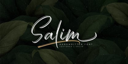 Salim is a handwritten brush font with 2 styles, regular (brush texture) and solid. Salim is perfect for branding, logotype, apparel, T-shirt, Hoodie, product packaging, quotes, flyer, poster. Comes with Uppercase and lowercase characters, Supports international languages, Numerals, punctuations, ligatures, stylistic alternates, and stylistic sets. Accessible in the Adobe Illustrator Glyphs panel, or under Stylistic Alternates in the Adobe Photoshop OpenType menu, Adobe InDesign, Corel Draw, even work on Microsoft Word. Thanks for looking, and I hope you enjoy it! Please don't hesitate to drop me a message if you have any issues or queries.
 - Eckhardt Informal JNL by Jeff Levine,
$29.00 Eckhardt Informal JNL was found in a Dan Solo alphabets book under the name "Circus Wagon". This hand-lettered design with a playful inline is reminiscent of the show cards of the 1940s and 1950s. The Eckhardt series of typefaces is named in honor of the late Al Eckhardt, Jr. - a good friend of type designer Jeff Levine whose talents in hand-crafting attractive lettering was appreciated by many. His work, like the others before him is fast become a lost art in today's technology-driven world. Eckhardt Informal JNL is available in it's regular (inline) version and also as a solid version.
 - Linotype Laika by Linotype,
$29.99Linotype Laika is part of the Take Type Library, chosen from the entries of the Linotype-sponsored International Digital Type Design Contests of 1994 and 1997. This fun font was created by Dutch designer Mark van Wageningen, who based its forms on those of a sans serif font but gave them wavy, irregular contours. They look almost as though they lie just under the surface of a pool and the movement of the water gives them their undulating appearance. The dynamic Linotype Laika is especially good for headlines in larger point sizes or shorter texts in point sizes of 14 or larger. - Mariott by Omotu,
$22.00 GRINDS! A handwritten display brush font, all caps. GRINDS font is suitable for branding, logotype, apparel, T-shirt, Hoodie, product packaging, quotes, flyer, poster, book cover, advertising, etc. Whats Include? Opentype support Multilingual support PUA encoded Features: All uppercase, numerals, punctuations, and ligatures Accessible in the Adobe Illustrator Glyphs panel, or under Stylistic Alternates in the Adobe Photoshop OpenType menu, Adobe InDesign, Corel Draw, even work on Microsoft Word Please message me if you're unsure of any language support. Thanks for looking, and I hope you enjoy it! Please don't hesitate to drop me a message if you have any issues or queries.
 - Neue Frutiger Vietnamese by Linotype,
$29.00 Neue Frutiger Vietnamese''' was developed by a team of designers and font engineers from the Monotype Studio under the direction of Monotype type director Akira Kobayashi. The family is available in 10 weights from Ultra Light to Extra Black, with matching italics. Neue Frutiger Vietnamese embodies the same warmth and clarity as Adrian Frutiger's original design, but allows brands to maintain their visual identity, and communicate with a consistent tone of voice, regardless of the language. It is part of the Neue Frutiger World collection, offering linguistic versatility across environments – suited to branding and corporate identity, advertising, signage, wayfinding, print, and digital environments.
 - Speed Line by Raditya Type,
$15.00 If you are looking for a neat vintage font, Speed Line is a very appropriate choice. It can be applied for various purposes. This font is perfect for logotype, headline, apparels, quotes, posters, labels with vintage and exclusive feels. What's included? 1. Uppercase and lowercase characters 2. Supports international languages 3. Features: Uppercase, Lowercase, numeral & punctuation, multilanguage, initials, ligatures, and trails 4. Accessible in the Adobe Illustrator Glyphs panel, or under Stylistic Alternates in the Adobe Photoshop OpenType menu, Adobe InDesign, Corel Draw, even work on Microsoft Word. 5. PUA Encoded Characters - Fully accessible without additional design software. Thanks You
 - News Gothic BT by Bitstream,
$29.99 The standard American sanserif of the first two thirds of the twentieth century, prepared for ATF by Morris Fuller Benton in 1908 under the name News Gothic, with a matching lightface known as Lightline Gothic. Linotype’s Trade Gothic follows News Gothic except for its widely-spaced straight-sided boldface based on ATF Alternate Gothic No.3. Linotype matches News Gothic Bold, a boldface version that originated at Intertype, with Trade Gothic Bold No.2. Ludlow Record Gothic follows News Gothic more loosely. News Gothic BT™ font field guide including best practices, font pairings and alternatives.
 - ITC Lintball by ITC,
$29.99Eric Stevens's latest typeface, ITC Lintball, combines two unusual features: its letterforms are based on the serifless lettering inscribed in stone by the ancient Greeks, yet the wobbly edges of the strokes, and especially the slightly wider “lintballs” on the ends, suggest lettering done on paper with a modern felt-tip pen. The ball motif is carried through in the fat dot under the raised capital O, and in the similar dot used in place of a crossbar in the capital A. There's an angularity to many of the strokes, especially in the lowercase, that gives Lintball its distinctive character. - LTC Jenson by Lanston Type Co.,
$24.95 Jenson Oldstyle was designed by J. W. Phinney of the Dickinson Type Foundry in 1893. Jenson is based on the 'Golden Type' designed by William Morris in 1890 for his private press editions under the imprint of the Kelmscott Press. The original digital Lanston version of this face included a companion Oblique. This remastered set instead features a true italic based on the 1893 ATF italic version as well as a newly digitized Jenson Heavyface based on Phinney's design of 1899. Jenson Italic Pro features alternate lowercase forms based on ATFs then contemporary Cushing Oldstyle Italic.
 - Dalgonis Brush by ijemrockart,
$15.00 Dalgonis Brush is handmade script font with stunning characters. Ideal for logos, name tag, handwritten quotes, product packaging, merchandise, social media & greeting cards. It contains a full set of lower & uppercase letters, a large range of punctuation, numerals, and multilingual support. The font also contains several alternatives for lowercase characters, accessible in the Adobe Illustrator Glyphs panel, or under Stylistic Alternates in the Adobe Photoshop OpenType menu. But If you don't have any opentype specific software, you can still use Collatin as is with its standard lowercase and uppercase letters. - Files Included Dalgonis Brush.otf Dalgonis Brush.otf Thank You.
 - PGF Dinos by PeGGO Fonts,
$29.00 “PGF Dinos” is a low contrast round typeface that resembles handmade American ‘Sign Painting’ in such the upper portion of the characters is bigger than the lower one, what gives the font a more playful and friendly personality. Another remarkable feature is its hooked terminals in characters such as C, G or S, heightening the differences between similar characters. “PGF Dinos” Family is composed of 10 different weights ranging from Hairline to Extra Black plus Italics and a full set of Dingbats. Early version was originallly called as “Globa” and was developed under the supervision of the Latinotype Team. Designer: Pedro González.
 - Neue Frutiger Arabic by Linotype,
$79.00 Neue Frutiger Arabic was created by Nadine Chahine and a team of designers and font engineers from the Monotype Studio, under the direction of Monotype type director Akira Kobayashi. The family is available in 10 weights from Ultra Light to Extra Black. Neue Frutiger Arabic embodies the same warmth and clarity as Adrian Frutiger's original design, but allows brands to maintain their visual identity, and communicate with a consistent tone of voice, regardless of the language. It is part of the Neue Frutiger World collection, offering linguistic versatility across environments – suited to branding and corporate identity, advertising, signage, wayfinding, print, and digital environments.
 - Bebas Neue by Dharma Type,
$- Bebas Neue is a free font which is licensed under the SIL Open Font License 1.1. Designed by Ryoichi Tsunekawa. - Bebas Neue Pro has lowercases and Italics. - Bebas Neue SemiRounded are some derived, Semi rounded fonts from this Bebas Neue. - Bebas Neue Rounded are some derived, rounded fonts from this Bebas Neue. - Mocha Mattari is a distressed, vintage-effected font based on this Bebas Neue. When you need more impact for titling, please try our Kaneda Gothic, Dharma Gothic and Rama Gothic. When you need body-text font matching with this Bebas family, please try our Bio Sans font family.
 - Broneo by Omotu,
$16.00 DETAILS Broneo! A handwritten script font. Broneo font is perfect for branding, logotype, apparel, T-shirt, Hoodie, product packaging, quotes, flyer, poster, etc. Whats Include? 1. Uppercase and lowercase characters 2. Supports international languages 3. Numerals, punctuations, ligatures. 4. Accessible in the Adobe Illustrator Glyphs panel, or under Stylistic Alternates in the Adobe Photoshop OpenType menu, Adobe InDesign, Corel Draw, even work on Microsoft Word. Please message me if you're unsure of any language support. Thanks for looking, and I hope you enjoy it! Please don't hesitate to drop me a message if you have any issues or queries. Omotu
 - Lavenda by Aga Silva,
$29.99 Lavenda font is a result of my two year classic calligraphy studies, and is based on my own handwriting. The overall look is classic, which makes it a match for invitations, place cards or other paper goods where old time elegance is required. With the glyph count just under 1500 the font has many alternates and options which makes it flexible to use. Apart from swashes, alternates and ligatures - number of fancy dingbats is also included. Again, with vast number of glyphs contained should you write in other language than English - Lavenda comes as a natural choice.
 - Namira by Omotu,
$12.00 Namira is a modern calligraphy script font. Namira is suitable for branding, logotype, apparel, T-shirts, Hoodies, product packaging, quotes, flyer, poster, advertising, and more. What's Included? 1. Uppercase and lowercase characters 2. Multilingual support 3. Numerals, punctuation 4. Accessible in the Adobe Illustrator Glyphs panel, or under Stylistic Alternates in the Adobe Photoshop OpenType menu, Adobe InDesign, Corel Draw, even work on Microsoft Word. Please message me if you're unsure of any language support. Thanks for looking, and I hope you enjoy it! Please don't hesitate to drop me a message if you have any issues or queries. Omotu Studio
 - Swiss Folk Ornaments by Gerald Gallo,
$20.00 Swiss Folk Ornaments were inspired by old Swiss embroidery designs. Swiss Folk Ornaments - Critters & Things is composed of critters (animals) and other things, hearts, pitchers, and a basket. In the character set all critters face to the left. In the shift+character set, under each respective key, all critters face to the right. There are a total of 72 ornaments in this font. Swiss Folk Ornaments - Floral is composed of floral designs. There are a total of 56 ornaments in this font. Swiss Folk Ornaments - Geometric is composed of symmetrical geometric designs. There are a total of 42 ornaments in this font.
 - Audela by Fontfabric,
$40.00 Surpassing traditional Antiqua, our new collaborative font family Audela emerges after overcoming time, national borders, language differences, cultural gaps, and professional challenges. Starting off as an exercise project of our very first intern Léa Bruneau in 2018, Audela slowly shaped into a full-fledged elegant serif typeface of 14 styles under the watchful eye of Plamen Motev, Fontfabric’s Type Director. Three years later, Audela is internally regarded as a breaker of limits earning its name from the French “au-delà,” meaning “beyond.” This new rising star features sharp serifs, flowing letterforms, advanced OpenType features, Extended Latin and Cyrillic support, to name a few.
 - Maison Luxe by FontMesa,
$25.00 Maison Luxe is a revival of a very old font designed in France in or around the year 1820. You may have seen this font in the past under the names of Circus, Roma, Madame and Gillé Classic. As of November 2016 we have changed the name of this font from Gillé Classic to Maison Luxe which means Luxury House in French. For many years Joseph Gillé was credited as the original designer of this font however we've recently been contacted by a type historian in France reporting that he could not find any evidence supporting Joseph Gillé as the designer and to the best of his knowledge an artist by the name of Sylvestre may be the true designer. If you love this classic font then you're sure to enjoy the alternate version also with a matching lowercase available from FontMesa under the name of Home Style. This version of the classic with its squared off shadow is true to the original design where Home Style has diagonal lines creating a cast shadow. New in 2016 for Maison Luxe is a new matching lowercase, an uppercase German Double S (versal eszett), Greek character set, opentype features including case sensitive forms and old style numerals. We know you'll enjoy the new additions to this timeless classic design.
 - Erotica by Lián Types,
$49.00 “A picture is worth a thousand words” and here, that’s more than true. Take a look at Erotica’s Booklet; Erotica’s Poster Design and Erotica’s User’s Guide before reading below. THE STYLES The difference between Pro and Std styles is the quantity of glyphs. Therefore, Pro styles include all the decorative alternates and ligatures while Std styles are a reduced version of Pro ones. Big and Small styles were thought for better printing results. While Big is recommended to be printed in big sizes, Small may be printed in tiny sizes and will still show its hairlines well. INTRODUCTION I have always wondered if the circle could ever be considered as an imperfect shape. Thousands of years have passed and we still consider circles as synonyms of infinite beauty. Some believe that there is something intrinsically “divine” that could be found in them. Sensuality is many times related to perfectly shaped strong curves, exuberant forms and a big contrasts. Erotica is a font created with this in mind. THE PROCESS This story begins one fine day of March in 2012. I was looking for something new. Something which would express the deep love I feel regarding calligraphy in a new way. At that time, I was practicing a lot of roundhand, testing and feeling different kinds of nibs; hearing the sometimes sharp, sometimes soft, sound of them sliding on the paper. This kind of calligraphy has some really strict rules: An even pattern of repetition is required, so you have to be absolutely aware of the pressure of the flexible pen; and of the distance between characters. Also, learning copperplate can be really useful to understand about proportion in letters and how a minimum change of it can drastically affect the look of the word and text. Many times I would forget about type-design and I would let myself go(1): Nothing like making the pen dance when adding some accolades above and below the written word. Once something is mastered, you are able to break some rules. At least, that’s my philosophy. (2) After some research, I found that the world was in need of a really sexy yet formal copperplate. (3) I started Erotica with the idea of taking some rules of this style to the extreme. Some characters were drawn with a pencil first because what I had in mind was impossible to be made with a pen. (4) Finding a graceful way to combine really thick thicks with really thin hairlines with satisfactory results demanded months of tough work: The embryo of Erotica was a lot more bolder than now and had a shorter x-height. Changing proportions of Erotica was crucial for its final look. The taller it became the sexier it looked. Like women again? The result is a font filled with tons of alternates which can make the user think he/she is the actual designer of the word/phrase due to the huge amount of possibilities when choosing glyphs. To make Erotica work well in small sizes too, I designed Erotica Small which can be printed in tiny sizes without any problems. For a more elegant purpose, I designed Erotica Inline, with exactly the same features you can find in the other styles. After finishing these styles, I needed a partner for Erotica. Inspired again in some old calligraphic books I found that Bickham used to accompany his wonderful scripts with some ornated roman caps. Erotica Capitals follows the essentials of those capitals and can be used with or without its alternates to accompany Erotica. In 2013, Erotica received a Certificate of Excellence in Type Design in the 59th TDC Type Directors Club Typeface Design Competition. Meet Erotica, beauty and elegance guaranteed. Notes (1) It is supossed that I'm a typographer rather than a calligrapher, but the truth is that I'm in the middle. Being a graphic designer makes me a little stubborn sometimes. But, I found that the more you don't think of type rules, the more graceful and lively pieces of calligraphy can be done. (2) “Know the forms well before you attempt to make them” used to say E. A. Lupfer, a master of this kind of script a century ago. And I would add “And once you know them, it’s time to fly...” (3) Some script fonts by my compatriots Sabrina Lopez, Ramiro Espinoza and Alejandro Paul deserve a mention here because of their undeniable beauty. The fact that many great copperplate fonts come from Argentina makes me feel really proud. Take a look at: Parfumerie, Medusa, Burgues, Poem and Bellisima. (4) Some calligraphers, graphic and type designer experimented in this field in the mid-to-late 20th century and made a really playful style out of it: Letters show a lot of personality and sometimes they seem drawn rather than written. I want to express my sincere admiration to the fantastic Herb Lubalin, and his friends Tony DiSpigna, Tom Carnase, and of course my fellow countryman Ricardo Rousselot. All of them, amazing.
 - Custer by Font Bureau,
$40.00 In 2009, a book from 1897 in the library of the University of Wisconsin caught David Berlow’s attention. It was set in a clear text face—a predecessor of Bookman—cast by the Western Type Foundry who called it Custer. Upon noting how well the typeface worked in sizes of 6 and 7 points, Berlow developed it into a member of the Reading Edge series specifically designed for small text on screen. Custer RE was a broad and approachable typeface drawn large on the body with a tall x-height to maximize its apparent size when set very small. This was the beginning of the newly expanded series; in 2020, Berlow added new optical sizes and weights, growing the original design’s versatility up to headline sizes.
 - Marian Churchland by Comicraft,
$39.00 Tall, thin and elegant, Marian Churchland’s fonts are very much like her.. and now available from those awfully nice chaps at Comicraft to allow you to pretend that you are too! Marian Churchland was born in Canada in 1982, and was raised on a strict diet of fine literature and epic fantasy video games. She has a BA in Interdisciplinary Studies (English Literature and Visual Arts) from the University of British Columbia, and has been doing professional illustration work, including book covers and magazine articles, since she was 17. Last year, she became the first woman to solo-illustrate a CONAN story, and this year she’s illustrating three issues of ELEPHANTMEN for Image Comics. See the families related to Marian Churchland: Marian Churchland Journal.