10,000 search results
(0.048 seconds)
- Fellicia Grace by Create Big Supply,
$15.00 Introducing Brenatte Script, a luxurious and exquisite handwriting font that adds a touch of elegance to your design projects. This script font embodies natural beauty and sophistication, perfect for creating stunning logos, branding materials, invitations, and more. With its impressive features like uppercase and lowercase letters, numbers, and punctuation, Brenatte Script offers versatility and creative possibilities. It supports multiple languages, ensuring seamless communication across different regions. The ligatures and PUA encoding enhance the overall aesthetic, providing a seamless and smooth writing experience. Enhance your designs with the opulence of Brenatte Script Luxury Handwriting Font
 - Bernhard Fashion by Monotype,
$40.99The German-born designer Lucian Bernhard designed Bernhard Fashion in 1929. An American" typeface, Bernhard's original design was created for the American Type Founders (ATF). It bespeaks the spirit of the roaring 20s. The hairline-thin letters exhibit elongated ascenders (but not descenders), and many stylized elements. The capital letters also all descend visibly below the baseline. In text, the extra large capitals seem almost like drop caps. This typeface is best used sparingly in text. Largely set headlines will allow readers to enjoy the fashionable quality of Bernhard Fashion's design." - Radar by Type-Ø-Tones,
$60.00 Radar is a revival of the sans serif typeface “Grotesca Radio”, from the Spanish foundry Richard Gans, which existed from 1888 to 1975. His authorship is attributed to the German type designer and master punchcutter Carl Winkow. Although the new version of this font has always tried to keep accurate similarities with the original typeface, Radar is not intended as a strict revival, but as a contemporary interpretation. In this new version the user can find some alternate characters that give the typeface a more art-déco or neutral flair.
 - Cheltenham by Bitstream,
$29.99 Daniel Berkeley Updike seems to have stimulated the architect Bertram G. Goodhue to design the prototype in 1896 for Ingalls Kimball at the Cheltenham Press. Six years later Morris Fuller Benton at ATF developed it into the design and then the series that we know today. “Owing to certain eccentricities of form,” writes Updike, “it cannot be read comfortably for any length of time.” But he concludes: “It is, however, an exceedingly handsome letter for ephemeral printing.” Mergenthaler bought composing machine rights to the original design c. 1896, but bought the Benton design in 1904.
 - Slam Rounded by Wiescher Design,
$12.00 »SLAM« is my new, very sturdy but elegant slab-serif font family. I designed this font family with body copy in mind and gave it all the glyphs necessary for use with all latin writing languages. I also gave the fonts all kinds of different numerals as well as a complete set of small caps and overall extensive kerning. It comes in eight rounded weights with corresponding oblique cuts and it comes in a normal version and corresponding obliques as well. Enjoy this original font, it is a real work horse!
 - Dahaut by Scriptorium,
$12.00Dahaut is a stylized, modernistic uncial variation. The idea for this font came from a small sample of hand lettering in a title on a book by Peter Tremayne. The idea of a bolder, more angular variation on uncial script seemed intriguing, so we developed it into a full font. It should work very well for titles and catches the eye by presenting traditional uncial letter forms in an almost futuristic style. For those who care about such things, the name comes from a princess in a Breton folk story. - Gilroy by Radomir Tinkov,
$25.00 Gilroy is a modern sans serif with a geometric touch. A younger brother of the original Qanelas font family. It comes in 20 weights, 10 uprights and its matching italics. The Light & ExtraBold weights are free of charge, so you can use them to your heart’s content. Designed with powerful opentype features in mind. Each weight includes extended language support (+ Cyrillic), fractions, tabular figures, arrows, ligatures and more. Perfectly suited for graphic design and any display use. It could easily work for web, signage, corporate as well as for editorial design.
 - Janges by Supfonts,
$18.00 This handwritten script has been attentively written, with gentle curves to produce a font thats completely distinctive and original. Perfect for adding a elegant and unique touch to your lettering projects and branding Also with their help, you can create a Wedding lettering or beautiful frame for your home. Or just use for your small business, book covers, stationery, marketing, magazines and more. --- TTF & OTF versions are available. A lot of Swashes Multilingual Support I hope you have oodles of fun using Janges script! Dmitriy --- Check out my blog: instagram.com/media.lab.co pinterest.com/dmitriychirkov7
 - AggressIan by Hackberry Font Foundry,
$13.95 AggressIan is the release of the first font I ever drew. It was done by hand with triangle and parallel rule back in the mid-1980s. I originally called it Aggressor, but I never liked it. My local type designer friend, Ian Roberts, really likes this type of drawing and told me I had to release it. So I named it after him. The small caps should work well if you need a bolder version. It has oldstyle and lining figures, plus the small cap figures. I hope you like it.
 - Dear Sister by Supfonts,
$20.00 This modern calligraphy script has been attentively written, with gentle curves to produce a font thats completely distinctive and original. It contains a full set of lower & uppercase letters, a large range of punctuation, numerals, and multilingual support. Perfect for adding a elegant and unique touch to your lettering projects and branding Also with their help, you can create a Wedding lettering or beautiful frame for your home. Or just use for your small business, book covers, stationery, marketing, magazines and more. Check out my blog: instagram.com/media.lab.co pinterest.com/dmitriychirkov7
 - Chankbats by Chank,
$39.00Chankbats are the original hand-drawn illustrations of artist Chank Diesel. Insert these nifty little doodles into your layouts when you feel an illustrator's touch would add personality to your designs. Or when you want a nice little horsie picture to break up the grayness of a long text passage. Or get yourself a tattoo. We trust you'll come up with a clever use for these whimsical, folk art drawings. The fonts in this family come in 4 varieties in cross-platform OpenType format for both Mac & Windows. - Central Point by Great Studio,
$19.00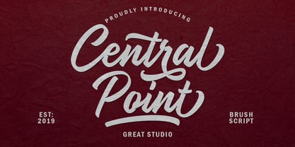 Central Point is a bold script font and a combination of original handwriting styles inspired by hand lettering. This versatile script includes many different alternatives for each lowercase letter, you can see some examples of design results in the preview image. This typeface works very well for logo design, clothing, handwritten quotes, product packaging, headers, posters, merchandise, social media, greeting cards and all your artwork. Central Point is equipped with uppercase and lowercase letters, numbers, punctuation and symbols, swash and ligature. It has Multilingual support. Thank you for purchasing our products and enjoy.
 - Xavier by CastleType,
$29.00 The Xavier family of typefaces is based on the delightful deco typeface called Ashley Crawford, originally designed in 1930 by Ashley Havinden. After designing Xavier Black (Serif) and Xavier Sans Black, I added Bold Sans, Medium and Medium Sans and finally added lowercase to the medium weights. Although more manageable than Ashley Crawford, Xavier, due to its very playful nature (splayed A, M, etc.) needs to be used with care, especially in terms of spacing. Xavier is a playful typeface and I have been particularly pleased to see it used in children's books.
 - Ciutadella Display by Emtype Foundry,
$69.00 Ciutadella Display is the extreme partner of the popular Ciutadella family for use in large sizes. The weight has been taken to the limit in both directions. It is available in Open Type format and includes Alternate Characters, Ligatures, Tabular Figures, Fractions, Numerators, Denominators, Superiors and Inferiors. It supports Central and Eastern European languages. The type family consists of 12 styles, 6 weights (Thin, UltraLight, ExtraLight, ExtraBold, Black and UltraBlack) plus italics, creating an expanded and really flexible system. See also the original Ciutadella, Ciutadella Rounded and Ciutadella Slab.
 - Wezer by Putracetol,
$24.00 The Wezer - Display Bold Font Duo is a unique and bold typeface that breaks away from the conventional font styles. It offers two distinct versions: rounded and display, both designed to bring something entirely fresh to the table. The purpose behind creating this font was to introduce a one-of-a-kind typeface that stands out in the design world. Wezer is the ideal choice for projects that require a touch of quirkiness and originality, making it perfect for logos, branding, headlines, posters, titles, billboards, banners, and any design that dares to be different.
 - Bandera Text by AndrijType,
$21.00 This serif typeface is a real workhorse. It is a modern tool for text design: extremely legible and well shaped. Bandera Text has six weights with original italics. It catches attention in headlines of posters and magazines or makes reading comfortable in plain texts. Don't forget to try Medium and Medium Italic faces for free. Bandera Text works well with Bandera (slab serif), Osnova (sans serif) and Bandera Display (contrast serif) fonts. Bandera is Spanish for ‘flag’. And Bandera is a symbol of Ukrainian fighting for freedom for many years.
 - Reaper BT by Bitstream,
$50.99Thomas Oldfield’s typeface, Reaper, is reminiscent of inscribed Greek letterforms but he claims that its origin is much simpler than that. “I recall”, Tom says, “that I just began the design by making the uppercase ‘I’ and continued using it to make up the other characters.” The cap only typeface has alternate cap forms in the lowercase positions, including a vastly scaled downed O and Q that make for some unusual text settings. Contrary to what the name might have you believe, there’s a lot of life in this quirky typeface. - Santa by Typo5,
$12.95Born as a revival of an Egyptian typeface, this hand-drawn typeface is is perfect for headers and even as a body text. It manages to keep the neutrality required for a legible typeface and having slight details that makes it unique. All the details are hand drawn, and it comes in 3 versions: Santa 01 Black, with the original inked look Santa 02 Line, an sketch version of the font, Santa 03 Out, an outline version with subtle different strokes. A Santa Pack is available including all the 3 styles. - Grane by Fontsphere,
$16.00 GRANE is the brother of GRAJ and is a minimalist, geometric font. It has a pixel style and is characterized by a sophisticated and original form. This font is quite experimental and stands out with its unique geometric elements, making it perfect for creating custom designs, logos, and other projects requiring a modern aesthetic. It is also quite versatile and can be used in a variety of projects, from large text projects and headers to custom projects. GRANE is the perfect choice for any project requiring a modern and experimental font.
 - Franklin Gothic by URW Type Foundry,
$39.99 By 1915, all the major foundries offered families of sans serifs, sometimes called Gothic in the USA. Franklin was a response suitable for countries in the vanguard of the machine age. Designed by Morris Benton in 1903-1912, Franklin has preserved its own personality ever since. The ITC Franklin Gothic font family is a redrawing by ITC that keeps the original strength intact, meeting the demand for a strong typeface. ITC Franklin Gothic is better read in display sizes and considered a standard in the newspaper and advertising fields.
 - PR-Uncial by PR Fonts,
$10.00 This is our first font, based on Peter's own personal way of writing uncials, The rounded letters of the fourth to eighth centuries. The characters in the caps position are more closely related to the classical Roman forms, and the lowercase position has letters that are the more rounded, medieval forms, at the same size, so they can be freely mixed, for a hand lettered appearance. This typeface is currently used for the titles in the TNT Television show "the Librarians". It was originally designed in 1998, and is now available in Open Type Format.
 - Georgia by Microsoft Corporation,
$49.00The European Union (EU) has added numerous members since 2004, increasing significantly the number of languages spoken within its boundaries. To write the thirty or more languages, three alphabets are required: Roman (Latin), Greek, and Cyrillic. The WGL character set supports all EU languages, in addition to Russian, Ukrainian, and Serbian, and Croatian. Current principal languages of the EU include: Basque, Breton, Bulgarian, Czech, Danish, Dutch, English, Estonian, Finnish, Flemish, French, German, Greek, Hungarian, Irish, Italian, Latvian, Lithuanian, Maltese, Polish, Portuguese, Romanian, Scots Gaelic, Slovak, Slovenian, Spanish, Swedish, Turkish and Welsh. - Balerno Serif by My Creative Land,
$29.99 Balerno is a modern (yet vintage) multilingual elegant Didone serif enhanced by ligatures, alternates and swashes. Balerno is a very versatile font family - with it's classic forms and modern features it covers a wide range of design projects starting from greeting cards to magazines, wedding invitations to websites etc. The amount of alternates is tremendous, from simple stylistic alternates to swashes, ligatures and their alternates. Languages supported: English, German, French, Italian, Spanish, Swedish, Portuguese, Irish, Norwegian, Luxembourgish, Basque, Breton, Corsican, Faroese, Galician, Icelandic. Free fonts contain basic latin characters set, numbers, punctuation and symbols.
 - Luminance by MAC Rhino Fonts,
$36.00 As a result of fascination for East European type design, MRF couldn’t resist to make a unique interpretation of a typeface named Pracht. Originally made by the Czech type designer Carl Pracht in 1941–43. Having a rather calligraphic style both in regular and italic, MRF preferred it to be more straightforward and modern-looking. The italic version was executed with traditional italic letters (a, f, g, k, v, w and y). The numerals were made in a classic manner as old-style figures. Can be treated as both a text and display font.
 - Utah by Monotype,
$92.99The European Union (EU) has added numerous members since 2004, increasing significantly the number of languages spoken within its boundaries. To write the thirty or more languages, three alphabets are required: Roman (Latin), Greek, and Cyrillic. The WGL character set supports all EU languages, in addition to Russian, Ukrainian, and Serbian, and Croatian. Current principal languages of the EU include: Basque, Breton, Bulgarian, Czech, Danish, Dutch, English, Estonian, Finnish, Flemish, French, German, Greek, Hungarian, Irish, Italian, Latvian, Lithuanian, Maltese, Polish, Portuguese, Romanian, Scots Gaelic, Slovak, Slovenian, Spanish, Swedish, Turkish and Welsh. - Ossuary by Wundes,
$13.00Ossuary is a font in which each letter is formed using a uniquely arranged pile of skulls. The font was originally designed to be caps only, but small caps were added for convenience. There is now a character for each typeable letter of the American English keyboard. The font was inspired by images from the Kostnice ossuary in Sedlec, Kutna Hora near Prague. (Google it.) Whether you are fascinated or repulsed, such images have a mystery about them. They demand your attention. That is the feel this font was intended to capture. - Sistina by Linotype,
$29.99Sistina, designed by Hermann Zapf in 1950 was first named Aurelia Titling. It is a heavy supplement to the Michelangelo Titling based on studies of inscriptions in Rome. First release in hotmetal at D. Stempel AG, Frankfurt in 1951. Sistina was originally an all caps font. The digital version from Linotype contains small caps. Hermann Zapf together with Akira Kobayashi, type director from Linotype had made a new revised version of Sistina now named as Palatino Imperial" in the Palatino nova type family, a Platinum Collection product from Linotype." - Bandera Text Cyrillic by AndrijType,
$21.00 This serif typeface is a real workhorse. It is a modern tool for text design: extremely legible and well shaped. Bandera Text Cyrillic has six weights with original italics. It catches attention in headlines of posters and magazines or makes reading comfortable in plain texts. Don't forget try Medium and Medium Italic faces for free. Bandera Text Cyrillic works well with Bandera Cyrillic (slab serif), Osnova Cyrillic (sans serif) and Bandera Display Cyrillic (contrast serif) fonts. Bandera is Spanish for ‘flag’. And Bandera is a symbol of Ukrainian fighting for freedom for many years.
 - Rundfunk Grotesk by Linotype,
$29.99Rundfunk Grotesk was produced together with Rundfunk Antiqua by the Linotype Design Studio in 1933-1935. The combination was originally intended for small point sizes and shorter texts. Unfortunately, this typeface was never completed and consists only of Antiqua roman and Grotesk bold. This unusual combination was chosen because small newspaper ads often use a semi bold for the headlines and a regular antique for the text. Rundfunk Grotesk is intended to be used exclusively in headlines and reflects in its unique character the spirit of the 1930s. - Snow Crystals by Deniart Systems,
$20.00 It's time to just let it snow! Deniart’s Snow Crystals typeface is an original design featuring 62 unique symbols. These charming snow crystals are sure to add elegance to all your winter designs - the set includes traditional style snow crystals as well as an assortment of bonus characters such as star-bursts and holiday accents. This font comes with a PDF guide to put all these special characters right at your fingertips! Note - if you want an even broader range of snow flakes, you may also like our second snow font known as "Star Crystals".
 - Caslon 540 by URW Type Foundry,
$89.99 William Caslon (1692-1766) laid the foundation for English typefounding, when he cut his first roman face in London in 1722. He modeled his designs on late seventeenth-century Dutch types; thus his typefaces are classified as Old Styles. The original Caslon punches have been preserved, enabling a perfect recutting of his faces. Notice the hollow in the apex of A and the two full serifs or beaks in the C. The italic capitals are irregular in their inclination. The Caslon font family is distinctive for use in subheadings or continuous text.
 - Metalet Modern JNL by Jeff Levine,
$29.00Metalet Modern JNL was based on the letters found within the Metalet Movie Titling Set manufactured by the Modern Display Advertising Company of Hollywood, California circa the 1940s. Each stamped metal letter would be affixed to the background surface via the use of miniature magnets. Once in place, titles for home movies or slides could be photographed, the letters then returned to their storage area in their box. The character shapes show unusual stroke movement, which means the original models used for these letters were most likely hand-drawn. - South Island by Rook Supply,
$14.00 The goal with South Island was to make a font that looked authentically handwritten. Each character had to perfectly flow into the next and maintain a nice balance between variation and legibility. The typeface retains all the texture and grit of the original handwritten characters, making it especially powerful when used for large headers. South Island comes in a regular version, and a second version which contains alternate versions of each letter A-Z (both upper and lowercase). Try pairing it up with a more traditional serif or sans serif font for endless possibilities.
 - Claudius by RMU,
$25.00 A blackletter font tending towards the gothic which was released by Klingspor, Offenbach am Main, in 1937. Claudius can be used for clerical as well as for secular purposes and shows a strong character of its own. The original esthetic atrocities of placing the dieresis within the letters A and O - due to former German industry standards - were abolished. Allow the font's beauty spread by giving it enough leading between the lines. This font contains various useful ligatures, and by activating the Ordinals feature and typing 'N', 'o' and period you get an oldstyle numbersign.
 - Ayita by Ascender,
$29.99Ayita is a new sans serif design by Jim Ford and Steve Matteson. Ayita is a Cherokee name which translates to first in dance" and recalls the rhythm and flow of this new typeface. Originally conceived as an upright italic design, Ayita remains contemporary, friendly and hard working. The open shapes render faithfully at small point sizes and on device screens while the compact design allows more characters per line for headlines. Ayita is a useful design for a wide variety of uses including interfaces, spreadsheets, greeting cards and banners." - P22 Goudy Aries by P22 Type Foundry,
$24.95 Frederic W. Goudy (1865-1947) created over 100 typefaces during his lifetime. Like most type designers, he is known principally to most people only through his eponymously titled faces such as Goudy Modern, Goudy Old Style etc. This set includes one of Goudy's rarest Arts & Crafts styled faces, a font known as Aries. The font was originally created by Goudy for a private press in Eden, New York in 1926. Also included in this set are two decorative fonts: one font of 52 decorative Ornaments & one font that contains 52 Ampersands.
 - Supaduper PB by Pink Broccoli,
$16.00 Supaduper PB is a font inspired by some wonderfully funky hand-lettered greeting cards from the 1980's. The delightfully awkward and animated playfulness of this lettering style was maintained throughout the fleshing out from the original specimens - and I think you're going to have a lot of fun typing with this. Even if you haven't seen these old greeting cards, the lettering style has a familiar visual to it. Bring back a little nostalgia, add a little wonkiness, or just have fun typing with Supaduper PB today!
 - Retrofit by Vanderfont,
$29.00 The evocative and original Retrofit is based on typefaces of the 1940s and 50s, which extolled the virtues of American products in glossy magazines for the new suburban consumer. Oversized terminal bulbs and occasional slab serifs lend a rhythm and a bouncing baseline provides just the "zing" to spice up that bland typographic treatise. Retrofit's easy familiarity can be seen on children's books, games, food packaging, and other places where a kid friendly note is needed. Retrofit has been adapted by Quickutz for their punched letter cutting tool, and re-named "Maggie".
 - Bron Shadline by Jeremia Adatte,
$49.00 Bron Shadline is the semi-outline and lighter variation of the original Bron typeface. The outline adds an extra vibrancy, more contrast and bring a special shading effect out. The Shadline version has also two separate layered fonts to make your own multi-color compositions. Possibilities of editing the font are infinite : even use Bron Black Two Color One to add an extra third layer. These can be used separately to create even more subtle effects. Bron Shadline is packed with an extended character set, supporting Central, Western and Eastern European languages.
 - 1848 Barricades by GLC,
$38.00 This family was inspired from a lot of 1848-1850 French engraved documents reproducing handwritten texts talking about the Paris' insurrection days in June 1848 (described by Victor Hugo in Les misérables) . It seems that all were first written using quill pens, as the strokes are too much heavy and bold for metal pens and even though the engraver work is very fine. We have added only a few characters, most of them were present in the originals. The TTF and OTF versions are enriched with more than 50 ligatures or alternate characters.