10,000 search results
(0.035 seconds)
- Brevet by Solotype,
$19.95Authentic copy of the original, with a couple of minor changes to the caps, making them fit better. Although made for the American market by an American typefounder, we found this font in a York, England printshop when we went on a second visit to the famous DeLittle Wood Type factory. - Ongunkan France Glozel Runic by Runic World Tamgacı,
$100.00 In March 2010, Émile Fradin, a modest peasant farmer from central France, died at the age of 103. To his grave he took the secret behind one of the most controversial archaeological discoveries of the 20th century. A discovery which put into question the very origins of the written word and the paternity of European culture. It was the uncovering of peculiar artefacts would come to be known as the Glozel runes. The discovery of the Glozel runes On the first day of March 1924, a not yet 18-year-old Fradin was ploughing his family’s field in the hamlet of Glozel, when his cow stumbled into a hole. When he and his grandfather, Claude, looked closer, they discovered a mass of broken stone, under which lay an underground chamber. Within, they discovered pottery fragments, carved bones, and a peculiar clay tablet covered in bizarre characters that neither of the two could decipher. The family requested a subsidy for excavation works to be carried out, but were refused by the regional authority. With that disappointment, it seemed as though the discovery would fade into obscurity. However, the following year, news of Fradin’s unusual clay tablet reached the ears of the physician and amateur archeologist, Antonin Morlet. By the end of May 1925, Morlet began the first of his excavations.4 Within the first two years alone, he had amassed some 3,000 finds.
 - Drakune by Shakira Studio,
$19.00 Introducing Drakune - Beauty Elegant Serif a font that epitomizes the essence of Beauty Elegant Serif. This font, meticulously crafted, offers a perfect blend of timeless beauty and contemporary sophistication. Drakune transforms your designs with its graceful serifs and intricate details, providing a touch of refined elegance that is currently in high demand. Explore the versatility of Drakune through its diverse alternates and ligatures, each contributing to a stylish and distinctive typographic experience. Elevate your creative projects with the allure of Drakune, setting a new standard for Beauty Elegant Serif fonts in the current design landscape. Here's what you get: Regular & Italic All Multilingual symbol Opentype features ( ligature, alternate ) Accessible in the Adobe Illustrator, Adobe Photoshop, Adobe InDesign, even work on Microsoft Word. PUA Encoded Characters - Fully accessible without additional design software. Multilingual character supports : (Afrikaans, Albanian, Catalan, Croatian, Czech, Danish, Dutch, English, Estonian, Finnish, French, German, Hungarian, Icelandic, Italian, Lithuanian, Maltese, Norwegian, Polish, Portuguese, Slovenian, Spanish, Swedish, Turkish, Zulu) Follow my shop for upcoming updates, and for more of my work, Thank you!
 - Ambitious by Create Big Supply,
$17.00 Ambitious is the perfect choice for adding a cute and energetic twist to your creative projects. With its combination of uppercase and lowercase letterforms, Ambitious offers versatility and allows you to create captivating typography that stands out. Whether you're designing posters, children's books, social media graphics, or any other lively project, this font will infuse your work with a sense of joy and excitement. The font includes a comprehensive range of characters, including numbers and punctuation marks, ensuring flexibility and compatibility across various design applications. It also supports multiple languages, enabling you to communicate your message effectively to a diverse audience. One of the standout features of Ambitious is its PUA Encoding, which grants easy access to all the special characters and glyphs. This means you can effortlessly incorporate unique flourishes and creative elements into your designs. Embrace the playful spirit of Ambitious and let your imagination soar. Whether you're working on personal projects, branding, or any other creative endeavor, this font will bring a cheerful vibe to your audience's experience.
 - Axios Pro by TipoType,
$24.00 In Axios Pro the rational language of the early XX century geometric sanserifs is complemented with an structure deeply attached to the renaissance typefaces; the uppercase proportions proceed form the roman canon while its lowercase was constructed following the humanist ductus. This blend produce a typeface of modern, clean and contemporary appearance that has implicit on its core a classic vibe, nourishing the text with a timeless elegance.In use, the form and function balance of its design allow it freely travel through a diverse range of fields and possibilities like short text settings, brands, headlines or signage systems with grace and naturality. Axios Pro is available in variable font format and in 20 different individual styles (10 weights), with a set of more than 1000 glyphs per style, supports over 200 latin languages and including an extensive repertoire of opentype features like small caps, ligatures, stylistic alternates, proportional and tabular figures, swashes, borders and many other resources to please your typographic urges. Designed by Rodrigo López Fuentes & Sergio Leiva Whittle
 - Blessed Love by Create Big Supply,
$15.00 With its unique style, Blessed Love brings a touch of elegance and charm to your designs, regardless of the topic or purpose. Whether you're working on branding, invitations, posters, or any other creative endeavor, this font has the potential to elevate your creations and leave a lasting impression. Blessed Love features both uppercase and lowercase letterforms, offering versatility and allowing you to experiment with various typographic compositions. Complete with numbers, punctuation marks, and extensive multilingual support, this font ensures seamless integration into your design projects, catering to diverse audiences across the globe. One of the standout features of Blessed Love is its PUA Encoding, which provides easy access to special characters and glyphs. This empowers you to infuse your designs with unique flourishes and personalized touches, allowing your creativity to shine. Embrace the cool and friendly vibe of Blessed Love and unlock a world of design possibilities. With its extensive character set and exceptional versatility, this font is ready to enhance your projects and create a memorable visual experience.
 - LaRuja by SilverStag,
$19.00 Embrace the captivating elegance of LaRuja, a modern serif font that seamlessly blends feminine grace with unwavering strength. Its distinctively high contrast between horizontal and vertical lines creates a dynamic interplay of elegance and structure, making it a versatile choice for a wide range of applications. LaRuja's gracefully tapered terminals and subtly curved arches exude a sense of refined femininity, while its sturdy serifs and well-defined letterforms project an unyielding strength. This unique balance of characteristics makes LaRuja the ideal choice for projects that demand both beauty and substance. LaRuja's extensive language support, encompassing over 90 languages, makes it a global font that can be effortlessly adapted to diverse cultural contexts. From fashion magazines and branding materials to websites and marketing campaigns, LaRuja seamlessly conveys your message across borders. LaRuja's comprehensive weight system, ranging from Thin to Black, enables you to tailor the font's appearance to suit the specific needs of your project. The lighter weights, such as Thin and Light, exude elegance and sophistication, while the heavier weights, such as Semibold and Black, project authority and impact. Happy creating everyone!
 - Silver South by Set Sail Studios,
$16.00 Introducing the Silver South Font Duo, a classy, contemporary pair of script and serif fonts. With a stylish didot-style serif font and a free-flowing, expressive script companion, Silver South offers beautiful typographic harmony for a diversity of design projects, including logos & branding, wedding designs, social media posts, advertisements & product designs. Silver South Script • A clean, free-flowing script font containing upper & lowercase characters, numerals and a large range of punctuation. Silver South Script Alt • This is a second version of Silver South Script, with a completely new set of upper & lowercase characters. If you wanted to avoid letters looking the same each time to recreate a custom-made style, or try a different word shape, simply switch to this font for an additional layout option. Silver South Serif • A classy serif font containing upper & lowercase characters, numerals and a large range of punctuation. Creates a perfect pairing contrast with the Silver South Script fonts. Script Ligatures • Silver South Script also includes 38 character ligatures. These double letters allow you to recreate a more natural, hand-drawn flow to your text.
 - Laricio by Présence Typo,
$36.00Laricio is the italian name of the larch tree. This typeface has naturalist and renaissance connotations. The design of the stems is organic. The general feeling is slightly prickling like the foliage of conifers. In french, the word "fût" qualifies the "stem" (of a letter) and also the "bole" (of a tree). - PF Champion Script Pro by Parachute,
$125.00 PF Champion Script Pro is perhaps the most advanced and powerful calligraphic family ever made. It received an award for Excellence in Type Design from the International Type Design Competition ‘Modern Cyrillic 2009’ which was held in Moscow. Most recently, it received another award from the 3rd International Eastern Type Design Competition - Granshan Awards 2010. This typeface was first presented in June 2007 at the 3rd International Conference on Typography and Visual Communication (ICTVC) and was met with rave reviews. It is based mainly on the manuscripts of the 18th century English calligrapher Joseph Champion. Developed over a period of two and a half years, each one of the 2 weights is loaded with 4300 glyphs(!), offering simultaneous support for all European languages based on the Latin, Greek and Cyrillic scripts. Furthermore, a wide selection of alternate forms and ligatures is included for all languages, in order to accommodate diverse design aesthetics. These alternates are either applied automatically through an advanced programming scheme, or manually through several OpenType features. An attempt was made to design a contemporary script typeface with classic roots, by following certain guidelines, i.e. lowercase characters were designed so they are less inclined, have a higher x-height and are less condensed than the original. Several characters were stripped-off their connecting lines in order to enhance legibility. Four sets of alternate swashed capitals as well as a plethora of ornaments and frames (117) was included. Small caps and their alternate forms were designed to replace the capitals which disrupt the flow of text within a sentence with their extravagant swashes. All characters were carefully designed with the proper weight in order to sustain harsh printing conditions (on special papers), a situation which affects mainly the light connecting parts of calligraphic typefaces. Finally, it was programmed in such a way as to preserve handwriting qualities, by designing an extensive array of ligatures and alternate glyphs in all languages, never before released or incorporated within the same font.
 - Metromedium #2 by Linotype,
$29.00American graphic designer William Addison Dwiggins' (W.A.D. for short) first typefaces were the Metro family, designed from 1927 onward. The project grew out of Dwiggins' dissatisfaction with the new European sans serif typefaces of the day, such as Futura, Erbar, and Kabel, a feeling he expressed in his seminal book Layout in Advertising. Urged by Mergenthaler Linotype to create a solution for the problem, Dwiggins began a professional relationship that would span over the next few decades. The first Metro family typeface to be released was Metroblack, brought to market by Linotype in 1929 (Metroblack #2™ the only one of the two versions that Mergenthaler Linotype eventually put into production which is available in digital form). With more of a humanist quality than the geometric styles popular in Europe at the time, Dwiggins drew what he believed to be the ideal sans serif for headlines and advertising copy. Metroblack has a warmer character than the Modernists' achievements, and the type is full of mannered curves and angled terminals (Metroblack also has an astoundingly beautiful Q). The other weights of the Metro family, Metromedium #2™ and Metrolite #2™, were designed by Mergenthaler Linotype's design office under Dwiggins' supervision. Despite having been created more than three-quarters of a century ago, the Metro family types have aged well, and remain a popular sans serif family. Although spec'd less often than other bestsellers, like Futura, Metro continues to find many diverse uses. The typeface has appeared throughout Europe and the North America for decades in newspapers and magazines, and can even help create a great brand image when used in logos and corporate identity. Dwiggins ranks among the most influential graphic designers and typeface designers of the 20th Century. He has several other quality fonts in the Linotype Originals, including the serif text faces Electra™ and New Caledonia™, as well as Caravan™, a font of typographic ornaments." - Helvetica World by Linotype,
$149.00 Helvetica is one of the most famous and popular typefaces in the world. It lends an air of lucid efficiency to any typographic message with its clean, no-nonsense shapes. The original typeface was called Neue Haas Grotesk, and was designed in 1957 by Max Miedinger for the Haas’sche Schriftgiesserei (Haas Type Foundry) in Switzerland. In 1960 the name was changed to Helvetica (an adaptation of Helvetia, the Latin name for Switzerland). Over the years, the original Helvetica™ family was expanded to include many different weights, but these were not as well coordinated with each other as they might have been. At the beginning of the 21st Century, Linotype released an updated design of Helvetica, the Helvetica World typeface family. This family is much smaller in terms of its number of fonts, but each font makes up for this in terms of language support. Helvetica World supports a number of languages and writing systems from all over the globe.
 - Bobby Jones by Tom Chalky,
$19.00 Introducing The Loud & Proud Bobby Jones Font Collection Inside you'll find 16 quirky handcrafted fonts, oozing with personality, ripe and ready to take center stage within a variety of creative and fun design projects. If you're looking to grab eyeballs with an ad campaign, a logo design, apparel, printed stationery, and all that other good stuff, then worry not. Bobby has you covered. We all come with imperfections and Bobby is no exception! His outlines are slightly off, his corners are irregular, his straights aren't straight, but he's cool with it. In fact, he's too busy strutting his stuff. - What's Inside? Each of the fonts listed below boast multilingual glyph ranges and their own individually handcrafted outline style! (16 fonts in total!) - Bobby Jones - The original Bobby.J - Bobby Jones Soft - A rounded version of the above - Bobby Jones Condensed - The thinner and leaner sibling to Bobby Jones - Bobby Jones Condensed Soft - A rounded version of the above - Bobby Rough - A high-res textured version of the original - Bobby Rough Soft - A textured version of Bobby Jones Soft - Bobby Rough Condensed - A textured version of Bobby Jones Condensed - Bobby Rough Condensed Soft - A textured version of Bobby Jones Condensed Soft Designed a little over five years ago, the original Bobby Jones Font was my first ever product. This new and improved version has been entirely redesigned from bottom to top. Holding dearly to the punch that the original had, while adding a whole lot of extra power. I hope you enjoy the Bobby Jones Family as much as I do and have, and as always if you have any questions or comments, please do not hesitate to get in touch. I'd love to hear from you. (tom[at]tomchalky.com)
 - Black Stamp by Andrey Font Design,
$9.00 Black Stamp is a unique, strong, and original handwritten font. Natural and elegant, this font can be used on a wide variety of designs such as headlines, titles, headings, logos, branding, posters, invitations, books, and any other creative design.
 - Empire by Monotype,
$29.99Empire was originally designed in 1937. This version is an all-capitals face with tall condensed characters. The Empire font can be used for headlines and posters where space is tight, or where an empression of height is desired. - Krisis Sans by ABSTRKT,
$25.00This font was originally designed for one lettering job with only one simple purpose—to be as much condensed as a font can be. Then it was developed as a font family of 4 weights with regulars and italics. - Tyton Pro by RMU,
$35.00 Based on Schumann's original Typoart font 'Stentor', Tyton Pro has been carefully redrawn and redesigned. Unlike the simplified forms of former photo-setting versions, Tyton Pro preserves the tender upstrokes and downstrokes which underline the typical brush-written letters.
 - Gilbey by Solotype,
$19.95Although wood types are found throughout the world, most of the decorative one originated in the United States. This one would work well on theatrical playbills, and advertising for tourist railroads, wild west shows and concerts in the park. - Hattan Antique by Solotype,
$19.95This font is a somewhat modified version of the original issued by the Manhattan Type Foundry in the 1880s. This New York foundry was in business for less than five years, so its fonts are not too well known. - Quatie by insigne,
$24.00 Originally a conceptual approach from the Chatype project of Jeremy Dooley and Robbie de Villiers, Quatie has been restructured to add a new industrial element to Insigne’s offerings. Like the Official Font of Chattanooga, Tennessee, Quatie definitely carries a contemporary, hipster feel. Quatie similarly draws much of its inspiration from the industrial brawn of the railroad and the unique characteristics of Cherokee letterforms, giving it an atypical form not usually found in an industrial slab. While the Quatie concept was originally set aside for the more technological look of Chatype’s final image, Jeremy revived this face from its dormant state and refined it for its commercial release in 2013. This bracketed slab with its slightly rounded, soft edges adds a warm, retro, industrial element to Insigne’s offerings. The resulting quirky, ‘hipster’ vibe of Quatie lends its voice to give an unparalleled edge to your designs.
 - Morris Sans by Linotype,
$40.99 Morris Sans is a newly revised and extended version of a small geometric family of typefaces originally produced by Morris Fuller Benton in 1930 for ATF. His initial design consisted of an alphabet of squared capital letters with a unique twist that characterized its appearance: corners with rounded exteriors and right-angle interiors. The types were intended for use in the fine print found on business cards, banking or financial forms, and contracts. But over the ensuing decades, this design became a popular element in all sorts of design environments, and several foundries revived the typeface in digital form. Since digital fonts are bicameral, with slots for both upper and lowercase letters, new cuts of the type opted filled the lowercase slots with small caps. In 2006, Linotype commissioned its own version of the typeface-an extension for 21st century use. Under the advisement of Linotype's type director Akira Kobayashi, Dan Reynolds redrew the uppercase and added an original lowercase for the first time. Additionally, a number of extras were brought into the fonts, including six figure styles (tabular and proportional lining figures, tabular and proportional oldstyle figures, and special tabular and proportional small cap" figures). Small caps, which have become an iconic element over time, are accessible in each font as an OpenType feature. To differentiate this version from the original, Linotype's new family is named Morris Sans, in honor of Morris Fuller Benton. All fonts in the Morris Sans family are OpenType Com fonts; they include a character set capable of setting 48 European languages that employ the Roman alphabet, including all Central and Eastern Europe languages, those from the Baltics, and Turkish. This glyph coverage extends to the small caps as well. Morris Sans is a wide typeface, especially in its regular widths; the condensed faces set a more conventional line of text. The new lowercase letters are less geometric than the uppercase, except for those that share the same basic forms (e.g., c, o, and s). Instead of following this geometric trend, the new lowercase tends to strengthen the humanist elements that were present in several characters from the original type, including the uppercase D and the figures 5, 6, and 9. Morris Sans also sports a number of glyphic flares, like the stroke found on the original uppercase Q. Morris Sans is a clean, modern design best suited for headlines, advertising, posters, expressive signage (especially on storefronts), and corporate identity work."
 - TT Bluescreens by TypeType,
$35.00 TT Bluescreens useful links: Specimen PDF | Customization options Please note! If you need OTF versions of the fonts, just email us at commercial@typetype.org Meet the upgraded TT Bluescreens! TT Bluescreens is a geometric sans serif with narrow proportions. The font has a memorable character, while remaining neutral, so it can be used in various design projects. The range of possibilities of the updated TT Bluescreens has become much wider! Condensed styles with narrowed proportions have been added. The classic styles of TT Bluescreens are universal and suitable for setting both in headings and in text arrays. Condensed styles are intended for non-standard design solutions. In small sizes, they are perceived as if having a texture, thanks to which they can become part of packaging or poster design. In large size they look extraordinary, but they are highly readable and convey information well. Variable font now changes along 3 axes: weight, width and slant. Even more options for those who love variety. The character set of TT Bluescreens was expanded, and additional extended Cyrillic and Latin characters were added. Expanded character set. Each style has 874 characters. This is 253 characters more than it there were in the previous version. New currency signs, arrows, punctuation and fractions were added. Number of OpenType features increased from 18 to 31! The font has become even more functional and convenient thanks to a large number of ligatures, stylistic alternatives and localizations. The quality of the contours has become even higher, diacritics were improved. The updated TT Bluescreens is suitable for the design of covers and posters, it will look aesthetically pleasing in packaging design. It can be used in the design of titles and disclaimers. Condensed styles are preferably used in large size. The TT Bluescreens font has 37 styles: 9 upright and 9 italics of standard width, 9 upright and 9 italics in Condensed, 1 variable style. Each style contains 874 characters. The font has 31 OpenType features, including ligatures, stylistic sets, and localizations.
 - Schindler by Red Rooster Collection,
$45.00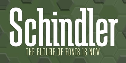 An original design.
 - Sinclair Script by Red Rooster Collection,
$45.00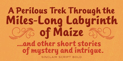 An original design.
 - Grove Script by Red Rooster Collection,
$45.00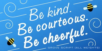 An original design.
 - Pipeline by Red Rooster Collection,
$45.00An original design. - Javelin by Red Rooster Collection,
$45.00An original design. - Iron Maiden by Red Rooster Collection,
$45.00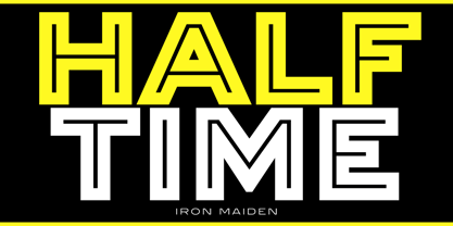 An original design.
 - Mefista by Grontype,
$18.00 The Mefista font is a masterpiece crafted from a rigorous and lengthy process. This font was written with care so as to produce a unique and diverse work by adding alternatives and some ligatures. This font can be used for print designs such as writing on invitation cards, magazine covers, greeting cards and so on. and can be used for company or logo taglines Features : Uppercase and Lowercase Ligatures and Alternates Numeral and Punctuations Thankyou for purchasing this fonts. Regards, Grontype
 - Ministry by Device,
$39.00 A 14-weight sans family based on the original British ‘M.O.T.’ (Ministry of Transport) alphabet. A capitals-only, single-weight design was drawn up around 1933 for use on Britain’s road network, and remained in use until Jock Kinnear and Margaret Calvert’s ‘Transport Alphabet’ was introduced for Britain's first motorway in 1958. The identity of the original designer is not preserved; however, Antony Froshaug in a 1963 ‘Design’ magazine article mentions Edward Johnston as an advisor. Speculation that it was based on Johnston’s London Transport alphabet is discussed in archived government documents from 1957: “So far as I am aware, the Ministry alphabet was not based on Johnston’s design; indeed, it has been suggested that Gill got his idea from Johnston. Our alphabet was based on advice from Hubert Llewellyn-Smith (then chairman of the British Institute of Industrial Art) and Mr. J. G. West, a senior architect of H. M. Office of Works.” A 1955-57 revision of the alphabet which polished the somewhat mechanical aspects of the original may be the work of stone carver and typographer David Kindersley. For the digitisation, Rian Hughes added an entirely new lower case, italics and a range of weights. The lower case mimics the forms of the capitals wherever possible, taking cues form Gill and Johnston for letters such as the a and g, with single-tier versions in the italic. A uniquely British font that is now available in a versatile family for modern use.
 - Aristotelica Pro by Zetafonts,
$39.00 Aristotelica Pro is the 2020 redesign of the rounded geometric sans designed by Cosimo Lorenzo Pancini and Andrea Tartarelli developing the original philosophy of one of the classic and best-selling Zetafonts typefaces, Arista by Francesco Canovaro. Originally conceived as an exercise in restraint and simplicity, Aristotelica is typographic eulogy to the simple beauty of circular shapes, aptly named after the greek philosopher who pioneered formal logic. It shows its strengths mostly in display uses and logo design, with a palette of moods ranging from the stark elegance of the uppercase hairline weights to the playful softness of the lowercase bold weights. True to its universalist calling, it has however been developed in a variant text version that applies slight corrections to design and metrics to allow for better legibility in long body copy. In Aristotelica Pro both the display and the text subfamilies have been complemented with a condensed version, though especially for mobile screens and other situations where space-saving is a concern. Also the original language coverage (extended latin, greek and cyrillic) has been expanded with the inclusion of arabic language glyphs, bringing the typeface to a total of over 1100 glyphs and 200 languages covered. The family is further enriched by the inclusion of Aristotelica Icons, a set of matching variable-width monoline icons that can be used to faultlessly match the typeface line width. OpenType features includes stylistic alternates, old style and lining figures and small caps.
 - Novella by FontHaus,
$19.95 Novella has always been one of Fonthaus' more popular period (Art Nouveau) fonts. The style of Novella captures the essence of typography that was popular at the turn of the 20th century (1890-1905). Its curvilinear lines are organic and floral, complimenting the work of Louis Comfort Tiffany, Charles Rennie Mackintosh and Gustav Klimt among others of the time.
 - Dubidam Arabic by NamelaType,
$29.00 Dubidam Arabic is new version of Dubidam with the addition of Arabic glyphs (Arabic, Urdu, Kurdish, Pegon and Farsi. Dubidam Arabic is A Cheerful semi-slab Typeface. Has a playful but firm style in each stem approach to harmony with Latin.
 - Crispy Yellow by Bogstav,
$14.00 It’s handmade, organic, all-caps and crispy! Just like a tasty treat or a lovely cake! I’ve added 5 slightly different versions of each letter, and they cycle as you type (no obvious repeating letters!) Of course, it’s multilingual as well!
 - The Munday by Alit Design,
$18.00 Presenting 🍃The Munday Typeface🍃 by alitdesign. The Munday is a sans serif font that features a nature concept with leaf swashes. It has a modern and clean design that can be used for various design projects such as branding, titles, logos, and more. Its leaf swashes give it a unique and playful touch, making it suitable for projects with a nature or organic theme. Yes, that's correct. The Munday font has support for ligatures, which are special character combinations that create a more visually appealing text appearance. It also supports multiple languages and has a total of 648 glyph characters, providing a wide range of options for users in different countries and regions. This makes the font versatile and suitable for various international projects. Language Support : Latin Basic, Western European, Central European, South European, Vietnamese. In order to use the beautiful swashes, you need a program that supports OpenType features such as Adobe Illustrator CS, Adobe Photoshop CC, Adobe Indesign and Corel Draw.
 - Yekuana by Neo Type Foundry,
$28.50 Yekuana is a typeface whose design is based primarily on the study of certain geometric ethnic ancestral Venezuelan signs, visually rich and originally used in the enrichment of various utilitarian objects with high symbolic and cultural content. Yekuana is a family of two weights, stylistic alternates, fractions, ordinals and ligatures. Its use is recommended for titles or short phrases and elements of oversized visual communication.
 - Screen Star JNL by Jeff Levine,
$29.00 The opening credits to the original (1937) version of “A Star is Born” starring Janet Gaynor and Frederic March was hand lettered in an Art Deco style with rounded terminals that emulated the look of neon signage – alluding to the glitz and glamour of 1930s Hollywood. Screen Star JNL is the digital revival of that lettering, and is available in both regular and oblique versions.
 - Ongunkan Runic by Runic World Tamgacı,
$39.99 It is necessary to keep the memories of our ancestors alive. Although the languages and cultures of the past societies were different, in my eyes the ancestor of our humanity is. Having to experience everything in that world, no matter where in the world it is. This font is a Runic member. It is a kind of variety that belongs to different geographical regions.
 - Century Expanded by Bitstream,
$29.99Shortly after the preparation of the original Century, the two Bentons (father Linn Boyd and son Morris Fuller) prepared a wider version for De Vinne’s press and called it Century Broadface. In 1900 ATF released the design for general use as Century Expanded, one of the most popular and effective of typefaces, to this day the text face of the New York Daily News. - Shattered Dreams JNL by Jeff Levine,
$29.00 Another filter effect version of Adhesive Serif Letters JNL (of which the original design was modeled after some vintage gummed letters used for signage) and is called Shattered Dreams JNL. This variant has jagged edges all around and is kind of reminiscent of shapes you could make with a small magnet and iron filings. Shattered Dreams JNL is available in both regular and oblique versions.