10,000 search results
(0.045 seconds)
- Rose Marie by Scratch Design,
$10.00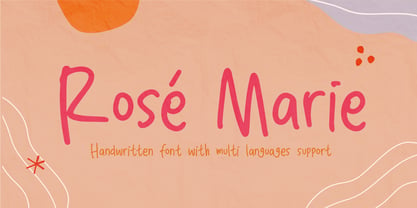 Rose Marie is a beautiful handwritten font, support with multi-languages. This font has a cute modern style that is perfect for your branding design, and will also be very beautiful in your wedding invitations, diary quotes, youtube text, movie titles, Instagram, and business cards. Rose Marie should make your designs instantly look beautiful, original, and amazingly! So enjoy this font and make some cool stuff!
 - Boshi by Tymime Fonts,
$30.00 Boshi is inspired by classic video games, but it can do more than that. Saturday morning cartoons, comic books and other logos that need to express fun are other ways this font can be used. It also includes several Tiki-style interlocking ligatures. Vastly improved over the original free version, already featured in several high-profile mobile games and even a toy, Boshi evokes retro goodness.
 - Conestoga by FontMesa,
$20.00 Conestoga was a challenge that I took on which was to take a logo from an old antique vegetable crate label and create a complete font based on its design. The original logo was curved on a path and was caps only. The new letters were drawn straight and a matching lowercase was created to turn this old custom logo into a working font.
 - Chantal by Device,
$29.00 A loose, casual felt-pen script, Chantal comes in three weights plus italics, and a Cyrillic version too. Alternate versions are available in the upper and lower case keys, so settings can be customised according to taste. Chantal communicates a hand-drawn light touch with character. Originally designed to letter the RoboHunter series that Peter Hogan and Rian Hughes produced for the comic 2000AD.
 - Ethery by LABFcreations,
$14.00 Ethery. Decorative modern serif font with a unique style. Elegant & Refined modern font. Geometric and stylish, this font is ideal for creating logon and branding. With original ligatures. It works perfect for creating stylish logos, striking editorials, invitations, graphic quotes, and more. Uppercase Characters Lowercase Characters Discretionary Ligatures Multilingual support for various languages Follow me by Instagram: @labfcreations Made in France with LOVE. © LABFcreations
 - Ps Willy by Fontopia,
$13.99 Willy is a typeface with a wink. This display font is based on existing piquant form from the immediate vicinity. It is sexy, if you have an eye for. But it also should not be taken too seriously, especially because it has a humorous slant. The font has its origins in an art project. It is now made available for design around festifals, parties, invitations, etc.
 - Vermandois by Magpie Paper Works,
$68.00 Rough yet refined, kinetic and distinctive, the handdrawn Vermandois family mimics original calligraphy with exceptional accuracy. Perfect for correspondence, invitations, unique branding and display, Vermandois' connecting letters, caps and ink blots make a mark. Vermandois regular includes contextual ligatures and double-letter ligatures, alternate caps, preposition & title word glyphs, old style numerals, international support, currencies and fractions. VermandExtra includes 52 coordinating strokes, splashes and splatters.
 - 1550 Arabesques by GLC,
$15.00 Font inspired by the decorative elements and opening capitals frequently in use in the early 1500s, under Geoffroy Tory’s book “Champfleury” influence, especially in Lyon (France). It is an entirely original design. It is used to embellish texts, such as posters, greetings, invitations, gastronomic menus and much more... This font easily supports enlargement to 48, 60, 72 points and more, as it is made for those sizes!
 - ALS Zheldor by Art. Lebedev Studio,
$63.00 The Zheldor typeface was designed specially for the Railroad movie credits, but wasn’t used there. As a result, here comes an original type product that fits nicely into the urban environment. This vigorous, twitching and deconstructive font works well for emotional large-letter designs and non-too-serious teenage style headings. But however extreme it may seem, Zheldor also has a simple and friendly feel to it.
 - LC Merkén by Compañía Tipográfica de Chile,
$30.00 Merkén is a typeface inspired in the Slab Serif fonts designed by Vincent Figgins in the early 20th century: his famous designs; Antique and Egiziano, were the main references when developing this project. The typeface is perfect for headlines, medium length texts, branding and advertising. His original set is strong and spicy but it also has an alternative set which is cursive and kind.
 - Dead Meat by wearecolt,
$8.00 DEAD MEAT - a bold, uppercase display font. Give your titles and logo types a hand made lettering look Features All uppercase font (use lower case key strokes for alternative character). Each glyph is unique from hand drawn originals. – Web font format included. The zip package contains both an opentype (.oft) and web font (.woff), DEAT MEAT has been created with all Western European characters.
 - Saffa Script Monoline by Viaction Type.Co,
$15.00 Saffa Script Monoline is a letter with original handwriting style, nice applied in various products. Complete with multilingual characters, ligature, alternate and swash. It is suitable for quote, clothing design, vintage logo, label, poster, packaging design and other designs. File Include: Saffa Script Monoline.otf Saffa Script Monoline.ttf Features: Uppercase Lowercase Multilingual Punctuation & Symbol Stylistic Style Ligature Swash I hope you enjoy and thank you.
 - Balcony Seats JNL by Jeff Levine,
$29.00Balcony Seats JNL is a different take on Jeff Levine's Aisle Seats JNL. The original font was modeled from Redikut die-cut cardboard letters - used in the 1940's and 1950's for display and show card work). Although the basic letter shapes are similar, the horizontal stroke weights have been narrowed, providing a type variation with a classic Art Deco "thick and thin" look. - South East by Girinesia,
$17.00 South East is stylish handwritten font. South East looks original and can be used for all your project needs. South East would perfect for Youtube Cover or Thumbnails, sports flyers, mockup , tote bags, kids books, scrapbooks, logos, icons, phrases or quotes for winter greeting cards (Halloween, Christmas or New Year holidays), photo overlay, short phrases, gift shops tags, presentation in social media Pinterest, Instagram, Facebook and more.
 - Esencia by CastleType,
$59.00 Esencia, a CastleType original, was inspired by a Spanish stock certificate from 1941 with 11 beautiful art deco style letters for the words "PERFUMES y ESENCIAS". Slender, elegant, with a Spanish flare. Uppercase only with numerals and punctuation. Supports all European languages that use the Latin alphabet, as well as modern Greek and most languages that use the Cyrillic alphabet. Includes alternate E, F, and S.
 - Note by Little Fonts,
$15.00 Note is a fresh and dynamic hand writing font. Inspired by graffitti and street style writing, executed using a flat tip calligraphy pen. The typeface is hand drawn on paper, then the resulting alphabets and punctuation scanned in and rendered to create the font. The resulting characters are bold yet energetic with an obvious human touch creating an interesting and original hand drawn typeface.
 - Believer by Viaction Type.Co,
$14.00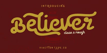 Believer is a letter with original handwriting style, nice applied in various products. Complete with multilingual characters, ligature, alternate and contextual alternate. It is suitable for quote, clothing design, vintage logo, label, poster, packaging design and other designs. File Include : Believer.otf . Believer.ttf . Believer Rough.otf . Believer Rough.ttf . Features (PUA Encoded) UPPERCASE. LOWERCASE. MULTILINGUAL. PUNCTUATION & SYMBOL. STYLISTIC SET. LIGATURE. CONTEXTUAL ALTERNATES. I hope you enjoy and thank you.
 - Blue Jay Way NF by Nick's Fonts,
$10.00Modern Caps—and lowercase, too—was how Ross George described the pattern for this typeface in his Speedball Text Book. Not surprisingly, the design was used on the Beatles' original Magical Mystery Tour album, which suggested the current name. Art Deco meets Psychedelia! Both versions include the complete Unicode Latin 1252, Central European 1250 and Turkish 1254 character sets, with localization for Moldovan and Romanian. - Amalta by Infonta,
$30.00 Amalta is a Display typeface with calligraphic background. It inherits weight and letter constructions from the original brush lettering. Amalta's Latin and Cyrillic sets were designed simultaneously with an equal attention to details and overall pattern. They both include initial and final swash forms which can be used by a typographer's choice. Amalta is suitable for large sized typesetting: headlines, few-line texts, etc.
 - Lisboa Hebrew by Vanarchiv,
$52.00 Lisboa Hebrew is humanist sans-serif typeface base on the same design as the original Lisboa (2005). The main structure is more close to the Sephardic proportions, where the letterforms contains reverse contrast and the terminals following the same calligraphic approach (Humanist). There are some characters and figures designed as small caps which have the same proportions from Hebrew. Latin transliteration characters were also included.
 - Fuetargio by Glukfonts,
$6.00 Fuetargio is a decorative display font and includes additional Fuetargio Ornaments. It's perfect for logos, titles, invitations or homemade banknotes. Languages supported: German, Irish, Romanian, Hungarian, Spanish, French, Italian, Turkish, Czech, Slovakian, Lithuanian, Latvian, Estonian, Basque, Albanian, Portugese, Dutch, Swedish, Icelandic, Danish, Croatian, Finnish, Norwegian, Polish, Bosnian, Lower Sorbian, Upper Sorbian, Kashubian, Breton, Slovene, Welsh, Walloon, Scottish Gaelic, Serbian, Belarusan Lacinka, Maltese, Esperanto, Greenlandic ...
 - Emoji Emotions by Pixel Colours,
$16.00 Emoji Emotions Font is a hand drawn dingbats font inspired in human emotions and feelings. Includes the complete emojis and the individual faces. Create beautiful quotes, social media posts, posters, cards, ads, packaging or any design with character! Includes 9 original emojis that you will love :) Includes: Emoji Emotions: includes the complete emojis Emoji Emotions Faces: includes just the faces so you can make color emojis
 - Saint Onki by Atom,
$10.00 Saint Onki is a natural brush font with 4 styles that will give a casual impression to your design. With stylistic sets and original handmade quality, your design will stand out more. You will get Saint Onki Regular Saint Onki Italic Saint Onki All Caps Saint Onki All Caps Bold Saint Onki Swash Hope you like it with this font. Have a great day and happy buying.
 - Halavah Twist JNL by Jeff Levine,
$29.00Halavah Twist JNL is a casual serif font designed by Jeffrey N. Levine and modeled after an early-1960s display font that was quite popular in its day. This new interpretation takes on an entirely different look from the original, creating a modern-yet-retro design. Light, playful and fun-loving, Halavah Twist JNL is perfect for any project that exudes a bubbly warmth and enthusiasm. - Milla Grace by LABFcreations,
$12.00 Milla Grace is a modern & classic font. This font is ideal for creating logos and branding. With original ligatures. It works perfect for creating sites, logos, striking editorials, invitations, graphic quotes, and more. Uppercase Characters & Discretionary Ligatures. Multilingual support for various languages. For presentation image, pairing script font: Carphe | Modern Luxury Duo font Follow me by Instagram: @labfcreations Made in France with LOVE. © LABFcreations
 - Rassetta NF by Nick's Fonts,
$10.00The pattern for this graceful, subtly modulated Art Deco typeface was designed by Willard T. Sniffin for American Type Founders in the 1930s. True to the original design, the Swash Caps version features Sniffin's twelve decorative variants. The Postscript and Truetype versions contain a complete Latin language character set (Unicode 1252); in addition, the Opentype version supports Unicode 1250 (Central European) languages as well. - Apura by Adelina Apostolova,
$12.00 Apura stands for a clear geometric language based on two main shapes: a circle and a square, complemented by organic elements. It‘s perfect for headlines, posters, experimental designs as well as branding. The font includes uppercase and lowercase characters, both latin and cyrillic, alternates, numbers, punctuation marks and symbols.
 - Attomi Gilbert by Motokiwo,
$16.00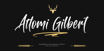 Organic handwriting gesture from a cool brush that useful for multipurpose projects. This is Attomi Gilbert, an elegant script font with passionate handmade feels in each characters. You can use it for vintage or urban projects style. Features: Ligatures Swashes Access All Alternates Special Characters (Multilingual) PUA Encoded
 - Sanischara by Beewest Studio,
$50.00 Sanschara Font is latinANS font that mitatiing ndian Traditional Devanagari Font. This Font is Very niice to apply in Yoga Brand Logo , Spa, Indian Secipes Book, Indian Philosophy Book, Apharels and more. This Font is organic made from hand drawing, that why it is look very natural and simple.
 - Linotype Ergo Paneuropean by Linotype,
$103.99Linotype Ergo was designed by American Gary Munch, and was a winner in Linotype's Second International Digital Design Contest in 1997. Conceived as a blend of traditional and modern type concepts, it works as a legible text family as well as a lively display or headline font. The word ergo means consequently," but it also comes from the Greek word "ergon" for "work." Consequently, Munch sees this family as full of energy -- an ideal font for working hard to make a point, and able to get it across with friendly vigor. The strokes of the characters are carefully designed to accommodate the tendency of the eye to enlarge horizontals and perceive verticals as lighter. The lowercase forms have open, friendly counters and are enhanced by small quirks, such as the slightly leaning s and the wide t. The deep branching of curves from main strokes helps this humanist sans to be very readable at smaller sizes. Linotype Ergo has four normal-width weights, five condensed weights, and two compressed weights - all with companion Italics! The family also includes a clever "Sketch" font for use in headlines, bringing the total number of font styles to 23. Ergo is available with Greek and Cyrillic and as W2G fonts with Hebrew." - Golften by Craft Supply Co,
$20.00 In the world of typography, Golften – Art Nouveau Serif Font stands as an epitome of elegance. It gracefully channels the beautiful and harmonious flow, drawing inspiration from the Art Nouveau style. Let’s delve into why Golften is an exceptional choice for those seeking refined and graceful design. Elegance at Its Core First and foremost, Golften exudes elegance through its graceful serifs and harmonious lines. It encapsulates the very essence of Art Nouveau. Moreover, its flowing curves and intricate details create a captivating visual experience, making it the ideal choice for designers aiming to create visually stunning projects. Versatile Beauty What sets Golften apart is its versatility, which knows no bounds. It seamlessly adapts to various design projects. Whether you’re crafting wedding invitations, establishing elegant branding, or designing artistic posters, Golften adds an exquisite touch that elevates your work. Furthermore, this font’s adaptability makes it suitable for a wide range of creative endeavors. Inspired by Art Nouveau Golften draws inspiration from the Art Nouveau movement, celebrated for its organic forms and ornate aesthetics. This font mirrors those principles, making it a perfect choice for projects aiming to capture the timeless allure of this influential style. With Golften, you can effortlessly infuse your designs with the spirit of Art Nouveau.
 - PF Beau Sans Pro by Parachute,
$79.00 The design of Beau Sans was inspired by Bernhard Gothic which is considered one of the first contemporary American sans serifs and was designed by Lucian Bernhard in the late 1920s. Panos Vassiliou came across this font while attempting to reduce the design elements of a text typeface, by introducing Bauhaus-like minimal forms to the characters. The first version was completed back in 2002 and introduced one year later in Parachute’s 3rd catalog, under the name PF Traffic. Some time later it was decided to make a few improvements but the project was so carried away that the new typeface which emerged needed urgently a new name. Beau Sans Pro is a modern sans-serif family of 16 fonts which includes true-italics. Just like all other Parachute fonts, it covers a broad range of languages by incorporating 3 major scripts i.e. Latin, Greek and Cyrillic in one font. Furthermore, every font in this family has been completed with 270 copyright-free symbols, some of which have been proposed by several international organizations for packaging, public areas, environment, transportation, computers, fabric care and urban life. This typeface is totally recommended for titles and/or body text when you want to give a distinct and contemporary identity to a product or service.
 - Linotype Ergo W2G by Linotype,
$124.99Linotype Ergo was designed by American Gary Munch, and was a winner in Linotype's Second International Digital Design Contest in 1997. Conceived as a blend of traditional and modern type concepts, it works as a legible text family as well as a lively display or headline font. The word ergo means consequently," but it also comes from the Greek word "ergon" for "work." Consequently, Munch sees this family as full of energy -- an ideal font for working hard to make a point, and able to get it across with friendly vigor. The strokes of the characters are carefully designed to accommodate the tendency of the eye to enlarge horizontals and perceive verticals as lighter. The lowercase forms have open, friendly counters and are enhanced by small quirks, such as the slightly leaning s and the wide t. The deep branching of curves from main strokes helps this humanist sans to be very readable at smaller sizes. Linotype Ergo has four normal-width weights, five condensed weights, and two compressed weights - all with companion Italics! The family also includes a clever "Sketch" font for use in headlines, bringing the total number of font styles to 23. Ergo is available with Greek and Cyrillic and as W2G fonts with Hebrew." - Jubilee by Red Rooster Collection,
$45.00 Jubilee is a glyphic font family with moderate stress, slightly inclined serifs, and storied history. Its original design was created in 1934 by famous English type designer Eric Gill for the Stephenson Blake type foundry. The development name was “Gill Text,” but this was changed to “Cunard” once the famous steamship company showed interest in using the typeface. The company, however, never utilized it. Stephenson Blake changed the name to Jubilee in 1935 to commemorate George V and Queen Mary’s Silver Jubilee Wedding Anniversary announcement. After International TypeFounders, Inc. acquired the exclusive rights to the Stephenson Blake collection, Paul Hickson (P&P Hickson) and Steve Jackaman (ITF) revived the family exclusively for the Red Rooster Collection in 1994. A new, Medium weight was created to accompany the original Light and Bold weights. Jubilee has an inscribed, Renaissance feel, and performs well at all sizes. Its letterforms are sturdy, yet there is an undeniable delicacy to the face.
 - 1557 Italique by GLC,
$38.00 Italic type was invented by Aldus Manutius in 1499 or 1501, first, before to be a style name, it was a plain font familly name. This Italique style font was inspired from these who was used by Jean de Tournes in Lyon (France) to print La mÈtamorphose d'Ovide figurÈe, a splendid book with numerous gothic style wood carved pictures. The original font contains almost all modern usual characters except accented ones, no longer in use on that time. They have been added, with some others, with respect for the original design. . A render sheet, enclosed in file, help to identify various others unusual letters on keyboard. It is used as successfuly as web-site titles, posters and fliers design, editing ancien texts or greeting cards, invitations, gastronomic menus... and much more, as a very decorative and elegant font... It supports easily as enlargement as small size, remaining clear and easy to read from 8 or 9 points to 72 and more, particularly on prints.
 - Simplo by Durotype,
$49.00 Simplo: the ‘Italian Futura’. Simplo is a geometric sans serif typeface, built in sixteen styles. It is a tribute to the 1930s typeface Semplicità, designed by Nebiolo’s Alessandro Butti. Although many details of Simplo differ from Semplicità, it preserves the spirit of the original. Simplo is ideal for use in display sizes. It is also quite legible in text, and is well suited for graphic design and corporate identity design. Simplo has sixteen styles, extensive language support, eight different kinds of figures, sophisticated OpenType features — so it’s ready for advanced typographic projects. The most notable characteristics of this typeface are the ‘t’ and the ‘f’. The ‘t’ is the culmination of simplicity: a vertical line with just a simple right-side crossbar. The ‘f’ also has just a right-side crossbar, and is really tall: it reaches both the highest and lowest vertical position of the typeface. The top of the distinctive ‘s’, is much narrower than its bottom. The ‘a’, ‘b’, ‘d’, ‘g’, ‘p’, ‘q’, and ‘u’ are spurless, and show a family resemblance with Hans Reichel’s 1990s typeface Dax. However, these letters are rounder and more geometric than Dax’s counterparts, because of Dax’s higher x-height and narrower design. In Paul Shaw’s Imprint article about typefaces that have been overlooked and/or underappreciated, “Overlooked Typefaces”, he concluded his discussion of Semplicità as follows: “These idiosyncrasies suggest that Semplicità might find a warm reception today, given the current love affair with Gotham, Neutraface and Proxima—and the resurgence of ITC Avant-Garde Gothic.” Free demo font available. For more information about Simplo, download the PDF Specimen Manual.
 - Charpentier Sans Pro by Ingo,
$41.00 A humanistic sans serif The first version of this font was created in 1994 within the framework of the bid placed by the city of Graz to become the location for the Winter Olympics in 2006. Appropriately, its original name was ”Olympia.“ The font is intended to embody classic ideals as well as to meet modern demands. The proportions of Charpentier Sans are directly derived from Roman capitals and the humanistic book-face. The contrast between strokes and thin strokes is based on medieval uncial script. And thus, a modern serif sans was created emphasizing thick and thin strokes together. Thanks to its traditional form language, Charpentier Sans is very legible, adapts to various forms of content and expresses a kind of calmness and certainty. Details resulting from writing with the quill guarantee that the font doesn’t appear too rough and unemotional. Even the tiny, pointed mini serifs contribute to the unmistakable appearance of the font. They create an exciting contrast to the soft flowing forms of the letters and are, to a great extent, conducive to the legibility. Consequently Charpentier Sans always appears with an extremely sharp and clear outline. Charpentier Sans Italique has an even more distinct ductus derived from writing. Especially the rounded forms from a, e, f, g and y reflect the handwritten humanistic cursive. Charpentier Sans is comprised of many ligatures, including discretional ones, plus proportional medieval and capital figures for the normal type as well as disproportional tabular figures with a consistent width. Above and beyond the ”normal“ Latin typeface system, small caps are available as an especially elegant form of distinction.
 - TT Ricordi Greto by TypeType,
$29.00TT Ricordi Greto useful links: Specimen | Graphic presentation | Customization options TT Ricordi Greto is the 5th project from the TT Ricordi collection of fonts, the main task of which is to find gems in old tablets and on stones and bring these inscriptions back to life in the form of contemporary fonts under the general name TT Ricordi. TT Ricordi Greto is Kseniya Karataeva’s original experimental project, inspired by a floor plaque dating from 1423 found in the Basilica di Santa Croce, Florence. When working on the typeface, we wanted to do something new and modern, but at the same time find details or artifacts in the source that could be exaggerated to the maximum. TT Ricordi Greto is a non-contrasting Florentine sans-serif with dynamic proportions and a hint on what would be serifs. The main features of the typeface are the closed aperture, dynamic proportions, and the combination of historical forms with modern visual solutions, flowing terminals with curling dash ends and flared ends, and subtle serifs that hint at the historical material. Another feature of the typeface is a large set of graphic icons (characters and objects), margin markers (flowers, stars and drops) and thirteen catchwords. All icons and spacing have been carefully selected and rendered in order to best match the visual plasticity of the font and interact well with it. The TT Ricordi Greto font family consists of 4 styles: Regular, Medium, Demibold + the Variable font. Each style includes 678 glyphs and 14 OpenType features. In addition to wide language support (extended Latin and basic Cyrillic), each style has two sets of figures and currencies (proportional and tabular), a set of arrows alternative versions of the letter M (flared and straight versions) and the letter Ф (round and oval) and the same a set of icons, margin markers and catchwords. TT Ricordi Greto OpenType features list: aalt, ccmp, locl, numr, ordn, tnum, pnum, case, ss01, ss02, ss03, ss04, ss05, calt. TT Ricordi Greto language support: Acehnese, Afar, Albanian+, Aleut (lat), Alsatian, Aragonese, Arumanian+, Asu, Aymara, Azerbaijani +, Banjar, Basque +, Belarusian (lat), Bemba, Bena, Betawi, Bislama+, Boholano+, Bosnian (lat), Breton +, Catalan+, Cebuano+, Chamorro+, Chichewa, Chiga, Colognian+, Cornish, Corsican +, Cree, Croatian, Czech+, Danish, Dutch+, Embu, English+, Esperanto, Estonian+, Faroese+, Fijian, Filipino+, Finnish, French, Frisian, Friulian+, Gaelic, Gagauz (lat), Galician+, Ganda, German+, Gikuyu, Guarani, Gusii, Haitian Creole, Hawaiian, Hiri Motu, Hungarian+, Icelandic+, Ilocano, Indonesian+, Innu-aimun, Interlingua, Irish, Italian+, Javanese, Jola-Fonyi, Judaeo-Spanish, Kabuverdianu, Kalenjin, Kamba, Karachay-Balkar (lat), Karaim (lat), Karakalpak (lat), Karelian, Kashubian, Kazakh (lat), Khasi, Kikuyu, Kinyarwanda, Kirundi, Kongo, Kurdish (lat), Ladin, Latvian, Leonese, Lithuanian+, Livvi-Karelian, Luba-Kasai, Ludic, Luganda+, Luo, Luxembourgish+, Luyia, Machame, Makhuwa-Meetto, Makonde, Malagasy, Malay+, Maltese, Manx, Maori, Marshallese, Mauritian Creole, Meru, Minangkabau+, Moldavian (lat), Montenegrin (lat), Morisyen, Nahuatl, Nauruan, Ndebele, Nias, Norwegian, Nyankole, Occitan, Oromo, Palauan, Polish+, Portuguese+, Quechua+, Rheto-Romance, Rohingya, Romanian +, Romansh+, Rombo, Rundi, Rwa, Salar, Samburu, Samoan, Sango, Sangu, Sasak, Scots, Sena, Serbian (lat)+, Seychellois Creole, Shambala, Shona, Silesian, Slovak+, Slovenian+, Soga, Somali, Sorbian, Sotho+, Spanish+, Sundanese, Swahili, Swazi, Swedish+, Swiss, German +, Tagalog+, Tahitian, Taita, Talysh (lat), Tatar+, Teso, Tetum, Tok Pisin, Tongan+, Tsakhur (Azerbaijan), Tsonga, Tswana +, Turkish+, Turkmen (lat), Uyghur, Valencian+, Vastese, Vepsian, Volapük, Võro, Vunjo, Walloon, Walser+, Welsh+, Wolof, Xhosa, Zaza, Zulu+, Belarusian (cyr), Bosnian (cyr), Bulgarian (cyr), Erzya, Karachay-Balkar (cyr), Khvarshi, Kumyk, Macedonian+, Montenegrin (cyr), Mordvin-moksha, Nogai, Russian+, Rusyn, Serbian (cyr)+, Ukrainian. - FS Conrad by Fontsmith,
$50.00 Art into type In 2008, Fontsmith were approached by their friend, Jon Scott, to investigate whether a typeface could assume the aesthetic of one artist’s body of work. Jon’s not-for-profit charity, Measure, was organising an event for the artist, Conrad Shawcross, whose giant mechanical installation, entitled Chord, was going on public display in the long-disused Kingsway tram tunnel in Holborn. Chord explores the way we perceive time, as either a line or a cycle. Two enormous machines with dozens of rotating arms and moving in opposite directions, weave rope with almost infinite slowness. An unusual brief Phil Garnham visited Conrad in his Hackney studio to get a feel for his work and ideas. “Conrad is a very clever and philosophical guy. He struggled to see how typeface design had any relevance to him and his art. This was going to be a challenge.” The artist presented the type designer with a pile of rope and a huge diagram of sketches and mathematical workings. “This was, in essence, my brief.” Phil developed three concepts, the simplest of which ticked all the boxes. “The idea of the strokes in the letterforms appearing and ending at peaks or points of origin fitted perfectly with Conrad’s idea of time occurring and ending at two ends of the sculpture.” Two versions Phil planned modules for two versions of the typeface: one with five lines in the letterforms and one with seven. He then drew the modules on-screen and twisted and turned them to build the machine that is FS Conrad. “This is not a simple headline typeface,” says Phil. “It’s not a rigid structure. It has varying character widths, and it’s informed by real typographic insight and proportions so that it actually works as piece of functioning, harmonious type.”
 - Bradstone-Parker Script by Intellecta Design,
$64.90 Iza and Paulo W (Intellecta Design) are proud to announce Bradstone-Parker script Script. A free interpretation of the golden age writing style from American classical penmanship. Inspired in Zaner and his contemporaries Bradstone-Parker has evocative (sometimes exaggerated) ligature forms and voluptuous forms. This enhanced OpenType version is a complete solution for producing documents and artworks with a evocative and voluptuous style of calligraphic script: - many stylistic alternates for each letter (upper- and lowercase), accessed with the glyph palette; - ornaments and tails (“rasgos”) in the typical style from the XIX to the first decades of the XX century writing style, all accessed with the glyph palette using the Ornaments feature; - an extensive set of ligatures (100s of contextual alternates ligatures) providing letterform variations that make your designs really special, resembling real handwriting on the page; - a tour-de-force kerning work: over 4600 kerning paris soft adjusted handly. In non-OpenType-savvy applications it works well as an unusual and beautiful script style font. Because of its high number of alternate letters and combinations (almost 700 glyphs), we suggest the use of the glyph palette to find ideal solutions to specific designs. The sample illustrations will give you an idea of the possibilities. You have full access to this amazing stuff using InDesign, Illustrator, QuarkXpress and similar software. However, we still recommend exploring what this font has to offer using the glyphs palette: principally to get all the power of the Contextual Alternates feature. You can get an idea of the power of this font looking at the “Bradstone-Parker Script Guide”, a pdf brochure in the Gallery section. Take a special look at the Bradstone-Parker Words (ready words). Bradstone-Parker Script has original letters designed by Iza W and overall creative direction plus core programming by Paulo W.