10,000 search results
(0.045 seconds)
- PF Centro Sans Pro by Parachute,
$79.00 Centro Sans Pro is an award-winning typeface. It received a Gold Award from the European Design Awards 2008 and an Excellence Award from the International Type Design Competition 2009 as part of the Centro Pro type system. This large series of 40 fonts with 1519 glyphs each is composed of three superfamilies (serif, sans and slab), includes true italics and supports Latin, Greek and Cyrillic. According to the jury of the European Design Awards “...Centro Pro is an almost ‘invisible’ typeface with distinct personality, it has legibility as its main attribute and is ideal for a wide range of design works. It does not attract any unnecessary attention, but rather serves its purpose. A rare case of contemporary type family working across three alphabets. Centro Pro meets an ever-growing demand for such typefaces among pan-European companies and institutions”. Centro Pro has become very popular among printed media and is ideal choice for newspapers, magazines and corporate applications. Furthermore every font in this series has been completed with 270 copyright-free symbols, some of which have been proposed by several international organizations for packaging, public areas, environment, transportation, computers, fabric care and urban life.
 - Aderos by Eko Bimantara,
$22.00 Aderos is a refined and professional slab serif font family that offers a fresh take on the modern and bold aesthetic of its predecessor, Adero. This font family introduces a range of styles that provide versatility and visual impact. With its four width variations – Normal, Extended, Wide, and Stretch – Aderos delivers an exciting array of extreme wide letterforms that command attention. Designed with precision and attention to detail, Aderos is particularly well-suited for branding projects, where it can lend a distinctive and authoritative presence. Its strong and bold letterforms make it an excellent choice for titles and headings that demand impact and legibility. The spacious layout of Aderos further enhances its professional appeal, allowing for clear and organized content presentation. Whether used in print or digital applications, Aderos brings a sense of sophistication and professionalism to a variety of design projects. Its versatility and range of styles make it a valuable asset for designers seeking to create visually compelling and memorable visuals. With Aderos, you can elevate your designs with its refined slab serif style and confidently communicate your message to your audience.
 - Amienne by Typodermic,
$11.95 Looking for a typeface that’s full of life and energy? Look no further than Amienne! This charmingly informal brush script typeface is perfect for all your creative projects. With a nimble rhythm that moves gracefully across the page, Amienne is sure to capture attention and add a touch of whimsy to any design. But that’s not all—Amienne also features ligatures, which means that certain letter combinations will be replaced with custom glyphs to create a more natural-looking brush flow. This gives your text a unique and organic feel that’s perfect for everything from invitations to packaging design. And with both Regular and Bold styles available, you can choose the perfect weight to suit your project. Whether you’re creating a bold headline or a delicate script, Amienne has you covered. So why settle for a boring font when you can add a touch of charm and personality with Amienne? Try it out today and see the difference for yourself! Most Latin-based European, Greek, and some Cyrillic-based writing systems are supported, including the following languages. Afaan Oromo, Afar, Afrikaans, Albanian, Alsatian, Aromanian, Aymara, Bashkir (Latin), Basque, Belarusian (Latin), Bemba, Bikol, Bosnian, Breton, Bulgarian, Cape Verdean, Creole, Catalan, Cebuano, Chamorro, Chavacano, Chichewa, Crimean Tatar (Latin), Croatian, Czech, Danish, Dawan, Dholuo, Dutch, English, Estonian, Faroese, Fijian, Filipino, Finnish, French, Frisian, Friulian, Gagauz (Latin), Galician, Ganda, Genoese, German, Greek, Greenlandic, Guadeloupean Creole, Haitian Creole, Hawaiian, Hiligaynon, Hungarian, Icelandic, Ilocano, Indonesian, Irish, Italian, Jamaican, Kaqchikel, Karakalpak (Latin), Kashubian, Kikongo, Kinyarwanda, Kirundi, Komi-Permyak, Kurdish (Latin), Latvian, Lithuanian, Lombard, Low Saxon, Luxembourgish, Maasai, Macedonian, Makhuwa, Malay, Maltese, Māori, Moldovan, Montenegrin, Ndebele, Neapolitan, Norwegian, Novial, Occitan, Ossetian, Ossetian (Latin), Papiamento, Piedmontese, Polish, Portuguese, Quechua, Rarotongan, Romanian, Romansh, Russian, Sami, Sango, Saramaccan, Sardinian, Scottish Gaelic, Serbian, Serbian (Latin), Shona, Sicilian, Silesian, Slovak, Slovenian, Somali, Sorbian, Sotho, Spanish, Swahili, Swazi, Swedish, Tagalog, Tahitian, Tetum, Tongan, Tshiluba, Tsonga, Tswana, Tumbuka, Turkish, Turkmen (Latin), Tuvaluan, Uzbek (Latin), Ukrainian, Venetian, Vepsian, Võro, Walloon, Waray-Waray, Wayuu, Welsh, Wolof, Xhosa, Yapese, Zapotec Zulu and Zuni.
 - Affluent by Typodermic,
$11.95 Looking for a typeface that exudes intelligence, sophistication, and technical know-how? Look no further than Affluent—the sleek, modern sans-serif typeface that blends cutting-edge technology with scientific elegance. One of the key features of Affluent is its unique mix of unconstrained vertical lines and perfectly flat, quantized near-horizontal lines. The result is a design that feels both dynamic and precise—perfect for conveying complex technical information with ease. Whether you’re designing materials for a military organization, a scientific research institute, or a cutting-edge technology company, Affluent is the font that will help you make your mark. With four distinct styles to choose from—Regular, Semi-Bold, Bold, and Italic—you can customize your design to perfectly match your brand’s personality and message. So why settle for a boring, generic font when you can choose Affluent and take your design to the next level? Try it out today and see the difference for yourself! Affluent comes in Regular, Semi-Bold, Bold, and Italic styles. Most Latin-based European, Greek, and some Cyrillic-based writing systems are supported, including the following languages. Afaan Oromo, Afar, Afrikaans, Albanian, Alsatian, Aromanian, Aymara, Bashkir (Latin), Basque, Belarusian (Latin), Bemba, Bikol, Bosnian, Breton, Bulgarian, Cape Verdean, Creole, Catalan, Cebuano, Chamorro, Chavacano, Chichewa, Crimean Tatar (Latin), Croatian, Czech, Danish, Dawan, Dholuo, Dutch, English, Estonian, Faroese, Fijian, Filipino, Finnish, French, Frisian, Friulian, Gagauz (Latin), Galician, Ganda, Genoese, German, Greek, Greenlandic, Guadeloupean Creole, Haitian Creole, Hawaiian, Hiligaynon, Hungarian, Icelandic, Ilocano, Indonesian, Irish, Italian, Jamaican, Kaqchikel, Karakalpak (Latin), Kashubian, Kikongo, Kinyarwanda, Kirundi, Komi-Permyak, Kurdish (Latin), Latvian, Lithuanian, Lombard, Low Saxon, Luxembourgish, Maasai, Macedonian, Makhuwa, Malay, Maltese, Māori, Moldovan, Montenegrin, Ndebele, Neapolitan, Norwegian, Novial, Occitan, Ossetian, Ossetian (Latin), Papiamento, Piedmontese, Polish, Portuguese, Quechua, Rarotongan, Romanian, Romansh, Russian, Sami, Sango, Saramaccan, Sardinian, Scottish Gaelic, Serbian, Serbian (Latin), Shona, Sicilian, Silesian, Slovak, Slovenian, Somali, Sorbian, Sotho, Spanish, Swahili, Swazi, Swedish, Tagalog, Tahitian, Tetum, Tongan, Tshiluba, Tsonga, Tswana, Tumbuka, Turkish, Turkmen (Latin), Tuvaluan, Uzbek (Latin), Ukrainian, Venetian, Vepsian, Võro, Walloon, Waray-Waray, Wayuu, Welsh, Wolof, Xhosa, Yapese, Zapotec Zulu and Zuni.
 - Lido STF by Storm Type Foundry,
$39.00Times with a Human Face: In my article of the same name which appeared in the magazine Font, volume 2000 I described the long and trying story of an order for a typeface for the Czech periodical Lidové noviny (People’s Newspaper). My task was to design a modification of the existing Times. The work, however, finally resulted in the complete re-drawing of the typeface. The assignment, which was on the whole wisely formulated, was to design a typeface which would enable “a smooth flow of information in the reader’s eye”, therefore a typeface without any artistic ambitions, from which everything which obstructs legibility would be eliminated. A year later Lidové noviny had a different manager who in the spring of 2001 decided to resume the cooperation. The typeface itself definitely profited from this; I simplified everything which could be simplified, but it still was not “it”, because the other, and obviously more important, requirement of the investor held: “the typeface must look like Times”. And that is why the above-mentioned daily will continue to be printed by a system version of Times, negligently adjusted to local conditions, which is unfortunately a far cry from the original Times New Roman of Stanley Morison. When I was designing Lido, the cooperation with the head of production of Lidové noviny was of great use to me. Many tests were carried out directly on the newspaper rotary press during which numerous weak points of the earliest versions were revealed. The printing tests have proved that the basic design of this typeface is even more legible and economical than that of Times. The final appearance of Lido STF was, however, tuned up without regard to the original assignment – the merrier-looking italics and the more daring modelling of bold lower case letters have been retained. The typeface is suitable for all periodicals wishing to abandon inconspicuously the hideous system typefaces with their even more hideous accents and to change over to the contemporary level of graphic design. It is also most convenient for everyday work in text editors and office applications. It has a fairly large x-height of lower case letters, shortened serifs and simplified endings of rounded strokes. This is typical of the typefaces designed for use in small sizes. Our typeface, however, can sustain enlargement even to the size appropriate for a poster, an information table or a billboard, as it is not trite and at the same time is moderate in expression. Its three supplementary condensed designs correspond to approximately 80% compression and have been, of course, drawn quite separately. The intention to create condensed italics was abandoned; in the case of serif typefaces they always seem to be slightly strained. I named the typeface dutifully "Lido" (after the name of the newspaper) and included it in the retail catalog of my type foundry. In order to prevent being suspected of additionally turning a rejected work into cash, Lido STF in six designs is available free of charge. I should not like it if the issuing of this typeface were understood as an “act out of spite” aimed against the venerable Times. It is rather meant as a reminder that there really are now alternatives to all fonts in all price categories. - Bolgan. by IM Studio,
$18.00 Luxurious Bolgan serif with an elegant serif font style with a unique character by combining geometric shapes with organic curvy details. This is a unique typeface for your personal personality. Inspired by old style serifs and contemporary serif fonts. The extreme contrast between thick and thin strokes gives a harmonious and stylish look. The elegance and sensuality of serifs are enhanced by binding, alternating, and sweeping. Bolgan Features: multilingual PUA encoded alternative binder. Perfect for a variety of uses. From greeting cards to magazines, wedding invitations, logos to websites etc. To be able to access alternative fonts, make sure the software you use can support opentype features such as Microsoft Word, Paint, Adobe, Corel draw, Cricut and other applications. If you need any help please contact me :)
 - Cahuenga by LuxTypo,
$50.00 Cahuenga embodies clarity in text and distinction in display. Throughout the development process, references were sought out only as moments for consideration presented themselves. Thus, the development was long and complex with Cahuenga not prescribing to a single distinctive model as a foundation. Exploration around formal traits was influenced as much by aesthetics as they were by desired functional outcomes. Cahuenga organically holds a tone and pitch that is sincere. The name is emblematic of many who drive through the Hollywood area of Los Angeles. As in many parts, the driving route is convoluted from point A to point B. However, it seems more often than not, that when in the Hollywood area, one usually ends up on Cahuenga Boulevard at some point.
 - PM Doorbuster Plug by Paper Moon Type & Graphic Supply,
$17.00 A new font inspired by vintage hand-painted paper signs. The Doorbuster Collection is based on retro hand-painted paper signs primarily seen in grocery stores from the 1920s through the 1970s. We meticulously hand-drew each font, modeling the spacing and uneven baseline found in vintage sign painting. The purposely organic ascenders and descenders, along with a huge set of ligatures/contextual alternates to avoid the same letters repeating when paired, give it a real hand-lettered look. Doorbuster Plug is perfect for both vintage-inspired and contemporary marketing, branding, and packaging designs. It's a classic workhorse font from the 1950s thru 1970s. Check out a few of the samples included in the thumbnails to see what can be done with it.
 - Farmer's Marker by Citrus Branding,
$3.99 Farmer's Marker is an ode to the hobby-farmer and their honest and hardworking (but not too serious) lifestyle. The font reflects a vision of a farmer who quickly scrawls down her produce (72 Eggs + 20L of Milk + 2kg Honey) before she heads off to the market to do her best to sell what she has farmed. It is a casual, freehand, marker script that doesn't take itself too seriously. It is hand drawn by me, then meticulously perfected in Illustrator while leaving in just enough small imperfections that the font retains it's humanistic, hand-drawn and personal feel. The font will lend itself perfectly to rustic restaurant menu's, organic branding and packaging, social media content, child-centric design, travel posters, humanitarian organisations and much more.
 - Dream Within A Dream by Storm Type Foundry,
$55.00 Dream Within a Dream was the title of exhibition of Czech art inspired by the work of Edgar Allan Poe curated by Otto M Urban and Veronika Hulíková. Three dozens of artists exhibited their works in the Czech National Gallery in 2020. The cataloguje was printed with the use of the present typeface. Artists took significant interest in Poe's literary oeuvre only after the writer's untimely death. This was mainly thanks to the poet Charles Baudelaire who translated Poe's works to French. As early as in the second half of the 19th century, prominent artists such as Edouard Manet, Odilon Redon, James Ensor and Gustave Doré created remarkable artworks inspired by Poe. Although the first Czech translations of Poe's woks date to the 1850s, artworks inspired by them only appeared several decades later, at the turn on the 20th century. Poe's poems and short stories inspired František Kupka and soon after him, Josef Váchal, Jan Konůpek and František Kobliha. Alfred Kubin, a German artist born in Bohemia, made illustrations for the German translation of Poe's collected stories. Later on, Alén Diviš and František Tichý created further Poe-inspired artworks. Poe was a source of inspiration for Jan Švankmajer and more recently, František Štorm and Jaroslav Róna.
 - Obliterate GRP by Grype,
$16.00 Obliterate is a self destructing sans-serif typeface created from old rub off typography sheets brought back from the brink of becoming landfill fodder. It contains four sets of capitals and one alternate set of numerals for a randomized look. Here’s what’s included with Obliterate: 633 glyphs - including Capitals, Alternate Capitals (in lowercase slots), Numerals, Punctuation, two additional alternate Capitals sets and an extensive character set that covers multilingual support of latin based languages. (see the last graphic for a preview of the characters included) Ligatures Feature that auto-switches between Capitals & three other alternate Capitals glyphsets, as well as Numerals and Alternate Numerals for visual randomness. The ligatures feature will be automatically enabled for most with opentype compatibility, otherwise you can access the alternate glyphs via a Glyphs panel. (try typing below to watch it alternate between sets) Four Sets of Distressed Capitals each come complete with international accented characters for each version. Here’s why Obliterate is for you: You're into legible but distressed typestyles that imitate a random looking distress to it You're a fan of the band Inner Circle, whom the font was originally a tribute to You're a fan of old Letraset/Transfertype rub off lettering You're designing a modern horror movie poster and want a typeface with some tooth to it You just like to collect quality fonts to add to your design arsenal
 - Bohemian Initials by Kaer,
$24.00 I’m happy to present you the Bohemian initials font family. Regular and Colored styles (Uppercase & Numbers) based on Codex Gigas originated in medieval Bohemia. The manuscript has been dated 1230. The elaborate initials are at the beginning of the main texts and their principal divisions. The painter was aiming to achieve a plastic depiction of the trailing vines of the initials, and he painted with solid colours. He used only four of the primary colours cinnabar red, blue, green and yellow, brightly toned, as well as white accents and contours. The trailing vines of the initial letters are painted in a decorative, advanced Romanesque style, already bordering on naturalism. The plant taken as the starting point is the acanthus, a thistle-like plant which grows wild in the Mediterranean countries. The decoration of the Devil’s Bible is not the work of an amateur. Scholars have concurred: it is book illuminations created in Northeast France and Southern England in the so-called Channel style which provided the starting point for the coiled trailing-vine shapes in the initials of the Devil’s Bible. --- You can use color fonts in PS CC 2017+, AI CC 2018+, ID CC 2019+, macOS 10.14 Mojave+ Please note that the Canva & Corel & Affinity doesn't support color fonts! --- Please feel free to request any help you need: kaer.pro@gmail.com Thank you!
 - Directa Serif Variable by Outras Fontes,
$170.00 Directa Serif Variable is a text type family in one single font file. It explores new possibilities for the original type family released by Outras Fontes some years earlier, which is designed to save space with the highest readability. The variable font is composed of two axes of variation: Weight (100–900) and Italic (0–1). It also contains 18 predefined styles between Thin and Heavy and their respective italics. So now you can adjust the weight of the type by interpolating it in real time using any variable font compatible app. There are hundreds of possibilities between the values of 100 (Thin) and 900 (Heavy). And if you're feeling adventurous, you can also use the Italic axis to interpolate instances between Roman (0) and Italic (1) and see what happens in the middle. This new technology can be very useful for web and video animations. Directa Serif Variable is also highly recommended for newspapers, magazines, corporate communication and so on. It has a large set of characters, including Western, Central European, Baltic, Scandinavian, Icelandic, Romanian and Turkish unicode ranges. The variable font also includes several ligatures, a complete set of small caps, sets of lining, old style and tabular figures, as well as fractions, superior and inferior numbers. These features can be easily accessed using any OpenType-compatible software.
 - Astrum Heart by Fontex,
$45.00 Astrum Heart is a very decorative script font using elegant caligraphic handwritten letters, that are all mutually interconnected, creating a unique look & feel of a personalized human handwritting. It’s clean and prefined lines makes Astrum Heart very appealing and modern, although it being very classical in it’s core essence. Capital letters are projected in a way to contain a stylized heart in it’s construction. Heart, as a symbol of love, makes this font unique for writting love letters, Valentine Day postcards, wedding invitations, etc. Idea for the creation of this font had originally came up from the need to create a beautiful design for Saint Valentine’s Day, but none of the existing fonts cut it - so I decided to create a new and unique typeface to fill this need. Letters and other characters are recognizeable by prefined ornaments, incorporated in a very subtle way. Whitespace between capital letters, lower-case letters, numbers and other characters are done in a way to minimize the need for kerning. Font Astrum Heart, besides being a celebration of class and exclusivity, is a very luxurious and elegant handwritten font. Words consisting of lower-case letters have the possibility of being decorated by adding a small heart at the beginning, anywhere between the letters, or at the end of the word. Character set for this font contains all western and central-european latin characters.
 - Sultan by Canada Type,
$24.95Sultan is a revival and expansion of a 1954 Matrin Kausche typeface called Mosaik. This design highlights the unmistakable Arabic/Moorish calligraphy influence on Celtic lettering, by way of the highly active Andalusian culture from the ninth century until the crusades in the early eleventh century. Although Celtic lettering evolved on its own and prompted different calligraphic styles after the crusades, elements of the Arabic influence survived with it, its appeal remaining evident to this very day. For instance, this kind of lettering is very similar to the one Louis Tiffany used to make the most recognizable athletic insignia in North America - the New York Yankees logo, which is now over 110 years old, and has inspired hundreds of spin-offs in many athletic and non-athletic fields all over the world. The original character set made by Kausche was quite minimal, consisting of only numerals and uppercase letters along with a few alternates. But in this digital version the set has been considerably expanded into uppercase, lowercase, numerals, punctuation, a complete set of accented characters, and more than 15 alternate letters built into the font. Sultan is a great font choice particularly for design contexts of fantasy, middle ages legend, mystical and new age content, pirate literature, and Irish history. But it is also an excellent all-purpose display and poster font in general. - Jannon Pro by Storm Type Foundry,
$55.00 The engraver Jean Jannon ranks among the significant representatives of French typography of the first half of the 17th century. From 1610 he worked in the printing office of the Calvinist Academy in Sedan, where he was awarded the title "Imprimeur de son Excellence et de l'Academie Sédanoise". He began working on his own alphabet in 1615, so that he would not have to order type for his printing office from Paris, Holland and Germany, which at that time was rather difficult. The other reason was that not only the existing type faces, but also the respective punches were rapidly wearing out. Their restoration was extremely painstaking, not to mention the fact that the result would have been just a poor shadow of the original elegance. Thus a new type face came into existence, standing on a traditional basis, but with a life-giving sparkle from its creator. In 1621 Jannon published a Roman type face and italics, derived from the shapes of Garamond's type faces. As late as the start of the 20th century Jannon's type face was mistakenly called Garamond, because it looked like that type face at first sight. Jannon's Early Baroque Roman type face, however, differs from Garamond in contrast and in having grander forms. Jannon's italics rank among the most successful italics of all time – they are brilliantly cut and elegant.
 - Wood Sans by TypoGraphicDesign,
$19.00 The typeface Wood Sans is designed from 2021 for the font foundry Typo Graphic Design by Manuel Viergutz. The display typeface is a digital version of original wood letters from a german flea market find. 8 font-styles (Clean, Clean Invest, Clean Mix, Rough, Rough Misprint, Rough Alt, Rough Dark & Icons) with 450 glyphs (Adobe Latin 2) incl. 100+ decorative extras like icons, arrows, German Capital Sharp S, dingbats, emojis, symbols, geometric shapes, catchwords, decorative ligatures (type the word #LOVE for ♥︎or #SMILE for ☺ as OpenType-Feature dlig) and stylistic alternates (3 stylistic sets). For use in logos, magazines, posters, advertisement plus as webfont for decorative headlines. The font works best for display size. Have fun with this font & use the DEMO-FONT (with reduced glyph-set) FOR FREE! ■ Font Name: Wood Sans ■ Font Styles: 8 font-styles (Clean, Clean Invert, Clean Mix, Rough, Rough Misprint, Rough Alt, Rough Dark & Icons) + DEMO (with reduced glyph-set) ■ Font Category: Display for headline size ■ Font Format:.off (for Print) + .woff (for Web) ■ Glyph Set: 450 glyphs (Latin 2 incl. decorative extras like icons) ■ Language Support: 69 languages: Afrikaans, Albanian, Asu, Basque, Bemba, Bena ,Breton ,Catalan ,Chiga ,Cornish ,Danish ,Dutch ,English ,Estonian ,Faroese ,Filipino ,Finnish ,French ,Friulian ,Galician ,German ,Gusii ,Indonesian ,Irish ,Italian ,Kabuverdianu ,Kalenjin ,Kinyarwanda ,Luo ,Luxembourgish ,Luyia ,Machame ,Makhuwa-Meetto ,Makonde ,Malagasy ,Manx ,Morisyen ,North Ndebele ,Norwegian Bokmål ,Norwegian Nynorsk ,Nyankole ,Oromo ,Portuguese ,Quechua ,Romansh ,Rombo ,Rundi ,Rwa ,Samburu ,Sango ,Sangu ,Scottish Gaelic ,Sena ,Shambala ,Shona ,Soga ,Somali ,Spanish ,Swahili ,Swedish ,Swiss German ,Taita ,Teso ,Uzbek (Latin) ,Volapük ,Vunjo ,Welsh ,Western Frisian ,Zulu ■ Design Date: 2021 ■ Type Designer: Manuel Viergutz
 - Richie by Monotype,
$29.99 The Richie™ typeface grew out of a lettering experiment inspired by the work of Czech type designer Oldrich Menhart (1897-1962). Menhart’s typefaces were primarily text designs with a strong personal calligraphic influence. Monotype Studio designer, Jim Ford, wondered what a display typeface from Menhart might look like, and began drawing bold script characters with a broad-tipped chisel marker. “It was a familiar but laborious exercise,” explains Ford, “I tried to achieve an authentic – yet controlled – randomness that would serve as the foundation of a typeface.” Ford first drew a large suite of characters using the marker. All the drawings were then carefully adjusted, and scanned. Ford then pieced together a typeface from the best versions of letters, and refined those further. The result is a rugged, somewhat eccentric and playful script built on an obvious hand-drawn foundation. In a world of smooth scripts, the Richie design is heavy, chunky and rough. Its hand-made feel and vigorous rhythm put the power of raw brush lettering into the typographer’s hands. OpenType® fonts of Richie include standard, contextual and discretionary ligatures, in addition to contextual and stylistic alternates, old style, lining and superior figures, plus a large complement of swash characters. The name “Richie”? It grew out of Ford’s original premise for the design. “I wondered what it might it look like if ‘Old Richie’ had designed a heavy display face or script.”
 - DynaGrotesk by Storm Type Foundry,
$55.00 The most exciting new feature of DynaGotesk is the Vintage Italics stylistic set, which activates the decorative forms. It includes the looped "w", curved ascenders and descenders of many lowercase letters. These can significantly change the feel of a poster or invitation. DynaGrotesk may look like a revival of an old typeface, but it is not. It uses only some historical reminiscences, sharp edges and curved shapes, but it’s completely original design aimed at ease of use. The bigger the size, the more evident and pronounced are the spicy details. In smaller and even smallest sizes it’s appearance is qieter, very well suited even for long portions of text. DynaGrotesk was created in 1995 with the use of Multiple Master interpolation. But the MM fonts never achieved the desired application in industry, so designers returned back to single fonts. Over the following decades, the font was modified several times as an old house, and the present re-animation includes the Variable font format. Since its first release in the mid-nineties, it is widely used in all areas of graphic industry from small publishing to international corporate identity. The warm character of DynaGrotesk derives from early sans-serif typefaces, those which appeared before Helvetica. All 60 styles contain common OTF features like Small Caps, various sorts of figures, ligatures, Cyrillics, Greek, and full Latin diacritics. Perfect for branding systems and corporate identities, lettering, as well as cultural posters and catalogs.
 - Bellissima Script Pro by Sudtipos,
$79.00 While in the same vein and spirit as Burgues and Compendium, Bellissima began from an entirely different thread from those fonts. It started with Alex Trochut generously showing me a gorgeous lettering book from his grandfather’s library: Bellezas de la Caligrafía, by Ramón Stirling, 1844. Stirling was one of the Latin calligraphy pioneers who introduced a refined version of English calligraphy in Spain and made it popular in the nineteenth century. Some scans from that book served as initial basis for the caps in my Poem Script. But it was always in the back of my mind that I should do a copperplate, and the Stirling model was the perfect source. My intention was to veer away from Stirling’s exuberant ornamentation, and work within simplified forms of his ideas. As it usually is with most of my projects, Bellissima became its own bird and shaped its own flying patterns. Suddenly there were many ligatures, multiple endings and swashed connections, hundreds of alternates for both uppercase and lowercase. Bellissima has an effusive energy that appeals much beyond its sourcing. It’s intended for these modern times of appreciation for old crafty things like stationery and letterpress, where its origins help it shine brightly. Bellissima Script Pro is a complete font with almost 2000 characters full of alternates, swashes, ligatures & ornaments covering a wide palette of latin languages and Bellissima Script Redux is a random sample of glyphs totally usable with a reduced price.
 - Delagio Script by Mans Greback,
$59.00 Delagio Script is a calligraphic font that combines cursive elegance with a funky, innovative edge. This retro-inspired font is both creative and heavy, making it perfect for designs that require a unique and playful touch. Delagio Script is ideal for projects that seek to convey a sense of fun, humor, and originality. The creation of Delagio Script traces back to a lucky discovery of a vintage magicians' promotional posters. The unique blend of whimsy and elegance in Delagio's lettering were captivating enough to form the base of a typeface that embodied the distinctive charm of entertaining calligraphy strokes. Thus, Delagio Script was born, encapsulating the spirit of serendipity and the magic of a forgotten world. Use underscores _ to make swashes under words. Example: Magician_ The Delagio Script font family features four styles that cater to a wide range of design needs: Thin, Regular, Bold, and their respective Italics. These distinct options allow you to create eye-catching compositions that capture the essence of innovation while remaining rooted in vintage aesthetics. Equipped with advanced OpenType functionality, Delagio Script ensures top-notch quality and provides you with full control and customizability. The font includes stylistic alternates, ligatures, and other features to make your designs truly unique and engaging. Offering extensive lingual support, Delagio Script covers all Latin-based languages, from Northern Europe to South Africa, from America to South-East Asia, and includes all the characters and symbols required for your creative projects, such as punctuation and numbers.
 - P22 Brass Script by IHOF,
$39.95 P22 Brass Script is a new font from an old source. This script font was discovered in a booklet from Dornemann & Co. of Magdeburg Germany, circa 1910. The book was titled Messingschriften fur Handvergoldung, which roughly translates to “Brass types for hand foil stamping.” The mini catalog called this type simply “Script.” It has not been previously digitized or seen in standard metal type form. The antique specimen book featured most of the characters needed for a full alphabet, but a number of letters were not shown. Since no other examples of this style could be found, P22 enlisted the assistance of master calligrapher Michael Clark to draw the missing characters in the same style as the original. The style is very loosely based on the secretarial hands and reminiscent of “French Hand” with a very early 20th century, pre-modern feel. It has an unusual flow that is neither too casual nor too formal. The font would be useful for wedding invitations or packaging and advertising. P22 Brass Script Pro features include: automatic ligatures for common pairs such as ll, tt, qu and a variety of f ligatures, full CE language support including Turkish and Romanian and a variety of swash underscores for different length words that can be added manually in OpenType ready applications with the glyph palette or with the contextual alternates. The length of the word will automatically select the best length of swash for the work.
 - Angostura by Typodermic,
$11.95 Introducing Angostura—the sans-serif typeface that’s set to revolutionize your designs! Drawing inspiration from the bold and beautiful American sign lettering of the 40s and 50s, Angostura is a truly unique typeface that’s sure to turn heads. With low crossbars that harken back to the industrial deco signage of yesteryear, and monocular “a” and “g” that pay homage to the mid-century Futura craze, this font is a true original. But that’s not all; Angostura comes in a range of styles, from Ultra-Light to Bold and everything in between, making it a versatile choice for any project. And if you really want to take things to the next level, be sure to check out the spray-paint, wood grain, and stencil variants—these special editions use ligatures to create bespoke letter pairs that add an extra layer of realism and authenticity to your work. So, why choose Angostura? Simple—this typeface is full of character and individuality, allowing you to convey your message in a tone that’s both distinct and memorable. Whether you’re working on a branding project, a website redesign, or a print campaign, Angostura is the typeface that’s sure to take your designs to the next level. So, what are you waiting for? Try it out today and see the difference for yourself! Most Latin-based European, Greek, and some Cyrillic-based writing systems are supported, including the following languages. Afaan Oromo, Afar, Afrikaans, Albanian, Alsatian, Aromanian, Aymara, Bashkir (Latin), Basque, Belarusian (Latin), Bemba, Bikol, Bosnian, Breton, Bulgarian, Cape Verdean, Creole, Catalan, Cebuano, Chamorro, Chavacano, Chichewa, Crimean Tatar (Latin), Croatian, Czech, Danish, Dawan, Dholuo, Dutch, English, Estonian, Faroese, Fijian, Filipino, Finnish, French, Frisian, Friulian, Gagauz (Latin), Galician, Ganda, Genoese, German, Greek, Greenlandic, Guadeloupean Creole, Haitian Creole, Hawaiian, Hiligaynon, Hungarian, Icelandic, Ilocano, Indonesian, Irish, Italian, Jamaican, Kaqchikel, Karakalpak (Latin), Kashubian, Kikongo, Kinyarwanda, Kirundi, Komi-Permyak, Kurdish (Latin), Latvian, Lithuanian, Lombard, Low Saxon, Luxembourgish, Maasai, Macedonian, Makhuwa, Malay, Maltese, Māori, Moldovan, Montenegrin, Ndebele, Neapolitan, Norwegian, Novial, Occitan, Ossetian, Ossetian (Latin), Papiamento, Piedmontese, Polish, Portuguese, Quechua, Rarotongan, Romanian, Romansh, Russian, Sami, Sango, Saramaccan, Sardinian, Scottish Gaelic, Serbian, Serbian (Latin), Shona, Sicilian, Silesian, Slovak, Slovenian, Somali, Sorbian, Sotho, Spanish, Swahili, Swazi, Swedish, Tagalog, Tahitian, Tetum, Tongan, Tshiluba, Tsonga, Tswana, Tumbuka, Turkish, Turkmen (Latin), Tuvaluan, Uzbek (Latin), Ukrainian, Venetian, Vepsian, Võro, Walloon, Waray-Waray, Wayuu, Welsh, Wolof, Xhosa, Yapese, Zapotec Zulu and Zuni.
 - Paletone by Bale Type,
$15.00 Paletone is hand lettered sans in two style, Regular & Bold. With the organic and handmade feels, you can use this font for any project. This minimalist font also suitable for the project with earth tone color. Also good for quotes.
 - Come Alive by Epiclinez,
$18.00 Introducing Come Alive, a hand-drawn, organic feel brush typeface. With its carefree and playful vibe, this typeface is suitable for logos, apparel, headlines, and more. Add a warm touch to your design projects with this fun and energetic brush typeface.
 - Hey Insomnia by Dhan Studio,
$20.00 Hey Insomnia is a modern handwriting, organic style, dynamic and energetic and has a ligature, also has an a-z alternative. Can be used for various purposes such as titles, signatures, logos, correspondence, letterhead, signage, labels, bulletins, posters, badges, etc.
 - Sugar Joint by PizzaDude.dk,
$15.00 Sugar Joint is a simple and legible sans serif font. It has a loose and easy look, which makes it very suitable for children's books or toys, candy labels, cereal, or perhaps even labels for organic products. It's 100% handmade!
 - Argentile by Scrowleyfonts,
$14.00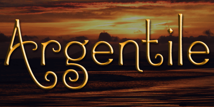 Argentile is a stylish, swirling, magical font with an organic, fairytale feel. Argentile is ideal for any project involving elves, goblins, wizards or suchlike. It includes contextual alternates for characters with swash elements or extravagant ascenders and descenders to avoid overlap.
 - Matchings by Fontysia,
$20.00 Matching is a beautiful, casual script adds a custom and organic feel to any design you need! Use this font for: Branding, Invitations, Stationery, Logos, Print Materials, Watermark, Label, Wedding designs, Social media posts, Products, Desktop Programs, Canva , Websites and more.
 - Coomeec by Linotype,
$29.99 Although Andi AW. Masry designed his Coomeec typeface with one eye on comic books, this is more than just another cartoon font. Even in our short profile of the font below, we're sure you'll find enough to be surprised by the calligraphic aesthetic and the wide range of potential uses of Coomeec. Typography had been one of Andy AW. Masry's hobbies before he turned professional in 2008 and formed his own agency in Jakarta in Indonesia. The former construction engineer had already spent many hours of his leisure time in following his pastimes of designing, photography and Latin typography. Fascinated by the close interaction between text and image in comic books, one of his first projects was the development of his font Coomeec™. The condensed letters of Coomeec seem to have more in common with a calligraphic brush typeface than a more conventional cartoon font. With the characteristic line forms of a brush font, the not unextensive variations in line thickness and numerous small embellishments to the glyphs, Coomeec can be used to enhance your projects with animated effects. You can achieve this not just in the larger font sizes; the font is also very legible in small sizes thanks to its large x-height. There are certain unusual letter forms, such as that of lowercase 'g', 's' and uppercase 'Y', that provide Coomeec with a touch of the exotic. As Coomeec has numerous character alternatives, you can use it not only to create diverse designs but also to ring the changes with the character of the text itself. There are variants for most lowercase letters, some of which exhibit only minor differences, such as the lack of a curlicue on the 'b', a modified downstroke on the 'h' and an elongated base for the 'k'. In the case of other letters, such as the 'q' and the 'r', there are significant disparities between variants. The uppercase characters are also available in a lively swash style with significantly extended terminals. Among the range of characters of Coomeec are oldstyle and lining figures designed for proportional and tabular setting. All alternatives are available in the form of the corresponding OpenType versions. Coomeec comes in two weights; Regular and Bold, each with its Italic version. The form of the slightly inclined Italic characters is identical to that of their upright counterparts with the exception of the lowercase 'f', which has an ascender in its Italic version. As an OpenType Pro font, the glyphs available for Coomeec ensure that it can be used to set not only western European but also central European texts. Coomeec is not just at home when used to set headlines. The excellent legibility of this individual and vibrant typeface means that it's also ideal for setting shorter texts. The various alternative letters provide the designer with the opportunity to vary the textual appearance, and to choose between creating a more formal or more light-hearted effect. Coomeec is not only available in an OpenType version but is also obtainable as a web font, so that you can employ its exotic features to good effect when creating internet pages.
 - Bookable Sans by Stiggy & Sands,
$24.00 A Sans Serif Family with a few unique relatives Our Bookable Sans Family was inspired by a lettering specimen from “Letters and Lettering” by Carlyle & Oring, but you'll find the inspiration has come a long way, baby. From its original reference of displaying a standard width and weight, to the two words showing a light narrow and a heavy wide, this friendly utilitarian display text face has grown to include three width families, with six weights from light to black each. The outliers of the family are Bookable Mondo: an uber heavyweight wide style exuding all brute power in an all-caps form, and Bookable Noir: a lightweight and narrow style with many unique alternate letterforms and ligatures that spoof film noir titling, but also goes off the rails having fun. Opentype features for the traditional families include: - Full set of Inferiors and Superiors for limitless fractions. - A small collection of f-based Ligatures. - Tabular & Proportional figure sets. - Ordinals. - Approx. 419 characters. Opentype features for Bookable Mondo include: - Full set of Inferiors and Superiors for limitless fractions. - Ordinals. - Approx. 391 characters. Opentype features for Bookable Noir include: - Full set of Inferiors and Superiors for limitless fractions. - Five Stylistic Alternate Sets. - Sixty-six unique ligatures. - Ordinals. - Approx. 701 characters.
 - Mon Nicolette by Sudtipos,
$49.00 This is a digital revival by Cristóbal Henestrosa based on an experimental typeface named Charter, designed – yet never fully accomplished – by the prominent William Addison Dwiggins. It is an upright italic, unconnected script typeface, whose main features are a pronounced contrast, condensed forms and exaggerated ascenders. While Dwiggins worked on this project from 1937 to 1955, he only completed the lowercase and a few other characters. However, it was used to set a specimen in 1942 and a short novel in 1946. The sources that Cristóbal used for Mon Nicolette were the original sketches by WAD as well as printing trails kept at the Boston Public Library, and a copy of the 1946 edition of The Song-Story of Aucassin and Nicolette. This gorgeous typeface can be used successfully in headlines, subheads and short passages of text from 12 points onwards, in applications such as fashion magazines, soft news, advertising, poetry, albums, and book covers. This project started ten years ago, while Cristóbal was studying the Type@Cooper Extended Program at New York City. A previous version was selected to be part of the Biennial Tipos Latinos 2018, and now Mon Nicolette is finally ready for commercial distribution with Sudtipos… and we are very proud of it! Festina lente.
 - Malden Sans by Monotype,
$49.00 Malden Sans is a mischievous grotesque sans serif with charming details that gives designers a solid typographic voice. It was created by Michele Patanè with regular and condensed widths, as a utilitarian typeface family for print and digital environments. It was originally designed as part of a type system for cinema magazines, and embodies the devil-may care attitude of the silver screen. Designer Michele Patanè looked back to an earlier era of typography to create the typeface, embracing unusual details, rather than ironing them out. “There is a very naive way of using typography in the 30s and 40s, something not as clean as how it’s used in the late 50s and 60s when everything passed through a rationalisation of the typographic palette,” he explains. “In film magazines you can still see a bit of roughness, and I like that.” This is a design that’s desperate to be used in editorial environments, and has been created to stand up to lower quality paper. It would be equally at home on posters, packaging, and even in digital environments where designers are looking for something more expressive than another geometric sans serif. Malden Sans includes a Normal and Condensed range, with 7 weights in the normal and 6 in the Condensed, both including italics.
 - Skolar PE by Rosetta,
$70.00 Originally developed for academic publishing, Skolar asserts credibility and sustains comfortable reading. It has established itself as a go-to choice for all kinds of scholarly texts, no matter the field or school of thought: it handles the minutiae of linguistic, scientific, and editorial typography with ease. A classic with a twist, Skolar brings a trace of human touch to serious typography. Thanks to this knack for subtlety, it is also successfully used in other genres from branding to children’s literature. Skolar PE has a vast character set that caters to nearly four hundred languages and transliteration systems (Pinyin, IAST/Sanskrit) using Latin, Cyrillic, and Greek (including polytonic). Its larger x-height, robust serifs, low contrast, and its deft italic make it a pleasure to read even at small sizes. With Skolar, footnotes and bibliography become readers’ best friends. The OpenType feature set is engineered for the most rigorous editorial settings. Tabular, proportional, old-style, and lining figures as well as a full set of fractions, ordinals, and scientific superiors and inferiors will stand up to any conjectural challenge. Language-sensitive forms and compound diacritics will handle the demands of many linguistic texts. The companion families Skolar Gujarati, Skolar Devanagari, Skolar Sans PE, and Skolar Sans Arabic expand its typographic and semantic potential even further.
 - Sybilla Multiverse by Karandash,
$28.00 Take a deep dive into the Sybilla Multiverse with this unique 294 style multi-versatile type family – a further creative exploration of the capabilities offered by our original warm and friendly slab design. Encompassing one body and six display sub-families, Sybilla Multiverse is a unique attempt to create a never before seen symphony of text and decorative type that spans in multiple usable widths and weights. Each sub-style consists of seven weights in three widths with complimentary true italics. Sybilla Multiverse is ideally suited for advertising and packaging, editorial and publishing, logo, branding and creative industries, poster and billboards, small text and signage as well as web and screen design. Every one of the styles offered (body or display) provides a broad range of advanced typographical features such as small caps, case-sensitive forms, fractions, scientific inferiors, super- and subscript characters. It comes with a complete figure range set of oldstyle and lining figures, each in tabular and proportional widths. Sybilla Multiverse has extensive multilingual support, covering more than 70 Latin-based languages and specially designed Cyrillic that works harmoniously with its Latin counterparts – a perfect choice for projects that need both writing systems running side by side.
 - Tag Banger by Okaycat,
$12.50 TagBanger WADE1 is the first in a short graffiti font series. This series will showcase the hand-styles of various mature street artists that Okaycat is working with. This first release highlights the style of one such graffiti writer, WADE1, who has an eclectic writing style after many years proliferating street art. Long-term graffiti artists develop their own style over their careers, spending as many endless hours honing their letter-forms as any full-time professional typographical artist. Style, individuality, and originality are everything. These attributes are key to the graffiti artist's tao. A writer who copies, or "bites" loses respect -- their work will be painted over or "crossed out" by all other writers. Okaycat's TagBanger series aims to demonstrate just how widely these individual styles can diverge, likely due, at least in part, to the social pressures of a community that ruthlessly punishes copycats. WADE1's tags were transformed into vector format from a generous sampling of their most recent scrawls. Our TagBanger series may not be composed of the most legible or beautiful fonts, but we imagine there are uses for these whenever highly unusual handwriting is needed. TagBanger WADE1 is extended, containing the full West European diacritics & a full set of ligatures, making it suitable for multilingual environments & publications.
 - DT Paperside by Dragon Tongue Foundry,
$15.00 Paperside: Neither Papyrus nor SSI Countryside. Inspired in some ways by the Papyrus form, but untextured and smoother, with the dimensions and proportions more open, like that of Countryside SSi, with its larger easily readable lowercase body, and more consistent, shorter stems. Paperside has an open scripted feel which is pleasing on the eye and easy to read. Paperside can enhance the first letter of most sentences automatically, and changes other letters to suit their position within words, and the letters they appear beside. Now comes in 5 weights plus italic. For best results, use this ‘smart font’ with Contextual Ligatures turned on. Mulitiple Stylistic Alternatives are included. Inspiration for this font came from two other fonts. Papyrus: was designed by Chris Costello and created in 1982, it is a hand-drawn textured typeface, emulating texts written in biblical times. One of the most used (and misused) fonts of all times. Owned by Letraset, and currently published by the Internation Typeface Corporating (ITC). Countryside SSi: The serif font of an unknown designer, is currently licensed by Southern Software Inc. Feel free to preview some of the Dragon Tongue fonts that are yet to be released, at https://www.dragon-tongue.com/fonts
 - Times New Roman Windows compatible by Monotype,In 1931, The Times of London commissioned a new text type design from Stanley Morison and the Monotype Corporation, after Morison had written an article criticizing The Times for being badly printed and typographically behind the times. The new design was supervised by Stanley Morison and drawn by Victor Lardent, an artist from the advertising department of The Times. Morison used an older typeface, Plantin, as the basis for his design, but made revisions for legibility and economy of space (always important concerns for newspapers). As the old type used by the newspaper had been called Times Old Roman," Morison's revision became "Times New Roman." The Times of London debuted the new typeface in October 1932, and after one year the design was released for commercial sale. The Times New Roman World Version is an extension of the original Times New Roman with several other scripts like with the Helvetica World fonts. It is part of the Windows Vista system. The following code pages are supported:1250 Latin 2: Eastern European 1251 Cyrillic 1253 Greek 1254 Turkish 1255 Hebrew 1256 Arabic Note: The Roman and Bold versions include the arabic scripts but they are not part in the corresponding italic versions. 1257 Windows Baltic 1258 Windows Vietnamese
- Grapple BRK Pro by CheapProFonts,
$10.00 Another very squarish and futuristic font from Brian Kent. This time I've kept the very thin style of the diacritics, but I have redesigned the A and H (and a couple of other letters and glyphs ;) - mostly to give them a little more "meat". And then added the usual plethora of accented letters for our unique language support, of course. Result! ALL fonts from CheapProFonts have very extensive language support: They contain some unusual diacritic letters (some of which are contained in the Latin Extended-B Unicode block) supporting: Cornish, Filipino (Tagalog), Guarani, Luxembourgian, Malagasy, Romanian, Ulithian and Welsh. They also contain all glyphs in the Latin Extended-A Unicode block (which among others cover the Central European and Baltic areas) supporting: Afrikaans, Belarusian (Lacinka), Bosnian, Catalan, Chichewa, Croatian, Czech, Dutch, Esperanto, Greenlandic, Hungarian, Kashubian, Kurdish (Kurmanji), Latvian, Lithuanian, Maltese, Maori, Polish, Saami (Inari), Saami (North), Serbian (latin), Slovak(ian), Slovene, Sorbian (Lower), Sorbian (Upper), Turkish and Turkmen. And they of course contain all the usual "western" glyphs supporting: Albanian, Basque, Breton, Chamorro, Danish, Estonian, Faroese, Finnish, French, Frisian, Galican, German, Icelandic, Indonesian, Irish (Gaelic), Italian, Northern Sotho, Norwegian, Occitan, Portuguese, Rhaeto-Romance, Sami (Lule), Sami (South), Scots (Gaelic), Spanish, Swedish, Tswana, Walloon and Yapese.
 - Bridone by Tipo Pèpel,
$22.00 Introducing the innovative and original Josep Patau’s new recipe, salsa and wild-type master. 1. In a font, combine a bit of slightly outdated British slab types from the late Victorian period. If you find Vincent Figgins’s variety, do not discard. You'll find plenty to choose from in his specimens, some of then with unexpected vitality an enviably condition, despite it’s age. As aging wine, they had improve their quality with time. Cut Didones into thin slices and add. 2. In a blender, whisk the strength of these Slab serif with highly contrasted strokes from Bodoni or Didot’s neoclassical types. Adjust the mix to get a sweeter or spicier taste, but do not forget to emphasize the contrast to avoid the dressing off. 3. On the page, set the wide variety of weights as your menu demands. If you want to feed fill the stomach of the hungriest holders, use Bridone Titling as main course. If you are serving a traditional menu, starter, main and dessert, then simmer a combination of weights and sizes according to your space. It will not disappoint, much less your guests . 4. Spread thoroughly the page, serve and enjoy . If you like natural, switch to Bridona, your pages will thank you.