10,000 search results
(0.043 seconds)
- Pudgy Puss NF by Nick's Fonts,
$10.00Here’s a new take on an old favorite, the Lubalin-Carnase classic Fat Face. This version, intended for large headlines, cranks the original’s very high contrast up another notch. Both versions of this font contain the complete Unicode Latin A character complement, with support for the Afrikaans, Albanian, Basque, Bosnian, Breton, Catalan, Croatian, Czech, Danish, Dutch, English, Esperanto, Estonian, Faroese, Fijian, Finnish, Flemish, French, Frisian, German, Greenlandic, Hawaiian, Hungarian, Icelandic, Indonesian, Irish, Italian, Latin, Latvian, Lithuanian, Malay, Maltese, Maori, Moldavan, Norwegian, Polish, Portuguese, Provençal, Rhaeto-Romanic, Romanian, Romany, Sámi, Samoan, Scottish Gaelic, Serbian, Slovak, Slovenian, Spanish, Swahili, Swedish, Tagalog, Turkish and Welsh languages, as well as discretionary ligatures and extended fractions. - Ongunkan Death Space by Runic World Tamgacı,
$50.00 Dead Space is a science fiction/horror media franchise created by Glen Schofield and Michael Condrey, developed by Visceral Games, and published and owned by Electronic Arts. The franchise's chronology is not presented in a linear format; each installment in the Dead Space franchise is a continuation or addition to a continuing storyline, with sections of the storyline presented in prequels or sequels, sometimes presented in other media from the originating video game series, which includes two films and several comic books and novels. This font is related to the video game Death Space, I redrawn this font to make it a font with a minimum character set.
 - Grok by PintassilgoPrints,
$20.00 Bold as love, Grok is a hand-drawn typeface, assertive but soft. Showy and friendly. It's an all caps font with 2 choices for each letter, accessible via keyboard upper and lower case slots. For that handcrafted look, you know. Turn on the contextual alternates feature to automatically alternate these. Grok originally comes in two cuts: bold and… less-bold :) Later the outline style was added as a gift, a free font. And finally, there's yet a nifty picture font with dozens of dingbats to beautify your words every now and then. Perfectly suited for display uses: packaging, signage, web titlings, editorial design, book covers – and not-only-covers. Grok it?
 - Francker by Linotype,
$29.99 Francker is a sans-serif, based on clean and simple design principles that betray its Danish origin. Its curves are based on the “super ellipse”, a mathematical shape about half-way between an ellipse and a rectangle. Francker’s lowercase lettershapes a, b, n, and u, have no spurs, emphasizing the simplicity of their construction. The Francker family is available in two widths, normal and condensed, each in nine weights, from extra light to extra black. Use Francker for signage, posters, magazines, advertisements, or corporate identity projects—wherever an industrial, contemporary look is needed. The Francker type was developed and designed by Anders Francker, an engineer and designer living in Denmark.
 - Hupp Antiqua NF by Nick's Fonts,
$10.00An enchanting design by Otto Hupp for Gebr. Klingspor in 1909 provided the pattern for this timeless classic, which gracefully and seamlessly combines medieval inspiration with Art Nouveau flair. All versions of this font contain the complete Unicode Latin A character complement, with support for the Afrikaans, Albanian, Basque, Bosnian, Breton, Catalan, Croatian, Czech, Danish, Dutch, English, Esperanto, Estonian, Faroese, Fijian, Finnish, Flemish, French, Frisian, German, Greenlandic, Hawaiian, Hungarian, Icelandic, Indonesian, Irish, Italian, Latin, Latvian, Lithuanian, Malay, Maltese, Maori, Moldavan, Norwegian, Polish, Portuguese, Provençal, Rhaeto-Romanic, Romanian, Romany, Sámi, Samoan, Scottish Gaelic, Serbian, Slovak, Slovenian, Spanish, Swahili, Swedish, Tagalog, Turkish and Welsh languages, as well as discretionary ligatures and extended fractions. - Superba Pro by Red Rooster Collection,
$60.00 Superba Pro is a condensed Egyptian font family with short ascenders and descenders. The dots on the lowercase ‘i’ and the German umlaut-vowels are square. Haas Type Foundry created the original Superba in 1928-1930. Steve Jackaman (ITF) designed and produced a digital version of the bold weight in 1992. In 2017, Jackaman completely redrew the bold weight, added an accompanying wide weight, and expanded the glyph set to support Central and Eastern European languages. Like other slab serif faces, Superba excels at display sizes and is comfortable at subhead sizes. It is robust, and has “superb” legibility, allowing it to dominate attention in any project it is utilized in.
 - Jotia by Hashtag Type,
$32.00 Creating a combination between serif and sans serif typefaces, Jotia utilises the best of both worlds, resulting in a unique and modern neo-humanist font family. Taking its inspiration from lapidary inscriptions rather than pen drawn text, Jotia uses triangular serif shape details to create a strong uniformed personality with clear legibility. This original quality enables characters to be expressive in headlines, as well as in printed and onscreen text situations. Jotia also works beautifully alongside both serif and sans serif typefaces giving complex editorial work a more powerful and visually stimulating dynamic. Details include six weights, manual kerning and spacing, ligatures and alternatives.
 - Aztek 2D by 2D Typo,
$36.00 Aztek emerged as a custom face for an ethno-music festival, and gradually developed a more robust, geometric base. The original ethno roots can still be seen in some of the alternative caps, and the ease with which Aztek forms decorative elements and borders. There is also an alternative “Tall Caps” set, that goes alongside normal uppercase characters as if they were Small Caps. The font features Latin (extended to support German and Polish) and Сyrillic character sets. Though Aztek is an accidental face designed primarily for display work, it holds well at smaller sizes and can endure high ink gain printing found in letterpress and silk-screen processes.
 - Yonky Display by Prioritype,
$21.00 Yonky Display is a really fun hand-drawn font. Consists of two styles namely regular & extrude. Perfect for poster designs, quotes, merchandise, logos and more. Features: Uppercase, Lowercase, Numeral, Punctuation, Multilingual & Ligatures. Multilingual contained: Afrikaans, Albanian, Asu, Basque, Bemba, Bena, Breton, Catalan, Chiga, Cornish, Danish, Dutch, English, Estonian, Filipino, Finnish, French, Friulian, Galician, German, Gusii, Indonesian, Irish, Italian, Kabuverdianu, Kalenjin, Kinyarwanda, Luo, Luxembourgish, Luyia, Machame, Makhuwa-Meetto, Makonde, Malagasy, Manx, Morisyen, North Ndebele, Norwegian Bokmål, Norwegian Nynorsk, Nyankole, Oromo, Portuguese, Quechua, Romansh, Rombo, Rundi, Rwa, Samburu, Sango, Sangu, Scottish Gaelic, Sena, Shambala, Shona, Soga, Somali, Spanish, Swahili, Swedish, Swiss German, Taita, Teso, Uzbek (Latin), Volapük, Vunjo, Zulu. Thanks!
 - Enotria by Aspro Type,
$39.99 Enotria is a contemporary neo-grotesk typefaces inspired by the Swiss school but with a Calabrian’s soul (south Italy region). It is composed by 8 weights and 7 widths for 112 styles with also 4 stylistic set for the letters, 2 stylistic set for numbers, 1 more stylistic set for symbols and punctuations, for three languages scripts. Enotria sports elegant 8° italic angle and a lot of adjustment between the letters for a better legibility as well as true fractions, ordinals, tabular and old style figures, numerators and denominators. Enotria typefamily is more then a typeface, it is a huge design and typographic system, flexible and suitable for any occasion.
 - Bangkokean by Cadson Demak,
$29.00 This font was originally designed side by side with my first attempt at a semi serif typeface in 1997. The design made it through to full development only a couple years ago when our studio decided to complete the regular weight for a local project here in Bangkok. The face is a traditional serif with narrow stem (somewhat like sans serif) and industrial stroke. A good mix of Bangkok character where you can find Wat (old buddhist temple) next to futuristic high rise. This font was shown in Klingspor-Museum Offenbach, Germany, at a Typographic & Type Design exhibition Schrift in Form 3-26 September 2008.
 - P22 Victorian Gothic by P22 Type Foundry,
$24.95 P22 Victorian is a font set created in conjunction with the Albright-Knox Art Gallery's exhibition of Victorian-era French artist James Tissot. The fonts developed for the P22 Victorian set are based on historic typefaces dating from the late 19th century. Victorian Gothic was based on a type style called ‘Atlanta’, a simple, expanded width, quirky, yet elegant face similar to ‘Copperplate’. Victorian Swash was inspired by the willowy, delicate face ‘Columbian’, which has also been known in recent years as ‘Glorietta’. The P22 version includes ‘snap-on’ flourishes based on the original 'Columbian' ornamental embellishment designs. Victorian Ornaments features over 150 decorative embellishments.
 - Ballon Midair by Nathatype,
$29.00 Wanna make your branding radiate elegance? Something that’s versatile, original, stylish, and eternal? Get ready to explore to a world of magic, laughter, and butterflies. Your branding will make everyone happy! Balloon Midair-A Handwritten Font A beautifully handcrafted font that’ll make your guests sing and elevate your projects! Every stroke and curve was created to spread happiness and elegance. Use it to create standout headings, promote your online sales, Instagram quotes, and even printed materials like business cards, t-shirts, or invitations. Balloon Midair includes Multilingual Options to make your branding globally acceptable. Features: Ligatures Stylistic Set PUA Encoded Numerals and Punctuation Thank you for downloading premium fonts from Nathatype
 - Frank Ruehl BT by Bitstream,
$29.99Frank-Rühl (or Ruehl) is the ubiquitous Hebrew text font style. There are many fonts that belong to this style, and all are based on an early 20th-century design by Raphael Frank. Some of the fonts are actually called Frank-Rühl (or Ruehl) and some are not. It was originally designed in a single weight. Bitstream developed Frank Ruehl for the Microsoft Windows operating system. The font is encoded with a Microsoft defined Hebrew character set, Hebrew Code Page 1255. Within the TrueType fonts, the characters are assigned Unicode character IDs. The font includes Hebrew characters, and Latin glyphs from Dutch 801 bold. - Solpera by Storm Type Foundry,
$32.00This type face fills one of the gaps between the world of Roman alphabets and that of linear alphabets. The first to be designed was the set of upper-case letters. The expression of these characters cannot conceal that they were originally intended only for the sculptor's use, as a type face for three-dimensional inscriptions. Their width proportions reflect a dialogue between the contemporary feeling and the legacy of classical Roman inscriptions. The type face was later complemented with a set of lower-case letters and elaborated into further designs. Its clear, concise letter forms end with small serifs which not only make the type face more refined, but above all anchor the individual letter signs visually to the horizontal of the text line. The austere construction of the majority of the letters is balanced by the more exuberant, humanizing forms of the most frequently used letters "a"; "e". (The three variants of the lower-case "e" enable to create rhythmically differentiated texts.) The letters in which a straight stroke is connected with an arch are designed in two ways. That means that the letters "n", "h","m" and the group of letters "b","d","p","q" are conceived in a different way. Thus an interesting tension is created in the structure of the text, which, however, does not endanger legibility. The economizing, slightly narrowed design of this type face predetermines its use for the setting of usual texts. In larger sizes, however, it produces a rather serious, even solemn, impression. - Metron by Storm Type Foundry,
$52.00 Metron is so far the most ambitious typeface made to order in the Czech Republic. Despite the fact that for a number of years it has not been used for the purpose for which it was designed, every inhabitant of Prague is still well aware of its typical features. Metron Pro was commissioned by the Transport Company of the Capital City of Prague in 1970 to be used in the information system of the Prague Metro. It was first published in the manual of the Metroprojekt company in 1973 and then used to the full, under the author’s supervision, for lines “A” and “C”. Since 1985 Rathouský's system has been disappearing from the Prague Metro; it survives only in the form of metal letters at its stations and at some stations of the Czechoslovak Railways. In 2014 we're mentioning the 90th birthday of Jiří Rathouský. It’s a good opportunity for updating and re-introducing his Metron. Extended was the choice of figures and fractions, new currency signs added, diacritics revised, etc., but above all the newly designed Cyrillics including true SmallCaps. Now we have six weights plus italics, where the tone of the basic style is even closer to the original. Ten years back we've had the feeling that this typeface should again take a part of Prague’s traffic system and today, when revisiting of all the fonts, the feeling turned to certainty. The main feature of this typeface is namely a noticeability a property above all welcomed in rush of platforms.
 - Moyenage by Storm Type Foundry,
$55.00Blackletter typefaces follow certain fixed rules, both in respect to their forms and to the orthography. Possibly, they were a reaction to the half-developed Carolingian minuscule which was soon to end in the Latin script. Narrow, ordered script was to replace the round, hesitant and shattered shapes of letters in order to simplify writing, to unify the meaning of individual letters, and to save some parchment, too. Opposed to the practice common in monasterial scriptoriums where Uncial, Irish and Carolingian inspiration flew freely and as a result, the styles of writing differed in each monastery, the blackletter type was to define one, common standard. It was to express spiritual verticality, in perfect tune with the architecture of the Gothic era. Typography became an integral part of the overall style of the period. The pointed arch and the blackletter type were the vanguard of the spectacular transformation from the Middle Ages towards the modern era, they were a celebration of a time when works of art were not signed by their makers yet. Some unfortunate souls keep linking blackletter solely with Germany and the Third Reich, while the truth is that its direct predecessor, the Gothic minuscule, evolved mostly in France. Even Hitler himself indicated blackletter type obsolete in the age of steel, iron and concrete – thus making a significant contribution to the spreading of the Latin script in Germany. Once we leave our prejudice aside, we find that the shapes of blackletter type have exceptional potential, unheard of in sans-serif letterforms. The lower case letters fit into an imaginary rectangle which is easily extended both upwards and sideways. In its scope and in the name itself, the Moyenage type family project is to celebrate the diversity of the Middle Ages. I begun realizing the urge to design my own blackletter when visiting the beer gardens of Munich and while walking through the villages of rural Austria. The letters from the notice boards of inns are scented with spring air, with the flowers of cudweed, with white sausage and weissbier. The crooked calligraphic hooks and beaks seem to imitate the hearty yodeling of local drinkers and the rustle of the giant skirts of girls who distribute the giant wreaths of beer jugs. Moyenage is, however, a modern replica of blackletter, so it contains some otherwise unacceptable Latin script elements in upper case. I chose these keeping the modern reader in mind, striving for better legibility. The font is drawn as if written with a flat pen or brush, and with the ambition to, perhaps, serve as a calligraphic model. In medium width, the face is surprisingly well legible; it is perfect for menus as well as posters and CD covers for some of the heavier kinds of music. It has five types of numerals and also a set of Cyrillic script, symbolising the lovelorn union of Germans and Russians in the 20th century. Thus, it is well suited for the setting of bilingual texts of the German classic literature, which, according to the ancient rules, must not be set in Latin script. - From the Internet by Typodermic,
$11.95 Introducing From the Internet, a sleek and pragmatic sans-serif typeface that exudes technical sophistication. The narrow and square shapes of this typeface create a compact and organized appearance, perfect for modern industrial design. With softened edges, the boxy letterforms have a sense of approachability that is sure to draw in any reader. From the Internet’s austere and uncomplicated style ensures that your message is delivered with clarity and precision. Its lack of intricate detail prevents any distractions, keeping the focus on the essential message. This typeface avoids clichés, ensuring that your designs are always fresh and unique, without any conspicuous sci-fi influences. This font’s versatility is enhanced by the “stylistic alternatives” feature available in OpenType-savvy applications, allowing for access to alternate versions of the “f” and “t” letters. From the Internet offers a range of styles, including Regular, Italic, Bold, and Bold Italic, each with its unique personality. Whether you’re looking to create sleek tech manuals or modern business presentations, From the Internet is the perfect typeface to convey your message with sophistication and style. Its pragmatic and precise style ensures that your designs will always be on-trend and highly readable, making it an excellent choice for any designer looking to create an impact. Most Latin-based European writing systems are supported, including the following languages. Afaan Oromo, Afar, Afrikaans, Albanian, Alsatian, Aromanian, Aymara, Bashkir (Latin), Basque, Belarusian (Latin), Bemba, Bikol, Bosnian, Breton, Cape Verdean, Creole, Catalan, Cebuano, Chamorro, Chavacano, Chichewa, Crimean Tatar (Latin), Croatian, Czech, Danish, Dawan, Dholuo, Dutch, English, Estonian, Faroese, Fijian, Filipino, Finnish, French, Frisian, Friulian, Gagauz (Latin), Galician, Ganda, Genoese, German, Greenlandic, Guadeloupean Creole, Haitian Creole, Hawaiian, Hiligaynon, Hungarian, Icelandic, Ilocano, Indonesian, Irish, Italian, Jamaican, Kaqchikel, Karakalpak (Latin), Kashubian, Kikongo, Kinyarwanda, Kirundi, Kurdish (Latin), Latvian, Lithuanian, Lombard, Low Saxon, Luxembourgish, Maasai, Makhuwa, Malay, Maltese, Māori, Moldovan, Montenegrin, Ndebele, Neapolitan, Norwegian, Novial, Occitan, Ossetian (Latin), Papiamento, Piedmontese, Polish, Portuguese, Quechua, Rarotongan, Romanian, Romansh, Sami, Sango, Saramaccan, Sardinian, Scottish Gaelic, Serbian (Latin), Shona, Sicilian, Silesian, Slovak, Slovenian, Somali, Sorbian, Sotho, Spanish, Swahili, Swazi, Swedish, Tagalog, Tahitian, Tetum, Tongan, Tshiluba, Tsonga, Tswana, Tumbuka, Turkish, Turkmen (Latin), Tuvaluan, Uzbek (Latin), Venetian, Vepsian, Võro, Walloon, Waray-Waray, Wayuu, Welsh, Wolof, Xhosa, Yapese, Zapotec Zulu and Zuni.
 - Warugaki by Typodermic,
$11.95 Introducing Warugaki: a typeface that defies convention and eschews predictability. With a bold, untamed energy that is deeply rooted in mid-century Japanese style, Warugaki captures the essence of a bygone era while remaining firmly anchored in the present. But don’t be fooled by its seemingly disorganized appearance—this headline typeface is the result of a meticulous subtractive process that imbues each letterform with a sense of organic authenticity. The edge technique used is reminiscent of a handcrafted silk screen or wax dye resist, resulting in compact letterforms that exude a sense of raw, unbridled energy. But Warugaki is more than just a typeface—it’s an experience. With bespoke letter combinations and alternate letters in the lowercase position, each word you create with Warugaki is a unique expression of your own creative vision. No two designs will ever be the same, and that’s exactly the way it should be. So if you’re looking to break free from the constraints of traditional typography and embrace a more spontaneous, expressive approach to design, look no further than Warugaki. This is a typeface that will take your work to new heights, and leave a lasting impression on anyone who sees it. Most Latin-based European, Vietnamese, Greek, and most Cyrillic-based writing systems are supported, including the following languages. Afaan Oromo, Afar, Afrikaans, Albanian, Alsatian, Aromanian, Aymara, Azerbaijani, Bashkir, Bashkir (Latin), Basque, Belarusian, Belarusian (Latin), Bemba, Bikol, Bosnian, Breton, Bulgarian, Buryat, Cape Verdean, Creole, Catalan, Cebuano, Chamorro, Chavacano, Chichewa, Crimean Tatar (Latin), Croatian, Czech, Danish, Dawan, Dholuo, Dungan, Dutch, English, Estonian, Faroese, Fijian, Filipino, Finnish, French, Frisian, Friulian, Gagauz (Latin), Galician, Ganda, Genoese, German, Gikuyu, Greenlandic, Guadeloupean Creole, Haitian Creole, Hawaiian, Hiligaynon, Hungarian, Icelandic, Igbo, Ilocano, Indonesian, Irish, Italian, Jamaican, Kaingang, Khalkha, Kalmyk, Kanuri, Kaqchikel, Karakalpak (Latin), Kashubian, Kazakh, Kikongo, Kinyarwanda, Kirundi, Komi-Permyak, Kurdish, Kurdish (Latin), Kyrgyz, Latvian, Lithuanian, Lombard, Low Saxon, Luxembourgish, Maasai, Macedonian, Makhuwa, Malay, Maltese, Māori, Moldovan, Montenegrin, Nahuatl, Ndebele, Neapolitan, Norwegian, Novial, Occitan, Ossetian, Ossetian (Latin), Papiamento, Piedmontese, Polish, Portuguese, Quechua, Rarotongan, Romanian, Romansh, Russian, Rusyn, Sami, Sango, Saramaccan, Sardinian, Scottish Gaelic, Serbian, Serbian (Latin), Shona, Sicilian, Silesian, Slovak, Slovenian, Somali, Sorbian, Sotho, Spanish, Swahili, Swazi, Swedish, Tagalog, Tahitian, Tajik, Tatar, Tetum, Tongan, Tshiluba, Tsonga, Tswana, Tumbuka, Turkish, Turkmen (Latin), Tuvaluan, Ukrainian, Uzbek, Uzbek (Latin), Venda, Venetian, Vepsian, Vietnamese, Võro, Walloon, Waray-Waray, Wayuu, Welsh, Wolof, Xavante, Xhosa, Yapese, Zapotec, Zarma, Zazaki, Zulu and Zuni.
 - Greek by Scholtz Fonts,
$8.95The Greek font started from an experiment with designing fonts based on a geometric grid. I joined the points on the grid with straight lines to form the various characters and found that this resulted in a font that closely resembled Greek writing (derived from inscriptions carved in stone) of ancient times. I continued to develop this theme but I now accentuated the look and feel of Greek writing. The three styles shown are the results of this development. I did not kern or letterspace the individual letters since this would have been out of character with the orignal Greek writing. This means that the font is mono-spaced. At a later stage I may produce more refined and "modern" versions of these fonts. Surprisingly, the Greek SCF styles are very readable. The font is fully professional in terms of its character set. It contains over 235 characters - (upper and lower case characters, punctuation, numerals, symbols and accented characters are present). In fact, it has all the accented characters used in the major European languages. - Binario by Tarallo Design,
$14.99 Binario is a simple and friendly font with three weights and matching obliques. The geometric and modular characteristics of this typeface subtly reference the Art Deco and early modernist periods. It is an ideal choice for achieving a clean, distinctive, and contemporary aesthetic, making it suitable for branding, posters, and screen-based designs. The light weight of Binario is good for body text. The regular weight exudes confidence, making it suitable for both body and heading text. For impactful headlines, the bold weight is superb. The clear weight distinction of this family make it easy to create organized text. Binario was designed in Siena, Italy taking some inspiration from train stations and shop signage. The name Binario means train platform in Italian. Other aspects that informed the design of this font are modularity and efficiency. The interior rounded forms of the letters (counterforms) are based on shape of the Roman arch. Binario has a sibling, Binario Soft. This version has gently rounded stroke ends, which make a softer impression on the page.
 - Luminaire by Muksal Creatives,
$17.00 Luminaire is an intriguing and modern sans serif font. With its clean and minimalist characteristics, Luminaire exudes a professional and contemporary impression when used in designs. One of the captivating features of Luminaire is its alternate style, specifically the display style. This unique feature allows users to combine two different styles within a single word, creating a distinct and eye-catching visual appearance. In display mode, Luminaire offers experimental and striking variations of letterforms. Certain characters exhibit alternative shapes with artistic touches, such as curved lines or changes in the basic structure of the letters. This grants greater design flexibility and makes words written in Luminaire font stand out. Luminaire also maintains the essential aspects of clarity and legibility expected from a sans serif font. When used in longer texts or paragraphs, this font remains easy to read and provides a professional and well-organized appearance.Overall, Luminaire is an appealing sans serif font with a modern style and a unique alternate style feature. It can add artistic touches and uniqueness to your designs while preserving the important aspects of clarity and legibility.
 - Niemeyer by Latinotype,
$36.00 Oscar Niemeyer is one of the greatest architects of our time—his unique way of mixing straight lines and abstract curves gives rise to an unmistakable and characteristic style. This typeface is my own tribute to Brazilian architect Oscar Niemeyer. The design process started when my wife and I visited Brazil while she was running a series of workshops on calligraphy. In my spare time, I would walk through the streets of beautiful cities like Rio de Janeiro or São Paulo, enjoying the local architecture and urban life. I had also the opportunity to attend to some of the workshops during which I was able to observe the organic of calligraphy and people. Then, I started to draw some shapes that reflected everything about this beautiful place: Niemeyer’s architecture and work and, in his own words ‘the curves on the body of the beloved woman’. This versatile typeface comes in 8 weights with matching italics, alternative characters, oldstyle figures and much more! Niemeyer is well-suited for logotypes, advertising, publishing, branding and corporate use. Special thanks to everyone in the Latinotype Team (especially to César Araya) for their support, help with corrections and digital editing.
 - Hybrea by Typodermic,
$11.95 Welcome to the future of typography with Hybrea, the neoteric sans-serif typeface inspired by the sleek and futuristic designs found in automotive and aerospace industries. This font is designed to elevate your brand, giving your phrases an air of sophistication and high-tech wonderment. Hybrea’s clean, crisp lines bend unexpectedly, creating a sense of originality that is sure to make your brand stand out from the rest. Whether you’re designing a website, creating marketing materials, or even just crafting a simple social media post, Hybrea is the typeface you need to take your brand to the next level. With seven distinct weights, ranging from light to bold, and italics for each, you can easily tailor words to suit your specific needs. Plus, if you’re looking to add an extra bit of edge to your design, Hybrea even comes with a greasy stencil font, perfect for creating that rough and rugged look. Designed with a clean future in mind, this typeface is perfect for brands looking to make a positive impact on the world. So why wait? Try Hybrea today and take the first step towards a brighter, more sustainable future. Most Latin-based European writing systems are supported, including the following languages. Afaan Oromo, Afar, Afrikaans, Albanian, Alsatian, Aromanian, Aymara, Bashkir (Latin), Basque, Belarusian (Latin), Bemba, Bikol, Bosnian, Breton, Cape Verdean, Creole, Catalan, Cebuano, Chamorro, Chavacano, Chichewa, Crimean Tatar (Latin), Croatian, Czech, Danish, Dawan, Dholuo, Dutch, English, Estonian, Faroese, Fijian, Filipino, Finnish, French, Frisian, Friulian, Gagauz (Latin), Galician, Ganda, Genoese, German, Greenlandic, Guadeloupean Creole, Haitian Creole, Hawaiian, Hiligaynon, Hungarian, Icelandic, Ilocano, Indonesian, Irish, Italian, Jamaican, Kaqchikel, Karakalpak (Latin), Kashubian, Kikongo, Kinyarwanda, Kirundi, Kurdish (Latin), Latvian, Lithuanian, Lombard, Low Saxon, Luxembourgish, Maasai, Makhuwa, Malay, Maltese, Māori, Moldovan, Montenegrin, Ndebele, Neapolitan, Norwegian, Novial, Occitan, Ossetian (Latin), Papiamento, Piedmontese, Polish, Portuguese, Quechua, Rarotongan, Romanian, Romansh, Sami, Sango, Saramaccan, Sardinian, Scottish Gaelic, Serbian (Latin), Shona, Sicilian, Silesian, Slovak, Slovenian, Somali, Sorbian, Sotho, Spanish, Swahili, Swazi, Swedish, Tagalog, Tahitian, Tetum, Tongan, Tshiluba, Tsonga, Tswana, Tumbuka, Turkish, Turkmen (Latin), Tuvaluan, Uzbek (Latin), Venetian, Vepsian, Võro, Walloon, Waray-Waray, Wayuu, Welsh, Wolof, Xhosa, Yapese, Zapotec Zulu and Zuni.
 - Expressway by Typodermic,
$11.95 Introducing Expressway, a sleek sans-serif typeface that draws inspiration from the iconic FHWA Series of Standard Alphabets, also known as Highway Gothic. As the most widely-used typeface on road signs in numerous countries since the mid-twentieth century, Expressway’s freeway-themed aesthetic exudes both technicality and industrial charm. With 28 unique styles to choose from, including seven weights, two widths, and italics, Expressway’s practical design perfectly captures the original road sign feel. This family also offers both lowercase (old-style) numerals and monospaced (tabular) numerals, as well as currency, mathematical, and fraction symbols, all of which are monospaced, making it a breeze to create price lists and other tabular numeric data. Whether you’re a designer, engineer, or simply a lover of all things technical, Expressway’s warm and inviting style is sure to stand the test of time. So why not hit the road with Expressway and take your designs to the next level? Most Latin-based European, Vietnamese, Greek, and most Cyrillic-based writing systems are supported, including the following languages. Afaan Oromo, Afar, Afrikaans, Albanian, Alsatian, Aromanian, Aymara, Azerbaijani, Bashkir, Bashkir (Latin), Basque, Belarusian, Belarusian (Latin), Bemba, Bikol, Bosnian, Breton, Bulgarian, Buryat, Cape Verdean, Creole, Catalan, Cebuano, Chamorro, Chavacano, Chichewa, Crimean Tatar (Latin), Croatian, Czech, Danish, Dawan, Dholuo, Dungan, Dutch, English, Estonian, Faroese, Fijian, Filipino, Finnish, French, Frisian, Friulian, Gagauz (Latin), Galician, Ganda, Genoese, German, Gikuyu, Greenlandic, Guadeloupean Creole, Haitian Creole, Hawaiian, Hiligaynon, Hungarian, Icelandic, Igbo, Ilocano, Indonesian, Irish, Italian, Jamaican, Kaingang, Khalkha, Kalmyk, Kanuri, Kaqchikel, Karakalpak (Latin), Kashubian, Kazakh, Kikongo, Kinyarwanda, Kirundi, Komi-Permyak, Kurdish, Kurdish (Latin), Kyrgyz, Latvian, Lithuanian, Lombard, Low Saxon, Luxembourgish, Maasai, Macedonian, Makhuwa, Malay, Maltese, Māori, Moldovan, Montenegrin, Nahuatl, Ndebele, Neapolitan, Norwegian, Novial, Occitan, Ossetian, Ossetian (Latin), Papiamento, Piedmontese, Polish, Portuguese, Quechua, Rarotongan, Romanian, Romansh, Russian, Rusyn, Sami, Sango, Saramaccan, Sardinian, Scottish Gaelic, Serbian, Serbian (Latin), Shona, Sicilian, Silesian, Slovak, Slovenian, Somali, Sorbian, Sotho, Spanish, Swahili, Swazi, Swedish, Tagalog, Tahitian, Tajik, Tatar, Tetum, Tongan, Tshiluba, Tsonga, Tswana, Tumbuka, Turkish, Turkmen (Latin), Tuvaluan, Ukrainian, Uzbek, Uzbek (Latin), Venda, Venetian, Vepsian, Vietnamese, Võro, Walloon, Waray-Waray, Wayuu, Welsh, Wolof, Xavante, Xhosa, Yapese, Zapotec, Zarma, Zazaki, Zulu and Zuni.
 - Firstland by Matra Creative,
$15.00 Firstland-Handwritten Fonts have many alternatives that give you the possibility to make your text almost handwritten with all the imperfections and captivating variations that the original handwriting has. Firstland will work perfectly for fashion, brand e-commerce, blog trends, boutiques, store brands, logos, weddings or any business that wants to look luxurious.
 - Saintecy by Ditatype,
$29.00 Saintecy is an equally relaxed and timeless handwritten font. It features an incredibly classic style, while still keeping a friendly feel. Saintecy is the perfect font for making original and outstanding designs, whether for formal or informal projects. Featured : Accents (Multilingual characters) PUA encoded Numerals and Punctuation (OpenType Standard) Full Support Dita Type
 - Homeplate Rough by Alphabet Agency,
$14.00 Homeplate Rough is a classic serif display font. The font is designed for use in vintage themes and works particularly well in bar, steakhouse, rodeo and country music themes. The font was originally developed for use in branding in baseball teams. The font is an all capitals font and includes 128 characters.
 - Public Notice JNL by Jeff Levine,
$29.00Public Notice JNL is based on a wood type alphabet originally shown in George Nesbitt’s 1838 catalog as “Gothic.” The image sample used for a model had only the basic A-Z characters, an ampersand and an exclamation point, so numbers and additional characters were designed and added to the digital version. - Coronette by Chank,
$99.00 The exciting new typewriter font, Coronette, combines old-fashioned charm with modern typographic sensibilities. Originally commissioned as a custom font for Magnetic Poetry, this clean, medium-weight typewriter font is now available to the general font-lovin' public. Enjoy a new, multi-purpose workhorse font for all your labeling and page layout needs.
 - Bistro by Vozzy,
$10.00 Introducing original label font named Bistro. This font has a wide languages support with west european characters (check out all available characters on previews). The font family has four styles: Regular, Shadow, Rough, Rough Shadow. This font will look good on any vintage styled designs like a poster, T-shirt, label, logo, etc.
 - Barriton Paradise by Timurtype,
$24.00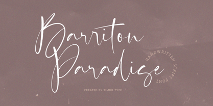 Introducing by Timur type Proudly Present, Barriton Paradise Barriton Paradise A Handwritten Script Font Barriton Paradise is perfect for product packaging, branding project, megazine, social media, wedding, or just used to express words above the background. Barriton Paradise also multilingual support. Embelish your designs with our original fonts.Enjoy the font,Thank you!
 - Gans Antigua Manuscrito by Intellecta Design,
$14.95Gans Antigua Manuscrito is a revival font by Intellecta Design. researched at the rare catalogue from the extinct Fundicion Richard Gans, from Madrid. See also other font families inspired by Gans' original typefaces: Gans Tipo Adorno , Gans Lath Modern , Gans Titular Adornada , Gans Ibarra , Gans Antigua , Gans Fulgor and Gans Radio Lumina . - Matthew Woolsen by Letterara,
$12.00 Matthew Woolsen is a sweet, soft hand-lettered font and monogram. Fall in love with its authentic feel and use it to create gorgeous wedding invitations, beautiful stationary art, eye-catching social media posts, Logo, Brand, and cute greeting cards. This display font is the perfect choice for making original and outstanding designs.
 - Londrina by Tipos Pereira,
$- Londrina is formerly known as Folk. The Londrina family originally had four typefaces: Solid, Shadow, Outline and Sketches. The idea is to combine the main typeface Solid with the others, experiencing different outlines. Now Londrina has three new weights: Thin, Book and Black, growing the family to work with the Solid version.
 - Think Road by Akrtype Studio,
$19.00 Think Road... This idea originated during the year-end holidays, trying to casually scribble on paper so it becomes handwritten, Think Road includes uppercase and lowercase letters, numerals, and supports multilingual. This smooth handwriting is perfect for creating signature logos and watermarks for photography studio or blogger, best for initial or branding logos
 - Giantboat by Timurtype,
$14.00 Proudly presenting: Giantboat, introduced by Timur Type Giantboat is a handwritten script font. Giantboat is perfect for product packaging, branding projects, magazines, social media, wedding invitations, or just used to express words above the background. Giantboat also has multilingual support. Embellish your designs with our original fonts. Enjoy the font, thank you!
 - Roosevelt - Unknown license

- Serling Galleria by Mans Greback,
$39.00 Serling Galleria is a classy, classic serif font that exudes an air of fine art and high-end creativity. With its clear, legible letterforms and modernist inventiveness, Serling Galleria brings a touch of strict creativity to your designs, making them stand out in sophistication. This versatile font family is perfect for projects that require a refined, elegant aesthetic. With its variable font feature, you have the flexibility to fine-tune the font to your specific needs and create a truly bespoke typographical experience, or use the pre-defined font styles: Thin, Thin Italic, Extra Light, Extra Light Italic, Light, Light Italic, Regular, Regular Italic, Medium, Medium Italic, SemiBold, SemiBold Italic, Bold, Bold Italic, Extra Bold, Extra Bold Italic, Black, Black Italic The diverse styles in the Serling Galleria font family provide unmatched versatility, allowing you to adapt your typography to various design contexts and moods seamlessly. With this array of weights and styles at your fingertips, you can effortlessly create a visual hierarchy, emphasize key elements, and establish a cohesive, engaging design language across your creative projects. Also includes a variable font! Only one font file, but the file contains multiple styles. Use the sliders in Illustrator, Photoshop or InDesign to manually set any weight and width. This gives you not only the predefined styles, but instead more than a thousand ways to customize the type to the exact look your project requires. Built with advanced OpenType functionality, Serling Galleria ensures top-notch quality and provides you with full control and customizability. It includes stylistic and contextual alternates, ligatures, and other features to make your designs truly unique and tailored to your needs. Serling Galleria offers extensive lingual support, covering all Latin-based languages, from Northern Europe to South Africa, from America to South-East Asia. It contains all the characters and symbols you'll ever need, including all punctuation and numbers.
 - Ebisu by Thinkdust,
$10.00 Ebisu is a sans serif family consisting of 10 different weights. Designed by Alex Haigh in 2010, and influenced by one of his original designs from 2008 Hiruko - Ebisu loses the soft sans serif curves, for a more robust geometric styling. But it’s much more than a geo-replica. The lowercase characters also have a more exaggerated sharpness that gives the whole family a unique look and feel. The kerning has been individually crafted for each letter, with vigorous attention - to ensure that each letter from is produced in a way that works with every member of the set, for a tightly knit sans serif family. It speaks many languages too. The open type features have an extended character set to support Eastern and Western European languages. With each weight conveying a different personality, Ebisu is set to become the modern new sans serif family to sit alongside you classics for versatility, cleanliness and a crafted edge.
