10,000 search results
(0.042 seconds)
- TT Norms Pro Serif by TypeType,
$39.00 Introducing TT Norms® Pro Serif, version 1.100! The updated font now has new OpenType features and localization for the Serbian and Bulgarian languages. TT Norms® Pro Serif is a functional serif based on our studio's main bestseller—the versatile sans serif TT Norms® Pro. Together, they form an ideal font pair. Although these typefaces are made for each other, they can easily be used independently and paired with other fonts. So, TT Norms® Pro Serif is a self-sufficient and elegant serif, neutral at the same time. It is easy to recognize due to its gentle proportion dynamics, open aperture, slanted oval axis, and low stroke contrast. Another distinctive feature of this font is brutal serifs that adjust in length according to the weight of the font. As well as TT Norms Pro, there are Italic font styles in TT Norms® Pro Serif. However, for this serif, we have designed true italics instead of simple slanted font styles. Their key feature is the ability of the lowercase letterforms to change in reference to the roman font styles. They become more rounded, moving towards handwritten shapes. The nature of the italics turned out sharper than that of the roman font styles. It can be used to place accents that would attract attention without interfering with the process of reading. TT Norms® Pro Serif is capable of solving multiple design tasks. It is highly readable, which makes it convenient for small point sizes. This serif's application range is broad and diverse: it can be used for websites, printed materials, and packaging design. The font is well-suited for projects in the domains of culture, art, history, or literature and can be implemented into the designs of signs, posters, or premium products and services. TT Norms® Pro Serif, version 1.100, consists of: 24 font styles: 11 roman, 11 italic, and 2 variable fonts (one for the roman font styles and another—for italics); 1380 glyphs in each font style; 31 OpenType features, including options for localization.
 - Sunblock Pro by Grype,
$19.00 Clean and geometric deco sans typefaces have been used in a range of scientific publications, corporate logotypes, and beauty products over the years. However, a typeface of this style has yet to have an expansive range of widths and weights to become a design workhorse, until now. The Sunblock family finds its origin of inspiration in the Coppertone sunscreen company logo, and from there expands to type megafamily. Sunblock celebrates the rounded geometric forms of deco and bauhaus lettering through a compressed lens, transcending its brand inspired origin to give birth to a font family that pulls on modern and historical styles. It inherited its soothing tone from the limited character logotype that inspired it, and goes on to include a lowercase, small caps, and a comprehensive range of widths and weights, creating a straightforward, uncompromising collection of typefaces that lend a solid foundation and a broad range of expression for designers. Here's what's included with the Sunblock Collection bundle: 643 glyphs per style - including Capitals, Lowercase, Numerals, Punctuation and an extensive character set that covers multilingual support of latin based languages. (see the 7th graphic for a preview of the characters included) 21 fonts in 5 width subfamilies: Ultra Condensed, Extra Condensed, Condensed, Semi Condensed, & Standard. 5 weights per subfamily (except Ultra Condensed): Thin, Light, Regular, Bold, & Black. Fonts are provided in both TTF & OTF formats. The TTF format is the standard go to for most users, although the OTF and TTF function exactly the same. Here's why the Sunblock Collection is for you: You're in need of a deco geometric font family with a big range of weights and widths You're love that Coppertone letter styling, and want to design anything within that genre You're looking for an alternative to Chalet Comprime with a more versatile range of styles You're looking to start up your own derivative Sunscreen product line You just like to collect quality fonts to add to your design arsenal
 - Cul De Sac - Personal use only

- Aint Nothing Fancy - Personal use only

- Terror JNL by Jeff Levine,
$29.00Creepy...crumbly...spooky... that's Terror JNL. Originally an experimental outline font made in the early days of Jeff Levine's typographic work, it's been revised and properly spaced for the design professional. The font is based on Ray Larabie's 1990's freeware release Foo - and a hand-traced, weathered-look was applied to the letter shapes. There's no kerning and a limited character set - but Terror JNL is still perfect for any headline that depicts "things that go bump in the night"... - Bonzeir by Flawlessandco,
$9.00 Bonzeir is a Retrotype with various alternates and ligatures, an updated blend of bohemian style. An Original typeface that suitable for any graphic designs such as branding materials, t-shirt, print, business cards, logo, poster, t-shirt, photography, quotes .etc This font support for some multilingual. Modern Boho Retro Font that contains uppercase A-Z and lowercase a-z, alternate character, numbers 0-9, and some punctuation. If you need help, just write me! Thanks so much for checking out my shop!
 - Bixa by Novo Typo,
$26.00 Bixa is a chromatic typeface designed for display use. Bixa comes in 13 different layers containing 11 weights for beautiful color combinations. Bixa was originally designed for the Typewood project in 2015. Read more about this project here. In 2016 we launched the chromatic web version of Bixa. More information about Bixa Color here. Bixa was awarded by the Type Directors Club New York and the European Design Awards in 2016. Bixa is designed by Novo Typo in 2015. Youtube
 - New Beginnings by Hanoded,
$15.00 A new year has begun, new resolutions have been made. Fresh ideas are popping up and a new life is about to begin. All in all, I figured New Beginnings was the perfect name for my first font in 2016. It is a very happy, very original typeface. All caps, but upper and lower glyphs differ and can be interchanged. New Beginnings font can be used virtually anywhere, but children’s books and product packaging spring to mind. Comes with an abundance of diacritics.
 - Moura by Flawlessandco,
$9.00 Moura is a handcrafted script, this style gives a feel of girly and Modern font type. An Original typeface that suitable for any graphic designs such as branding materials, t-shirt, print, business cards, logo, poster, t-shirt, photography, quotes .etc This font support for some multilingual. Modern script that contains uppercase A-Z and lowercase a-z, alternate character, numbers 0-9, and some punctuation. If you need help, just write me! Thanks so much for checking out my shop!
 - Gliven by Flawlessandco,
$9.00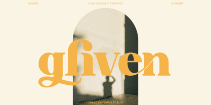 Gliven is a Modern Serif with various alternates and ligatures, an updated blend of bohemian style. An Original typeface that suitable for any graphic designs such as branding materials, t-shirt, print, business cards, logo, poster, t-shirt, photography, quotes .etc This font support for some multilingual. Handcrafted Script that contains uppercase A-Z and lowercase a-z, alternate character, numbers 0-9, and some punctuation. If you need help, just write me! Thanks so much for checking out my shop!
 - Broca by Flawlessandco,
$9.00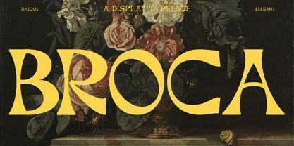 Broca is a Modern Retrotype with various connected letters, an updated blend of bohemian style. An Original typeface that suitable for any graphic designs such as branding materials, t-shirt, print, business cards, logo, poster, t-shirt, photography, quotes .etc This font support for some multilingual. Display Typeface that contains uppercase A-Z and lowercase a-z, alternate character, numbers 0-9, and some punctuation. If you need help, just write me! Thanks so much for checking out my shop!
 - Rikon by JCFonts,
$30.00 Rikon is a modern Sans Serif Family designed by Joël Carrouché and available in six weights, from Thin to Black. With its simple yet original letter shapes, this family displays a strong personality and will really shine in branding or titling applications, while being legible enough to endure longer texts and smaller sizes. The fonts are available in OpenType format, and include diacritics for most European languages and a selection of OpenType features (two stylistic sets, case sensitive forms, tabular figures...).
 - Kattys by Flawlessandco,
$9.00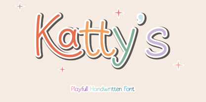 Introducing "Kattys" - a delightful and playful handwritten font that adds a touch of whimsy to any project. An Original typeface that suitable for any graphic designs such as branding materials, t-shirt, print, business cards, logo, poster, t-shirt, photography, quotes .etc This font support for some multilingual. Modern Sweet Retro that contains uppercase A-Z and lowercase a-z, alternate character, numbers 0-9, and some punctuation. If you need help, just write me! Thanks so much for checking out my shop!
 - Graj by Fontsphere,
$16.00 GRAJ is a minimalist, bitmap font with a unique pixel style. It features a sophisticated and original form, making it quite experimental. Despite this, it is widely applicable, and can be used for a variety of large text projects, headers, and custom projects. Its unique geometric elements are perfect for creating custom designs, logos, and other projects requiring a unique and modern aesthetic. With its ingenuity and versatility, GRAJ is a perfect choice for any project requiring a modern bitmap typeface.
 - Quince by Atlantic Fonts,
$26.00 Quince is a playful, zesty, handwritten font. Lower case letters are energetic and sweet, then as all-caps its essence shifts to more architectural and stylish. Both upper and lower case have a set of double-letter ligatures to keep it lively. Quince family also features Quince Designs, an original, floral picture font drawn by Amy Dietrich, rich with charming patterns, borders and spots. See your projects bloom with Quince. Posters also include images from Kiwi Fruits, another picture font by Atlantic Fonts.
 - TG Yane by Weishan Gao,
$39.00 The font design of TG Yane is inspired by my service design for a coffee brand, taking the coffee logo as the design origin. I supplemented the remaining letters, making the font suitable for applications in the catering, cosmetics, luxury goods, and other industries. The lines are soft and very creative. The entire character set is designed with the capital letter "O" as a circular element, ensuring a unified design language. I look forward to seeing it applied to your brand.
 - Pacardo by Luxfont,
$18.00 Introducing a clean geometric font family in Modernism style. Neat and at the same time provocative font attracts attention with its forms. New-fashioned font with original letters will perfectly complement both trendy abstract designs and designs in a retro style. Constructing letters with a bias towards heavier weights and contrast. Versatility of the typeface works well with designs in different styles. Features: Geometric and Modern 6 fonts in family: - Thin, Thin Italic - Regular, Italic - Bold, Bold Italic Kerning ld.luxfont@gmail.com
 - Microsoft Sans Serif by Microsoft Corporation,
$39.00Microsoft Sans Serif™ Regular is a very legible User Interface (UI) font. It was designed to be metrically compatible with the MS Sans bitmap font that shipped in early versions of Microsoft Windows. The original MS Sans was in the inflexible .fon bitmap format and could not be scaled. Microsoft Sans Serif Regular is much more flexible and legible as it font antialiasing and scalable user interfaces. Character Set: Latin-1, WGL Pan-European (Eastern Europe, Cyrillic, Greek and Turkish). - Nouveau Signage JNL by Jeff Levine,
$29.00 Occasionally a type design is started - then set aside for whatever reason - before eventually being completed. More often than not, the original source material is forgotten, so proper attribution cannot be made. Such is the case for a hand lettered Art Nouveau alphabet likely found within the pages of an early Speedball lettering book from around the 1920s. This playful and casual design is now digitally reproduced as Nouveau Signage JNL, and is available in both regular and oblique versions.
 - Flowy by Typesketchbook,
$49.00 Flowy is a romantic and delicate type, made up of four sub-families. Brush, Script, and Condensed imitate freehand writing using different tools. In these families, you can choose the original version which embodies freehand styles, the Clean option which offers a clean-cut edge and is more suitable for corporate assignments, or Rust which changes the texture. Meanwhile, two options, Clean and Ink, come with the Sans type. The complete family has 29 individual typefaces that serve your projects every purpose.
 - WBP Cor by Studio Jasper Nijssen,
$25.00 Introducing the WBP Cor. A retro font based on the old drugstore signage (DROGISTERIJ). Many happy customers have observed it and is now made available for all. Accents have been added, and there quite are a few alternative glyphs. The A has two options for example: there's a sharp version consistent with the original signage, but also a rounded version consistent with the rest of de design. The font can be used to recreate retro signage or other niche designs.
 - Moretta by Flawlessandco,
$9.00 Morettaa is a handcrafted script, this style gives a feel of girly and Modern font type. An Original typeface that suitable for any graphic designs such as branding materials, t-shirt, print, business cards, logo, poster, t-shirt, photography, quotes .etc This font support for some multilingual. Modern Sweet Retro that contains uppercase A-Z and lowercase a-z, alternate character, numbers 0-9, and some punctuation. If you need help, just write me! Thanks so much for checking out my shop!
 - Harelia by Nissa Nana,
$21.00 Harelia is an equally classy and authentic handwritten font with a unique feel. Fall in love with its organic swashes!
 - EB Martin by Erik Bertell,
$12.95 Martin is a quirky modern blackletter, inspired by several traditional styles. Despite the organic feel, its construction is entirely geometric.
 - Prillwitz Pro by preussTYPE,
$49.00 Johann Carl Ludwig Prillwitz, the German punch cutter and type founder, cut the first classic Didot letters even earlier than Walbaum. The earliest proof of so-called Prillwitz letters is dated 12 April 1790. Inspired by the big discoveries of archaeology and through the translations of classical authors, the bourgeoisie was enthused about the Greek and Roman ideal of aesthetics. The enthusiasm for the Greek and Roman experienced a revival and was also shared by Goethe and contemporaries. »Seeking the country of Greece with one’s soul«. All Literates who are considered nowadays as German Classics of that time kept coming back to the Greek topics, thinking of Schiller and Wieland. The works of Wieland were published in Leipzig by Göschen. Göschen used typefaces which had been produced by until then unknown punch cutter. This punch cutter from Jena created with these typefaces master works of classicist German typography. They can stand without any exaggeration on the same level as that of Didot and Bodoni. This unknown gentleman was known as Johann Carl Ludwig Prillwitz. Prillwitz published his typefaces on 12th April 1790 for the first time. This date is significant because this happened ten years before Walbaum. Prillwitz was an owner of a very successful foundry. When the last of his 7 children died shortly before reaching adulthood his hope of his works was destroyed, Prillwitz lost his will to live. He died six months later. His wife followed him shortly after. The typeface Prillwitz as a digital font was created in three optical styles (Normal, Book and Display). The typeface Prillwitz Press was created especially for a printing in small sizes for newspapers. »Prillwitz Press« combines aesthetic and functional attributes which make written text highly readable. It was originally designed for a newspaper with medium contrast to withstand harsh printing conditions. Its structure is quite narrow which makes this typeface ideal for body text and headlines where space is at premium. For the Normal – even more for the Book – a soft and reader-friendly outline was created through a so-called »Schmitz« and optimized in numerous test prints. The arris character and the common maximal stroke width contrast of the known classicist typefaces (Didot/Bodoni) were edited by the study of the original prints. This was also done in order to reach a very good readability in small type sizes. This typeface is perfectly suited to scientific and belletristic works. Accordingly it has three styles: Regular, Bold and Italic as Highlighting (1). The typeface Prillwitz is a complete new interpretation and continuing development of the conservated originals from 1790. They have been kept in the German Library in Leipzig. It was always given the priority to keep the strong roughness and at the same time optimizing the readability of this striking font. The type family has all important characters for an efficient and typographic high quality work. ----------- (1) Accentuation of particular words or word orders (e.g. proper names, terms etc.). Typographic means for Highlighting could be Italic, SmallCaps or semi-bold.
 - Brazarri Pro AOE by Astigmatic,
$24.00 The Brazzari Pro AOE is an unusual but fun geometric typestyle design. It is the historical revival and elaboration of the "Bizarre" typeface created by MacKellar, Smiths, & Jordan Co. in 1884. What began as a basic character set of Capitals, lowercase, numerals, and a small handful of punctuation characters has been expanded to a full character set including unlimited fractionals, superiors & inferiors, ordinals, tabular & proportional figures, and an expanded language glyph set, all with a smallcaps and Caps to Smallcap set to match. Definitely a niché use typeface, however, it has some great appeal. The letterforms of Brazarri Pro AOE are easy to convert to paths and extend various stems, making this revival something you can really let your imagination run wild with for your designs. WHAT'S INCLUDED: Enable the Stylistic Alternates feature for standardized letterforms without the extensions. Extensive language support. Invocation has accented and special characters that support the following languages: Afrikaans, Albanian, Basque, Bosnian, Breton, Catalan Cornish, Corsican, Croatian, Czech, Danish, Dutch, Embu, English, Esperanto, Estonian, Faroese, Filipino, Finnish, French, Galician, German, Hungarian, Icelandic, Irish, Indonesian, Italian, Kurdish, Leonese, Luxenbourgish, Malay, Maltese, Manx, Maori, Meru, Morisyen, North Ndebele, Norwegian Bokmål, Norwegian Nynorsk, Nyankole, Occitan, Oromo, Polish, Portuguese, Rhaeto-Romanic, Romanian, Scottish Gaelic, Scots, Serbian (Latin), Slovak, Slovenian, Spanish, Swahili, Swedish, Tagalog, Turkish, Walloon, & Welsh. One of my guilty pleasures is in taking the time to recreate historical typefaces as digital fonts, and expand on their character sets to enable them to be used more widely than their limited originals. A lot of incredible historical typestyles created as wood or metal type with bare bones character sets have been lost or only exist as limited specimen proofs in old books. These typefaces may have more niché uses than modern typefaces, but I believe it is important nonetheless to preserve these typefaces for future generations. These typefaces, if nothing else, can often inspire new creations.
 - Neuzon by Typodermic,
$11.95 Neuzon pays homage to the bygone era of antique metal typesetting with a retro design that brings an air of nostalgia and character to any project. This textured, inky typeface is a modern interpretation of the iconic Tempo Bold Extended typeface. One of the standout features of Neuzon is its unique custom letter pairings. These pairings help to break up the uniformity of repeating letters, adding a touch of artistry and originality to your designs. The result is a typeface that exudes rustic charm and a warm, authentic feel that is sure to leave a lasting impression on your audience. Designed with versatility in mind, Neuzon’s wide letterforms make it a great choice for a variety of design projects. It works particularly well as a headliner, instantly capturing attention and drawing the eye with its bold and engaging style. Whether you’re creating a vintage-themed poster or revamping your website, Neuzon’s distinctive personality is sure to leave a lasting impression. So why settle for bland, generic typefaces when you can bring your designs to life with the unique character and charm of Neuzon? Get your hands on this retro-inspired typeface today and take your designs to the next level. Most Latin-based European writing systems are supported, including the following languages. Afaan Oromo, Afar, Afrikaans, Albanian, Alsatian, Aromanian, Aymara, Bashkir (Latin), Basque, Belarusian (Latin), Bemba, Bikol, Bosnian, Breton, Cape Verdean, Creole, Catalan, Cebuano, Chamorro, Chavacano, Chichewa, Crimean Tatar (Latin), Croatian, Czech, Danish, Dawan, Dholuo, Dutch, English, Estonian, Faroese, Fijian, Filipino, Finnish, French, Frisian, Friulian, Gagauz (Latin), Galician, Ganda, Genoese, German, Greenlandic, Guadeloupean Creole, Haitian Creole, Hawaiian, Hiligaynon, Hungarian, Icelandic, Ilocano, Indonesian, Irish, Italian, Jamaican, Kaqchikel, Karakalpak (Latin), Kashubian, Kikongo, Kinyarwanda, Kirundi, Kurdish (Latin), Latvian, Lithuanian, Lombard, Low Saxon, Luxembourgish, Maasai, Makhuwa, Malay, Maltese, Māori, Moldovan, Montenegrin, Ndebele, Neapolitan, Norwegian, Novial, Occitan, Ossetian (Latin), Papiamento, Piedmontese, Polish, Portuguese, Quechua, Rarotongan, Romanian, Romansh, Sami, Sango, Saramaccan, Sardinian, Scottish Gaelic, Serbian (Latin), Shona, Sicilian, Silesian, Slovak, Slovenian, Somali, Sorbian, Sotho, Spanish, Swahili, Swazi, Swedish, Tagalog, Tahitian, Tetum, Tongan, Tshiluba, Tsonga, Tswana, Tumbuka, Turkish, Turkmen (Latin), Tuvaluan, Uzbek (Latin), Venetian, Vepsian, Võro, Walloon, Waray-Waray, Wayuu, Welsh, Wolof, Xhosa, Yapese, Zapotec Zulu and Zuni.
 - Alan Den - Unknown license

- Neue Plak Variable by Monotype,
$344.99A little-known design by Futura designer Paul Renner gets a long overdue update by Linda Hintz and Toshi Omagari, in this reliable and impactful industrial sans serif. Neue Plak offers more weights and widths than the original 1928 design, extending its use for branding, editorial, logos and UIs. The pair based their updated and extended version on the original Plak wood type, uncovering lost details and incorporating them as alternates – including the choice between open or strikethrough counters. Neue Plak's outwardly stubborn personality is counteracted by unexpected details, which make for an unusual juxtaposition of severe and playful. “It felt like we should pay Paul Renner more tribute,” says Hintz, who spent time researching the typeface in Hamburg's Museum der Arbeit. “The forms themselves are partly quirky, partly really fun, but with a German stiffness that makes for a strange mix.” Neue Plak offers 60 weights, including a new text version that pairs well with the display weights, and allows the design to function in print and digital environments, and for a wide range of uses. Neue Plak Text Variables are font files which are featuring one axis and have a preset instance from Thin to Black. - Rufina STD by TipoType,
$13.00 Rufina was as tall and thin as a reed. Elegant but with that distance that well-defined forms seem to impose. Her voice, however, was sweeter, closer, and when she spoke her name, like a slow whisper, one felt like what she had come to say could be read in her image. Rufina's story can only be told through a detour because her origin does not coincide with her birth. Rufina was born on a Sunday afternoon while her father was drawing black letters on a white background, and her mother was trying to join those same letters to form words that could tell a story. But her origin goes much further back, and that is why she is pierced by a story that precedes her, even though it is not her own. Maybe her origin can be traced back to that autumn night in which that tall man with that distant demeanor ran into that woman with that sweet smile and elegant aspect. He looked at her in such a way that he was trapped by that gaze, even though they found no words to say to each other, and they stayed in silence. Somehow, some words leaked into that gaze because since that moment they were never apart again. Later, after they started talking, projects started coming up and then coexistence and arguments, routines and mismatches. But in that chaos of crossed words in their life together, something was stable through the silence of the gazes. In those gazes, the silent words sustained that indescribable love that they didn't even try to understand. And in one of those silences, Rufina appeared, when that man told that woman that he needed a text to try out his new font, and she saw him look at her with that same fascination of the first time, and she started to write something with those forms that he was giving her as a gift. Rufina was as tall and thin as a reed, wrote her mother when Rufina was born.
 - Alrighty! So, the Born This Way font, inspired by none other than Lady Gaga's iconic album "Born This Way," is a real testament to the bold, empowering, and unmistakable energy that Gaga herself radi...
- Earth Tone by Sarid Ezra,
$15.00 Introducing, Earth Tone - Organic Sans Family Earth Tone is a handmade font family with natural and organic feels! Contain three weight. Including Light - Regular - Bold. You can use this font for every project. Suitable for branding logo, hand lettering, or apparel design. When you want a handmade touch in your design, this font will never disappoint. This font family also support multilingual, number and symbol.
 - Moonlight Shadow - Personal use only

- Ongunkan Norwegian Futhark by Runic World Tamgacı,
$40.00 THE NORWEGIAN RUNES The oldest runes discovered in Norway date from 400 AD. They were based upon the 24 - rune Elder Futhark of Germanic origin. Two of the runes in the Elder Futhark, Pertra and Eoh, have never been found in any Norwegian rune text. From 550 AD to 700 AD there was a transition period between the older 24-rune Futhark and the newer 16-rune Futharks. By the end of this period, the 24-rune Futhark went completely out of use and the 16-rune Futharks had prevailed. Then, about 900 AD, the Shorttwiggs-runes were introduced from Sweden. Shortly thereafter, from 1000 AD, Futharks with more than 16 runes became more prevalent, as these were more consistent with the Latin alphabet. These types of runes were used in Norway up to 1800 AD.
 - Private Eye JNL by Jeff Levine,
$29.00 From 1958 to 1964, one of ABC-TV’s popular shows was the detective series “77 Sunset Strip”. Based in Los Angeles, the fictional detective agency was located next door to Dino’s Lodge, (partly owned by Dean Martin and actually located at 8532 Sunset). It was originally known as the Alpine Lodge. The adjacent building where Stuart Bailey and Jeff Spencer’s private detective service was located in fact housed a popular modeling agency. The ‘77’ address did not exist outside of the realm of the series. However, a wonderful sign with Art Deco-influenced lettering graced the set (on the wall of the office foyer) saying “Bailey & Spencer Private Investigators Suites 101-102”. A screen capture of this sign served as the working model for Private Eye JNL, which is available in both regular and oblique versions.
 - Ongunkan Irk Bitig Viking by Runic World Tamgacı,
$99.00 This is the Viking font that I developed based on the letters in the Irk Bitig book, which is written with the brush line of the old Turkish runic alphabet, the information below. It was interesting work. Irk Bitig or Irq Bitig (Old Turkic: 𐰃𐰺𐰴 𐰋𐰃𐱅𐰃𐰏), known as the Book of Omens or Book of Divination in English, is a 9th-century manuscript book on divination that was discovered in the "Library Cave" of the Mogao Caves in Dunhuang, China, by Aurel Stein in 1907, and is now in the collection of the British Library in London, England. The book is written in Old Turkic using the Old Turkic script (also known as "Orkhon" or "Turkic runes"); it is the only known complete manuscript text written in the Old Turkic script. It is also an important source for early Turkic mythology.
 - Oscar Bravo by Studio K,
$35.00 This font family was inspired by a visit to the Duxford Air Museum just outside of Cambridge, UK, where the whole history of aviation is represented in a series of exhibits ranging from early prop planes to supersonic jetliners. A common feature is the clipped, blockletter painted on the wing or fuselage of each aircraft, my interpretation of which I present here. To add an original touch each letter incorporates its designation in the NATO phonetic alphabet. In response to popular demand this font is now available in 'Scotch' and 'Irish' versions. If you take your whiskey with an 'e' choose Oscar Bravo Whiskey. If you prefer it neat, choose Oscar Bravo. And no, I am not going to bring out an Oscar Bravo Bourbon version! For variations on this font family see also Alma Mater.
 - Grund by SIAS,
$29.90 GRUND is a new fontographic adaption of a remarkable 1920s epigraphical find in the city of Leipsic. This old well-known European trade fair hotspot struggled with a severe shortage of exhibition space around 1920. The solution was to dig deeper into the matter – literally – and 1924 the world’s first underground trade fair exhibition hall was opened right under the city’s central market square. After several changes of use during the past decades the sophisticated Art Deco entrance structure (architect: Otto Droge) was re-opened in December 2013 as a gateway to a new subway rail track. – The original brass lettering of the UNTERGRUNDMESSHALLE MARKT has been retrieved – and served as the inspiration for this new and unique font. If you’d like to see more exceptional Art Deco type, have a look at my Arthur series. __________________________________________________________________________________________
 - Finnegan by Linotype,
$40.99German designer Jürgen Weltin designed Linotype Finnegan, a modern text design with roots in the humanist letterforms of the Renaissance. As the recognizable direction of movement in writing runs from upper left to lower right, Weltin mimicked this in his design: Linotype Finnegan's up and down strokes end in residual serifs. All of the thick strokes have a taper; horizontal strokes and curves are noticeably thinner than the verticals. This dynamic nature lends a combination of individualness and energy, along with a high degree of variety, to Linotype Finnegan. Linotype Finnegan is a wholly new and unique typeface. It distinguishes itself through its extreme legibility, originality, and formal excellence. Linotype Finnegan makes fun to read longer texts non-stop. However, the typeface never distracts the attention from the text's content by forcing itself too much into the foreground. - Beware The Neighbors by Intellecta Design,
$23.90 Beware The Neighbors is based on “Personality Script”, a rough alphabet originally drawn by Ross F. George, and published in one of the Speedball series of lettering catalogs that ran from 1935 to 1948. The design is something of a minor classic, and several foundries have recreated digital fonts based on it. However, mostly of these interpretations are very “geometric”, formed using straight lines. Intellecta preferred to create a new interpretation using smoother, curved lines to create a creepy appearance. Also included are several ligatures and OpenType stylistic alternates. This version also has an extended character set for use in Central as well as and West European countries, plus Baltic, Turkish and Romanian. Check out Intellecta’s Clarvoyant for another creepy experience based on lettering from old Speedball catalogs. CLOSE THE DOORS AND WINDOWS AND BEWARE OF YOUR NEIGHBORS!


