10,000 search results
(0.07 seconds)
- Hondo by Fontasmic,
$16.99 The Hondo fonts are a collection of ultrabold slab serif typefaces with a dynamic look. Accented with decorative and functional inktraps and complete with Slant and Backslant styles, this heavyweight has a high performance racey feel to it. Ideal for titling, poster work, logos, and small bits of copy.
 - Vuvuzela NF by Nick's Fonts,
$10.00A signpainter's chapbook called this style Show Card Casual, although "casual" might be understating the case a bit. Guaranteed to put some fun, and a wee bit of mischief, into your headlines. Both versions of this font include the complete Latin 1252 and Central European 1250 character sets. - Old Wood JNL by Jeff Levine,
$29.00 One of the charming features of vintage wood type is the unusual interplay of stroke widths or letter shapes that can vary from character to character. In today's world of digital perfection, a set of letters, numbers and punctuation marks must conform to rigid standards of uniform lines, balanced curves and other form-and-function rules that has often removed the human feel from the overall type design. While this is fine when applied to most text fonts and some modern display faces, Old Wood JNL is a simple throwback to an earlier time when type design was an artistic, not engineering endeavor. Modeled in part from vintage source material, this wood type design retains that charming imperfection of a time long passed.
 - F2F Styletti by Linotype,
$29.99The Face2Face (F2F) series was inspired by the techno sound of the mid-1990s, personal computers and new font creation software. For years, Sibylle Schlaich and her friends formed a unique type design collective, which churned out a substantial amount of fresh, new fonts, none of which complied with the traditional rules of typography. Many of these typefaces were used to create layouts for the leading German techno magazine of the 1990s, Frontpage. Schlaich and her fellows would even set in type at 6 points, in order to make it nearly unreadable. It was a pleasure for the kids to read and decrypt these messages! F2F Styletti Medium is one of 41 Face2Face fonts included in the Take Type 5 collection from Linotype GmbH." - Morris by HiH,
$10.00 Morris is a four-font family produced by HiH Retrofonts and based on the work of the very English William Morris. William Morris wanted a gothic type drawn from the 14th century blackletter tradition that he admired both stylistically and philosophically. He drew from several sources. His principal inspiration for his lower case was the 1462 Bible by Peter Schoeffer of Mainz; particularly notable for the first appearance of the ‘ear’ on the g. The upper case was Morris’s amalgam of the Italian cursive closed caps popular throughout the 12th through 15th centuries, a modern example of which is Goudy’s Lombardic Capitals. The gothic that Morris designed was first used by his Kelmscott Press for the publication of the Historyes Of Troye in 1892. It was called “Troy Type” and was cut at 18 points by Edward Prince. It was also used for The Tale of Beowulf. The typeface was re-cut in at 12 points and called “Chaucer Type” for use in The Order of Chivalry and The Works of Geoffrey Chaucer. Morris' objective is designing his gothic was not only to preserve the color and presence of his sources, but to create letters that were more readable to the English eye. ATF copied Troy and called it Satanick. Not only was the ATF version popular in the United States; but, interestingly, sold very well in Germany. There was great interest in that country in finding a middle ground between blackletter and roman styles -- one that was comfortable for a wider readership. The Morris design was considered one of the more successful solutions. Our interpretation, which we call Morris Gothic, substantially follows the Petzendorfer model used by other versions we have seen, with the following exceptions: 1) a larger fillet radius on the upper arm of the H, 2) a more typically broadpen stroke in place of the foxtail on the Q, which I do not like, 3) inclusion of the aforementioned ear on the g and 4) a slightly shorter descender on the y. We have included five ornaments, at positions 0135, 0137, 0167, 0172 and 0177. The German ligatures ‘ch’ & ‘ck’ can be accessed using the left and right brace keys (0123 & 0125). Morris Initials One and Morris Initials Two are two of several different styles of decorative initial letters that Morris designed for use with his type. He drew from a variety of 15th century sources, among which were Peter Schoeffer’s 1462 Mainz Bible and the lily-of-the-valley alphabet by Gunther Zainer of Augsburg. Each of the two initial fonts is paired with the Morris Gothic lower case. Morris Ornaments is a collection of both text ornaments and forms from the surrounding page-border decorations.
 - Glance Sans by Identity Letters,
$29.00 Geometric, stylish, and not quite a stencil face: Glance Sans is the urban alter ego of Glance Slab—a strong-willed sans-serif with no frills but a few unique character traits. Glance Sans follows the design principle of nonjoining parts that made Glance Slab successful. Some strokes may not connect to their stems, creating visible gaps and thus, a dynamic impression of balance and movement. However, Glance Sans has a calmer appearance due to the lack of detached serifs. If Glance Slab’s home territory are large, crowded stadiums and massive sports events, Glance Sans prefers streetball courts, well-used skate parks, and underground clubs. It also adapts to urban work environments from finance to high-tech. Whenever a more toned-down look is called for while retaining the elegance of an athlete, Glance Sans is ready to roll. In the city environment, versatility is key. That’s why Glance Sans sports 7 weights as well as a complete set of italics. These are not just sloped romans but individually drawn letterforms, subtly referencing classic italic construction for more effective emphasis. Among the 600+ glyphs of Glance Sans, you’ll find goodies such as six sets of figures, circled numbers, circled arrows, and all kinds of currency symbols in two stylistic versions. Glance Sans is a great tool for industrial and high-tech branding, for wayfinding systems in contemporary or modernist architecture, for corporate identities in arts, crafts, medicine, culture, and education, and for all kinds of sports-themed design. Both members of the Glance superfamily are easily and effectively combinable; both are able to stand on their own feet. With its powerful italics, you might opt for Glance Sans as your text typeface and use Glance Slab for headlines. Or you set large, clean, display-sized lines in Glance Sans and spice them up with a bit of sportive Glance Slab. It’s up to you to decide how to bring out the best in both of them.
 - Helvetica Monospaced by Linotype,
$42.99 Born in 1831, Hermann Berthold was the son of a calico-printer. On completion of his apprenticeship as a precision-instrument maker and after practical experience gained abroad in galvanography, Hermann Berthold founded his "Institute for Galvano Technology" in Berlin in 1858. Very quickly he discovered a method of producing circular lines from brass and not, as customary at that time, from lead or zinc. The soldering normally necessary could also be dispensed with. The lines were elastic and therefore highly durable. They produced outstandingly fine results. Most of German's letterpress printers and many printers abroad placed their orders with Berthold. His products became so popular that the print trade popularized the saying "As precise as Berthold brass". In 1878 Hermann Berthold was commissioned to put an end to the confusion of typographic systems of measurement. With the aid of Professor Foerster he succeeded in devising a basic unit of measurement (1m = 2,660 typographic points). This was the birth of the first generally binding system of typographic measurement. It is still used in the trade. Hermann Berthold served as the head of the Berthold type foundry until 1888.
 - Laughing Gull by Atlantic Fonts,
$26.00 Distinctive with a sense of humor, Laughing Gull is a fun interlocking font that will fill your project with swirling energy, but won’t snatch your lunch. Handsome straight up, or switch on discretionary ligatures to find a fresh array of interlocks. Most of the ligatures are for lower case, some for upper/lower, and a few are for all-caps. Play around by turning some on and others off and feel free to mix up upper/lower whenever you need a laugh. Laughing Gull posters also feature Atlantic Fonts' Digby and Atlantic Doodles.
 - Bellarosa by Letterara,
$12.00 Bellarosa is a refined and delicate handwritten font. This lovely script font has a wide spectrum of applications ranging from greeting cards to headlines and is guaranteed to add a romantic feel to your next project. It will turn any design project into a true stand-out. Add it to your most creative ideas and notice how it makes them come alive! This font is PUA encoded which means you can access all of the amazing glyphs and swashes with ease! It also features a wealth of special features including alternate glyphs, swashes, and ligatures.
 - Cristopher Shake by Violatype,
$14.00 Introducing “Cristopher Shake” Font, a unique creation born from the elegance of handcrafted strokes. With an artful touch, each character exhibits a natural and distinctive quality that adds a truly authentic charm to your design projects. “Cristopher Shake” Font is the perfect choice for those who seek a blend of individuality and style. Whether it’s for branding, logo design, magazine layouts, quotes, or any other creative endeavor, this font brings a touch of genuine craftsmanship to your work, Christopher Shake Supports more than 90 languages If you have any questions, don’t hesitate to contact us
 - Mocacino by Arkalandara,
$120.00 The elegant handwritten font for this brand exudes sophistication and timeless charm. Its strokes are fluid and graceful, reminiscent of a skilled calligrapher's penmanship. The letters are carefully crafted with a balance of curves and straight lines, creating a harmonious and refined look. The font maintains a moderate size, allowing for readability without sacrificing the delicate details that make it elegant. Each letter flows seamlessly into the next, creating a sense of continuity and grace. The spacing between characters is thoughtfully considered, striking the right balance between openness and cohesion.
 - Stencil by Monotype,
$36.99Stencil™ was designed by Gerry Powell for American Type Founders in 1938. It's a faithful imitation of a stenciled alphabet, much like those used on boxes and crates, with rounded edges and thick main strokes. The font is composed of capital letters and figures; there is no lowercase. Use Stencil™ for graphic designs that call for a rough-and-ready look, a military look, or even to create real stencils for signs and marking boxes or luggage. Alexei Chekulaev made a Cyrillic version of Stencil™ in 1997. - Langit Salju by Aisyah,
$12.00 This casual handwriting font adds a touch of personality and charm to any project. With its organic, flowing lines and unique character, it captures the essence of natural handwriting while remaining legible and easy to read. The font is perfect for adding a natural touch to invitations, posters, social media graphics, and more. Its versatility makes it a great choice for a wide range of creative projects. Whether you're looking to add a fun and casual vibe or simply want to create something that stands out, this handwriting font is the perfect choice.
 - Lindsey by Ascender,
$29.99 Lindsey Pro is a new handwriting style font with advanced OpenType features including alternative characters and ligatures. Lindsey Pro was created by Steve Matteson based on a teenager’s handwriting. It is a casual typeface design with irregular alignments and occasional connections. Lindsey is a fun font to use in a wide range of documents, from Valentine’s Day cards to invitations, memos, greeting cards, signs and correspondence. Lindsey Pro was developed to take advantage of the rich typographic OpenType features of applications Adobe Creative Suite, QuarkXPress 7, and Microsoft Expression.
 - Fuggles by TypeSETit,
$59.95 Take a little Inspiration, mix in some Sassy Frass and a splash of Waterfall; add hundreds of alternate forms and you have the recipe for a versatile hand writing font. This fun, scribbly little font can fool you. At first glance it looks crude and simple. But, with over 1600 glyphs, combine the right character pairs and suddenly Fuggles is a powerful script that can be used for sophisticated commercial design. Some characters are quirky, some are swashy, some are scribbly and others are elegant. So take a look at the world of Fuggles.
 - Dranskof by PintassilgoPrints,
$29.00 Dranskof is a light-hearted, cheery font. It is inspired by a page from an extraordinary serbian publication for children by the writer, poet and journalist Duško Radović. Dranskof whimsical letterforms are full of joie de vivre, consisting of different glyphs on upper and lower case slots for added flexibility.The contextual alternates feature will instantly alternate glyphs. To literally add a twist here and there, Dranskof is equipped with a spirited set of stylistic alternates, easily accessible through stylistic alternates feature or by the glyphs palette. This is definitely a 'make feel good' font. Enjoy!
 - Manual by TypeUnion,
$39.00 Manual is an 80 font super family formed of 10 weights in 4 different widths. The font is styled with a slight retro feel to give it a unique appearance. Manual is a blue-collar font that works hard for you and your design ideas. The higher x-height enhances the readability for smaller, more informative text sizes whereas the black weights create beautiful, impactful headlines to fit a variety of spaces. The support of the expansive weights and widths will give your design a truly unique feel.
 - Seattle Highland by Letterhend,
$14.00 Introducing, The epitome of modernity in this extras condensed display font, Seattle Highland. With its clean and crisp appearance, it exudes a sense of modernity and sophistication . It comes with unique rough and stamp style, add a touch of ruggedness, making it a font that effortlessly bridges the gap between cool and contemporary. This font adds a unique touch to any design project. From logos to posters, Seattle Highland is the perfect choice for applications that require a fresh and contemporary look. Features : Uppercase & lowercase Numbers and punctuation Alternates & Ligatures Multilingual PUA encoded
 - Hondo Grunge by Fontasmic,
$16.99 The Hondo Grunge fonts are a collection of ultrabold eroded slab serif typefaces with a dynamic look and extended functionality. Accented with decorative and functional inktraps and complete with Slant and Backslant styles, this heavyweight has a high performance hardcore edge to it. Ideal for titling, poster work, logos, and small bits of copy. For the Opentype savvy, the Opentype version contains a complete alternate set of base characters, which by enabling contextual alternates option will force the typeface to continually alternate between the original & alternate character sets for a more spontaneous look.
 - Busky by Craft Supply Co,
$20.00 Urban Graffiti Font Busky Introduction Meet Urban Graffiti Font Busky, a vibrant display font inspired by street art. This font captures the essence of graffiti culture. It’s perfect for adding a playful touch to your designs. Busky’s bold and lively appearance is sure to grab attention. Design and Style Busky features bubble letter forms, giving it a fun and bouncy feel. Each character is crafted to resemble graffiti bubbles. The font’s rounded edges convey a sense of movement and fluidity. This style is ideal for projects needing a touch of urban flair.
 - Bale Mono by moretype,
$28.00 Bale Mono is the monospaced companion of Bale. This Mono font brings a technical edge to the cool professionalism of Bale. Originally developed as a part of a corporate identity, Bale is a warm and confident sans-serif font. With its generous counters and angled terminals Bale is a dependable work horse with enough flare to add interest to any typographical landscape. This hardworking font comes equipped with small caps, automatic fractions, proportional/tabular lining and old style figures and alternative glyphs and is the must for any typographic toolkit.
 - Amster by PampaType,
$60.00 Amster is an energetic & refined type created by Francisco Gálvez, with a sharp idea on how elegance & legibility can meet harmoniously. Amster can build a text that is highly readable as well as friendly. It has five weights of roman & cursive both with smallcaps and fully-equipped with all OT sorts and even a wonderful set of illuminated initials. Amster is a very versatile typeface, allowing for a wide range of uses: screen to print, small text to display, science to poetry. Amster speaks more than 200 languages.
 - Hyggemand by Hanoded,
$16.00 Hyggemand is not a real word: it is a combination of Hygge (meaning ‘fun’ or ‘coziness’ in Danish) and Mand (which means man in Danish). Combined it means something like ‘Nice Man’. I just like the sound and look of this name, so if I offend Danish languages purists, then I apologise for this monstrosity! ;-) Hyggemand is a happy kids font that comes with extensive language support and a set of alternates for the lower case glyphs. If you want the cute Huggeman face, you will find it as a stylistic alternate for the asterisk.
 - Karben 205 by Talbot Type,
$19.50 Karben 205 is inspired by the classic, no nonsense DIN, and has a form that follows its highly legible function. Based on a lozenge, it has a clean and pure geometry with even stroke weights. Karben 205 is available in a family of five weights, and is also available with character variations as Karben 105. There are also monospaced variants of both Karben 105 and Karben 205 and a stencil version. All of the Karben fonts feature an extended character set, including accented characters for Central European languages.
 - Lemony Crumpet by Kitchen Table Type Foundry,
$10.00 A crumpet is a small griddle bread, mostly enjoyed in the UK, North America, Australia and New Zealand. I have never had one, but I have heard of them and I like the name - which is probably Welsh in origin. Lemony Crumpet is a whimsical, handmade font. It is tall & thin, shaky and jumpy and I wouldn’t use it as a poster font because of its delicate properties, but it would look fantastic on book covers, product packaging and websites. Comes with extensive language support and a set of alternates for the lower case letters.
 - Kilometro Display by Hueso,
$20.00 Kilometro Display is a Font Family inspired by the chrome car emblems of the auto industry. In the early 1950s Car manufacturers started using this sort of joint-lettering (script) to write their brand or model on their cars. The trend quickly made it’s way to other industries like electric appliances and it lasted for a good 30 plus years. Today only a handful of brands still uses this font style for their products. This geometric script re-lives a bold past all the way through 5 styles to a thin future.
 - An Education by David Engelby Foundry,
$25.00 Go ahead, and call it a rational serif. After all, An Education owes its basic style to the neoclassical typefaces like Bodoni and Didot. But it’s more than simply a rational approach – An Education is pure love for a classic expression of elegance (combined with a touch of European decadence, I mean, who needs Le Corbusier all the time?). An Education is a tailor made text font for those of you who crave elegant typographic design. Elegantly spice up your reports, your book layouts, your posters and many other designs – without sacrificing legibility or contrasts.
 - Drawboard BT by Bitstream,
$50.99Drawn by Italian graphic designer Nicola Serradimigni, Drawboard is a fun, freeform display typeface. Serradimigni based each character on a rectangle and kept the use of curved shapes and diagonals to a minimum. Serradimigni had intended to use his sketches as a basis for a more precise outline, but we liked the spontaneity of the drawings so much that we encouraged him to keep that motif. The looseness of Drawboard is the result. The character set supports Central Europe, and includes some upper and lowercase alternates accessible via OpenType features. - Riccia by Hubert Jocham Type,
$39.00 Riccia actually started with the idea of a Rotunda a. Specifically the lower part of it. This element has a lot of character and I wanted to transfer it to a modern sans serif. The curly endings made it possible to spread that idea to the entire alphabet. Apart from those strong elements the proportions are inspired by classic grotesques. The weights are layed out in the usual way I create my families. 9 weights up to a strong Ultrabold, all with italics. Ideal for magazine and corporate usage.
 - Logx 30 by Fontsphere,
$12.00 LOGX-30 is a geometric, all-caps, display typeface. As a brother of LOGX-10 and LOGX-20 , this is the most narrow version in a series of three related typefaces. LOGX-30 is designed, like other LOGX versions, for a wide range of graphic designs and visual identifications. I think that it works best in works with a technical, geometric style, and rather striving for minimalism. Both the normal and the italic version can be used together to compose graphics, photos, large and small text in an interesting way.
 - Dryer Grain by Patrick Dewenter,
$- This typeface is intended for use with single words or phrases at a large point size. Suggesting some sort of calligraphic inspiration, I sketched a couple of these letters while creating a logo concept and decided to make a complete alphabet. The stroke through the letterforms adds some interest and elegance, although I believe this typeface expresses a sort of vehement or serious character. This is my new, and first, typeface. I plan to create more in the future. If you use it for anything interesting, I'd love to see!
 - Banda by Typedepot,
$- Banda is a semi-serif typeface characterized by a tall x-height and rounded semi-serifs. Although it was first designed as a display typeface, Banda quickly evolved into more complex type consisting of seven weights plus their respectful italics. Banda can be used for short passages of text as well as a fancy display type. Varying from the elegant and finesse, thinner weights to the almost childish bubbliness of the heavier weights, Banda is a great all-round performer suitable for logos, headlines, package & food designs & much more.
 - Masio by IbraCreative,
$37.00 Masio is a vibrant and captivating display font that embodies the essence of fun and excitement. Its bold and exaggerated letterforms command attention and make a powerful visual statement. With its playful curves and dynamic angles, Masio injects a sense of energy and liveliness into any design. The exaggerated serifs and unique character shapes add a touch of whimsy and personality, making Masio an ideal choice for headlines, logos, and eye-catching signage. Whether used in print or digital mediums, Masio captivates viewers with its exuberant charm and creates a memorable and enjoyable visual experience.
 - Simply Nouveau JNL by Jeff Levine,
$29.00 As Word War I raged on during 1917, a large number of songs were written as morale builders for both the soldiers leaving for overseas service as well as their friends, family and loved ones. One such song, "Send Me Away with A Smile" has its title hand lettered in a simple, yet somewhat stylized sans serif design that was so much a part of the Art Nouveau style of that era. Simply Nouveau JNL captures and preserves that design within a digital typeface; available in both regular and oblique versions.
 - Auto Pro by Underware,
$50.00 Auto Pro is a warm, humanist sans serif typeface which has three different styles of italics, each with its own flavor. With its three italics, Auto creates a new typographic palette, allowing the user to drive through unknown typographic and linguistic possibilities. Also, because of its four weights and the three different figure styles, it’s a vehicle equipped for many roads of typography. Comes with Underware’s Latin Plus character set with a support for 219 languages. Take a cruise, and let this typeface carry you to business or leisure.
 - Attic Antique by Three Islands Press,
$29.00 Attic Antique by Three Islands Press. Flipping through a friend’s old hardbound collection of John Burroughs nature essays a while back, I thought it'd be fun to try to develop a typeface with the same uneven, imperfect look to it. I picked and chose among various printed characters, enlarged them somewhat with a photocopier, then hand-rendered each. Had to custom-make some of the accents and symbols, then added a couple goofy dingbats just for the heck of it. The result: an amazingly legible serif family akin to the Century faces.
 - Sunshine Formula by PizzaDude.dk,
$17.00 Imagine having a formula for sunshine. I mean, in a way to make the sun shine when you want it, or really need it. That could be for a day at the beach, or for the plants in your garden - or even better: make someone happy with a little bit of sunshine! I made this font on the first day of summer in Denmark 2020 - the rounded corners and the soft and easy look of Sunshine Formula, really got me into the "this-is-going-to-be-a-great-summer" mode! :)
 - Karben 105 by Talbot Type,
$19.50 Karben 105 is inspired by the classic, no nonsense DIN, and has a form that follows its highly legible function. Based on a lozenge, it has a clean and pure geometry with even stroke weights. Karben 105 is available in a family of five weights, and is also available with character variations as Karben 205. There are also monospaced variants of both Karben 105 and Karben 205 and a stencil version. All of the Karben fonts feature an extended character set, including accented characters for Central European languages.
 - Verlint by Keristyper Studio,
$14.00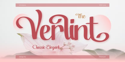 Verlint is a classic and elegant serif font that adds a touch of sophistication to any design project. Its clean and refined lines make it perfect for luxurious branding, editorial work, or any other application where a sense of timeless elegance is required. Featured: Standard, Uppercase & Lowercase Numeral & Punctuation Multilingual : ä ö ü Ä Ö Ü ß ¿ ¡ Alternate & Ligature PUA encoded We recommend programs that support the OpenType feature and the Glyphs panel such as Adobe applications or Corel Draw, so you can use all the variations of the glyphs. Hope you enjoy our fonts!
 - Zaphire by 38-lineart,
$24.00 Zaphire is a humble sans serif font, delicately infused with a hint of monographic handwriting, seamlessly blending classic elegance with a touch of contemporary experimentation. Comprising a singular variable font, it gracefully encompasses the essence of 49 distinct fonts, gracefully navigating through 7 weights and 7 widths. Its uniqueness is understated yet undeniable, making it a valuable addition for those seeking to infuse creativity into various artistic endeavors. Zaphire's versatility extends gracefully to contemporary art, posters, and provides an enriching touch to the written word in books and magazines