10,000 search results
(0.031 seconds)
- Polythem by Haksen,
$13.00 "Polythem" is a beautiful high bold script font that makes for gorgeous logos, posters, wedding invitations, blog posts, social media, and more! Polythem Script includes ligatures to make everything look totally hand-done, and alternates for each letter. Thanks for visited
 - Lovely Bluebells by Susan Brand Design,
$18.00 Introducing Lovely Bluebells Script font. A totally swoon worthy romantic font. Perfectly suited for a diversity of design projects, including logos, branding, wedding designs and social media posts. Lovely Bluebells include multilingual support for All Western Europe languages, as well as Afrikaans. xx Susan
 - Jacky Hand by Open Window,
$4.95 Jacky Hand is a waxy new font totally drawn by my 6 year old son while practicing his handwriting. This is a totally diverse font perfect for a wide range of uses from horror posters to childlike naiveté, or to inject some preppy school spirit.
 - Morphine Jack - Unknown license

- Waltowns by Variatype,
$24.00 Waltowns is a dynamic and expressive typeface that captures the essence of street art with its bold and energetic design. The letters are characterized by organic shapes, reminiscent of marker strokes on urban surfaces. The font exudes a raw and brave vibe, reflecting the spirit of graffiti culture. The font includes a diverse set of characters, allowing for creative and eye-catching compositions. Whether you’re designing posters, album covers, or any other graphic project, Waltowns inject a sense of urban attitude and artistic edge. Its versatility makes it suitable for a wide range of applications, making your designs stand out in the crowd. Waltowns is not just a font; it’s a statement. It represents expression, the vibrancy of the streets, and the bold creativity that defines graffiti art. Use Waltowns to bring a touch of urban authenticity to your design projects and let your creativity run wild on the walls of the digital world.
 - Hand Scribble Sketch Rock by TypoGraphicDesign,
$19.00 U-P-D-A-T-E (more glyphs, bug fixed, MAC (Desktop) + WIN (Office) Version) CHARACTERISTICS An own interpretation of a classic egyptienne/slab serif typeface with modern and fancy handmade haptics/hatching. The 3 styles/weights fits perfectly in each font size. From light till bold. All 3 styles are handemade sketched for diverse display size. APPLICATION AREA This heavy, sketched, scribbled, handmade slab serif font “Hand Scribble Sketch Rock” with many language support would look good in headlines. Magazines or websites, party flyer, movie posters, music Poster, music covers or webbanner. TECHNICAL SPECIFICATIONS ■ Font Name: Hand Scribble Sketch Rock ■ Font Weights: Regular, Bold, Light ■ Fonts Category: Display for Headline Size ■ Font Format: OpenType OTF + Windows TrueType TTF ■ Glyph Set: 361 glyphs ■ Language Support: Basic Latin/English letters, Central Europe, Baltic, Romanian ■ Specials: alternative letters and ligatures (with accents & €) ■ Design Date: 2013 ■ Type Designer: Manuel Viergutz ■ Font License: Desktop license, Web license, App license, eBook license, Server license
 - Wonder Smile by Mans Greback,
$69.00 Wonder Smile is a lovely script typeface. With a quirky character, this optimistic and charming lettering will give any project a naive and happy appearance. In a hand-drawn style, Wonder Smile is your rustic and down-to-earth calligraphic font. Use underscore _ before or after any letter to make cute heart decorations. Example: _beauty_ Write # after any letter to make a swash. Example: Wand#er (Download required.) The Wonder Smile typeface family consist of four diverse styles: Regular, Italic, Bold and Bold Italic. The font is built with advanced OpenType functionality and has a guaranteed top-notch quality, containing stylistic and contextual alternates, ligatures and more features; all to give you full control and customizability. It has extensive lingual support, covering all Latin-based languages, from Northern Europe to South Africa, from America to South-East Asia. It contains all characters and symbols you'll ever need, including all punctuation and numbers.
 - Zamenhof by CastleType,
$59.00 Zamenhof is a family of five fonts that can be used singly or in combination to create a variety of bold, yet elegant, display styles. Inspired by Russian hand-lettering that appears to have been based on Jakob Erbar’s Phosphor, Zamenhof is essentially a Latin interpretation (with Cyrillic and Greek) of a Cyrillic interpretation of a Latin type design, with many changes along the way. (For example, all the Latin-only letters are quite different between the two designs: D, F, G, J, K, N, Q, R, S, U, V, W, Y, Z.) The Inline and Inverse styles of Zamenhof are the basic fonts and can be used effectively on their own. The Plain and Outline fonts — which I recommend using only in combination with the main designs — were created specifically to be combined with Inline and Inverse, as underlay and overlay layers, respectively. (You will need an application that supports layers, such as Adobe InDesign or Photoshop.) Zamenhof supports most European languages as well as modern Greek, and of course, Russian and other languages that use the Cyrillic alphabet. Needless to say, as Zamenhof is named after the father of Esperanto, it also supports Esperanto (as do all fonts from CastleType).
 - Stancilo by Ardyanatypes,
$15.00 Stancilo is a type of serif font that offers uniqueness in its form. With a distinctive design and superior aesthetics, this font gives each character an elegant and modern touch. Stancilo font has nine different thicknesses, ranging from thin to bold, providing flexibility and variation. Thus, this font can be used for various design purposes, from main headings to body text, with the ability to adjust the desired intensity and emphasis. One of the advantages of Stancilo is the presence of alternate letters and ligatures that provide character variations for each letter. Allows users to combine alternate letters or use special ligatures to create more harmonious combinations and relationships between characters within words. This feature adds a sense of personalization and additional creativity to the design. Furthermore, Stancilo font also supports multiple languages, making it suitable for multilingual design projects. With the support of diverse languages, this font enables effective and comprehensive visual communication in various cultural contexts. Stancilo is a prominent serif font with a unique form, providing nine different thicknesses, alternate letters, and ligatures. These advantages make it suitable for elegant, modern designs and allow for creative exploration in using its letters. With support for multiple languages, this font becomes a versatile and inclusive choice for diverse design projects.
 - Fempowering by Franziska Herrmann Sustainable graphic design,
$14.00 GENDER DIVERSITY Introducing 'Fempowering' – designed to champion gender diversity in typography, created by a sustainable graphic designer who recognized the need for balance in a predominantly male field. SPACE-SAVING In the world of typography, space is often a precious commodity. 'Fempowering' is designed with this in mind. Its space-saving characteristics make it an ideal choice for print materials, editorial layouts, and any project where readability within confined space is paramount. GLYPH COLLECTION At the core of Fempowering lies an extensive glyph collection. It goes beyond the standard characters and numbers, embracing specialized symbols, mathematical notations, and even phonetic transcription. This comprehensive assortment opens new creative avenues, enabling you to craft unique and captivating designs. Franziska Herrmann
 - Gibon by Juraj Chrastina,
$29.00 Gibon draws inspiration from the fascinating comic book universe, inhabited not only by many legendary superheroes, monsters and superbadass antiheroes, but also by its own legendary typefaces. Every cartoonist and hand letterer needs a pencil, a T-square and on and on. For digital lettering, books Gibon is an option. This handy toolkit helps you easily letter your comic strips, but even if you have nothing to do with cartooning, this bundle can simply add some comic book feel to your design or make some noise with layered sound effects. The basic font for speech balloon inking is Gibon Lettering, while Gibon Bold and Heavy let you emphasize certain text. Gibon Bold is further developed as a multilayer type where different styles are designed to be overlaid on top of each other, letting you work with built-in shadows, 3D effects and outlines to create striking SFX. Gibon Balloons offers different types of layered speech balloons and a few halftone patterns. The OpenType contextual alternate feature is set to automatically apply the random effect using two sets of glyphs. Traditionally, comic books are lettered in caps only, which explains why Gibon is an all caps font. To easily access alternate characters they are encoded as lowercase letters. For example, type the uppercase “I” to access the crossbar “I” and the lowercase “i” to access the crossbar-less “I”. Turn on stylistic set number one to use only crossbar-less “I”.
 - Grand Rainbow Script by Mindtype Co.,
$20.00 Grand Rainbow Script a beautiful modern calligraphy font with Extrude Shadow Style. Comes with 2 layered font handwritten, sophisticated flows. Grand Rainbow Script offers beautiful typographic harmony for a diversity of design projects, signature, stationery, logo, typography quotes, branding, wedding designs, social media posts, advertisements & product designs.
 - Italian Horskey by Mindtype Co.,
$22.00 Italian Horskey is new fashionable handwriting font and super cool with sexy style. And also the Capital letters with contemporary and sophisticated accents. Italian Horskey offers beautiful typographic harmony for a diversity of design projects, including logos & branding, wedding designs, signature, social media posts, advertisements & product designs.
 - Love Wins by Resistenza,
$19.00 In 2007 we shared our first pride together. More than 1 million people took the streets of Madrid for this huge celebration … seeing the diversity of people supporting love was incredibly touching. Gay Pride is a celebration of freedom, human rights and the right to love whoever we want. It’s a memorial for the battles, the lives lost and the pain suffered while fighting for a growing list of equal rights. But let’s not forget there are still places where LGTBQ community is repressed and persecuted. As Letter crafters we love seeing the signs people design for their different pride parades, and we wondered… Why don’t we create a collection of handcrafted lettering to share some love and to add a typographic realness to the party? Love Wins Font is a series of 60 phrases handwritten with expertise and love specially designed to celebrate diversity. The lettering was crafted with different calligraphic tools creating diverse aesthetics. You can use them to create your signs, t-shirts, stickers, poster, banners.. all you need is to spread love during your Pride Celebrations (or day-to-day life!).
 - Custer by Font Bureau,
$40.00 In 2009, a book from 1897 in the library of the University of Wisconsin caught David Berlow’s attention. It was set in a clear text face—a predecessor of Bookman—cast by the Western Type Foundry who called it Custer. Upon noting how well the typeface worked in sizes of 6 and 7 points, Berlow developed it into a member of the Reading Edge series specifically designed for small text on screen. Custer RE was a broad and approachable typeface drawn large on the body with a tall x-height to maximize its apparent size when set very small. This was the beginning of the newly expanded series; in 2020, Berlow added new optical sizes and weights, growing the original design’s versatility up to headline sizes.
 - Marian Churchland by Comicraft,
$39.00 Tall, thin and elegant, Marian Churchland’s fonts are very much like her.. and now available from those awfully nice chaps at Comicraft to allow you to pretend that you are too! Marian Churchland was born in Canada in 1982, and was raised on a strict diet of fine literature and epic fantasy video games. She has a BA in Interdisciplinary Studies (English Literature and Visual Arts) from the University of British Columbia, and has been doing professional illustration work, including book covers and magazine articles, since she was 17. Last year, she became the first woman to solo-illustrate a CONAN story, and this year she’s illustrating three issues of ELEPHANTMEN for Image Comics. See the families related to Marian Churchland: Marian Churchland Journal.
 - Echelon by Barnbrook Fonts,
$50.00 Echelon is based upon 1970s Eastern European ‘pipe-style’ typefaces. This style of Communist consumer typography came from what, at the time, seemed like a bizarre mirror universe: Existing alongside the West, similar-but-different, essentially unknowable. Even though the letterforms had the same historical origins as their Western equivalents, they also had their own bizarre fashionable/unfashionable aesthetic. The parallels between the surveillance practices of the Soviet Union and those of today’s Western governments informed the naming of this typeface. Echelon is the codename for a massive international surveillance system that collects and processes data from communications satellites. It can eavesdrop on telecoms and computer systems, it can track bank accounts. It can record and store information on millions of individuals.
 - Tabac Slab by Suitcase Type Foundry,
$75.00 Tabac Slab was created by combining several contradictory influences, the result of which is a universal linear font. The combination of brisk serifs and refined calligraphic details in the structure of the characters serves to create an original concept that mixes influences from both book and advertising graphics. Serifs aid legibility in long texts, while small drawn details realise their full potential in sizes of twenty-four points and larger. The basis for our Egyptienne was Tabac Sans, with which Slab logically forms a harmonic duo. The addition of bracket-less serifs caused the typeface to thicken and become solidly anchored on the lines, giving a firm answer to all typographers who like to complain about the slight exuberance of grotesque fonts.
 - 1470 Sorbonne by GLC,
$21.00 This family was created inspired from the first font carved and cast in France, for the Sorbonne University’s printing workshop (Paris). The characters were drawn by Jean Heynlin, rector of the university - inspired from Pannartz’s - and in all probability was carved by Adolf Rusch. It has only one style, in one size (about 14 Didots points). We have added the U, J, W and Y, some accented characters and others not in use in the original, but the standard and historical ligatures and the numerous Latins abbreviations are these of the original font. The font is proposed in two choices : Basic Latin, MacTT & TTF, free for a private use, and “Pro”, TTF/OTF, available for standard basic Latin plus Central Europe, Baltic, Turkish, Croatian, Romanian, Celtic.
 - Hwaiting Handwriting by Konstantine Studio,
$20.00 Inspired by the emerging Korean culture that grabbing the worldwide actuation in so many realms of the industry. To bridge the vibes and to make it easier to consume, we found the gap to fill with simple things in life that are useful for it, and yes, it’s a new day it’s a new font. So without any further ado, please welcome Hwaiting Handwriting. 1/3 series of Korean vibes typefaces. It’s handwriting-based fonts with the reference of the ancient style ink and brush strokes but make it modern. Crafted with deep research about Korean traditional letters, shaped up with the approach of universal Latin letters. This is the first drop of 3 series from the Hwaiting family. So stay tuned for the upcoming release.
 - AG Bambook by Alexandr Galuzin,
$26.00 AG Bambook- compressed geometric sans serif with the closed forms. Contains 4 fonts. 2 regular and 2 italic. The font is universal and can be used in different directions of graphic design. Internet, printed materials, clothing, logos, posters, labels, navigation and more. Thanks to character compression, you can place a large amount of information in a compressed space. It will read equally well in large and small sizes. A small difference in the width of the glyphs for different styles allows you to change the saturation while maintaining the size of the text block. OpenType: alternate numbers, old-style numbers, arrows, case sensitive forms, superscript and subscript, numerators and denominators. Support: Cyrillic, Cyrillic extended, Latin, Latin Extended (Western European, Central European, South-East), Kazakh.
 - 58 Rodeo by Baseline Fonts,
$24.00Introducing 58 Rodeo: A Classic Redefined 58 Rodeo is based on several different woodtypes used primarily as display faces in the late 1800s/early 1900s. The difference with this version of a classic woodtype is the balance and legibility. 58 Rodeo has been redrawn to emphasize line and character uniformity. The goal is to create a eurostyle, square look in a western font designed for modern applications with wild west sensibility. Additional characters provide whimsy and flair to round out any layout on the fly. Stars and other sorts are included in this reinterpreted design. Egyptienne-style fonts possess a universal appeal and are spectacular for adding interest and legibility in a variety of applications. The extended character set includes the Euro, placed on the currency key. - Nolan Next by Kastelov,
$40.00 Nolan Next is a low-contrast humanist sans-serif with a large x-height and streamlined appearance. It is based on Nolan, but with a more compact letterforms and remastered curves. Designed to appeal to a broader audience due to its narrower width and subtle presence, Nolan Next is ideal for everyday usage. It is well suited for design applications ranging from branding and corporate identity to editorial and web design. Comprising of eight weights with matching italics, Nolan Next is easy to work with and accommodating to your needs. Designed to work as a universal typeface, it also stands its ground in headlines, presentation materials, logotypes, etc. Additionally, the typeface includes an extended character set supporting an array of languages.
 - Cartesius by T4 Foundry,
$21.00Veteran designer Bo Berndal has created Cartesius, an oldstyle serif typeface with roots in the 16th and 17th centuries, France and Venice. Bo Berndal: "Rene Decartes, the great French philosopher, was invited to Sweden in the 17th century, when the country was at the height of its power. In the university city of Uppsala he used the Latin name form Cartesius. The typeface that carries his name is inspired by letterforms from the 1600s, but upper case letters are of pure Roman type". Cartesius holds up well even under less than perfect circumstances, and is suitable for magazine and book design. It comes with a full range of styles, including small caps. Swedish type foundry T4 premiere new fonts every month. Cartesius is our fifth introduction. - Shelf by SzymonType,
$- Shelf is a humanistic sans-serif font of cool and solid character. Its frugal, clean and organic drawing as well as its name were inspired by the ice shelf landscape. Shelf was designed as a universal tool for creating a coherent information and navigation systems with accompanying publications, such as visual identity of exhibitions including catalogues. It is suggested to set long texts in Roman and Italic, while the best combination for a wayfinding system is Roman and Oblique. Every weight, therefore, contains Roman, Italic and Oblique versions. The variety of over 1500 glyphs constitutes a rich set of Latin script characters. Shelf includes small caps, a broad set of figures, a wide set of alternative style variants, arrows and a number of OpenType features.
 - Beshkasteh by Si47ash Fonts,
$17.00 An innovative combination between Persian Nastaliq calligraphy and Bannai script. Beshkasteh is designed so that the letters are attached to each other while going up the baseline. In result it creates an experience of typing a Kufic Bannai script like it is a Nastaliq or Tahriri calligraphic font. This inventive approach to Persian And Arabic calligraphy scripts is what a creative designer wants for his artistic projects. Shahab Siavash, the designer has done more than 30 fonts and got featured on Behance, Microsoft, McGill University research website, Hackernoon, Fontself, FontsInUse,... Astaneh text and headline font which is one of his latest designs, already got professional typographers, lay-out and book designers' attention as well as some of the most recognizable publications in Arabic/Persian communities.
 - KayKhosrow by Si47ash Fonts,
$19.00 Futuristic, modular, blocked, squarish and modernist KayKhosrow font has got 12 versatile styles! The very first non-cursive Arabic/Persian font which also supports Latin characters as well! You're gonna love how all those different styles are gonna work with each other! For your cover designs, posters, logotypes and any typographic projects, you can count on KayKhosrow fonts! There are 12 of them! Shahab Siavash, the designer has done more than 30 fonts and got featured on Behance, Microsoft, McGill University research website, Hackernoon, Fontself, FontsInUse,... Astaneh text and headline font which is one of his latest designs, already got professional typographers, lay-out and book designers' attention as well as some of the most recognizable publications in Arabic/Persian communities.
 - Rukishy by Twinletter,
$17.00 Rukishy font is the most appropriate choice to enhance the visual appeal of your branding projects. With an attractive Script font style, this font presents an impressive design touch, creating an unforgettable charm. What makes Rukishy so unique is its wide range of features. With a complete family that includes regular, shadow, slant, and shadow slant, you have everything you need to express your creativity optimally. Not only that but some ligatures and alternates add a unique touch to each character, helping you create truly original designs. The ability to support multiple languages makes Rukishy a universal choice that allows you to reach a global audience. With its ease of use and flexibility, this font becomes a valuable asset in your design world.
 - Donchenko Serif by Donchenko,
$15.00 Donchenko Serif is a leisurely, elegant, minimalist serif typeface that combines references to medieval half-uncials with Art Nouveau motifs. Its styles are well readable and at the same time have individual features, which makes this typeface stand out from the rest. Donchenko Serif is a "universal soldier". It's great for any challenge. It is also good for typing books or articles, designing corporate identity and promotional materials, or creating display cases. A wide range of Latin, Greek, Cyrillic and special characters provides extensive language support for all European languages. Font Donchenko Serif Regular was developed by designer Oleksandr Donchenko in Lviv (Ukraine) in the first half of 2022. His daughter - Sofia Donchenko - took part in the development some letters. Donchenko Serif - Good font for good people!
 - Frink Rio by Brenners Template,
$19.00 Frink Rio Modren Grotesk Font Family It has evolved to converge wider and more trendy design needs. By designing the thin style vertical stem value as 10pt, the contrast between individual styles is ensured. Great care has been taken to ensure that the characteristics of individual Glyphs are well reflected in the each style. Extended Cyrillic language support will help make this font family more universal. And the support of various OpenType Features will respond to the designer's coverage in a variety of ways. OpenType Features Ligatures - fi, fl Small Caps (from lowercases) Ordinals (1st. 2nd. 3rd, 4~9th) Oldstyle Figures Tabular Figures Fractions Scientific Inferiors Superscrpt (lowercases. numbers) Check in advance how the apps you are using support these OpenType Features.
 - Lecheet by Zamjump,
$17.00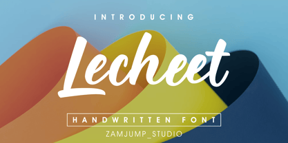 Lecheet is a handwritten script font. It has an authentic modern calligraphy look and feels bold which makes it perfect for digital branding and design. Use this font for logos, social media, wedding decorations, invitations, home decor, websites, blogs, instagram, business cards, branding and more!
 - Times New Roman PS Cyrillic by Monotype,
$67.99In 1931, The Times of London commissioned a new text type design from Stanley Morison and the Monotype Corporation, after Morison had written an article criticizing The Times for being badly printed and typographically behind the times. The new design was supervised by Stanley Morison and drawn by Victor Lardent, an artist from the advertising department of The Times. Morison used an older typeface, Plantin, as the basis for his design, but made revisions for legibility and economy of space (always important concerns for newspapers). As the old type used by the newspaper had been called Times Old Roman," Morison's revision became "Times New Roman." The Times of London debuted the new typeface in October 1932, and after one year the design was released for commercial sale. The Linotype version, called simply "Times," was optimized for line-casting technology, though the differences in the basic design are subtle. The typeface was very successful for the Times of London, which used a higher grade of newsprint than most newspapers. The better, whiter paper enhanced the new typeface's high degree of contrast and sharp serifs, and created a sparkling, modern look. In 1972, Walter Tracy designed Times Europa for The Times of London. This was a sturdier version, and it was needed to hold up to the newest demands of newspaper printing: faster presses and cheaper paper. In the United States, the Times font family has enjoyed popularity as a magazine and book type since the 1940s. Times continues to be very popular around the world because of its versatility and readability. And because it is a standard font on most computers and digital printers, it has become universally familiar as the office workhorse. Times?, Times? Europa, and Times New Roman? are sure bets for proposals, annual reports, office correspondence, magazines, and newspapers. Linotype offers many versions of this font: Times? is the universal version of Times, used formerly as the matrices for the Linotype hot metal line-casting machines. The basic four weights of roman, italic, bold and bold italic are standard fonts on most printers. There are also small caps, Old style Figures, phonetic characters, and Central European characters. Times? Ten is the version specially designed for smaller text (12 point and below); its characters are wider and the hairlines are a little stronger. Times Ten has many weights for Latin typography, as well as several weights for Central European, Cyrillic, and Greek typesetting. Times? Eighteen is the headline version, ideal for point sizes of 18 and larger. The characters are subtly condensed and the hairlines are finer." - Times New Roman Seven by Monotype,
$67.99In 1931, The Times of London commissioned a new text type design from Stanley Morison and the Monotype Corporation, after Morison had written an article criticizing The Times for being badly printed and typographically behind the times. The new design was supervised by Stanley Morison and drawn by Victor Lardent, an artist from the advertising department of The Times. Morison used an older typeface, Plantin, as the basis for his design, but made revisions for legibility and economy of space (always important concerns for newspapers). As the old type used by the newspaper had been called Times Old Roman," Morison's revision became "Times New Roman." The Times of London debuted the new typeface in October 1932, and after one year the design was released for commercial sale. The Linotype version, called simply "Times," was optimized for line-casting technology, though the differences in the basic design are subtle. The typeface was very successful for the Times of London, which used a higher grade of newsprint than most newspapers. The better, whiter paper enhanced the new typeface's high degree of contrast and sharp serifs, and created a sparkling, modern look. In 1972, Walter Tracy designed Times Europa for The Times of London. This was a sturdier version, and it was needed to hold up to the newest demands of newspaper printing: faster presses and cheaper paper. In the United States, the Times font family has enjoyed popularity as a magazine and book type since the 1940s. Times continues to be very popular around the world because of its versatility and readability. And because it is a standard font on most computers and digital printers, it has become universally familiar as the office workhorse. Times?, Times? Europa, and Times New Roman? are sure bets for proposals, annual reports, office correspondence, magazines, and newspapers. Linotype offers many versions of this font: Times? is the universal version of Times, used formerly as the matrices for the Linotype hot metal line-casting machines. The basic four weights of roman, italic, bold and bold italic are standard fonts on most printers. There are also small caps, Old style Figures, phonetic characters, and Central European characters. Times? Ten is the version specially designed for smaller text (12 point and below); its characters are wider and the hairlines are a little stronger. Times Ten has many weights for Latin typography, as well as several weights for Central European, Cyrillic, and Greek typesetting. Times? Eighteen is the headline version, ideal for point sizes of 18 and larger. The characters are subtly condensed and the hairlines are finer." - Times New Roman WGL by Monotype,
$67.99 In 1931, The Times of London commissioned a new text type design from Stanley Morison and the Monotype Corporation, after Morison had written an article criticizing The Times for being badly printed and typographically behind the times. The new design was supervised by Stanley Morison and drawn by Victor Lardent, an artist from the advertising department of The Times. Morison used an older typeface, Plantin, as the basis for his design, but made revisions for legibility and economy of space (always important concerns for newspapers). As the old type used by the newspaper had been called Times Old Roman," Morison's revision became "Times New Roman." The Times of London debuted the new typeface in October 1932, and after one year the design was released for commercial sale. The Linotype version, called simply "Times," was optimized for line-casting technology, though the differences in the basic design are subtle. The typeface was very successful for the Times of London, which used a higher grade of newsprint than most newspapers. The better, whiter paper enhanced the new typeface's high degree of contrast and sharp serifs, and created a sparkling, modern look. In 1972, Walter Tracy designed Times Europa for The Times of London. This was a sturdier version, and it was needed to hold up to the newest demands of newspaper printing: faster presses and cheaper paper. In the United States, the Times font family has enjoyed popularity as a magazine and book type since the 1940s. Times continues to be very popular around the world because of its versatility and readability. And because it is a standard font on most computers and digital printers, it has become universally familiar as the office workhorse. Times?, Times? Europa, and Times New Roman? are sure bets for proposals, annual reports, office correspondence, magazines, and newspapers. Linotype offers many versions of this font: Times? is the universal version of Times, used formerly as the matrices for the Linotype hot metal line-casting machines. The basic four weights of roman, italic, bold and bold italic are standard fonts on most printers. There are also small caps, Old style Figures, phonetic characters, and Central European characters. Times? Ten is the version specially designed for smaller text (12 point and below); its characters are wider and the hairlines are a little stronger. Times Ten has many weights for Latin typography, as well as several weights for Central European, Cyrillic, and Greek typesetting. Times? Eighteen is the headline version, ideal for point sizes of 18 and larger. The characters are subtly condensed and the hairlines are finer."
 - Times New Roman by Monotype,
$67.99 In 1931, The Times of London commissioned a new text type design from Stanley Morison and the Monotype Corporation, after Morison had written an article criticizing The Times for being badly printed and typographically behind the times. The new design was supervised by Stanley Morison and drawn by Victor Lardent, an artist from the advertising department of The Times. Morison used an older typeface, Plantin, as the basis for his design, but made revisions for legibility and economy of space (always important concerns for newspapers). As the old type used by the newspaper had been called Times Old Roman," Morison's revision became "Times New Roman." The Times of London debuted the new typeface in October 1932, and after one year the design was released for commercial sale. The Linotype version, called simply "Times," was optimized for line-casting technology, though the differences in the basic design are subtle. The typeface was very successful for the Times of London, which used a higher grade of newsprint than most newspapers. The better, whiter paper enhanced the new typeface's high degree of contrast and sharp serifs, and created a sparkling, modern look. In 1972, Walter Tracy designed Times Europa for The Times of London. This was a sturdier version, and it was needed to hold up to the newest demands of newspaper printing: faster presses and cheaper paper. In the United States, the Times font family has enjoyed popularity as a magazine and book type since the 1940s. Times continues to be very popular around the world because of its versatility and readability. And because it is a standard font on most computers and digital printers, it has become universally familiar as the office workhorse. Times?, Times? Europa, and Times New Roman? are sure bets for proposals, annual reports, office correspondence, magazines, and newspapers. Linotype offers many versions of this font: Times? is the universal version of Times, used formerly as the matrices for the Linotype hot metal line-casting machines. The basic four weights of roman, italic, bold and bold italic are standard fonts on most printers. There are also small caps, Old style Figures, phonetic characters, and Central European characters. Times? Ten is the version specially designed for smaller text (12 point and below); its characters are wider and the hairlines are a little stronger. Times Ten has many weights for Latin typography, as well as several weights for Central European, Cyrillic, and Greek typesetting. Times? Eighteen is the headline version, ideal for point sizes of 18 and larger. The characters are subtly condensed and the hairlines are finer."
 - Times New Roman Small Text by Monotype,
$67.99In 1931, The Times of London commissioned a new text type design from Stanley Morison and the Monotype Corporation, after Morison had written an article criticizing The Times for being badly printed and typographically behind the times. The new design was supervised by Stanley Morison and drawn by Victor Lardent, an artist from the advertising department of The Times. Morison used an older typeface, Plantin, as the basis for his design, but made revisions for legibility and economy of space (always important concerns for newspapers). As the old type used by the newspaper had been called Times Old Roman," Morison's revision became "Times New Roman." The Times of London debuted the new typeface in October 1932, and after one year the design was released for commercial sale. The Linotype version, called simply "Times," was optimized for line-casting technology, though the differences in the basic design are subtle. The typeface was very successful for the Times of London, which used a higher grade of newsprint than most newspapers. The better, whiter paper enhanced the new typeface's high degree of contrast and sharp serifs, and created a sparkling, modern look. In 1972, Walter Tracy designed Times Europa for The Times of London. This was a sturdier version, and it was needed to hold up to the newest demands of newspaper printing: faster presses and cheaper paper. In the United States, the Times font family has enjoyed popularity as a magazine and book type since the 1940s. Times continues to be very popular around the world because of its versatility and readability. And because it is a standard font on most computers and digital printers, it has become universally familiar as the office workhorse. Times?, Times? Europa, and Times New Roman? are sure bets for proposals, annual reports, office correspondence, magazines, and newspapers. Linotype offers many versions of this font: Times? is the universal version of Times, used formerly as the matrices for the Linotype hot metal line-casting machines. The basic four weights of roman, italic, bold and bold italic are standard fonts on most printers. There are also small caps, Old style Figures, phonetic characters, and Central European characters. Times? Ten is the version specially designed for smaller text (12 point and below); its characters are wider and the hairlines are a little stronger. Times Ten has many weights for Latin typography, as well as several weights for Central European, Cyrillic, and Greek typesetting. Times? Eighteen is the headline version, ideal for point sizes of 18 and larger. The characters are subtly condensed and the hairlines are finer." - Times New Roman PS Greek by Monotype,
$67.99In 1931, The Times of London commissioned a new text type design from Stanley Morison and the Monotype Corporation, after Morison had written an article criticizing The Times for being badly printed and typographically behind the times. The new design was supervised by Stanley Morison and drawn by Victor Lardent, an artist from the advertising department of The Times. Morison used an older typeface, Plantin, as the basis for his design, but made revisions for legibility and economy of space (always important concerns for newspapers). As the old type used by the newspaper had been called Times Old Roman," Morison's revision became "Times New Roman." The Times of London debuted the new typeface in October 1932, and after one year the design was released for commercial sale. The Linotype version, called simply "Times," was optimized for line-casting technology, though the differences in the basic design are subtle. The typeface was very successful for the Times of London, which used a higher grade of newsprint than most newspapers. The better, whiter paper enhanced the new typeface's high degree of contrast and sharp serifs, and created a sparkling, modern look. In 1972, Walter Tracy designed Times Europa for The Times of London. This was a sturdier version, and it was needed to hold up to the newest demands of newspaper printing: faster presses and cheaper paper. In the United States, the Times font family has enjoyed popularity as a magazine and book type since the 1940s. Times continues to be very popular around the world because of its versatility and readability. And because it is a standard font on most computers and digital printers, it has become universally familiar as the office workhorse. Times?, Times? Europa, and Times New Roman? are sure bets for proposals, annual reports, office correspondence, magazines, and newspapers. Linotype offers many versions of this font: Times? is the universal version of Times, used formerly as the matrices for the Linotype hot metal line-casting machines. The basic four weights of roman, italic, bold and bold italic are standard fonts on most printers. There are also small caps, Old style Figures, phonetic characters, and Central European characters. Times? Ten is the version specially designed for smaller text (12 point and below); its characters are wider and the hairlines are a little stronger. Times Ten has many weights for Latin typography, as well as several weights for Central European, Cyrillic, and Greek typesetting. Times? Eighteen is the headline version, ideal for point sizes of 18 and larger. The characters are subtly condensed and the hairlines are finer." - Times New Roman PS by Monotype,
$67.99In 1931, The Times of London commissioned a new text type design from Stanley Morison and the Monotype Corporation, after Morison had written an article criticizing The Times for being badly printed and typographically behind the times. The new design was supervised by Stanley Morison and drawn by Victor Lardent, an artist from the advertising department of The Times. Morison used an older typeface, Plantin, as the basis for his design, but made revisions for legibility and economy of space (always important concerns for newspapers). As the old type used by the newspaper had been called Times Old Roman," Morison's revision became "Times New Roman." The Times of London debuted the new typeface in October 1932, and after one year the design was released for commercial sale. The Linotype version, called simply "Times," was optimized for line-casting technology, though the differences in the basic design are subtle. The typeface was very successful for the Times of London, which used a higher grade of newsprint than most newspapers. The better, whiter paper enhanced the new typeface's high degree of contrast and sharp serifs, and created a sparkling, modern look. In 1972, Walter Tracy designed Times Europa for The Times of London. This was a sturdier version, and it was needed to hold up to the newest demands of newspaper printing: faster presses and cheaper paper. In the United States, the Times font family has enjoyed popularity as a magazine and book type since the 1940s. Times continues to be very popular around the world because of its versatility and readability. And because it is a standard font on most computers and digital printers, it has become universally familiar as the office workhorse. Times?, Times? Europa, and Times New Roman? are sure bets for proposals, annual reports, office correspondence, magazines, and newspapers. Linotype offers many versions of this font: Times? is the universal version of Times, used formerly as the matrices for the Linotype hot metal line-casting machines. The basic four weights of roman, italic, bold and bold italic are standard fonts on most printers. There are also small caps, Old style Figures, phonetic characters, and Central European characters. Times? Ten is the version specially designed for smaller text (12 point and below); its characters are wider and the hairlines are a little stronger. Times Ten has many weights for Latin typography, as well as several weights for Central European, Cyrillic, and Greek typesetting. Times? Eighteen is the headline version, ideal for point sizes of 18 and larger. The characters are subtly condensed and the hairlines are finer." - Skyward by Carmel Type Co.,
$19.00 Robust, towering, and geometrically refined, Skyward is a surefire classic cocktail of equal parts utility and elegance. This typeface carries a set of over 300 glyphs across 8 distinct faces. With Deco-era sensibilities and a touch of modern refinement + an all new alternative set of characters, Skyward is exceedingly effective in a diverse spectrum of situations. Skyward is the perfect selection for modern, chic, luxury products and packaging as well as bold ad campaigns, window signage, magazine headlines or the classic branding project. Skyward works best as display text. 12 styles Sans-Serif, Serif, and Rounded styles Select Stylistic alternates Upper & lowercase Numerals & punctuation 330+ glyphs per style Supports 75+ Latin based languages OTF files Designed by Jason Carne
 - Rise of Beauty by Kereatype,
$9.00 Rise of Beauty - Modern Variable Paired Duo A classy, contemporary pair of Script Signature and Sans Serif fonts. With a stylish expressive script companion, Rise of Beauty offers beautiful typographic harmony for a diversity of design projects, including logos & branding, wedding designs, social media posts, advertisements & product designs.
