4,476 search results
(0.018 seconds)
- Thorowgood Sans by HiH,
$8.00 A three-dimensional all-cap font for title use, Thorowgood Sans Shaded was released by the Fann Street Foundry of W. Thorowgood & Co. in 1839. Interestingly, it more closely resembles Figgins' Four-Line Emerald Sans-Serif Shaded of 1833 than Fann Street’s own Grotesque Shaded of 1834 (with light and shadow reversed). The idea of a shaded font is of an outline font whose letters have each been extruded through a die and then viewed from the lower right to reveal the third dimension. That third dimension has also been referred to as a shadow. Vincent Figgins' 1815-release of a shaded serif typeface was the first known of many shaded faces, as the other foundries rushed to bring out their own versions. Thorowgood Sans Shaded may be gainfully used today as a eye-catching headline font, just as it was so popularly used in the early nineteenth century. To assist with the usual all-cap letter-spacing problem, the following pre-kerned pairs are included: AT, AV, AW and AY. Be sure to download the Type Specimen showing the full character set, as well as a sample text. Live large - use it boldly.
 - Fibra by Los Andes,
$26.00 The font is actually not a revival of ‘Avant Garde’—by Herb Lubalin—but it takes its spirit. Fibra is a geometric sans serif, yet without the typical structural strictness of these kind of fonts, that represents experimental type design. This can be seen in the contrast between curves and straight lines in some characters such as ’n’ and ‘h’ unlike rounded ones such as ‘a’ and ‘d’; details of some display characters (e.g. three upper terminals in ‘W’ and projection off the stem in ‘A’); and exaggerated terminal in ‘R’. All these features give Fibra a strong personality—a sans serif typeface that ‘gives you the chills’. Fibra was specially designed for display use. The font has a very generous x-height that allows for use in corporate text, thanks to its good readability. Fibra comes with 2 subfamilies—a more ’normal’ Basic family, with a smaller amount of stylistic features, for use in subheadings or any other type of text that requires formality, and an Alt family that shows off the true potential of the font, making it the perfect choice for magazine headlines, posters and logotypes.
 - 1509 Leyden by GLC,
$49.00 This script font was inspired by the type used in Leyden by Jan Seversz to print Breviores elegantioresque epistolae [...], author Francesco Filfelo, circa 1509. The original font contains all lower case characters, except w, eth, thorn, lslash, oslash and so... and almost upper case. In addition, one set of small lombardic initials were also nearly complete. It take place instead of the Bold style (in only one package)offering a real and rare complete historical printing set... The original small "a" hight was 2,8 mm !, the upper case hight no more than nearly 5 mm, the initials hight almost 15 mm, covering nearly two lines. This font includes "long s", naturally, as typically medieval and also a few ligatures, but not any variants. We have entirely recreated some characters, upper, lower and initials, to fill gaps. It is used as variously as web-site titles, posters and fliers design, publishing texts looking like ancient ones, or greeting cards, all various sorts of presentations, menus, certificates, as a very decorative, elegant and unusual font, besides its historical scrupulous reality... This font supports enlargement as well as small size.
 - TT Lakes Neue by TypeType,
$39.00 Introducing TT Lakes Neue in version 2.0! Please note that the TT Lakes font has been removed from platforms, but you can still order it by sending a request to the studio's commercial department: commercial@typetype.org We have released a continuation of the geometric sans serif inspired by Finnish functionalism. The new version provides more opportunities, because we not only increased the character set and improved the font technically, but also reworked its visual character. What changed? Font character. TT Lakes Neue 2.0 has become calmer, as we have removed the display details in the characters of the main set, making the font more versatile. New stylistic sets were created, thanks to which the nature of the font can be controlled, making it more expressive. Changed the forms of the characters "Кк", "ЖЖ", "Дд", "Лл", lowercase "b" and alternative "g". Added alternative forms for all types of the number "1", for the characters "Mm", "DD", "Ll". Added technological character sets, with which the font looks stylish and expressive. You may notice that in these sets, the forms of lowercase characters with arches (r, m, n) are changed, and there are gaps in the places of infusions and connections of all characters. Scope of application. The scope of TT Lakes Neue 2.0 have become even more diverse, because the sans serif has become more neutral in character and more functional. TT Lakes Neue 2.0 is the perfect font for the gaming industry. Suitable for game interfaces of different genres. Technological sets can be used in architectural projects, in the headlines of posters and magazines, on outdoor signs. The font is suitable for logo design, looks great in branding. Character set and technical characteristics. We have significantly improved the set of the font, increasing the number of characters from 736 to 921. The font has become more functional due to the updated technical stuffing and new features, of which there are now 36 instead of 24. Added characters of extended Latin, fractions, arrows. Created new kerning and hinting. Updated variable font. Added new OpenType features. The TT Lakes Neue font has 5 subfamilies: Compressed, Condensed, Regular, Extended, Expanded. In total, there are 91 styles in the font: 9 upright and 9 slanted in each subfamily and 1 variable font. Each style has 921 characters and 36 OpenType features.
 - Kernig Braille by Echopraxium,
$5.00 This font is the younger sister of HexBraille with which it may be combined to create new patterns. This also explains why their introductory text are similar. Introduction The purpose of this monospace font is to display braille in an original and "steganographic" way. The Kernig prefix means "Robust" in German, this is because of the crank shapes . The core of the glyph design is a flat hexagon which can be read as 3 rows of 2 dots (i.e. regular braille glyph grid). Even if within a glyph, braille dots ("square dots" indeed) are placed on the vertices of a flat hexagon, the difference with HexBraille is that edges connecting vertices are not straight lines but "crank shapes" instead. This can be summarized by saying that the whole glyph is a Hexcrank (a flat hexagon where vertice pairs are connected by a crank shape) NB: The initial design is illustrated by glyphs 'ç' (no dot) and 'û' (6 dots) as shown by poster 6. A. "Kernig Lattice" In KernigBraille, glyphs are connected to each other, thus for each Hexcrank glyph there are 6 connections: 2 on left/right and 4 on top/bottom. In the final design some cranks were removed for esthetical reason (i.e. leave empty space for allowing patterns diversity). In summary, a text using this font won't display a honeycomb but a lattice instead. NB: Please notice that in order to obtain the lattice without vertical gaps, you must set the interline to 0. The lattice is made from 3 kind of shapes: a.1. Hexcrank a.2. Square a.3. Irregular cross (mostly unclosed) The design favored squares over crosses. The whole slightly resembling a PCB. B. Text Frames It's possible to frame the text with 4 sets of frame glyphs (as illustrated by poster 2) b.1. Kernig { € ° £ µ § ¥ ~ ¢ } b.2. Rectangular-High { è é ê ï î à â ä } b.3. Rectangular-Low { Â ù Ä Ê Ë Ô õ ö } b.4. Mixed Kernig+High: a mix of Kernig and Rectangular-High frame glyphs When using frame glyphs, it is advised to show Pilcrow (¶) and Non Breaking Space, which are replaced by empty shapes in this font (e.g. in Microsoft Word, use CTRL+8 or use [¶] button in the ribbon).
 - Hamerslag by Paweł Burgiel,
$38.00 Hamerslag is an ultra-condensed serif type family with uncomplicated, regular appearance, large x-height, relatively high contrast and modern glyphs shapes. Available in four styles, contain fraction- and scientific numerals, standard ligatures, currency symbols, proportional and tabular lining figures. Its wide character set support 200 Latin-script languages, 50 Cyrillic-script languages and 190+ romanizations/transliterations, e.g. The United Nations romanizations, Chinese official romanization (Hanyu Pinyin), BGN/PCGN (United States Board on Geographic Names and the Permanent Committee on Geographical Names for British Official Use), American Library Association / Library of Congress romanizations and others. The OpenType PostScript CFF (.otf) and OpenType TrueType TTF (.ttf) support encodings: Windows 1250 Latin 2 (Eastern European), Windows 1251 Cyrillic, Windows 1252 Latin 1 (ANSI), Windows 1254 Turkish, Windows 1257 Baltic, ISO 8859-1 Latin 1 (Western), ISO 8859-2 Latin 2 (Central Europe), ISO 8859-3 Latin 3 (Turkish, Maltese, Esperanto), ISO 8859-4 Latin 4 (Baltic), ISO 8859-5 Cyrillic, ISO 8859-9 Latin 5 (Turkish), ISO 8859-10 Latin 6 (Scandinavian), ISO 8859-13 Latin 7 (Baltic 2), ISO 8859-14 Latin 8 (Celtic), ISO 8859-15 Latin 9, ISO 8859-16 Latin 10, Macintosh Character Set (US Roman). Supported OpenType features: Acces All Alternates, Capital Spacing, Case-Sensitive Forms, Denominators, Fractions, Glyph Composition/Decomposition, Historical Forms, Kerning, Localized Forms, Numerators, Ordinals, Proportional Figures, Scientific Inferiors, Slashed Zero, Standard Ligatures, Stylistic Alternates, Subscript, Superscript, Tabular Figures. Kerning is prepared as single ('flat') table for maximum possible compatibility with older software.
 - Times New Roman PS Cyrillic by Monotype,
$67.99In 1931, The Times of London commissioned a new text type design from Stanley Morison and the Monotype Corporation, after Morison had written an article criticizing The Times for being badly printed and typographically behind the times. The new design was supervised by Stanley Morison and drawn by Victor Lardent, an artist from the advertising department of The Times. Morison used an older typeface, Plantin, as the basis for his design, but made revisions for legibility and economy of space (always important concerns for newspapers). As the old type used by the newspaper had been called Times Old Roman," Morison's revision became "Times New Roman." The Times of London debuted the new typeface in October 1932, and after one year the design was released for commercial sale. The Linotype version, called simply "Times," was optimized for line-casting technology, though the differences in the basic design are subtle. The typeface was very successful for the Times of London, which used a higher grade of newsprint than most newspapers. The better, whiter paper enhanced the new typeface's high degree of contrast and sharp serifs, and created a sparkling, modern look. In 1972, Walter Tracy designed Times Europa for The Times of London. This was a sturdier version, and it was needed to hold up to the newest demands of newspaper printing: faster presses and cheaper paper. In the United States, the Times font family has enjoyed popularity as a magazine and book type since the 1940s. Times continues to be very popular around the world because of its versatility and readability. And because it is a standard font on most computers and digital printers, it has become universally familiar as the office workhorse. Times?, Times? Europa, and Times New Roman? are sure bets for proposals, annual reports, office correspondence, magazines, and newspapers. Linotype offers many versions of this font: Times? is the universal version of Times, used formerly as the matrices for the Linotype hot metal line-casting machines. The basic four weights of roman, italic, bold and bold italic are standard fonts on most printers. There are also small caps, Old style Figures, phonetic characters, and Central European characters. Times? Ten is the version specially designed for smaller text (12 point and below); its characters are wider and the hairlines are a little stronger. Times Ten has many weights for Latin typography, as well as several weights for Central European, Cyrillic, and Greek typesetting. Times? Eighteen is the headline version, ideal for point sizes of 18 and larger. The characters are subtly condensed and the hairlines are finer." - Times New Roman Seven by Monotype,
$67.99In 1931, The Times of London commissioned a new text type design from Stanley Morison and the Monotype Corporation, after Morison had written an article criticizing The Times for being badly printed and typographically behind the times. The new design was supervised by Stanley Morison and drawn by Victor Lardent, an artist from the advertising department of The Times. Morison used an older typeface, Plantin, as the basis for his design, but made revisions for legibility and economy of space (always important concerns for newspapers). As the old type used by the newspaper had been called Times Old Roman," Morison's revision became "Times New Roman." The Times of London debuted the new typeface in October 1932, and after one year the design was released for commercial sale. The Linotype version, called simply "Times," was optimized for line-casting technology, though the differences in the basic design are subtle. The typeface was very successful for the Times of London, which used a higher grade of newsprint than most newspapers. The better, whiter paper enhanced the new typeface's high degree of contrast and sharp serifs, and created a sparkling, modern look. In 1972, Walter Tracy designed Times Europa for The Times of London. This was a sturdier version, and it was needed to hold up to the newest demands of newspaper printing: faster presses and cheaper paper. In the United States, the Times font family has enjoyed popularity as a magazine and book type since the 1940s. Times continues to be very popular around the world because of its versatility and readability. And because it is a standard font on most computers and digital printers, it has become universally familiar as the office workhorse. Times?, Times? Europa, and Times New Roman? are sure bets for proposals, annual reports, office correspondence, magazines, and newspapers. Linotype offers many versions of this font: Times? is the universal version of Times, used formerly as the matrices for the Linotype hot metal line-casting machines. The basic four weights of roman, italic, bold and bold italic are standard fonts on most printers. There are also small caps, Old style Figures, phonetic characters, and Central European characters. Times? Ten is the version specially designed for smaller text (12 point and below); its characters are wider and the hairlines are a little stronger. Times Ten has many weights for Latin typography, as well as several weights for Central European, Cyrillic, and Greek typesetting. Times? Eighteen is the headline version, ideal for point sizes of 18 and larger. The characters are subtly condensed and the hairlines are finer." - Times New Roman WGL by Monotype,
$67.99 In 1931, The Times of London commissioned a new text type design from Stanley Morison and the Monotype Corporation, after Morison had written an article criticizing The Times for being badly printed and typographically behind the times. The new design was supervised by Stanley Morison and drawn by Victor Lardent, an artist from the advertising department of The Times. Morison used an older typeface, Plantin, as the basis for his design, but made revisions for legibility and economy of space (always important concerns for newspapers). As the old type used by the newspaper had been called Times Old Roman," Morison's revision became "Times New Roman." The Times of London debuted the new typeface in October 1932, and after one year the design was released for commercial sale. The Linotype version, called simply "Times," was optimized for line-casting technology, though the differences in the basic design are subtle. The typeface was very successful for the Times of London, which used a higher grade of newsprint than most newspapers. The better, whiter paper enhanced the new typeface's high degree of contrast and sharp serifs, and created a sparkling, modern look. In 1972, Walter Tracy designed Times Europa for The Times of London. This was a sturdier version, and it was needed to hold up to the newest demands of newspaper printing: faster presses and cheaper paper. In the United States, the Times font family has enjoyed popularity as a magazine and book type since the 1940s. Times continues to be very popular around the world because of its versatility and readability. And because it is a standard font on most computers and digital printers, it has become universally familiar as the office workhorse. Times?, Times? Europa, and Times New Roman? are sure bets for proposals, annual reports, office correspondence, magazines, and newspapers. Linotype offers many versions of this font: Times? is the universal version of Times, used formerly as the matrices for the Linotype hot metal line-casting machines. The basic four weights of roman, italic, bold and bold italic are standard fonts on most printers. There are also small caps, Old style Figures, phonetic characters, and Central European characters. Times? Ten is the version specially designed for smaller text (12 point and below); its characters are wider and the hairlines are a little stronger. Times Ten has many weights for Latin typography, as well as several weights for Central European, Cyrillic, and Greek typesetting. Times? Eighteen is the headline version, ideal for point sizes of 18 and larger. The characters are subtly condensed and the hairlines are finer."
 - Times New Roman by Monotype,
$67.99 In 1931, The Times of London commissioned a new text type design from Stanley Morison and the Monotype Corporation, after Morison had written an article criticizing The Times for being badly printed and typographically behind the times. The new design was supervised by Stanley Morison and drawn by Victor Lardent, an artist from the advertising department of The Times. Morison used an older typeface, Plantin, as the basis for his design, but made revisions for legibility and economy of space (always important concerns for newspapers). As the old type used by the newspaper had been called Times Old Roman," Morison's revision became "Times New Roman." The Times of London debuted the new typeface in October 1932, and after one year the design was released for commercial sale. The Linotype version, called simply "Times," was optimized for line-casting technology, though the differences in the basic design are subtle. The typeface was very successful for the Times of London, which used a higher grade of newsprint than most newspapers. The better, whiter paper enhanced the new typeface's high degree of contrast and sharp serifs, and created a sparkling, modern look. In 1972, Walter Tracy designed Times Europa for The Times of London. This was a sturdier version, and it was needed to hold up to the newest demands of newspaper printing: faster presses and cheaper paper. In the United States, the Times font family has enjoyed popularity as a magazine and book type since the 1940s. Times continues to be very popular around the world because of its versatility and readability. And because it is a standard font on most computers and digital printers, it has become universally familiar as the office workhorse. Times?, Times? Europa, and Times New Roman? are sure bets for proposals, annual reports, office correspondence, magazines, and newspapers. Linotype offers many versions of this font: Times? is the universal version of Times, used formerly as the matrices for the Linotype hot metal line-casting machines. The basic four weights of roman, italic, bold and bold italic are standard fonts on most printers. There are also small caps, Old style Figures, phonetic characters, and Central European characters. Times? Ten is the version specially designed for smaller text (12 point and below); its characters are wider and the hairlines are a little stronger. Times Ten has many weights for Latin typography, as well as several weights for Central European, Cyrillic, and Greek typesetting. Times? Eighteen is the headline version, ideal for point sizes of 18 and larger. The characters are subtly condensed and the hairlines are finer."
 - Times New Roman Small Text by Monotype,
$67.99In 1931, The Times of London commissioned a new text type design from Stanley Morison and the Monotype Corporation, after Morison had written an article criticizing The Times for being badly printed and typographically behind the times. The new design was supervised by Stanley Morison and drawn by Victor Lardent, an artist from the advertising department of The Times. Morison used an older typeface, Plantin, as the basis for his design, but made revisions for legibility and economy of space (always important concerns for newspapers). As the old type used by the newspaper had been called Times Old Roman," Morison's revision became "Times New Roman." The Times of London debuted the new typeface in October 1932, and after one year the design was released for commercial sale. The Linotype version, called simply "Times," was optimized for line-casting technology, though the differences in the basic design are subtle. The typeface was very successful for the Times of London, which used a higher grade of newsprint than most newspapers. The better, whiter paper enhanced the new typeface's high degree of contrast and sharp serifs, and created a sparkling, modern look. In 1972, Walter Tracy designed Times Europa for The Times of London. This was a sturdier version, and it was needed to hold up to the newest demands of newspaper printing: faster presses and cheaper paper. In the United States, the Times font family has enjoyed popularity as a magazine and book type since the 1940s. Times continues to be very popular around the world because of its versatility and readability. And because it is a standard font on most computers and digital printers, it has become universally familiar as the office workhorse. Times?, Times? Europa, and Times New Roman? are sure bets for proposals, annual reports, office correspondence, magazines, and newspapers. Linotype offers many versions of this font: Times? is the universal version of Times, used formerly as the matrices for the Linotype hot metal line-casting machines. The basic four weights of roman, italic, bold and bold italic are standard fonts on most printers. There are also small caps, Old style Figures, phonetic characters, and Central European characters. Times? Ten is the version specially designed for smaller text (12 point and below); its characters are wider and the hairlines are a little stronger. Times Ten has many weights for Latin typography, as well as several weights for Central European, Cyrillic, and Greek typesetting. Times? Eighteen is the headline version, ideal for point sizes of 18 and larger. The characters are subtly condensed and the hairlines are finer." - Times New Roman PS Greek by Monotype,
$67.99In 1931, The Times of London commissioned a new text type design from Stanley Morison and the Monotype Corporation, after Morison had written an article criticizing The Times for being badly printed and typographically behind the times. The new design was supervised by Stanley Morison and drawn by Victor Lardent, an artist from the advertising department of The Times. Morison used an older typeface, Plantin, as the basis for his design, but made revisions for legibility and economy of space (always important concerns for newspapers). As the old type used by the newspaper had been called Times Old Roman," Morison's revision became "Times New Roman." The Times of London debuted the new typeface in October 1932, and after one year the design was released for commercial sale. The Linotype version, called simply "Times," was optimized for line-casting technology, though the differences in the basic design are subtle. The typeface was very successful for the Times of London, which used a higher grade of newsprint than most newspapers. The better, whiter paper enhanced the new typeface's high degree of contrast and sharp serifs, and created a sparkling, modern look. In 1972, Walter Tracy designed Times Europa for The Times of London. This was a sturdier version, and it was needed to hold up to the newest demands of newspaper printing: faster presses and cheaper paper. In the United States, the Times font family has enjoyed popularity as a magazine and book type since the 1940s. Times continues to be very popular around the world because of its versatility and readability. And because it is a standard font on most computers and digital printers, it has become universally familiar as the office workhorse. Times?, Times? Europa, and Times New Roman? are sure bets for proposals, annual reports, office correspondence, magazines, and newspapers. Linotype offers many versions of this font: Times? is the universal version of Times, used formerly as the matrices for the Linotype hot metal line-casting machines. The basic four weights of roman, italic, bold and bold italic are standard fonts on most printers. There are also small caps, Old style Figures, phonetic characters, and Central European characters. Times? Ten is the version specially designed for smaller text (12 point and below); its characters are wider and the hairlines are a little stronger. Times Ten has many weights for Latin typography, as well as several weights for Central European, Cyrillic, and Greek typesetting. Times? Eighteen is the headline version, ideal for point sizes of 18 and larger. The characters are subtly condensed and the hairlines are finer." - Times New Roman PS by Monotype,
$67.99In 1931, The Times of London commissioned a new text type design from Stanley Morison and the Monotype Corporation, after Morison had written an article criticizing The Times for being badly printed and typographically behind the times. The new design was supervised by Stanley Morison and drawn by Victor Lardent, an artist from the advertising department of The Times. Morison used an older typeface, Plantin, as the basis for his design, but made revisions for legibility and economy of space (always important concerns for newspapers). As the old type used by the newspaper had been called Times Old Roman," Morison's revision became "Times New Roman." The Times of London debuted the new typeface in October 1932, and after one year the design was released for commercial sale. The Linotype version, called simply "Times," was optimized for line-casting technology, though the differences in the basic design are subtle. The typeface was very successful for the Times of London, which used a higher grade of newsprint than most newspapers. The better, whiter paper enhanced the new typeface's high degree of contrast and sharp serifs, and created a sparkling, modern look. In 1972, Walter Tracy designed Times Europa for The Times of London. This was a sturdier version, and it was needed to hold up to the newest demands of newspaper printing: faster presses and cheaper paper. In the United States, the Times font family has enjoyed popularity as a magazine and book type since the 1940s. Times continues to be very popular around the world because of its versatility and readability. And because it is a standard font on most computers and digital printers, it has become universally familiar as the office workhorse. Times?, Times? Europa, and Times New Roman? are sure bets for proposals, annual reports, office correspondence, magazines, and newspapers. Linotype offers many versions of this font: Times? is the universal version of Times, used formerly as the matrices for the Linotype hot metal line-casting machines. The basic four weights of roman, italic, bold and bold italic are standard fonts on most printers. There are also small caps, Old style Figures, phonetic characters, and Central European characters. Times? Ten is the version specially designed for smaller text (12 point and below); its characters are wider and the hairlines are a little stronger. Times Ten has many weights for Latin typography, as well as several weights for Central European, Cyrillic, and Greek typesetting. Times? Eighteen is the headline version, ideal for point sizes of 18 and larger. The characters are subtly condensed and the hairlines are finer." - Fletcher Typewriter by Ana's Fonts,
$15.00 Fletcher Typewriter font and extras is an authentic vintage typewriter font, perfect to add an extra retro look to your designs. Use it in long or short texts, in digital collages, branding and packaging, social media posts, logotypes, etc. What you’ll get: 1 font family with 3 weights (regular, bold, black - each weight drawn individually), 2 styles (regular and jumpy); an extra set of stamps, misprints, underlines and overlines.
 - Haettenschweiler by Microsoft Corporation,
$39.00Haettenschweiler™ is a very condensed, very bold alphabet. Haettenschweiler was derived from a more condensed typeface, called Schmalfette Grotesk, first shown in the early 1960s in a splendid book called Lettera by Walter Haettenschweiler and Armin Haab. Haettenschweiler became popularized by the Paris Match magazine. Use this distinguished face in large sizes for headlines. Character Set: Latin-1, WGL Pan-European (Eastern Europe, Cyrillic, Greek and Turkish). - Quitter by Hatftype,
$15.00 Is a font with groovy retro style. With distinctive handwritten characters perfect for branding projects, logos, wedding designs, media posts, advertisements, product packaging, product designs, labels, photography, watermarks, invitations, stationery, and any project who need handwritten dishes. Features : 1. Uppercase & Lowercase 2. Multilingual support 3. Number 4. Symbol 5. Punctuation 6. Support in Mac and Windows OS -Support in design application (photoshop, illustrator, and more) I really hope you enjoy it.
 - Honeymoon Phase by Hatftype,
$17.00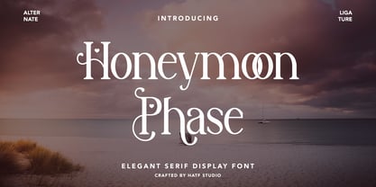 Is a elegant serif font with distinctive handwritten characters perfect for branding projects, logos, wedding designs, media posts, advertisements, product packaging, product designs, labels, photography, watermarks, invitations, stationery, and any project who need handwritten dishes. Features : 1. Uppercase & Lowercase 2. Multilingual support 3. Number 4. Symbol 5. Punctuation 6. Support in Mac and Windows OS -Support in design application (photoshop, illustrator, and more) I really hope you enjoy it.
 - Marlyn Malson by Bosstypestudio,
$12.00 Marlyn Malson is a beautiful and light handwritten font with a romantic twist. Use it to add an authentic spark to any design project. It includes 1-10 amazing alternates, which gives you the opportunity to create multiple unique designs with just this one download. It is suitable for logos, web, stationary kits, banners, greeting cards, quotes and every other design which needs an elegant touch. Have a great day! Thanks :)
 - Hancock Pro by Red Rooster Collection,
$60.00 Hancock Bold Condensed is slab serif typeface. The original Hancock design was produced by the Keystone Type Foundry, circa 1903; a condensed version was added circa 1917 by Lanston Monotype. Steve Jackaman (ITF) designed and produced a digital version of Hancock in 1994, and completely redrew the typeface for its 2017 release. The new version has a 40% larger glyph set, and supports Latin 1 plus Central/Eastern European languages.
 - Identidad by Punchform,
$39.00 Identidad v1.02 2023, Sep 22 Identidad is a sans-serif type family designed to offer support for most Latin script languages. Identidad has nine weights, each with corresponding italics, 710 glyphs, and 17 OpenType features (aalt, calt, case, ccmp, dnom, frac, locl, numr, ordn, pnum, sinf, ss01, ss02, subs, sups, tnum, zero). Identidad supports 377 languages and covers 3 Unicode blocks (Basic Latin, Latin-1 Supplement, Latin Extended-A).
 - Buroek by Twinletter,
$18.00 Buroek is a display font that is not just letters, but also a spirit of courage that is expressed in every line and curve. Created in a stunning superhero style, Buroek is the perfect choice for projects that require a visual punch. What’s Included : File font All glyphs Iso Latin 1 Alternate, Ligature Simple installations PUA Encoded Characters – Fully accessible without additional design software. Fonts include Multilingual support
 - Ondise by Magpie Paper Works,
$32.00 Ondise is a curvy and warm hand-lettered calligraphy script with a natural, dancing baseline. This Opentype font was created with a pointed pen & ink, and includes six different ampersands as well as a swash feature that automatically substitutes beginning & end of word letters. To enable alternate ampersands, simply turn on the contextual alternates feature and type &1, &2, &3, etc. Opentype coding automatically substitutes the new ‘and’.
 - Tecnica Slab Stencil by Graviton,
$20.00 Tecnica Slab Stencil font family is the stencil version of Tecnica Slab font family, it has been designed for Graviton Font Foundry by Pablo Balcells in 2014. Tecnica Slab Stencil consists of 8 styles. The 4 “Stencil 1” styles contain a narrow stem for big sizes type and/or rigid materials printing, and the 4 “Stencil 2” styles contain a wide stem for small sizes type and/or light materials printing.
 - Hazel Clouds by Rillatype,
$12.00 Hazel Clouds is a script font that has modern looks. This font is perfect for you who needs modern script as this font is applicable for branding, headline, apparel, packaging. it also comes with more than 9 stylistic alternates to make you can choose your own style! Hazel Clouds also support multilingual language. To acces the underlines just type _ (underscore) + 1(one) or 2(two). example _1 _2
 - Royal Style by Rizkimau,
$30.00 Royal Typeface is stylish copperplate fonts, combines from copperplate to contemporary font with a dancing baseline, classic and elegant touch. Can be used for various purposes. Such as headings, luxury, logos, wedding invitation, t-shirt, letterhead, lable, news, posters, badges etc. Royal Typeface features 1.500 glyphs. Support with Opentype: Unique glyphs, With cool Stylistic Alternates, Swash, Italics, Stylistic Sets 1-20, Ligatures, Multilingual characters, UPPERCASE, LowerCase, Numeric, Oldstyle Figures & Tabular Figures.
 - Tecnica Stencil by Graviton,
$20.00 Tecnica Stencil font family is the stencil version of Tecnica font family, it has been designed for Graviton Font Foundry by Pablo Balcells in 2014. Tecnica Stencil consists of 8 styles. The 4 “Stencil 1” styles contain a narrow stem for big sizes type and/or rigid materials printing, and the 4 “Stencil 2” styles contain a wide stem for small sizes type and/or light materials printing.
 - TS Karagoz by TSfonts Type Studio,
$35.00 Introduction: Karagoz is a playful and fun display typeface that has strong and powerful. It is designed to be bold and large. Karagoz is perfect for video games, cartoons, t-shirts, children’s books, captions, headlines, and posters. Weights and Languages: It consists of 1 Weight. It supports Latin, Arabic, Persian, and Urdu. Usage: Karagoz Font is used in headlines, posters, websites, social media, and visual identities. Designing & Developing: TSfonts Type Studio.
 - Energy Recharge by Hatftype,
$15.00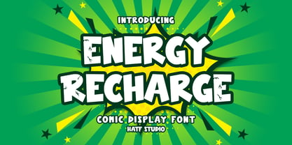 Is a comic display font with distinctive handwritten characters perfect for branding projects, logos, wedding designs, media posts, advertisements, product packaging, product designs, labels, photography, watermarks, invitations, stationery, and any project who need handwritten dishes. 1. Uppercase & Lowercase 2. Multilingual support 3. Number 4. Symbol 5. Punctuation 6. Support in Mac and Windows OS -Support in design application (photoshop, illustrator, and more) I really hope you enjoy it.
 - Idiot Boy by The Type Fetish,
$60.00 Idiot Boy was inspired and named after a design by Huw Morgan from the book Typographics 1. Idiot Boy is built from The Type Fetish’s distressed collection of fonts, including a few that have never been released. The OpenType version contains eight alternative glyphs for each character within the single font file. The TrueType version offers nine different fonts, each with a unique variation of the character in its character set.
 - Bloket by profonts,
$20.99 profonts Bloket is a carefully designed display typeface with a strong impact. The characters are constructed in a way that they can perfectly work alongside each other. Ideal for eye-catching headlines, strong logos and fresh layouts throughout a variety of media. profonts bloket supports the full Basic Latin, Latin 1 and Latin Extended A character set. Additionally, alternates for all uppercase, lowercase and figure characters are included.
 - Little Things by Ana's Fonts,
$15.00 Little Things is a cute handwritten font with an alternates character set and lots of extras (underlines, doodles, arrows, words). Perfect to include in cute handmade designs, such as logos, packaging, prints and postcards, patterns, and social media posts. Little Things includes: Little Things font Little Things alternates, with an extra character for 0-1, a-z, A-Z (and accents) Little Things extras, with swashes, underlines, doodles, arrows and words
 - Paperboard by Anastasia Kuznetsova,
$14.00 I present my funny and very cute font "Paperboard" Great for sweet greeting cards and invitations, for playful branding and quotes, for unusual packaging and much more! This font is unique and lightweight:) Font Features • character set A-Z; • 1 languages (English) It is recommended to use it in Adobe Illustrator or Adobe Photoshop Made with love ♡ Thank you for stopping by, and I wish you a creative day!
 - Broaek by Linecreative,
$10.00 Broaek is a display typeface with a modern impression. This font consists of 3 types of styles, namely regular, thin, and outline. This font is perfect for use in headlines, posters, branding, titles, and other graphic designs. What you get dear, you will get : 1. Broaek- A clean San serif font including Upper & Lowercase characters(Regular,thin,Outline) 2. Numbers and Pointing 3. Supports Multi linguage (Latin Western Europe)
 - Dortmund by Punchform,
$39.00 Dortmund v1.02 2023, Oct 02 Dortmund is a sans-serif type family designed to offer support for most Latin script languages. Dortmund has nine weights, each with corresponding italics, 710 glyphs, and 17 OpenType features (aalt, calt, case, ccmp, dnom, frac, locl, numr, ordn, pnum, sinf, ss01, ss02, subs, sups, tnum, zero). Dortmund supports 377 languages and covers 3 Unicode blocks (Basic Latin, Latin-1 Supplement, Latin Extended-A).
 - Oh Manoghara by Bosstypestudio,
$14.00 Oh Manoghara is a beautiful and light handwritten font with a romantic twist. Use it to add an authentic spark to any design project. It includes 1-10 amazing alternates, which gives you the opportunity to create multiple unique designs with just this one download. It is suitable for logos, web, stationary kits, banners, greeting cards, quotes and every other design which needs an elegant touch. Have a great day! Thanks :)
 - Sweet Youth by Atom,
$14.00 Sweet Youth is a modern calligraphy typeface. It includes amazing swashes in 4 styles, which gives you the opportunity to create multiple unique designs with just this one download. It is suitable for logos, web, stationary kits, banners, greeting cards, quotes and every other design which needs an elegant touch. Features : 1. Ligatures 2. Titling and swash 3. 6 Stylistic Sets 4. OpenType Features 5. PUA Encoded Thank you :)
 - Under Terror by Sarid Ezra,
$15.00 Under Terror is a rough handwritten font with creepy vibes that will suitable for your next halloween poster. You can use this font for any project especially horror movie poster. With unique lowercase and uppercase, you can combine both to get more handwritten looks. You can access the underline from ligatures, just type underline + number(1-6) in the middle of the text. For example: TeR_2roR. This font also support multilingual.
 - Mabista Script by stiplinestudios,
$15.00 Introducing a dancing calligraphy font, Mabista Script! Simple way to access is just type a number (1-7) after the letters. example : m3ab5ista2 Mabista Script is perfect for wedding stationery, invitations, lovey cards, logos, bussiness cards, branding and other projects that require a touch of casual and feminine. This font was created with multilingual support and over 484 glyph characters, allowing you to create a fresh look to your projects.
 - Wizard Illusion by Hatftype,
$17.00 Wizard Illusion is a halloween display font that is inspired by gothic and horror style because its shape is very unique and is perfect for any project that you will use with this theme. Features : 1.Uppercase & Lowercase 2.Multilingual support 3.Number 4.Symbol 5.Punctuation 6.Support in Mac and Windows OS -Support in design application (photoshop, illustrator, and more). I really hope you enjoy it.
 - Chinese Monoline by Attype Studio,
$19.00 Chinese Monoline is a Chinese style monoline font, with a modern twist. It has 2 styles: regular and slant. Chinese Monoline is perfect for branding and promotional material for Asian-themed designs The fonts works best as display typefaces or as beautiful headline fonts, but can also be used in other ways to create stunning designs. Features : - Chinese Monoline Family Font - Ligatures - Multilingual, US Roman, Latin 1 Support