4,476 search results
(0.018 seconds)
- Scribonius GTSLB by Intellecta Design,
$30.00 Blackletter typefaces, also known as Gothic, Fraktur, or Old English, have been used in the headings and initial chapters of books. This style of typeface is recognizable by its dramatic thin and thick strokes, and in some fonts, the elaborate swirls on the serifs. Blackletter typefaces are based on early manuscript lettering and evolved in Western Europe from the mid twelfth century. They are best used for headings, logos, posters, and signs, as they are not easy to read in body texts. Blackletter was type that emulated the most common handwritten scripts of the era and was used for books of hours and initial chapters of books Brazilian type designer Paulo W created this font ideally suited for advertising and packaging, festive occasions, editorial and publishing, logo, branding and creative industries as well as poster and billboards. An elegant and clean typeface, with two harmonic blackletters styles, the bold lowercases with beaufitul ornamented initials. A classic decorative design around an antique theme: The headings of gothic texts, this font works great in display purposes. ENJOY
 - Tweed SG by Spiece Graphics,
$39.00 Tweed is a journey into the 1930s world of hand-lettering. The design looks very much like the personal scribblings of an old-fashioned cartoon animator. It’s the sort of sketch-style you might find describing a goofy caterpillar or laughing willyworm. Tweed is fun and light-hearted with open and rounded letters of a somewhat musical quality. Derived from old letterforms popularized by Carl Holmes in his wonderful book on the subject, Tweed is basically friendly in nature. This typeface is great for personal greeting cards and stationery - any kind of casual correspondence. It works well in display situations, too. And yes, there is an alternate to the funny-looking “w” character. Just press option l (el) on Mac. Or Alt 0172 on Windows. Tweed is now available in the OpenType Std format. Some new stylistic alternates have been added to this OpenType version. Advanced features work in current versions of Adobe Creative Suite InDesign, Creative Suite Illustrator, and Quark XPress. Check for OpenType advanced feature support in other applications as it gradually becomes available with upgrades.
 - User Stencil by DSType,
$30.00 User is a monospaced type family with 30 styles, from Hairline to Bold, divided in Regular, Upright and Stencil, with five weights (Hairline, ExtraLight, Light, Medium and Bold) all with Cameo versions. Complexity and versatility are the keywords for this type family. Despite being a monospaced font, which means there's no kerning, all the glyphs were designed in order to sit comfortably in the 600 points width, a hard task because some glyphs are too narrow ('i' and 'l'), while others are too wide ('m' and 'w'), but they must fit the same width. The desire for keeping a comfortable readability in User was one of the key elements, therefore we designed several ligatures that fit both single and double space width, allowing to maintain a certain idea of proportional design. In this digital booklet you will find a detailed vision of the anatomy of the typefaces, the amount of characters available, the styles and weights, along with a series of features, specially designed to make User a very versatile and usable type system.
 - User Upright by DSType,
$30.00 User is a monospaced type family with 30 styles, from Hairline to Bold, divided in Regular, Upright and Stencil, with five weights (Hairline, ExtraLight, Light, Medium and Bold) all with Cameo versions. Complexity and versatility are the keywords for this type family. Despite being a monospaced font, which means there's no kerning, all the glyphs were designed in order to sit comfortably in the 600 points width, a hard task because some glyphs are too narrow ('i' and 'l'), while others are too wide ('m' and 'w'), but they must fit the same width. The desire for keeping a comfortable readability in User was one of the key elements, therefore we designed several ligatures that fit both single and double space width, allowing to maintain a certain idea of proportional design. In this digital booklet you will find a detailed vision of the anatomy of the typefaces, the amount of characters available, the styles and weights, along with a series of features, specially designed to make User a very versatile and usable type system.
 - Caslon #540 by Linotype,
$29.99The Englishman William Caslon punchcut many roman, italic, and non-Latin typefaces from 1720 until his death in 1766. At that time most types were being imported to England from Dutch sources, so Caslon was influenced by the characteristics of Dutch types. He did, however, achieve a level of craft that enabled his recognition as the first great English punchcutter. The original Caslon specimen sheets and punches have long provided a fertile source for the range of types bearing his name. Identifying characteristics of most Caslons include a cap A with a scooped-out apex; a cap C with two full serifs; and in the italic, a swashed lowercase v and w. A few of the many interpretations from the early twentieth century were true to the source, as well as strong enough to last into the digital era. These include two from the American Type Founders company, Caslon 540 and the slightly heavier Caslon #3. Both fonts are relatively wide, and come complete with small caps, old style figures, and italics. - Belwe by ITC,
$29.99The typeface Belwe, created in 1926 by German typographer and teacher Georg Belwe, has an uncommon style that is difficult to describe. It is a synthesis of many different genres: it is a slab serif with Art Nouveau style but also with many blackletter influences. The angled serifs on the ascenders and the calligraphic flourishes on the the upper and lowercase V, W, and Ys reference marks made by pens. There are also many other special characters that are unlike any other designs. Have a look at the fun lowercase a, the quirky lowercase f and g, and the unique C, F, L, and R for the uppercase. This design works especially well for display sizes, but is also good for short amounts of text. The mood and image suggested by this typeface is great for menus, invitations, and signs when you want to send a personal and friendly message. It's Art Nouveau roots also give it a place in history for designs from the Victorian period up through the 1920's and 30's - User by DSType,
$30.00 User is a monospaced type family with 30 styles, from Hairline to Bold, divided in Regular, Upright and Stencil, with five weights (Hairline, ExtraLight, Light, Medium and Bold) all with Cameo versions. Complexity and versatility are the keywords for this type family. Despite being a monospaced font, which means there's no kerning, all the glyphs were designed in order to sit comfortably in the 600 points width, a hard task because some glyphs are too narrow ('i' and 'l'), while others are too wide ('m' and 'w'), but they must fit the same width. The desire for keeping a comfortable readability in User was one of the key elements, therefore we designed several ligatures that fit both single and double space width, allowing to maintain a certain idea of proportional design. In this digital booklet you will find a detailed vision of the anatomy of the typefaces, the amount of characters available, the styles and weights, along with a series of features, specially designed to make User a very versatile and usable type system.
 - Belwe Mono by ITC,
$29.99 The typeface Belwe, created in 1926 by German typographer and teacher Georg Belwe, has an uncommon style that is difficult to describe. It is a synthesis of many different genres: it is a slab serif with Art Nouveau style but also with many blackletter influences. The angled serifs on the ascenders and the calligraphic flourishes on the the upper and lowercase V, W, and Ys reference marks made by pens. There are also many other special characters that are unlike any other designs. Have a look at the fun lowercase a, the quirky lowercase f and g, and the unique C, F, L, and R for the uppercase. This design works especially well for display sizes, but is also good for short amounts of text. The mood and image suggested by this typeface is great for menus, invitations, and signs when you want to send a personal and friendly message. It's Art Nouveau roots also give it a place in history for designs from the Victorian period up through the 1920's and 30's
 - Gothic Tuscan One by HiH,
$12.00 Gothic Tuscan One is a all-cap condensed gothic with round terminals and decorative “tuscan” center spurs. It was first shown by William H. Page of Norwich, Connecticut among his wood type specimen pages of 1859. Gothic Tuscan One exemplifies the strength of decorative wood types: large, simple type forms that provide the visual boldness sought by advertisers of the Victorian period. While our marketing has gotten so very sophisticated, there is always a place for simple, visually strong typeface. Although about 14 miles inland, Norwich lies at the head of the Thames River. The river is both wide and deep, and therefore was not bridged in the early 20th century. From the 17th century until then, if you wanted to get from Groton on the west bank to the whaling port of New London on the east bank by land, you had to had to go by way of Norwich. Because of its size, the Thames is navigable all the way from Norwich to New London. Docks were built in Norwich around 1685 and the city became Connecticut’s 2nd largest port by 1800. With the construction of the Norwich & Worcester Railroad in 1835, Page could easily ship his wood type north by rail or south by coastal schooner. Included with our font, Gothic Tuscan One, are two 19th century printer’s ornaments of sailing ships similar to those that sailed up the Thames to Norwich. There is also a more contemporary glyph of a whale, looking quite pleased that the only whaling ship left in Connecticut is the Charles W. Morgan, permanently moored at Mystic Seaport. Reference: Moon’s Handbooks, Connecticut 2nd Edition (Emeryville CA 2004). Gothic Tuscan One ML represents a major extension of the original release, with the following changes: 1. Added glyphs for the 1250 Central Europe, the 1252 Turkish and the 1257 Baltic Code Pages. Added glyphs to complete standard 1252 Western Europe Code Page. Special glyphs relocated and assigned Unicode codepoints, some in Private Use area. Total of 332 glyphs. 2. Added OpenType GSUB layout features: pnum, ornm and dlig. 3. Added 330 kerning pairs. 4. Revised vertical metrics for improved cross-platform line spacing. 5. Redesigned mathamatical operators 6. Included of both tabular (std) & proportional numbers (optional). 7. Refined various glyph outlines. Please note that some older applications may only be able to access the Western Europe character set (approximately 221 glyphs). The zip package includes two versions of the font at no extra charge. There is an OTF version which is in Open PS (Post Script Type 1) format and a TTF version which is in Open TT (True Type)format. Use whichever works best for your applications.
 - bearerFond - Personal use only

- curlyJoe - Unknown license

- Doctor Azul - Unknown license

- Frames1 - Unknown license

- Silver Crown by Linecreative,
$16.00 Silver Crown is an Ultra Condensend display font with minimalist characters. It's perfect for logos, name cards, magazine layouts, headers, or even large scale artwork. Silver Crown, a clean sans serif, offers you: 1. Upper and Lowercase characters (All Caps) 2. Ligatures (121 characters) and Stylistic alternates (9 Characters) 3. Multilingual Support (Latin Western Europe), Numbers and Punctuation
 - Okomito Next by Hanken Design Co.,
$30.00 Okomito Next is a sans serif inspired by the classic typefaces that were imbued with a sense of functionality, boldness and industrial strength. OpenType features: Access All Alternates, Case-Sensitive Forms, Glyph Composition / Decomposition, Discretionary Ligatures, Fractions, Kerning, Standard Ligatures, Localized Forms, Mark Positioning, Mark to Mark Positioning, Ordinals, Proportional Figures, Stylistic Alternates, Stylistic Set 1, Superscript, Tabular Figures
 - Shield Classic 2 Letters by MonogramBros,
$12.00 Shield Classic 2 Letters Monogram Font is a perfect shaped monogram font consisting of 52 letters and 1 basic frame. With just a single font file you will be able to create beautiful monograms in just a matter of minutes after the purchase! Shield Classic 2 Letters Monogram Font comes with font file in OTF format.
 - Darkwell by Rillatype,
$10.00 Darkwell is a striking signature family. It includes two fonts. Darkwell 1 is a signature font but without loop on the letters, meanwhile Darkwell 2 is a signature font with a loop to make every connection each letters more smooth Both fonts are perfect for branding projects or just to add a stylish touch to your background image.
 - Obdulia by Andinistas,
$39.9520g Rosadelia + 200g Alcira + 2 tablespoons Heleodora + 1 cup ninja stock + 100g Lucrecia + 2 tablespoons lirrot. REDUCE to a medium heat and melt the grunge. Add the photo and color and sauté for 5 minutes or until softened. Add the design, stock and andinistas and simmer until slightly thickened. Serve immediately with Dingbats and handwriting South America. - Mangal by Microsoft Corporation,
$49.00Mangal™ is an OpenType font for the Indic script Devanagari. Mangal can be used to write Hindi, Sanskrit, Marathi, Nepali, Punjabi and other Indic scripts. Mangal is based on Unicode, contains TrueType outlines and was designed by Raghunath Joshi for use as a UI font. Copyright ™ 2001 Microsoft Corporation. All rights reserved. Character Set: Latin-1, Devanagari. - Ayara by Twinletter,
$13.00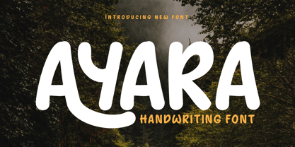 Introducing "AYARA Font" - a harmonious fusion of traditional handwriting and contemporary design. Whether you're working on invitations, posters, or branding materials, AYARA Font effortlessly adds a unique handwritten style that instantly grabs attention. What’s Included : File font All glyphs Iso Latin 1 Alternate, Ligature Simple installations PUA Encoded Characters – Fully accessible without additional design software. Fonts include Multilingual support
 - Piepie by Dharma Type,
$24.99 Piepie is very heavy typeface for titlings and captions. OpenType Format (.otf) with 461 glyphs! Super mini ascenders and descenders! Ultra big x-height! Fatty weight yet Sharpy sharp detail! Bring it on Retina display! OpenType alternates for K, R and Y! Mac Roman ✓ Windows 1252 ✓ Adobe Latin 1 ✓ Adobe Latin 2 Almost all Adobe Latin 3 Almost all
 - DF Staple Mono by Dutchfonts,
$33.00 DF Staple Mono is a personal answer on the archaic and ‘middle-of-the-road’-forms of typewriter typefaces like ‘Courier’ and ‘American Typewriter’. The form of a staple (office supply no. 1) and its transformations inspired me during the design process. The first four weights are all monospaced and are completed with a real italic.
 - Megren by Azzam Ridhamalik,
$18.00 Introducing Megren, an experimental display typeface combining a simple and clean sans serif typeface with an elegant copperplate script typeface. Consists of 1 font file with copperplate script typeface on the uppercase and sans serif on the lowercase. The combination of different typefaces looks modern and fashionable but also gives a nostalgic retro vibes at the same time.
 - Roasted by Crumphand,
$30.00 Hello, Introducing the new hand brush fonts Roasted. Roasted is truly hand made by 100%. This fonts have a Stylistic Set. You can access the Stylistic Set with lowercase too. Still have a good readibility and strong font. What's Included Inside The Fonts ? Uppercase Lowercase Numerals Symbols European Multilingual Stylistic Set 1 Stylistic Set 2 Thank You, Regards!
 - Chuck by Parkinson,
$20.00 Chuck. Designed in 2004 by Jim Parkinson. Originally released as a Type 1 font, Chuck was refreshed (version2) and re-released as simple Open Type in 2012. The models for this massive Deco typeface appear on a bronze plaque on the South Tower of the Golden Gate Bridge. The plaque commemorates the builders of the bridge.
 - Roadster Script by Fontop,
$9.00 Welcome my new vintage style ROADSTER font family. With so many extras the font gives additional opportunities for logo creation, branding designs, blogs. Also looks cool when used in headers in signs, layouts, ad materials. OpenType features include swashes and dividers. To use swashes and dividers you need to press dot (.) followed by a number from 1-9 range.
 - Jaferon by Twinletter,
$17.00 Jaferon is a display font that comes with a stunning superhero style. Ready to take the lead in projects that call for a bold, bold touch and a bold look. What’s Included : File font All glyphs Iso Latin 1 Alternate, Ligature Simple installations PUA Encoded Characters – Fully accessible without additional design software. Fonts include Multilingual support
 - Eiffel in love by Letterara,
$13.00 Eiffel in love is a beautiful high fashion font trio, consisting of 2 sans fonts and 1 script font. With a strong modern style sans and beautiful script, this is perfect for branding, logos, printed quotes, badge, insignia, packaging, headline, poster, t-shirt/apparel, greeting card and many more. Use your inspiration and your design will be perfect!
 - Selauk by Twinletter,
$17.00 Selauk is a window into the futuristic world of typography’s future. With this theme, this font is the ideal answer for projects that need a touch of modern, sci-fi, and future atmosphere. What’s Included : File font All glyphs Iso Latin 1 Alternate, Ligature Simple installations PUA Encoded Characters – Fully accessible without additional design software. Fonts include Multilingual support
 - Gumok by Linecreative,
$14.00 Gumok - Ultra Condensend font and Minimalis Character, It's Perfect for logo, name card, magazin layout,headers, or oven large scale artwork What you get dear, you will get : 1. Gumok- A clean San serif font including Upper & Lowercase characters(ALL CAPS), 2. Stylistic alternates Character (9 Character) 3. Supports Multi linguage (Latin Western Europe), Numbers and Punctuation
 - Rothek Stencil by Groteskly Yours,
$25.00 Rothek Stencil is a stencil type family based on our bestselling Rothek family. Rothek Stencil is highly legible, versatile and multilingual. • Ideal for graphic design, packaging, branding and signage • Unique stencilled letterforms • 23 Styles (11 Uprights, 11 Italics, 1 Variable Font) • 1000+ Characters per font • Extended Latin, Extended Cyrillic, and Vietnamese support • Versatile OpenType Features • Legible, versatile, and multifunctional
 - Astroz by Gravitype,
$14.90 Astroz is a single weight display font inspired by sci-fi culture and space environments. It has been conceived for logos, headlines and posters. The sharp lines mixed with perfect circles give a wonderful futuristic aesthetic. In addition, alternates of letter “A” and number “1” are included to give you more stylistic options. Multilingual support is available.
 - PR Swirlies 01 by PR Fonts,
$10.10 This font is a collection of simple calligraphic ornaments suitable for invitations, gift tags, and anything that can benifit from a “spoonful of sugar” visually. The "Sand Drift" version combines well with: PR Bramble Wood 1, PR Bramble Wood 2, PR Hallow Doodles 01, PR Hallow Doodles 02, PR Cauldron, PR Swirlies 01], PR Swirlies 05.
 - Kartika by Microsoft Corporation,
$49.00Kartika™ is an OpenType TTF font for the Indic script Malayalam. The Karitka font was tuned for high quality display and is used for Malayalam and Konkani. Kartika is based on Unicode, contains TrueType outlines and was designed for use as a UI font. Copyright ™ 2002 Microsoft Corporation. All rights reserved. Character Set: Latin-1, Malayalam - Breakfast Burrito by Hanoded,
$15.00 Recently I have been watching some re-runs of Dexter. In season 1, Debra has a rough morning and complains she cannot make it through the day without eating a breakfast burrito. The name stuck, a font was born and the result is Breakfast Burrito font. It is a tall, all caps typeface with a little twist.
 - Sugaqi by Twinletter,
$17.00 Sugaqi is a visual embodiment of courage in the form of a superhero display font. Tailor-made for projects that require a bold, bold, and punchy look like movies, games, or standout designs. What’s Included : File font All glyphs Iso Latin 1 Alternate, Ligature Simple installations PUA Encoded Characters – Fully accessible without additional design software. Fonts include Multilingual support
 - Ohex by kome.studio,
$12.00 Contemporary geometric typeface. Ohex™font family consists of 5 unique font styles — thin, light, regular, bold and black + VARIABLE version. Opentype features including stylistic alternates, ligatures and kerning pairs. Currency glyphs and stylish digits. Capital letters are designed on the shape of a hexagon. Lowercase letters to cooperate with them, refers to the street style look. Great for logos, posters, magazine layouts, headers, apparel and prints. - Multilanguage support covering Western, South and Central Europe. 1256 Latin 1 / 1250 Latin 2: Eastern Europe / 1254 Turkish / 1257 Windows Baltic / Macintosh Character Ser (US Roman) 1256 Latin 1: Afrikaans, Basque, Catalan, Danish, Dutch, English, Faeroese, Finnish, French, Galician, German, Icelandic, Irish, Italian, Norwegian, Portuguese, Scottish, Spanish, and Swedish. 1250 Latin 2: Eastern Europe / 1254 Turkish / 1257 Windows Baltic : Czech, Polish, Hungarian, Croatian, Romanian, Estonian, Latvian , Lithuanian, Turkish, Slovak and Slevenian -
 - Screener by Canada Type,
$25.00Game over. Insert coin to continue. 1 coin, 1 play. Credits 00. Screener is the latest child of arcade alphabets. Not too trendy, not too retro, not too stand-out, yet clear and fresh. Although it boasts plenty of the traits of its origins (early screen technologies), it manages to maintain a balance between the elements of its 1980s origins and the mechanical yet transparent late 20th century techno/pop design. Precise and geometric, solid and strong, Screener looks great on screen as well as in print, in tracked small sizes as well as in teaser headlines. Screener comes in two widths and weights, with italics, and extra sets of symbols and numerals (enclosed, fractions, superiors, inferiors, etc.), as well as two weights of small caps. Screener is available in separate packages, or in a value package that contains all twelve fonts. - Waite Park JNL by Jeff Levine,
$29.00Waite Park JNL is based on the smallest of the die-cut letters and numbers contained in the Webway Sign Cabinet - once manufactured by the Holes-Webway Company of Minneapolis, Minnesota. The largest of the set's sizes (2 inch) was the model for Sign Kit JNL, the medium size (1-1/8 inch) was used to make Sign Production JNL and this font is a version from the 3/4 inch size. Each size of alphabet and numerals have their own unique characteristics, although they all follow the same basic font style, which is reminiscent of classic Art Deco-era sanserif typefaces. The name Waite Park JNL was derived from a division of Holes-Webway that (for some reason lost to time) distributed their sign kits under the name Waite Park Sign Company, located in the Minnesota city of the same name. - Mr Robot by Hipopotam Studio,
$16.00 Mr Robot is a typeface designed for our next book for children. We wanted to have a colorful, dimensional and edgy looking letters for headlines. There are three ways to use Mr Robot. You can align three text frames with same text but with different colors and font styles (Regular, Shadow 1 or Shadow 3 and Shadow 2) or with ALLinONE font style but select a different OpenType Stylistic Sets (set 1 is like Shadow 1, set 2 like Shadow 2 and set 3 like Shadow 3). This works great but we don’t like to have unnecessary text frames in our layouts so we added a very cool Contextual Alternates OpenType feature. You just need Mr Robot ALLinONE style and only one text frame. First make sure that Contextual Alternates is off. Type every character three times (RRROOOBBBOOOTTT), select colors for each letter (first letter of every three is a side shadow, second is bottom shadow and third is a front of the dimensional letter). When everything is set just turn Contextual Alternates back on. Styles and alignment will be set automatically. Check out the Users Manual for a visual explanation. For web fonts it is better (at least for now) to use the first method (with font styles) as the OpenType features are not supported in older browsers.


