4,579 search results
(0.026 seconds)
- Garment Bag Stencil JNL by Jeff Levine,
$29.00 Searching the internet for interesting type ideas leads one to many unusual items for sale online. An antique, hand-cut metal stencil from France with the word “Bagagens” [luggage] provided a condensed Art Deco design in a semi-stencil format (some solid letters, others with traditional ‘breaks’ within the characters). The digital version of the type style has a more traditional stencil character set. Garment Bag Stencil JNL is available in both regular and oblique versions.
 - MC Cartinz by Maulana Creative,
$16.00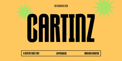 Cartinz is a modern sharp condensed sans display font. With bold consist stroke, fun character with a bit of ligatures and alternates. To give you an extra creative work. Cartinz font support multilingual more than 100+ language. This font is good for logo design, Social media, Movie Titles, Books Titles, a short text even a long text letter and good for your secondary text font with sans or serif. Make a stunning work with Cartinz font. Cheers, Maulana Creative
 - Avelia by Fatih Güneş,
$16.00 Avelia is a high contrast typeface with multilingual applications. Slender lines and great legibility make it perfect as a display font. With curves in all the right places, it is great for editorials and other commercial use. Avelia decorative font consists of 426 characters, including uppercase, lowercase, numbers, small caps, ligatures and accents. With its condense character, Avelia is very effective and useful for uses in works such as Packaging, Logo design, Headlines and derivatives of modern Art Deco.
 - Mellnik by ParaType,
$25.00Mellnik is a sans serif of humanist style (in a way) that was developed by Oleg Karpinsky for ParaType in 2006. The type family contains nine styles with a number of alternate characters in each ones. For use as a text font in long text passages of advertising booklets, catalogues or magazines, as well as for accident setting. Mellnik may be also applied as a corporate typeface. Five condensed styles were added in 2007 by the same designer. - Cobya by Creativemedialab,
$20.00 Cobya is inspired by the waves and the ocean. Some letter like A,W,V reflects the dynamic and beautiful shape of the waves. Try All Capitals and play with the spacing for a modern and fashionable look. Cobya consists of three widths condensed, normal and expanded. Each width has 9 weights, also a variable format. Cobya has distinctive and unique characteristics, so it is very suitable when used as a branding logo or fashion design concept.
 - Tightwad JNL by Jeff Levine,
$29.00 “I Don't like No Cheap Man” is a piece of early 1900s sheet music featuring its title hand lettered in a condensed slab serif design. The influences of the Art Nouveau era are clearly found in the many eccentric character shapes within the various letters of the original artwork. Recreated in digital type, Tightwad JNL is available in both regular and oblique versions – and its font name is a variant of the “Cheap Man” portion of the song’s title.
 - Config by Adam Ladd,
$25.00 Config was influenced by geometric sans with circular forms but the proportions have been condensed by incorporating straight sides for a design that is sturdy and efficient yet friendly. The neutral design with subtle details makes it functional for type setting in small and large sizes. Its clean nature makes it readable at small sizes but the touch of character—as seen in the notched joints, rounded details, and horizontal/vertical terminals—make it interesting at large sizes.
 - Upside by Little Fonts,
$15.00 Upside is an all caps font. The design of the font is tied to historic golden ages gone by, but with a modern flair giving it a contemporary edge. It is a tall and condensed geometric sans serif, with four unique styles and appearances. Upside is a distinctive display font, perfect for headlines and headings across a range of formats such as graphic design posters, editorial pieces, or anything that needs that extra eye-catching touch.
 - MC Magtons by Maulana Creative,
$15.00 Magtons is a classic condensed strong bold sans display font. Bold stroke, fun character with a bit of ligatures and alternates. To give you an extra creative work. Magtons font support multilingual more than 100+ language. This font is good for logo design, Social media, Movie Titles, Books Titles, a short text even a long text letter and good for your secondary text font with script or serif. Make a stunning work with Magtons font. Cheers, Maulana Creative
 - MC Bigfutz by Maulana Creative,
$15.00 Bigfutz is a modern Decorative sans serif condensed font. Medium stroke, fun character with a bit of ligatures and alternates. To give you an extra creative work. Bigfutz font support multilingual more than 100+ language. This font is good for logo design, Social media, Movie Titles, Books Titles, a short text even a long text letter and good for your secondary text font with script or serif. Make a stunning work with Bigfutz font. Cheers, Maulana Creative
 - Thealiens by Almarkha Type,
$25.00 Hello Everyone, introduce our new product Thealiens - Ligature Condensed Sans, inspired by the title of the sports poster and We make it very energetically, taking into account the thickness and density of each gliph, along with a ligature that makes this font look unique. Thealiens font with strong and challenging nuances. very suitable for the title, typography, clothes, Poster, magazines, brochures, packaging,Websites and much more for your design needs, making your designs more modern and professional.
 - MC Alysse by Maulana Creative,
$16.00 Alysse is a tech industrial genre sans display font. With regular condensed stroke, fun character with a bit of ligatures and alternates. To give you an extra creative work. Alysse font support multilingual more than 100+ language. This font is good for logo design, Social media, Movie Titles, Books Titles, a short text even a long text letter and good for your secondary text font with script or serif. Make a stunning work with Alysse font. Cheers, Maulana Creative
 - Thurkle by Grontype,
$15.00 Thurkle is bold new serif font, look tough and playable. Comes with sharp edges, inspired by sword making dynasty in British History. This display typeface is semi condensed and included some extra unique ligatures. Thurkle is perfect for any project such as magazine header, flyer header, logotype, invitation card name, and some any other design. Features: All Caps and Small Caps Character Numbers and Punctuation Special Characters Ligatures. Multilingual Support Thankyou For Picking The Font, Enjoy. Grontype
 - Galber by Craft Supply Co,
$20.00 Introducing Galber - Compressed Sans Serif: A commanding typeface that captures the eye with its bold, condensed design. With its impactful lines and modern allure, Galber adds a strong touch to your projects. Elevate your designs with Galber's assertive style, making a striking statement that simply can't be ignored. This typeface is ideal for greeting card, packaging, brand identity, poster, or any purpose to make your design project look eye catching and trendy. Feel free to play with this typeface!
 - Stenka by Katatrad,
$39.00 Stenka is a sans-serif stencil typeface that stand for display typeface to use in any typographic situation. It has his own unique style in expressed perfect condensed forms. Stenka is an ideal font family for display, print, corporate identity, mobile devices, magazine cover, signage, and web design creation, with a set of ligatures and alternative characters for your design in any layout. The family has 4 weights ranging from Light to Black and their italic.
 - Argot by K-Type,
$20.00 Argot is inspired by condensed grotesque letterforms and would be a monolinear sans except for an unorthodox disparity between inner and outer shapes. Elegantly curved outlines contrast starkly with austere rectangular counters, suggesting a no-frills functionality, 20th century modernism, or an unsettling discordance. The squared off inner spaces also add clarity and crispness. Argot is available in three widths — Wide, Normal and Narrow. Each width is supplied in three weights — Regular, Bold and Black — with corresponding italics (obliques).
 - Malto by Maulana Creative,
$15.00 Malto is a condensed sans serif font. With semi bold soft edge stroke, fun character with a bit of ligatures and alternates. To give you an extra creative work. Malto font support multilingual more than 100+ language. This font is good for logo design, Social media, Movie Titles, Books Titles, a short text even a long text letter and good for your secondary text font with sans or serif. Make a stunning work with Malto font. Cheers, Maulana Creative
 - MC Granko by Maulana Creative,
$17.00 Granko is a a retro vibes condensed sans serif font. Bold stroke, fun character with a bit of ligatures and alternates. To give you an extra creative work. Granko font support multilingual more than 100+ language. This font is good for logo design, Social media, Movie Titles, Books Titles, a short text even a long text letter and good for your secondary text font with script or serif. Make a stunning work with Granko font. Cheers, Maulana Creative
 - Vidocq by Typogama,
$19.00 Vidocq is a single weight typeface designed for use in headlines and titles, inspired by the woodcut styles of the 19th century. Its rounded forms and dark stroke translate into a bold yet friendly appearance coupled with a narrow proportion that let’s it set well in condensed settings. Thanks to an extended character set and wide range of Opentype features that includes arrows and fleurons, Vidocq was created to allow designers to play with various styles while composing layouts.
 - Matwin by Eyad Al-Samman,
$10.00 The idea behind designing ‘Matwin’ font was related to the youngest children of the designer namely the M-A fraternal twin. The name of the typeface (i.e., Matwin or M-A-Twin) was composed by merging three linguistic small syllables. The ‘-Twin’ syllable refers to the non-identical twin of the designer. The ‘M-’ and ‘A-’ syllables refer to the initial letters of the twin’s first names (i.e., Muhammad and Abdul-Wli) respectively. The typeface ‘Matwin’ has a personal trait which makes it as one of the most favorite fonts for the designer among his humble collection of fonts. Modestly, it is the designer’s handwriting and it has been designed to be added to the script font family known as brush un-joined. The brief process for having this typeface alive was done by firstly scanning the real script for each Latin letter, digit, symbol which were handwritten earlier by the designer himself. Then, the combination of these many scanned characters was manipulated using digital programs to produce at the end the complete typeface. The typeface has the essential glyphs comprising the character set required for most of the Latin, Western, and Eastern European languages including the Irish language. It combines +605 characters and this makes it as a pro font. It also entitles it to be applicable for usage in many languages of different communities and nations worldwide. ‘Matwin’ is dedicated for those who search for a genuine handwriting typeface with a natural touch and informal style to be added on their different published and produced products and services. It is more preferable when it is used in artistic, typographic, and other works using the lowercase letters or by mixing both upper- and lower-case letters. Moreover, the typeface is appropriate for any type of typographic and graphic designs in web, print, and other media such as boards and walls. It is also preferable to be used in the wide fields related to publications especially children-related ones, comics, printed or handwritten menus of cafeterias and restaurants at universities and public places, as well as other prints related to services and production industries. It also can create a very personal and friendly impact when used in headlines, books and novels’ covers, posters, titles, messages, envelopes addresses, grocery lists, postcards, ads, fliers, journals, paper arts, public notices, invitations, scrapbooks, notations, products’ surfaces for organic foods and juices, logos, medical packages related to children, Android applications, as well as products and corporates branding and the like. In a nutshell, ‘Matwin’ typeface fits without a glitch those (i.e., designers, typographers, publishers, artists, packagers, service providers, and so on) who have drastic and strong tendency towards imprinting their works with spontaneous and outlandish touches made by this typeface. Please, enjoy it extremely.
 - FALLING SKIES - Personal use only

- WHEN THE GOES SUN . SCENE - Unknown license

- Trek - Unknown license

- Web Serveroff - 100% free

- Ab Fangs - Unknown license

- K5 - Personal use only

- Squeeze Me Baby! - 100% free

- loco - Personal use only

- PF Bague Round Pro by Parachute,
$79.00 Bague Round is a soft contemporary geometric typeface which blends distinct minimalist characteristics with mainstream details. It originates from Bague Universal, a superfamily with a warm well-balanced texture and a distinct personality. Usually, round sans letterforms tend to look rather organic and playful at heavier weights. This problem was avoided in Bague Round by applying all necessary optical corrections at the rounded corners in order to retain its robust qualities. Mechanical replacement of the stem endings with standard arcs was not implemented and each round form of the horizontal, vertical and diagonal strokes was treated differently from the other. Whilst the rounded endings at heavier weights become gradually more flat at acute corners, the round stems in letters such as A, b, m, p, s are perfectly matched with sharp diagonals in letters such as M, N, w, v, in a very distinct manner. A remarkable feature of Bague Round is its vast array of uppercase alternates and ligatures which truly shine when set at display sizes. Make your selection from 6 distinct groups of alternates as well as a rich set of discretionary ligatures and watch it transform into a flexible, charming and stylish typeface with strong modern aesthetics. This typeface offers enormous possibilities and variations for editorial design, branding and corporate identity. The Bague Round type family includes 14 weights from Thin to Ultra Black and matching true-italics with a consistent and well-refined structure. Each style consists of 1017 glyphs with more that 280 alternates and ligatures and an extended set of characters which supports Latin, Cyrillic and Greek. PDF Specimen Bague Round on Behance
 - VLNL Bromfiets by VetteLetters,
$30.00 Vette Letters are thrilled to add maverick designer Dirk Uhlenbrock to the family, with the release of VLNL Bromfiets. Bromfiets (the Dutch word for moped) is a ‘holiday child’, the basic idea coming from a stop at a road junction in the Dutch coastal province of Zeeland. The Dutch signage, the black and white rings of traffic light poles, the symbols for brom- and snorfiets have always appealed to Dirk. While on vacation in Zeeland the first scribbles and digital drafts were created, always in mind that the typeface had to be striking, clear and friendly. The end result is more than that, a strong and instantly recognisable font with a matching dingbat weight full of icons and arrows. Stencil fonts have always interested Dirk, the informal character and the possible universal use as a paint- or spray-stencil on a wide variety of surfaces makes this type of font so interesting for me. The technically necessary dissolution of closed font contours always ensures a special aesthetic: What’HAT and HOW MUCH has to be removed or left, in order to make words easy to read and to avoid a fractal impression. Dirk Uhlenbrock has been working as graphic designer and illustrator in his hometown Essen, Germany for over 30 years. Always interested in typedesign he got in contact with Fontographer in 1996 and started to create and distribute loads of free fonts through his online platforms ‘Eyesaw’ and ‘Fontomas’. A bunch of these type experiments have been extented on request to complete fonts. Still located in Essen in 2009 Dirk started his second owner-based business erste liga büro für gestaltung - ersteliga.de
 - Julietrose by Monotype,
$29.99Julietrose debuted in May of 2006 and was quickly embraced by members of the graphic design community, who found it as charming as its name. The playful, full-bodied script began to show up in all forms of graphic communication. However, it soon became apparent that a bold weight would add more versatility to the design. Martin Wait, Julietrose’s designer, happily obliged by drawing a new and more forceful weight of the typeface. Where Julietrose is vivacious and lighthearted, Julietrose Bold is assertive and speaks with authority. They are clearly sisters, though – both weights feature flamboyant swashes and elegantly long ascenders and descenders. Both designs also offer a suite of swash and alternate characters, and are available in OpenType format The Julietrose family is small but irresistible. This pair can easily charm their way into such diverse uses as posters, restaurant menus, social announcements and even product brochures. - Corner C by CarnokyType,
$20.00 Corner C is a part of Corner type family. This subfamily is designed with rounded shapes in the corners. The concept of the typeface Corner is based on variation of corner shapes in font characters, from what is also its name derived. The basis is a bitmap modular principle, to which by simple addition of “the missing pixels” in corners of the characters ( Corner A ) to the shape of diagonal ( Corner B ), curvature (Corner C), or inversion curvature ( Corner D ), three more font variations are created. The basic monolinear bitmap weight is supplemented by two more extreme thicknesses – hairline and fat weight. The character set supports the complete Latin, while the x-height of lowercase is drawn at the same height as in the uppercase characters. Corner is a strong display typeface, which allows you to easily experiment and to combine it with its mutual font variations.
 - Galak Round by Luhop Creative,
$27.00 Galak Pro is a modern geometric sans serif family characterized by its simplicity and extensive functionality.consisting of 9 weights ranging from Hairline to Heavy with matching italics. It supports Extended Latin, Cyrillic and Greek. This blend produce a typeface of modern, clean and contemporary appearance that has implicit on its core a classic vibe, nourishing the text with a timeless elegance.In use, the form and function balance of its design allow it freely travel through a diverse range of fields and possibilities like short text settings, brands, headlines or signage systems with grace and naturality. Galak Pro is available in variable font format and in 18 different individual styles (9 weights), with a set of supports over 200 latin languages and including an extensive repertoire of opentype features like small caps, ligatures, stylistic alternates, proportional and tabular figures,and many other resources to please your typographic urges.
 - Fulgora by Sudtipos,
$39.00 Fulgora is a sort of ‘calligraphic typography’ or ‘typographic calligraphy’, depending on the point of view. Inspired by late-medieval Bâtarde and Civilité blackletter styles, the Kannada and Sinhala writing systems from Southern India, Celtic uncials, and diverse vernacular Mexican scripts, Fulgora was created straight from pen on paper as a personal calligraphic style where fantasy in the chief ingredient. The idea to take it to the digital realm came later, as an extension of the creative process. To this end, originals for each character were made, directly traced with the nib with no retouching, then vectorized to be digitally assembled. Work has been done on spacing and kerning with the aim to digitally reproduce an utterly calligraphic outcome keeping the natural, imperfect, manual finish of all signs. Fulgora has two variants: Blanca (white) and Negra (black), executed with different nib widths but the same style and proportions.
 - Famiar by Mans Greback,
$39.00 Famiar is a professional sans-serif typeface. It is friendly and optimistic while retaining an intellectual appearance and smooth, balanced curvatures. Drawn and created by Mans Greback between 2020-2022, Famiar has a fresh style and a strong personality, and is a great option for many modern designs. Provided in 18 high-quality styles, such as Thin, Light, Regular, Bold, SemiBold, ExtraBold, Black and Italic, the diversity of the typeface family ensures it can always be used to its fullest potential. Famiar is built with advanced OpenType functionality and has a guaranteed top-notch quality, containing stylistic and contextual alternates, ligatures and more features; all to give you full control and customizability. It has extensive lingual support, covering all Latin-based languages, from Northern Europe to South Africa, from America to South-East Asia. It contains all characters and symbols you'll ever need, including all punctuation and numbers.
 - Shizzle by 38-lineart,
$15.00 Shizzle is a font with a graffiti marker style. The lettterform of ‘Shizzle’ essentially made by the combination of downward and upward stroke base on -15 degres angle guideline. The basic of downward stroke is pulling pen from the top left to thw bottom right with full width of marker, then the basic shape of upward stroke look like the ligh flick by using the tip of the pen from bottom right to the top left. Inspired by Hip Hop and Rap style style. ‘Shizzle’ is a slang way of saying "Sure". People generally use it to communicate agreement to another person. This term is a product of Snoop Dogg's penchant for replacing the end of words with "izzle" to sound cooler. And ‘Fo Shizzle’ (for sure) this font offers beautiful typographic harmony for a diversity of design projects, including logos & branding, social media posts and advertisements, especially with graffiti look.
 - Spritz And Delicious by Mans Greback,
$79.00 Spritz And Delicious is a modern typeface with a traditional heritage. Captivating and blending the ruggedness of a saloon's wooden sign and the elegance of a Victorian tea room's menu, Spritz And Delicious is a typeface where the subtle hint of serifs adds a unique flavor, a nod to its vintage inspirations. At its core it remains a robust sans-serif, maintaining a fresh, modern twist. Provided in Regular, Bold, Italic and Bold italic, this font family is as diverse as it is refined. The font is built with advanced OpenType functionality and has a guaranteed top-notch quality, containing stylistic and contextual alternates, ligatures, and more features; all to give you full control and customizability. It has extensive lingual support, covering all Latin-based languages, and includes all the characters and symbols you'll ever need. Behind this creation is type designer Mans Greback.
 - HS Alhuda by Hiba Studio,
$50.00 HS Alhuda is a display typeface. It can be used for titles and graphic projects, which support Arabic, Persian Urdu and Kurdish. It has been created based on modern kufi style. It enjoys flexibility between sharp and curved lines in the structure of characters. This supports with a beautiful appearance and wonderful geometric structure. The sharp endings in the bottom of character also give an aesthetic addition to the character. (8) Weights has been created for this typeface between the heariline weight and heavy weight. Besides, those six additional weights which can be used in headline, has baseline parts are more thicker than the vertical parts. One has a regular form and the others has a stencil form in the middle using various styles. This typeface with its diversity of (14) weights is intended to be an attempt for a good addition to Arabic typography.
 - Walkway by Sabrcreative,
$25.00 Discover the elegance of Walkway Font, a stunning handwritten signature script with a natural flow. Whether you're a photographer, brand designer, or simply looking to add a touch of sophistication to your projects, Walkway Font is the perfect choice. It is versatile and can be used for various purposes such as watermarks, social media posts, advertisements, logos and branding, invitations, product designs, labels, stationery, wedding designs, and product packaging. With its full set of alternate characters, Walkway Regular offers endless creative possibilities. As a bonus, you'll also receive the Walkway Bonus, which includes ornamental vector graphics to enhance your designs further. This font provides multilingual support, catering to a wide range of languages including Afrikaans, Albanian, Catalan, Danish, Dutch, English, Icelandic, Italian, Spanish, Portuguese, German, Swedish, Norwegian, Polish, Indonesian, Zulu, and more. Its extensive language support ensures that you can communicate your message effectively to diverse audiences.
 - Round Technocrat by Mans Greback,
$39.00 Round Technocrat is a rounded, geometric font that blends heavy, square shapes with circular curves to create a distinct and modern typeface. The font family is perfect for designs that require a balance of rigidity and fluidity, making it suitable for both professional and creative projects. The Round Technocrat font family features five weights: Thin, Light, Regular, Bold, and Black, offering a diverse selection of styles to elevate your designs and give them a contemporary edge. The font is built with advanced OpenType functionality and has a guaranteed top-notch quality, containing stylistic and contextual alternates, ligatures, and more features; all to give you full control and customizability. It has extensive lingual support, covering all Latin-based languages, from Northern Europe to South Africa, from America to South-East Asia. It contains all characters and symbols you'll ever need, including all punctuation and numbers.


