10,000 search results
(0.023 seconds)
- Plak by Linotype,
$40.99 Plak is a typeface originally created by famous German designer Paul Renner in 1930. Paul Renner is also the designer of the Futura typefaces. Like Futura, Plak is a sans serif design. But its unique qualities include its heaviness, and its un-geometric lowercase a.""
 - Hermosa by sizimon,
$18.00 Beautifly is an elegant and flowing handwritten font. It features a varying baseline, smooth lines, gorgeous glyphs and stunning alternates. It maintains its classy calligraphic influences while feeling contemporary and fresh. Fall in love with this font and bring your projects to the highest levels!
 - Tehisa by Sealoung,
$10.00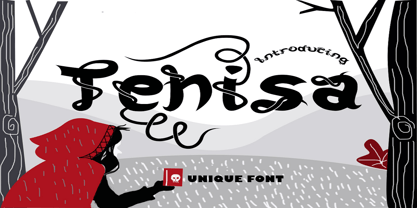 Tehisa is a lovely monoline font with a unique look. It features cute ligatures and alternates that will make your designs standout. It is perfectly suited for a wide variety of crafting projects, be it branding, signature, logos, social media posts and much more!
 - Melathy by Awan Senja,
$14.00 Melathy is a script calligraphy font. It looks stunning on wedding invitations, thank you cards, quotes, greeting cards, logos, business cards and every other design which needs a handwritten touch. Add it to your most creative ideas and notice how it makes them come alive!
 - CA Gothique Superfat by Cape Arcona Type Foundry,
$44.00 The name says it all. It is aesthetically located between American Gothics and European Grotesques and features small caps, a Central European character set and four number formats plus small caps numerals. This makes it not only a heartbreaking headline font, but also extremely versatile.
 - Amarissima by Vasava Fonts,
$30.00 Amarissima is a display font inspired in vintage Italian signs of baker shops. Regardless its crafty inspiration, the construction remains highly mechanical and structured. It has several OT features being the most iconic its contextual alternates that automatically create tails on every single word.
 - Stola by Jujumisur’s Ficus,
$15.00 Stola is able to be used with all European languages including ancient and reconstructed languages like Old Church Slavonic (it can be written by Cyrillic or Glagolitic script), Proto Slavic, Ancient Greek etc. Also it includes IPA, so it can be used in education.
 - HARBER by bb-bureau,
$60.00 The name ‘HARBER’ comes from the first letters drawn. It is a sans serif family designed of dots on a grid, that gives it this round and rhythmic aesthetic. Only dots grow, approaching or moving away, changing the aspect of letters but keeping its characteristics.
 - Type Prodigy by VP Creative Shop,
$39.00 Introducing Type Prodigy, a timeless serif logo font that combines classic elegance with modern versatility. This font is a designer's dream, boasting over 310 crafted ligatures and alternate glyphs that add flair and sophistication to any project. With support for 87 languages, Type Prodigy is truly a global font that caters to diverse design needs. Type Prodigy is a font that exudes professionalism, making it perfect for creating logos, branding, editorial designs, and more. Its refined serifs and clean lines convey a sense of authority, while its generous ligatures and alternate glyphs allow for creative customization, making each design truly unique. Whether you're designing for a luxury brand, a boutique business, or a creative agency, Type Prodigy delivers exceptional results. Its extensive character set and language support make it ideal for international clients, enabling you to communicate effectively in multiple languages and markets. With Type Prodigy, you'll have access to a versatile font that combines classic beauty with modern functionality. Its exquisite design and extensive features make it a profitable choice for professional designers who demand the best. Unlock your creative potential with Type Prodigy, and elevate your designs to new heights of excellence. Language Support : Afrikaans, Albanian, Asu, Basque, Bemba, Bena, Breton, Chiga, Colognian, Cornish, Czech, Danish, Dutch, Embu, English, Estonian, Faroese, Filipino, Finnish, French, Friulian, Galician, Ganda, German, Gusi,i Hungarian, Indonesian, Irish, Italian, Jola-Fonyi, Kabuverdianu, Kalenjin, Kamba, Kikuyu, Kinyarwanda, Latvian, Lithuanian, Lower Sorbian, Luo, Luxembourgish, Luyia, Machame, Makhuwa-Meetto, Makonde, Malagasy, Maltese, Manx, Meru, Morisyen, North Ndebele, Norwegian, Bokmål, Norwegian, Nynorsk, Nyankole, Oromo, Polish, Portuguese, Quechua, Romanian, Romansh, Rombo, Rundi, Rwa, Samburu, Sango, Sangu, Scottish, Gaelic, Sena, Shambala, Shona, Slovak, Soga, Somali, Spanish, Swahili, Swedish, Swiss, German, Taita, Teso, Turkish, Upper, Sorbian, Uzbek (Latin), Volapük, Vunjo, Walser, Welsh, Western Frisian, Zulu Ligatures : AB,AC,AD,AE,AF,AG,AH,AI,AK,AM,AN,AO,AP,AR,AS,AT,AU,AV,AW,AY,AZ,BA,BE,BF,BG,BH,BM,BO,BU,CA,CB,CC,CE,CF,CG,CH,CI,CK,CL,CO,CQ,CR,CT,CU,DA,DE,DG,DI,DK,DM,DN,DO,DR,DU,EA,EB,ED,EE,EF,EG,EH,EI,EK,EL,EM,EN,EP,ER,ES,ET,EU,EV,EW,EX,EY,FA,FE,FF,FG,FI,FL,FO,FP,FR,FS,FT,FU,FY,GA,GE,GH,GL,GR,HA,HB,HD,HE,HF,HI,HK,HL,HO,HT,IB,IC,ID,IE,IF,IG,IK,IL,IM,IN,IO,IR,IS,IT,IU,KA,KC,KE,KF,KG,KI,KO,KP,KQ,KR,KS,LA,LC,LD,LE,LF,LI,LK,LL,LM,LN,LO,LP,LT,LU,MA,MB,ME,MF,ML,MM,MO,MP,MS,MU,NA,NB,NC,ND,NE,NF,NG,NH,NI,NK,NL,NM,NN,NO,NQ,NT,NU,OA,OB,OC,OD,OE,OF,OG,OH,OI,OK,OL,OM,ON,OO,OP,OR,OT,OU,OV,OW,OX,OY,PA,PC,PE,PF,PG,PM,PN,PO,QA,QE,QU,RA,RB,RC,RD,RE,RF,RG,RH,RI,RK,RL,RM,RN,RO,RP,RR,RS,RT,RU,RY,SA,SD,SG,SS,ST,SU,TC,TD,TE,TF,TH,TI,TK,TL,TM,TN,TO,TP,TR,TT,TU,TW,TY,UH,UK,UL,UM,UN,UO,VA,VE,WA,WD,WE,WF,WO,XA,XC,XE,XT,YE,YO,YT,ZE,MEN,WER,FRO,RON,ROM,THE,AND,ING,HER,HAT,HIS,THA,ERE,FOR,ENT,ION,TER,WAS,YOU,ITH,VER,ALL,THI,TIO,OUL,ULD,IGH,GHT,AVE,HAV,ICH,HIC,HIS,HIN,HEY,ATI,EVE,HING,WERE,FROM,THAT,THER,TION,HERE,OULD,IGHT,HAVE,HICH,THIS,THIN,THEY,ATIO,EVER,MENT How to access alternate glyphs? To access alternate glyphs in Adobe InDesign or Illustrator, choose Window Type & Tables Glyphs In Photoshop, choose Window Glyphs. In the panel that opens, click the Show menu and choose Alternates for Selection. Double-click an alternate's thumbnail to swap them out. Mock ups and backgrounds used are not included. Thank you! Enjoy!
 - TT Tsars by TypeType,
$39.00 TT Tsars useful links: Specimen | Graphic presentation | Customization options The TT Tsars font family is a collection of serif display titling fonts that are stylized to resemble the fonts of the beginning, the middle and the end of the XVIII century. The project is based on title fonts, that is, the fonts that were used to design book title pages. The idea for the project TT Tsars was born after a small study of the historical development of the Cyrillic type and is also based on Abram Shchitsgal’s book "Russian Civil Type". At the very beginning of the project, we had developed a basic universal skeleton for the forms of all characters in all subfamilies of the family, and later on, we added styles, visual features, artifacts and other nuances typical of the given period onto the skeleton. Yes, from the historical accuracy point of view it might be that such an approach is not always justified, but we have achieved our goal and as a result, we have created perfectly combinable serifs that can be used to style an inscription for a certain time period. The TT Tsars font family consists of 20 fonts: 5 separate subfamilies, each of which consists of 4 fonts. Each font contains 580 glyphs, except for the TT Tsars E subfamily, in which each font consists of 464 characters. Instead of lowercase characters in the typeface, small capitals are used, which also suggests that the typeface is rather a display than text one. In TT Tsars you can find a large number of ligatures (for Latin and Cyrillic alphabets), arrows and many useful OpenType features, such as: frac, ordn, sinf, sups, numr, dnom, case, onum, tnum, pnum, lnum, salt (ss01), dlig. Time-related characteristics of the subfamilies are distributed as follows: • TT Tsars A—the beginning of the 18th century (Latin and Cyrillic) • TT Tsars B—the beginning of the 18th century (Latin and Cyrillic) • TT Tsars C—the middle of the 18th century (Latin and Cyrillic) • TT Tsars D—the end of the 18th century (Latin and Cyrillic) • TT Tsars E—conditionally the beginning of the 18th century (only Latin) TT Tsars A and TT Tsars B families (both the beginning of the 18th century) have different starting points: for TT Tsars A it is Latin, for TT Tsars B it is Cyrillic. The development of the TT Tsars A family began in Latin, the font is based on the royal serif Romain du Roi. The Cyrillic alphabet is harmoniously matched to the Latin. The development of the TT Tsars B family began in Cyrillic, which is based on a Russian civil type. Characteristic elements are the curved one-sided serifs of triangular characters (A, X, Y), drops appear in the letter ?, the middle strokes ? and P are adjacent to the main stroke. Latin was drawn to pair with Cyrillic. It is still based on the royal serif, but somewhat changed: the letters B and P are closed and the upper bar of the letter A rose. This was done for the visual combination of Cyrillic and Latin and at the same time to make a distinction between TT Tsars A and TT Tsars B. TT Tsars C is now the middle of the 18th century. Cyrillic alphabet itself did not stand still and evolved, and by the middle of the 18th century, its forms have changed and become to look the way they are shown in this font family. Latin forms are following the Cyrillic. The figures are also slightly modified and adapted to the type design. In TT Tsars C, Cyrillic and Latin characters are created in parallel. A distinctive feature of the Cyrillic alphabet in TT Tsars C is the residual influence of the flat pen. This is noticeable in such signs as ?, ?, K. The shape of the letters ?, ?, ?, ? is very characteristic of the period. In the Latin alphabet, a characteristic leg appears at the letter R. For both languages, there is a typical C characterized by an upper serif and the appearance of large, even somewhat bolding serifs on horizontals (T, E, ?, L). TT Tsars D is already the end of the 18th century when with the development of printing, the forms of some Cyrillic characters had changed and turned into new skeletons of letters that we transposed into Latin. The figures were also stylized. In this font, both Cyrillic and Latin are stylistically executed with different serifs and are thus logically separated. The end of the century is characterized by the reduction of decorative elements. Straight, blueprint-like legs of the letters ?, R, K, ?. Serifs are very pronounced and triangular. E and ? are one-sided on the middle horizontal line. A very characteristic C with two serifs appears in the Latin alphabet. TT Tsars E is a steampunk fantasy typeface, its theme is a Latinized Russian ?ivil type (also referred to as Grazhdansky type which emerged after Peter the Great’s language reform), which includes only the Latin alphabet. There is no historical analog to this typeface, it is exclusively our reflections on the topic of what would have happened if the civil font had developed further and received a Latin counterpart. We imagined such a situation in which the civil type was exported to Europe and began to live its own life.
 - Socialite JNL by Jeff Levine,
$29.00Socialite JNL takes its cue from the Art Deco style of the 1930s with its clean, angular lines and stylized letter shapes. - Shooma MF by Masterfont,
$59.00 Ever wondered how your great text will look like as if it just came out of an ATM machine? Here it is!
 - Oslo by Wilton Foundry,
$29.00 Oslo is an understated sans with subtle qualities that make it appropriate for many applications. It is simple, clean and very legible.
 - Pomthinq by Stringlabs Creative Studio,
$29.00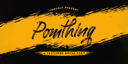 Pomthinq is a remarkable brush script font. Fall in love with its incredibly versatile style and use it to create spectacular designs!
 - OnepunchJim by JOEBOB graphics,
$9.00 OnepunchJim got its name from the way it was created; every character was made in one 'punch'. Very suitable for kids stuff.
 - MidnightKernboy - Unknown license

- Khews by Invasi Studio,
$15.00 Are you ready to add some fun to your designs? Khews is the perfect font for you! It has a modern and playful vibe with its unique cutoff letterform and inspiration from graffiti tagging. You'll love the casual and bubbly twist that Khews brings to any project. And here's the best part: Khews comes in two styles - regular color and outline - so you can mix and match to create the perfect design. Give it a try and see the magic for yourself! Ideal for posters, flyers, logos, and headlines. It pairs well with sans-serif and serif fonts. Despite its imperfections, it is casual yet legible and has a good blend of modern and casual styles.
 - Great Copper by Pixesia Studio,
$19.00 Introducing Great Copper - An Old Handcraft Display Font With a perfect combination of its unique yet classic shapes, Great Copper greatly portrays the familiar feeling that you are looking for. This typeface suits the nostalgic feeling you want to evoke through words. It comes as if Great Copper is written personally as letters to deliver good news. As splendid it curves in delivering the sweet vibe, Great Copper comes also with its firm shape to emphasize how valuable the messages and stories that it brings. Enchanting yet emphatic, Great Copper typeface will be perfect to depict the great story about the past you'd be delighted to tell and share. Hope you Like it. Thanks.
 - Lemongrass by Nova Type Foundry,
$30.00 Lemongrass is a connected script typeface for display use. It was inspired by brush lettering and the sea and the strong winds that exist in Porto. These winds are called "nortada", which was also the developing name of the font. It has low contrast and smooth connections to get a good rhythm in the text. Lemongrass can be used for branding and packaging where it will shine, but it can also be used in small texts creating beautiful content. Lemongrass has lots of ligatures, swashes and alternative shapes that will allow making your brand unique. It supports most western European languages making it a more useful display font. Lemongrass Caps comes to complement the main style.
 - Birly by Orenari,
$18.00 A few nights ago, I was dreaming about making a cute font that the children in the city would love. I only remember some characters of the font but I thought that it was a sign to make a new font. So, here it is, Birly. A new font and I think its cute yet playful for your fun projects. Birly was made with all my heart, I love it, and I hope you like it too. Birly has 2 styles, the regular and solid. You can choose, these all in the package! Please take a look and enjoy the preview pictures of Birly. I made it seriously, so you can see how is Birly looks on some projects.
 - Mermer by Jana Orsolic,
$35.00 Mermer font family is a contemporary take on Roman capitals in six weights. The font name is the Serbian word for marble, and the inspiration for its creation comes from chiseled street signs in Istria. With lowercase and Cyrillic added, it gets a broader range of usages. Mermer is bold and versatile, can be both sporty and high fashion, looking sharp in more than 40 languages. Thin is thorny and Heavy feels like a block of concrete. Make it LOUD by setting it in large sizes and choosing Mermer Heavy for posters, magazine headings or logos, or you can make it cosy and friendly setting it smaller in Mermer Regular for menus, book covers, invitations or business cards.
 - Plau Redonda by Plau,
$249.00 Humanist on one hand, geometric wannabe on the other Born from the need of having a custom font for our own branding, Redonda became too big to keep just for us. Like that, came to light Plau's 10th retail font, the first one designed by Carlos Mignot. The font's personality is a result of a search for extreme impact. Having started out as a exclusively Black geometric face, it became a full, versatile humanist sans. While it maintains the impact that inspired it, it also offers performance for both UI and body copy. This balance reflects the font's creative process: at first it referenced historic examples, but we also made sure it worked as a contemporary face.
 - Magic World by Mozatype,
$13.00 MAGIC WORLD is embodied in fun and joyfulness. It is a bold and thick lettered display font. This font is perfect for children-themed designs, especially when combined with bright colors. No matter the topic, this font will be an incredible asset to your fonts’ library, as it has the potential to elevate any creation. Get creative with its childlike playfulness, and use it to brighten up any kids and school project! Use this font for any crafting project that requires a personalized look! What’s Included : - Works on PC & Mac - Easy to use ( Installations ) - Compatibility Windows, Apple, Linux, Cricut, Silhouette, and Other cutting machines Thank you for purchasing this font. Please appreciate it, if you like this. ENJOY it :)
 - Protagonice by Invasi Studio,
$17.00 Designed by hand-drawn slab serif style font, Protagonice font comes in two varieties of regular and dotted textures. You can enhance your project with a retro-style using Protagonice Font. Ensuring carefully crafted styles result from the use of this font. Its imperfections keep it casual but allow it to still be legible. There is an incredibly wide range of uses for it, so give it a try and see how it inspires your creativity! It's ideal for headlines, flyers, posters, greeting cards, product packaging, book covers, printed quotes, logotype, and album covers, among other applications. Because this font is PUA encoded, you can easily access all of the glyphs and swashes!
 - Zeta by Roy Cole,
$34.00 Zeta was developed by Roy Cole, the British typographer and book designer. It is his second typeface family, completed in 2006, and comprises six fonts. As with his other typeface families - Lina, Colophon and Coleface - Zeta is a sans-serif typeface, particularly notable for its fluidity and strong legibility. Whilst the proportions of Zeta are derived from classical models, the letter forms themselves are totally modern in concept. For example, when used for blocks of text little line spacing is needed to achieve good readability. Zeta is conceived as an easy reading typeface presenting an up-to-date impression wherever it is utilized. Due to its origins it really comes into its own when used for book design.
 - Singolare by Latinotype,
$29.00 Singolare is a contemporary geometric Sans Serif with angular terminals and a great x height. Its main feature is the style difference between the lighter and heavier weights. The more weight it gains, the higher its singularity. With its weights, styles and layers variety, it's perfect for display use and short texts that require a visual impact. Singolare is composed by five weights, from Ultralight to Black. Every weight has its own stencil variation with expressive cuts and four decorative versions: three outline and one inline version, that can work on it’s own or overlapped to the black normal version (changing the colors of each layer) in order to amplify its usage possibilities.
 - Different Cultures by Shakira Studio,
$19.00 Introducing "Different Cultures," a font that effortlessly embodies the latest design trends. This modern serif display font transcends conventional styles, offering a perfect fusion of bold and thin strokes that create a visually stunning balance. Immerse your designs in the contemporary allure of "Different Cultures," where every curve and detail is meticulously crafted for maximum impact. Explore the font's diverse array of alternates and ligatures, providing you with a stylish toolkit to customize and enhance your typographic creations. "Different Cultures" is more than just a font; it's a visual journey that seamlessly blends modernity with timeless elegance. Elevate your projects with the unique and captivating aesthetics of "Different Cultures," setting a new standard for stylish and versatile modern serif display fonts in today's design landscape. Here's what you get: Regular & Italic All Multilingual symbol Opentype features ( ligature, alternate ) Accessible in the Adobe Illustrator, Adobe Photoshop, Adobe InDesign, even work on Microsoft Word. PUA Encoded Characters - Fully accessible without additional design software. Multilingual character supports : (Afrikaans, Albanian, Catalan, Croatian, Czech, Danish, Dutch, English, Estonian, Finnish, French, German, Hungarian, Icelandic, Italian, Lithuanian, Maltese, Norwegian, Polish, Portuguese, Slovenian, Spanish, Swedish, Turkish, Zulu) Follow my shop for upcoming updates, and for more of my work, Thank you!
 - Phiz by Shinntype,
$29.00 Phiz is a diverse suite of 28 decorative fonts based on Figgins Sans Extra Bold. Classic (10 fonts), Rounded (7 fonts), Rough (4 fonts) and Particles (7 fonts). The Rough and Particles styles emerge as a unique niche—neither imitating distressed printing (e.g. the “rusty” look), nor casual, hand-drawn styles. These type designs are conceived and executed as complex algorithmically-generated graphic procedures, in which repetitive elements have been artfully applied to the Sans capitals, and manually nuanced. As such they also differ substantially from textured glyph shapes that have been cut out from larger pattern fields, for the constituent particles are disposed in relation to the specific shape of each character they define. The caps-with-small-caps format was chosen for two reasons. Firstly, titling display usage is predominantly capitals, and secondly, rather like optical scaling, having the same resolution of texture available in two different “sizes” (upper and lower case) should prove useful in the hierarchy of page layout—not primarily for setting upper and lower case text as caps-with-small-capitals, although this is of course an option. All figures and major symbols (punctuation and currency) are provided in both cap and small cap height.
 - Magenos Soft by Graphite,
$18.00 Magenos Soft is the rounded version of Magenos typeface family. It is a modern geometric sans serif family characterized by its simplicity and extensive functionality. With its open apertures, geometric architecture and low contrast strokes, it expresses a sincere tone with a modernistic, neutral, yet friendly personality. It has been designed to work well for a wide range of applications and is a reliable workhorse. Equally suitable for print and screen usage, it works well for both text and display at a wide range of point sizes. The addition of true italics gives the whole family a dynamic edge and flexibility. Magenos Soft comes with many OpenType features including stylistic alternates, standard ligatures, oldstyle and lining (proportional and tabular) numerals, slashed zero and a variety of symbols, making it a perfect choice for contemporary and professional typography.
 - Stretto by Canada Type,
$29.95 Stretto (Italian for narrow) is a revival, correction and expansive update of an Aldo Novarese reverse-stress font called Sintex, which he did for VGC in 1973. Openly idiosyncratic and playfully rebellious in its design, this alphabet fuses the straights and rounds in an unusual manner, riffing on the idea of hand-made sign and wood type forms while adhering to its odd grid’s parameters. In spite of its counter-stress, its legibility is high and even, helped by its unicase forms and very distinct counters. First released in 2007, it became quite popular with film studios and nostalgia designers (Sintex was the font used for David Bowie’s Hunky Dory album and Life on Mars? single). A dozen years later we revisited it for an update. Stretto now comes with over 660 characters and includes Pan European language support.
 - Vagebond by Characters Font Foundry,
$17.50 Vagebond is a monoline family in three widths, Condensed (C), Normal (N), and Extended (XT). With Vagebond I was inspired by a very old television I once saw on a junkyard. I wanted to create a typeface with round edges that would fit within the 4 x 3 proportion of the screen. It had to be monoline, because that gives it a very simplistic and minimalistic look. Having created the XT width I felt it needed the both complementing widths to make it complete. The Condensed version, for me, is the funky rounded version of the DIN. I love DIN, but it sometimes feels just a bit to ‘normed’ for me. Vagebond C brings in a bit more personality. Although Vagebond looks kinda ‘oldstyle’, it works very well in futuristic designs. It feels best in combination with a super futuristic 3d object.
 - Lamaesa by Carlos Maeso González,
$15.90 Lamaesa is a versatile and original design sans serif typeface. Designed to be used primarily on medium and large point sizes. Designed so you do not get tired of reading it, but at the same time, so that you notice its particularity. Oriented for use in headlines and continuous text, with a solid appearance, but with a slight aroma of handwriting, which gives it an ambivalent and original character. It is perfect for magazines, company letters, websites, advertisements, restaurant menus, and any support and function where it is essential to attract attention in an elegant and non-abusive way. Basic Latin characters. It consists of 217 glyphs (ISO 8859-15): uppercase, lowercase, numbers, currency symbols, and special characters. It consists of six fonts: light, normal and bold as well as their oblique equivalents. Carlos Maeso González is the designer of the typeface “Lamaesa”.
 - Minimela Tm by Mustafa Demirel,
$30.00 "It is hard to believe, but they won't be able to give up on us" The story of this font has started with a little suitcase actually. These characters were trying to do something for minimela kitchen which it named.After that, they looked that they was wanting to be that font beautiful writings written with it, belonging to it, special to it and reminding it to everybody. These cute monsters that have shaped themselves were a piece of a whole, of a little whole. They were totally believing to beautiful and long ways that have being waited them. They have given a sincere promise they will continue with little steps on that ways. "It is hard to believe, but they won't be able to give up on us" while telling this, we were totally talking about that
 - My Sweet Farmhouse by Mozatype,
$17.00 My Sweet Farmhouse is a sweet and quirky handwritten font. Its natural and unique style makes it incredibly fitting to a large pool of designs. Use this font for any crafting project that requires a personalized look! It is PUA encoded which means you can access all of the glyphs and swashes with ease! This font is ideal for crafting, branding, and decorates your any project. This font is perfect for wedding invitations or your blog. Also with their help, you can create a logo or beautiful frame for your home. Or just use it for your business, book covers, stationery, marketing, magazines, and more. Fall in love with its incredibly versatile style and use it to create spectacular designs! The only limit is your imagination! Thank you for purchasing this font. Please appreciate, if you like this. ENJOY it :)
 - Lethal Fake by Brush Art Design Office,
$39.80My name is Teruyoshi Matsui. I am a Brush Art Designer. My foundry ‘Brush Art Design Office’ is situated at the foot of an active volcano ‘ Mt. Aso ’ in the Kumamoto Prefecture, the southern part of Japan. I design the letters of the alphabet with a Japanese brush. I have created the brush font named ‘ Lethal Fake ’ in my unique brush style. At the beginning of making the font I was going to name it ‘BrushType Lethal’ and tell you, “ Be careful using it. That’s because it ’s Lethal ”. But actually I was very disappointed when it was finished. I tried to make it lethal, but it was not. So I changed the font name into ‘ Lethal Fake ’. This time I have to say to you, “ Be careful using it. That’s because it’s not Lethal ”. Thank you. - Brinar by Hackberry Font Foundry,
$24.95 I've been working on a usable sans serif for body copy since the mid-1990s (though I certainly did not know it at the time). This one works well. It started life back in the mists of time as a scan of an old German font by Carl Fahrenwaldt. It was developed fully as a synergized serif with strong traditional roots and released as Bergsland Pro. Now it finally makes it to where I was headed all along as a sans text font. This is a well modulated humanist, sans serif font family with many OpenType features and over 600 characters: Caps, lower case, small caps, ligatures, swashes, small cap figures, old style figures, numerators, denominators, accents characters, ordinal numbers, and so on. It is designed for text use in body copy. But it also works very well for elegantly stylized display.
 - Ravenheart by Hanoded,
$15.00 I like Ravens. In fact, I like them so much that I have a tattoo of a Haida raven! Ravenheart was more or less modelled on my Qilin font, but it is completely different. It is scary and inky, but it has a certain flair as well. A bit mystical, a bit evil, but I am sure you’ll find many uses for it. Comes with a fluttering of diacritics.
 - Economica Cyrillic PRO by Underground,
$29.90 Economica Pro is a font especially developed for design in complex situations: It is ideal for use in small sizes on screen and in print. It has been tested successfully for use in very small sizes without losing legibility. Its ink traps ensure smooth operation even on low quality papers. It is an ideal font for newspapers, news portals and all designs requiring space saving. Now also in Cyrillic!
 - Classic Horror by Mvmet,
$12.00 Classic Horror is a fun and comical horror display font inspired by vintage spooky cartoon. Not only can be used for Halloween theme needs, you can use it too for other things for daily needs. Use it on t-shirts and clothing, book designs, greeting cards, stickers, posters, banners, or anything that needs a fun touch. Try it to create fabulous designs and feel the fun and cool vibes with it!
 - You are Superb by DainType,
$15.00 Nicely scribbled script font. It has a masculine, wild and wild mood. It also has a feeling of being torn. It is good when you want to use a lively atmosphere because of the fast flow of strokes. It is good to use when you want a cool and striking design such as a bromide for a rock festival, an album cover for music, a beer package, or a beer logo.
