6,220 search results
(0.029 seconds)
- Barbary Coast by Solotype,
$19.95In one of our yearly type hunts, we came across the ancestor of this font, much wider and more decorative, with fine outside shading. Condition was poor so we did the obvious, cutting out the excess decoration and condensing the face optically. It reeks of dancing girls and drunken sailors and other colorful attributes of Old San Francisco. - Laguna Madre NF by Nick's Fonts,
$10.00Another addition to the Whiz-Bang Wood Type series is this ultra-condensed font, well suited for very large headlines. Named for the body of water which separates Padre Island from the mainland of Texas. Both versions of this font contain the Unicode 1252 (Latin) and Unicode 1250 (Central European) character sets, with localization for Romanian and Moldovan. - HWT Antique Tuscan 9 by Hamilton Wood Type Collection,
$24.95 A very condensed 19th century Tuscan style wood type design with a full character set with ligatures. This design was first shown by Wm H Page Co in 1859 and this is the first digital version of this font to include a lowercase and extended European character set. This is a font best used at large sizes.
 - Diamond Cubic by Attractype,
$17.00 Diamond Cubic is a modern serif font with a geometrical and a slightly condensed design which makes it particularly effective for space economizing. It will look fantastic with short and middle length text blocks, headlines, presentations, logo, branding, poster, packaging or any other creative design. Diamond Cubic containing small caps and glyph coverage for several languages.
 - Vecta by Wilton Foundry,
$29.00I think it is one of our most useful fonts in that it doesn't draw much attention to itself while it is quite refreshingly different. Almost all shapes in Vecta are rounded to provide a friendly effect. Proportions are somewhat condensed providing economic space usage. Vecta looks equally at home in headlines as well as body text. - Tact by Pesic,
$35.00 Tact is a geometrically sans serif font, black and condensed looking glyphs, with an alternative glyph set to improve its use in different graphic contexts. It is suitable for use in the fields of science, art, architecture, urban planning, techniques, electronics, advertising, futuristic themes, sport, film, computers, phones, video games, magazines... Contains all Latin and Cyrillic glyphs.
 - Chupada by Tipo Pèpel,
$14.00 Chupada is an ultra-condensed font family noted for their exaggerated x-height, which consists of five different weights, accompanied by their italic version. It contains all the central european characters and Cyrillic. Chupada with its bold semi-modular forms make it ideal for use in headlines, posters, titles and anywhere you need for create impact.
 - Gardo Grotesk by Ayca Atalay,
$18.00 Gardo Grotesk is a bold condensed display typeface designed to make a strong impact. Armed with eye catching ligatures and catchwords, combined with its striking visual features, Gardo Grotesk grabs the attention of the reader effortlessly. Gardo Grotesk's Opentype Features include Standard and Discretionary Ligatures, Alternates, Catchwords (Contextual Alternates), Case Sensitive Forms, Fractions, Scientific Inferiors, Superscript and Tabular Figures.
 - Black Mustang by Linecreative,
$16.00 Black Mustang is is an Condensed font with a modern look, go for the alternates titling or manually choose from the Glyph Palette from more alternative characters to give it a borderless design. Black Mustang offers you: - Upper and Lowercase characters (All Caps) - Stylistic alternates (Uppercase 52 charcters, Lowwercase 26 characters) - Numbers and Punctuation - Multilingual Support (Latin Western Europe)
 - Mobley by Sudtipos,
$29.00Based on ten characters found on the cover of a 1960s Blue Note jazz album. The source characters were originally designed for film-based typesetting by Wayne Stettler as part of a single typeface published by Visual Graphics Corporation (VGC) under the name Neil Bold. Mobley Sans, along with its condensed and serifed counterparts, constitute a brand new typographic whole molded around the original inspirational source. The family embodies the independent creative spirit of that era - yet manages to remain contemporary with several modern design traits - creating its own unique visual theme through the use of odd counters, generous curves and sharp corners. Mobley delivers your message in a bold, yet friendly, and subtly discerning fashion. Perfect for music artwork, packaging and book covers. Available with both sans and serif versions, in regular and condensed widths. - Ganges by ROHH,
$40.00 Ganges is a condensed sans serif typeface inspired by Central European advertising typography from late XIX century. The font has condensed proportions and original letter shapes. Ganges is designed mainly for editorial design, especially for display use, as well as short paragraphs of text. Its narrow proportion makes it very practical to use for posters and magazine covers. Characteristic letter forms fit great for branding, logo and packaging design. It is also a very interesting choice for websites and e-book headlines. Ganges family consist of 27 fonts - 9 weights, 9 italics and 9 obliques. It supports extended set of latin languages, as well as broad number of OpenType features, such as case sensitive forms, standard and dicretionary ligatures, stylistic alternates, contextual alternates, lining, oldstyle and tabular figures, slashed zero, fractions, superscript and subscript, ordinals, currencies and symbols.
 - ITC Lubalin Graph by ITC,
$40.99 ITC Lubalin Graph® was initially designed by Herb Lubalin and drawn to fit the requirements of typographic reproduction by Tony DiSpigna and Joe Sundwall in 1974. Its underlying forms are those of Lubalin's previously released ITC Avant Garde Gothic, but its shapes were modified to accommodate large slab serifs. Its condensed weights, which include small caps and oldstyle figures, were later additions by Helga Jörgenson and Sigrid Engelmann in 1992. The family, with its generous x-height and overall tight fit has come to represent the typographic style of American graphic design in the 1970s. The typeface is at home when paired with mid-century modern design and spare sanses or more traditional text faces from the period. ITC Lubalin Graph covers four weights in its condensed width from Book to Bold, and five weights in its normal width.
 - Vagebond by Characters Font Foundry,
$17.50 Vagebond is a monoline family in three widths, Condensed (C), Normal (N), and Extended (XT). With Vagebond I was inspired by a very old television I once saw on a junkyard. I wanted to create a typeface with round edges that would fit within the 4 x 3 proportion of the screen. It had to be monoline, because that gives it a very simplistic and minimalistic look. Having created the XT width I felt it needed the both complementing widths to make it complete. The Condensed version, for me, is the funky rounded version of the DIN. I love DIN, but it sometimes feels just a bit to ‘normed’ for me. Vagebond C brings in a bit more personality. Although Vagebond looks kinda ‘oldstyle’, it works very well in futuristic designs. It feels best in combination with a super futuristic 3d object.
 - Why Square by Linotype,
$29.99The different fonts in the Why Square family are an extension of the designs begun in Zoran Kostic's Just Square family. Why Square's lowercase letters are all more condensed versions of Just Square's letters, and in some of the fonts, the uppercase letters are wider. The first five fonts are the different weights of Why Square (UltraThin, UltraLight, Thin, Light, and Regular). Here, all of the characters--both upper and lowercase--are more condensed versions of the geometric letters from the Just Square family. The next five fonts (UltraThin, UltraLight, Thin, Light, and Regular weights) include identical lowercase letters to those from the first five fonts in the family, but their capitals are considerably wider. These may be used as initials, either with the other fonts in the Why Square family, or with the Just Square family. - Bredagh by Tony Fahy Font Foundry,
$25.00 Bredagh (pronounced Braid-ah) is a happy font! It can bring a smile to your face, yet is at one with science and mathematics and the Arts. The first presentation is in a Poetry book. Overall, it is a strong and capable font. The organic nature of the font Breadgh is in Nature itself, with the roundels as found in the cross-section of a tree, for example, both circular and rounded oblong shapes, influencing. Accordingly, some of the characters are of a condensed nature and some are not. The lower case does not have the condensed aspects but the numerals do. In the creation of Bredagh, it was the dynamic between all of these that was part of the challenge. And to make them all work together subtly to be in overall harmony—was the ultimate challenge.
 - Thronemy by Invasi Studio,
$19.00 This elegant condensed serif display typeface is perfect for designs that require a touch of class and nostalgia. Inspired by ancient concepts and the nostalgic classic era, Thronemy Font adds a timeless and sophisticated look to any design project. The condensed serif design of Thronemy Font is both elegant and easy to read, making it perfect for headlines, titles, and other design elements that need to be easily understood. Plus, its retro style is perfect for creating logos and headings that will make your designs stand out from the rest. Thronemy Font is a versatile font that can be used in a variety of design projects such as invitations, posters, book covers, packaging, magazine layouts, and more. No matter what your project requires, Thronemy Font can help you achieve a timeless and sophisticated design that will leave a lasting impression.
 - Atto Sans by Wilton Foundry,
$29.00I set out to design a contemporary font that is condensed with thick and thin strokes. The highly structured forms of this condensed font was made more interesting and softer by giving it a slightly calligraphic tone and by adding round corners. Atto's express purpose is to be both utilitarian, compact and technical but with a friendly face. The name "atto" was adopted since it refers to the measurement of "smallness" or detail. You will no doubt discover all the many pleasant nuances within Atto. Adopted in 1964, "atto" comes from the Danish "atten", meaning eighteen. Atto - (symbol a) a SI prefix to an unit and means that it is 10 to the power- 18 times this unit. Examples are one attosecond or one attometer/attometre. Atto is available in for Mac and Windows in Postscript, Truetype and Opentype. - Nameh by Naghi Naghachian,
$105.00 Nameh is a single weight sans-serif headline font designed by Naghi Naghashian. It is a condensed big title font. This font is a contribution to modernize the Arabic typography, gives the font design of Arabic letters real typographic arrangement and provides more typographic flexibility. Nameh supports Arabic, Persian (Farsi) and Urdu. It also includes proportional and tabular numerals for the supported languages. Nameh design fulfills the following needs: A Explicitly crafted for use in electronic media fulfills the demands of electronic communication. B Suitability for multiple applications. Gives the widest potential acceptability. C Extreme legibility not only in small sizes, but also when the type is filtered or skewed, e.g., in Photoshop or Illustrator. Nima’s simplified forms may be artificial oblilqued in InDesign or Illustrator, without any loss in quality for the effected text. D An attractive typographic image. Nameh was developed for multiple languages and writing conventions. Nameh supports Arabic, Persian and Urdu. It also includes proportional and tabular numerals for the supported languages. E The highest degree of calligraphic grace and the clarity of geometric typography.
 - Platz Groteske FJ by Frncojonastype,
$27.00 fj Platz Groteske™ is the new font from frncojonastype project that culminates after almost 5 years of learning and development. fj Platz Groteske™ is a Neo-grotesk font with slight geometrical proportions with humanistic terminations. For this occasion, this font will show the normal version, however, the entire project contemplate condensed family, extended and the development of alphabets as Cyrrilic and Greek. This proposal is to improve the legibility in the Neo-grotesk fonts with generous gaps, vertical and square counter form and ascendents that exceed slightly the capitals. Counts with old numbers, small caps, modern numbers, tabular, numerators and denominators to fraccions, reference numbers to notes and formulas to face confidant and complex different stages. Ideal to editorial projects of informative content - scientific and titular of a huge impact because of the various alternative characters, stylistic options and a optometrical version to risky designers. To exclusive licenses and to follow the develop of this project, please visit frncojonas.com (WIP) Learn about upcoming releases, work in progress and get to know us better! Instagram: @frnco.jonas
 - Stajn Pro by Anže Veršnik,
$45.00 stajn-type.com — Stajn Pro Type Family Website where you can get DEMO version of Stajn Pro Book Stajn Pro was designed upon a main goal of using this typeface to set larger amount of text. The slightly condensed proportion allows for more content per page while large x height with its larger counters improves legibility and readability while used on smaller sizes. Despite the fact that Stajn Pro was designed as a body text Type Family, it works as well as a display too. Wide variety of weights as well as interesting, strong and at the same time beautiful character along with some stylistic alternate makes Stajn Pro a useful typeface in a field of editorial, magazine and promotional materials design. The Stajn Pro character includes some humanistic typeface characteristics, which add some softness and elegance in its strong and stable presence. More information about development, usage and characteristics of a Stajn Pro Type Family at stajn-type.com If you have any other questions please do not hesitate to write me at info@stajn-type.com
 - Ah, yes, the Bionic Comic Condensed font by Iconian Fonts – it's like the superhero of the typeface world, donned in its sleek, form-fitting spandex, ready to add a punch of personality to any projec...
- ATF Headline Gothic by ATF Collection,
$59.00 ATF Headline Gothic cries out to be used in headlines, and that is exactly how it was used after it was first created by American Type Founders in 1936 with newspapers in mind. It would be hard to imagine a better typeface for a shocking, front-page headline in a scene from an old black-and-white movie. With its all-caps character set, and its big, bold, condensed design, ATF Headline Gothic is the epitome of its name. “Extra! Extra!” The style of ATF Headline Gothic recalls the bold, condensed gothic display faces of the 19th century, but with more refinement in its details than many large types of the time (typically wood type). Its most recognizable trait is the restrained, high-waisted M, with short diagonal strokes that end with their point well above the baseline; this avoids the sometimes cramped look of a bold condensed M with a deep “V” in the middle, common in many similar headline faces. The digital ATF Headline Gothic comes in a single weight, all caps, like its predecessor, but offers two styles: one crisply drawn, and a “Round” version with softer corners, to suggest a more “printed” feel, reminiscent of wood type. Of course, in either style it includes a full modern character set, including symbols such as the Euro, Ruble, and Rupee, that didn’t exist in 1936.
 - Fishmonger by Suitcase Type Foundry,
$39.00Fishmonger originated from a commission of two fonts for the corporate identity of a fishmonger shop. When sketching the elementary principles for the lettering, the idea for a modern, extensive font family with a large number of styles was born. The first step consisted of defining the range of widths and weights. Then the master design Medium Regular was completed. The next step was adjusting the Extra Condensed Thin, the Extra Condensed Bold, The Extra Extended Thin and the Extra Extended Bold weights, as they are the vertices of an imaginary square map of the face. This meant that, in order to achieve a harmonious result, the x and y axis needed to be defined. From top to bottom, from the widest to the most condensed cut, the proportions are linear. However, from light to black, the line curves gently, allowing lesser difference between the light cuts, and a dramatic one between the heavier cuts. To ensure the original parameters were respected each position on the vertex was checked against the Medium Regular. After sorting out the ideal set-up, the remaining characters of each of the weights were drawn, and the remaining cuts were interpolated according to the principles above. Fishmonger is a functional, clean design, free of any buoyant, ornamental shapes, almost minimalist. Maybe this is what lends the type family its unique appearance. - Bucinta by Goodigital13,
$20.00 It easily cooperating together For Magazine, Movies, or Book Titles. For Photography, Wedding Invitation, Restaurant Menu or T-shirt Design. For Flyers, Banner Ads, web and printing. From Food and Fashion to a Cosmetics product beautiful typographic harmony for a diversity of design projects, including logos & branding, wedding designs, social media posts, advertisements & product designs.
 - Beauty Handwriting by Nirmana Visual,
$22.00 Beauty Handwriting is a Natural handwriting modern calligraphy font. full set of lowercase and uppercase letters, numerals and punctuation, multilingual symbols, lowercase beginning and ending swashes. 80 ligatures giving realistic hand-lettered style. Beauty Handwriting offers beautiful typographic harmony for a diversity of design projects, including logos & branding, social media posts, advertisements & product designs.
 - Delamere by AVP,
$29.00Delamere uses conventional sans-serif letterforms but delivered with a strong calligraphic feel. - Buddy Smile by Create Big Supply,
$15.00 Introducing Buddy Smile, a unique handwritten font that adds a splash of color, cheerfulness, and playfulness to your designs. With its charming and lively style, this font is perfect for enhancing your brand identity, book covers, children's events, quotes, and more. Buddy Smile brings a touch of personality to your projects with its combination of uppercase and lowercase letters. The fluid and organic strokes create a friendly and approachable feel, making your text feel warm and inviting. Whether you're designing a logo or crafting a heartfelt message, this font will leave a lasting impression. With its extensive language support, Buddy Smile ensures that your message can reach a diverse audience. Express yourself in different languages and connect with people from around the world. The font also includes numbers and punctuation marks, allowing you to maintain consistency throughout your designs. Experience the convenience of PUA (Private Use Area) Encoding, which provides access to special characters and glyphs. Customize your typography and add extra flair to your compositions, making them truly one-of-a-kind.
 - Alumina by Rafaeiro Typeiro,
$27.00 Discover Alumina, a typeface that exudes elegance and authority. Its robust weights demand attention, while lighter variants display grace. From bold statements to subtle emotions, Alumina empowers your creativity effortlessly. Suitable for diverse mediums, Alumina remains legible and versatile. Unleash customization with OpenType features like ligatures and fractions. Embrace Alumina as your creative companion, sparking change and expression.
 - MGN Burro by Morgana Studio,
$17.50 MGN Burro by Morgana Studio is a slab serif font offering 7 styles: Thin, Light, Regular, Medium, Semibold, Bold, and Extra Bold. Combining classic and modern elements, it caters to diverse designs, ensuring readability and impact. From delicate Thin to bold Extra Bold, each weight caters to various preferences, making MGN Burro a versatile toolkit for designers.
 - Headline Brush by MJB Letters,
$16.00 Headline Brush is a versatile brush script font designed for a natural, casual feel. Crafted from hand-brushed letters scanned into vector format. Making it ideal for diverse projects like logo design, poster design, blog titles, posters, clothing, and branding. The font's variations and alternative underlines enhance text and design, adding a distinctive touch to any professional endeavor.
 - Red Ribbory by FallenGraphic,
$20.00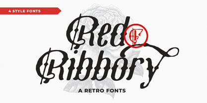 Red Ribbory is stands out as a diverse selection of typefaces, beautiful alternates character that maintain a coherent look and feel throughout. font is perfect for branding, headings, signatures, logos, blog, t-shirts, letterhead, merchandise, signage, lable, news, posters, badges etc. FEATURES : Character Set A-Z Numberal Accents (Multilingual characters) PUA encode Alternates MULTiLINGUAL ACCENT žŠŒšŸÀÁÂÃÄÅÆÇÈÉÊËÌÍÎÏÐÑÒÓÔÕÖØÙÚÛÜÝßàáâãäåæçèéêëìíîïðñòóôõöøùúûüýÿ
 - Pesha by Valentino Vergan,
$20.00 Pesha is a beautiful and unique sans serif typeface that is inspired by the early art nouveau typestyles. Pesha combines diverse styles from different eras, to create a unique blend between contemporary and retro. Pesha works best for elegant titles, magazines, logos, wedding invitations, headlines, editorials and much more. I hope you enjoy using the Pesha typeface.
 - Quentes Fleur by FallenGraphic,
$20.00 Quentes Fleur is stands out as a diverse selection of typefaces, beautiful alternates character that maintain a coherent look and feel throughout. font is perfect for branding, headings, signatures, logos, blog, wedding invitations, t-shirts, letterhead, merchandise, signage, labels, news, posters, badges etc. FEATURES: Character Set A-Z Numeral Accents (Multilingual characters) PUA encode Alternates MULTILINGUAL ACCENT žŠŒšŸÀÁÂÃÄÅÆÇÈÉÊËÌÍÎÏÐÑÒÓÔÕÖØÙÚÛÜÝßàáâãäåæçèéêëìíîïðñòóôõöøùúûüýÿ
 - Konichiwa by Motokiwo,
$18.00 Brush textured with casual handwritten gesture, say hi to Konichiwa. This is hot and tasty font that very recommended for food branding such as Burger, BBQ, Coffee and Pizza. It's also great for fashion and cosmetic projects that need diversity. Features: Uppercase Lowercase Numbers & Punctuation Standard Latin Multilingual Support Ligatures Easy to use on any devices
 - Times Eighteen by Linotype,
$29.00In 1931, The Times of London commissioned a new text type design from Stanley Morison and the Monotype Corporation, after Morison had written an article criticizing The Times for being badly printed and typographically behind the times. The new design was supervised by Stanley Morison and drawn by Victor Lardent, an artist from the advertising department of The Times. Morison used an older typeface, Plantin, as the basis for his design, but made revisions for legibility and economy of space (always important concerns for newspapers). As the old type used by the newspaper had been called Times Old Roman," Morison's revision became "Times New Roman." The Times of London debuted the new typeface in October 1932, and after one year the design was released for commercial sale. The Linotype version, called simply "Times," was optimized for line-casting technology, though the differences in the basic design are subtle. The typeface was very successful for the Times of London, which used a higher grade of newsprint than most newspapers. The better, whiter paper enhanced the new typeface's high degree of contrast and sharp serifs, and created a sparkling, modern look. In 1972, Walter Tracy designed Times Europa for The Times of London. This was a sturdier version, and it was needed to hold up to the newest demands of newspaper printing: faster presses and cheaper paper. In the United States, the Times font family has enjoyed popularity as a magazine and book type since the 1940s. Times continues to be very popular around the world because of its versatility and readability. And because it is a standard font on most computers and digital printers, it has become universally familiar as the office workhorse. Times™, Times™ Europa, and Times New Roman™ are sure bets for proposals, annual reports, office correspondence, magazines, and newspapers. Linotype offers many versions of this font: Times™ is the universal version of Times, used formerly as the matrices for the Linotype hot metal line-casting machines. The basic four weights of roman, italic, bold and bold italic are standard fonts on most printers. There are also small caps, Old style Figures, phonetic characters, and Central European characters. Times™ Ten is the version specially designed for smaller text (12 point and below); its characters are wider and the hairlines are a little stronger. Times Ten has many weights for Latin typography, as well as several weights for Central European, Cyrillic, and Greek typesetting. Times™ Eighteen is the headline version, ideal for point sizes of 18 and larger. The characters are subtly condensed and the hairlines are finer. Times™ Europa is the Walter Tracy re-design of 1972, its sturdier characters and open counterspaces maintain readability in rougher printing conditions. Times New Roman™ is the historic font version first drawn by Victor Lardent and Stanley Morison for the Monotype hot metal caster." - Times Europa LT by Linotype,
$29.99In 1931, The Times of London commissioned a new text type design from Stanley Morison and the Monotype Corporation, after Morison had written an article criticizing The Times for being badly printed and typographically behind the times. The new design was supervised by Stanley Morison and drawn by Victor Lardent, an artist from the advertising department of The Times. Morison used an older typeface, Plantin, as the basis for his design, but made revisions for legibility and economy of space (always important concerns for newspapers). As the old type used by the newspaper had been called Times Old Roman," Morison's revision became "Times New Roman." The Times of London debuted the new typeface in October 1932, and after one year the design was released for commercial sale. The Linotype version, called simply "Times," was optimized for line-casting technology, though the differences in the basic design are subtle. The typeface was very successful for the Times of London, which used a higher grade of newsprint than most newspapers. The better, whiter paper enhanced the new typeface's high degree of contrast and sharp serifs, and created a sparkling, modern look. In 1972, Walter Tracy designed Times Europa for The Times of London. This was a sturdier version, and it was needed to hold up to the newest demands of newspaper printing: faster presses and cheaper paper. In the United States, the Times font family has enjoyed popularity as a magazine and book type since the 1940s. Times continues to be very popular around the world because of its versatility and readability. And because it is a standard font on most computers and digital printers, it has become universally familiar as the office workhorse. Times™, Times™ Europa, and Times New Roman™ are sure bets for proposals, annual reports, office correspondence, magazines, and newspapers. Linotype offers many versions of this font: Times™ is the universal version of Times, used formerly as the matrices for the Linotype hot metal line-casting machines. The basic four weights of roman, italic, bold and bold italic are standard fonts on most printers. There are also small caps, Old style Figures, phonetic characters, and Central European characters. Times™ Ten is the version specially designed for smaller text (12 point and below); its characters are wider and the hairlines are a little stronger. Times Ten has many weights for Latin typography, as well as several weights for Central European, Cyrillic, and Greek typesetting. Times™ Eighteen is the headline version, ideal for point sizes of 18 and larger. The characters are subtly condensed and the hairlines are finer. Times™ Europa is the Walter Tracy re-design of 1972, its sturdier characters and open counterspaces maintain readability in rougher printing conditions. Times New Roman™ is the historic font version first drawn by Victor Lardent and Stanley Morison for the Monotype hot metal caster." - Times Ten by Linotype,
$40.99In 1931, The Times of London commissioned a new text type design from Stanley Morison and the Monotype Corporation, after Morison had written an article criticizing The Times for being badly printed and typographically behind the times. The new design was supervised by Stanley Morison and drawn by Victor Lardent, an artist from the advertising department of The Times. Morison used an older typeface, Plantin, as the basis for his design, but made revisions for legibility and economy of space (always important concerns for newspapers). As the old type used by the newspaper had been called Times Old Roman," Morison's revision became "Times New Roman." The Times of London debuted the new typeface in October 1932, and after one year the design was released for commercial sale. The Linotype version, called simply "Times," was optimized for line-casting technology, though the differences in the basic design are subtle. The typeface was very successful for the Times of London, which used a higher grade of newsprint than most newspapers. The better, whiter paper enhanced the new typeface's high degree of contrast and sharp serifs, and created a sparkling, modern look. In 1972, Walter Tracy designed Times Europa for The Times of London. This was a sturdier version, and it was needed to hold up to the newest demands of newspaper printing: faster presses and cheaper paper. In the United States, the Times font family has enjoyed popularity as a magazine and book type since the 1940s. Times continues to be very popular around the world because of its versatility and readability. And because it is a standard font on most computers and digital printers, it has become universally familiar as the office workhorse. Times™, Times™ Europa, and Times New Roman™ are sure bets for proposals, annual reports, office correspondence, magazines, and newspapers. Linotype offers many versions of this font: Times™ is the universal version of Times, used formerly as the matrices for the Linotype hot metal line-casting machines. The basic four weights of roman, italic, bold and bold italic are standard fonts on most printers. There are also small caps, Old style Figures, phonetic characters, and Central European characters. Times™ Ten is the version specially designed for smaller text (12 point and below); its characters are wider and the hairlines are a little stronger. Times Ten has many weights for Latin typography, as well as several weights for Central European, Cyrillic, and Greek typesetting. Times™ Eighteen is the headline version, ideal for point sizes of 18 and larger. The characters are subtly condensed and the hairlines are finer. Times™ Europa is the Walter Tracy re-design of 1972, its sturdier characters and open counterspaces maintain readability in rougher printing conditions. Times New Roman™ is the historic font version first drawn by Victor Lardent and Stanley Morison for the Monotype hot metal caster." - Times Ten Paneuropean by Linotype,
$92.99In 1931, The Times of London commissioned a new text type design from Stanley Morison and the Monotype Corporation, after Morison had written an article criticizing The Times for being badly printed and typographically behind the times. The new design was supervised by Stanley Morison and drawn by Victor Lardent, an artist from the advertising department of The Times. Morison used an older typeface, Plantin, as the basis for his design, but made revisions for legibility and economy of space (always important concerns for newspapers). As the old type used by the newspaper had been called Times Old Roman," Morison's revision became "Times New Roman." The Times of London debuted the new typeface in October 1932, and after one year the design was released for commercial sale. The Linotype version, called simply "Times," was optimized for line-casting technology, though the differences in the basic design are subtle. The typeface was very successful for the Times of London, which used a higher grade of newsprint than most newspapers. The better, whiter paper enhanced the new typeface's high degree of contrast and sharp serifs, and created a sparkling, modern look. In 1972, Walter Tracy designed Times Europa for The Times of London. This was a sturdier version, and it was needed to hold up to the newest demands of newspaper printing: faster presses and cheaper paper. In the United States, the Times font family has enjoyed popularity as a magazine and book type since the 1940s. Times continues to be very popular around the world because of its versatility and readability. And because it is a standard font on most computers and digital printers, it has become universally familiar as the office workhorse. Times™, Times™ Europa, and Times New Roman™ are sure bets for proposals, annual reports, office correspondence, magazines, and newspapers. Linotype offers many versions of this font: Times™ is the universal version of Times, used formerly as the matrices for the Linotype hot metal line-casting machines. The basic four weights of roman, italic, bold and bold italic are standard fonts on most printers. There are also small caps, Old style Figures, phonetic characters, and Central European characters. Times™ Ten is the version specially designed for smaller text (12 point and below); its characters are wider and the hairlines are a little stronger. Times Ten has many weights for Latin typography, as well as several weights for Central European, Cyrillic, and Greek typesetting. Times™ Eighteen is the headline version, ideal for point sizes of 18 and larger. The characters are subtly condensed and the hairlines are finer. Times™ Europa is the Walter Tracy re-design of 1972, its sturdier characters and open counterspaces maintain readability in rougher printing conditions. Times New Roman™ is the historic font version first drawn by Victor Lardent and Stanley Morison for the Monotype hot metal caster." - Times by Linotype,
$40.99In 1931, The Times of London commissioned a new text type design from Stanley Morison and the Monotype Corporation, after Morison had written an article criticizing The Times for being badly printed and typographically behind the times. The new design was supervised by Stanley Morison and drawn by Victor Lardent, an artist from the advertising department of The Times. Morison used an older typeface, Plantin, as the basis for his design, but made revisions for legibility and economy of space (always important concerns for newspapers). As the old type used by the newspaper had been called Times Old Roman," Morison's revision became "Times New Roman." The Times of London debuted the new typeface in October 1932, and after one year the design was released for commercial sale. The Linotype version, called simply "Times," was optimized for line-casting technology, though the differences in the basic design are subtle. The typeface was very successful for the Times of London, which used a higher grade of newsprint than most newspapers. The better, whiter paper enhanced the new typeface's high degree of contrast and sharp serifs, and created a sparkling, modern look. In 1972, Walter Tracy designed Times Europa for The Times of London. This was a sturdier version, and it was needed to hold up to the newest demands of newspaper printing: faster presses and cheaper paper. In the United States, the Times font family has enjoyed popularity as a magazine and book type since the 1940s. Times continues to be very popular around the world because of its versatility and readability. And because it is a standard font on most computers and digital printers, it has become universally familiar as the office workhorse. Times™, Times™ Europa, and Times New Roman™ are sure bets for proposals, annual reports, office correspondence, magazines, and newspapers. Linotype offers many versions of this font: Times™ is the universal version of Times, used formerly as the matrices for the Linotype hot metal line-casting machines. The basic four weights of roman, italic, bold and bold italic are standard fonts on most printers. There are also small caps, Old style Figures, phonetic characters, and Central European characters. Times™ Ten is the version specially designed for smaller text (12 point and below); its characters are wider and the hairlines are a little stronger. Times Ten has many weights for Latin typography, as well as several weights for Central European, Cyrillic, and Greek typesetting. Times™ Eighteen is the headline version, ideal for point sizes of 18 and larger. The characters are subtly condensed and the hairlines are finer. Times™ Europa is the Walter Tracy re-design of 1972, its sturdier characters and open counterspaces maintain readability in rougher printing conditions. Times New Roman™ is the historic font version first drawn by Victor Lardent and Stanley Morison for the Monotype hot metal caster." - SURROUNDED large - Unknown license

