8,523 search results
(0.068 seconds)
- Aurora Lights by Lazy Holiday Studio,
$15.00 Aurora Lights was designed by Moon Young. Aurora Lights was inspired by album [ AURORA - URC ]. Included: -Uppercase and Lowercase -Number and Punctuation It expresses the fluid shape of the aurora. Recomended to use it on album covers and posters.
 - Love Light by TypeSETit,
$24.95 Love Light was the first commercial font released to the public by Rob Leuschke. As a result of many requests to make this piece of hand lettering into a font, Love Light introduced the world to the TypeSETit foundry. A playful calligraphic style, Love Light is great for scrapbooking, cards, invitations and other fun things.
 - Antique Light by Wooden Type Fonts,
$15.00 One of the classic display types of the 19th century, a slab font, suitable for text and display.
 - Inked Lights by PizzaDude.dk,
$20.00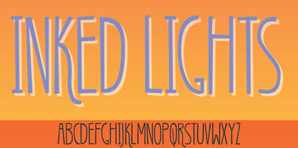
- Kruti Dev 010 - Unknown license

- Sleepy Hollow 2.0 - Unknown license

- W.J. Pearce 213 - Unknown license

- Mighty Zeo 2.0 - Personal use only

- FF Dingbats 2.0 by FontFont,
$51.99 German type designers Johannes Erler and Henning Skibbe created this pi and symbols FontFont in 2009. The family has 12 weights and was one of the first symbol typeface for a new generation.It has one of the largest collections of contemporary symbols and icons for office communication.
 - Walbaum 2010 Pro by Storm Type Foundry,
$54.00 Upon numerous demands of highly esteemed users of our fonts I decided to supplement the Walbaum type family by display and poster cuts. Because I obviously cannot compete with world’s renowned type foundries which already offer a number of renderings of forenamed typeface, I thought proper to decline a bit from the original Walbaum’s design, strictly speaking, from the apprehension we commonly keep about this typeface. Therefore I didn’t set forth the way of modernizing (shame!), but rather the opposite direction: towards an analysis of the original neo-classical intention. I took the 10-point character, magnified it enormously and cut off progressively all the optically thickened bobbles which raised by small-size correction. I ended up at the size of about 120 points, where it became obvious that any further thinning would lead to an undesired manneristic fragility. Resulting 8-member family Walbaum 120 is naturally usable in variety of sizes, as well as cuts marked “10” you can use, say, from 6 to 30 points. I only hope that mister Justus Erich won’t pull me by the ear when we’ll meet on the other side...
 - YD Myungjo 200 by Yoon Design,
$400.00
- A10 STAR Black by Mogtahid,
$90.00 As a former typographer / lino and calligrapher, Abdallah NASRI had recourse to the nature of the idea of an "INTERCHANGEABLE" collection for types who in reality offer a police collar parallel to the complex typeface of the variable. Our fashion is outlined by a simple calculation defined by superimposed geometric circles where we used only its ¼ to fill the need for the angles of each of our letters. Always with the idea of having in the same allocated space, the same letter nested as many times as fat example from Hairline to Ultrabold. It was in this way that I was able to obtain a large number of styles, with a very interesting kerning which prompted me to extend the font to other languages with +1000 characters and +600 glyphs. I have always been treasured by the all in "1". I assure you that I sought to obtain the maximum of Visibility for a use S / Titling TV, WEB Pages and Typography Typo; once the difficult thing was done, I was rewarded by a font that has countless typographic openings for the world of graphics with 10 styles of weights in hand, and again I am happy to have personalized the charm of each letter by new details; I do not regret the time spent on thinking about it so that it is useful and at the same time pleasant as a working tool, finally profitable in all sectors and more multilingual, without forgetting that it is a family of inter change c ' is to say: All the types occupy the same height of the body and it is their fats which differs in the same space width of each of the letters, therefore no interference in spacing. Here, an additional alternative, a participation of a septuagenarian in the service of the love of modern digital typography. • TEST: At 50% screen in a body of 12 pixels, the A10 STAR Alphabet subjected to a test, has a clear Readability / Visibility. • P.S: A10 STAR integrates Diacriticism in all its forms. Texte d'origine : Abdallah NASRI a eu recours en étant ancien typographe/lino et calligraphe à la nature de l'idée d'une collection "INTERCHANGEABLE" pour les types qui en réalité offre un collier de police parallèle à la fonte complexe du variable. Notre mode est esquissé par un calcul simple défini par des ronds géométrique superposés où on a utilisé seulement son ¼ pour garnir le besoin des angles de chacune de nos lettres. Toujours dans l’idée à avoir dans le même espacement alloué, la même lettre imbriquée autant de fois de graisse exemple du Hairline à Ultrabold. C’est de cette manière que j’ai pu obtenir un grand nombre de styles, avec un crénage très intéressant ce qui m’a incité à étendre la police à d’autres langues avec +1000 caractères et +600 glyphes. J’ai toujours été prisé par le tout en « 1 ». Je vous assure que j’ai cherché à obtenir le maximum de Visibilité pour une utilisation S/Titrage TV, Pages WEB et Maquette typo ; une fois le difficile fait, j’ai été récompensé par une police qui possède d’innombrable ouverture typographique pour le monde du Graphisme avec comme atout en main 10 styles de graisses, et encore je suis content pour avoir personnalisé le charme de chaque lettre par des détails nouveaux ; je ne regrette pas le temps passé dessus à réfléchir pour qu’il soit utile et à la fois agréable comme outil de travail, enfin profitable tous secteurs confondus et en plus multilingue, sans oublié que c’est une famille d’inter change c’est-à-dire : Tous les types occupent la même hauteur du corps et c'est leurs graisses qui diffère dans un même espace largeur de chacune des lettres, donc aucune interférence dans l’espacement. Voilà, une alternative supplémentaire, une participation d’un septuagénaire au service de l’amour de la typographie numérique moderne. • TEST : A 50% d'écran dans un corps de 12 pixels, l'Alphabet A10 STAR soumise a un test, présente une nette Lisibilité / Visibilité. • P.S : A10 STAR intégre la Diacritique dans toutes ses formes.
 - MPI No. 510 by mpressInteractive,
$5.00 No. 510 is a friendly, slim gothic face. Strokes have a gentle inward curve at the median with the tops and bottoms of the letters slightly wider and thicker. The design was first introduced by William H. Page & Company around 1887.
 - FM Christmas 2.0 by The Fontmaker,
$20.00 FM Christmas 2.0 consists of 26 hand-lettered Christmas greetings. All the words and phrases are original and handwritten - a high quality calligraphy for your holiday projects. Check our portfolio for the rest of our Christmas collection and more holiday related hand-lettered fonts.
 - 2010 Cancellaresca Recens by GLC,
$38.00 This font was inspired by the Cancellaresca pattern (look at our 1491 Cancellaresca and 1610 Cancellaresca), in particular Spanish one, from Francisco Lucas, who was working in the late 1500s. It is a modern variation, including West European accented characters and a lot of initial and final alternates (not in the Mac TT version for technical reasons).
 - 2010 Outta Space by Morganismi,
$10.00 2010 OuttaSpace is a late space age font with geometric yet organic characters. Ideal for use in posters, cards, invitations etc. 2010 OuttaSpace Icons show you what it's all about in the universe. 2010 OuttaSpace supports West European languages.
 - YD Gothic 200 by Yoon Design,
$400.00
- American Advertise 010 by Intellecta Design,
$13.90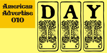
- Swift 2.0 Cyrillic by ParaType,
$100.00 Gerard Unger developed this newspaper font between 1984 and 1987 for Dr.-Ing. Rudolf Hell GmbH, Kiel. He was mainly influenced by William A. Dwiggins (1880-1956), the typographic consultant of Mergenthaler Linotype, who started to develop more legible, alternative fonts for newspaper printing as early as 1930. Swift was named after the fast flying bird. Austere and concise, firm and original, Swift is suited for almost any purpose. Swift has been specially developed to sustain a maximum of quality and readability when used in unfavorable print and display processes, e.g. newspapers, laser printing and low resolution screens. Its robust, yet elegant serifs and its large x-height provide an undeniable distinction to the typeface, making it suitable for corporate ID and advertising purposes as well. Swift 2.0 family was designed in 1995. It's an improved version with technical and aesthetic enhancements and new family members. The Cyrillic version was developed for ParaType in 2003 by Tagir Safayev. Please note that this family includes only basic latin characters; it does not include accented characters required for western and central Europe.
 - 20 db - Personal use only

- 21 Heads - Unknown license

- 10 Minutes - Unknown license

- 21 Emmerson by Deniart Systems,
$20.00 A bit grungy, a bit stern, 21 Emmerson is a tribute to my birthplace and was designed with punky headline posters in mind. The simple lines of this font are angular and sharp - great for party posters, invitations, labels, etc.
 - Quercus 10 by Storm Type Foundry,
$69.00 Quercus is characterised by open, yet a little bit condensed drawing with sufficient spacing so that the neighbouring letters never touch. It has eight interpolated weights with respective italics. Their fine gradation allows to find an exact valeur for any kind of design, especially on the web. Quercus serif styles took inspiration from classicistic typefaces with vertical shadows, ball terminals and thin serifs. The italics have the same width proportion as upright styles. This “modern” attitude is applied to both families and calls for use on the same page, e g in dictionaries and cultural programmes. Serif styles marked by “10” are dedicated to textual point sizes and long reading. The sans-serif principle is rather minimalistic, with subtle shadows and thinned joints between curved shapes and stems. Quercus family comprises of the usual functionality such as Small Caps, Cyrillics, diacritics, ligatures, scientific and aesthetic variants, swashes, and other bells & whistles. It excels in informational and magazine design, corporate identity and branding, but it’s very well suited for book covers, catalogues and posters as well. When choosing a name for this typeface I've been staring out from my studio window, thinking helplessly without any idea in sight. Suddenly I realised that all I can see is a spectacular alley of oaks (Quercus in Latin) surrounding my house. These oaks were planted by the builders of local ponds under the leadership of Jakub Krčín in the fifteenth century.
 - Logx 10 by Fontsphere,
$12.00 LOGX-10 is a geometric minimalistic all-caps display typeface. Designed for strong headers, original graphic designs, visual identification and for many types of designs. It works not only in headings and subtitles but also in arrangements of various sizes and long text.
 - 20 Kopeek by Letterhead Studio-YG,
$35.00 20 kopeek is sans serif font with a slight touch of a steampunk.
 - Roaring 20s by Thomas Käding,
$5.00 This is a decorative font containing the letters A-Z, numbers 0-9, and enough punctuation to make invitations, playbills, posters, and the like. It is meant to have the feel of the theatre district early last century. "Roaring 20s" comes in three styles: regular/engraved, hollow/white, and black. Enjoy!
 - Logx 20 by Fontsphere,
$12.00 LOGX-20 is a geometric, all-caps display typeface. This is the brother of the LOGX-10 font. It obviously refers to the previous one, but considering the construction it is a different typeface. LOGX-20 is designed to create elements of visual identification, various creative projects and outstanding graphics. It looks great in arrangements with different text sizes, headers, sentences and longer texts. Both on websites, print or applications.
 - Orator 10 by Tilde,
$39.75 - 21 Cent by Letterhead Studio-YG,
$45.00 21 Cent - not Century or Clarendon. This is an original font family designed from scratch. 21 Cent is named after a magical coin that brings good luck. And well, in honor of the 21st century, of course. 21 cent family is used in the almanac of the State Hermitage Museum, St. Petersburg, Russia. All members of 21 Cent family include the expanded character set of with support of Cyrillics, Central European and Baltic languages.
 - Lightbox 21 by Protimient,
$21.00 Lightbox 21 is a radical update of my previous version of a geometric sans serif. The design of the original Lightbox was fundamentally based on the idea of incorporating the proportions of the ‘Golden Ratio’ into each letterform; Lightbox 21 greatly improves on this concept by entirely abandoning it. The result is a much more readable, ‘natural’ typeface that retains elements of the original without being bound to it. Overall, Lightbox 21 has been designed to convey that classic feel of a geometric sans that makes the genre so tremendously enduring and versatile, as well as providing an effortless sense of class to whatever they are applied. Primarily intended for editorial work (i.e. short to medium length texts) or display settings, Lightbox 21 has a reasonably extensive character set, including support for Vietnamese, many currency symbols, arrows, and small caps. It also has OpenType support for nut fractions (via a stylistic set) and a barred alternate uppercase i and an alternate curled j.
 - Triole 21 by KaiserType,
$40.00 "Triole 21" is the name of a gothic script font designed by Bertram Kaiser. The forms of this so called "Rotunda" script are based on the manuscripts of italian calligraphers of the late 14th century. Inspiration for this project also comes from the calligrapher Lisa Beck. The glyphs were first written with a broad-nib and then digitized. The Open-Type font is equiped with multilingual (Latin-based) alternates, ligatures and oldstyle figures for various typographical purposes. It can be used for headlines and also stays legible in smaller textsizes for longer textpassages.
 - NEON LED Light - Personal use only

- Ronduit Capitals Light - Personal use only

- ENYO Serif Light - Personal use only

- Kingthings Petrock Light - Unknown license

- LIGHT EMITTING DIODES - Personal use only

- id-Kaze2OT-Light - Personal use only

- Kingthings Serifique Light - 100% free

- Ignite the Light - Personal use only


