9,506 search results
(0.027 seconds)
- Silentclaire by Allouse Studio,
$16.00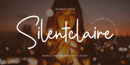 Proudly Presenting, Silentclaire A Monoline Handwritten Font Silentclaire is perfect for product packaging, branding project, megazine, social media, wedding, or just used to express words above the background. Silentclaire also multilingual support. Enjoy the font, feel free to comment or feedback, send me PM or email.
 - Sez Who Sez You by Comicraft,
$29.00 Hand-crafted by Richard Starkings in the classic style of Will Eisner's The Spirit, this free and easy font made its debut in the pages of...The Spirit! Never let it be said that those awfully nice chaps at Comicraft don't think about what they're doing!
 - Thinna Bell by Allouse Studio,
$16.00 Proudly PresentingTinna Bell, a Bold Script Font. Tinna Bell is perfect on any tittle, product packaging, branding project, megazine, social media, wedding, or just used to express words above the background. Enjoy the font, feel free to comment or feedback, send me PM or email. Thank You!
 - Rolasand by Balpirick,
$15.00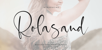 Rolasand is a Modern Handwritten Font. Rolasand is perfect for product packaging, branding project, megazine, social media, wedding, or just used to express words above the background. Rolasand also multilingual support. Enjoy the font, feel free to comment or feedback, send me PM or email. Thank you!
 - Quadrille 2 by Solotype,
$19.95This is a simplified Tuscan, free from excessive ruffles and flourishes. Types of this general design began to appear in profusion in the 1830, and continued as a popular form until the end of the nineteenth century. We added the lowercase to this one for increased usefulness. - Magic Clause by Balpirick,
$15.00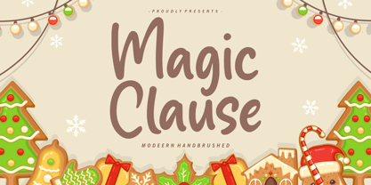 Magic Clause is a Modern Handbrushed Font. Magic Clause is a cute and friendly handwritten font. Get creative with its childlike playfulness, and use it to Magic Clause also multilingual support. Enjoy the font, feel free to comment or feedback, send me PM or email. Thank you!
 - Mbf Grub by Moonbandit,
$14.00 Grub is a bold, playful and fun typeface, it is ideal for branding, logo, title, headlines, poster and many other projects that needs an attention grabber. Use it on your projects to give that free spirit and bold look. Also include opentype features: ligature and alternate
 - Reveler JNL by Jeff Levine,
$29.00 The sheet music for "Good Night Angel" from the 1937 motion picture "Radio City Revels", had the movie's title hand lettered in a free form Art Deco sans serif design. This has been recreated digitally as Reveler JNL, which is available in both regular and oblique versions.
 - Brotusse by Forberas Club,
$16.00 Hi this is Brotusse our new handwritten font, maybe this playful font theme can suits your upcoming event, party, or your personal project. This font is free for personal use, If you need an extended license or corporate license you can contact me at gasforberas@gmail.com.
 - Malpicamoln by Allouse Studio,
$16.00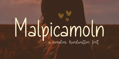 Proudly Presenting, Malpicamoln A Monoline Handwritten Font Malpicamoln is perfect for product packaging, branding project, megazine, social media, wedding, or just used to express words above the background. Malpicamoln also multilingual support. Enjoy the font, feel free to comment or feedback, send me PM or email.
 - Street Art by Arendxstudio,
$18.00 Street Art is a free-style font that has the characteristics of street art that shows freedom and is filled with unique characters. Features : • Character Set A-Z • Numerals & Punctuations (OpenType Standard) • Accents (Multilingual characters) • Ligatures • Alternates There it is! I really hope you enjoy it.
 - Summertime Breeze JNL by Jeff Levine,
$29.00 The opening title sequence for the 1958 film “The Long, Hot Summer” was hand lettered in a free-form style as if painted with loose paintbrush strokes. This served as the model and inspiration for Summertime Breeze JNL, which is available in both regular and oblique versions.
 - Neko Neco by Gatype,
$14.00 Neko Neco is a cute and naturally styled comic balloon display font suitable for logos, branding, greetings, social media themes, and birthday invitation designs. The font is suitable for children and cheerful events. If you have any questions please feel free to contact me! Thank You,
 - Autoprom Pro by Stefan Stoychev,
$29.88 AutopromPro is a modern sans serif display font with a geometric touch contains 24 styles. It comes in 6 weights and its matching rounded and italics. The Thin weight and Black Rounded Italic is a free of charge, so you can use them to your projects.
 - Street Power by Arendxstudio,
$17.00 Street Power is a free style font that has the characteristics of street art that shows freedom. It is filled with unique characters. Features : • Character Set A-Z • Numerals & Punctuations (OpenType Standard) • Accents (Multilingual characters) • Ligatures • Alternates There it is! I really hope you enjoy it.
 - The Overcook by Arendxstudio,
$22.00 The Overcook is a free style font that has the characteristics of street art that shows freedom and is filled with unique characters Features : • Character Set A-Z • Numerals & Punctuations (OpenType Standard) • Accents (Multilingual characters) • Ligature • Alternate There it is! I really hope you enjoy it
 - FineArt OT by John Moore Type Foundry,
$10.00 FineArt OT is a casual typeface, created by brush, as an emulation of a conventional typography, however, comes with alternative FineArt Opentype OT for exploring other radical forms of expression. Thus FineArt offers 4 styles in a single font.
 - Spicy Taste by Vozzy,
$10.00 A new script label typeface named Spicy Taste. This typeface contents caps and small letters, numbers, punctuation signs and some alternates for small letters. This is a handwritten brush font with authentic dry brush strokes like drawn on paper.
 - Miscellany JNL by Jeff Levine,
$29.00 Miscellany JNL collects numerous images of various genres into one dingbat font. There are vintage stencil patterns, old-time ad cuts and decorations, line spacers [number keys 1 through 7], conversation balloons, parking lot symbols and other assorted goodies.
 - Basalt by Volcano Type,
$19.00 Basalt is a hard, black volcanic rock with less than about 52 weight percent silica. Because of basalt's low silica content, it has a low viscosity (resistance to flow). Basalt is erupted at temperatures between 1100 to 1250° C.
 - Punkstoric - Personal use only

- Spoonge Punk - Personal use only

- Black Audio - Personal use only

- The "Janda Closer To Free" font, designed by Kimberly Geswein, embodies a perfect blend of casual charm and heartfelt emotion, making it stand out in the realm of typography. This font captures the e...
- CMSquish, a font designed by Charly Masci, stands out as a distinctive, playful, and versatile typeface that brings a unique flair to any creative project. Imagine the letters as if they've been gent...
- DIVERGENT, a unique font crafted by the designer known as SpideRaY, embodies a standout style that clearly sets it apart from the plethora of typefaces available. This distinctive font captures the e...
- Lido STF by Storm Type Foundry,
$39.00Times with a Human Face: In my article of the same name which appeared in the magazine Font, volume 2000 I described the long and trying story of an order for a typeface for the Czech periodical Lidové noviny (People’s Newspaper). My task was to design a modification of the existing Times. The work, however, finally resulted in the complete re-drawing of the typeface. The assignment, which was on the whole wisely formulated, was to design a typeface which would enable “a smooth flow of information in the reader’s eye”, therefore a typeface without any artistic ambitions, from which everything which obstructs legibility would be eliminated. A year later Lidové noviny had a different manager who in the spring of 2001 decided to resume the cooperation. The typeface itself definitely profited from this; I simplified everything which could be simplified, but it still was not “it”, because the other, and obviously more important, requirement of the investor held: “the typeface must look like Times”. And that is why the above-mentioned daily will continue to be printed by a system version of Times, negligently adjusted to local conditions, which is unfortunately a far cry from the original Times New Roman of Stanley Morison. When I was designing Lido, the cooperation with the head of production of Lidové noviny was of great use to me. Many tests were carried out directly on the newspaper rotary press during which numerous weak points of the earliest versions were revealed. The printing tests have proved that the basic design of this typeface is even more legible and economical than that of Times. The final appearance of Lido STF was, however, tuned up without regard to the original assignment – the merrier-looking italics and the more daring modelling of bold lower case letters have been retained. The typeface is suitable for all periodicals wishing to abandon inconspicuously the hideous system typefaces with their even more hideous accents and to change over to the contemporary level of graphic design. It is also most convenient for everyday work in text editors and office applications. It has a fairly large x-height of lower case letters, shortened serifs and simplified endings of rounded strokes. This is typical of the typefaces designed for use in small sizes. Our typeface, however, can sustain enlargement even to the size appropriate for a poster, an information table or a billboard, as it is not trite and at the same time is moderate in expression. Its three supplementary condensed designs correspond to approximately 80% compression and have been, of course, drawn quite separately. The intention to create condensed italics was abandoned; in the case of serif typefaces they always seem to be slightly strained. I named the typeface dutifully "Lido" (after the name of the newspaper) and included it in the retail catalog of my type foundry. In order to prevent being suspected of additionally turning a rejected work into cash, Lido STF in six designs is available free of charge. I should not like it if the issuing of this typeface were understood as an “act out of spite” aimed against the venerable Times. It is rather meant as a reminder that there really are now alternatives to all fonts in all price categories. - Aeron by District,
$15.00 Aeron started with a no-nonsense geometric sans-serif structure that grew into a functional semi-serif family of fonts. Half-rounded slabs mix with curvy and squared-off terminals for a personable yet structured family that works in all sizes.
 - Fairway by Alan Meeks,
$45.00 The thinking behind Fairway was to create a relatively conventional soft sans with a certain amount of movement at the top of the x-height line. The face is casual and quirky but can still be used as a text face.
 - Myglaos by Sealoung,
$25.00 Myglaos is a lovely elegant font for branding and logo design. This typeface includes a massive selection of ligatures, making it perfect for a variety of creative projects such as branding, logo design, content creation, packaging designs, stationery & so much more.
 - Dining Room JNL by Jeff Levine,
$29.00 Inspired by the basic letter concept of Walter Huxley's 1935 gem Huxley Vertical, Dining Room JNL is a completely re-drawn typeface, adding even more of an Art Deco feel to an already classic Deco-era letter form consisting of condensed, rounded letters. Thick vertical lines balance against lighter weight ones, giving a dramatic contrast so typical of the Streamline Era of design concepts. This font marks another milestone in the Jeff Levine library of retro-inspired type faces. Beginning in 2006 with only ten designs, the collection has grown steadily with Dining Room JNL being the 750th font in the library.
 - Avonick by Valentino Vergan,
$16.00 Avonick is a beautiful condensed font family with an elegant touch. Avonick has a sophisticated and professional look, its clean and elegant letters make it perfect for sleek and professional projects. Avonick comes in four weights, Light, Regular, Semibold and Bold. Each font weight has an oblique version. Avonick has a stylish design which makes it very versatile, the font can cover a wide range of projects such as: branding, mastheads, magazines, logos, banners, wedding invitations, websites, blog posts, pull quotes, editorials, packaging, social media posts, advertisements and much more. We hope you enjoy using the Avonick font family.
 - Obvia Wide by Typefolio,
$29.00 'Obvia' appeared as a result of direct observation on typefaces classified as geometric and the plan to explore for the first time width axes Condensed, Narrow (soon), Normal and new Wide and Expanded. The idea behind 'Obvia's design was to create a distancing from geometrically pure shapes, in this case, square shapes. Then some details were added, such as subtle inktraps, concave endings of the stems and carefully drawn alternate characters, giving a 'geohumanist' tone to the font. This first family of 'Obvia' has 9 weights ranging from Thin to Black, delivering a strong typographic identity, from the paper to the pixel.
 - Rotundus by dayflash,
$35.99 Rotundus is an elegant sans serif typeface based on geometric shapes. Precise lines and accurate curves with sharp corners are the main characteristics of this fresh and modern font family. While unconventional letterforms give Rotundus its distinctive appearance, a tall x-height and a condensed width provide good legibility and nice readability even at smaller sizes. With its contemporary feel, Rotundus is suitable for almost any type of analogue and digital application. A rounded sibling of Rotundus is available as Rotundus Rounded. The Rotundus font family includes unique letterforms, exclusive ligatures and extensive OpenType features. Rotundus comes in six weights with matching italics.
 - Kaleidos Rough by Melvastype,
$32.00 Kaleidos Rough lining is a brush script. It has two versions; Kaleidos Rough and Kaleidos Textured. The rough version has rough edges to mimic authentic brush strokes. The textured version also has those rough edges and in addition it has a brush stroke texture to mimic dry ink. Both versions are sketched and drawn with a pointed brush pen. Kaleidos Rough has plenty of alternates, ligatures and swashes so you can build interesting-looking words and headlines. Although Kaleidos Rough is condensed and quite tightly spaced it is clear and legible. Also check out Kaleidos Smooth, a clean and smooth version of Kaleidos.
 - Droid Serif by Ascender,
$92.99 The Droid Serif Pro Family (4 fonts) is a contemporary serif typeface family designed for comfortable reading on screen. The font is slightly condensed to maximize the amount of text displayed on small screens. Vertical stress, sturdy serifs and open forms contribute to the readability of Droid Serif while its proportion and overall design complement its companion Droid Sans. The fonts were designed by Steve Matteson, the Type Director at Ascender Corporation. The Droid Serif Pro Family (4 fonts) includes Latin 1 and WGL character sets, along with Old Style Figures (requires an application that support advanced OpenType typographic features).
 - Marne by Eurotypo,
$30.00 “Marne” is a new font inspired by letter designs from the 80's but updated. Standing out for its condensation, its angular touch, its slight slant and its thick and thin lines, “Marne” is the perfect mix of elegance and informality. Open Type features include a full complement of international characters, alternatives and ligatures. With all this, the text will look alive and dynamic, without the monotony of repeated letterforms. “Marne” can be the choice to create titles, logos and posters for branding and packaging, invitations, greeting cards, magazine and book covers, children's material, fashion, and wherever you want!
 - Andes by Latinotype,
$29.00 Andes, designed by Daniel Hernández, is a display typeface that has neo-humanist characteristics. Its different terminals, among other elements, give it a look of mixed typography. Andes is a typeface with 10 Upright weights, 10 Italics & Condensed version , ranging from Ultra Light to Black, each of the same x-height. This typeface contains additional italic glyphs (a, y, z, g) that help to emphasise text or words. Andes is based on the design of Merced and both of them share several features. This type is well-suited for use in retail, magazines, logotypes, books, etc.
 - Norman Variable by Resistenza,
$110.00 Norman Variable contains all the weights in between Norman Regular and Norman Fat. Get to know Norman, elegant and fashion forward. This new condensed and high contrast serif font is based on expansion giving a sense of self confidence. The oblique ax was specially added to get a contemporary and innovative sense. Norman is young and idealist, he has a distinctive sense of style. A complete set of ligatures and stylistic alternates is included, this will help the designer to customize and give a special look to any layout. We recommend to use it for big title, magazine, editorial purposes and display.
 - Obvia Expanded by Typefolio,
$29.00 'Obvia' appeared as a result of direct observation on typefaces classified as geometric and the plan to explore for the first time width axes Condensed, Narrow (soon), Normal and new Wide and Expanded. The idea behind 'Obvia's design was to create a distancing from geometrically pure shapes, in this case, square shapes. Then some details were added, such as subtle inktraps, concave endings of the stems and carefully drawn alternate characters, giving a 'geohumanist' tone to the font. This first family of 'Obvia' has 9 weights ranging from Thin to Black, delivering a strong typographic identity, from the paper to the pixel.


