9,508 search results
(0.58 seconds)
- VAG Rounded Next Variable by Monotype,
$172.99VAG Rounded Next Variable Regular is a single font file that features one axis: Weight. For your convenience, the Weight axis has preset instances from Light to Extra Black. This Roman (upright) font is provided as an option to customers who do not need Italics, and want to keep file sizes to a minimum. - Brainy by Maculinc,
$8.00 Introducing the new Sans Serif Font Family with 13 Weight and 5 Width variables. This font is available in two separate font types for your convenience to find the desired variant, Regular Variable and Italic Variable. Choose a font according to your needs to create Magazines, Brochures, Posters, Articles, Books, Logos or other Templates.
 - Grape Feud by PizzaDude.dk,
$17.00 The name Grape Feud is obviously a wordplay, and is derived of the, sometimes, mistaken of the orange and the (often) purple fruits. But Grape Feud is also a playful and charming no-nonsense comic style font. The x-height is quite unpredictable, and I've added ligature for the most common double letter combinations.
 - IM FELL French Canon - Unknown license

- Warm Curves by Nathatype,
$29.00 Most traditional display fonts are old-fashioned and hard to read in small sizes and are not applicable for any contexts in which you need to deliver messages to the audience clearly. Therefore, think about a beautiful, clean, legible modern font which is multipurpose and applicable anywhere along with the pretty serif style. Warm Curves is a display serif font to meet your needs. This elegant, modern, legible display serif font is perfectly applicable to formal, serious contents. It looks more stylish and has its own protruding characters to strengthen the points delivered. Furthermore, this display serif font is legible due to the thick, regular serif to ease readers to recognize every letter accurately. For that reason, you can use this font for any text length and size due to its great legibility. Also enjoy interesting features available in this font. Features: Alternates Multilingual Supports PUA Encoded Numerals and Punctuations Warm Curves fits best for various design projects, such as brandings, posters, banners, logos, magazine covers, quotes, headings, printed products, invitations, name cards, merchandise, social media, etc. Find out more ways to use this font by taking a look at the font preview. Thanks for purchasing our fonts. Hopefully, you have a great time using our font. Feel free to contact us anytime for further information or when you have trouble with the font. Thanks a lot and happy designing.
 - Illustrate IT - Unknown license

- Cowgirl by By Meg Burk,
$25.00 An uppercase font that has versatile character. Got a story to tell? Cowgirl can help you tell it. Includes western-themed vector illustrations handmade by Meg Burk. I grew up spending almost every family vacation as a road trip across the southwestern US. In these adventures, I fell in love with learning about the nature around us; deserts, mountains, plains, piñon trees, rainbow trout, black bears, eagles, and more. I fell into freezing cold white water rapids, explored long-abandoned cliff dwellings, camped under the Milky Way, saw old cave markings, stone markings, preserved art, and read many a many old map legends. These memories are visceral and the inspiration that I get from them permeates my every day. Take a piece of these stories with you and use them in your designs, too. Handmade, meant to last a lifetime and inspire others for decades to come.
 - The Scooter Boy Free font is a distinctive typeface that encapsulates the spirit of adventure, freedom, and youthful energy, reminiscent of the vibrant scooter culture. Its character design embodies ...
- The DS Rada_Double font, crafted by the talented designer Nikolay Dubina, is a testament to the creative prowess that merges traditional typography elements with contemporary design trends. At its co...
- Generis Slab by Linotype,
$29.00The idea for the Generis type system came to Erik Faulhaber while he was traveling in the USA. Seeing typefaces mixed together in a business district motivated him to create a new type system with interrelated forms. The first design scheme came about in 1997, following the space saving model of these American Gothics. Faulhaber then examined the demands of legibility and various communications media before finally developing the plan behind this type system. Generis’s design includes two individually designed styles; each of with is available with and without serifs, giving the type system four separate families. Each includes at least four basic weights: Light, Regular, Medium, and Bold. Further weights, small caps, old style figures, and true italics were added to each family where needed. The Generis type system is designed to meet both optical criteria and the highest possible measure of technical precision. Harmony, rhythm, legibility, and formal restraint make up the foreground. Generis combines aesthetic, technical, and economic advantages, which purposefully and efficiently cover the whole range of corporate communication needs. The unified basic form and the individual peculiarity of the styles lead to Generis’ systematic, total-package concept. The clear formal language of the Generis type system resides beneath the information, bringing appropriate typographic expression to high-level corporate identity systems, both in print and on screen. The condensed and aspiring nature of the letterforms allows for the efficient setting of body copy, and the economic use of the page. A range of accented characters allows text to be set in 48 Latin-based languages, offering maximal typographic free range. This previously unknown level of technical and design execution helps create higher quality typography in all areas of corporate communication. Optimal combinations within the type system: Generis Serif or Generis Slab with Generis Sans or Generis Simple. - Generis Serif by Linotype,
$29.00The idea for the Generis type system came to Erik Faulhaber while he was traveling in the USA. Seeing typefaces mixed together in a business district motivated him to create a new type system with interrelated forms. The first design scheme came about in 1997, following the space saving model of these American Gothics. Faulhaber then examined the demands of legibility and various communications media before finally developing the plan behind this type system. Generis’s design includes two individually designed styles; each of with is available with and without serifs, giving the type system four separate families. Each includes at least four basic weights: Light, Regular, Medium, and Bold. Further weights, small caps, old style figures, and true italics were added to each family where needed. The Generis type system is designed to meet both optical criteria and the highest possible measure of technical precision. Harmony, rhythm, legibility, and formal restraint make up the foreground. Generis combines aesthetic, technical, and economic advantages, which purposefully and efficiently cover the whole range of corporate communication needs. The unified basic form and the individual peculiarity of the styles lead to Generis’ systematic, total-package concept. The clear formal language of the Generis type system resides beneath the information, bringing appropriate typographic expression to high-level corporate identity systems, both in print and on screen. The condensed and aspiring nature of the letterforms allows for the efficient setting of body copy, and the economic use of the page. A range of accented characters allows text to be set in 48 Latin-based languages, offering maximal typographic free range. This previously unknown level of technical and design execution helps create higher quality typography in all areas of corporate communication. Optimal combinations within the type system: Generis Serif or Generis Slab with Generis Sans or Generis Simple. - Generis Simple by Linotype,
$39.00The idea for the Generis type system came to Erik Faulhaber while he was traveling in the USA. Seeing typefaces mixed together in a business district motivated him to create a new type system with interrelated forms. The first design scheme came about in 1997, following the space saving model of these American Gothics. Faulhaber then examined the demands of legibility and various communications media before finally developing the plan behind this type system. Generis’s design includes two individually designed styles; each of with is available with and without serifs, giving the type system four separate families. Each includes at least four basic weights: Light, Regular, Medium, and Bold. Further weights, small caps, old style figures, and true italics were added to each family where needed. The Generis type system is designed to meet both optical criteria and the highest possible measure of technical precision. Harmony, rhythm, legibility, and formal restraint make up the foreground. Generis combines aesthetic, technical, and economic advantages, which purposefully and efficiently cover the whole range of corporate communication needs. The unified basic form and the individual peculiarity of the styles lead to Generis’ systematic, total-package concept. The clear formal language of the Generis type system resides beneath the information, bringing appropriate typographic expression to high-level corporate identity systems, both in print and on screen. The condensed and aspiring nature of the letterforms allows for the efficient setting of body copy, and the economic use of the page. A range of accented characters allows text to be set in 48 Latin-based languages, offering maximal typographic free range. This previously unknown level of technical and design execution helps create higher quality typography in all areas of corporate communication. Optimal combinations within the type system: Generis Serif or Generis Slab with Generis Sans or Generis Simple. - Generis Sans by Linotype,
$29.00The idea for the Generis type system came to Erik Faulhaber while he was traveling in the USA. Seeing typefaces mixed together in a business district motivated him to create a new type system with interrelated forms. The first design scheme came about in 1997, following the space saving model of these American Gothics. Faulhaber then examined the demands of legibility and various communications media before finally developing the plan behind this type system. Generis’s design includes two individually designed styles; each of with is available with and without serifs, giving the type system four separate families. Each includes at least four basic weights: Light, Regular, Medium, and Bold. Further weights, small caps, old style figures, and true italics were added to each family where needed. The Generis type system is designed to meet both optical criteria and the highest possible measure of technical precision. Harmony, rhythm, legibility, and formal restraint make up the foreground. Generis combines aesthetic, technical, and economic advantages, which purposefully and efficiently cover the whole range of corporate communication needs. The unified basic form and the individual peculiarity of the styles lead to Generis’ systematic, total-package concept. The clear formal language of the Generis type system resides beneath the information, bringing appropriate typographic expression to high-level corporate identity systems, both in print and on screen. The condensed and aspiring nature of the letterforms allows for the efficient setting of body copy, and the economic use of the page. A range of accented characters allows text to be set in 48 Latin-based languages, offering maximal typographic free range. This previously unknown level of technical and design execution helps create higher quality typography in all areas of corporate communication. Optimal combinations within the type system: Generis Serif or Generis Slab with Generis Sans or Generis Simple. - Fontin, a creation by the talented type designer Jos Buivenga, is a sophisticated and versatile typeface that seamlessly blends classic type qualities with contemporary styling. Its design is a harmo...
- Stiletto - Unknown license

- Amurg - Personal use only

- CF Anarchy - Personal use only

- Fiolex Mephisto - 100% free

- VIDEO PIRATE - Personal use only

- Just The Way You Are - Personal use only

- silent witness - Personal use only

- InavelTetka Cyr - Unknown license

- Research Remix - Personal use only

- !Basket of Hammers - Unknown license

- KG Like A Skyscraper - Personal use only

- Barbies Jalous Sisters - Unknown license

- Zrnic Cyr - Unknown license

- Rumo Script by Bean & Morris,
$35.00 Rumo Script is a bright, breezy, free-flowing contemporary script to lighten the load when a change of pace is required to communicate freshness, fun, lifestyle and a general 'good feeling'. Designed so that some letters connect while others don't giving a spontaneous feel at the same time keeping it a 'considered' style. Rumo (pronounced Roo-mo) will enhance your graphics and give them that 'wow' look!
 - Mothra by madeDeduk,
$15.00 Introducing MOTHRA use this font for any branding, product packaging, invitation, quotes, t-shirt, label, poster, logo etc. Feature Uppercase & Lowercase Number & Symbol International Glyphs Multilingual support Feel free to drop us a message any time and follow my shop for upcoming updates Shoot me on email at: dedukvic@gmail.com and find more previews on my Instagram here : https://www.instagram.com/acekelgondolayu/?hl=en Hope you enjoy it.
 - Boshi by Tymime Fonts,
$30.00 Boshi is inspired by classic video games, but it can do more than that. Saturday morning cartoons, comic books and other logos that need to express fun are other ways this font can be used. It also includes several Tiki-style interlocking ligatures. Vastly improved over the original free version, already featured in several high-profile mobile games and even a toy, Boshi evokes retro goodness.
 - Relaxme by BonjourType,
$9.00 Relaxme can be used for personal or commercial projects, in logos, on items for purchase with unlimited sales. Font that is perfect for quotes, cool logos and social media images and quotes. Featured fonts: Uppercase, Lowercase, Numbers, Symbols, Accents, Alternative, Ligatures and also supports multilingual Enjoy the font, feel free to leave a comment or feedback, send me a PM or email bonjourtype@gmail.com. Thank you!
 - Nouveau Cartoon JNL by Jeff Levine,
$29.00 Samuel Welo’s “Studio Handbook – Letter and Design for Artists and Advertisers” was a go-to source of inspiration for generations of layout artists, graphic designers and sign painters. An interesting example of free-form pen lettering was found amongst the pages of one edition and it has now been recreated as a digital typeface called Nouveau Cartoon JNL; available in both regular and oblique versions.
 - Locke by North Type,
$- Locke is a stylish slab serif with a modern twist. Currently, it has 6 weights, ranging from ExtraLight to Bold. The presence of ball terminals on certain glyphs and its unusually high x-height give it a unique look, perfect for large titles or body copy. Locke has extensive multi-language support, counting over 390 glyphs per weight. Try out Locke Regular for free!
 - Toska by Locomotype,
$20.00 Toska is a geometric sans serif font. This font has a strong but friendly impression because the rounded corners make the eyes feel comfortable. Suitable for headings, poster titles, logotypes, signage, packaging and Toska can even be used for interesting paragraphs. Comes in eight weights, each weight having an italic version so you are free to pair various weights to make your typography more attractive.
 - Pixeloza 03 by Fontsphere,
$12.00 Pixeloza 03 is a pixel-style, grid-based, display typeface. Compared to Pixeloza 01&02 the lightest and clearly narrow version. The font is characterized by its simplicity, attention to detail, and original forms. You can use it in a wide variety of projects. It gives many possibilities for creating graphics. Pixeloza 03 is available in two options: Pixeloza 03 Regular (FREE) and Pizeloza 03 Skewo Regular.
 - Amperas by Allouse Studio,
$16.00 Amperas is a Graffiti Font. Amperas is perfect for product packaging, branding project, megazine, social media, wedding, or just used to express words above the background. Amperas also come with extras graffiti elements and underline style for your need to make them realistic. This font also come with multilingual support. Enjoy the font, feel free to comment or feedback, send me PM or email.
 - Diastema by Issam Type,
$22.00 Diastema is a modern ligature serif typeface comes with joining ligatures that give it a fancy and unique style. This font perfect for branding, logos, invitation, watermark and more. Diastema typeface comes with regular, italic, bold and bold italic font styles. Uppercase & lowercase letters, numbers, punctuation, ligatures, alternates Multilingual support. If you have any questions, please feel free to get in touch. Thank you
 - Motte by TypeClassHeroes,
$14.00 Introducing Motte is a tall and wide sans comes with classic casual family to get more stunning. Use this font family for any branding, product packaging, invitation, quotes, t-shirt, label, poster, logo etc. Character Set Uppercase & Lowercase Number & Symbol International Glyphs Ligatures Multilingual support Feel free to drop us a message or shoot me on message any time and follow my shop for upcoming updates
 - Catastrophist by Allouse Studio,
$16.00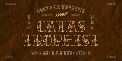 Catastrophist a Retro Tattoo Font that carefully crafted and will bring an cool impression to your project. Catastrophist is perfect for any titles, logo, product packaging, branding project, megazine, social media, wedding, or just used to express words above the background. Catastrophist also come with Multi-Lingual Support. Enjoy the font, feel free to comment or feedback, send me PM or email. Thank You!
 - Gush Kettel AT by madeDeduk,
$12.00 Gush Kettle is a distinct note font made manually with a pen contains 50+ ligatures with two alternative. Gush Kettle is great for branding, posters, logos, invitation, writing and headings. Feature Uppercase & Lowercase Number & Symbol International Glyphs Multilingual support Alternative Ligature Thanks so much for checking out my shop and feel free to drop us a message any time and follow my shop for upcoming updates


