10,000 search results
(0.211 seconds)
- PL Behemoth by Monotype,
$29.99Dave West released the Behemoth Semi-Condensed font in 1960. With nineteenth-century wood-cut influence PL Behemoth Semi-Condensed is an example of the revival of slab serif styles, popular in the sixties and seventies. - Livery Stable by FontMesa,
$25.00Livery Stable is a revival of an old classic font from the 1800s. Much research was done to recreate the original versions of Livery Stable which include regular, black, condensed and shadow lined versions of this font. Also look for the Horse Head symbol placed on the Less-Than and Greater-Than keys. - Ravensara Serif by NaumType,
$19.00 Ravensara Serif - elegant high contrast classic serif. Style of the typeface originates in a classic Didone but took a step to simplify some letter forms and make Didone feel more contemporary. Ravensara Serif is a part of the Ravensara superfamily, united by the same anatomy, which currently also includes Ravensara Sans and Ravensara Stencil. Ravensara Serif, despite its ancient roots and due to simplified and smoothed forms, can be used in a variety of different styles. It’s a perfect choice for bold headlines, oversize typography, fashion logos, branding, identity, website design, album art, covers, posters, advertising, etc. It is available in 7 weights, including Thin, Light, Regular, Medium, SemiBold, Bold and Black. Ravensara Serif extends multilingual support to Basic Latin, Western European, Euro, Catalan, Baltic, Turkish, Central European, Pan African Latin and Afrikaans.
 - Bagilean Geliayditan by Gold Type,
$12.00 Bagilean Geliayditan is the new editorial serif with all clean and soft lines, tight curves, and a trendy and elegant look! Bagilean Geliayditan has 16 fonts. which comes with 2 font family styles: - Bagilean Geliayditan: Regular, Italic, Medium, Medium Italic, Condensed, Condensed Italic, Outline and Outline Italic. - Bagilean Geliayditan Elegant: Regular, Italic, Medium, Medium Italic, Condensed, Condensed Italic, Outline and Outline Italic. Bagilean Geliayditan is perfect for your design needs such as to create nostalgic designs but still clean and elegant such as headlines, magazines, logos, packaging, editorials, titles, branding projects, logo designs, packaging, magazine titles, advertisements, short or long texts. Etc......
 - Neo Sans Cyrillic by Monotype,
$103.99The branding agency's client wanted an ultra modern"" typeface that was ""futuristic without being gimmicky or ephemeral,"" according to the design brief. Designer Sebastian Lester took on this intriguing custom font assignment, but soon, a bureaucratic decision cancelled the project. ""I was left with a sketchbook full of ideas and thought it would be a shame not to see what came of them,"" says Lester. He decided to finish the design on his own. Lester's research confirmed that the principal ingredient of an ""ultra modern"" typeface was simplicity of character structure: a carefully drawn, monoline form, open letter shapes and smooth, strong curves. To conceive a typeface that crossed the line from modern to futuristic, Lester decided to amplify these qualities. About a year after Lester's initial conceptual work, two highly functional and versatile typefaces emerged. These are Neo Sans and Neo Tech, designs Lester describes as ""legible without being neutral, nuanced without being fussy, and expressive without being distracting."" Both the Neo Sans and the more-minimalist Neo Tech families are available in six weights, ranging from Light to Ultra. Each has a companion italic, and Neo Tech offers a suite of alternate characters. While engineered to look modern as tomorrow, Neo Sans and Neo Tech display the functional and aesthetic excellence that earns them a place in the list of classic designs from the Monotype typeface library. - Neo Sans Paneuropean by Monotype,
$114.99The branding agency's client wanted an ultra modern"" typeface that was ""futuristic without being gimmicky or ephemeral,"" according to the design brief. Designer Sebastian Lester took on this intriguing custom font assignment, but soon, a bureaucratic decision cancelled the project. ""I was left with a sketchbook full of ideas and thought it would be a shame not to see what came of them,"" says Lester. He decided to finish the design on his own. Lester's research confirmed that the principal ingredient of an ""ultra modern"" typeface was simplicity of character structure: a carefully drawn, monoline form, open letter shapes and smooth, strong curves. To conceive a typeface that crossed the line from modern to futuristic, Lester decided to amplify these qualities. About a year after Lester's initial conceptual work, two highly functional and versatile typefaces emerged. These are Neo Sans and Neo Tech, designs Lester describes as ""legible without being neutral, nuanced without being fussy, and expressive without being distracting."" Both the Neo Sans and the more-minimalist Neo Tech families are available in six weights, ranging from Light to Ultra. Each has a companion italic, and Neo Tech offers a suite of alternate characters. While engineered to look modern as tomorrow, Neo Sans and Neo Tech display the functional and aesthetic excellence that earns them a place in the list of classic designs from the Monotype typeface library. - Artico by cretype,
$20.00 Artico Family is a modern sans-serif typeface that is clean, simple and highly readable. Letters in this type family are designed with genuine neo-grotesque and neutral shapes without any decorative distractions. The spaces between individual letter forms are precisely adjusted to create the perfect typesetting. Artico is versatile type family of 72 fonts. Artico family consists of 9 weights (Thin, ExtraLight, Light, Regular, Medium, Bold, ExtraBold, Heavy & Black) and 4 widths (Extra Condensed, Condensed, Normal & Expanded) with their corresponding italics. The Open Type fonts contain complete Latin 1252, Cyrillic, Central European 1250, Turkish 1254 character sets. Each font includes proportional figures, tabular figures, numerators, denominators, superscript, scientific inferiors, subscript, fractions and case features. We highly recommend it for use in books, web pages, screen displays, and so on.
 - Homura by Arterfak Project,
$18.00 Homura is a sans-serif display font that is inspired by newspaper headlines and modern typography. It comes in four styles: regular, rounded, slanted, and slanted rounded. This font is condensed, bold, and elegant, with a tight design that includes ink-traps in some sharp corners, giving it a fancy, fun, and minimalist impression. Flexible for various design themes. With its condensed and elegant look, Homura is perfect for creating high impact logos, headlines, and quotes. Homura's versatility makes it a great choice for any project. This font is perfect for large displays or headlines, such as logos, short quotes, stickers, label and posters. What you'll get : Uppercase & lowercase Numbers & punctuation Symbols & multilingual Stylistic alternates Give it a try today and see the difference it can make! Thanks!
 - Colagent by Great Studio,
$25.00 Colagent is a high-contrast typography inspired by transitional and contemporary typography. The font expands its usability by providing weights ranging from Light to black. Natural curves, swelling and slanting stems grow in characters as the font gets heavier. While the thinner weights have reduced contrast and optical corrections to create a warm and soft appearance. Featuring charming italic letters, exceptional bold weights, and full character support for over 200 Latin-based languages. Colagent excels in display settings such as editorial design, titles, branding projects, logo design, packaging, magazine headings, advertising, short or long text. Colagent also comes with four Variable font versions: Regular, Italic, Condensed, and Condensed Italic to make it easier for designers to explore and perfect beautiful designs, uncovering many visual tones and hidden secrets.
 - Gemini Type Fontpack by Chank,
$49.00 INTRODUCING THE GEMINI TYPE FONTPACK, an industrial-strength OpenType font bundle inspired by and optimized for dimensional type. Chank Co is proud to introduce the new “Gemini Type Fontpack,” a collection of ten fonts available for use on your desktop computer or web pages, but also optimized for use as exterior cast-metal signage in bronze or aluminum in collaboration with Gemini, a family-owned industry leader in the wholesale manufacture of dimensional letters, logo and plaques based in Cannon Falls, MN. Gemini collaborated with Chank Co to assemble a line of fonts that would work well as dimensional, cast-letter signage for use on the sides of buildings, in stores, and other public spaces. The fonts included in the “Gemini Type Fontpack” are reinterpretations of previous Chank Fonts, now optimized for dimensional signage display, but then also repackaged and presented for your use as an OpenType desktop computer font collection: GT-Adrianna DemiBold GT-Adrianna Bold GT-Adrianna ExtraBold GT-Fairbanks GT-Forward Thinking GT-Hydropower ExtraCondensed GT-Kegger GT-Shopaganda GT-Shopaganda Condensed GT-Timeless Geometric. This is a multi-purpose collection of heavy-lifting fonts to convey your message strong and clearly, full of legibility and clarity, but also displaying personality and distinction. You can purchase and download these fonts in OpenType format for your desktop computer right now via MyFonts. Get it today and you'll also get a great introductory special sale price. These exclusive typefaces are also available as dimensional letters, manufactured by Gemini in bronze or aluminum, from 6" tall up to 18" tall, with a variety of finish options, for use in public signage and wayfinding systems. Gemini manufacture their products in 20 plants through out the US, Canada and Mexico, and all their products are backed by a lifetime guarantee. Chank Co is excited to offer these ten strong, industrial font designs in durable cast metal format via Gemini. ----- More about the fonts in the Gemini Type Fontpack: GT-Adrianna DemiBold, Bold, and Adrianna ExtraBold Clear, invisible, no-nonsense, multi-purpose. A versatile sans-serif heavy-lifting font family. GT-Fairbanks Vintage, silent film, speedball, old-timey, old-fashioned, retro. Based upon the lettering in the 1914 silent film, “The Good Bad Man.” GT-Forward Thinking Futuristic, semi-serif, clean, distinctive, contemporary, idiosyncratic. A font for tomorrow and the future. GT-Hydropower ExtraCondensed Extra-condensed, compressed, strong, rigid and concise. GT-Kegger Strong, sporty, collegiate, athletic. Nothing says “GO TEAM” quite like a big, bold slab-serif font. GT-Shopaganda and GT-Shopaganda Condensed Industrial, geometric, constructivist, propaganda, oh there’s so much to love about the strength and clarity of these two fonts. Based on Chank’s Liquorstore and Nicotine fonts, which have been married and unified here, with a few new twists and turns to their letterforms. GT-Timeless Geometric Bauhaus, anyone? The geometric and minimalist alphabet here is about as clean and straight-forward as a semi-condensed sans can get. ----- All of the fonts in this package are available individually, or save money when you purchase all ten of them as a collection. Download this digital font package from MyFonts today and you'll receive both OpenType and TrueType formats in your download for your desktop computer. Webfont format is also available. (If you'd like to use these fonts as cast-metal letters for exterior, architectural purposes, visit the Gemini website to learn more about how you can find a signage retailer near you.)
 - Olive by Typesketchbook,
$9.00 Olive is a hand-drawn condensed font.
 - Times New Roman PS Cyrillic by Monotype,
$67.99In 1931, The Times of London commissioned a new text type design from Stanley Morison and the Monotype Corporation, after Morison had written an article criticizing The Times for being badly printed and typographically behind the times. The new design was supervised by Stanley Morison and drawn by Victor Lardent, an artist from the advertising department of The Times. Morison used an older typeface, Plantin, as the basis for his design, but made revisions for legibility and economy of space (always important concerns for newspapers). As the old type used by the newspaper had been called Times Old Roman," Morison's revision became "Times New Roman." The Times of London debuted the new typeface in October 1932, and after one year the design was released for commercial sale. The Linotype version, called simply "Times," was optimized for line-casting technology, though the differences in the basic design are subtle. The typeface was very successful for the Times of London, which used a higher grade of newsprint than most newspapers. The better, whiter paper enhanced the new typeface's high degree of contrast and sharp serifs, and created a sparkling, modern look. In 1972, Walter Tracy designed Times Europa for The Times of London. This was a sturdier version, and it was needed to hold up to the newest demands of newspaper printing: faster presses and cheaper paper. In the United States, the Times font family has enjoyed popularity as a magazine and book type since the 1940s. Times continues to be very popular around the world because of its versatility and readability. And because it is a standard font on most computers and digital printers, it has become universally familiar as the office workhorse. Times?, Times? Europa, and Times New Roman? are sure bets for proposals, annual reports, office correspondence, magazines, and newspapers. Linotype offers many versions of this font: Times? is the universal version of Times, used formerly as the matrices for the Linotype hot metal line-casting machines. The basic four weights of roman, italic, bold and bold italic are standard fonts on most printers. There are also small caps, Old style Figures, phonetic characters, and Central European characters. Times? Ten is the version specially designed for smaller text (12 point and below); its characters are wider and the hairlines are a little stronger. Times Ten has many weights for Latin typography, as well as several weights for Central European, Cyrillic, and Greek typesetting. Times? Eighteen is the headline version, ideal for point sizes of 18 and larger. The characters are subtly condensed and the hairlines are finer." - Times New Roman Seven by Monotype,
$67.99In 1931, The Times of London commissioned a new text type design from Stanley Morison and the Monotype Corporation, after Morison had written an article criticizing The Times for being badly printed and typographically behind the times. The new design was supervised by Stanley Morison and drawn by Victor Lardent, an artist from the advertising department of The Times. Morison used an older typeface, Plantin, as the basis for his design, but made revisions for legibility and economy of space (always important concerns for newspapers). As the old type used by the newspaper had been called Times Old Roman," Morison's revision became "Times New Roman." The Times of London debuted the new typeface in October 1932, and after one year the design was released for commercial sale. The Linotype version, called simply "Times," was optimized for line-casting technology, though the differences in the basic design are subtle. The typeface was very successful for the Times of London, which used a higher grade of newsprint than most newspapers. The better, whiter paper enhanced the new typeface's high degree of contrast and sharp serifs, and created a sparkling, modern look. In 1972, Walter Tracy designed Times Europa for The Times of London. This was a sturdier version, and it was needed to hold up to the newest demands of newspaper printing: faster presses and cheaper paper. In the United States, the Times font family has enjoyed popularity as a magazine and book type since the 1940s. Times continues to be very popular around the world because of its versatility and readability. And because it is a standard font on most computers and digital printers, it has become universally familiar as the office workhorse. Times?, Times? Europa, and Times New Roman? are sure bets for proposals, annual reports, office correspondence, magazines, and newspapers. Linotype offers many versions of this font: Times? is the universal version of Times, used formerly as the matrices for the Linotype hot metal line-casting machines. The basic four weights of roman, italic, bold and bold italic are standard fonts on most printers. There are also small caps, Old style Figures, phonetic characters, and Central European characters. Times? Ten is the version specially designed for smaller text (12 point and below); its characters are wider and the hairlines are a little stronger. Times Ten has many weights for Latin typography, as well as several weights for Central European, Cyrillic, and Greek typesetting. Times? Eighteen is the headline version, ideal for point sizes of 18 and larger. The characters are subtly condensed and the hairlines are finer." - Times New Roman WGL by Monotype,
$67.99 In 1931, The Times of London commissioned a new text type design from Stanley Morison and the Monotype Corporation, after Morison had written an article criticizing The Times for being badly printed and typographically behind the times. The new design was supervised by Stanley Morison and drawn by Victor Lardent, an artist from the advertising department of The Times. Morison used an older typeface, Plantin, as the basis for his design, but made revisions for legibility and economy of space (always important concerns for newspapers). As the old type used by the newspaper had been called Times Old Roman," Morison's revision became "Times New Roman." The Times of London debuted the new typeface in October 1932, and after one year the design was released for commercial sale. The Linotype version, called simply "Times," was optimized for line-casting technology, though the differences in the basic design are subtle. The typeface was very successful for the Times of London, which used a higher grade of newsprint than most newspapers. The better, whiter paper enhanced the new typeface's high degree of contrast and sharp serifs, and created a sparkling, modern look. In 1972, Walter Tracy designed Times Europa for The Times of London. This was a sturdier version, and it was needed to hold up to the newest demands of newspaper printing: faster presses and cheaper paper. In the United States, the Times font family has enjoyed popularity as a magazine and book type since the 1940s. Times continues to be very popular around the world because of its versatility and readability. And because it is a standard font on most computers and digital printers, it has become universally familiar as the office workhorse. Times?, Times? Europa, and Times New Roman? are sure bets for proposals, annual reports, office correspondence, magazines, and newspapers. Linotype offers many versions of this font: Times? is the universal version of Times, used formerly as the matrices for the Linotype hot metal line-casting machines. The basic four weights of roman, italic, bold and bold italic are standard fonts on most printers. There are also small caps, Old style Figures, phonetic characters, and Central European characters. Times? Ten is the version specially designed for smaller text (12 point and below); its characters are wider and the hairlines are a little stronger. Times Ten has many weights for Latin typography, as well as several weights for Central European, Cyrillic, and Greek typesetting. Times? Eighteen is the headline version, ideal for point sizes of 18 and larger. The characters are subtly condensed and the hairlines are finer."
 - Times New Roman by Monotype,
$67.99 In 1931, The Times of London commissioned a new text type design from Stanley Morison and the Monotype Corporation, after Morison had written an article criticizing The Times for being badly printed and typographically behind the times. The new design was supervised by Stanley Morison and drawn by Victor Lardent, an artist from the advertising department of The Times. Morison used an older typeface, Plantin, as the basis for his design, but made revisions for legibility and economy of space (always important concerns for newspapers). As the old type used by the newspaper had been called Times Old Roman," Morison's revision became "Times New Roman." The Times of London debuted the new typeface in October 1932, and after one year the design was released for commercial sale. The Linotype version, called simply "Times," was optimized for line-casting technology, though the differences in the basic design are subtle. The typeface was very successful for the Times of London, which used a higher grade of newsprint than most newspapers. The better, whiter paper enhanced the new typeface's high degree of contrast and sharp serifs, and created a sparkling, modern look. In 1972, Walter Tracy designed Times Europa for The Times of London. This was a sturdier version, and it was needed to hold up to the newest demands of newspaper printing: faster presses and cheaper paper. In the United States, the Times font family has enjoyed popularity as a magazine and book type since the 1940s. Times continues to be very popular around the world because of its versatility and readability. And because it is a standard font on most computers and digital printers, it has become universally familiar as the office workhorse. Times?, Times? Europa, and Times New Roman? are sure bets for proposals, annual reports, office correspondence, magazines, and newspapers. Linotype offers many versions of this font: Times? is the universal version of Times, used formerly as the matrices for the Linotype hot metal line-casting machines. The basic four weights of roman, italic, bold and bold italic are standard fonts on most printers. There are also small caps, Old style Figures, phonetic characters, and Central European characters. Times? Ten is the version specially designed for smaller text (12 point and below); its characters are wider and the hairlines are a little stronger. Times Ten has many weights for Latin typography, as well as several weights for Central European, Cyrillic, and Greek typesetting. Times? Eighteen is the headline version, ideal for point sizes of 18 and larger. The characters are subtly condensed and the hairlines are finer."
 - Times New Roman Small Text by Monotype,
$67.99In 1931, The Times of London commissioned a new text type design from Stanley Morison and the Monotype Corporation, after Morison had written an article criticizing The Times for being badly printed and typographically behind the times. The new design was supervised by Stanley Morison and drawn by Victor Lardent, an artist from the advertising department of The Times. Morison used an older typeface, Plantin, as the basis for his design, but made revisions for legibility and economy of space (always important concerns for newspapers). As the old type used by the newspaper had been called Times Old Roman," Morison's revision became "Times New Roman." The Times of London debuted the new typeface in October 1932, and after one year the design was released for commercial sale. The Linotype version, called simply "Times," was optimized for line-casting technology, though the differences in the basic design are subtle. The typeface was very successful for the Times of London, which used a higher grade of newsprint than most newspapers. The better, whiter paper enhanced the new typeface's high degree of contrast and sharp serifs, and created a sparkling, modern look. In 1972, Walter Tracy designed Times Europa for The Times of London. This was a sturdier version, and it was needed to hold up to the newest demands of newspaper printing: faster presses and cheaper paper. In the United States, the Times font family has enjoyed popularity as a magazine and book type since the 1940s. Times continues to be very popular around the world because of its versatility and readability. And because it is a standard font on most computers and digital printers, it has become universally familiar as the office workhorse. Times?, Times? Europa, and Times New Roman? are sure bets for proposals, annual reports, office correspondence, magazines, and newspapers. Linotype offers many versions of this font: Times? is the universal version of Times, used formerly as the matrices for the Linotype hot metal line-casting machines. The basic four weights of roman, italic, bold and bold italic are standard fonts on most printers. There are also small caps, Old style Figures, phonetic characters, and Central European characters. Times? Ten is the version specially designed for smaller text (12 point and below); its characters are wider and the hairlines are a little stronger. Times Ten has many weights for Latin typography, as well as several weights for Central European, Cyrillic, and Greek typesetting. Times? Eighteen is the headline version, ideal for point sizes of 18 and larger. The characters are subtly condensed and the hairlines are finer." - Times New Roman PS Greek by Monotype,
$67.99In 1931, The Times of London commissioned a new text type design from Stanley Morison and the Monotype Corporation, after Morison had written an article criticizing The Times for being badly printed and typographically behind the times. The new design was supervised by Stanley Morison and drawn by Victor Lardent, an artist from the advertising department of The Times. Morison used an older typeface, Plantin, as the basis for his design, but made revisions for legibility and economy of space (always important concerns for newspapers). As the old type used by the newspaper had been called Times Old Roman," Morison's revision became "Times New Roman." The Times of London debuted the new typeface in October 1932, and after one year the design was released for commercial sale. The Linotype version, called simply "Times," was optimized for line-casting technology, though the differences in the basic design are subtle. The typeface was very successful for the Times of London, which used a higher grade of newsprint than most newspapers. The better, whiter paper enhanced the new typeface's high degree of contrast and sharp serifs, and created a sparkling, modern look. In 1972, Walter Tracy designed Times Europa for The Times of London. This was a sturdier version, and it was needed to hold up to the newest demands of newspaper printing: faster presses and cheaper paper. In the United States, the Times font family has enjoyed popularity as a magazine and book type since the 1940s. Times continues to be very popular around the world because of its versatility and readability. And because it is a standard font on most computers and digital printers, it has become universally familiar as the office workhorse. Times?, Times? Europa, and Times New Roman? are sure bets for proposals, annual reports, office correspondence, magazines, and newspapers. Linotype offers many versions of this font: Times? is the universal version of Times, used formerly as the matrices for the Linotype hot metal line-casting machines. The basic four weights of roman, italic, bold and bold italic are standard fonts on most printers. There are also small caps, Old style Figures, phonetic characters, and Central European characters. Times? Ten is the version specially designed for smaller text (12 point and below); its characters are wider and the hairlines are a little stronger. Times Ten has many weights for Latin typography, as well as several weights for Central European, Cyrillic, and Greek typesetting. Times? Eighteen is the headline version, ideal for point sizes of 18 and larger. The characters are subtly condensed and the hairlines are finer." - Times New Roman PS by Monotype,
$67.99In 1931, The Times of London commissioned a new text type design from Stanley Morison and the Monotype Corporation, after Morison had written an article criticizing The Times for being badly printed and typographically behind the times. The new design was supervised by Stanley Morison and drawn by Victor Lardent, an artist from the advertising department of The Times. Morison used an older typeface, Plantin, as the basis for his design, but made revisions for legibility and economy of space (always important concerns for newspapers). As the old type used by the newspaper had been called Times Old Roman," Morison's revision became "Times New Roman." The Times of London debuted the new typeface in October 1932, and after one year the design was released for commercial sale. The Linotype version, called simply "Times," was optimized for line-casting technology, though the differences in the basic design are subtle. The typeface was very successful for the Times of London, which used a higher grade of newsprint than most newspapers. The better, whiter paper enhanced the new typeface's high degree of contrast and sharp serifs, and created a sparkling, modern look. In 1972, Walter Tracy designed Times Europa for The Times of London. This was a sturdier version, and it was needed to hold up to the newest demands of newspaper printing: faster presses and cheaper paper. In the United States, the Times font family has enjoyed popularity as a magazine and book type since the 1940s. Times continues to be very popular around the world because of its versatility and readability. And because it is a standard font on most computers and digital printers, it has become universally familiar as the office workhorse. Times?, Times? Europa, and Times New Roman? are sure bets for proposals, annual reports, office correspondence, magazines, and newspapers. Linotype offers many versions of this font: Times? is the universal version of Times, used formerly as the matrices for the Linotype hot metal line-casting machines. The basic four weights of roman, italic, bold and bold italic are standard fonts on most printers. There are also small caps, Old style Figures, phonetic characters, and Central European characters. Times? Ten is the version specially designed for smaller text (12 point and below); its characters are wider and the hairlines are a little stronger. Times Ten has many weights for Latin typography, as well as several weights for Central European, Cyrillic, and Greek typesetting. Times? Eighteen is the headline version, ideal for point sizes of 18 and larger. The characters are subtly condensed and the hairlines are finer." - Meuga by Ferry Ardana Putra,
$19.00 Introducing our sleek and modern condensed sans-serif font - Meuga. Meuga is condensed sans-serif font offers a minimalist design with its narrow width and clean lines, perfect for any branding or design project. This condensed sans-serif font is perfect for anyone looking for a clean and modern look, with its narrow width and elegant lines. Add a contemporary touch to your designs with our condensed sans-serif font, perfect for headlines and titles in digital and print design. This font is perfect for Headlines and titles, digital advertisements, brochures and flyers, infographics and data visualizations, navigation menus and labels, web designs, logotypes, t-shirts, and many more. Meuga features: A full set of uppercase Numbers and punctuation Multilingual language support PUA Encoded Characters OpenType Features Condensed Style +235 Total Glyphs
 - California Poster SG by Spiece Graphics,
$39.00 Known to many eastern artists as the California Poster Letter because it originated in the West, this old 1930s style has reappeared in digital form. Carl Holmes, in his wonderful book on old lettering styles, pays tribute to this uniquely American design. Faintly reminiscent of the lettering of Fred G. Cooper, California Poster Bold is at times wildly exaggerated and boisterous. Letters appear to be inflated and loopy. The design might aptly be described as a kind of rollicking Cooper Black (Oswald Bruce Cooper). An extensive range of alternates and figures has been provided for your convenience. California Poster Bold is now available in the OpenType Std format. Some new characters have been added to this OpenType version as stylistic alternates and historical forms. These advanced features work in current versions of Adobe Creative Suite InDesign, Creative Suite Illustrator, and Quark XPress. Check for OpenType advanced feature support in other applications as it gradually becomes available with upgrades.
 - Arlego by Maulana Creative,
$14.00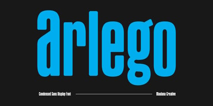 Arlego is a modern condensed sans serif Display font. Bold stroke, fun character with a bit of ligatures and alternates. To give you an extra creative work. Arlego font support multilingual more than 100+ language. This font is good for logo design, Social media, Movie Titles, Books Titles, a short text even a long text letter and good for your secondary text font with script or serif. Make a stunning work with Arlego font. Cheers, Maulana Creative
 - Mynalos by Maulana Creative,
$11.00 Mynalos is a condensed sans serif font. With bold tall sharp edge stroke, fun character with a bit of ligatures and alternates. To give you an extra creative work. Mynalos font support multilingual more than 100+ language. This font is good for logo design, Social media, Movie Titles, Books Titles, a short text even a long text letter and good for your secondary text font with sans or serif. Make a stunning work with Mynalos font. Cheers, Maulana Creative
 - Hide Seek by Maulana Creative,
$12.00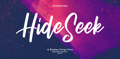 Hide Seek is a Script Display font. With bold stroke, condensed and fun character with a bit of ligatures. To give you an extra creative work. Hide Seek font support multilingual more than 100+ language. This font is good for logo design, Social media, Movie Titles, Books Titles, a short text even a long text letter and good for your secondary text font with sans or serif. Make a stunning work with Hide Seek font. Cheers, MaulanaCreative
 - Konnekta by Maulana Creative,
$15.00 Konnekta is a condensed decorative display font. With bold consist stroke, fun character with a bit of ligatures and alternates. To give you an extra creative work. Konnekta font support multilingual more than 100+ language. This font is good for logo design, Social media, Movie Titles, Books Titles, a short text even a long text letter and good for your secondary text font with sans or serif. Make a stunning work with Konnekta font. Cheers, Maulana Creative
 - Brice by Studio Sun,
$10.00 Brice refers to cultural products of the 80s such as music, art, literature, fashion, dance, film, that are consumed by the majority of society population. The Characteristic of Brice are in the small bouncy serif with a dynamic contrast, like R, B, S, K, P, etc. Perfect for Logotype, Caption, & Header. Brice are available in 5 Widths (Condensed - SemiCondensed - Normal - SemiExpanded - Expanded) with matches 6 weights (ExtraLight - Light - Normal - SemiBold - Bold - Black) and support for 75+ language.
 - Gigenham by Maulana Creative,
$14.00 Gigenham is a Retro-ish condensed sans font. Bold stroke, fun character with a bit of ligatures and alternates. To give you an extra creative work. Gigenham font support multilingual more than 100+ language. This font is good for logo design, Social media, Movie Titles, Books Titles, a short text even a long text letter and good for your secondary text font with script or serif. Make a stunning work with Gigenham font. Cheers, Maulana Creative
 - Arghfunks by Maulana Creative,
$14.00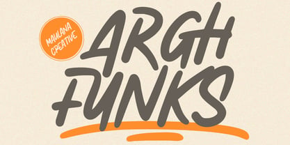 Arghfunks is a fancy handwritten display font. With condensed bold stroke, fun character with a bit of ligatures and alternates. To give you an extra creative work. Arghfunks font support multilingual more than 100+ language. This font is good for logo design, Social media, Movie Titles, Books Titles, a short text even a long text letter and good for your secondary text font with signature or script. Make a stunning work with Arghfunks font. Cheers, Maulana Creative
 - UUeirdie by Ingrimayne Type,
$7.95UUeirdie is weird. The Condensed-Light style was derived from the star-serifed font Asterx by replacing the star serifs with a rounded flare serif. Widening that style resulted in UUeirdie-Regular and the bold was then constructed to complement it. The warped version was a result of play with a font distortion program. Although the glyphs have sharp corners, they do not have straight lines. The UUeirdie faces are rough, irregular, and maybe a bit creepy. - Pintanina by RodrigoTypo,
$45.00 Pintanina was developed in 2013 with many alternatives of alphabets as ligatures Based on the Comics of Condorito in the headlines, a typography very condensed, in 2015 was redesigned next to andrey kudryavtsev now with a much more finished design and a better Cyrillic and now 2017 with Franco Jonas, takes Pintanina and begins to generate all the Family of Thin, Light Regular, Bold, Extrabold, Black, also contains different dingbats that can be of help in the titles.
 - Aseel by MAKYN,
$40.00 Aseel is a contemporary and legible typeface. It is intended to work well in the context of information and signage design. It also works well as a body text typeface as it is characterized by open counter forms and a large x-height. It is based on the Naskh calligraphic structure and has a medium stroke contrast. The letters are condensed to fit more information per line and it exists in three weights, regular, medium and bold.
 - Altrincham by URW Type Foundry,
$39.99 Back when shop window decoration was done with a brush, every window designer had his own style. In this vein the sans serif Altrincham was created. But even as a text font, it has stood the test of time, since it is very easy to read even in smaller point sizes, thanks to its relatively large x-height. With the Altrincham Condensed and Altrincham Wide Bold two other fonts have been created to perfectly complement the font family.
 - Agency FB by Font Bureau,
$40.00 ATF Agency Gothic was designed by Morris Fuller Benton in 1932 as a lone titling typeface. In 1990, David Berlow saw potential in the squared forms of the narrow, monotone capitals. He designed a lowercase and added a bold to produce Font Bureau Agency, an immediately popular hit. Sensing its potential to be than just a useful condensed face, Font Bureau developed Agency into a major series offering five weights in five widths; FB 1990-95
 - MC Aglesko by Maulana Creative,
$14.00 Aglesko is a modern condensed sans display font. Bold stroke, fun character with a bit of ligatures and alternates. To give you an extra creative work. Aglesko font support multilingual more than 100+ language. This font is good for logo design, Social media, Movie Titles, Books Titles, a short text even a long text letter and good for your secondary text font with script or serif. Make a stunning work with Aglesko font. Cheers, Maulana Creative
 - Decima+ by TipografiaRamis,
$29.00 Decima+ is a subfamily addition to Decima, a new face by TipografiaRamis. Decima+ is an upright variation of Decima italics and is built in three weights. The unique difference of this typeface is that it presents a softer and more human look, while retaining the condensed geometric structure of its counterpart. Decima+ is a display face, with bold weight most suited for titling use. Decima+ is released as OpenType single master with a Western CP1252 character set.
 - Remah Pro by Rosario Nocera,
$12.00 Originally created in 2014 but redesigned and improved in 2020, Remah Pro is an eclectic and versatile sans serif font family consisting of 5 weights, from extra light to extra bold with its respective condensed. When looking for something different, Remah Pro is certainly the best choice: the wavy shapes that defines it are intertwined with clean cuts and sharp edges, making it suitable for typographic experimentation and ideal for display work, logo design, posters and billboards.
 - Scrosiet by Maulana Creative,
$24.00 Scorsiet is a modern condensed font. With bold low contrast stroke, fun character with a bit of ligatures and alternates. To give you an extra creative work. Scorsiet font support multilingual more than 100+ language. This font is good for logo design, Social media, Movie Titles, Books Titles, a short text even a long text letter and good for your secondary text font with sans or serif. Make a stunning work with Scorsiet font. Cheers, Maulana Creative
 - Highest Praise by Adam Ladd,
$25.00 Highest Praise is a bold and expressive brush script. It has condensed proportions and subtle texture on the edges, giving it a blend of modern and vintage qualities. While stylish and distinct, the typeface is very readable, making it great for branding, packaging, quotes, invitations, headlines, etc. Features include swash characters and alternate “s” to give a different look, double-letter ligatures for certain combinations, and extras (swashes, lines) built into the font to add decoration.
 - Karglos by Maulana Creative,
$15.00 Karglos is a condensed sans serif font. With bold strong stroke, fun character with a bit of ligatures and alternates. To give you an extra creative work. Karglos font support multilingual more than 100+ language. This font is good for logo design, Social media, Movie Titles, Books Titles, a short text even a long text letter and good for your secondary text font with sans or serif. Make a stunning work with Karglos font. Cheers, Maulana Creative
 - MC Fectron by Maulana Creative,
$16.00 Fectron is a semi round condensed sans serif font. With semi bold stroke, fun character with a bit of ligatures and alternates. To give you an extra creative work. Fectron font support multilingual more than 100+ language. This font is good for logo design, Social media, Movie Titles, Books Titles, a short text even a long text letter and good for your secondary text font with script or serif. Make a stunning work with Fectron font. Cheers, Maulana Creative
 - MC Earlgos by Maulana Creative,
$17.00 Earlgos is a modern Condensed sans serif Display font. Bold stroke, fun character with a bit of ligatures and alternates. To give you an extra creative work. Earlgos font support multilingual more than 100+ language. This font is good for logo design, Social media, Movie Titles, Books Titles, a short text even a long text letter and good for your secondary text font with script or serif. Make a stunning work with Earlgos font. Cheers, Maulana Creative