7,763 search results
(0.022 seconds)
- Rufolo by Eurotypo,
$22.00 Rufolo is a family of fonts that can be considered both aesthetic and utilitarian. It has an apparent serif, barely hinted at, whose clear past reference is a beautiful epigraphic script on the marble plate placed at the southern entrance of the Roman amphitheatre, in Pompeii. Perhaps its origin dates back to Ugarit's cuneiform writing (as Morrison suggests as the origin of the serif in "Politics and Scripts") whose characteristic triangular-shaped incision footprint produces a powerful trait that not only gives character to the writing but also facilitates its support and visual compensation of sizes with neighboring signs. Other clear inspirational references have been Robert Hunter Middleton's Stellar (1929); Albertus (1932) by William A. Dwiggins; Optima (1952) by Hermann Zapf; And more recently RRollie (2016) by our foundry. Rufolo collects the attractive characteristic of the stroke endings but the proportions of its structure becomes much more regular, the capitals are in line with a constant square module, while the above references retain the proportions of the Roman Trajan. Some endings strokes have slightly baroque reminiscence with the intention of giving it greater plasticity and aesthetic enrichment, but absolutely controlled, taking special care of the aspects of readability and expressive neutrality. Rufolo Family comes in four weight: Light, Regular, Bold and Black, accompanied by its corresponding Italic versions.
 - X Ruffian by ThoroughBR&,
$9.00 X RUFFIAN Ruffian was a champion thoroughbred horse who won 10 consecutive races. A feat worth mentioning & repeating. Her tenacity & steadfast approach established the basis for this variable based font. The X represents both the Roman numeral 10, but also the X-factor for creating bespoke works of art. It is quite befitting that this font be named after a legendary champion. Which begs the question...Do you champion variety? X Ruffian's design motif uses a broad tipped chiseled marker that was set at an angle for that extra bit of vigor. Identical letter forms defeat that truly "hand rendered" look that we ultimately strive for. Each uppercase letter offers 10 (X) or more stylistic alternatives, the lowercase and number sets have 3+ options and an over under for those special characters that yield a long bottom or top (see images). Ligatures & bonus characters can add that unique offering to your already individual style & can easily be found via the glyphs panel in any open type program. With a gigantic glyph count of 688, you'll never run out of options. As a right of passage, we felt obliged to include a roman numeral set as the name beckons, which differs from the standard letter form in which you would use to create. This is a variable winner. See you at the races!
 - Hierophant by Monotype,
$40.00 Hierophant is a humanist serif type family that has the heritage of classic Old Style and Transitional type while having the crisp lines and functionality of contemporary fonts. Its defining features include a high-contrast combined with diagonal stress, along with pinched stems and horizontals. This gives Hierophant a distinctive hand-drawn feel which also reflects the strong influence of the work of 16th century calligrapher Giovanni Francesco Cresci upon this family. OpenType features include stylistic sets of alternate glyphs – the first of which contains ornate teardrop serifs and ball terminals (ss01). This style dramatically changes the look of your typography and is ideally suited for short runs of text, headlines and branding purposes. Swash alternates for certain glyphs are available via Stylistic Sets 2 and 3. Other useful features include Small Caps at the click of a button, and Old Style Figures are an option to the default proportional figure style. There are 14 fonts altogether over 7 weights in roman and italic, you can also avail of two variable fonts which allow you to fine tune the weight to your exact liking. Hierophant has an extensive character set (1000+ glyphs) that covers every Latin European language. Key features: 7 weights in both roman and italic 112 Alternates Small Caps Variable fonts included with full family Full European character set (Latin only) 1000+ glyphs per font.
 - Serapion by Storm Type Foundry,
$39.00Another variation on the Renaissance-Baroque Roman face, it extends the selection of text type faces. In comparison with Jannon, the contrast within the letters has been enhanced. The dynamic elements of the Renaissance Roman face have been strengthened in a way which is illustrated best in the letters "a", "b" and "s". These letters contain, in condensed form, the principle of this type face - in round shapes the dark stroke invariably has a round finial at one end and a sharp one at the other. Another typical feature is the lower-case "g"; the upper part of this letter consists of two geometrically exact circles, the inner of which, a negative one, is immersed down on the right, upright to the direction of the lower loop and the upright knob. The vertical strokes slightly splay out upwards. Some details of the upper-case letters may seem to be too daring, but they are less apparent in the text sizes. It has to be admitted that typographers tend to draw letters in exaggerated sizes, as a result of which they stick to details. Serapion Italic are italics inspired partly by the Renaissance Cancelleresca. This is obvious from the drop-shaped finials of its lower-case descenders. The type face is suitable for illustrated books, art posters and short texts. It has a rather ugly name - after St. Serapion. - Jannon Pro by Storm Type Foundry,
$55.00 The engraver Jean Jannon ranks among the significant representatives of French typography of the first half of the 17th century. From 1610 he worked in the printing office of the Calvinist Academy in Sedan, where he was awarded the title "Imprimeur de son Excellence et de l'Academie Sédanoise". He began working on his own alphabet in 1615, so that he would not have to order type for his printing office from Paris, Holland and Germany, which at that time was rather difficult. The other reason was that not only the existing type faces, but also the respective punches were rapidly wearing out. Their restoration was extremely painstaking, not to mention the fact that the result would have been just a poor shadow of the original elegance. Thus a new type face came into existence, standing on a traditional basis, but with a life-giving sparkle from its creator. In 1621 Jannon published a Roman type face and italics, derived from the shapes of Garamond's type faces. As late as the start of the 20th century Jannon's type face was mistakenly called Garamond, because it looked like that type face at first sight. Jannon's Early Baroque Roman type face, however, differs from Garamond in contrast and in having grander forms. Jannon's italics rank among the most successful italics of all time – they are brilliantly cut and elegant.
 - Slowglass by Adam Jagosz,
$29.00 Slowglass is a geometric semi-serif accompanied by geohumanist italics. Softly rounded edges lend it a friendly tone. The typeface includes two categories of stylistic alternates, available as font features as well as complementary font subfamilies. Text forms for increased legibility (Slowglass Text) and uncial-inspired unicase variants (Slowglass Alt). At over 1500 glyphs per weight, the fonts support 80+ Latin-based languages (incl. Vietnamese), 14 Cyrillic-based languages and polytonic Greek. OpenType features: Six sets of figures: proportional / tabular × oldstyle / lining / petite (ss20) Superscript and subscript figures Fractions, numerators, denominators Optional slashed zero Case-sensitive forms Glyph composition/decomposition (support for Navajo and Greek) Localization (Dutch, Marshallese, Bulgarian) Stylistic Sets: ss01 Roman: Two-story a, loopy α / Italic: Loopy α ss02 Roman: Simple g / Italic: Simple k ss03 Unicase r ss04 Alt f t г п т γ ss05 Descending η χ ss06 Unicase β ζ θ ξ ss07 Alt в г д ж з к п т ю ss08 Latinized ς, cursive и й ss09 Round Δ Λ Д д Л л Љ љ ss10 Full-stem a q ss11 Seriffed I ss12 Unicase A ss13 Unicase E Ω ss14 Descending F T Г П ss15 Descending G P Q Y ss16 Unicase M N И H Y ss17 Extending Φ Ψ ss20 Petite figures
 - Testament by Canada Type,
$24.95 From the standpoint of calligraphy, a font family of capitals and uncials makes perfect sense. The Roman square capitals, the quadrata, are matched by round capitals of older Greek origin; the word "uncus" means hook-shaped like a beak or talon. Interrelated and often interchangeable, these capital letters served as book hands for both the Latin West and the Greek-speaking East before they evolved into minuscule alphabets. The Testament family is based on the few formal capital manuscripts of the Bible, Virgil and Homer that have survived from the ancient world. Throughout the Middle Ages both uncials and square capitals were used, often together, for headings and initial characters. By their nature the Roman capitals are the voice of Caesar and hold the place of authority, while the uncials speak for the Church in a balanced relationship. In ancient times church and state were not as separate as they are now, and the alphabets were not as different as typographic tradition has made them. In this calligraphic rendering it is clear that they are of the same substance and can be written in the same style, conveying even to the modern eye the eternal and classical quality of epic and scripture. Testament comes in all popular font formats, and includes support for a vaster-than-usual range of Latin-based languages.
 - AW Conqueror Std Sans by Typofonderie,
$59.00 AW Conqueror Sans was born out of this desire to fuse geometric and humanistic sans. It remains a typeface fundamentally influenced by both Bauhaus spirit — with its simplified geometric forms — and Jan Tschichold’s attempts to link this modular spirit to Eric Gill’s humanist sans serif. AW Conqueror Sans is a claimed French synthesis of Germanic Modernism and English classical tradition. Spheres of influence The core set of capitals are based on the proportions of the Roman capitals like Futura, Erbar, Nobel, Johnston, Gill Sans. During the 1930s, the Futura was a true success. Since then, Monotype offered a geometric version of the Gill Sans, and Linotype added Futura-like variants to WA Dwiggins’ Metro. AW Conqueror Sans is kind of a “fusion” of this approach. The lower case “b, d, p, q” are also directly influenced by Eric Gill’s, while the “y” is influenced by some of Jan Tschichold’s alphabets. In italics, drawn narrower, AW Conqueror Sans reinterprets Gill’s idea: a rigorous italic like a roman but which sometimes reveals some aspects of a Renaissance italic. AW Conqueror Sans and its extensions AW Conqueror Sans is the initial reference point for an extended family, including AW Conqueror Inline, Slab, Carved, Didot. The potential of these mixed families is powerful. Because AW Conqueror typefaces are based on an identical structure, and compatible proportions.
 - Scarletta Script by Rastype Studio,
$10.00 Scarletta Script is a romantic and sweet calligraphy typeface with characters that dance along the baseline. It has a casual and yet elegant touch. It can be used for various purposes such as logos, wedding invitations, headings, t-shirts, letterhead, signage, lables, news, posters, badges etc. The fonts include OpenType features with stylistic alternates, ligatures and multiple language support. To enable the OpenType Stylistic alternates, you need a program that supports OpenType features such as Adobe Illustrator CS, Adobe Indesign & CorelDraw X6-X7, Microsoft Word 2010 or later versions. There are additional ways to access alternates/swashes, using Character Map (Windows), Nexus Font (Windows), Font Book (Mac) or a software program such as PopChar (for Windows and Mac).
 - Baby Gentha Script by Nk Studio,
$14.00 Baby Gentha is a cute and romantic calligraphy typeface with the characters dancing along the baseline. It has a casual yet elegant touch. It can be used for various purposes such as logos, wedding invitations, titles, t-shirts, letterheads, name boards, labels, news, posters, badges etc. The font includes OpenType features with alternative styles, ligatures, and multiple language support. To enable OpenType Stylistic alternates, you need a program that supports OpenType features such as Adobe Illustrator CS, Adobe Indesign & CorelDraw X6-X7, Microsoft Word 2010 or a later version. There are additional ways to swap / swap, using Character Map (Windows), Nexus Fonts (Windows), Font Book (Mac) or a software program such as PopChar (for Windows and Mac).
 - Bellabio by Dora Typefoundry,
$22.00 Introducing, Bellabio is an elegant modern Serif Font that gives a romantic feel to every curve that has smooth edges and a trendy look to your designs. This font also has a very fancy uppercase alternative to combine. Bellabio has 200+ Ligatures included, it's really helpful in creating your project titles: like fashion, magazine, logo, branding, photography, invitations, wedding invitations, quotes, blog headers , posters, advertisements, postcards, books, websites, etc. Features Full set of uppercase, lowercase letters 200+ Ligatures Alternates Numbers, symbols & punctuation Characters with accents Supports Multiple Languages PUA Encoded This type of family has become a work of true love, making it as easy and enjoyable as possible. I really hope you enjoy it! Thank You!
 - Lovingly by Happy Letters,
$6.00 Welcome to Happy Letters shop :) Happy St. Valentine's Day! Lovingly includes unique heart flourishes that give a charm and romantic love holiday mood ornaments, Valentine greeting cards, invitations, etc. Thin, elegant calligraphic lines like a light breeze give freshness and dreaminess to your handmade creations. Ornament font Lovingly is mapped to regular keyboard keys, so you don't need any additional programs to use them. Just install font, type and go! Lovingly is perfect for: decorating your albums, for holidays, logos, phrases, gift shops, Valentine's Day card, gift cards, tags, labels, stickers, wedding invitations, header images, Etsy presentations, ideal for handmade, scrap booking, printed paper items, promoting seasonal blog posts, social media posts, Pinterest, Instagram and much more.
 - Schorel by insigne,
$29.00 Schorel commands the room and sets the audience at ease. This new Scotch Roman typeface from insigne is a confident personality with a tasteful amount of contrast. Cool, sharp, balanced, and contemporary, Schorel not only delivers well in longer texts, but can use its mass to meet the needs of subheadlines, callouts, and other similar projects. Scotch typefaces initially come from Scottish foundries, popular in the United States in the late 18th century. This beautiful genre of type grew in popularity through the Victorian era and most of the 20th century to make regular appearance in books, magazines, newspapers, and advertisements. Schorel itself, with its moderate contrast and organic design, features short ascenders and descenders and calligraphic italics. The design features a few ball terminals, but mostly touts its bracket serifs, which come to a sharp point. The typeface, ideal for medium to large sizes, is useful for both headlines and text, carefully created for both print and screen. This OpenType font supports most Latin-based languages. Schorel has nine weights and a true italic, and many special features such as small caps, fractions, old-style figures, and numerous extras complete each font. It’s every bit a delight to your reader’s eye.
 - Beefcakes by Monotype,
$50.99 Inspired by butcher shop and supermarket window advertising, Beefcakes™ emulates "big brush” style lettering – with a contemporary twist. Not for the typographically timid, this is a design that makes a powerful and friendly statement in print and on screen. Advertising headlines, posters, cover art, menus and packaging are all in Beefcakes’ wheelhouse. While it would be a little crowded on small screens, big type in web sites and games are also part of Beefcakes kit-bag. Drawn by Jim Ford, Beefcakes’ big, sassy and playful shapes are sure to grab attention. Its letterforms are dense and sturdy – yet soft and welcoming as your mom’s old couch. The suite of Beefcakes fonts is available as all-caps designs with small caps, in roman, italic and shadow flavors. As a nod to the typeface’s inspiration, Beefcakes fonts also include a set of decorative abbreviations (lb, oz, kg, in, etc.) for bold signage and showcard-style displays.
 - Creo by Wahyu and Sani Co.,
$25.00 Creo is a low contrast, classic proportioned sans serif family, consisting of 18 fonts, 9 weights from thin to black; with uprights and italics. The word "Creo" was taken from the Latin language and means "I create, make, produce" (verb), which also stands for 'Classic Ratio'. The uppercase letters are highly influenced by Roman Inscriptional Capital letterform, and the lowercase letterform and their proportions were influenced by oldstyle serif typefaces. Creo font family is equipped with some OpenType features, such as fractions, alternates, ordinals, numerator, denominator, superscript, scientific inferior, proportional lining, etc. The alternate style letters are separated for individual usage of alternate style. Each font file has 500+ glyphs which covers major Western and Eastern Europe languages. Creo typeface with its classic letter proportions will give a different touch to your typographic work and will be a great choice for branding project, display poster, website, packaging, and a broad range of graphic design projects.
 - Peoni Pro by Emily Lime,
$89.00 Peoni is sweet and quirky… and distinctly different. Her hand-lettered glyphs have retained their original textured appearance for an even more authentic custom-lettering feel. With over 1200 glyphs, Peoni is robust and full of open-type features. She’s designed to select the most ideal characters as you type. But feel free to make changes via your open-type panel, glyphs panel or character map. Have fun with it! There are plenty of options to allow you to create something truly unique and special. Peoni’s Open-Type features include: Stylistic Sets*, including 6 different Caps Styles Contextual Alternates Standard Ligatures Discretionary Ligatures Swashes Contextual Swashes Tabular Numbers Proportional Old Style Numbers Extras- Stylized words (i.e. and, the, from, etc), Roman Numerals (I, V and X), Ordinals (1st, 2nd, 3rd) *Stylistic Sets (ss01-ss18) & alternate glyphs aren't accessible with all programs. If your design software doesn't support open-type, you may need to use your computer’s character map to access other characters.
 - Ming Gothic JJCR - Personal use only

- The Augustus Beveled font, crafted by Intellecta Design, is a distinct typeface that instantly captures attention with its unique characteristics and historical aura. This font is a celebration of Ro...
- Tobu by Hanoded,
$15.00 Tobu means 'to jump' in Japanese. I came across a haiku by Matsuo Bashô wich reads: The old pond… a frog jumps in… the sound of water (Furu ike ya… kawazu tobikomu… mizu no oto). The font is named Tobu because of its jumpy character: it doesn't have a real baseline, which makes it playful and fun to use. Tobu comes with a pond full of diacritics.
 - Optima Cyrillic by Linotype,
$65.00Many typefaces are distinctive or attractive at the expense of legibility and versatility. Not so the Optima® family. Simultaneously standing out and fitting in, there are few projects or imaging environments outside of its range. Although Optima is almost always grouped with sans serif typefaces, it should be considered a serifless roman. True to its Roman heritage, Optima has wide, full-bodied characters – especially in the capitals. Only the E, F and L deviate with narrow forms. Consistent with other Zapf designs, the cap S in Optima appears slightly top-heavy with a slight tilt to the right. The M is splayed, and the N, like a serif design, has light vertical strokes. The lowercase a and g in Optima are high-legibility two-storied designs. Optima can be set within a wide choice of line spacing values – from very tight to very open. In fact, there are few limits to the amount of white space that can be added between lines of text. Optima also benefits from a wide range of letter spacing capability. It can be set quite tight, or even slightly open – especially the capitals. If there are any guidelines, Optima should be set more open than tight. It’s not that readability is affected that much when Optima is set on the snug side; it’s just that the unhurried elegance and light gray typographic color created by the face are disrupted when letters are set too tight. Optima is also about as gregarious as a typeface can be. It mixes well with virtually any serif design and a surprisingly large number of sans serif faces. The Optima family is available in six weights, from roman to extra black, each with an italic counterpart. In addition, the family is available as a suite of OpenType® Pro fonts, providing for the automatic insertion of small caps, ligatures and alternate characters, in addition to offering an extended character set supporting most Central European and many Eastern European languages. When you’re ready to find its perfect pairing, browse these fantastic matches: Monotype Century Old Style™, Dante®, Frutiger® Serif, Joanna® Nova, Malabar™, and Soho®. - Alisal by Monotype,
$29.99 Matthew Carter has been refining his design for Alisal for so long, he says, that when he was asked to complete the design for the Monotype Library, it was almost as if he were doing a historical revival of his own typeface. The illusion even extended to changes in his work process: although he now does all his preliminary and final drawing on screen, the first trial renderings of Alisal were done as pencil renderings. Alisal is best classified as an Italian old style design. Originally created between the late 15th and mid-16th centuries in northern Italy, the true Italian old styles were some of the first roman types. They tend to be the most calligraphic of serifed faces, with the axis of their curved strokes inclined to the left, as if drawn with a flat-tipped pen or brush. These designs offer sturdy, free-flowing and heavily bracketed serifs, short descenders, and a modest contrast in stroke weight. Alisal has nearly all the classic Italian old style character traits, plus a few quirks of its own. It is calligraphic in nature, with more of a pen-drawn quality than faces like Palatino or Goudy Old Style. It is more rough-hewn than either Goudy's Kennerley or Benton's Cloister, and is generally heavier in weight than most of the other Italian old style designs. One place where Alisal makes a clean break with traditional old style designs is in the serifs. While sturdy and clearly reflecting pen-drawn strokes, Alisal's serifs have no bracketing and appear to be straight strokes crossing the main vertical. Like Caslon or Trajanus, Alisal is a handsome design when viewed as a block of copy. Ascenders are tall and elegant, and serve as a counterpoint to the robust strength of the rest of the design. Alisal is available as a small family of roman and bold with a complementary italic for the basic roman weight, providing all that is needed for the majority of text typography. Alisal is not as well-known as some of Carter's other typefaces, but this lovely and long-incubated design was certainly worth the wait.
 - Garalda by TypeTogether,
$49.00 Type designer Xavier Dupré’s Garalda is a charming 21st century family that renews a legacy of finesse. As paragraphs on a page, Garalda’s overall impression is of a workaday personality, committed to the main purpose of the job: easy long-form reading. But setting it in display sizes proves something different: This reinvented Garamond is anything but basic. The Garalda story begins with the serendipitous finding of a book typeset in a rare Garalde, called Tory-Garamond, with which Dupré was not immediately familiar. This Garamond was used in bibliophile books in the decades surrounding 1920, but after that it became déclassé for an unknown reason. Dupré found the italic styles especially charming and discovered the family was probably the mythical Ollière Garamond cut from 1914. He obtained low resolution scans of the typeface and used them, rather than high resolution scans, as the basis for his new type family. This allowed Dupré the mental freedom to experiment and remix as he saw fit, culminating in a contemporary family with heritage. As seen in the simplistic rectangular serifs, Garalda is a humanist slab serif, but with a mix of angles and curves to give the classic shapes a fresh, unorthodox feeling. While almost invisible in paragraph text, these produce a graphic effect in display work. The set of ligatures in the roman and italics lend themselves to unique display use, such as creating lovely logotypes. In the italics, some swashes inspired by different historic Garamonds are included, sometimes breaking their curves to be more captivating. Just look at how the italic ‘*-s’ ligatures create ‘s’ with a cursive formation rather than merely a flowing slant. And how the roman ‘g’ link swings as wide as a trainer’s whip. These are all balanced by squared serifs in the roman to keep an overall mechanised regularity. The Garalda family comes in eight styles, includes some of the original arrows and ornaments, and speaks multiple languages for all typesetting needs, from pamphlets to fine book printing. The complete Garalda family, along with our entire catalogue, has been optimised for today’s varied screen uses.
 - Optima by Linotype,
$45.99 Many typefaces are distinctive or attractive at the expense of legibility and versatility. Not so the Optima® family. Simultaneously standing out and fitting in, there are few projects or imaging environments outside of its range. Although Optima is almost always grouped with sans serif typefaces, it should be considered a serifless roman. True to its Roman heritage, Optima has wide, full-bodied characters – especially in the capitals. Only the E, F and L deviate with narrow forms. Consistent with other Zapf designs, the cap S in Optima appears slightly top-heavy with a slight tilt to the right. The M is splayed, and the N, like a serif design, has light vertical strokes. The lowercase a and g in Optima are high-legibility two-storied designs. Optima can be set within a wide choice of line spacing values – from very tight to very open. In fact, there are few limits to the amount of white space that can be added between lines of text. Optima also benefits from a wide range of letter spacing capability. It can be set quite tight, or even slightly open – especially the capitals. If there are any guidelines, Optima should be set more open than tight. It’s not that readability is affected that much when Optima is set on the snug side; it’s just that the unhurried elegance and light gray typographic color created by the face are disrupted when letters are set too tight. Optima is also about as gregarious as a typeface can be. It mixes well with virtually any serif design and a surprisingly large number of sans serif faces. The Optima family is available in six weights, from roman to extra black, each with an italic counterpart. In addition, the family is available as a suite of OpenType® Pro fonts, providing for the automatic insertion of small caps, ligatures and alternate characters, in addition to offering an extended character set supporting most Central European and many Eastern European languages. When you’re ready to find its perfect pairing, browse these fantastic matches: Monotype Century Old Style™, Dante®, Frutiger® Serif, Joanna® Nova, Malabar™ and Soho®.
 - Homemade Choco by Tlatous Type,
$19.00 Introducing Homemade Choco by Tlatoustype Homamade Choco is a Monoline handwritten Font. Homemade Choco is a cute, quirky and fresh handwritten font. It is ideal for holiday-themed greeting cards and for any crafting project that requires a sweet, romantic touch. Homemade Choco also multilingual support. Enjoy the font, feel free to comment or feedback, send me PM or email. Thank you!
 - Featherly Handlettered by Joanne Marie,
$10.00 I had to do it :-) - A hand lettered version of featherly is here! As always with featherly, it's perfect for anything to do with romance, weddings and love but this hand lettered version can give you an even more authentic, handmade look to your designs. There are 26 left and right swashes. No alternates with this one though. Hence the lower price.
 - Corinthia by TypeSETit,
$24.95 A festive, elegant script, Corinthia flows with perfect connections and beautiful curves. It’s a delightful design that offers wide usage... Available in OpenType format, this award winning font comes with over 500 glyphs, and character sets for European languages. All three weights are perfect for creating elegant design work from packaging and romance novels, to invitations and social expression products.
 - Hoakey by PizzaDude.dk,
$20.00 Hoakey is not really a grunge font, although it comes with rugged edges and a worn surface. This may sound like a grunge typeface, but Hoakey is a lot more than that! It oozes romance. Hoakey has curly alternate uppercase letters, and ligatures for both double lowercase and double numbers. You will need to use OpenType supporting applications to use the autoligatures.
 - Goldink Brittey by Ws Studio,
$18.00 Goldink Brittey is an elegant Modern Serif Font that gives a romantic feel to any curve that has smooth edges. This typeface has been carefully crafted to ensure premium quality and a luxurious feel, This typeface comes in both uppercase and lowercase, with punctuation, symbols, numbers, alternative styles and also has multilingual support. Make something beautiful today with this font.
 - Shelline by Almarkha Type,
$29.00 Welcome to the new Romantic script font, Shelline. This is a modern script with a delicious flow, snap-perfect characters and start & end swash. With its alternative character, you will immediately get an original handmade look. Become the perfect professional in a minute and start creating modern designs such as advertising, sales, logos, branding, posters, social media text overlays today!
 - Lovely Couple by Putracetol,
$19.00 Introducing a new romantic and a beautiful handwritting script font called "Lovely Couple". Come with open type feature with a lot of alternates, its help you to make great lettering. Lovely Couple best uses for invitation, wedding, heading,cover, poster, logos, quotes, product packaging, header, merchandise, social media & greeting cards and many more. This font is also support multi language.
 - Orchida Serif Display by Typehill Studio,
$15.00 Ochida Serif Display attracts a typeface that is smooth, clean, unique, elegant, modern, feminine, sensual, glamorous, simple and very easy to read. Classic style is very suitable to be applied in various formal forms such as invitations, labels, menus, logos, fashion, make up, stationery, letterpress, romantic novels, magazines, books, greeting/wedding cards, packaging, labels. Ochida Serif Display has alternative, Ligature and multilingual support.
 - Lovely Style by Yoga Letter,
$15.00 "Lovely Style" is a very pretty handwritten font. This font features uppercase, lowercase, swashes, headings, uppercase alternative, lowercase alternative, binders, multilingual support, numbers, and punctuation. How to use letter decoration is very easy, and there is a guide in the preview. This font is perfect for weddings, valentines, engagements, stickers, banners, posters, invitations, Christmas, Easter, romantic moments, quotes, and more.
 - Kontes Compressed by Gatype,
$14.00 The Compressed Contest font is packaged in a modern font that is unique, elegant, feminine, sensual, glamorous, simple and very easy to read. The classic style is very suitable to be applied in various formal forms such as invitations, labels, menus, logos, fashion, make up, stationery, letterpress, romantic novels, magazines, books, greeting/wedding cards, packaging, labels. Hope you enjoy this font!!
 - WIP Sugar Baby by WIP Fonts,
$49.00WIP Sugar Baby depicts the handwriting of a young woman with opulent curves that spread juvenile charm and warms the hearts of all of us. The (lower case) characters are joined as it is usual in German speaking countries. Originally designed in 1995 the font has been extended by a lot of new characters such as accented characters, punctuation, symbols and currency symbols. - Aghisna Display by Typehill Studio,
$15.00 Aghisna Display attracts a typeface that is smooth, clean, unique, elegant, modern, feminine, sensual, glamorous, simple and very easy to read. Classic style is very suitable to be applied in various formal forms such as invitations, labels, menus, logos, fashion, make up, stationery, letterpress, romantic novels, magazines, books, greeting/wedding cards, packaging, labels. Aghisna Display has alternative, Ligature and multilingual support.
 - Adellia by Yoga Letter,
$12.00 This font is named Adellia. Adellia is a font that is very elegant, beautiful and has a romantic impression. It is suitable for beautifying all types of your work. This font is very unique and has high quality. It is suitable for wedding designs, branding, invitations, signatures, labels, logos, promotion of your business, creating social media status, quotes and more.
 - Hello Bucin by Sealoung,
$15.00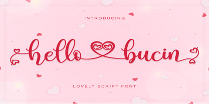 Hello Bucin feels equally romantic and whimsical. It looks lovely on wedding invitations, thank you cards, quotes, greeting cards, logos, business cards and every other design which needs a handwritten touch. This font is PUA encoded which means you can access all of the glyphs and swashes with ease! It features a varying baseline, smooth lines, gorgeous glyphs and stunning alternates.
 - The Gathon by Letter Muray,
$15.00 The Gathon is a beautiful Modern Display. it comes with beautiful characters in a hand lettering style. It was created to bring some elegance to all designs! It has a subtle, clean, feminine, sensual, and glamorous look which makes it perfect for invitations, labels, menus, logos, stationery, letterpress, romantic novels, magazines, books, greeting / wedding cards, packaging, labels, and much more!
 - Gossamer by Scholtz Fonts,
$19.95 Gossamer is a delicate, wispy font, with extravagant caps and controlled, softly curved lower case characters. It is reminiscent of fantasy and fairy lore, and wonderfully evokes the magic of childhood. Use Gossamer for Christmas cards, for wedding stationery, for cosmetics and clothing, for romance and enchantment. Gossamer has standard OpenType features, and language support includes all European character sets.
 - Santa Robin by Balpirick,
$15.00 Santa Robin is a Modern Handbrushed Font. Santa Robin is a sweet and friendly handwritten font. This playful font will look gorgeous on a variety of design ideas. It will add a joyful and romantic touch to each of your projects! Santa Robin also multilingual support. Enjoy the font, feel free to comment or feedback, send me PM or email. Thank you!
